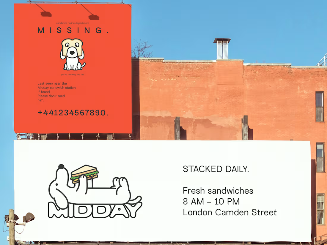
midday: a bold, modern sandwich brand built to be fresh, playful, and impossible to ignore. branding isn’t just about a logo; it’s about building a system people remember. every decision from the bold typography and vibrant palette to the playful mascot and minimal layouts was made to give Midday a distinct personality that feels fresh, approachable, and memorable across every touchpoint.🥪🧡
(brand identity, restaurant branding, food branding, visual identity, logo design, brand strategy, packaging design, menu design, hospitality branding, creative direction, typography, mascot design, graphic design, restaurant marketing, branding designer)
4
3
83
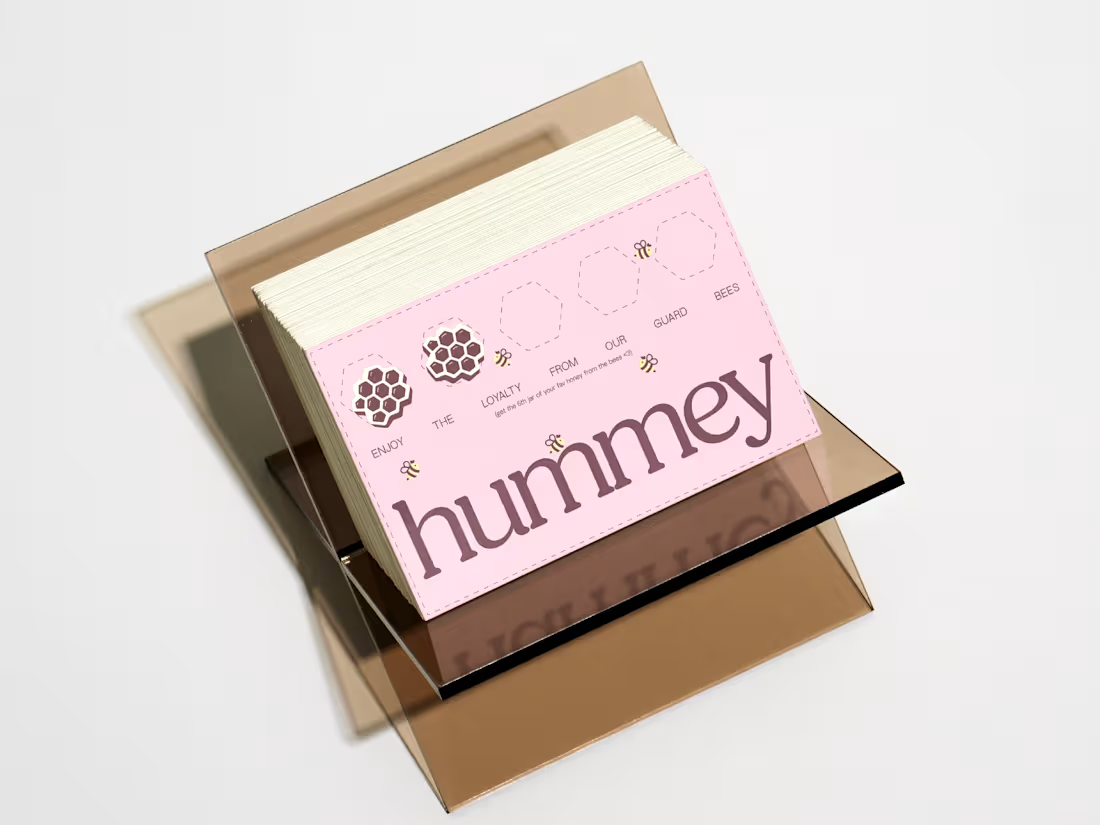
Hummey, a branding project that reimagines everyday honey through packaging, playful storytelling, with personality. The goal was simple: transform a product that’s often overlooked into something people would proudly leave on their kitchen counter.🩷🍯
#BrandIdentity (https://www.instagram.com/explore/tags/brandidentity/) #PackagingDesign (https://www.instagram.com/explore/tags/packagingdesign/) #BrandDesign (https://www.instagram.com/explore/tags/branddesign/)#CreativeDirection (https://www.instagram.com/explore/tags/creativedirection/)
(branding, visual identity, packaging design, FMCG branding, CPG design, food packaging, consumer goods, brand strategy, art direction, creative direction, logo design, editorial design, product branding, retail packaging, conceptual branding)
2
46
meet Skeltch, a contemporary stationery brand created for people who still believe that the best ideas begin on paper❤️📄the identity explores the tension between precision and imperfection. while the wordmark is clean and structured, the hand-drawn “l” and “t” intentionally break the rhythm, representing the human touch that continues to exist in a world increasingly driven by screens, algorithms and perfection.the bold colour palette was designed to do exactly what great packaging should stop you mid-scroll, stand out on a shelf, and make curiosity impossible to ignore. every notebook becomes its own collectible object while still feeling like part of the same system.
#brandidentity #branding #stationerybranding
(branding, brand identity, packaging design, visual identity, creative direction, logo design, stationery branding, premium branding, retail packaging, consumer packaging, typography design, creative studio, brand strategy, product branding, graphic designer, branding studio, brand designer, freelance designer)
2
43
Bold Sourdough Branding: “what if a sourdough bakery didn’t look like every other earth-tone, muted, “farm-to-table” spot on the planet?”
Yeah… I asked myself the same thing. Uncle Dough is a bakery built on honesty and neighborhood warmth, so I pushed the identity toward something that feels handmade, bold, and full of character: reds inspired by oven heat, soft blues from morning light, and scribbly handwritten textures that mimic the way bakers track notes.🧡
1
55
A refined brand identity designed for a modern needlepoint store, where tradition meets thoughtful design.
This project focused on creating a visual language that feels timeless yet contemporary, honoring the craft while inviting a new generation of makers in. From the monogram and typography to tactile stationery and storefront applications, every detail was crafted to reflect patience, precision, and the beauty of slow, handmade work.
A brand rooted in craft, calm, and considered design, made to last 🤍
3
104
Bare Earth Branding 🌿
A brand shaped by nature, not trends.
My take focused on restraint, earthy tones, botanical forms, and tactile details that feel grounded and honest. Nothing loud, nothing forced. Just calm, modern design that lets nature lead and materials speak for themselves.
1
60
Quiet luxury branding isn’t loud, it’s intentional.
For SĒRA, every curve, letter, and detail was designed to feel composed, timeless, and modern. A brand identity rooted in restraint, crafted to endure.
1
65
Cookie Branding: Not your average cookie brand, this one’s built to be craved, shared, and remembered 🍪✨
1
113
Decaffeinated Coffee Branding: no caffeine. no chaos. no noise.
just clarity. just control. just you.
built a brand around the idea that energy isn’t something you sip, it’s something you own.
From the wind-up key concept → to playful characters → to a system that visually removes “the rush” while still feeling alive…
this was about designing restraint in a world addicted to intensity🤍
1
60
Bonta Cara Branding, building a brand that feels like passing plates around a crowded table, red wine stains on paper menus, and staying “just one more hour.”
because the best restaurants don’t just feed you, they make you feel like you belong there.🩷
1
59
Ice Cream Branding: Too cool to stay quiet. iscream brings the meltdown energy 🍨🔥
1
70
The vision for REN was clear from day one:
earthy. minimal. intentional. premium🤎
We designed a brand identity inspired by slow coffee rituals and calm community spaces, balancing softness with sophistication through muted tones, clean typography, and an understated visual system.
Because premium branding doesn’t need to be loud to leave an impression.
1
78
Whimsical branding project for Cake Social🩷
A custom cake studio imagined as a world of ribbons, celebrations, and edible centerpieces. blending playful illustrations with a modern aesthetic, this identity was designed to make every occasion feel a little more magical.
1
77
For Carmelies, we designed more than a logo we built a brand experience. From the playful mascot illustrations to the thoughtfully crafted packaging, each element was created to feel warm, memorable, and full of personality.
The challenge was finding the sweet spot between premium and playful. Soft storytelling, charming characters, and a refined visual system come together to create a brand that feels inviting at every touchpoint.🍔🤎
1
146
One branding mistake I see over and over: Businesses spend months perfecting their product...and two hours designing their brand.
The result? A great product that doesn't get the attention it deserves.
Good branding doesn't replace a good product, it helps people notice it!
1
100
This project started with a really fun brief, build a hot sauce brand that’s bold, spicy, cheeky, and doesn’t take food too seriously.
From day one, I wanted Peppa Please to feel playful without being gimmicky. Cheeky without being loud. Spicy without screaming about it.
The idea was to create a visual world where bold reds, raw chilies, and editorial-style imagery do most of the talking, supported by dry humor, polite copy, and a calm confidence that lets the heat speak for itself.
No clichés. No over-explaining. Just a brand that stands out on the table, packs real punch, and feels memorable for all the right reasons.
2
99
A full brand identity created for a floral boutique rooted in warmth, character, and handmade charm.
From the logo system to illustrations, packaging, and in-store touchpoints, every element was thoughtfully designed to feel personal, gift-worthy, and emotionally led.
This project was about translating the client’s vision into a cohesive floral world: one that feels welcoming, expressive, and quietly refined across both print and digital.
So excited to see Belrose come to life🩷
2
94
Rude Olive, is a grab-and-go snack brand built for people obsessed with salty, briny flavor. every detail was designed to feel bold, playful, and impossible to ignore.
2
97
Build it. Stack it. Own it. 🥯💥
My take on BGL turns a simple bagel into a bold, playful experience where every ingredient becomes a character and every order feels personal. Bright, modern, and impossible to ignore… because why should your food be boring?
(bagel bar, branding, menu design, playful design, bold colors, pink aesthetic, character design, modern branding, food identity, packaging design, typography, fun visuals, creative direction, brand identity, graphic design)