
Syed NooreTabassum
Logo Designer | Minimal & Memorable Brand Identities
New to Contra
Syed is ready for their next project!


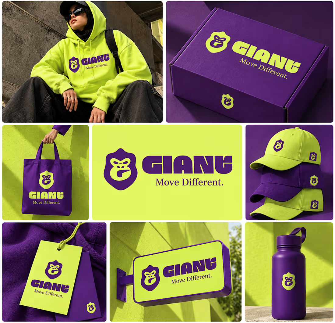
GIANT — Move Different.
Built around a bold gorilla mark, oversized typography, and an electric purple + neon-lime palette.
A streetwear identity designed to feel bold, rebellious, and instantly recognizable — from hoodies and caps to packaging, tags, and everyday brand details.
Concept branding project | Open for custom projects
2
3
54
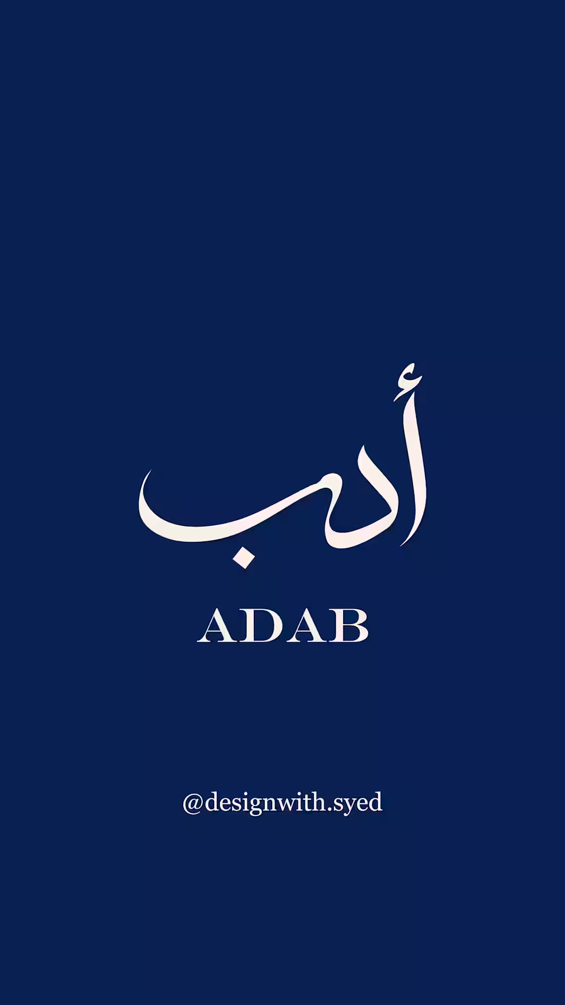
ADAB — a minimal Arabic-inspired logo concept.
This concept explores elegant Arabic lettering with a clean, modern and refined visual direction, designed to feel timeless and versatile.
Originally created as a practice concept, but now available for purchase. If this direction fits your brand, feel free to reach out — I can also customize it to suit your brand’s personality and needs.
Available at a friendly budget. ✨
0
36
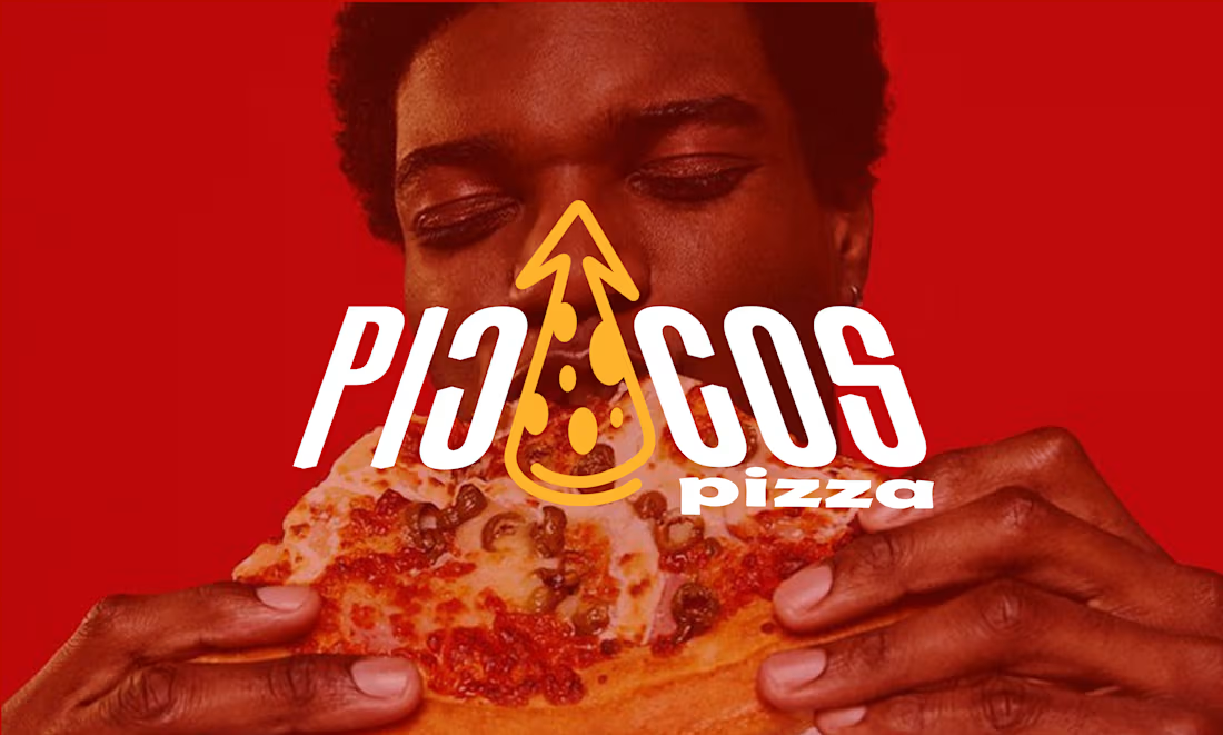
A self initiated project piccos pizza
0
40
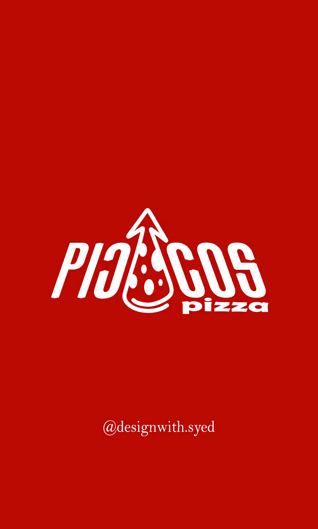
Piccos Pizza — Practice Logo Concept
This is a self-initiated practice logo concept created for Piccos Pizza.
I explored a simple pizza-inspired mark with an upward pointed shape to create a bold and memorable identity. The concept combines the idea of pizza with a sharp, energetic visual direction.
I kept the design minimal, clean, and easy to recognize, with the goal of making it work across social media, packaging, menus, and other brand applications.
This logo concept is available for purchase. If you’re interested in using or customizing this design for your brand, feel free to DM me.
Open to small adjustments based on your brand needs. ✨
2
118