The network for creativity
Join 1.25M professional creatives like you
Connect with clients, get discovered, and run your business 100% commission-free
Creatives on Contra have earned over $150M and we are just getting started
Back to feedPost
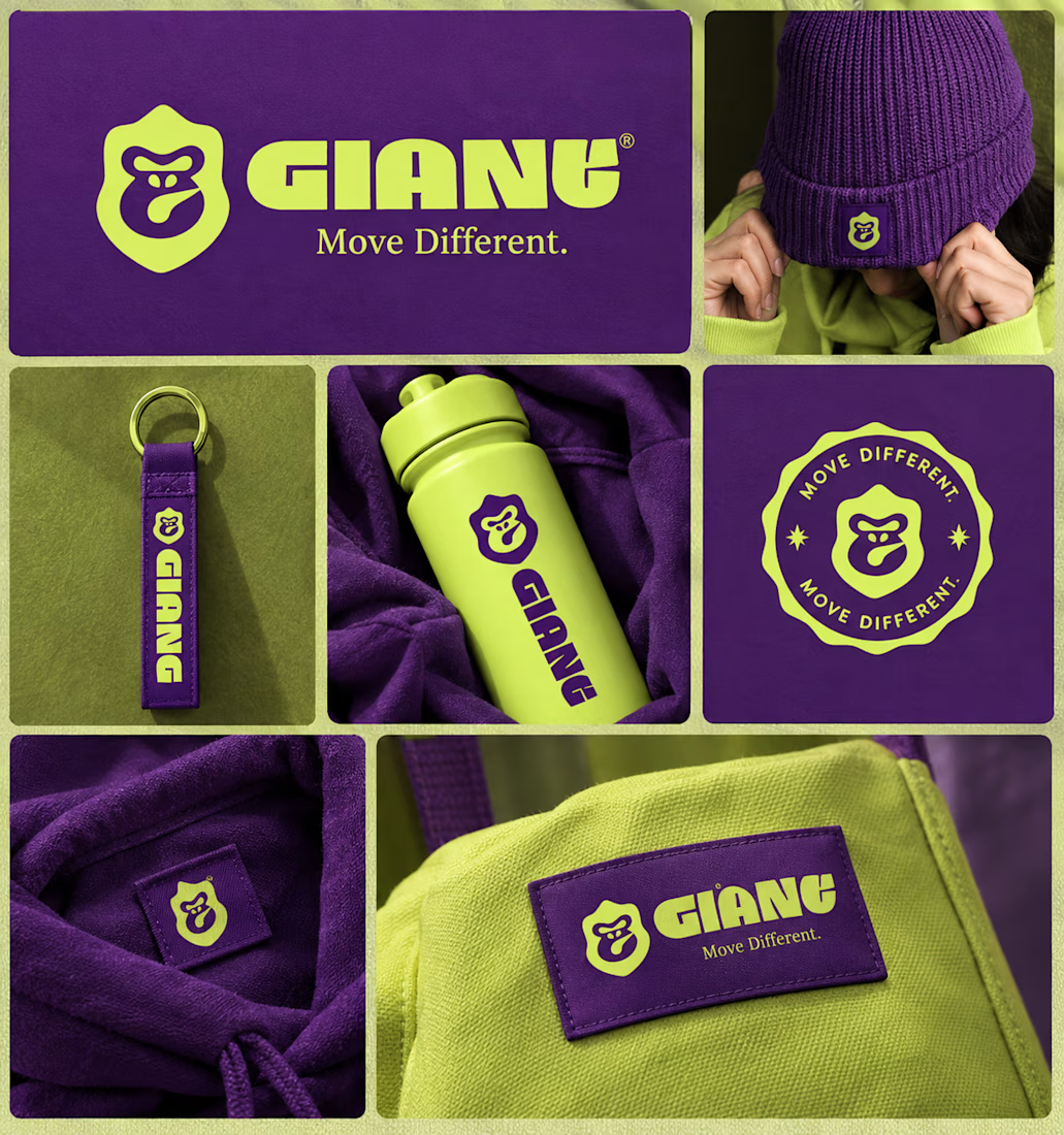
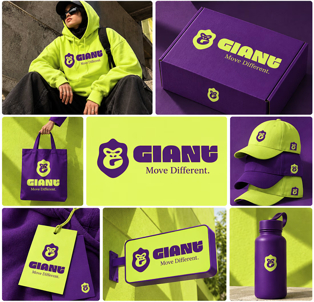
GIANT — Move Different.
Built around a bold gorilla mark, oversized typography, and an electric purple + neon-lime palette.
A streetwear identity designed to feel bold, rebellious, and instantly recognizable — from hoodies and caps to packaging, tags, and everyday brand details.
Concept branding project | Open for custom projects



nice colour combination!

Using electric purple paired with neon lime is a high risk color choice that demands exceptional contrast management. Getting that balance right across different fabrics and lighting conditions is often where streetwear brand identities actually fail.

Thanks for sharing your perspective! I'd love to understand this better. I used purple as the primary color and neon lime as the secondary accent. Could you point out what specifically you'd improve in my design, especially regarding contrast, readability, or how the colors work...


This is a really creative piece! I love how the visual elements come together to create something that feels distinctive rather than predictable. The composition, the overall visual direction, and the way the idea has been executed all contribute to making this stand out. It’s a...
Thank you so much! Really appreciate your thoughtful feedback. 🙌✨
You're welcome. Can we be mutuals? I just followed you.

The gorilla patch on the beanie is my favorite detail!
Thankyou

Great color palette and gorilla Mark you make a great match ❤️❤️
Great job Syed❤️
Thankyou
Pardon Syed❤️
Haha, no worries ❤️
The network for creativity
Join 1.25M professional creatives like you
Connect with clients, get discovered, and run your business 100% commission-free
Creatives on Contra have earned over $150M and we are just getting started
Related posts

A little more about the inspiration behind Tindara.
I wanted the identity to have a connection to Tindari, Sicily. The Madonna di Tindari statue was the starting point for the symbol, while Sicilian decorative patterns inspired the graphics around it.
For the colors, I chose mustard yellow, deep green, and burgundy, balanced with cream. I wanted to bring some of that warmth and richness into the packaging, while keeping the different elements comfortable together.
For me, these references are what give the project its character and sense of place.



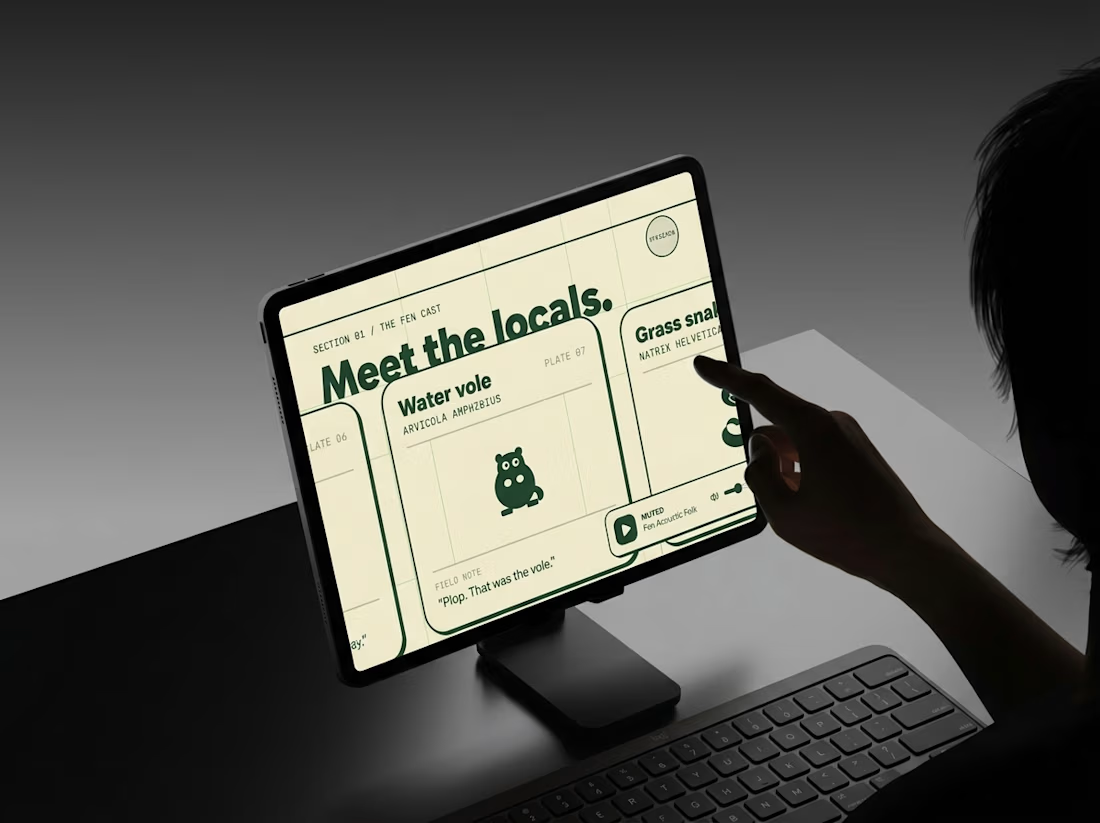
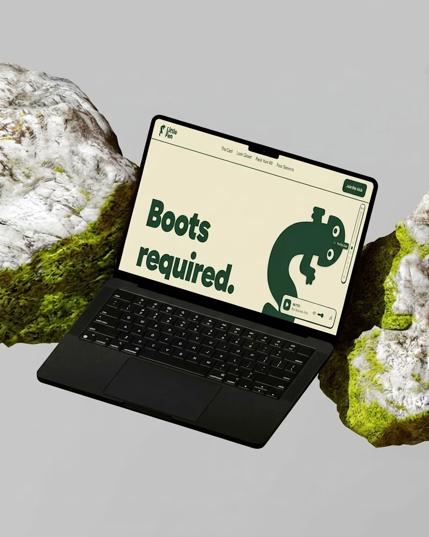
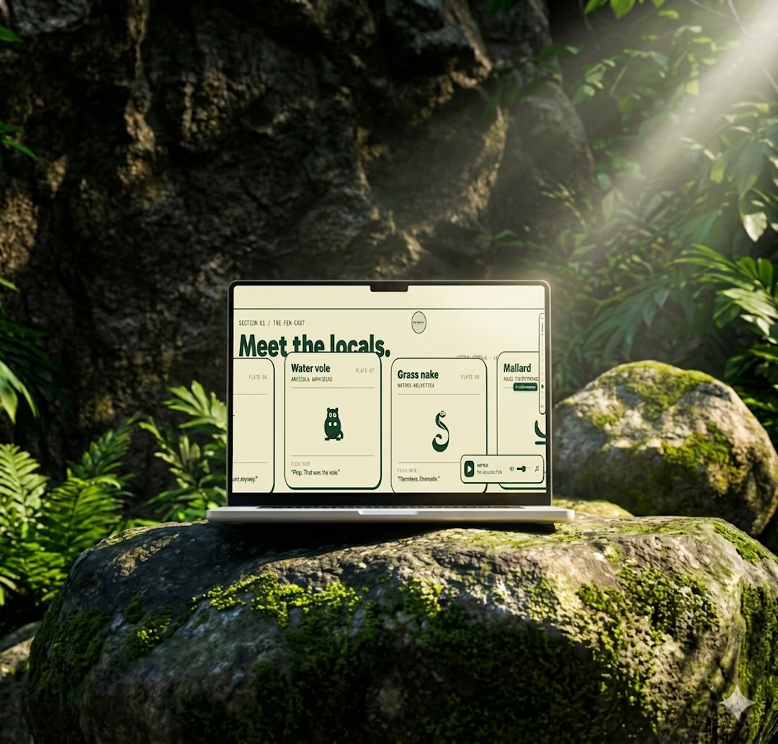
Most websites open with “Welcome.”
This one opens with “Boots required.”
Little Fen’s site is a field guide: locals with Latin names and a heron soundtrack.
Go meet the vole.

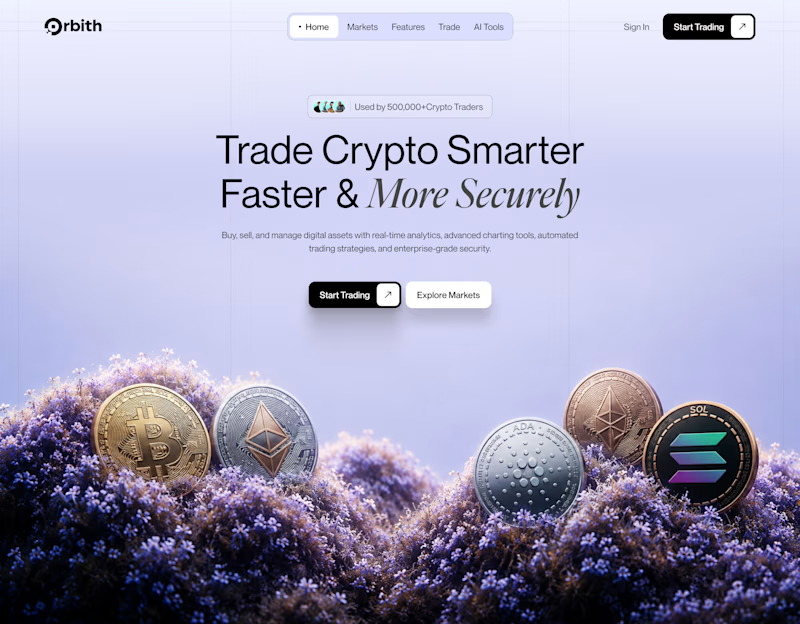
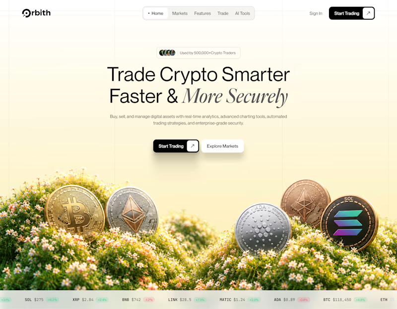
Your crypto landing page has 3 seconds to earn trust. Which direction gets it right?
One crypto homepage feels built for serious traders. The other makes crypto feel effortless.
Which one would make you click “Start Trading” without hesitation: #1 or #2?


10 voted
37%
17 voted
63%
27 votes
Closed
