


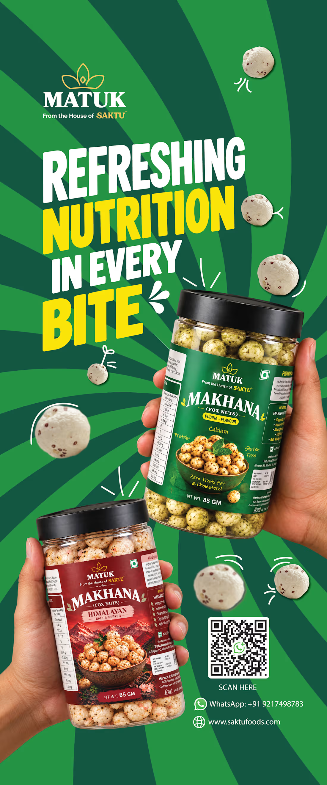
SAKTU & MATUK (https://www.saktufoods.com/) — Retail Standee Design & Brand Activation
Project Overview
Designed two promotional standees for SAKTU and MATUK, food brands bringing traditional Indian nutrition into contemporary consumer lifestyles.
The objective was to create high-impact, large-format promotional visuals that communicate each brand's product offering, reinforce brand recognition, and attract attention in retail and promotional environments.
Creative Direction
The two standees use distinct visual approaches tailored to each brand's identity and product positioning.
SAKTU — Rooted in Heritage. Made for Today.
The SAKTU standee highlights traditional, hand stone-ground Chana Sattu through warm earthy tones, heritage-inspired graphics, product packaging, and lifestyle-led imagery. The composition emphasizes the brand's roots in Indian nutrition while presenting the product in a modern, approachable way.
MATUK — Refreshing Nutrition in Every Bite
The MATUK standee takes a bold, energetic approach with a vibrant green palette, oversized typography, dynamic radial patterns, and prominent product visuals. The composition showcases the Makhana snack range while creating a contemporary, attention-grabbing presence suited to a retail display.
My Role
Visual Designer | Art Direction | Retail Marketing Design
My responsibilities included:
Creative and visual direction for both standees
Large-format layout and composition
Typography and visual hierarchy
Product packaging presentation
Brand messaging and promotional communication
Integration of product benefits, QR codes, and contact details
Maintaining brand consistency while differentiating the two visual identities
Design Approach
The goal was to make each standee immediately recognizable and easy to scan from a distance. SAKTU uses a heritage-led, natural aesthetic to communicate authenticity, while MATUK uses bold color, expressive typography, and energetic compositions to communicate a modern snack experience.
Together, the designs demonstrate how a shared brand family can maintain a cohesive commercial presence while giving individual product brands their own visual character.
Deliverables
1 SAKTU promotional standee
1 MATUK promotional standee
Large-format print design artwork
2
36
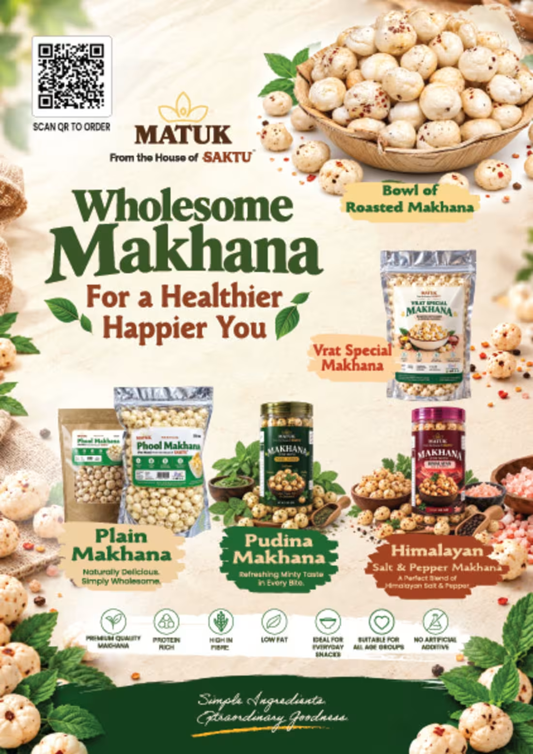
SAKTU & MATUK — FMCG Brand Flyer & Product Marketing Design.
Project Overview
A promotional flyer designed for SAKTU and MATUK, two food brands celebrating traditional Indian nutrition through a contemporary visual identity.
The objective was to bring SAKTU's hand stone-ground Chana Sattu and MATUK's Phool Makhana product range together in a cohesive, print-ready marketing piece that communicates product variety, key benefits, brand heritage, and product positioning.
Creative Direction
The design combines earthy brand colors, heritage-inspired typography, natural ingredient imagery, and product-focused compositions to create a visual language that feels authentic, wholesome, and commercially appealing.
The bi-fold layout gives each brand its own visual space while maintaining a consistent connection between the two. SAKTU's section emphasizes traditional nutrition and product authenticity, while MATUK's section showcases its Makhana range, flavor variations, and product benefits.
My Role
Visual Designer | Brand Collateral | FMCG Marketing Design
I worked on the visual communication and design execution, including:
Visual Direction: Establishing a cohesive aesthetic across both brands.
Layout Design: Organizing brand messaging, product information, and promotional content within a bi-fold format.
Product Presentation: Showcasing packaging, product variants, and serving imagery.
Typography & Hierarchy: Making headlines, product names, and key selling points easy to navigate.
Marketing Communication: Integrating brand positioning, product benefits, website details, and QR-code ordering touchpoints.
Design Approach
The design balances traditional Indian food heritage with contemporary FMCG presentation. Warm neutrals, deep greens, earthy browns, and ingredient-led visuals reinforce the natural-food positioning, while structured information and prominent product imagery support product discovery.
The result is a unified marketing asset designed to introduce the brands, communicate their offerings, and support product promotion across relevant customer touchpoints.
Deliverable
A4 landscape bi-fold promotional flyer design for SAKTU and MATUK.
1
45
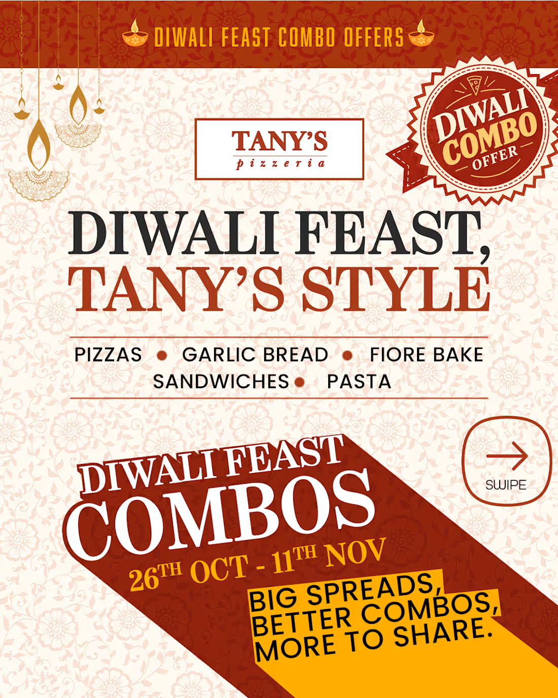
Restaurant Advertising / Social Media Carousel Diwali Combo Offer | Festive Campaign Design
(https://www.instagram.com/tanys.pizzeria)Diwali Feast Combo Campaign - Tany’s Pizzeria (https://www.instagram.com/tanys.pizzeria). A festive food advertising campaign designed by me (https://www.behance.net/sivadth-designs), featuring curated vegetarian and non-vegetarian pizza combos, promotional pricing, and a warm Diwali-inspired visual identity. The campaign includes promotional creatives, combo menu layouts, and a final ordering slide with WhatsApp, Instagram, and Google touchpoints. A food branding and social media design project showcasing festive campaign art direction, promotional communication, and cohesive visual storytelling.
Format: Social media carousel design with promotional creatives, combo menu layouts (vegetarian and non-vegetarian options), pricing callouts, and an ordering slide featuring touchpoints for WhatsApp, Instagram, and Google.
Project Type: Food branding, festive campaign art direction, and social media advertising.
Key Responsibilities & Deliverables
Festive Visual Identity: Developed a warm, Diwali-inspired aesthetic using custom decorative elements (diyas, festive borders, and promotional badges) while maintaining core brand guidelines.
Carousel Architecture & Storytelling: Structured a multi-slide carousel flow:
Hook: High-impact festive offer announcement.
Menu Breakdown: Structured combo layouts showcasing both vegetarian and non-vegetarian offerings alongside promotional pricing.
Call-to-Action (CTA): Final conversion slide integrating contact points across WhatsApp, Instagram, and Google.
Copy & Layout Integration: Arranged high-density promotional information—covering pizzas, garlic bread, fiore bake, sandwiches, and pasta—ensuring legibility across mobile devices.
Project Scope
Services: Food Branding, Social Media Advertising, Art Direction, Visual Design
Deliverables: Social Media Carousel (Instagram/Facebook), Digital Menu Creatives
Tools Used: Photoshop / Illustrator
1
43
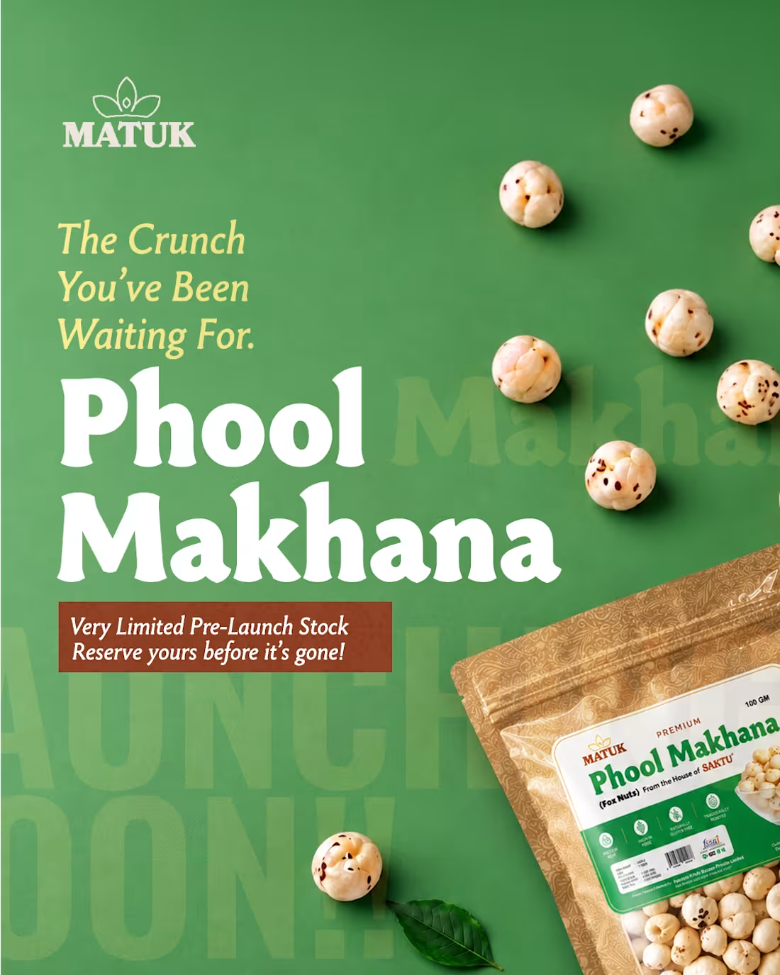
::MATUK — Product Launch & Social Media Campaign.
1
55