The network for creativity
Join 1.25M professional creatives like you
Connect with clients, get discovered, and run your business 100% commission-free
Creatives on Contra have earned over $150M and we are just getting started
Back to feedPost

SAKTU & MATUK — Retail Standee Design & Brand Activation
Project Overview
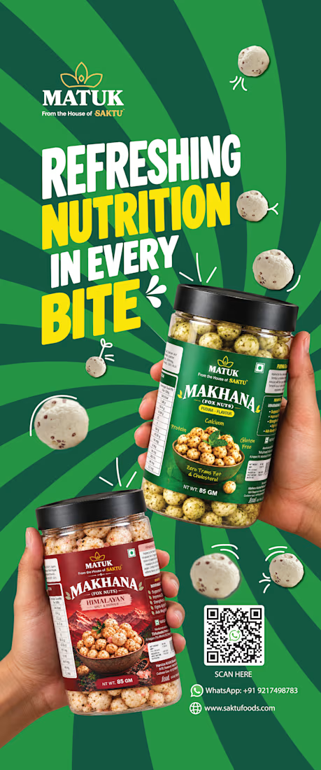
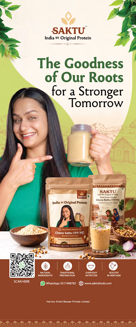
Designed two promotional standees for SAKTU and MATUK, food brands bringing traditional Indian nutrition into contemporary consumer lifestyles.
The objective was to create high-impact, large-format promotional visuals that communicate each brand's product offering, reinforce brand recognition, and attract attention in retail and promotional environments.
Creative Direction
The two standees use distinct visual approaches tailored to each brand's identity and product positioning.
SAKTU — Rooted in Heritage. Made for Today.
The SAKTU standee highlights traditional, hand stone-ground Chana Sattu through warm earthy tones, heritage-inspired graphics, product packaging, and lifestyle-led imagery. The composition emphasizes the brand's roots in Indian nutrition while presenting the product in a modern, approachable way.
MATUK — Refreshing Nutrition in Every Bite
The MATUK standee takes a bold, energetic approach with a vibrant green palette, oversized typography, dynamic radial patterns, and prominent product visuals. The composition showcases the Makhana snack range while creating a contemporary, attention-grabbing presence suited to a retail display.
My Role
Visual Designer | Art Direction | Retail Marketing Design
My responsibilities included:
Creative and visual direction for both standees
Large-format layout and composition
Typography and visual hierarchy
Product packaging presentation
Brand messaging and promotional communication
Integration of product benefits, QR codes, and contact details
Maintaining brand consistency while differentiating the two visual identities
Design Approach
The goal was to make each standee immediately recognizable and easy to scan from a distance. SAKTU uses a heritage-led, natural aesthetic to communicate authenticity, while MATUK uses bold color, expressive typography, and energetic compositions to communicate a modern snack experience.
Together, the designs demonstrate how a shared brand family can maintain a cohesive commercial presence while giving individual product brands their own visual character.
Deliverables
1 SAKTU promotional standee
1 MATUK promotional standee
Large-format print design artwork

The network for creativity
Join 1.25M professional creatives like you
Connect with clients, get discovered, and run your business 100% commission-free
Creatives on Contra have earned over $150M and we are just getting started








Related posts

Two Ads, Two Designs but Different Vibes:
Using the hours and the rest day, I came with these ads using the
software of SVGator combined with the transitions from Adobe After Effects.
Vote and let me know your opinions on which one and why?


12 voted
57%
9 voted
43%
21 votes
Closed


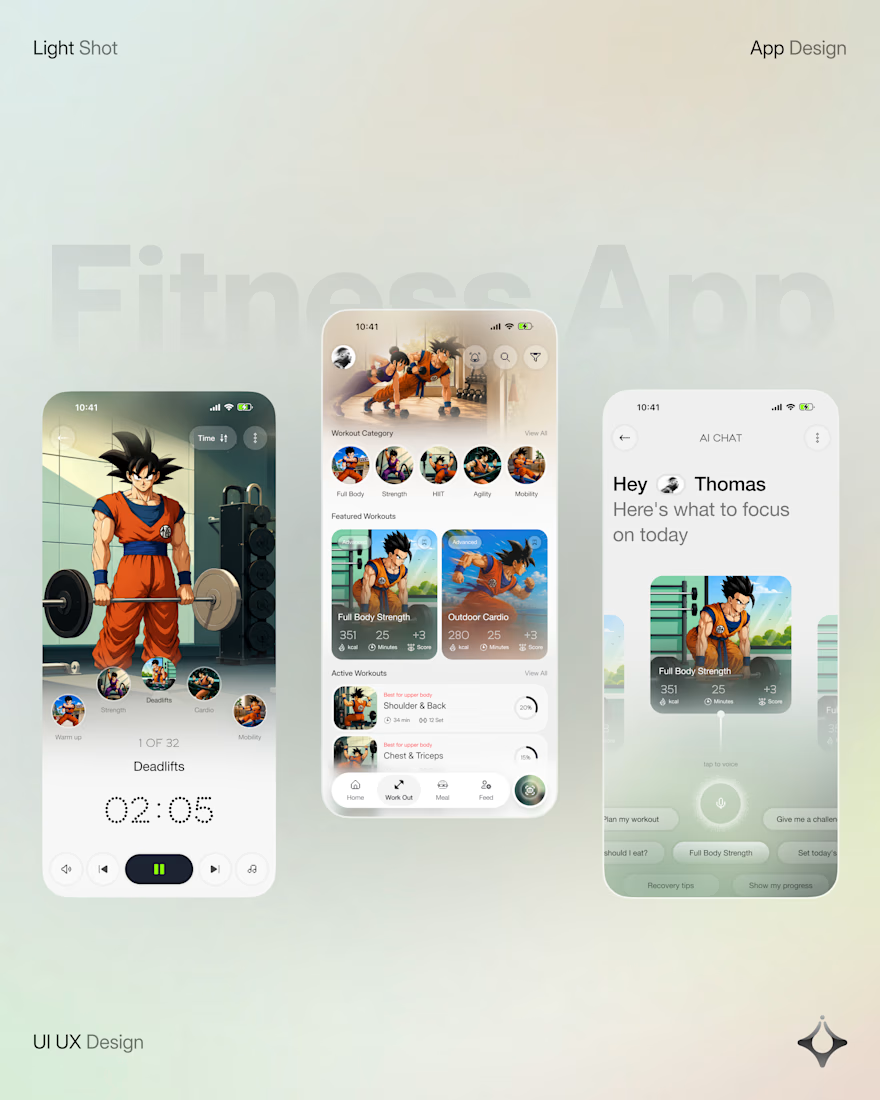
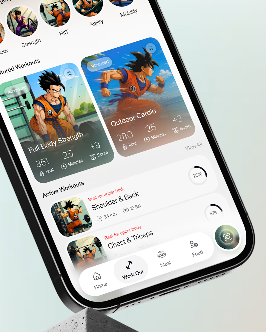
What if your fitness app felt like having a personal trainer in your pocket?
Meet your new workout companion. A bold fitness app concept combining personalized workouts, AI coaching, and a seamless mobile experience to make every session count.
Would you use this to level up your fitness journey?

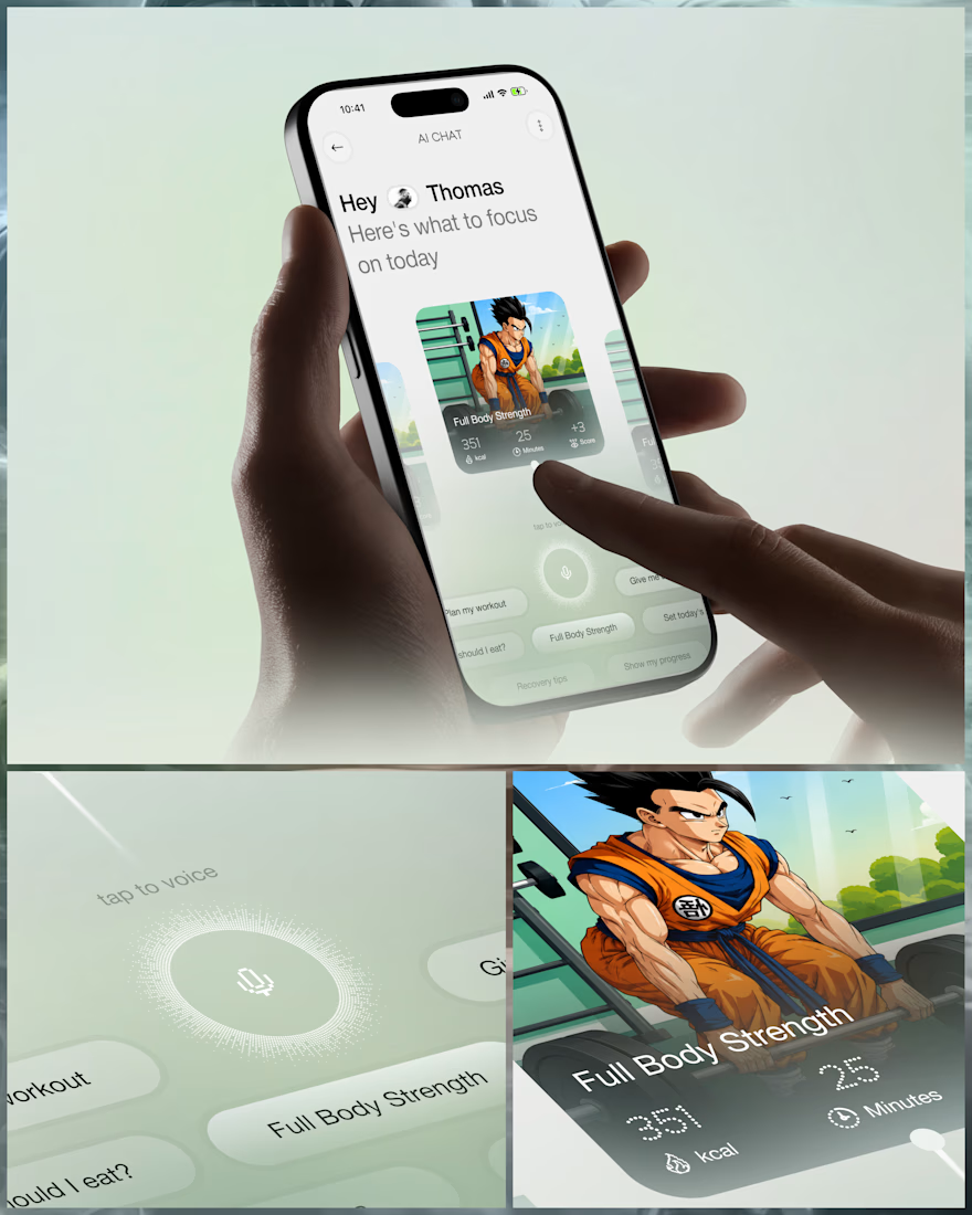
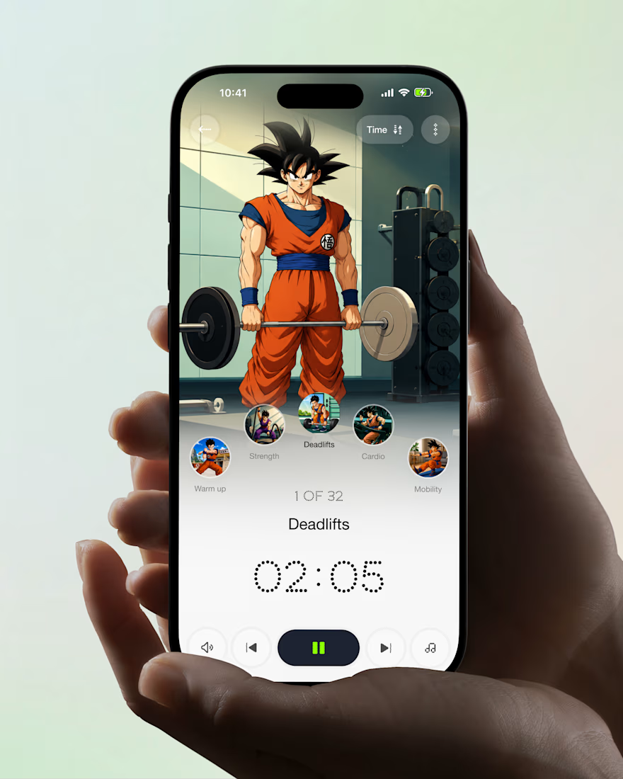

Ye le Jani Juice Lab wali post ke liye copy-ready:
Love this concept Juice Lab! A fitness app that feels like a personal trainer in your pocket is exactly what's needed — combining personalized workouts with AI coaching and a seamless mobile experience is a great approach. The...

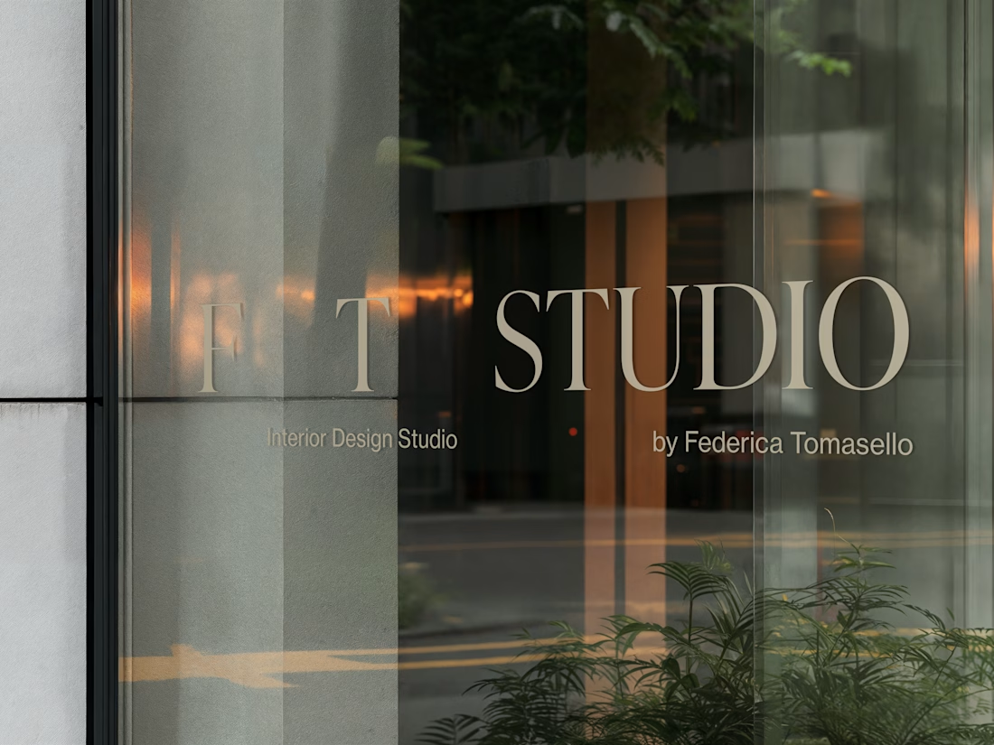
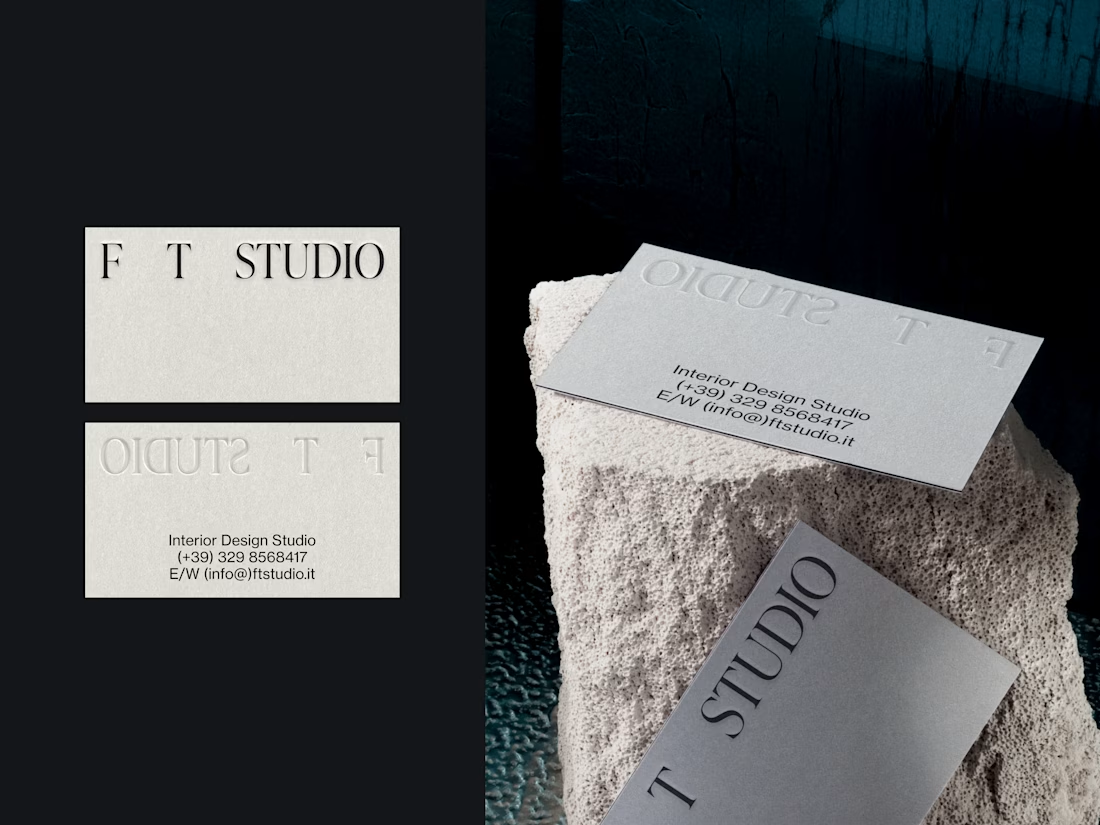
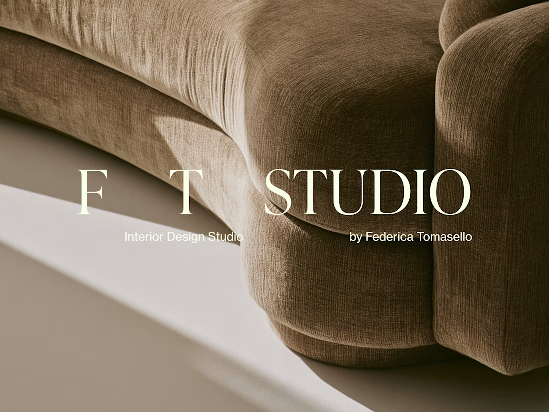
FT Studio is an Interior Design Studio, led by Federica Tomasello.
Through careful listening and a psychological approach to design, she studies each client’s personality and translates it into details that make the space unmistakably theirs.
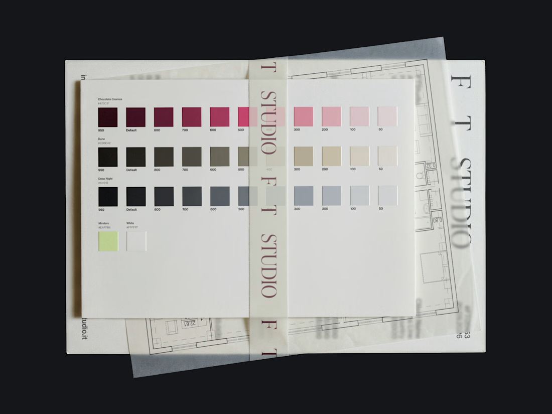
The brand identity is built around the one thing she works with every day: space.
Hope you enjoy it!🤍 Check it out


Nice