
pro

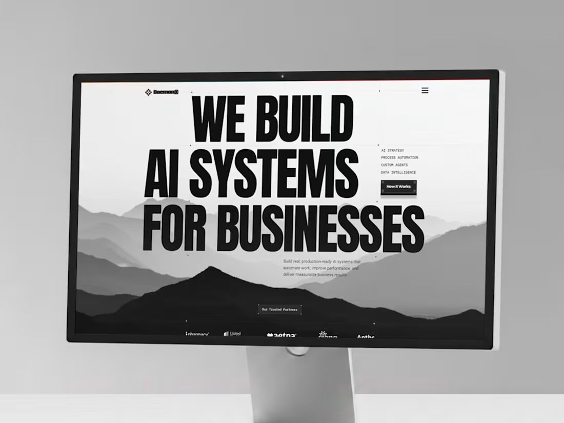
🚀 Daemon AI is a high-converting website template for AI agencies that want to look premium, explain what they do clearly, and turn visitors into paying clients
Get it here on Contra 👉 https://contra.com/products/15WBZ3Bl-ai-agency-framer-template-daemon
⚡ No coding needed 🧠 Built to simplify complex AI services 📊 Showcase real results 💼 Turn traffic into high-value deals
0
136
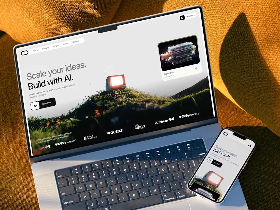
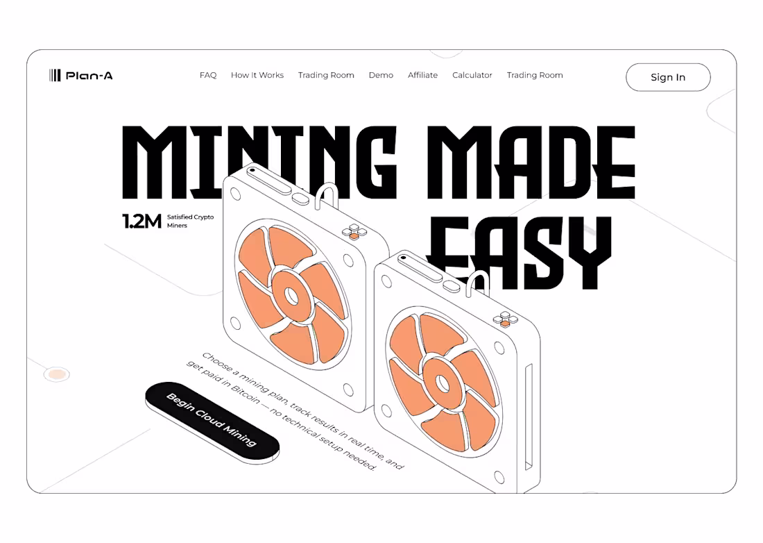
🚀 Spartan AI is a high-converting website template for AI agencies that want to look premium, explain what they do clearly, and turn visitors into paying clients
Get it here on Contra 👉 https://contra.com/products/nPfq1wxN-ai-agency-framer-template-spartan-ai
⚡ No coding needed 🧠 Built to simplify complex AI services 📊 Showcase real results 💼 Turn traffic into high-value deals
1
4
663
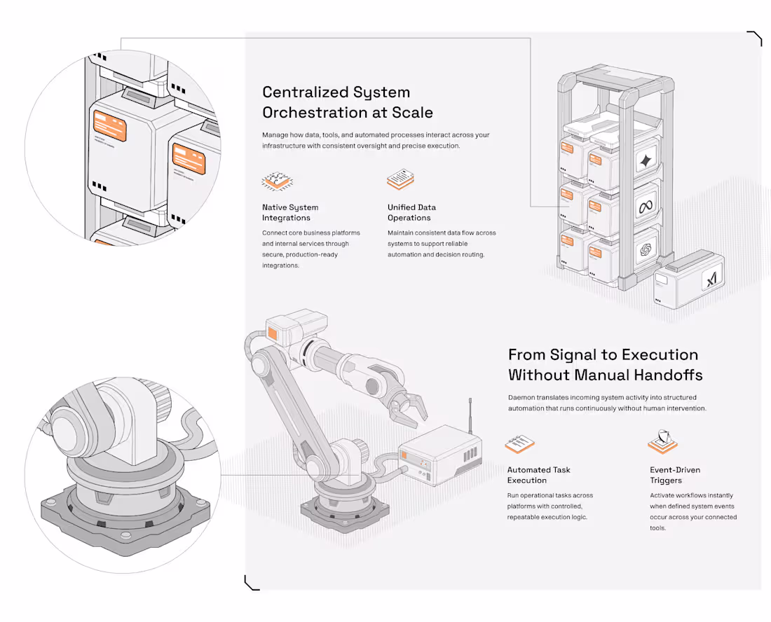
Teams struggle to depict how orchestration works.
APIs, triggers, data, tasks all invisible.
The real issue wasn’t functionality. It was clarity.
Lesson: If users can’t visualize the system, they won’t trust it.
So I built a modular, industrial-style illustration system from scratch.
Every block equals a function.
Every connection equals a decision point.
Benchmark: 100% custom vectors. Zero stock or AI generated assets.
The Result
A single frame now explains centralized orchestration, event-driven triggers, and automated execution in under 5 seconds of visual scanning.
Not decoration. Not abstraction. Actual system thinking.
The Takeaway
Good SaaS design doesn’t just look good.
It teaches, guides, and reduces cognitive load.
This changes everything.
If your product is complex, your design must be even clearer.
2
6
902
Today, on 3D websites..
1
902
Hero Section Redesign for Avelis
0
16
This is how yoy can tell the difference between a beginner web designer, a pro designer, and an ultimate designer
2
7
915
Website Design for Salestable AI Start-Up
0
28
This is how I design for SaaS: clarity over decoration, structure over trend, systems over isolated visuals.
If your product needs illustration that explains, not just decorates, my work is built for that level.
0
679
Scalable SaaS Illustration System for Framer
1
20
Website for short form video editors
1
555
Reset password screen doesn't have to be boring.
What do you think?
1
532
I built this landing page for an agency who was contracted by an AI start-up. I enjoyed making these illustrations.
36
705
Is this minimal enough for a hero section?
26
522
Check out my first Rive project. How did I do?
32
462
What do you think about this layout?
4
31
482
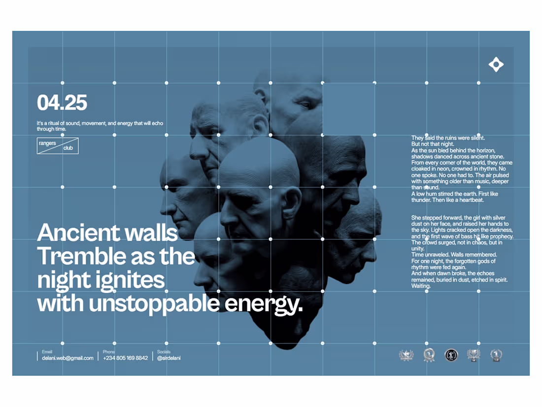
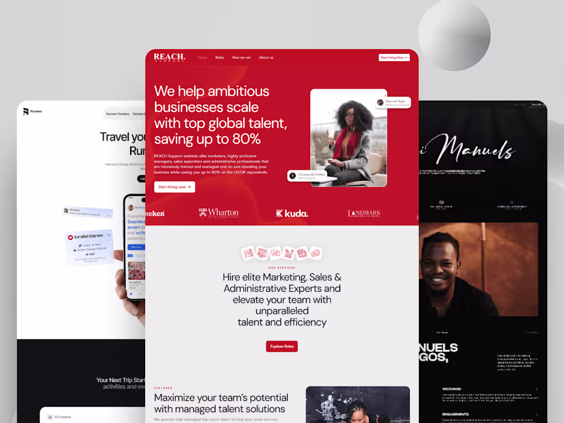
Here are some websites I've built using Framer. What do you think?
Check out the live website here (https://www.delani.pro).
32
453
Good design sells itself. Great design sells everything around it, the brand, the story, the vision. I built this Framer template for a web design agency from a shared Figma file.
I set created the animations, components, and set up 4 CMS collections, with 14 pages altogether including error 404 page.
Check out the live preview (https://lime-life-987127.framer.app/).
3
29
474
Hero Sections Case Study in Framer
2
34
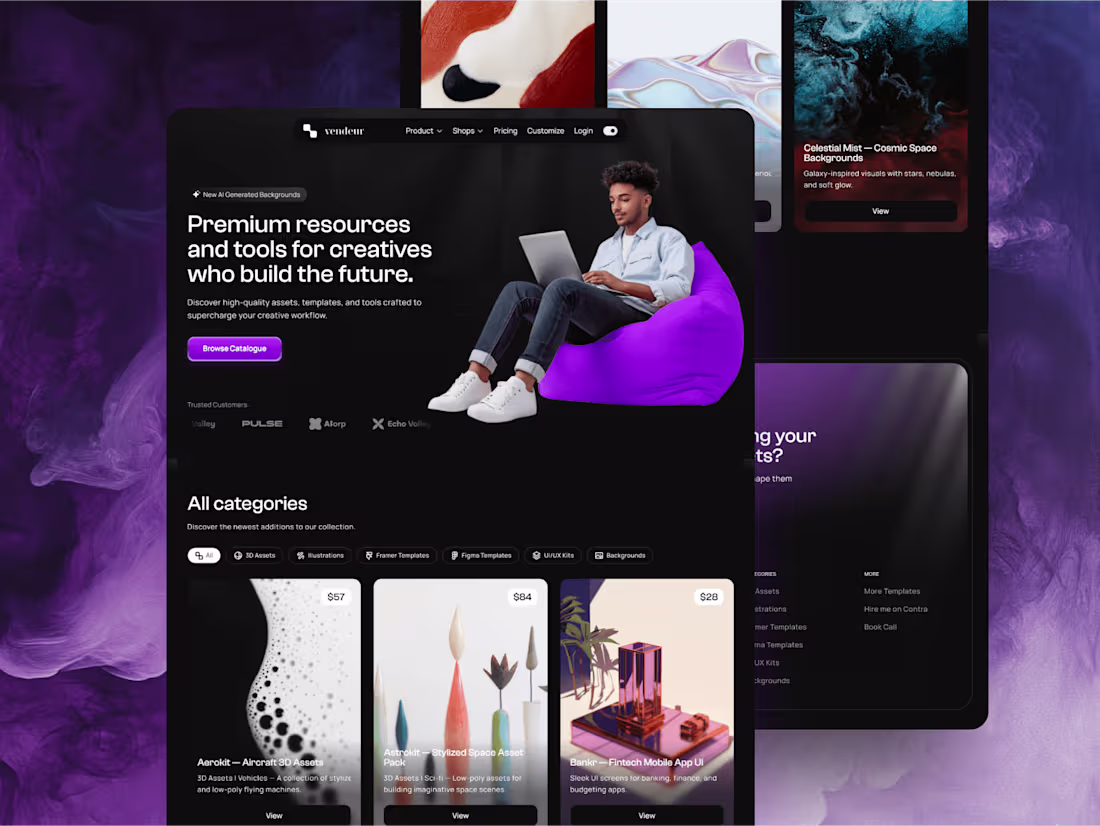
Vendeur - Ecommerce Website
0
22
Why do I use Framer?
1
76
Delium -SaaS Website Built In Framer
0
43
Marketing Website In Framer
1
54
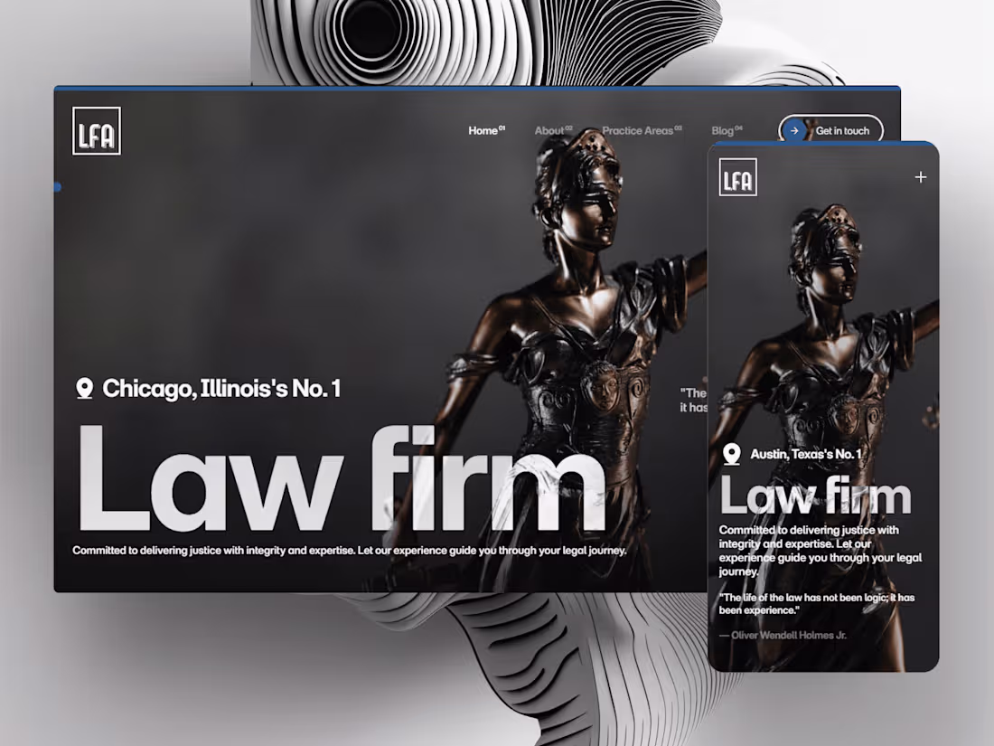
LFA - Law Firm Website Built In Framer
1
30
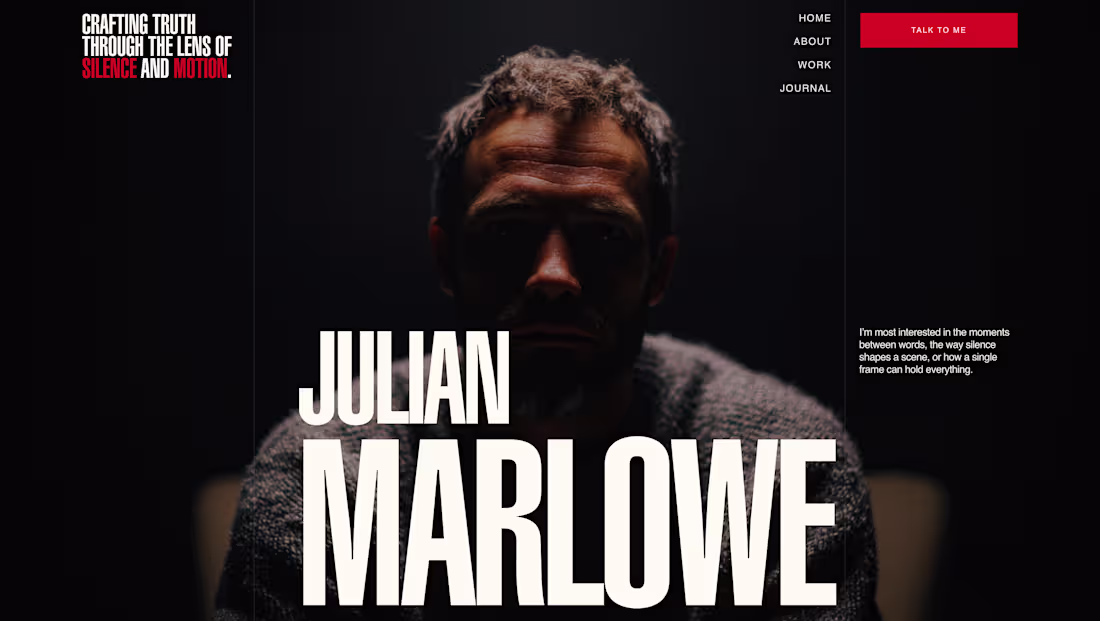
Dami Manuels Photography Website
0
11
Gym Website Built With Framer
0
20
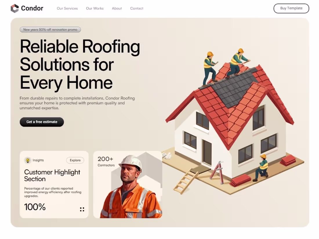
Condor Construction Website - Built In Framer
0
14
Runwae Website - Built In Framer
0
15
Sennheiser Product Page In Framer
0
21
Lens Loom - Wedding Photography Website
0
10
Fintech Website In Framer
0
22
Airline Website
0
19