
Pro
Siraj Dhanani
Product designer for SaaS & AI Startups
Ready for work
Siraj is ready for their next project!
Duet in fricaa
1
126
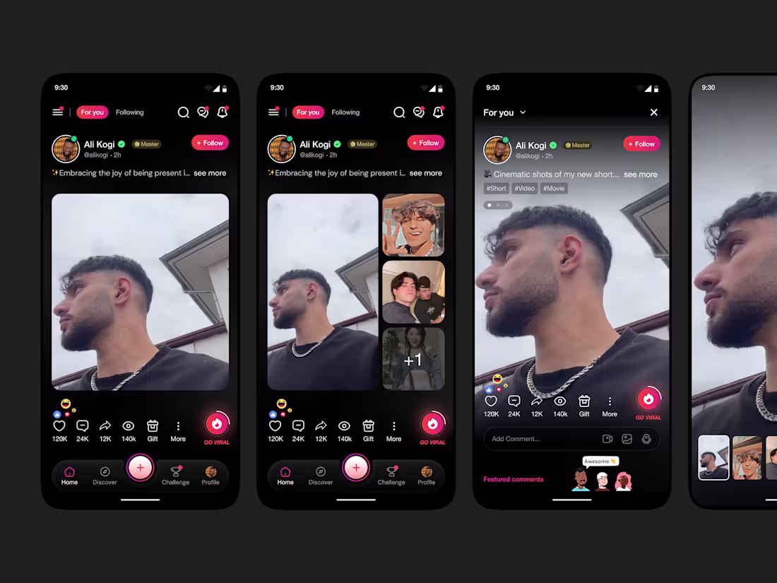
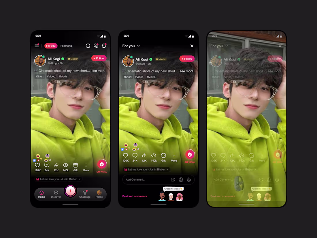
Photo post in fricaa
2
120
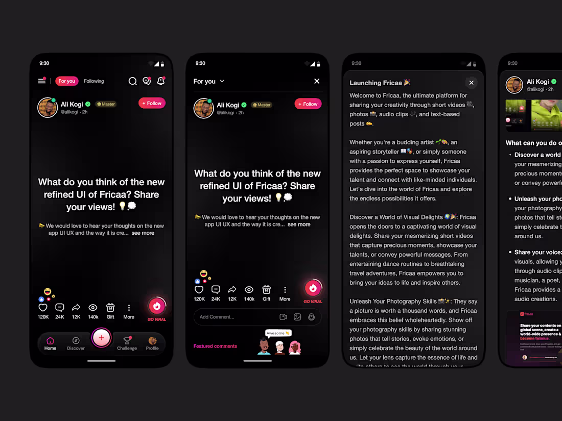
Text Post in fricaa
3
85
Video Post in fricaa
2
80
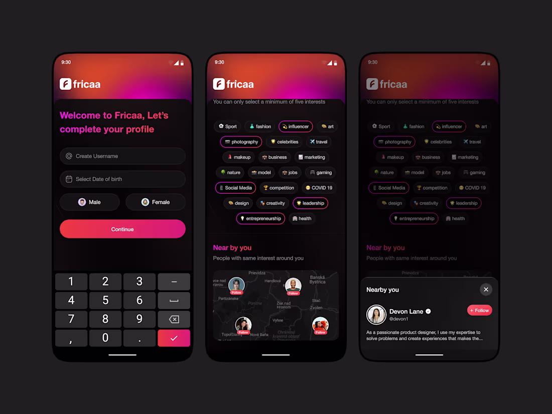
User onboarding flow for fricaa
1
69
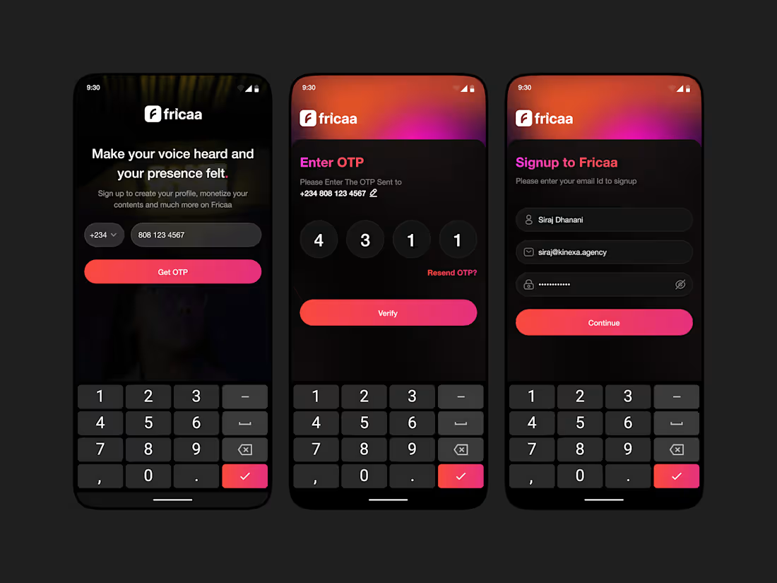
Signup flow for fricaa
1
84
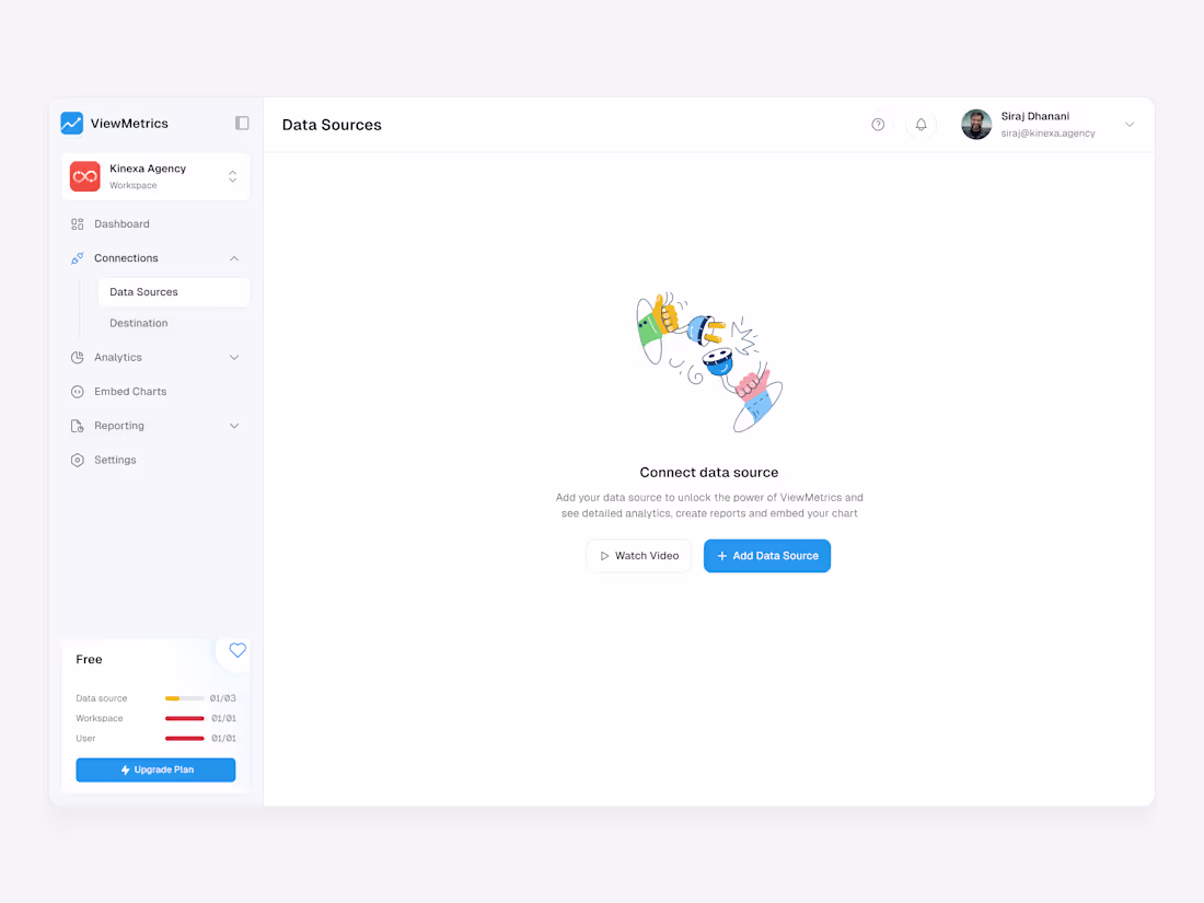
We designed the ViewMetrics “Data Sources” screen to make analytics setup feel effortless.
The goal was to simplify a typically complex process: connecting, visualizing, and activating data.
A clean layout, calm whitespace, and guided hierarchy help users focus on the main action: “Add Data Source.”
The playful illustration reduces friction, making the experience approachable for first-time users. Key states like “Free Plan Limit” and “Upgrade” are placed intuitively for visibility without distraction.
The result is an onboarding view that feels light, friendly, and functionally clear helping teams connect data faster and unlock insights sooner.
2
2
66
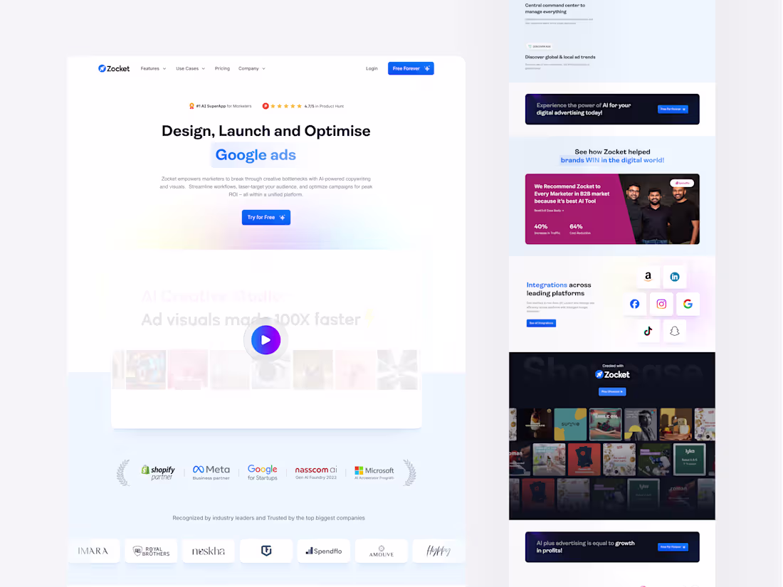
We designed Zocket’s landing page to make AI feel empowering, not overwhelming.
The goal was simple: clarity, credibility, and conversion.
The hero section instantly communicates the promise: “Design, Launch, and Optimise Google Ads,” supported by Product Hunt ratings and trusted brand logos.
The flow guides users through value, proof, and action from the AI Creative Studio section to testimonials and integrations with Meta, Google, and Amazon.
The clean layout, calming gradients, and standout CTAs like “Try for Free” make the experience effortless.
A landing page built to convert by speaking to marketers who want results not explanations.
1
3
54
Bento Cards
0
52
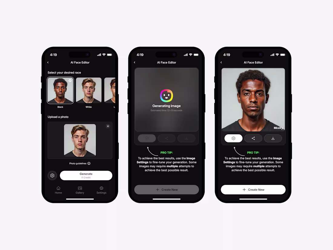
We designed Mixify, an AI-powered mobile app that lets users combine different facial features and photos to create entirely new, realistic portraits.
The goal was to make advanced AI image generation feel accessible, intuitive, and human-centered without overwhelming users with complexity.
Key focuses during design:
Simple, guided flow - upload, mix, and generate within seconds.
Clean visual hierarchy that keeps attention on the generated image.
Subtle motion feedback during image generation to enhance engagement.
Consistent design system for better scalability across modes and devices.
0
39
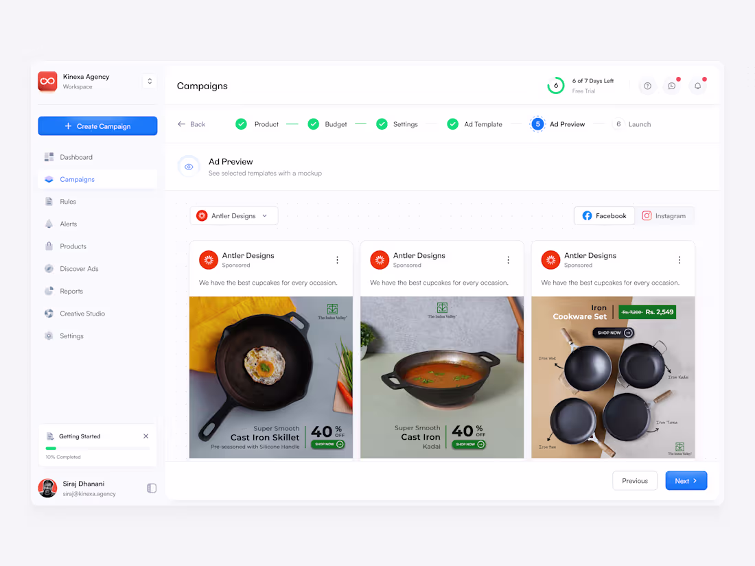
Campaigns Page Design
0
43
Mixify AI - Website and Mobile app design
2
3
Zocket (Kalaari Backed) - Website design & Webapp design
2
5
KorrAI (YC W22) Webapp design
1
1
CreditReady - Branding & Website design
2
2
ViewMetrics product revamp
1
5
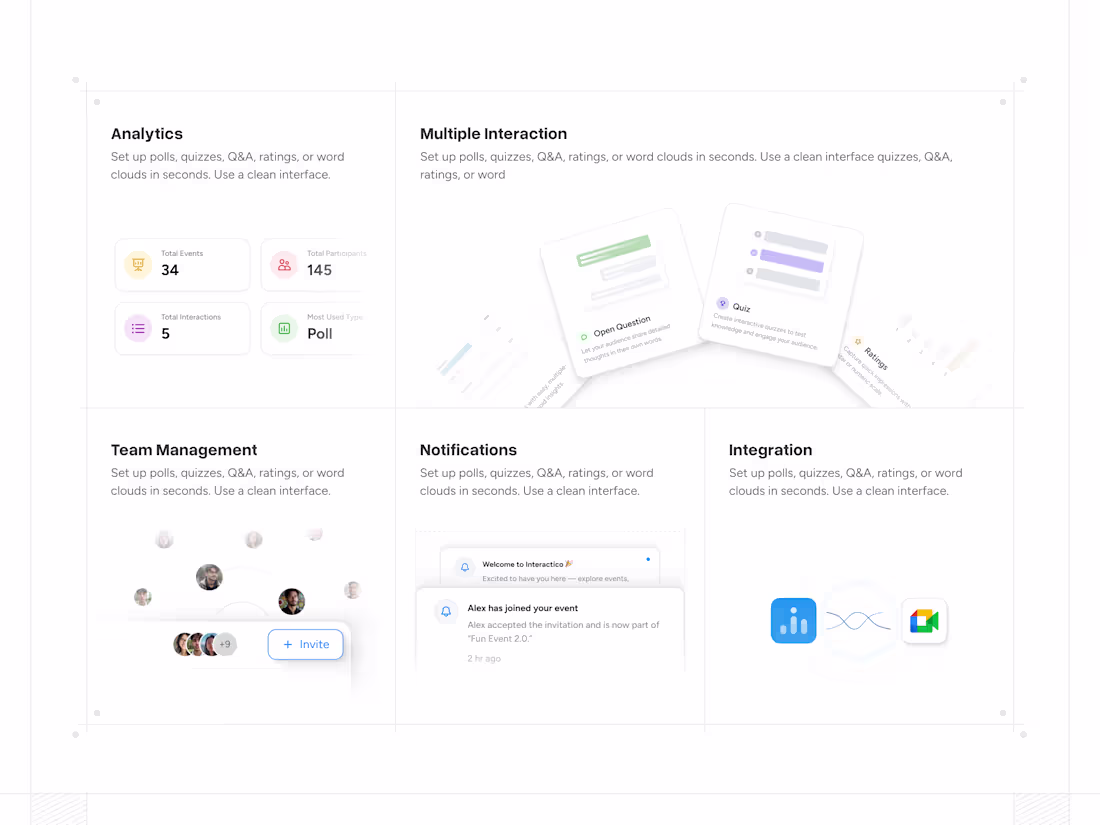
Interactico - Website, Webapp and Plugin design
1
3
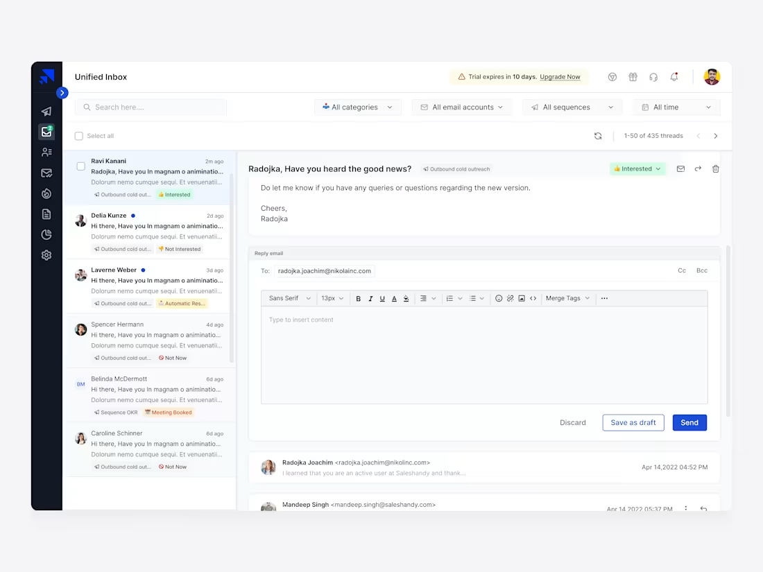
Elevating User Adoption and Retention in Saleshandy: A Cold Emai
1
15
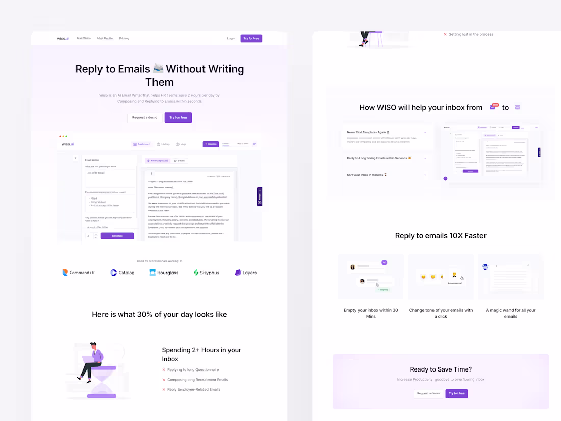
Designing the first MVP for wiso.ai
2
10
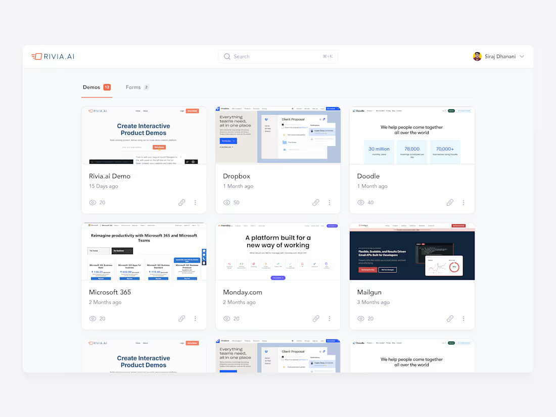
Crafting a Delightful User Experience for Rivia.ai (YC S21)
1
17