Crafting a Delightful User Experience for Rivia.ai (YC S21)
Siraj Dhanani
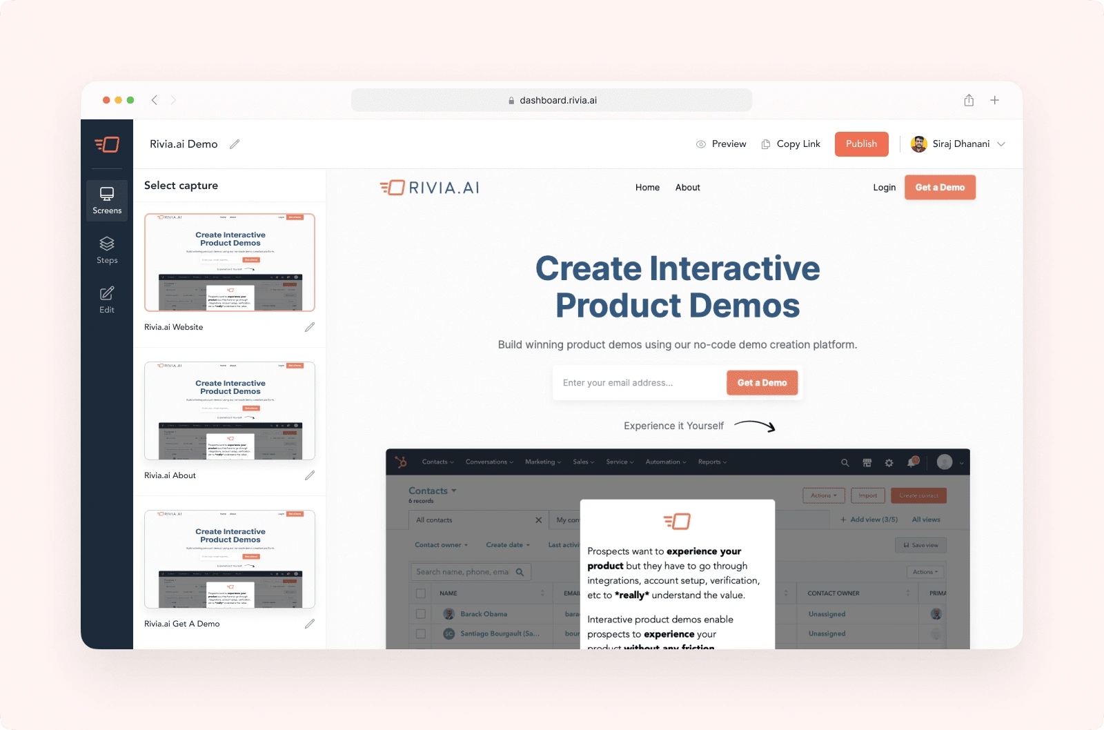
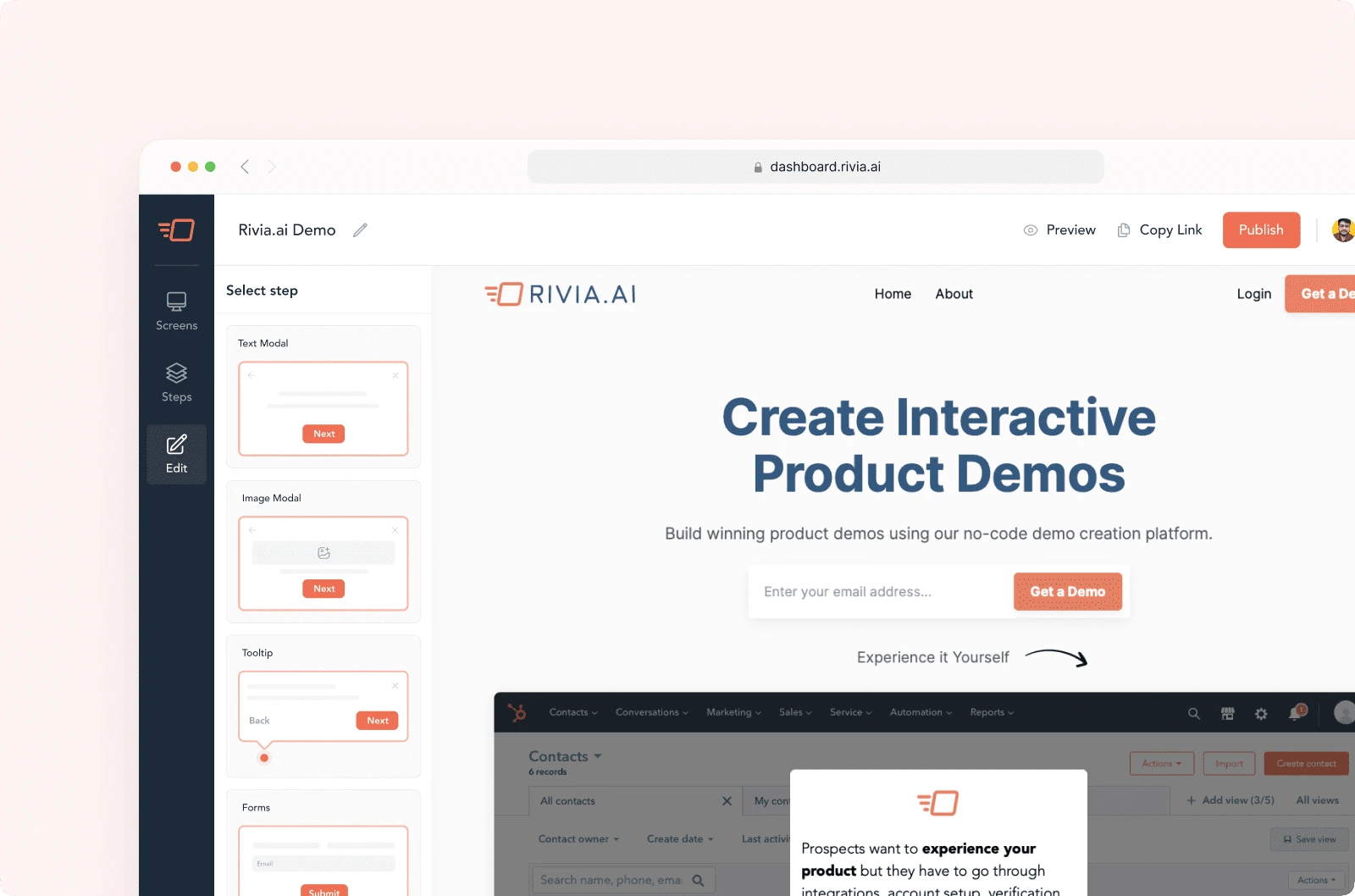
Rivia.ai is a no-code product that helps sales and marketing teams create interactive product demos. The software captures the entire HTML of a product and transforms it into an interactive demo that looks and feels like the real functional thing. Users can then edit the text, images, and graphs of the demo using a simple interface. Rivia.ai also allows users to add modals, tooltips, videos, and forms to their demos, and to customize them according to their brand guidelines.
Problem
While Rivia.ai has successfully developed the functional aspects of its platform, the current UI and UX design fall short of the market's best standards. The primary objective is to elevate the platform's product design, ensuring it stands out in the competitive landscape and delivers enhanced user experience.
Observations have revealed that users occasionally struggle to grasp certain features independently, leading to the necessity of scheduling explanatory calls. Rivia.ai aims to address this challenge by creating an intuitive and user-friendly design that empowers users to comprehend features effortlessly, reducing the need for external assistance.
Sprint-Driven Agile Approach
To achieve this goal, we've adopted an agile approach, utilizing sprints and regular scrum meetings. Our intention is to treat this as a continuous, long-term project rather than a one-time endeavor. Through iterative development and refinement based on user feedback and needs, we aim to consistently enhance the product. As a founding product design consultant, I have actively contributed to this iterative process.
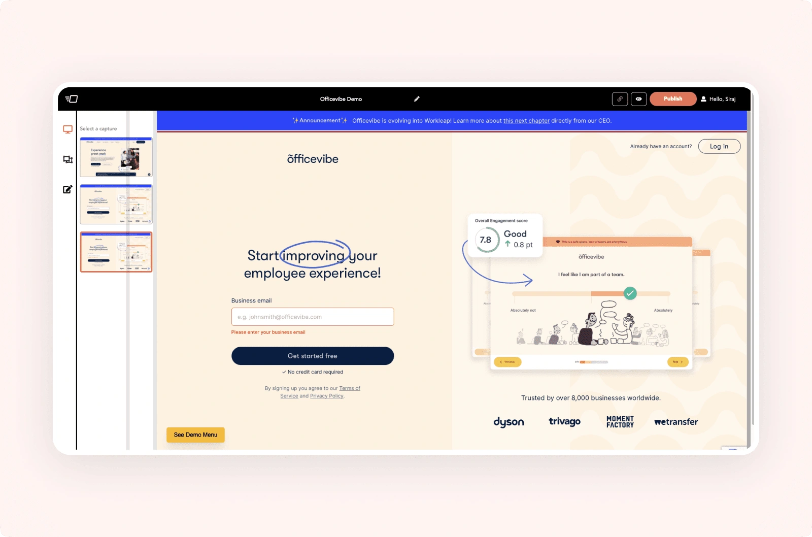
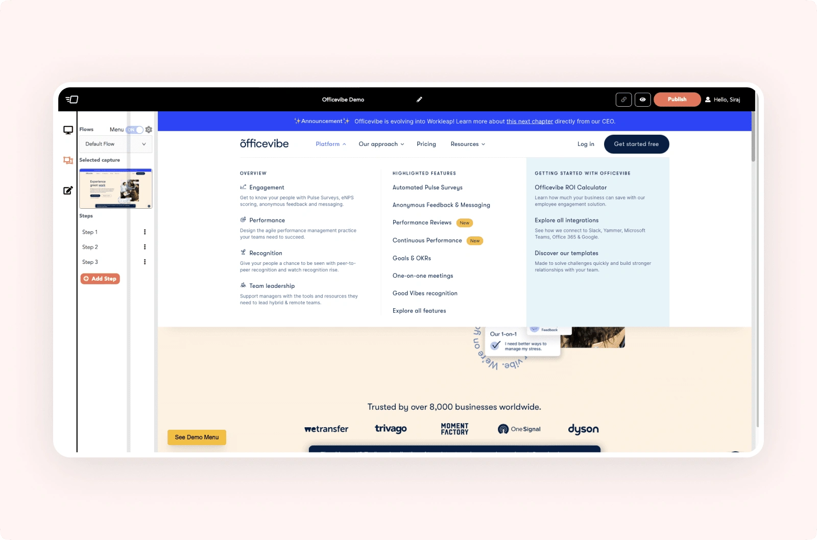
Home Page
During our thorough audit of the live home page, a few issues have come to light. Here's a summary of the findings
The way cards are placed within other cards looks unusual and disconnected.
Showing four cards in a single row makes the page look crowded and busy.
The "Published" tab doesn't seem to fit its purpose well, as it's not related to tabs.
When there are fewer demos, pagination is unnecessary and it makes the layout appear cluttered.
The design of the cards is basic; there's an opportunity to make them more engaging. Consider a design that lets users quickly understand specific demos.
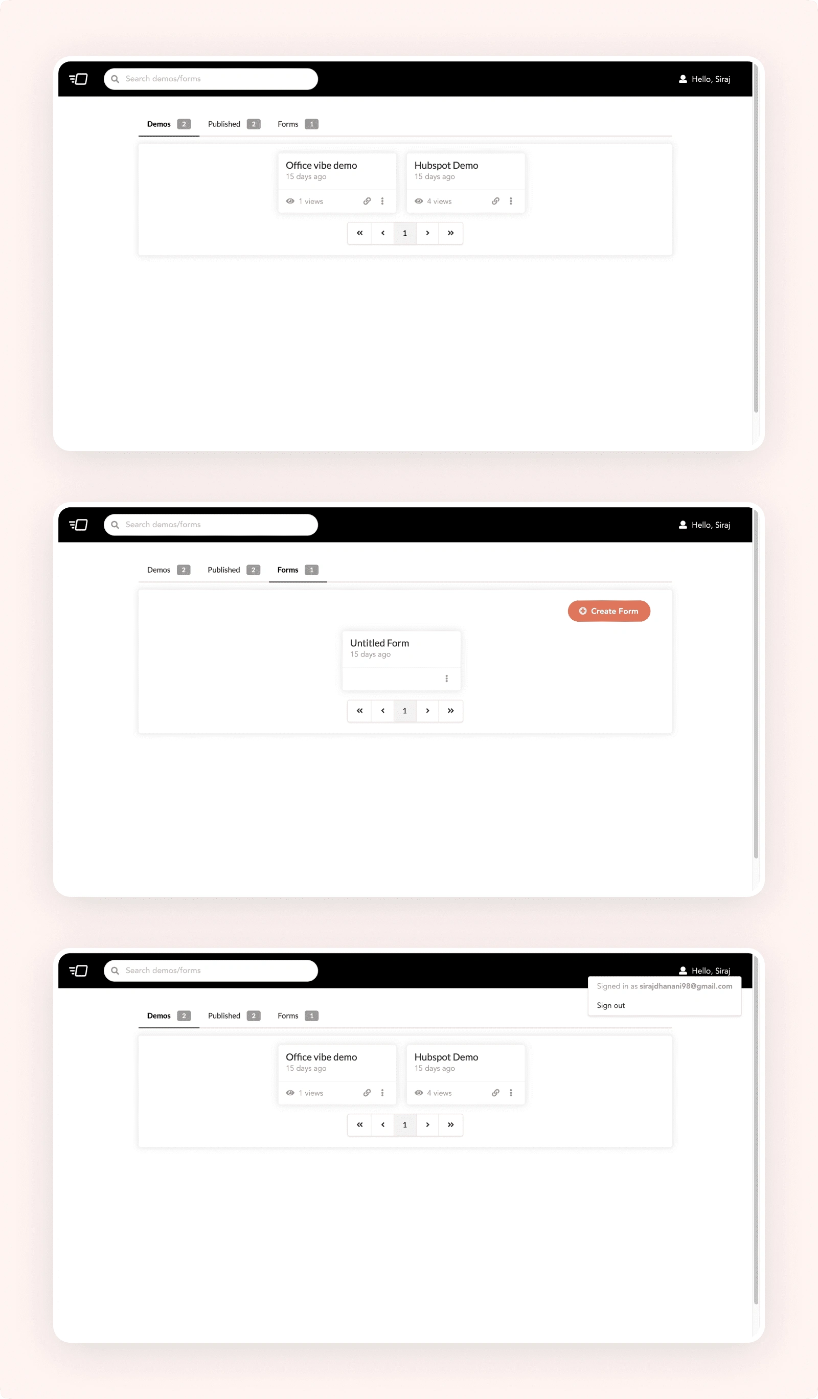
Based on the findings from our design issue assessment in the audit, and after careful analysis and experimentation with different approaches, we have finalized this version. This novel design approach has completely revolutionized our information display. I have incorporated new and improved components to enhance engagement.
Directly showing cards to make UI looks clean.
The updated version gives more space, replacing the crowded card layout with a simpler design.
Displaying three cards per row keeps it simple, and adding preview images helps users quickly understand specific demos.
The cleaner card design reduces clutter, making the experience simpler. Also, users can now search for demos faster using shortcuts like CMD + K or CTRL + K.
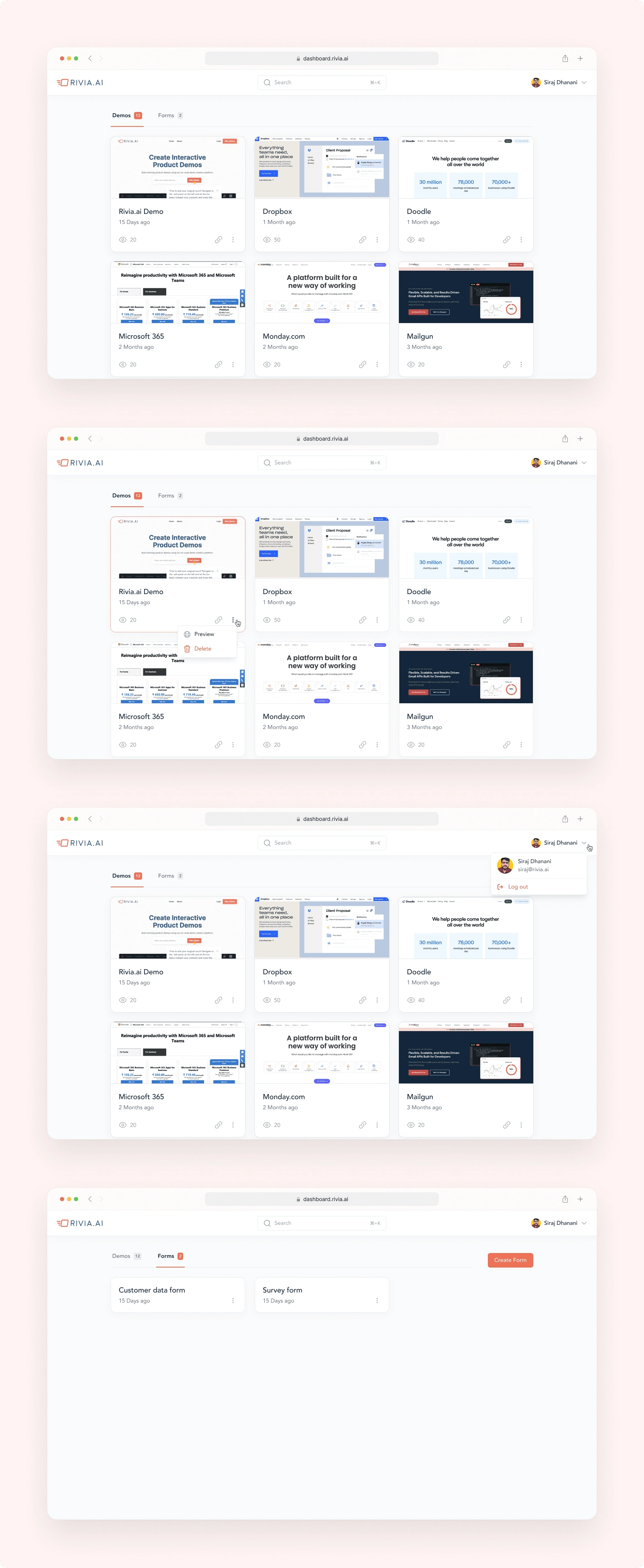
Demo Detail Page Navigation
During the assessment of the demo detail page navigation, we identified several common issues that needed refinement for an improved user experience. Some of these issues include:
Outdated and poorly thought-out icons.
Lack of labels for icons, causing confusion for users regarding their intended functionality.
Inconsistent hierarchy, with the side navigation having a light background while the top navigation features a dark background. This inconsistency adds visual weight to the overall page.
After exploring various approaches and undergoing different iterations, we have decided to implement this particular version.
This version greatly simplifies user understanding and effectively addresses the issue, while also enhancing the visual aesthetics of the navigation.
The new icons fit seamlessly with the overall design.
The inclusion of labels enhances user-friendliness and makes it easier to grasp features.
A proper color hierarchy has been established, enhancing the overall importance of navigations.
Top navigation now maintains a consistent look that aligns perfectly with our brand.
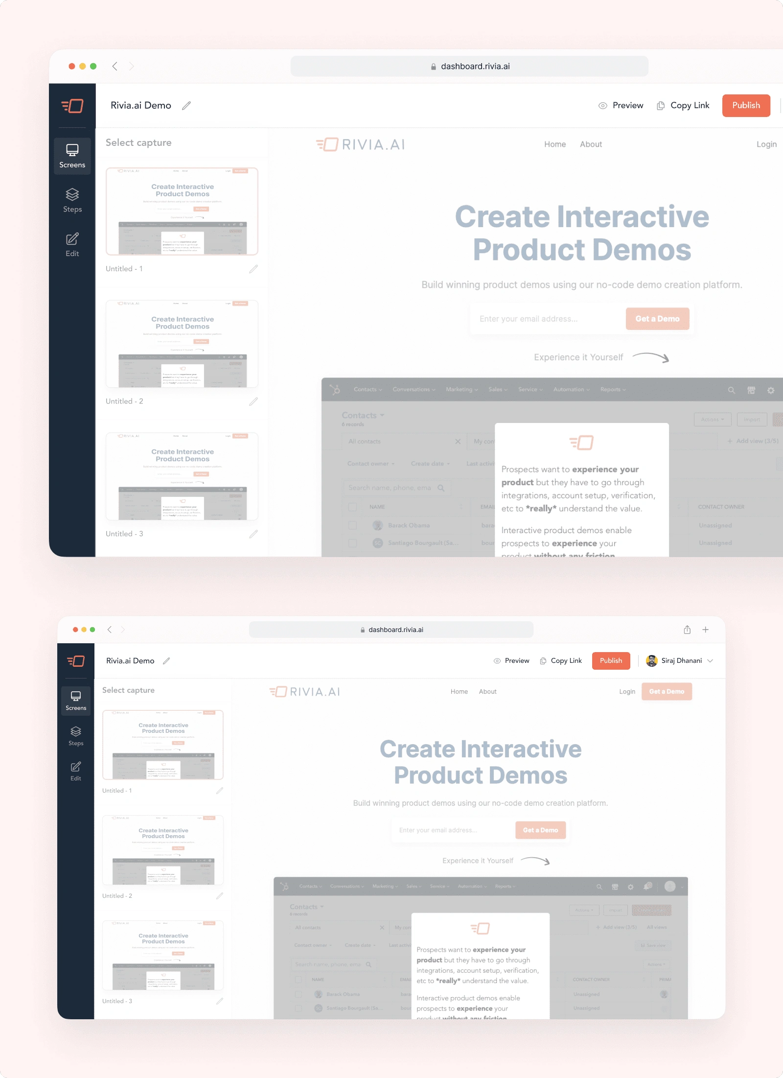
Screens Page
We've recognized that users often encounter confusion when managing multiple screens. This is particularly true when certain screens share the same screenshot but require distinct modals or tooltips. Users frequently click and view the image preview to the right side in an attempt to clarify this confusion.
We've identified this issue and are committed to finding a solution that transforms this frustrating experience into a positive one.
We've crafted a simple yet effective solution for this challenge. Users now have the option to name their screens, starting with a default label like "Untitled 1." This feature empowers users to personalize screen names, preventing mistakes and confusion when dealing with similar screens. This small yet impactful change significantly enhances the overall user experience.
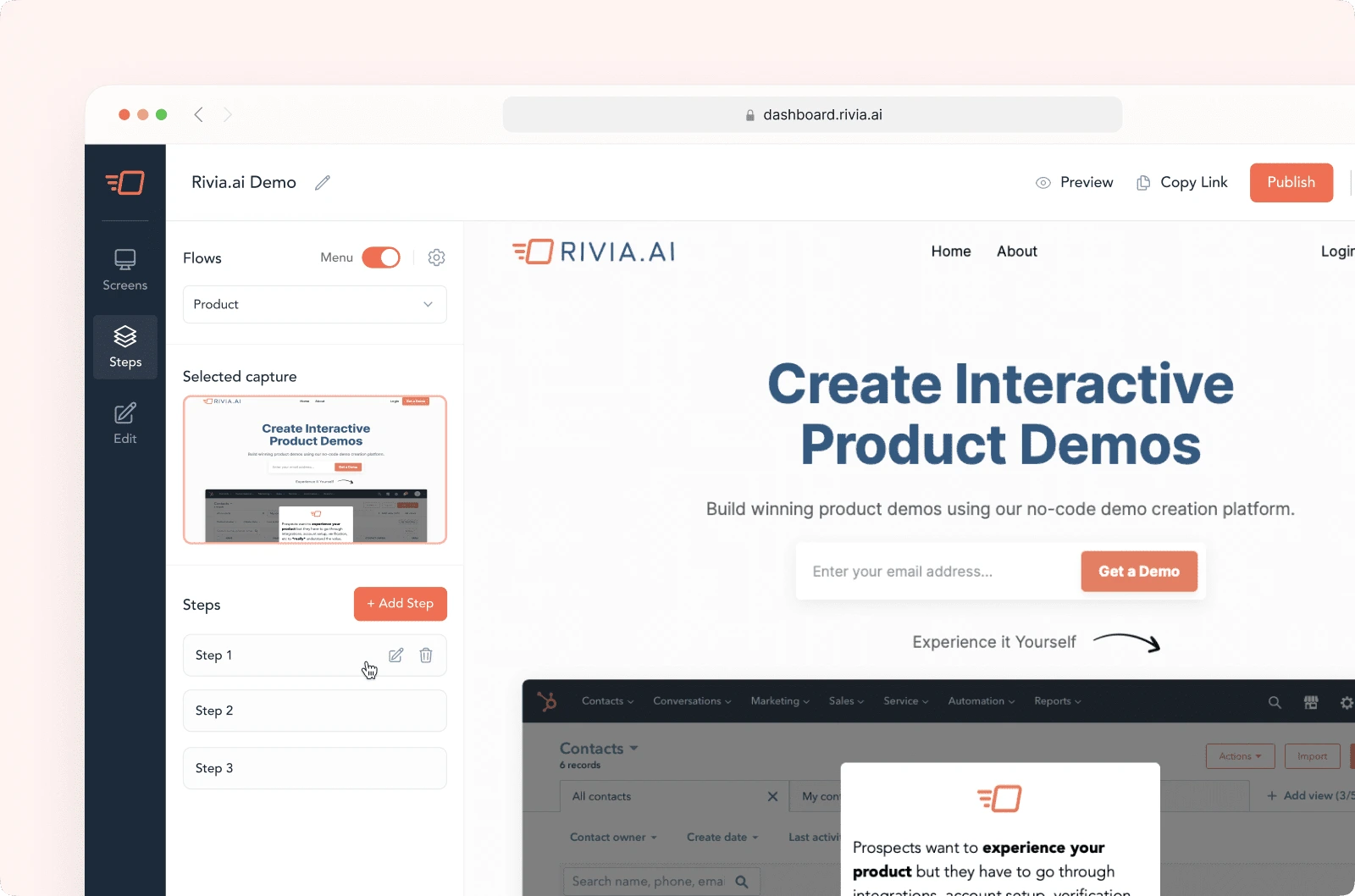
Steps Page
Steps was functional but required few UI polishing to match the new style that we have defined for rivia.ai, here are few things that we have considered and solved in updated version
components looks outdated and are not looking good as per the industry standards
steps are written directly and requires user to hover exactly at the text which is not a good experience
If user have added more number of steps, the add steps button might get hidden which would make things harder for some of the users
more icon beside steps can be show in a better way
We've completely overhauled the steps page with a fresh design. The new components seamlessly integrate with the overall redesign
Step cards have been introduced to enhance user experience by enabling hovering anywhere on the card for quick access, as opposed to hovering over the text specifically.
On hover, the options to edit and delete appear, replacing the default display of more icons across all steps.
This deliberate choice results in a cleaner UI, reducing clutter and providing a more focused experience.
Users can now conveniently take action when they hover, enhancing overall usability.
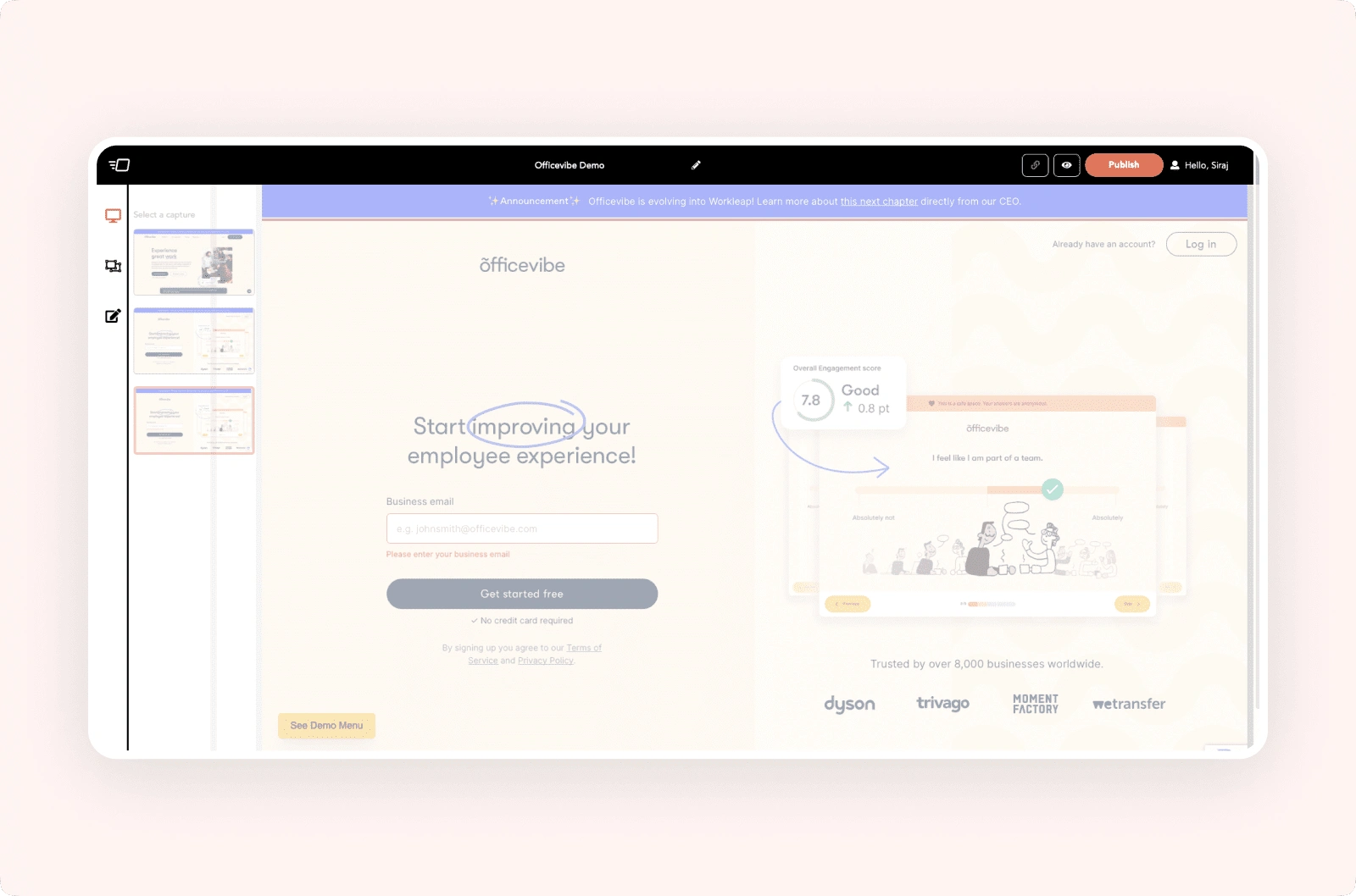
Edit Panel
The edit panel used to look quite dull. One of the key issues that emerged from user interview calls was that users lacked familiarity with technical terms. During these interviews, we noticed users frequently asking questions like "What is a modal?" or "What is a tooltip?" This confusion arose from users not being familiar with development-related terminology. In response, we've taken steps to address this matter.
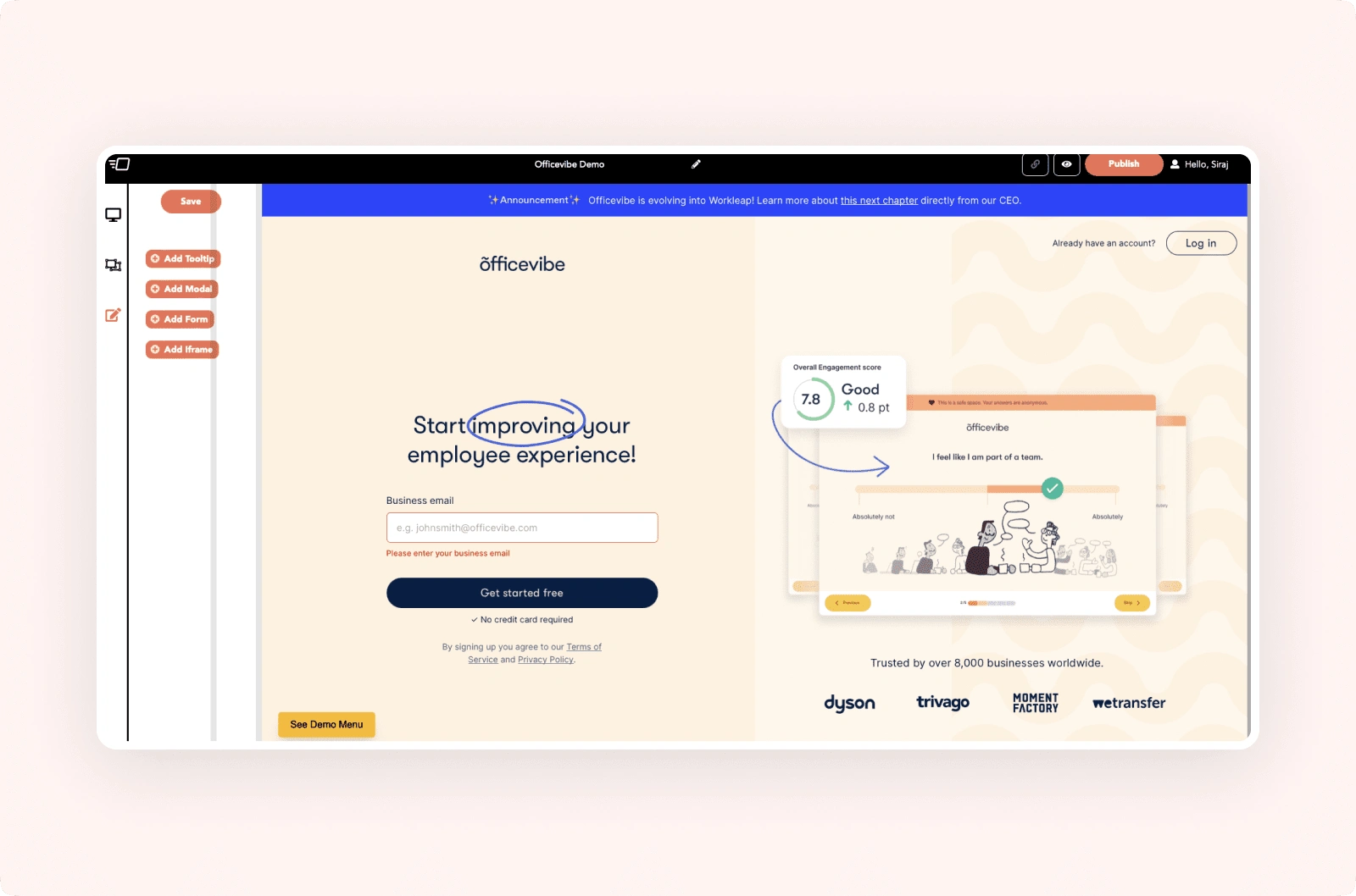
Recognizing that users might not be familiar with technical development terms such as "modal" or "tooltip," we've taken steps to enhance user understanding. To address this, we've incorporated visual representations that provide users with a quick grasp of these concepts. By including clear and unobtrusive visual depictions in the UI, we've effectively addressed this user concern and improved the overall user experience.
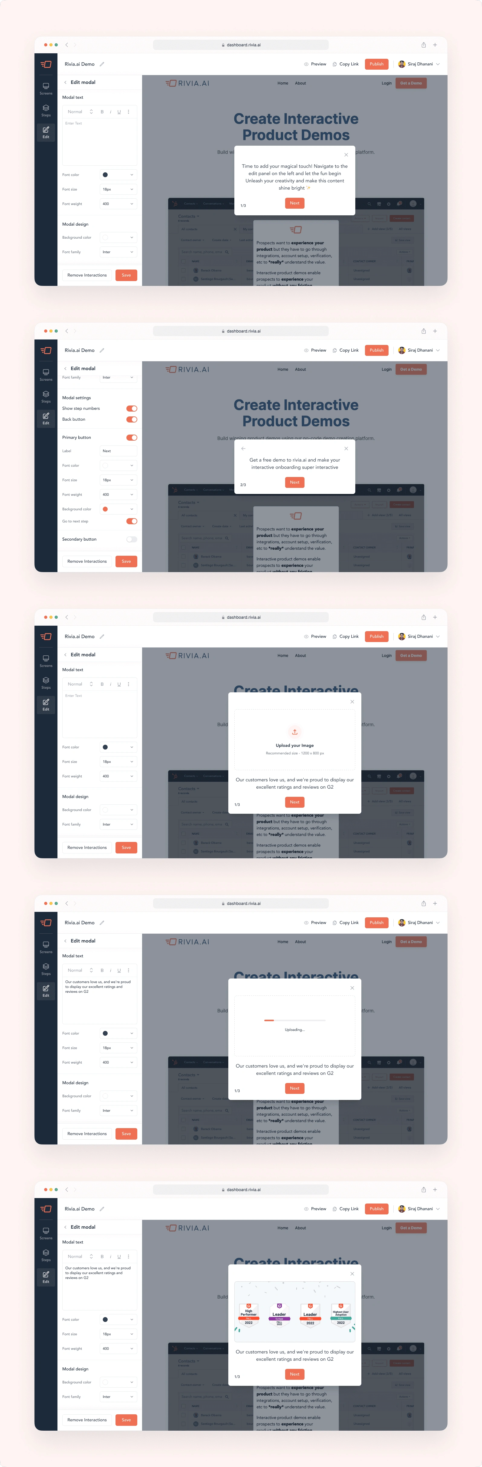
Edit Panel - Modal
Within the edit panel, when a user selects options such as modal, tooltip, or others, we display an editing panel tailored to the selection. However, we encountered several issues that required addressing:
The placement of "Save" and "Remove" CTAs at the top didn't align with user behavior; we found that users typically edit before saving or removing. Placing them below seems more logical.
The CTAs lacked consistent visual hierarchy and a cohesive appearance.
The internal text selection and editing options felt cramped, lacking sufficient space for easy interaction.
The components and elements appeared outdated and weren't cohesive.
Incorporating images under modals caused UI problems, particularly with larger images.
When the text within modal cards became too large, it extended beyond the card boundaries.
Our refinements aimed to resolve these concerns, ensuring a smoother user experience and a more visually consistent design.
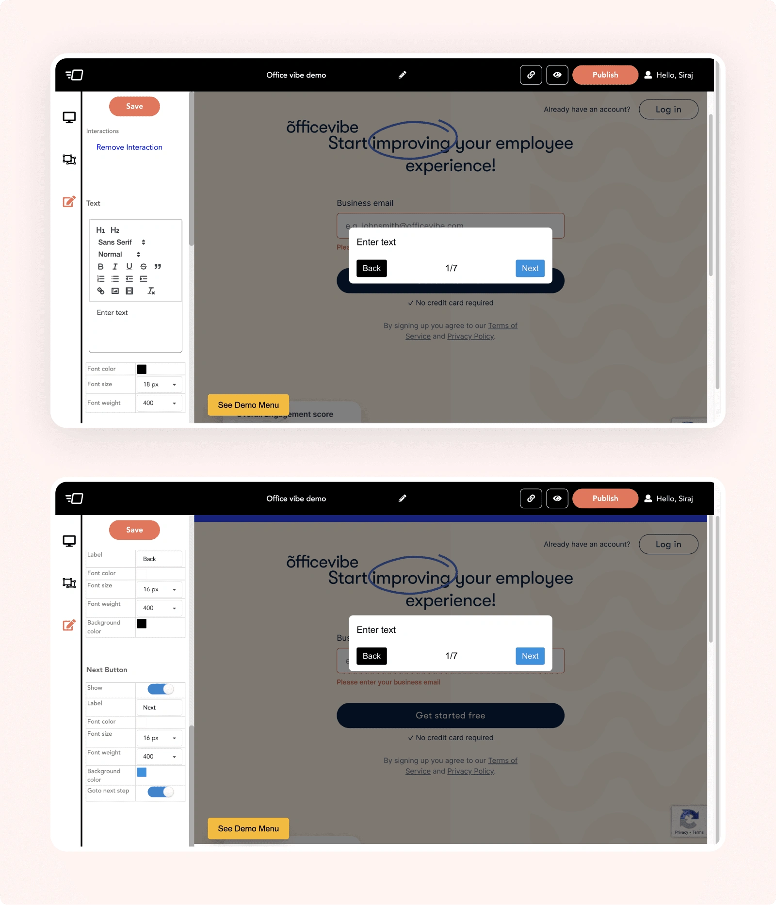
Upon identifying these issues, we opted for a complete redesign to simplify the solution. Here are the specific changes:
Incorporated new, up-to-date components that align seamlessly with our brand identity.
Eliminated clutter and ensured well-fitting elements, enhancing user understanding.
Positioned CTAs below to establish a logical hierarchy; this facilitates smooth editing and subsequent saving actions.
Added a "Edit Modal" label accompanied by a back arrow for straightforward navigation.
Introducing a dedicated image modal component to facilitate image uploads within a responsive and dynamic modal, rather than within the text panel.
Removed the back button, replacing it with a back arrow within the modal for all steps except the first.
These minor yet impactful adjustments have effectively addressed various usability concerns, significantly enhancing user experience and design clarity.
Publish Modal
The Publish modal was working fine, but it felt a bit heavy for users. Instead of being straightforward, it seemed to make the process more complicated and time-consuming. To simplify things, we decided to remove unnecessary elements and make it as easy as possible. Our goal was to make sure users don't have to think too much and can publish their demos quickly.
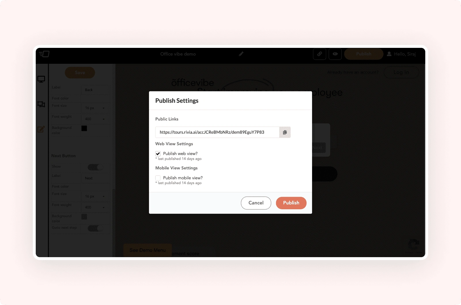
We've addressed several aspects in the Publish modal:
We decided to remove the public link copy element since it's already available in the edit panel. Having it here seemed redundant.
Unnecessary and unused elements have been removed from the modal.
We revamped the web view and mobile view sections, adding icons for clearer UI comprehension. We included toggle switches, and when users opt for the mobile view, a text input with pixel selection appears.
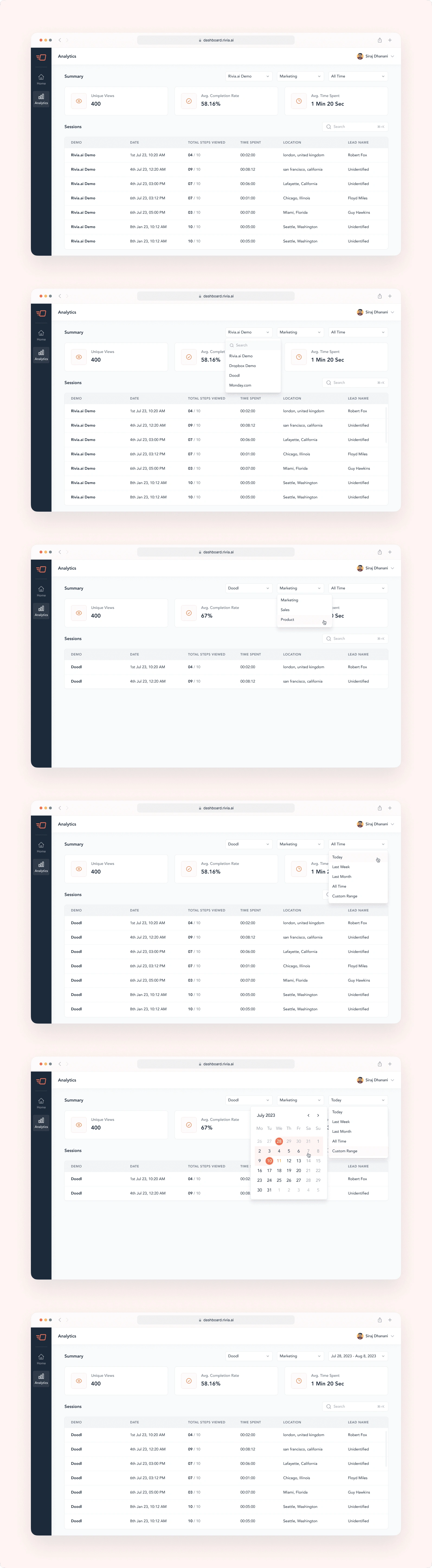
Analytics
Users have shared their challenges, expressing their frustration at being unable to track their demo performance. Here's what some of them had to say:
As a demo creator, I'm left in the dark about how well my demos are actually performing. This lack of visibility hampers my ability to address any issues.
Understanding how my prospects are interacting with the demo has been a big blind spot for me.
To tackle this issue head-on, we're excited to introduce our innovative analytics feature. This feature aims to provide you with comprehensive insights into your demos' performance, enabling you to make informed decisions, optimize engagement, and drive better outcomes.
In our initial release, simplicity takes the lead. We've focused on delivering essential features, with plans to refine and expand based on user insights.
Here's what you'll find in this first version:
Summary at a Glance: Get a quick overview of unique views, average completion rate, and average time spent for your demos.
Detailed Sessions: Dive deeper into your leads' interactions with the newly added sessions feature. Understand every minute detail of their engagement.
Filtered Insights: The filters placed above allow you to narrow down your analysis. Select specific demos, flows, or time periods to access more tailored and focused data.
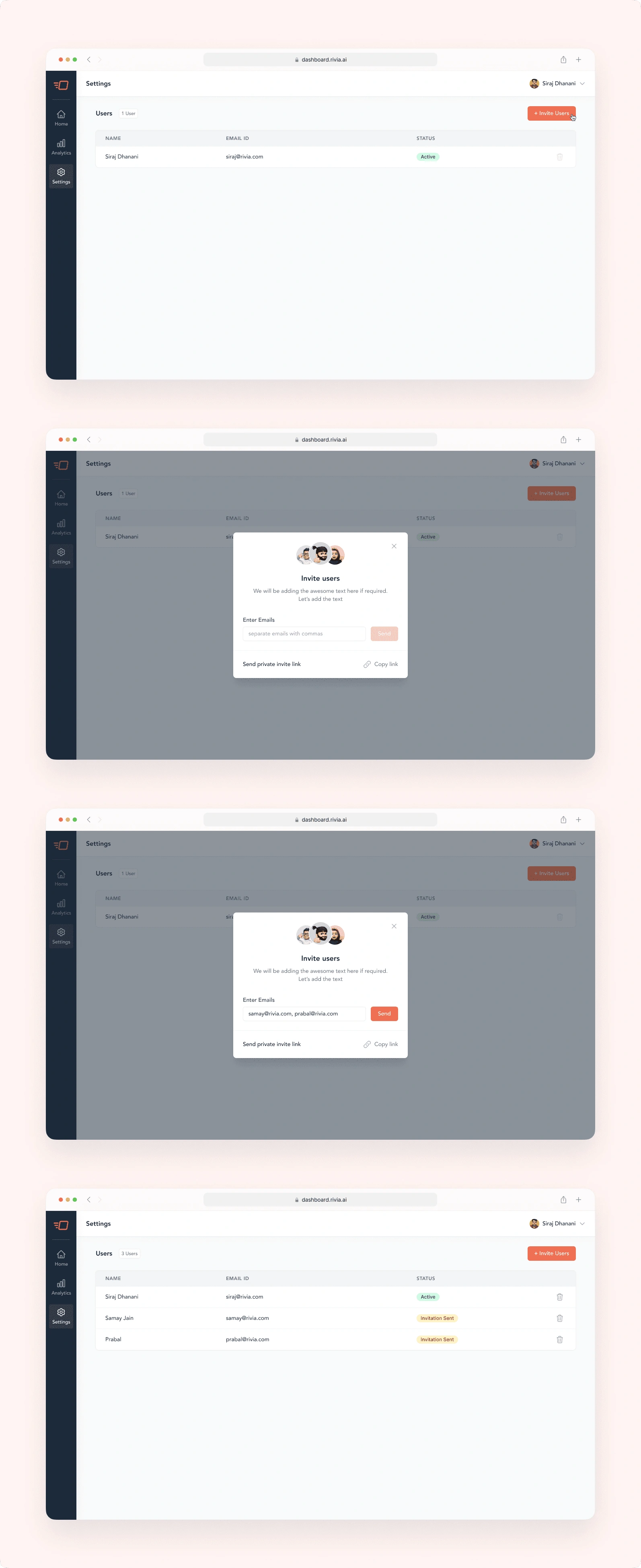
Settings - Invite Users
We're in the process of developing a self-signup feature that will allow users to invite new members to their accounts. Initially, we're focusing on keeping the design simple, focusing solely on user invitation. At this stage, there won't be distinctions between user roles like admin or owner; all invited individuals will have full access. As we move forward, we'll continue to enhance and expand the feature.
In our latest user invitation flow, we've added several features to make the process smoother:
Users can invite multiple users to their accounts.
Users can view detailed status updates for their invitations.
Inviting multiple users is made easy and efficient.
Users also have the ability to remove invited individuals from their accounts.
More Awesome Features Await ✨
Buckle up your belts, because we're about to take you on a thrilling ride! This is just the beginning – our project is in full swing, and a universe of excitement is gearing up to unveil itself.
Founders Message ❤️
Siraj has been leading our product design at Rivia.AI and has been great to work with. He has really transformed our product with a neat and clean UI. He has a high sense of ownership and has been able to deliver designs as per the timelines.
— Samay Jain
Like this project
Posted Dec 26, 2023
Designed and revamped the web application of Rivia.AI from scratch. I have helped Rivia.AI with solving the usability issues and defined the new style-guide.
Likes
1
Views
17