
Siddharth Singh
App and website designer
Ready for work
Siddharth is ready for their next project!

Most loan apps make you feel like you’re signing a contract in a dark room with a flickering tube light.
They have a massive trust problem.
Not because the interest rates are bad, but because the interface induces anxiety.
Loans are deeply emotional. They involve urgency, vulnerability, and high stakes. Yet, most fintech apps are built like cold, confusing databases.
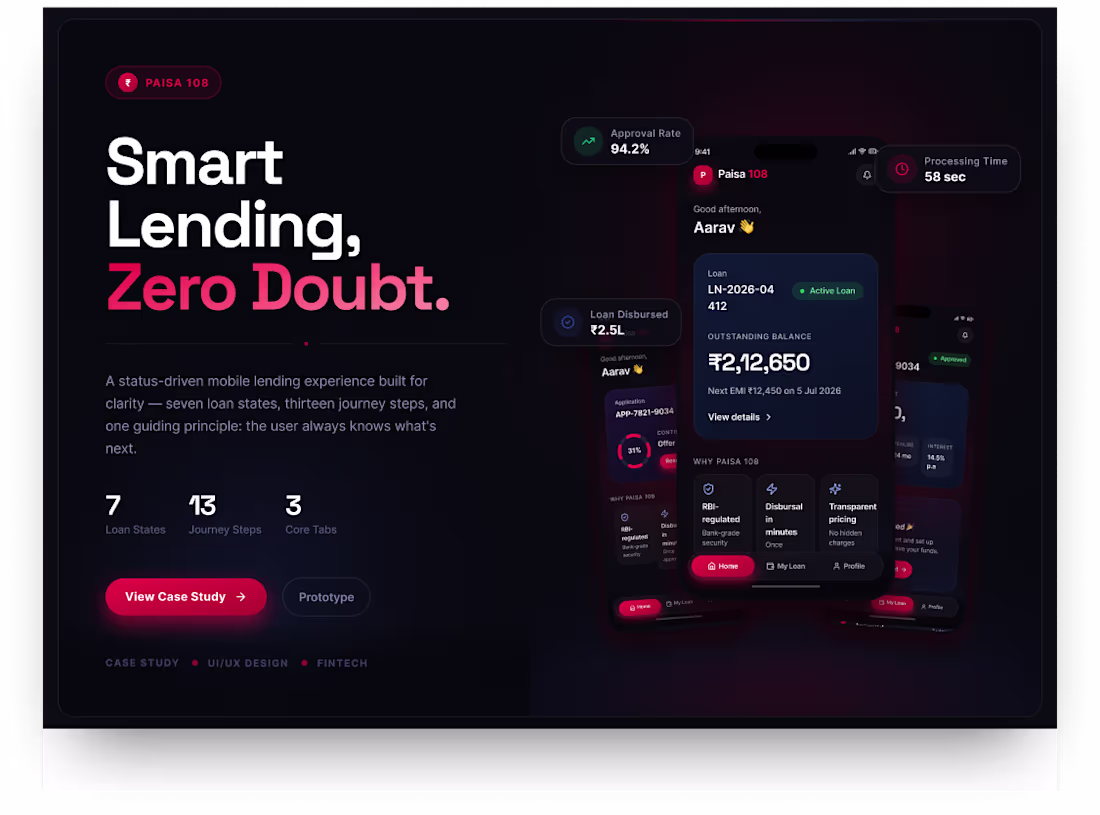
I set out to fix this with a new mobile design concept: Paisa 108.
The goal? A digital lending experience that tells users exactly where they stand—without the "processing black hole."
Here is the design system that solves it:
1. Fixed-State Architecture
Instead of changing the navigation layout for different users, the app relies on three permanent tabs: Home, My Loan, and Profile. The UI acts as a state machine—dynamically transforming its data density whether a user has a $0$ balance, a pending verification, or an overdue loan.
2. Clarity Before Complexity
Fintech interfaces can become overwhelming fast. By applying progressive disclosure, the interface surfaces the single most critical action first (e.g., "Step 4 of 13: Upload Bank Statement"). Details are hidden until the exact moment they are needed.
3. Emotional Color Psychology
Built on a premium, dark-mode visual canvas, the system relies on intentional contrast and soft glassmorphic surfaces using three strategic emotional anchors:
🔴 Primary Red (#ED1846): Reserved strictly for urgent actions and critical attention.
🔵 Primary Blue (#2E4AA0): Used to anchor stability, long-term tracking, and systemic trust.
🟢 Success Green: Deployed exclusively for positive milestones like verification and approval.
💼 The Business Bottom Line
In fintech, clarity isn't decorative. Clarity is conversion. By designing for the real-world edge cases—the waiting loops, the document rejections, and the "what now?" moments—this system directly combats application drop-offs.
It answers the user’s ultimate question: "Can I trust this app with my money?" before they ever have to contact support.
Building a fintech MVP, SaaS dashboard, or scaling a complex mobile workflow? I design interfaces that look premium and behave responsibly. Let’s build something your users can actually understand and trust.
https://www.behance.net/gallery/250643097/Paisa-108
📩 Drop a DM to chat about your product.
5
344
Some projects start with a clean brief.
This one started with:
“Let’s make it simple.”
And then immediately became a full journey of layout experiments, font debates, color decisions, tiny UI tweaks, and me staring at the screen like the design owed me an explanation.
But after all the overthinking, iterations, and dramatic creative moments…
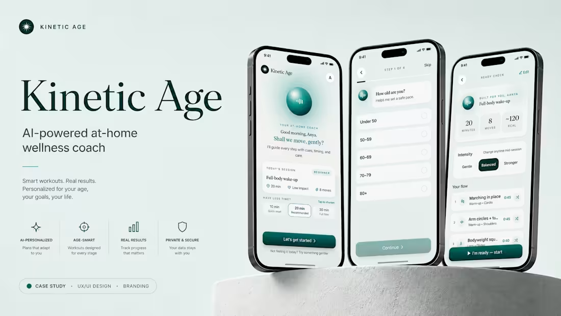
✨ Kinetic Age is live.
Kinetic Age is an AI-powered at-home wellness coach concept built around one goal: making fitness feel more personal, gentle, and human.
For this case study, I focused on creating a visual experience that felt calm but energetic, polished but warm, and structured without feeling boring.
The fun part?
Some of the best details came from ideas that felt completely random at first.
That’s the magic of design. You keep moving pieces around until suddenly everything clicks.
I’d love to hear what you think.
What stands out the most to you: the UI screens, visual style, color palette, typography, or overall presentation?
Project link: https://lnkd.in/gWVr2YvR
Currently pretending to be relaxed while absolutely checking the views like it’s a live sports score.
1
3
269
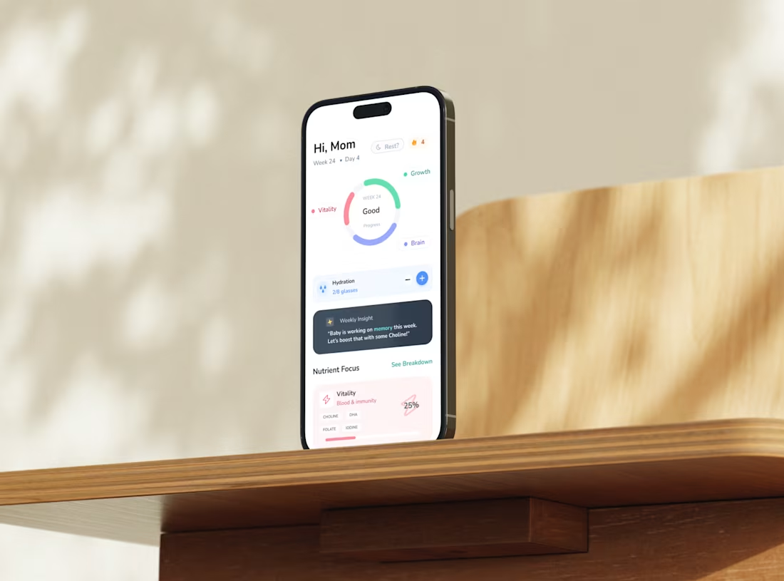
Designing the ONI Nutrition Flow for Expecting Mothers
1
3
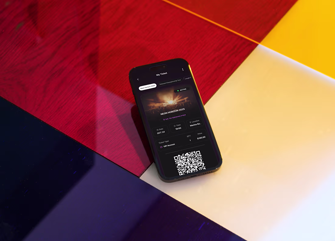
Reimagining the Universal Digital Ticket
1
6
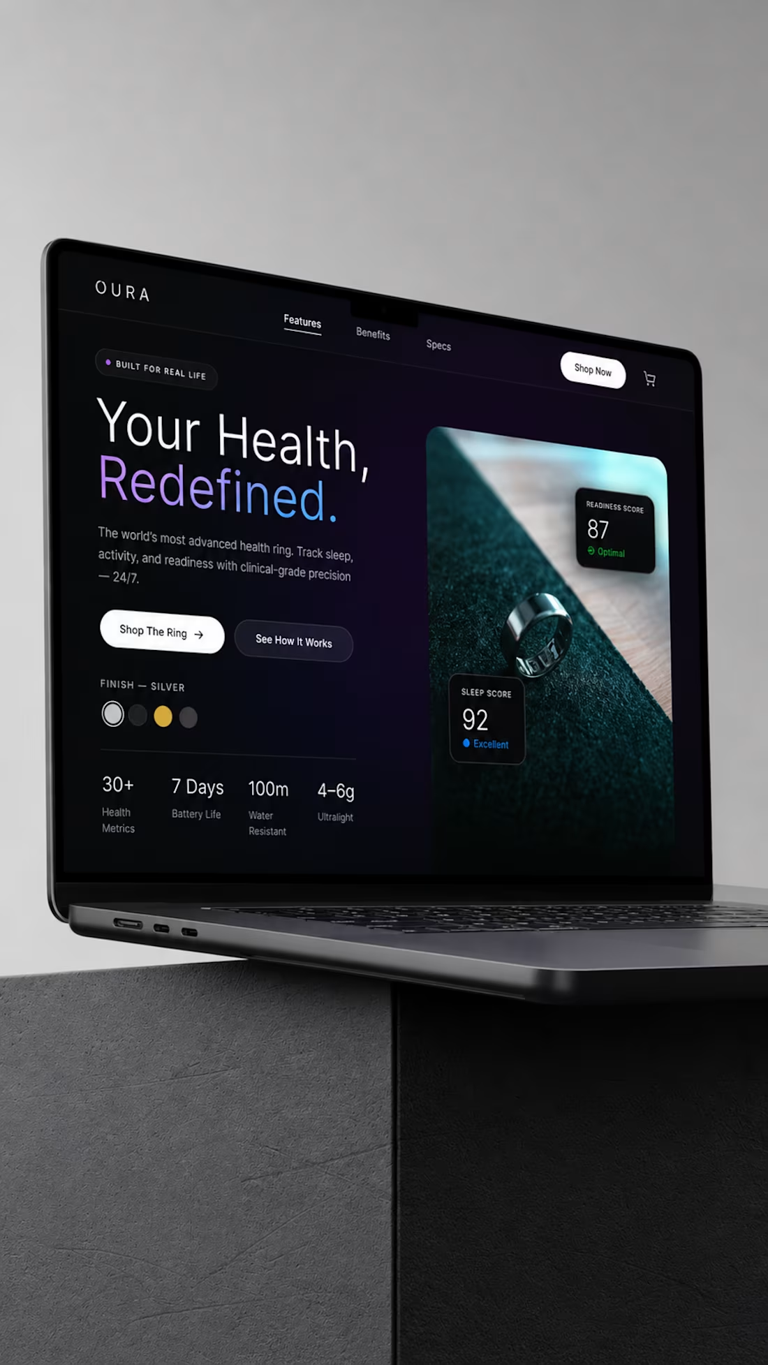
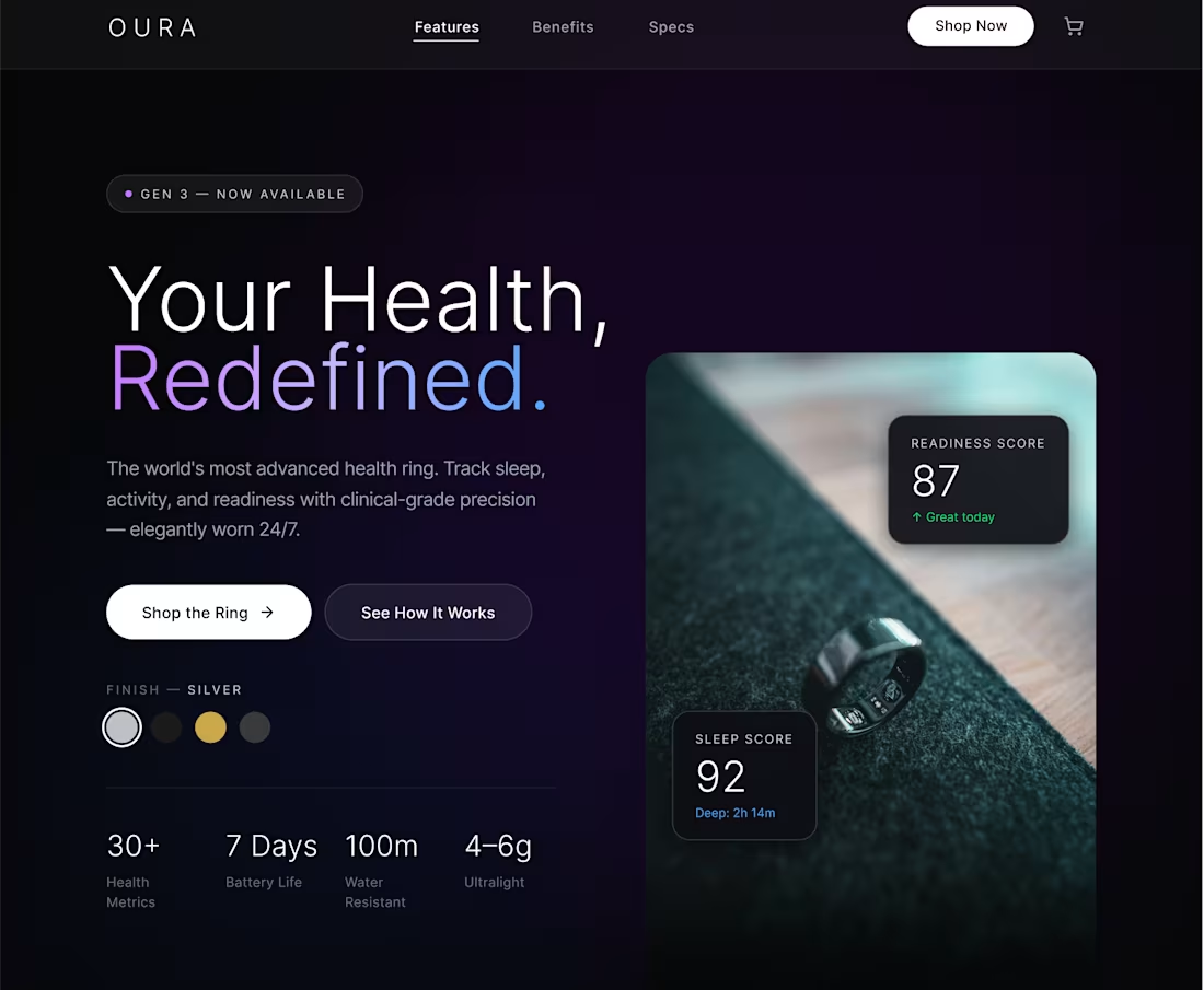
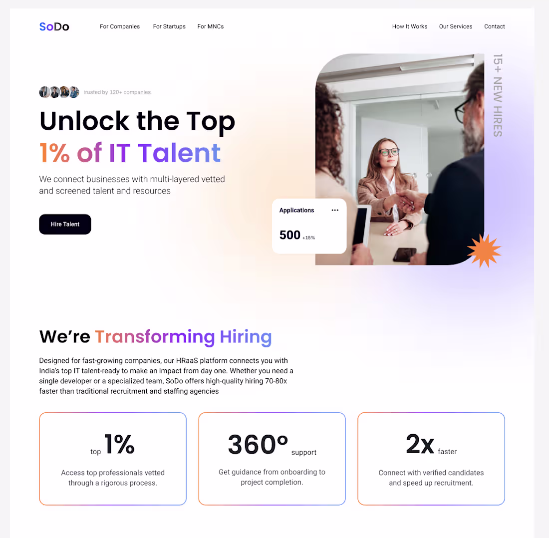
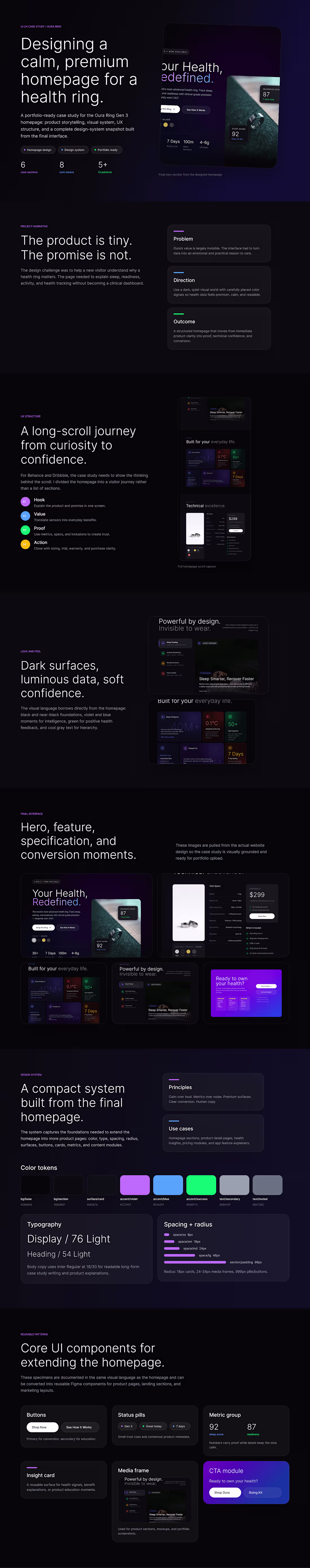
Designed a high-converting homepage experience for Oura Ring.
The focus wasn’t aesthetics.
It was decision-making.
→ Simplify complex data
→ Guide users with clear hierarchy
→ Build trust before asking for action
Every section answers one question:
“Why should I care?”
Because attention is expensive —
and clarity is what converts it.
If you’re building a product that deserves better storytelling,
let’s work.
1
2
216
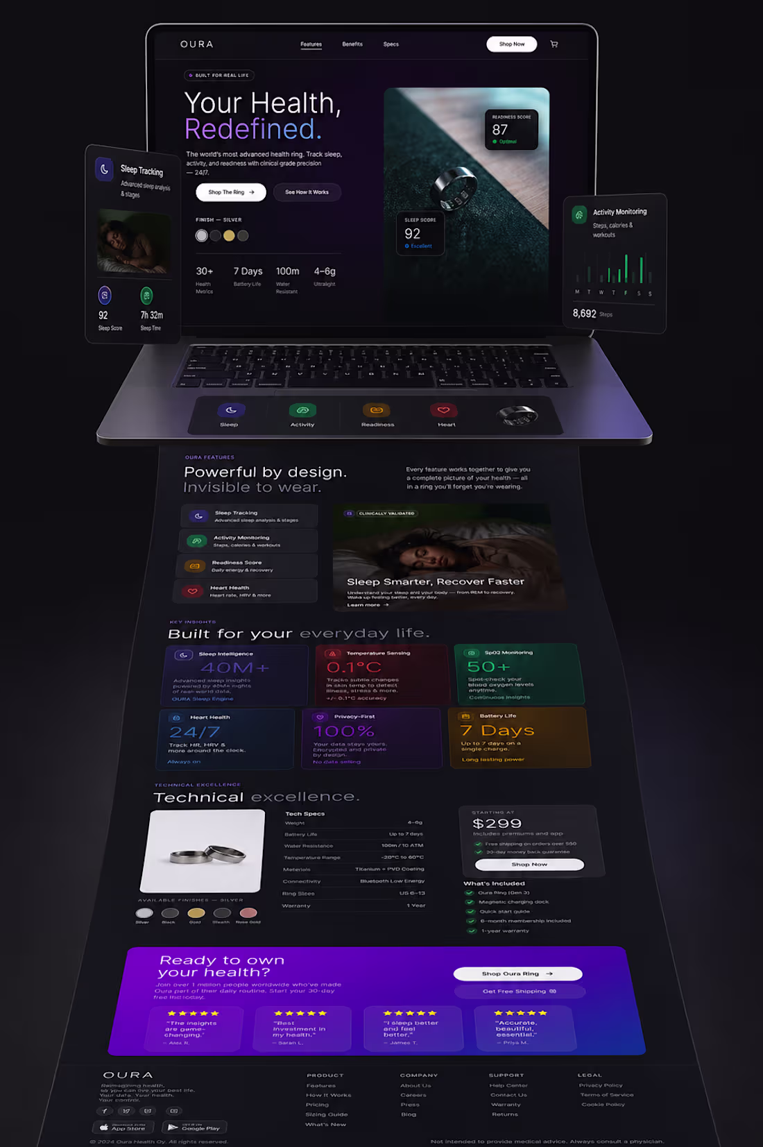
Most product pages don’t sell. They explain.
And that’s the problem.
I redesigned the Oura Ring homepage with one goal:
👉 Make people feel the product before they understand it.
No feature dumping.
No generic sections.
Just a clear story:
What it is
Why it matters
Why you should care right now
Dark UI. Strong hierarchy. Data that actually feels alive.
Because good design isn’t about looking premium —
it’s about making decisions easier.
If your product page isn’t converting,
it’s probably not a traffic problem.
It’s a clarity problem.
Let’s fix that.
3
5
234
Hey guys I have recently finished working on a product case study and I would like you guys to go through it and give your thoughts in this. I am also open to take on new projects :)
1
140

ONI: Redesigning Pregnancy Nutrition through Empathy
1
201
Hey guys so currently working on a framer project and i am excited to show you guys what i have made after completing it.
1
175
A piece of work that i am sharing and trying to understand this place because i have just joiined contra so please show some love guys
1
156
OURA Ring
1
4
Hi guys i am new to this place so help me grow here
1
138