Reimagining the Universal Digital Ticket
Siddharth Singh
Case Study: The Living Artifact
Reimagining the Digital Ticket as an Immersive Event Companion
1. Executive Summary
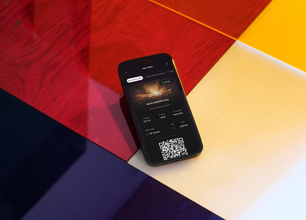
The Universal Digital Ticket is a mobile-first design system created to transform the standard event entry pass from a static "receipt" into a premium, functional Event Companion. By combining high-utility logistics with immersive brand aesthetics (glass morphism, dynamic lighting), the design addresses the anxiety of event entry while building anticipation for the experience itself.
2. The Problem
Current digital ticketing solutions suffer from three core issues:
The "Receipt" Syndrome: Most digital tickets look like spreadsheets or PDFs—utilitarian, uninspiring, and disconnected from the excitement of the event.
Entry Anxiety: Users often struggle to find critical info (Gate, Seat, ID Policy) right when they need it, buried under marketing fluff.
Scanning Friction: Low screen brightness or cluttered UIs often cause delays at the turnstiles.
3. The Solution
I designed a "Universal" container—a single, adaptive component that houses any event type (Music, Sports, Arts) while maintaining a consistent visual hierarchy. The ticket is no longer just a permission to enter; it is a dynamic dashboard for the day of the event.
4. Design Philosophy & Visual System
A. "Glass & Light" Aesthetic
To make the ticket feel like a premium digital object, I utilized Glass morphism in a dark-mode environment.
Why Dark Mode? It preserves battery life on OLED screens (crucial for festivals) and allows the event's brand colors to "glow" without overwhelming the text.
The Background Mesh: A dynamic, blurred gradient sits behind the glass card. This allows the ticket to visually adapt:
Purple/Fuchsia: High-energy Music Festivals.
Emerald/Teal: Tech-focused Esports.
Amber/Warm: Intimate Comedy/Theatre.
B. Skeuomorphism 2.0
I reintroduced subtle physical metaphors to create familiarity:
• • The Tear Line: A dashed divider with semi-circle cutouts physically separates the "Event Identity" (Image/Title) from the "Scan Area" (QR). This mimics the rip of a physical ticket stub.
5. Information Architecture (The "Day-Of" Hierarchy)
6. Key UX Features
The "Scan Mode" Modal
Challenge: Scanning fails when other UI elements distract the scanner or screen brightness is too low. Solution: Tapping the QR code triggers a dedicated Modal Overlay.
Focus: Removes all non-essential data.
Utility: Visually isolates the code (and in a native build, would trigger max screen brightness).
Feedback: Provides a visual cue that the app is ready for the reader.
The "Event Companion" Widget Layer
I moved beyond the ticket by adding a "Day of Event" section below the fold:
Live Weather: Integration with weather APIs to help users dress appropriately (e.g., "Rainy" icon warns users to bring ponchos).
Gate Logic: Explicitly stating "Gate B" or "West Entry" prevents users from queuing in the wrong line.
One-Handed Ergonomics
Recognizing that users often hold a drink or a bag in one hand, all primary interactions are placed in the Thumb Zone:
Sticky Actions: The "Add to Wallet" and "Transfer" buttons are fixed to the bottom of the viewport.
• • Carousel Navigation: Swiping between tickets is handled via a snap-scroll container at the bottom half of the screen.
7. Results & Impact
This design creates a scalable framework for ticketing platforms.
Scalability: The grid system accommodates long titles (Comedy shows) or complex seating (Stadium sports) without breaking the layout.
User Confidence: By surfacing "Status," "Gate," and "Weather," the design reduces the cognitive load on the user.
Brand Value: The high-fidelity visuals turn the ticket into a shareable asset, increasing social visibility for the event organizer.
Like this project
Posted May 5, 2026
Created immersive digital ticket system improving event experience.
Likes
1
Views
6
Tags