Designing the ONI Nutrition Flow for Expecting Mothers
Siddharth Singh
The Challenge
Pregnancy nutrition is scientifically complex. Expecting mothers are asked to track over 12 changing micronutrients (like Choline, Selenium, and DHA) while simultaneously battling physical symptoms like nausea, fatigue, and "mom brain."
Most existing apps treat this problem like a spreadsheet: strict calorie counting, clinical warnings, and high-friction data entry. This leads to cognitive overload and high churn rates by the second trimester.
The Goal: Design a nutrition tracking flow that reduces cognitive load, adapts to physical symptoms, and reframes nutrition as an act of love rather than a chore.
1. Discovery & User Insights
I analyzed user behavior in health tracking apps to understand why mothers stop tracking. The friction wasn't technical; it was emotional and physical.
Key Pain Points Identified:
The Nausea Barrier: When a user has morning sickness, seeing a goal for "Grilled Salmon" (high DHA) creates food aversion and guilt.
Data Fatigue: Mothers care about the baby, not the data. Tracking "12mcg of Selenium" feels like homework.
The "All-or-Nothing" Fallacy: If a user misses a day or eats a "bad" meal, they feel they have broken their streak and abandon the app.
Core Insight: Empathy is a UX feature. A pregnancy app must account for the user's worst days, not just their best ones.
2. The Solution: Abstraction over Precision
To solve the cognitive load problem, I moved away from a list of 12 nutrients and created an abstraction layer anchored in fetal development.
The "3 Pillars" System
I grouped complex micronutrients into three approachable categories:
Growth (Green): Protein, Zinc, EAA - Context: Building Bones
Brain (Indigo): Choline, DHA, Folate - Context: Memory & Vision
Vitality (Rose): Iron, B6, Selenium - Context: Mom's Energy
3. UI Design & Features
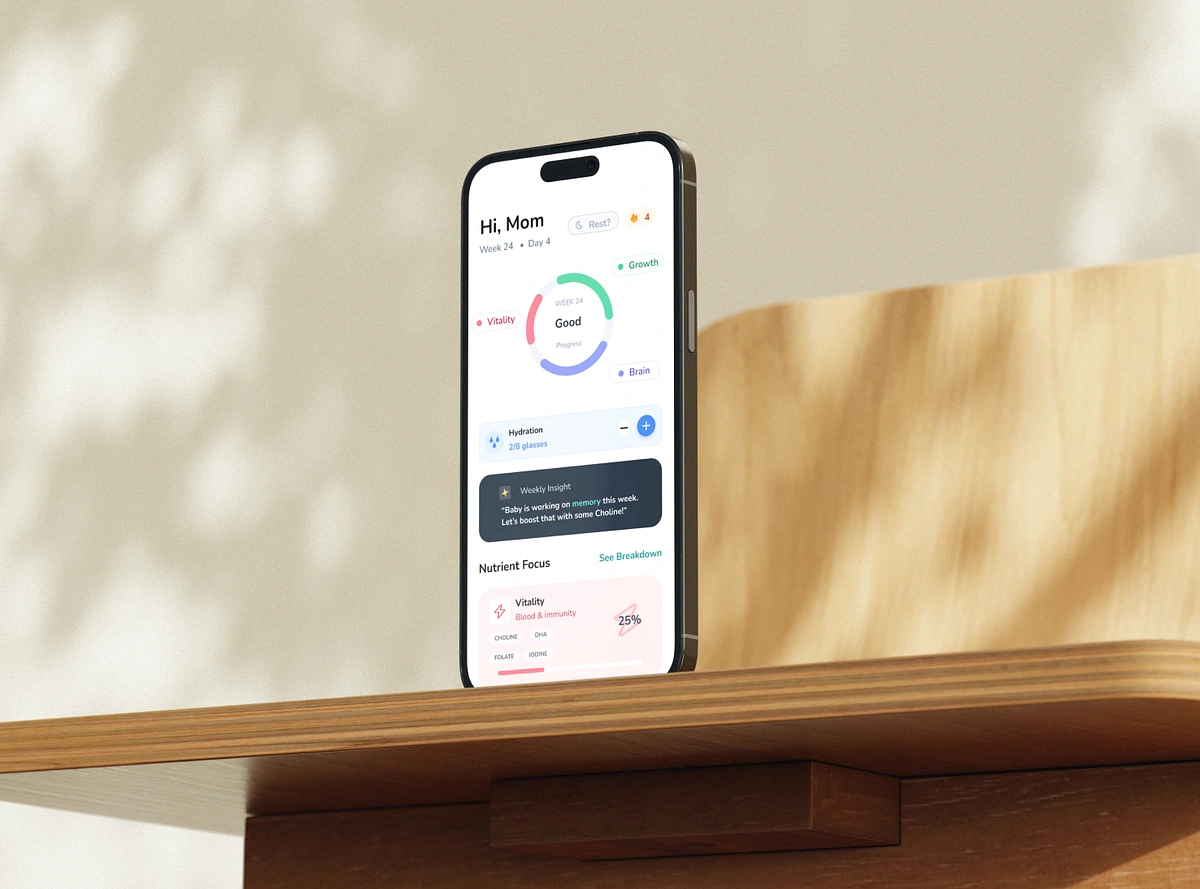
A. The Nurture Ring (Dashboard)
Instead of bars and graphs, I designed a soft, radial progress indicator.
UX Rationale: This utilizes the "Glanceability" heuristic. A mother can understand her daily status in under 2 seconds without reading a single number.
Visuals: Soft gradients and rounded caps replace sharp medical charts to induce a sense of calm.
B. Symptom-Adaptive Logging
This is the app's standout empathy feature. Standard apps show the same food suggestions every day. ONI adapts based on how the user feels.
The Interaction: A "How are you feeling?" selector sits at the top of the log screen.
The Logic:
Select "Normal": Shows Salmon, Eggs, Spinach.
Select "Nauseous": Filters database to show Ginger Tea, Crackers, Cold Fruit.
Outcome: Reduces decision fatigue and prevents the app from feeling "tone-deaf" to the user's physical reality.
C. Retention Mechanics: Forgiveness UI
To combat the "All-or-Nothing" dropout rate, I implemented features inspired by behavioural psychology (specifically the Duolingo model).
Rest Mode: A toggle that allows the user to pause goals for the day. It acknowledges that pregnancy is exhausting. The UI greys out, and the streak is preserved.
Micro-Habits: A one-tap Hydration Widget. Even on days when logging a meal feels too hard, tapping a water glass provides a dopamine hit and keeps the habit loop alive.
4. Visual Design System
The aesthetic goal was "Scientific Nurturing." It needed to feel credible but warm.
Typography: Used Nunito. Its rounded terminals feel organic and soft, reducing the subconscious stress associated with sharp, clinical fonts
Glass morphism: Navigation and widgets use blurred, translucent backgrounds to create a sense of lightness and depth, ensuring the UI doesn't feel heavy or cluttered.
Color Psychology:
Teal (Primary): Balance and renewal.
Indigo: Wisdom and depth (Brain pillar).
Rose: Warmth and vitality (Energy pillar).
5. Conclusion
The ONI Nutrition Flow demonstrates that in health UX, reducing friction is not enough; we must also reduce shame. By designing for the physical realities of pregnancy—nausea, fatigue, and overwhelming love—we transformed a utility tool into a supportive companion.
Key Takeaways:
Context is King: Data means nothing without the "Why." (e.g., "Eat this for baby's memory" vs "Eat this for Choline").
Forgiveness Retains Users: Allowing users to rest keeps them coming back.
3. Soft UI Matters: In stressful life stages, UI should be a sanctuary, not a taskmaster.
Like this project
Posted May 5, 2026
Designed an empathetic pregnancy nutrition app to reduce cognitive load for expecting mothers.
Likes
1
Views
3