


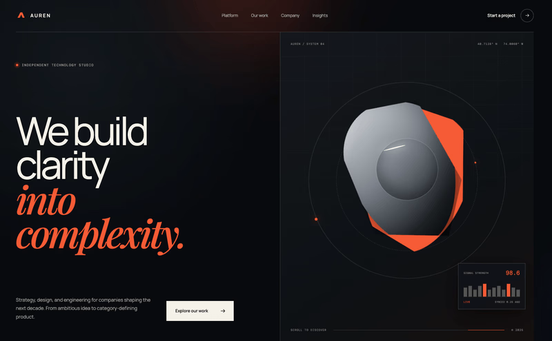
I have been trying to understand why some Webflow and Framer developers charge $1K–$5K for a website, while some creative studios charge $20K–$50K for websites with just 1–4 pages.
At first, the difference seems crazy. But the more I look at studios like MONOLOG and Aperios...
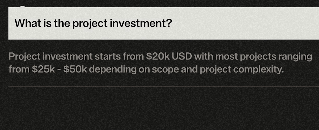
Auren Premium Digital Experience Concept
Exploring a bold, editorial direction for a modern technology studio.
The concept combines expressive typography, sculptural 3D visuals, a dark interface, and a restrained orange accent to create a distinctive digital experience.
Design...
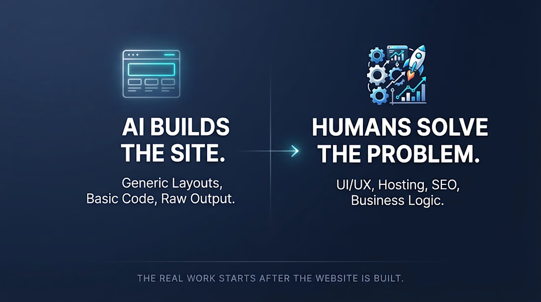
Anyone can build a website with AI now. Even clients can create basic to medium websites themselves using tools like ChatGPT.
But does building a website mean the job is done?
Not really.
The real work often starts after the website is built.
Improving UI/UX
Fixing bugs and testing...
A website should be more than a collection of pages.
Every section should have a purpose.
Every interaction should feel intentional.
And the foundation should make future growth easier.
That’s how I approach building websites with Webflow, from clear UX to scalable CMS and integrations.
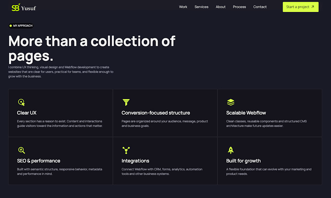
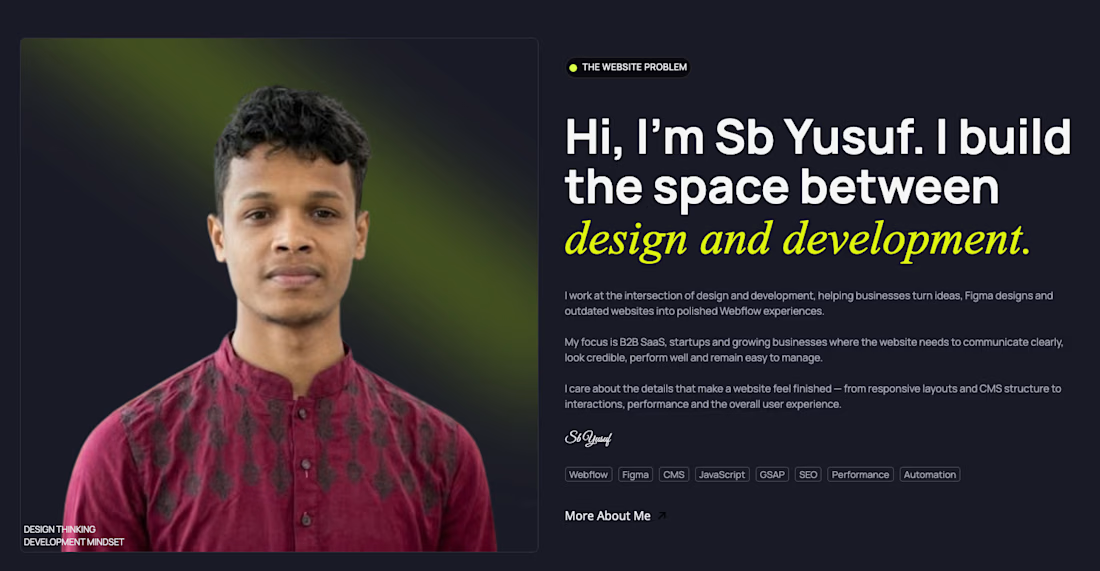
Just a simple about me section on what I work.