
Sarafina St_matthew
I create bold, thoughtful visuals that help brands stand out
New to Contra
Sarafina is building their profile!

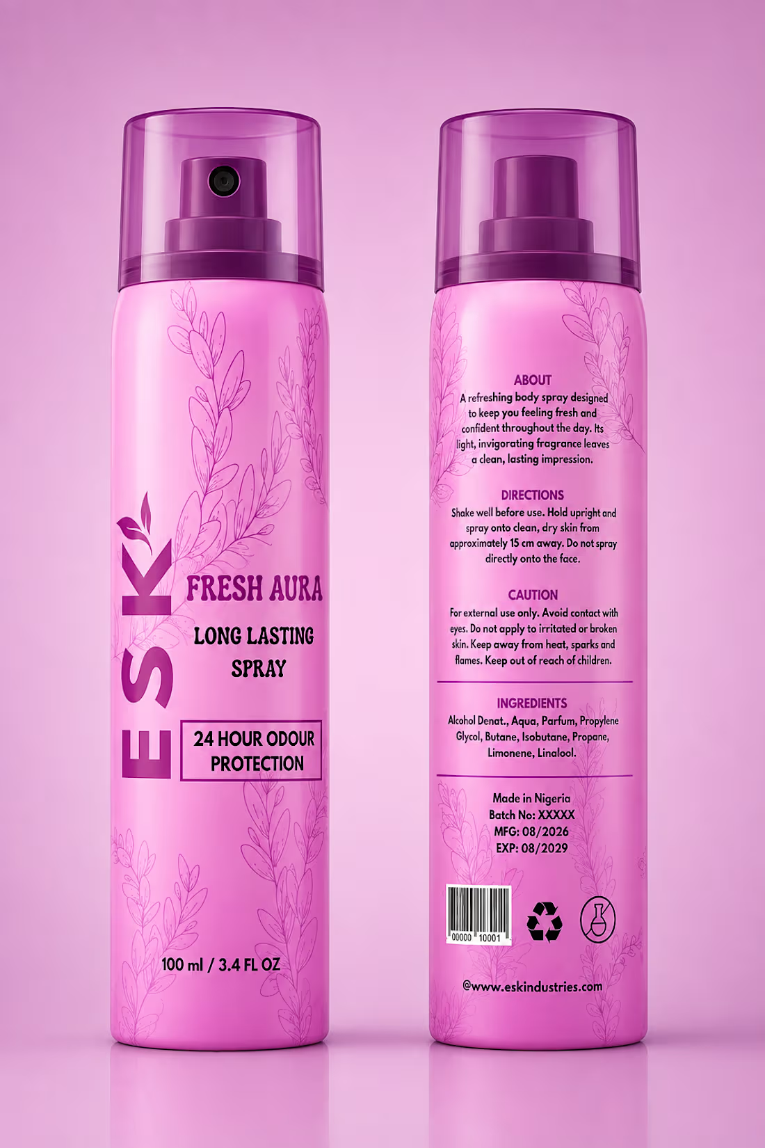
Esk Fresh Aura A body spray packaging design focused on creating a fresh, youthful, and visually appealing identity for a personal-care fragrance product. The design was developed to communicate freshness and confidence while giving the product a distinctive presence that feels modern and approachable.
The packaging brings together bold typography, color, product information, and carefully arranged visual elements to create a clear and engaging composition. The hierarchy was intentionally structured to make the Esk Fresh Aura name immediately noticeable while keeping the supporting details organized and easy to read.
Overall, the design balances personality with simplicity, creating a cohesive body spray identity that feels vibrant, polished, and suited to its target audience.
0
4
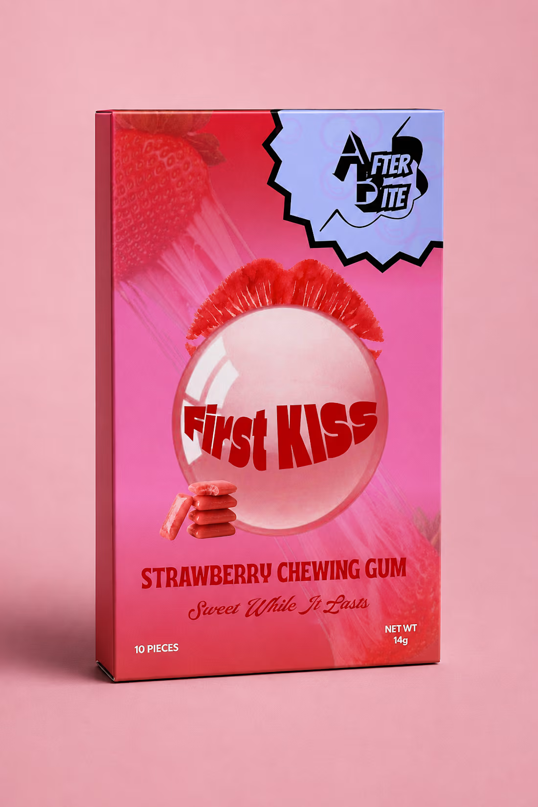
Afterbite, First Kiss A packaging design concept for a strawberry chewing gum created around the playful excitement and sweetness of a first kiss.
The packaging takes a bold, youthful approach, using a vibrant pink and red color palette to immediately communicate the strawberry flavor while reinforcing the romantic theme. Large strawberry imagery creates a strong sense of flavor and freshness, while the oversized translucent gum bubble and pair of lips bring the “First Kiss” concept to life visually.
The central “First Kiss” typography is intentionally bold and expressive, making the flavor name the main focal point of the package. Smaller details, including the illustrated chewing gum pieces and the playful Afterbite logo treatment, add personality without competing with the main message. The tagline “Sweet While It Lasts” further connects the product to the fleeting, memorable feeling associated with a first kiss.
The overall direction was designed to make the packaging feel fun, youthful, cheeky, and highly visual, while keeping the product and flavor immediately recognizable at first glance. The project explores how color, typography, imagery, and visual storytelling can work together to give a simple chewing gum product a distinct personality and memorable shelf presence.
0
9
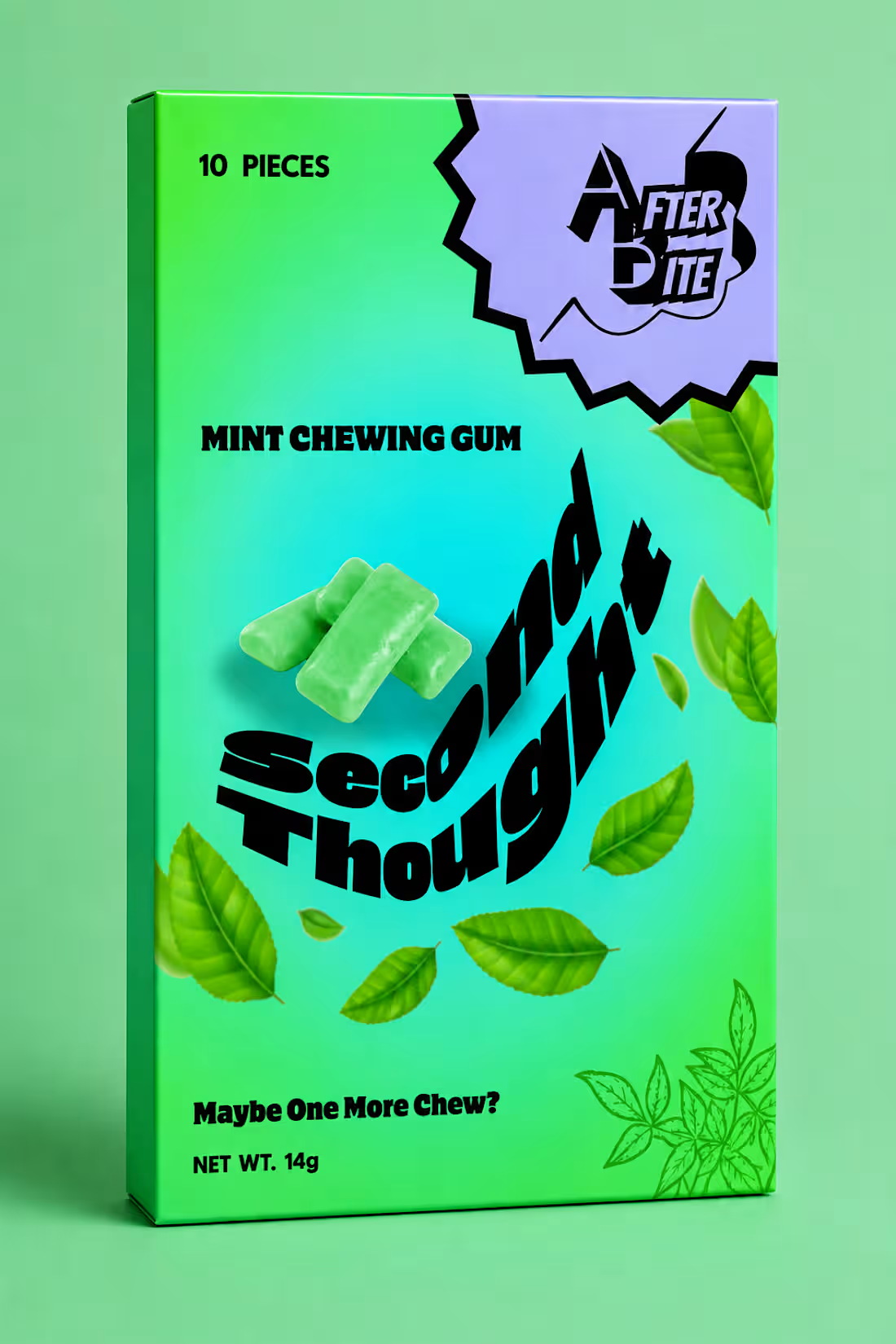
Afterbite Second Thought
A playful packaging design concept for Afterbite’s “Second Thought” mint chewing gum. The design brings the product’s fresh mint flavour to life through a vibrant green-to-turquoise colour palette, floating mint leaves, and a visual treatment that feels energetic and refreshing.
At the centre of the pack, the oversized “Second Thought” typography creates a bold focal point, giving the product a distinct personality while reinforcing the idea behind the name. The contrasting lavender graphic element, expressive Afterbite logo, and scattered botanical details add a fun, unexpected quality that makes the packaging feel youthful and memorable.
The overall direction was designed to make Afterbite stand out on the shelf while balancing strong product communication with a playful, character-driven visual identity.
0
14
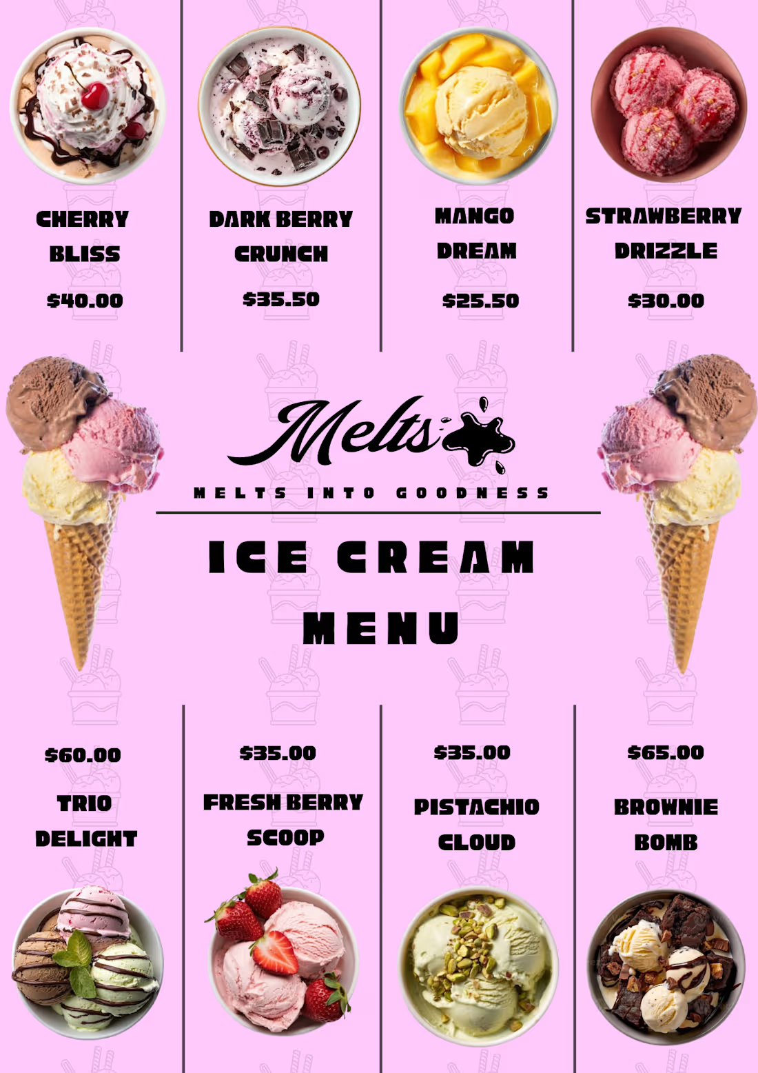
A playful, modern menu design created for Melts, an ice cream brand. The goal was to present a variety of flavours and offerings in a way that felt fun, appetizing, and easy to navigate while staying aligned with the brand’s visual personality.
1
26