
🎬 Great video editing does more than make your content look polished.
It gives people a reason to stop scrolling and keep watching.
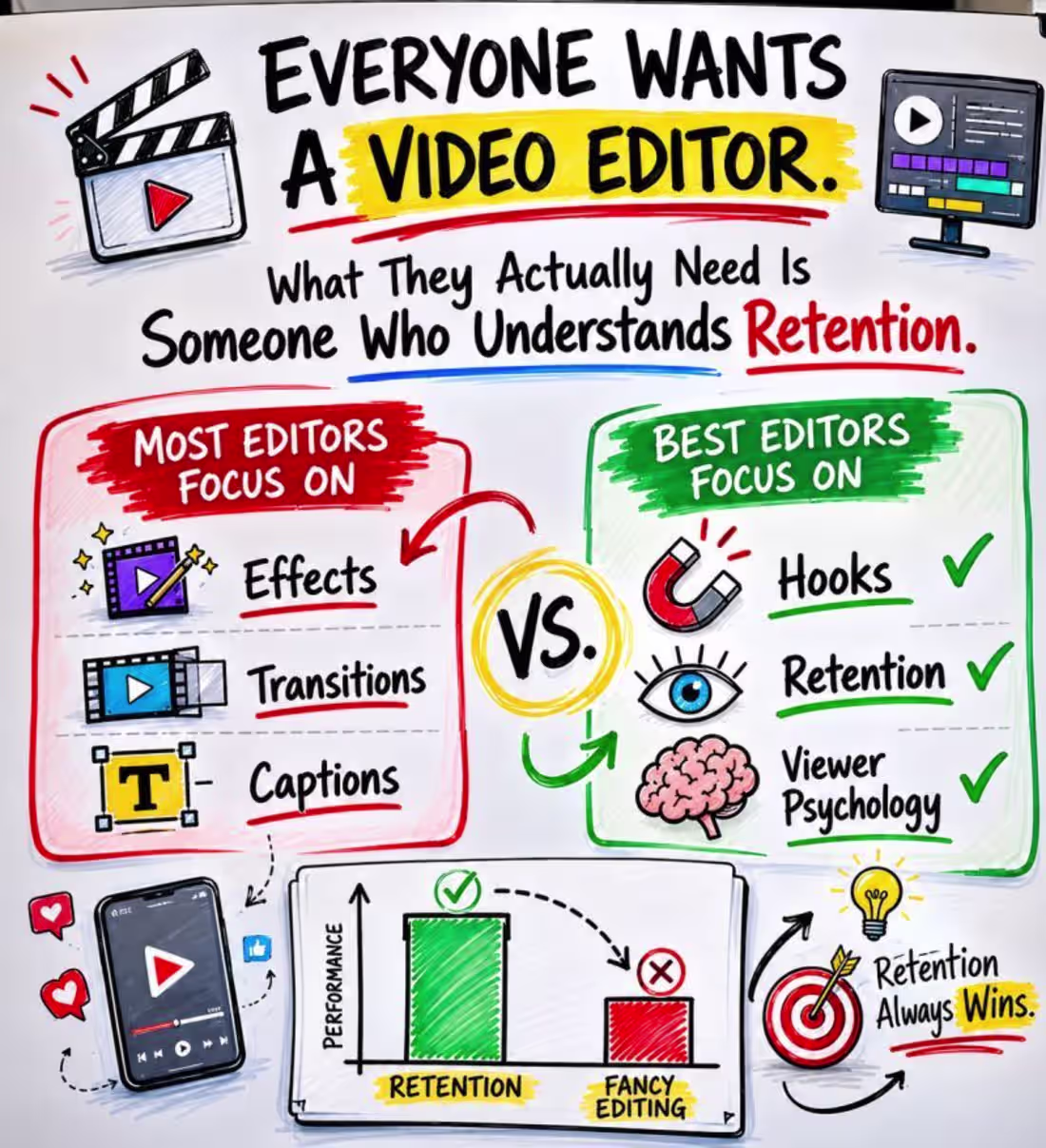
Transitions, captions, animations, and effects are valuable. However, they cannot guarantee engagement or retention on their own.
Strategic video editing focuses on:
⚡ Capturing attention within the first three seconds
✂️ Removing unnecessary pauses, repetition, and distractions
🎯 Keeping every scene focused on the core message
⏱️ Maintaining a fast and engaging pace
🎧 Using music, sound effects, and voiceovers intentionally
📖 Turning raw footage into a compelling visual story
📈 Creating content designed to support clicks, leads, and conversions
My goal is not simply to deliver a polished video.
I create attention-grabbing, conversion-focused content that communicates clearly and keeps viewers watching.
🚀 Available for:
📱 Short-form videos and social media reels
📣 Meta and performance advertising creatives
🛍️ E-commerce product and promotional videos
▶️ YouTube videos and Shorts
🏢 Corporate, educational, and brand content
✨ Have raw footage or a creative idea?
Let’s transform it into content your audience will remember and act on.
📩 Send me a message to discuss your next video project.
1
24
Meta Ads Video Editing — Lead Generation Campaign
Client: Palmary Loans (Australian Mortgage Broker)
Platform: Meta — Facebook & Instagram (Feed, Reels, Stories)
Goal: Generate qualified leads for mortgage brokering services
Palmary Loans needed a consistent flow of short-form video content to run as paid Meta ads targeting Australian homebuyers and property investors. The brief was clear — take raw footage and turn it into scroll-stopping creatives that could drive real lead volume in a competitive financial services market.
What I delivered:
Starting from raw talking-head footage, I edited multiple video variations across formats — vertical Reels, square feed ads, and Story placements — each adapted to how that specific placement is consumed. One source shoot, multiple assets ready to test.
Every video was built around the three things that make financial service ads convert on Meta: a strong hook in the first 2–3 seconds that speaks directly to a homebuyer's anxiety or aspiration, a clean benefit-driven middle section that builds trust fast, and a clear CTA close that removes friction and tells the viewer exactly what to do next.
Captions were added with clean modern styling — essential for financial content where the majority of viewers watch on silent autoplay. Motion graphics and text overlays were used to emphasise key messages (rates, savings, trust signals) without overwhelming the speaker.
Music selection matched the professional yet approachable tone a mortgage broker needs — reassuring, not corporate. The kind of energy that says "I'm on your side" rather than "I'm a bank."
Delivered:
—> Multiple short-form video cuts (Reels, Feed, Stories)
—> Animated captions throughout
—> Platform-optimised exports for direct Meta upload
—> Variations ready for A/B testing
1
24
Short-form interview video for AutoHDR — a real estate AI tool
Format: 32-second YouTube/social cut
Starting point: Single talking-head raw footage file, zero graphics
The client provided a raw interview clip of Eli Jones and a finished reference video showing their expected motion graphics style. The task was to match — and deliver — that same production quality from scratch.
What I built:
Rather than simply layering a screen recording over the speaker (the easy shortcut most editors take), I created actual motion graphics — animated UI elements, product screenshot compositions, and dynamic transitions that integrated with the interview footage naturally.
Captions were designed with clean, modern styling and smooth animation — not static subtitles, but motion-timed text that moves with the energy of the video. A music track was selected to match the pacing and professional tone of the brand.
Delivered: Watermarked preview cut, export-ready for approval — full production from raw footage to finished video.
1
24
Event Highlight Video — Multi-Camera Team Compilation
Project type: Event video editing & post-production
Deliverable: Single cohesive highlight video
Source material: 5 separate video clips from 5 team members
Key tasks: Multi-source sync · Captions · Sound design · Transitions · Color & pacing
The Challenge
The client came with raw footage from 5 different team members — each filmed on a different device, at different times, with different lighting, different audio quality, and different framing. Individually, each clip told a fragment of the story. The job was to turn those fragments into one seamless, professional video that felt like it was always meant to be a single piece.
That's a harder edit than most people realize. When you're working with one camera, one shoot, one environment — you're just cutting. When you're working with 5 sources, you're solving continuity, audio consistency, visual tone, and pacing all at once.
What I Did
1. Multi-Source Assembly & Continuity Edit
The first task was reviewing all 5 clips and building a logical story arc — what moment comes first, what builds in the middle, what closes strong. I structured the sequence around the event's natural energy flow rather than just chronological order, which gave the final video a much stronger sense of narrative momentum.
Clips with mismatched color temperatures and exposure levels were brought into a consistent visual tone so the viewer doesn't notice the jump between sources — they just experience the event.
2. Caption Design & Placement
Animated captions were added throughout — not auto-generated, but designed and timed manually to match the speech rhythm and visual pacing of each scene. Caption style was kept clean and readable at small sizes, since most viewers watch on mobile. Placement was adjusted per clip to avoid covering key subjects or action in the frame.
3. Sound Matching & Audio Cleanup
Five clips. Five different audio environments. This is where most amateur edits fall apart — jarring volume jumps, background noise shifting between cuts, music that doesn't breathe with the visuals.
I cleaned each audio track individually, leveled the mix across all clips, and laid a music bed underneath that tied the energy of the entire video together. SFX transitions were used at key cut points to give the edit physical texture — the kind of detail that viewers feel without knowing why the video feels more professional.
4. Transitions & Visual Flow
Transitions were selected and timed to match the event's tone — energetic where the moment called for it, clean and simple where the content needed to speak. No template-dump transitions. Each one was chosen because it served the cut, not because it was available.
The result is a video that moves — you don't sit waiting for the next thing to happen. The pacing keeps the viewer in the moment from first frame to last.
5. Final Polish
Color grade applied for consistent warmth and brand-appropriate tone across all 5 sources
Music fades and audio ducking under speech segments
Opening and closing frames designed to work as standalone still thumbnails
Exported in platform-ready format, optimized for social sharing and event replay
1
28
High-Converting Meta Ads Video for Service-Based Business
For this project, I created a high-converting Meta ads video for a service-based business with the goal of capturing attention quickly and improving engagement within the first few seconds.
Instead of creating a standard promotional video, I focused on building a structured ad experience designed to stop scrolling and guide viewers toward action.
My Approach
I structured the video using a conversion-focused framework:
✓ Strong hook within the first few seconds to capture attention
✓ Clear problem and solution flow
✓ Dynamic captions for better retention
✓ Motion graphics and visual elements to increase engagement
✓ Fast-paced editing with smooth transitions
✓ Strategic B-roll placement
✓ Sound design and effects
✓ Strong call-to-action section
Tools Used
• Adobe Premiere Pro
• After Effects
• Photoshop
• AI-assisted creative workflow tools
1
41