
Sandaruwani D
Art Direction | Brand & Design Expert | 12+ Yrs


Lumi — Character Design & PR Campaign for a Kids Dental Clinic
0
3
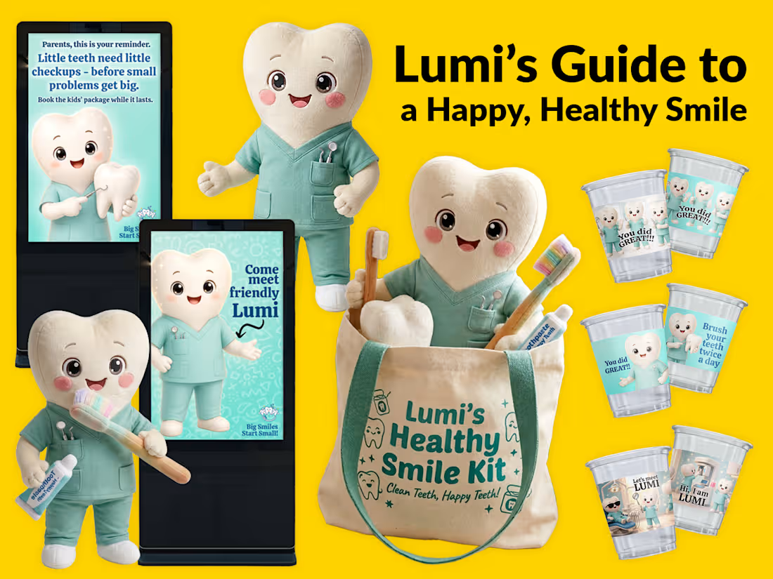
Building a Brand Around a Character: Meet Lumi
What if a pediatric dental clinic had a friendly little character that children could recognize, trust, and look forward to seeing?
Meet Lumi — a cheerful tooth mascot created to bring warmth, personality, and consistency to a pediatric dental brand.
I explored how Lumi could become more than just a mascot by extending the character across multiple brand touchpoints:
• Digital clinic screens
• Plush mascot merchandise
• Branded takeaway cups
• Smile-care kits
• Promotional materials
• Child-friendly messaging
The goal was to create a visual world that feels gentle, playful, memorable, and reassuring for children — while still feeling professional to parents.
A strong mascot can become a recognizable brand asset, helping a business communicate its personality across both digital and physical experiences.
Character → Identity → Experience.
That’s where I love taking brand design.
Ps.: I have a phobia for dentists my self.. a plushie toy would be great.... 😊
1
1
157
Apparel hang tags — motivation & body positivity
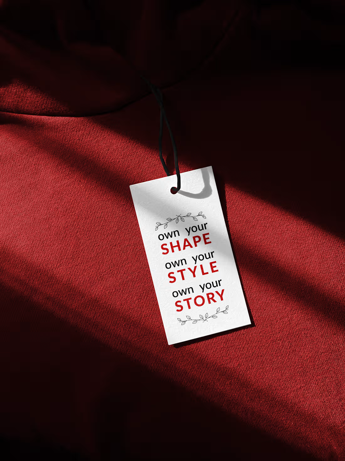
A clothing label wanted hang tags that feel like the brand, not a size sticker. The goal was a small set of tags that carry a body-positive message at the point of unboxing, then sit cleanly on garment photos and in-store rails.
The constraint is the format. A tag is tiny, often seen against busy fabric, and has to survive print, string, and crease. Long copy fails. Soft colour disappears on dark cloth. Decorative type that looks good on screen becomes unreadable at 2–3 cm.
I designed three tags as one system: one message per tag, high contrast (black on gold fabric, white on burgundy, yellow on purple), and a single typographic idea so they still look like a family. The layout left room for a small mark and kept the punchline in the centre of the card. Files went out print-ready — correct size, bleed, and type that holds at actual hang-tag scale.
The result is a set that works on the garment, in a flat lay, and as the start of a wider apparel system (tag + care label + packaging) without redesigning the voice for each piece.
Which one will you like best?
1
6
429
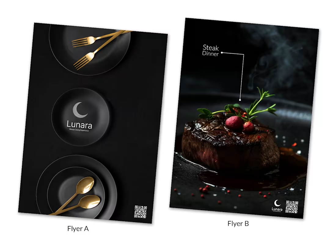
Created 2 different flyers for my previous client, to give an idea on how less words can be used to promote his luxury diner.
What do you think?
Will this work?
And which one do you like?
2
1
321