Lumi — Character Design & PR Campaign for a Kids Dental Clinic

Sandaruwani D


Kids don’t remember the price. They remember Lumi.
Mascot branding works because people don’t process a character like a logo. They process it like a person. That shift is the whole game.
A logo is judged. A mascot is met.
1. Anthropomorphism: the brain treats Lumi as social
Humans automatically assign intention, mood, and personality to anything with a face, eyes, and posture. Once that happens, evaluation moves from “Is this offer good?” to “Do I like this character?”
For a kids’ dental clinic, that is useful. A checkup is clinical. Lumi is not. A smiling tooth in scrubs turns an unglamorous medical visit into a friendly encounter.
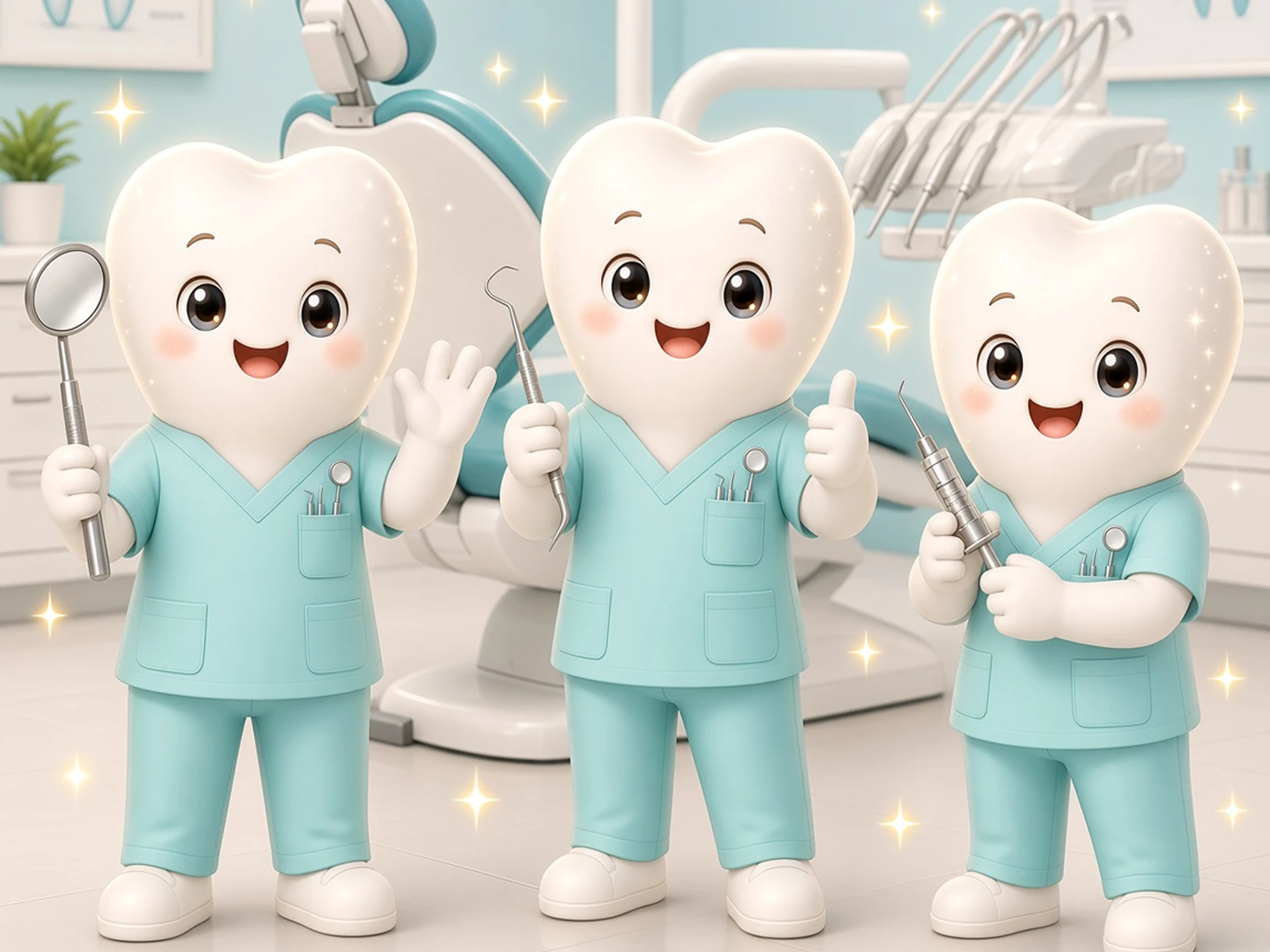
Lumi’s design already uses the cues that trigger this:
large eyes + blush = warmth, not authority
open palm = invitation, not inspection
mint scrubs + pocket tools = competence without threat
sparkles = “this is safe and special”
Warmth first. Competence second. In healthcare for children, that order matters. If competence comes first, kids read it as clinical. If warmth comes first, parents still see the scrubs and trust the clinic.
2. Affect transfer: liking Lumi leaks onto the clinic
Positive feeling toward a character transfers to the brand attached to it. That is affect transfer.
The child does not need to understand “$100 package, September 1–15.” They need to feel “Lumi is nice.” The parent then inherits that lowered resistance: if the child is willing, booking becomes easier.
This is why the hook Kids don’t remember the price. They remember Lumi. is psychologically accurate. Price is System 2. A face is System 1.
3. Parasocial bond: a one-sided friendship that still works
Children form parasocial relationships with characters — one-sided attachments that still feel like friendship. Repeated exposure (poster, feed, waiting room) makes the character feel familiar, trusted, and “mine.”
That bond is low-risk. Lumi never scolds, never rushes, never looks tired. He is a stable social other. For a first dental visit, stability is the product.
Healthcare research on mascots also shows relational, peer-like tone beats institutional, directive tone when the topic is sensitive. “Come meet Lumi” works better than “Schedule your child’s examination.”
4. Memory: characters beat logos
The brain is built to remember faces and stories, not wordmarks. Characters raise emotional engagement and recall because they give memory a personality to attach to. Reported lifts often cited in industry writing sit around ~30% more emotional engagement and ~37% better ad recall versus character-free ads — treat those as directional, not clinic-specific proof.
Practically: a parent scrolling past ten clinic ads will forget the serif logo. They will not forget a glowing tooth in mint scrubs waving a mirror.
Silhouette test still applies. Lumi should read at poster size and at a 48px profile picture. Tooth-head + V-neck scrubs is already a strong shape.
5. Dual audience: child + parent at once
Kids’ brands fail when they only charm the child or only reassure the adult.
Audience: What they need. What Lumi does: Child safety, play, a friend. Cute face, sparkles, open pose. Parent: Competence, clarity, low drama. Scrubs, tools, clean offer copy
Lumi is the bridge. The child sees a friend. The parent sees a professional wrapped in friendliness. That is why the same character can carry both the playful poster and the “what’s included” carousel.
In childcare branding, mascots that feel nurturing reduce parent anxiety while giving children a sense of security in a new place. A dental chair is the same problem as a first day of preschool: unknown room, unknown adult, loss of control.
6. Emotional contagion
Smiling characters pull a matching state. Darwin’s old observation still gets used in branding: even simulated emotion tends to produce it. A mascot that smiles at you makes you feel slightly better.
For dentistry, that is not decoration. It is pre-visit regulation. A child who has already “met” a happy tooth is less likely to arrive in fight-or-flight.
7. The risk: cute without character rules
Mascots break when they become inconsistent, too authoritative, or too commercial.
Rules that keep Lumi psychologically clean:
Never make him the dentist with power over the child. He is a helper-peer.
Keep tools visible but friendly (mirror, brush), not threatening.
Same face, same palette, same posture language across posters and social.
Don’t oversell. Parasocial trust dies when the character only exists to push the $100 package.
Let him invite. Don’t let him lecture.
A mascot used only as a sales sticker teaches the child that Lumi is an ad. A mascot used as a guide teaches the child that the clinic is a place Lumi would go.
Design takeaway for this campaign
Lumi works if he does three jobs at once:
Face — anthropomorphic warmth that reduces dental fear
Fluent device — same character across every touchpoint so recognition compounds
Translator — turns a clinical offer into a social invitation
The posters sell the package. The social posts sell the feeling. Lumi is the memory that makes both stick.
Like this project
Posted Sep 19, 2026
Most dental mascots are smiling teeth. Lumi is a calm, light-spirited kid whom kids trust and parents take seriously. From Mascot to brand Identity design.
Likes
0
Views
7
Timeline
Sep 9, 2026 - Sep 21, 2026