
Samuel Maina
Data Analyst | SQL, Excel, and Power BI Expert.
- 3
- Followers

Samuel Maina


Retail Fraud Analysis
Business Gap & Problem
Retail businesses suffer significant financial losses through fraudulent transactions and ineffective fraud monitoring. Without clear visibility, organizations struggle to identify where fraud occurs, understand the behavioral indicators tied to suspicious transactions, and translate data into practical risk management recommendations.
Solution
Built an end-to-end retail fraud analytics solution to analyze high-volume transaction logs, track suspicious activity flags, and present actionable risk intelligence through a multi-page Power BI dashboard.
Page-by-Page Dashboard Breakdown
1. Overview Page
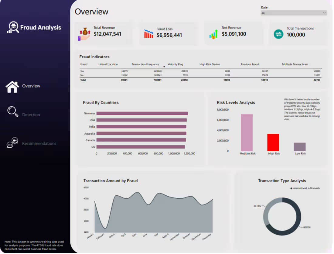
Purpose: Serves as the high-level financial command center, tracking overall enterprise revenue against fraud exposure and categorizing risk tiers.
Key Metrics & Visuals: Displays top-level KPI cards for Total Revenue ($12.04M), Fraud Loss ($6.95M), Net Revenue ($5.09M), and Total Transactions (100k). Features a fraud indicators matrix, regional fraud breakdown across top countries, transaction amount trends by fraud over time, domestic vs. international transaction distribution, and a risk level analysis chart categorizing exposure into Low, Medium, and High risk.
2. Detection Page
Purpose: Focuses deeply on transaction-level detection mechanics, velocity flags, and vulnerable merchant or payment categories.
Key Metrics & Visuals: Highlights fraud change metrics year-over-year (+52.44%) and a global fraud rate gauge (47.51%). Includes a transaction frequency matrix, fraud revenue by payment method (spanning Google Pay, Debit Card, Credit Card, PayPal, and Apple Pay), fraud revenue across merchant categories (Fashion, Luxury, Gaming, Travel, Groceries, Electronics), and a breakdown of fraud by account age.
3. Recommendations Page
Purpose: Translates complex analytical findings into an executive-ready summary and actionable risk mitigation strategies.
Key Metrics & Visuals: Features a structured Executive Summary detailing financial exposure across risk tiers (noting that Medium Risk carries the highest exposure at $7.1M) and a targeted Recommendation section advising management to strengthen medium-risk monitoring, review specific payment methods, enhance international verification steps, and track multi-indicator accounts.
1
249
Security Support Information System
The Business Problem
Private security firms manage vast amounts of operational, workforce, and commercial data scattered across multiple sites, creating severe visibility gaps. Leadership struggles to track real-time incident response times, monitor contract performance, and evaluate workforce deployment efficiency across thousands of active locations. Without a centralized analytics framework, management cannot easily identify high-risk zones, optimize staffing levels, or track high-value revenue streams.
The Solution
Developed an end-to-end, multi-page Power BI executive dashboard suite to centralize enterprise metrics. This solution transforms fragmented security logs, site contracts, and employee records into actionable intelligence, giving leadership complete operational oversight.
Page-by-Page Dashboard Breakdown.
Overview Page:
Acts as the executive command center, providing a high-level summary of the entire firm’s health at a single glance. Key Metrics & Visuals: Displays top-level KPI cards for total contract value ($236M+), active employees, active contracts, total incidents, active sites, and total clients. Features a breakdown of top skills by gender, top 10 clients by contract value, incident trends over time, and a contract status distribution ring.
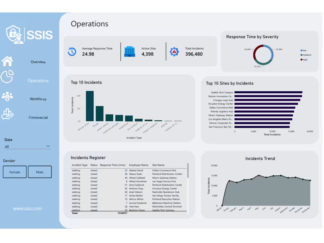
2. Operations Page:
Focuses on incident management, emergency response efficiency, and site vulnerability tracking. Key Metrics & Visuals: Tracks average response time (24.98 mins), active sites (4,398), and total incidents (~396k). Includes a severity breakdown ring (low, medium, high), top 10 incident types (led by warrant arrests and threats), top sites by incident volume, an interactive incidents register table, and a monthly incident trend line.
3. Workforce Page Purpose:
Monitors staff allocation, attendance rates, and shift distributions across all operational zones. Key Metrics & Visuals: Highlights total workforce assignments (3,000), present employees (2,461), and overall attendance rate (82.03%). Features shift distribution charts (Morning, Evening, Night, Rotating), top 10 assigned sites, employee hiring trends, employment status breakdowns, and a searchable employee directory.
4. Commercial Page Purpose:
Drives business development and financial tracking by analyzing contract types, expiries, and client portfolios. Key Metrics & Visuals: Summarizes total contract value, active contracts, and total client counts. Breaks down contracts by type (Service Agreement, Security Provision, Consulting, Fixed-Term), highlights top 10 clients, charts contract statuses, and maps out a contract expiry timeline across the year.
1
44
Retail Inventory Sales Analysis
The Business Problem
Private security firms manage vast amounts of operational, workforce, and commercial data scattered across multiple sites, creating severe visibility gaps. Leadership struggles to track real-time incident response times, monitor contract performance, and evaluate workforce deployment efficiency across thousands of active locations. Without a centralized analytics framework, management cannot easily identify high-risk zones, optimize staffing levels, or track high-value revenue streams.
The Solution
Developed an end-to-end, multi-page Power BI executive dashboard suite to centralize enterprise metrics. This solution transforms fragmented security logs, site contracts, and employee records into actionable intelligence, giving leadership complete operational oversight.
Page-by-Page Dashboard Breakdown
1. Overview Page
Purpose: Acts as the executive command center, providing a high-level summary of the entire firm’s health at a single glance.
Key Metrics & Visuals: Displays top-level KPI cards for total contract value ($236M+), active employees, active contracts, total incidents, active sites, and total clients. Features a breakdown of top skills by gender, top 10 clients by contract value, incident trends over time, and a contract status distribution ring.
2. Operations Page
Purpose: Focuses on incident management, emergency response efficiency, and site vulnerability tracking.
Key Metrics & Visuals: Tracks average response time (24.98 mins), active sites (4,398), and total incidents (~396k). Includes a severity breakdown ring (low, medium, high), top 10 incident types (led by warrant arrests and threats), top sites by incident volume, an interactive incidents register table, and a monthly incident trend line.
3. Workforce Page
Purpose: Monitors staff allocation, attendance rates, and shift distributions across all operational zones.
Key Metrics & Visuals: Highlights total workforce assignments (3,000), present employees (2,461), and overall attendance rate (82.03%). Features shift distribution charts (Morning, Evening, Night, Rotating), top 10 assigned sites, employee hiring trends, employment status breakdowns, and a searchable employee directory.
4. Commercial Page
Purpose: Drives business development and financial tracking by analyzing contract types, expiries, and client portfolios.
Key Metrics & Visuals: Summarizes total contract value, active contracts, and total client counts. Breaks down contracts by type (Service Agreement, Security Provision, Consulting, Fixed-Term), highlights top 10 clients, charts contract statuses, and maps out a contract expiry timeline across the year.
1
231