max
Sabrina Polanco
Branding for DTC wellness brands
- $100k+
- Earned
- 17x
- Hired
- 4.93
- Rating
- 1.7K
- Followers
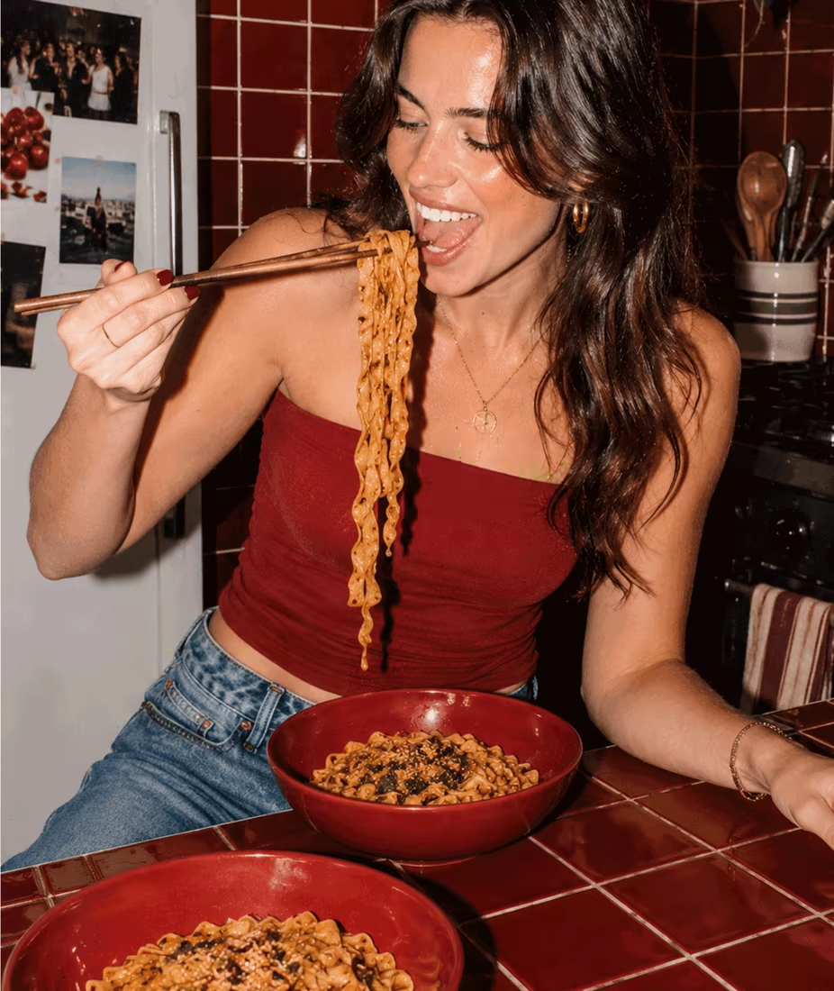
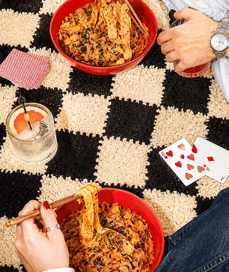
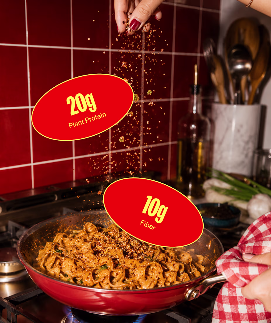
The best campaigns make you wish you were there.
That's why flash photography is everywhere right now.
Hard shadows, blown highlights, awkward crops...
The photos don't feel like someone spent six hours art directing every detail (even though they probably did). They feel like...
So excited for this one!
NEW PAID PROJECT
Sabrina PolancoMilika Pillmann
People keep comparing AI tools like they’re all built for the same thing.
They’re not.
The creatives who figure that out early are going to have a massive advantage.
The conversation around AI is still so focused on aesthetics that people ignore the operational side of creativity.
...
Oooh very excited that Contra and Google Stitch just announced this challenge
One of the most interesting shifts happening in creative workflows right now is the move from static outputs to interactive systems.
Also… $10k prize pool.
Curious to see what people build 👀
brb gotta start working on my submission