Roberto De Simone
Creative Director | Brand Identity & Packaging Design



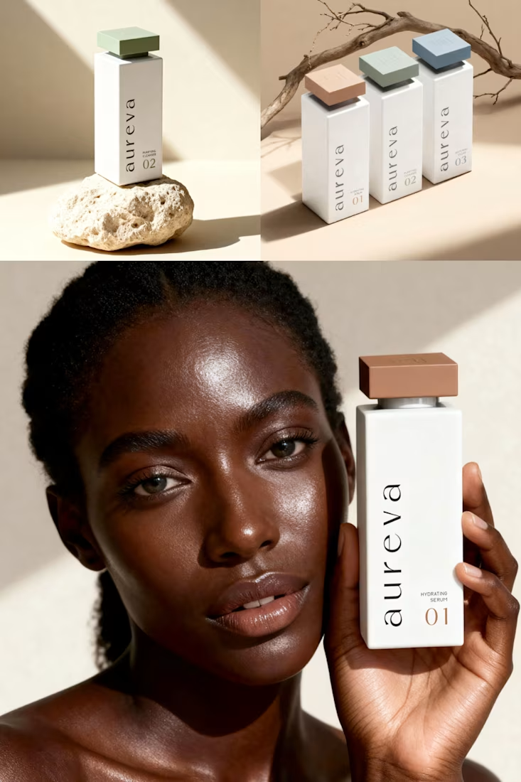
A closer look at Aureva, a Paris-based skincare brand I worked on.
The brief was to create a brand identity and packaging that felt premium yet approachable. I paired distinctive typography with soft earth tones, using color to give each product its own place within the range.
The full case study is now on my profile.
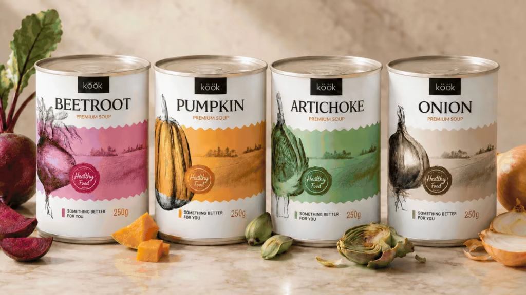
Sharing KÖÖK, a vegetable soup brand I worked on for a client in Portland.
The idea was to bring the warmth of homemade soup into a canned range. I put the vegetables at the center of the packaging, using botanical illustrations and a different color for each recipe. Something...
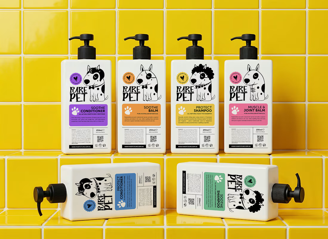
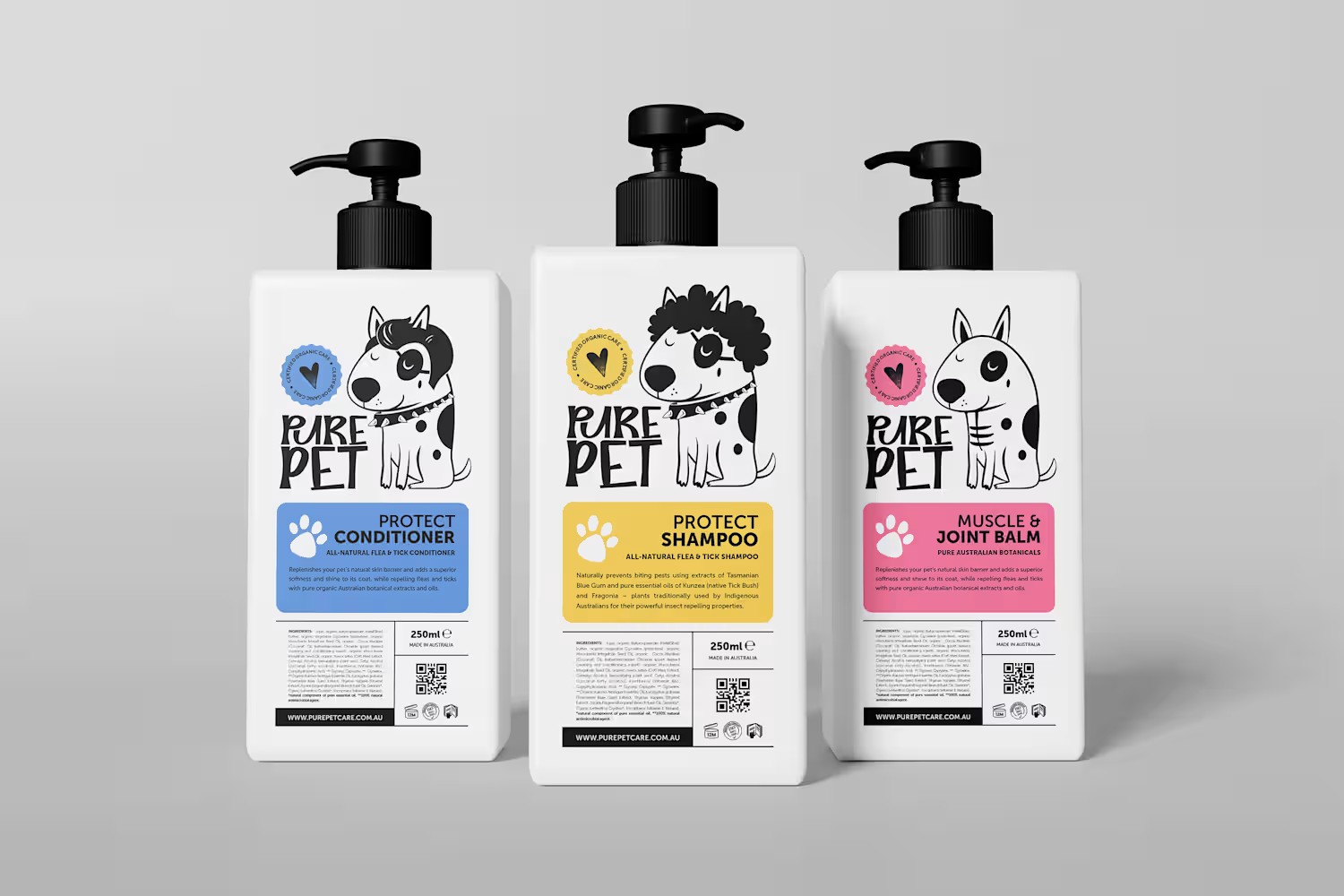
Pure Pet needed its dog care range to feel trustworthy and premium, while still being friendly and approachable.
I paired hand-drawn dog illustrations with bold colors and clear packaging layouts, giving each product its own personality while keeping the range connected.
First small project on Contra! 🎉 🚀 🙌
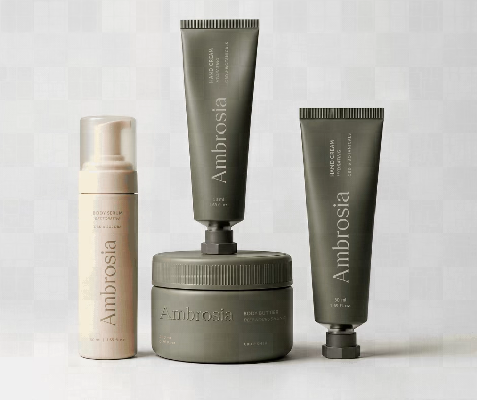
Ambrosia - Bodycare Brand Identity & Packaging
My favorite part of this branding and packaging project was working with the different materials. The dark glass, aluminum, and soft paper each bring something different, so I kept the typography and labels simple to help everything sit together.