The network for creativity
Join 1.25M professional creatives like you
Connect with clients, get discovered, and run your business 100% commission-free
Creatives on Contra have earned over $150M and we are just getting started
Back to feedPost

Fuchs Real Estate - Switzerland. Still no house-shaped logo. 🦊
For Fuchs, I wanted an identity that feels confident and approachable. The name gave me the fox and its angular shapes gave me a connection to architecture.
Orange brings warmth and a bit of boldness, balanced by cream, charcoal and simple typography. Those same shapes and colours run through the whole identity, so the brand feels familiar even when the logo takes a back seat.
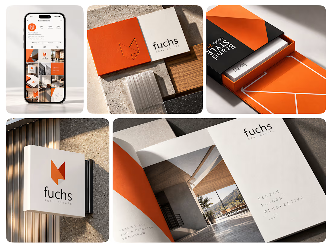

The negative space and angular geometry in that mark are so satisfying. It feels authoritative yet modern, and looks great across the editorial print spreads and mobile UI. Great identity work, Roberto!
The network for creativity
Join 1.25M professional creatives like you
Connect with clients, get discovered, and run your business 100% commission-free
Creatives on Contra have earned over $150M and we are just getting started



Related posts

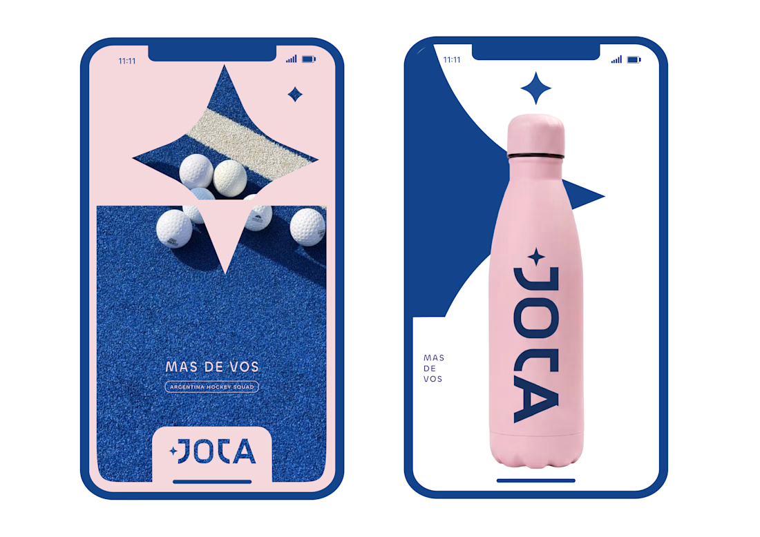
JOTA is an Argentine field hockey brand built for players who play with personality. The founder reached out to rethink how the brand shows up beyond the stick itself.


Wow project

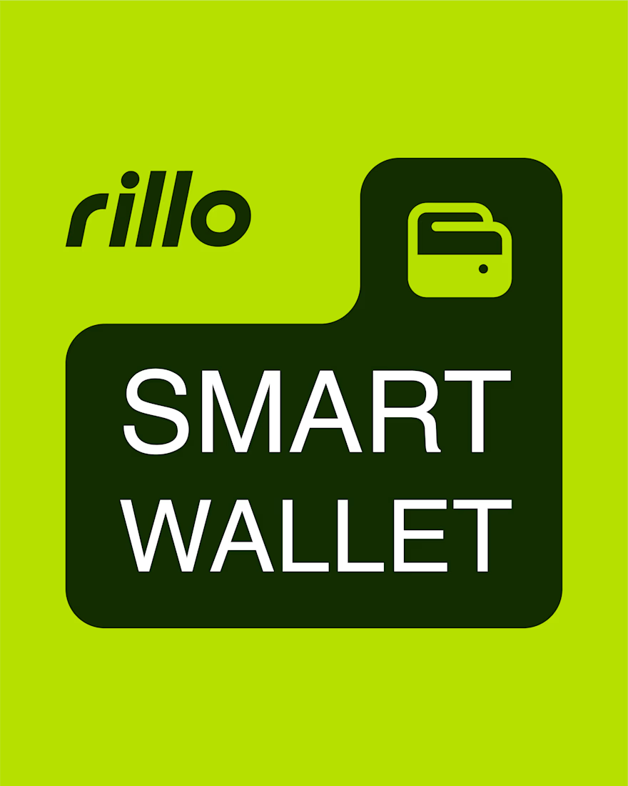
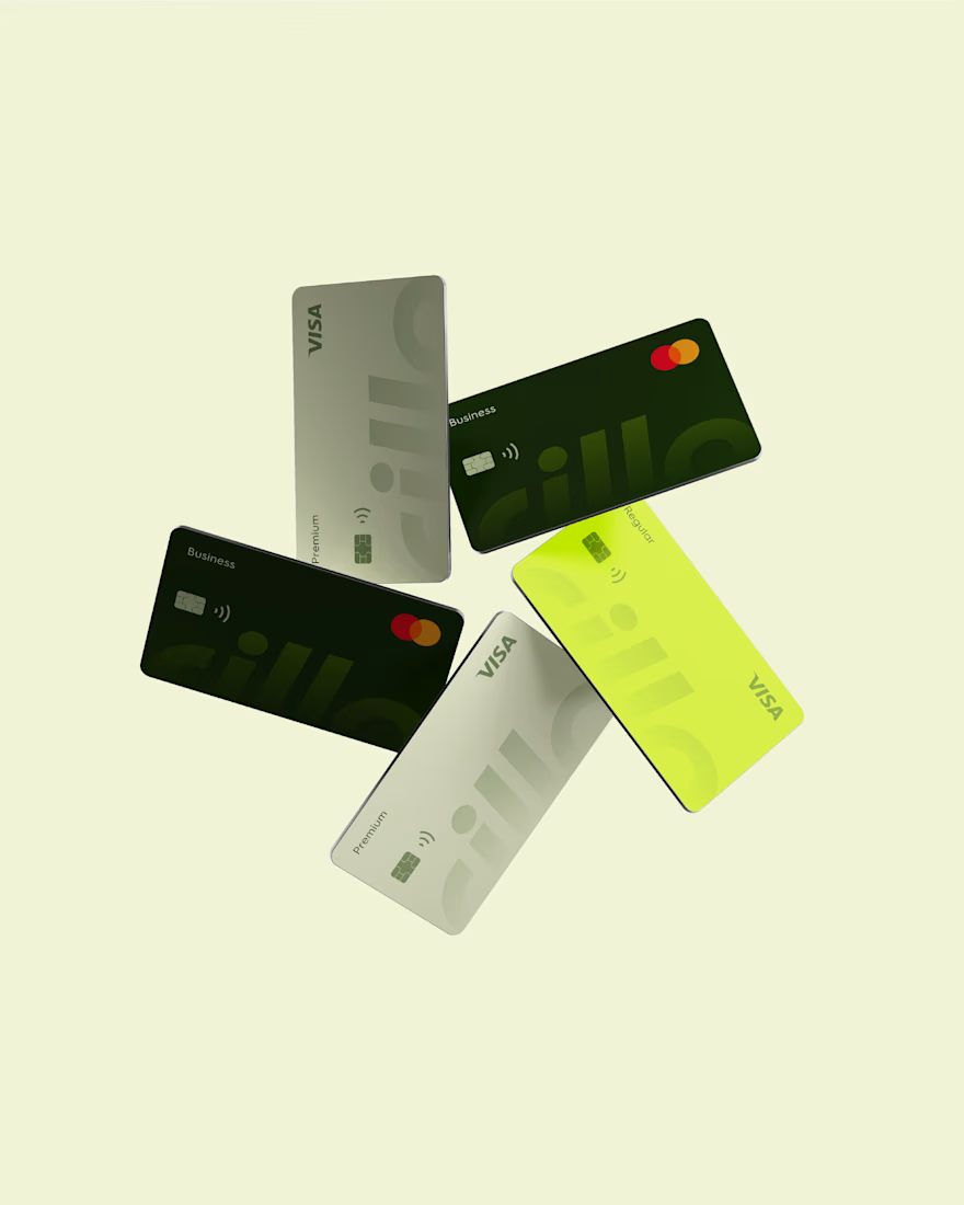
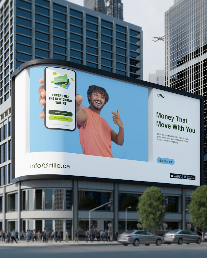
Rillo — A Modern Fintech Brand Identity
Exploring lime green, geometric typography, and a connected visual system across cards, interfaces, and everyday brand touchpoints.
A self-initiated fintech brand concept.
Explore the full case study:
https://contra.com/p/ce7sY6kZ-rillo-fintech-brand-redesign


Great work

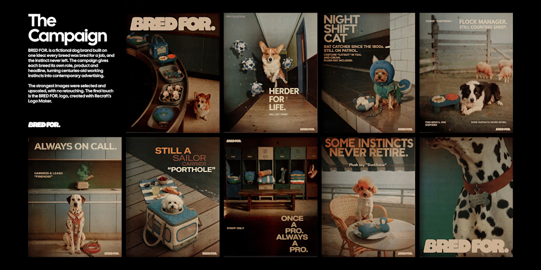
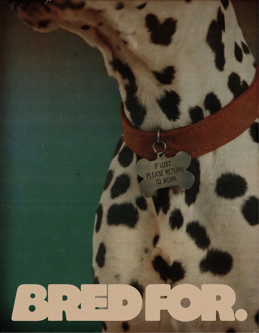
BRED FOR. is a fictional dog brand built on one idea: every breed was bred for a job, and the instinct never left. Collies herded sheep, poodles retrieved ducks, Yorkies hunted rats, Dalmatians ran beside fire carriages, so each product turns a breed's original work into an everyday object.
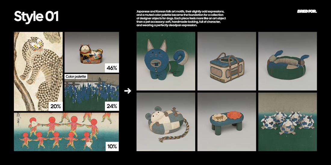
Style 01 is built from Japanese and Korean folk art found at the Cleveland Museum of Art, The Met, LACMA and the Rijksmuseum, and designs the products as soft, deadpan designer objects.
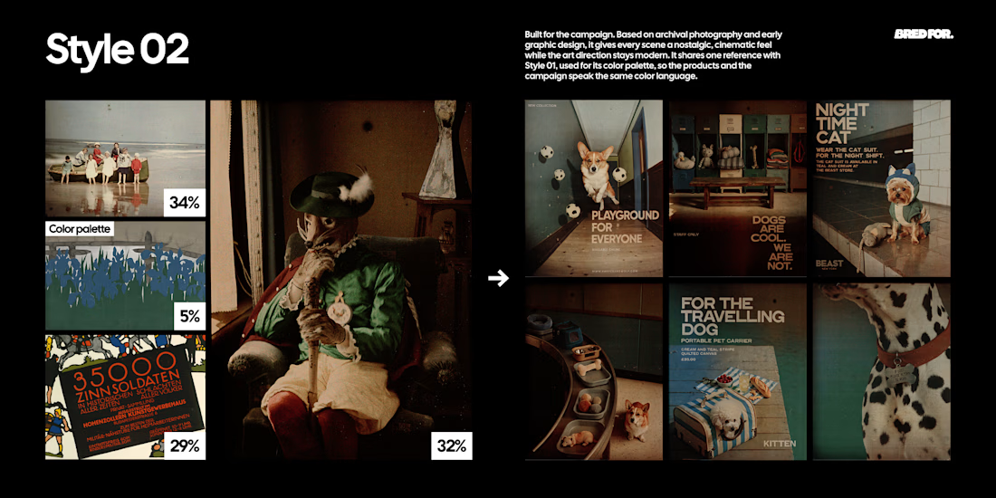
Style 02 is built from early colour autochromes and a 1914 lithographic poster from the Rijksmuseum and the Albertina, and turns every scene into a modern fashion campaign with an archival feel.
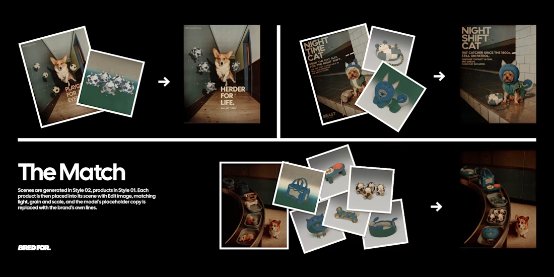
The two Styles were chained with Edit image: Style 01 products placed into Style 02 scenes, every headline rewritten in the brand's dry, deadpan voice. The strongest images were selected, upscaled and finished with a logo made in Recraft Logo Maker.
Style 01 (products): https://www.recraft.ai/styles/b8e1a6b6-ae61-49db-907d-74229530b596
Style 02 (campaign): https://www.recraft.ai/styles/7f2a89de-d69a-4fad-aa0d-ba6302c9a2f3