
Ricardo Gantschnigg
I create distinctive brands through strategy and CGI.


2025 3D Showcase
3
77
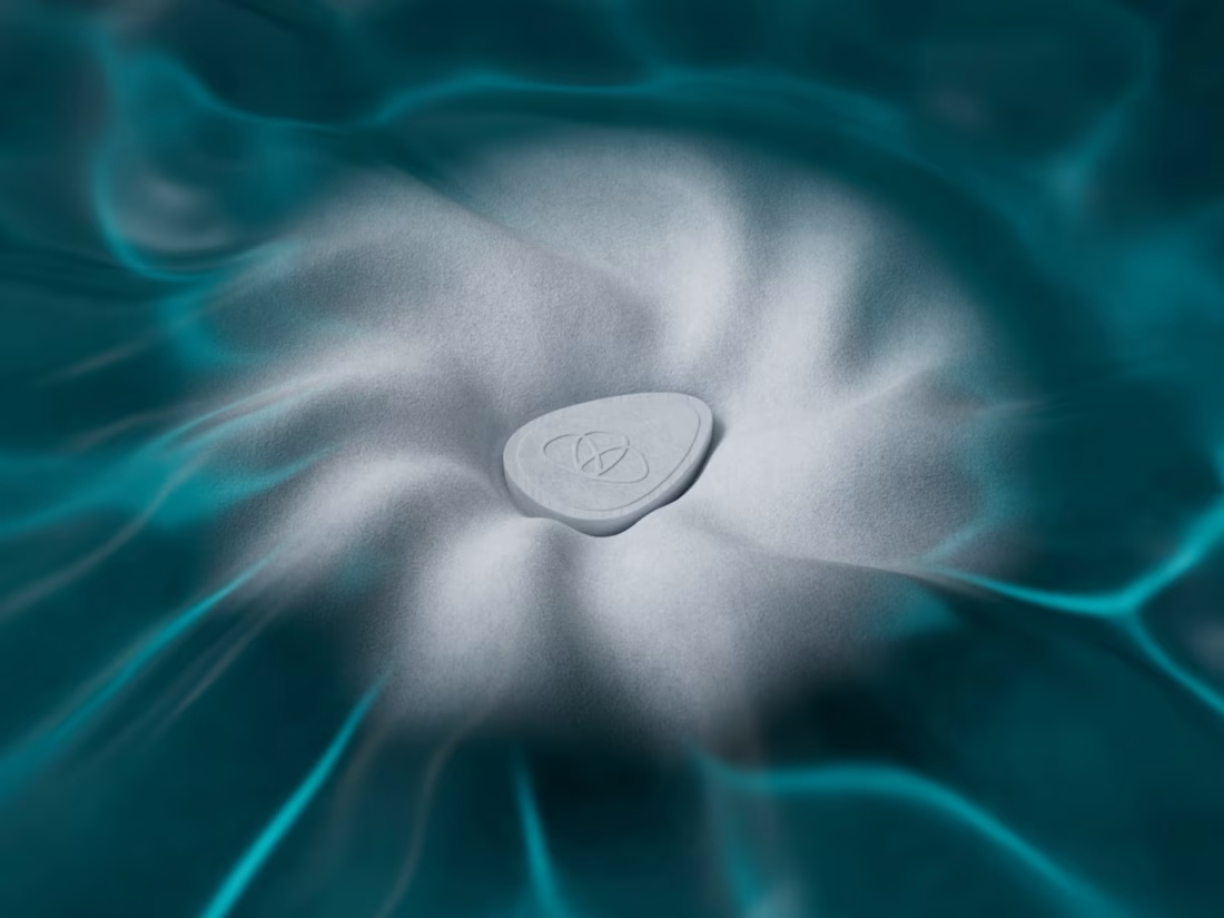
Towello transforms handwashing at the table into a refined and sensory ritual. When the compact Blooming Towel comes into contact with water, it unfolds into a fresh, soft towel.
The visual concept focuses on this moment of transformation. Inspired by the first contact between water and the product, an abstract liquid surface gradually becomes fabric—translating freshness, purity and tactility into a distinctive visual experience.
The project combined art direction and CGI to create a cohesive visual world for the product. A central key visual, atmospheric product renderings and a short teaser animation present Towello in a modern and premium way while making its unusual functionality immediately understandable.
Created in collaboration with Fabian Gwiggner, who led the brand design and project direction.
1
65
Cybersecurity is often visualized through familiar clichés: dark hackers, warning signs, locks and shields. For this edition of Salzburg University of Applied Sciences’ digital “warum!” magazine, the challenge was to communicate security differently—as something positive, trustworthy and connected.
The concept centers on a familiar safety buckle whose strap is woven from flowing streams of data. As the data comes together and locks into place, an abstract digital process becomes a clear and relatable moment of protection.
The project combined concept development, art direction and CGI to create a distinctive editorial cover that communicates a complex technological topic without relying on fear or threat-based imagery. Developed for both static and animated use, the visual introduces the magazine’s central theme while translating digital security into a simple, memorable metaphor.
3
4
135
The sustainability strategy of Salzburg University of Applied Sciences is built around six interconnected areas of action.
The challenge was to translate this complex strategic framework into a clear and engaging cover illustration for the university’s digital “warum!” magazine.
The concept visualizes sustainability as a system in which every element influences and supports the others. Six individual forms come together to create a connected structure, demonstrating that meaningful change can only happen when all areas work in unison.
The project combined conceptual development, art direction and CGI to create a distinctive editorial visual that communicates an abstract topic in an accessible and memorable way. The illustration was developed as both a static cover image and an animated digital experience.
2
5
138