
Priyanka - Brand Designer
Brand identity that stops the scroll, sticks in the head.
- 1
- Followers

Behind the scenes of ZYVRA’s moisturiser tube label design 🧴✨Created to bring ZYVRA’s skincare personality to the shelf through a bold visual style, playful fruit-inspired mascot and clear product details that catch the eye.
A little more personality. A lot less ordinary. 👀Would you pick it up?
Building a CPG skincare brand? Let’s make your packaging stand out.
0
11
A BTS look at ZYVRA’s serum label design 🧴⚡Designed with a CPG mindset packaging that communicates fast, stands out in a crowded skincare shelf and makes the product want to pick it up. Bold colours, fruit charged mascot and a label system made for instant recognition.
No boring skincare packaging here.
0
18
Let’s build the logo for a skincare brand that refuses to look like every other skincare brand. 🍋🍊🍉
For ZYVRA, the logo needed to feel bold, energetic, expressive, and instantly recognisable while still being flexible enough to work across packaging, social content and the wider visual identity.
I started with the brand strategy and moodboard, explored different lettering styles and directions, and then refined the forms until I found something that felt like ZYVRA confident, playful and full of energy.
The final logo direction became the foundation for the rest of the identity, from bold typography and vibrant colours to the expressive packaging system.
Brand personality:
Bold • Energetic • Expressive • Modern
This is why I believe a logo should be more than just a visual mark. It should come from the strategy and personality of the brand and give the rest of the identity a clear direction.
0
42
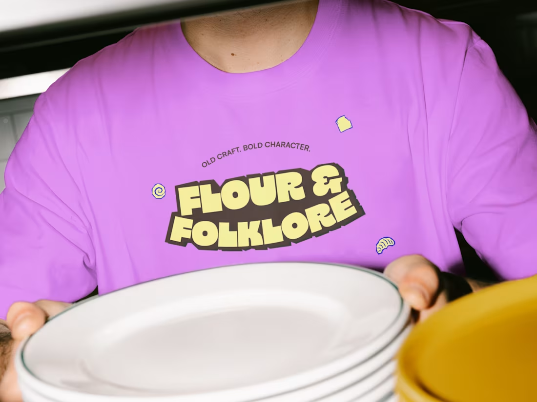
Flour & Folklore - Bread Bakery ( brand identity & packaging )
0
5