
Great products deserve a presentation that makes people want to experience them.
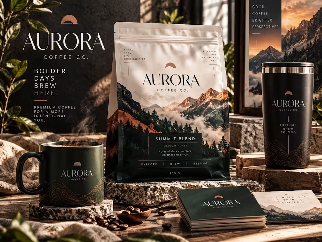
AURORA Coffee Co. is a self-initiated premium coffee brand concept designed to explore how sophisticated product mockups can transform everyday packaging into a compelling visual experience.
The project brings together a beautifully presented coffee pouch, branded drinkware, and coordinated stationery in one cohesive, photorealistic composition. Every element was art-directed to communicate craftsmanship, quality, and an elevated lifestyle.
Warm natural lighting, rich forest-green tones, earthy copper accents, and rugged mountain imagery establish a distinctive premium identity. Carefully arranged products, realistic materials, and layered environmental details create depth while keeping the packaging at the center of attention.
The creative objective: To demonstrate how thoughtful product presentation can make a brand feel more established, recognizable, and desirable before a customer ever holds the product.
This concept showcases my approach to premium product visualization, cohesive branding, and AI-assisted creative art direction.
Project type: Self-initiated portfolio concept
Creative focus: Product mockups, packaging presentation, visual branding, and commercial-style product imagery.
1
34
Fashion isn't just what you wear. It's how you command attention.
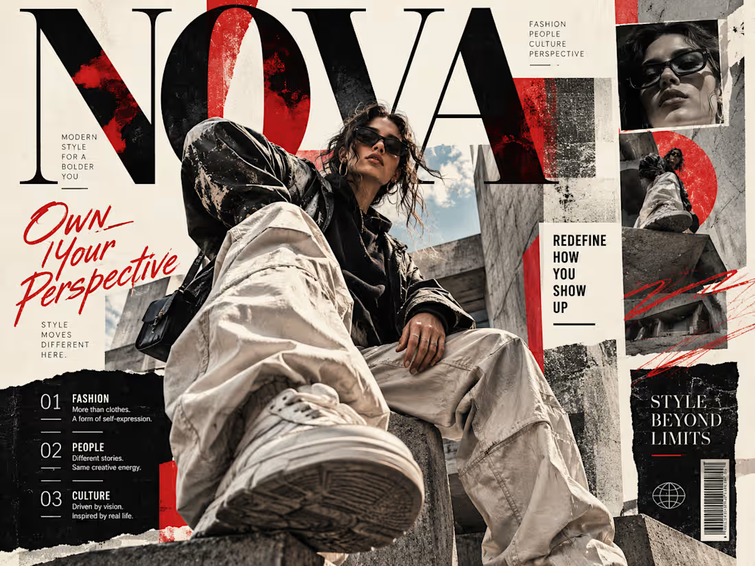
NOVA is a self-initiated fashion editorial concept designed to capture the confidence, individuality, and rebellious energy of contemporary streetwear.
The visual combines dramatic low-angle fashion photography, oversized editorial typography, distressed textures, and layered magazine-style compositions to create a bold, high-impact statement.
A striking black, cream, and red palette reinforces the rebellious aesthetic, while intentional typography and photographic layering guide the viewer's attention across the composition.
The objective was to create more than an attractive poster: a distinctive editorial visual that feels worthy of a contemporary fashion publication while demonstrating how strong art direction can give a concept its own visual identity.
1
39
A brand built to make complexity feel effortless.
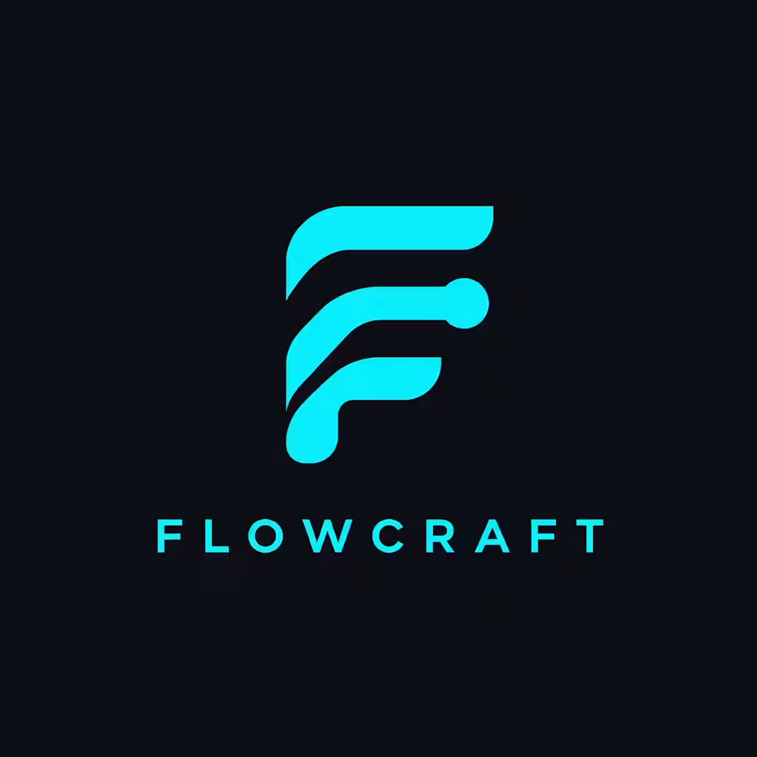
Flowcraft is a self-initiated visual identity project for a creator-focused automation brand. The goal was to establish a distinctive, modern presence that communicates connection, clarity, and forward movement in a digital-first environment.
The identity centers on a flowing, geometric F-inspired symbol paired with clean, widely spaced typography. Vibrant cyan creates immediate contrast against a deep charcoal background, giving the brand a confident, technology-focused personality without overwhelming the design.
The result is a streamlined logo concept designed to feel recognizable, adaptable, and visually consistent across digital brand touchpoints.
1
43
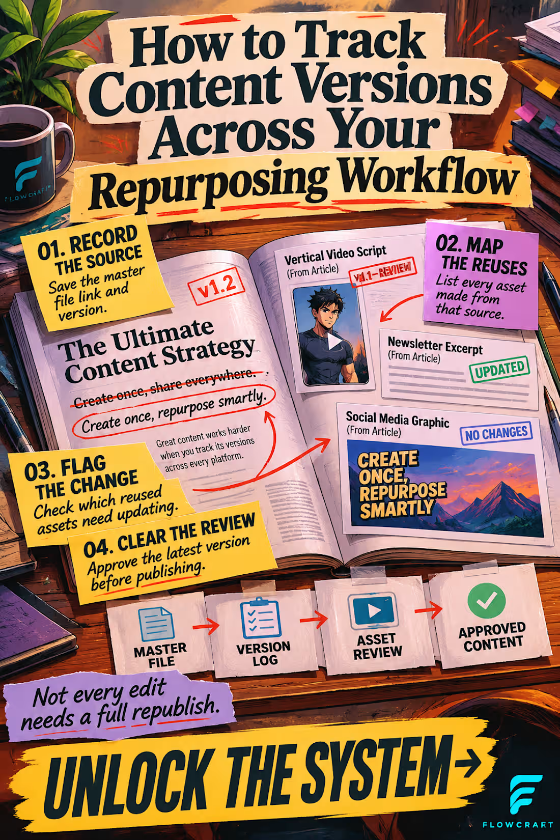
Complex information doesn't have to look complicated.
This self-initiated Pinterest infographic for Flowcraft transforms a multi-step content repurposing workflow into a visually engaging editorial experience.
Instead of relying on conventional infographic boxes, the design uses an illustrated workspace, layered paper elements, expressive typography, and directional storytelling to guide the viewer from tracking original content to managing revisions and publishing approved assets.
The warm editorial palette creates visual energy, while contrasting labels and oversized headlines establish a clear reading hierarchy. Every design choice supports one goal: making useful information easier to notice, understand, and remember.
This project showcases my approach to creating distinctive Pinterest graphics that combine educational value with compelling visual communication.
1
42