The network for creativity
Join 1.25M professional creatives like you
Connect with clients, get discovered, and run your business 100% commission-free
Creatives on Contra have earned over $150M and we are just getting started
Back to feedPost

The Daily Grind Café — Creative Coffee Shop Poster & Flyer Design
Posters & Flyers | Coffee Shop Advertising | Hospitality Graphic Design
Project Overview
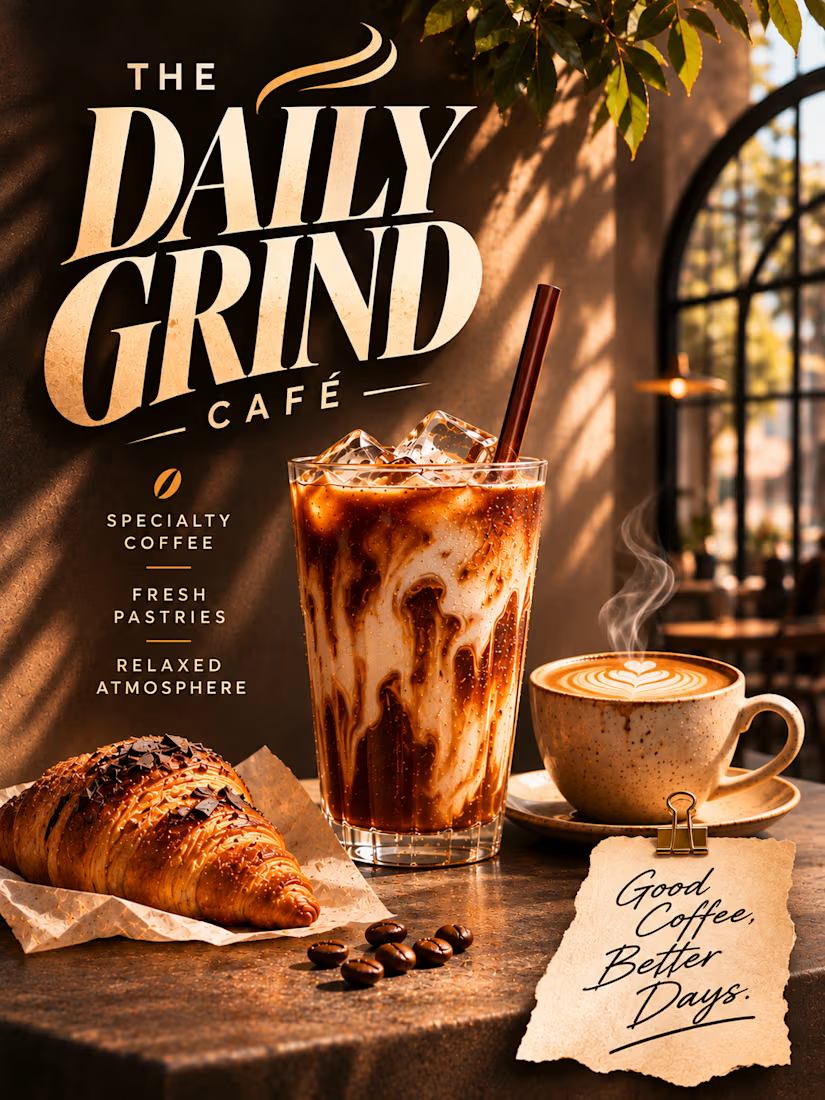
The Daily Grind Café is a self-initiated poster and flyer design concept developed for a fictional specialty coffee shop centered around quality beverages, fresh pastries, and a welcoming café experience.
The project explores how expressive typography, cinematic product photography, and carefully considered editorial art direction can transform a familiar coffee shop advertisement into a distinctive piece of visual communication.
The creative objective was to design a poster that immediately communicates the café's personality while creating an inviting atmosphere that encourages viewers to imagine themselves enjoying the experience.
Rather than relying on conventional promotional graphics, crowded menus, or excessive information, the design emphasizes a small number of carefully chosen elements: an impactful headline, beautifully presented coffee, an appetizing pastry, and concise supporting messages.
The finished composition balances visual richness with clarity, demonstrating how a restrained layout can still feel expressive, premium, and memorable.
Creative Concept & Visual Storytelling
The creative direction is built around the idea “Good Coffee, Better Days.”
This message positions the café as more than a place to purchase coffee. It represents a welcoming environment where customers can slow down, enjoy quality beverages, and appreciate simple everyday moments.
The scene features a chilled iced coffee with rich espresso-and-milk swirls, a freshly prepared latte with delicate heart-shaped latte art, and a golden chocolate-drizzled croissant.
These three elements establish the café's core offerings while creating a visually appealing lifestyle moment.
The products are arranged on a textured stone café table, illuminated by warm natural sunlight filtering through an arched window.
Soft greenery, subtle architectural details, and blurred café furniture provide environmental context without overwhelming the composition.
The result is a sophisticated visual narrative that communicates warmth, comfort, freshness, and relaxed hospitality.
Typography & Visual Hierarchy
Typography is the defining feature of the poster.
The café name, THE DAILY GRIND CAFÉ, dominates the upper-left portion of the artwork through oversized, high-contrast serif lettering.
The words DAILY GRIND use dramatic proportions, sharp letterforms, and tightly controlled spacing to create a bold editorial statement.
A subtle steam-inspired flourish introduces movement and connects the typography to the café theme.
The word CAFÉ appears beneath the main headline in smaller, widely spaced lettering, creating a clear hierarchy while preserving the impact of the primary typography.
The headline's cream color contrasts strongly with the dark background, ensuring immediate readability.
This approach creates a recognizable typographic identity without relying on excessive decorative elements.
Supporting Information & Messaging
Beneath the main headline, three concise statements communicate the café's core offering:
SPECIALTY COFFEE
FRESH PASTRIES
RELAXED ATMOSPHERE
These phrases are arranged vertically in clean uppercase lettering, separated by delicate gold rules.
A small coffee-bean symbol introduces a subtle visual reference to the café's specialty without competing with the typography.
The supporting information is intentionally concise, allowing viewers to understand the café's appeal at a glance.
A textured paper note positioned near the bottom-right corner introduces the message:
Good Coffee, Better Days.
The handwritten lettering creates a softer, more personal contrast to the structured headline typography.
Together, these elements balance strong visual impact with an approachable, human tone.
Color Palette & Art Direction
The visual palette is inspired by the natural colors of coffee, warm café interiors, and freshly baked pastries.
Espresso Brown: Establishes the rich, atmospheric background and provides strong contrast for the typography.
Warm Cream: Creates an elegant, highly readable headline while complementing the latte foam and pastry tones.
Caramel Gold: Introduces warmth through the coffee, sunlight, and subtle graphic accents.
Toasted Amber: Reinforces the appetizing quality of the croissant and the inviting café environment.
Natural Green: Adds freshness through the surrounding foliage and soft environmental details.
The palette feels cohesive and welcoming while supporting the premium editorial character of the design.
Photography & Product Styling
The photography-inspired product presentation plays an essential role in establishing the café's appeal.
The iced coffee is rendered with visible ice cubes, rich coffee-and-milk marbling, and subtle condensation.
Its tall glass and dark straw create a strong vertical form that complements the headline typography.
Beside it, a ceramic latte cup features carefully detailed heart-shaped latte art, communicating craftsmanship and attention to detail.
The croissant introduces an additional tactile element through its flaky golden layers, chocolate drizzle, and glossy baked surface.
Warm directional lighting emphasizes the textures of the beverages and pastry, making the products feel inviting and visually appealing.
The surrounding stone table, scattered coffee beans, and subtle environmental details contribute to a believable café atmosphere.
Composition & Layout
The composition is designed around three primary focal areas.
The Typographic Identity
The oversized café name establishes immediate recognition and occupies the upper-left section.
The Product Presentation
The iced coffee, latte, and croissant occupy the central and lower portions, creating an appetizing visual narrative.
The Supporting Message
The café offerings and handwritten note provide context while maintaining the poster's clean editorial character.
The layout uses controlled spacing to prevent visual overcrowding.
Rather than introducing unnecessary objects or decorative graphics, the composition allows the typography, products, and atmosphere to carry the visual story.
The result is a balanced advertisement that feels sophisticated without becoming overly minimal.
Editorial Details & Atmosphere
Several subtle design elements contribute to the finished aesthetic.
The arched window introduces architectural depth and creates a recognizable café setting.
Warm sunlight casts natural shadows across the textured wall and table.
Soft foliage adds organic framing and visual freshness.
The handwritten paper note creates a tactile editorial detail while reinforcing the café's personality.
The ceramic latte cup, textured table, and pastry presentation contribute to a sense of authenticity.
These elements work together to create an environment that feels inviting and visually cohesive.
Design Applications
The concept demonstrates a visual direction suitable for a range of hospitality marketing materials, including:
Coffee shop advertising posters
Printed café flyers
In-store promotional displays
Specialty coffee campaigns
Social media café advertisements
Coffee shop website visuals
Seasonal beverage promotions
Hospitality brand presentations
The design showcases how a consistent visual approach can communicate both product quality and brand atmosphere.
Final Design Outcome
The completed Daily Grind Café project demonstrates an approach to Posters & Flyers that combines expressive editorial typography, realistic food and beverage imagery, atmospheric lighting, and clear visual communication.
Its strongest characteristics are the oversized typographic headline, inviting product presentation, balanced composition, and cohesive café art direction.
Developed as a self-initiated portfolio concept, the project showcases the ability to create hospitality advertising that feels visually distinctive, commercially relevant, and emotionally inviting.
The Daily Grind Café — Good Coffee, Better Days.


The network for creativity
Join 1.25M professional creatives like you
Connect with clients, get discovered, and run your business 100% commission-free
Creatives on Contra have earned over $150M and we are just getting started



Related posts

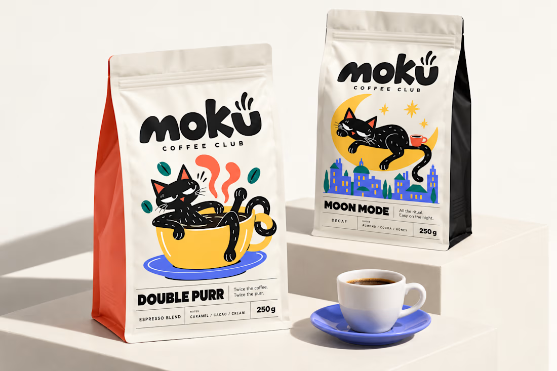
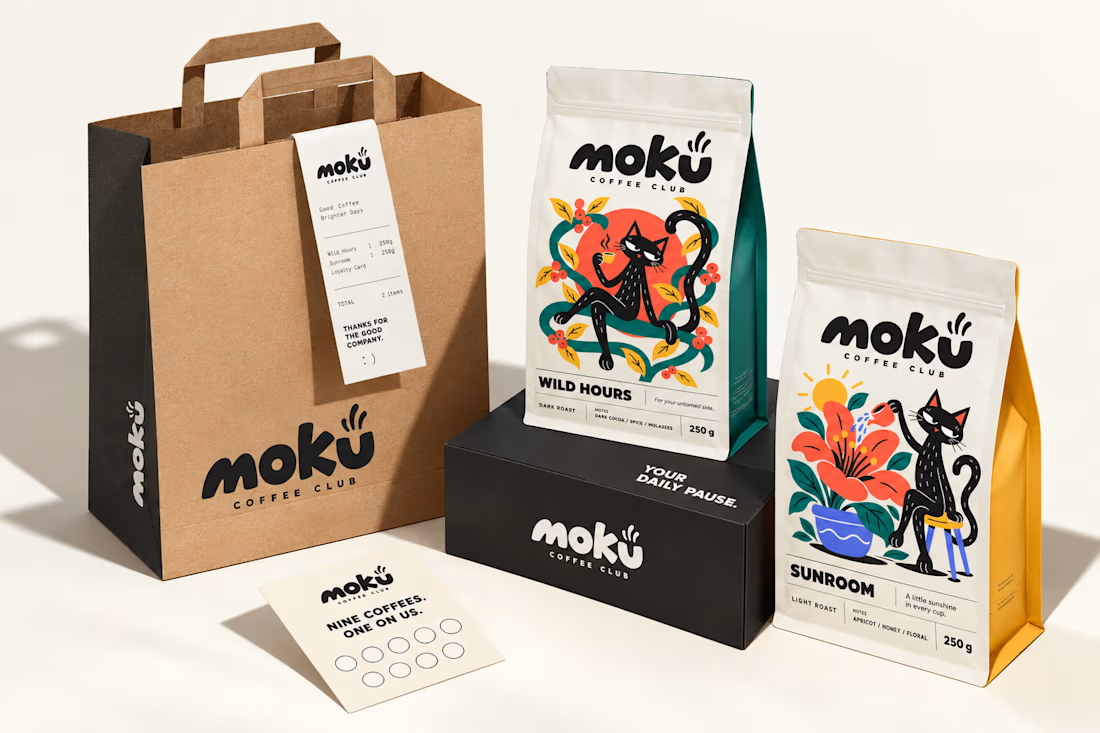
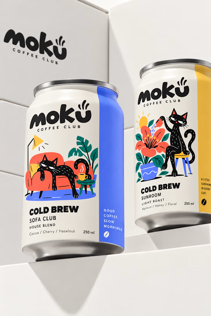
What if coffee packaging had a personality? 🐾
I designed Moku’s whole world, from bags and cold brew cans to drip packs and cups, around a cat who’s always having a better day than you.
See the full project and let me know what you think!


Woow Jerin that's stunning🔥🔥
The colors was so vibrant that's unbelievable


New project in progress: the website for Adara, a residential architecture and planning practice in London. We'll post updates as the build comes together.
First, the services section on the homepage. As you scroll, the house comes apart floor by floor, and each service opens on the right, from planning advice to building regulations.


More screens for mystical tarot reading app concept, inspired by a little spooky season magic 🎃🔮


