
Phiwe Dlamini
Graphic Designer | Visuals That Make Brands Stand Out
- 1
- Followers

VELA — A Study in Movement
Avant-Garde Fashion Poster | Experimental Editorial Design | Luxury Womenswear Campaign
Project Overview
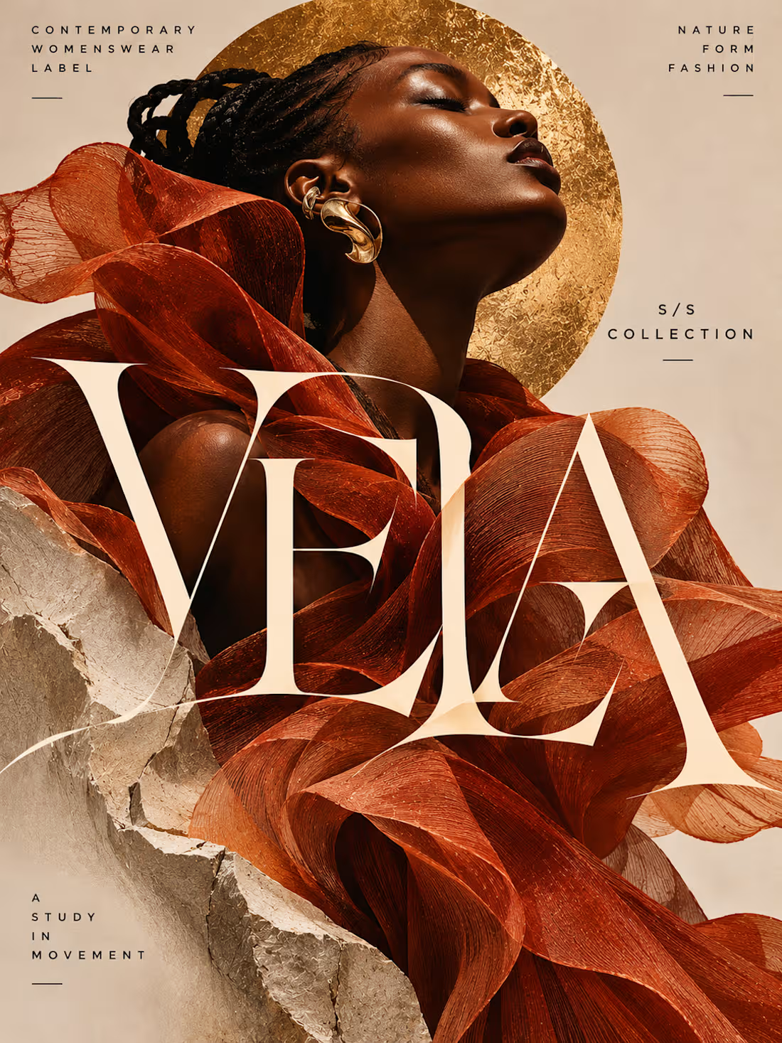
VELA is a self-initiated fashion poster and editorial campaign concept developed for a fictional contemporary womenswear label.
The project explores the intersection of fashion, sculpture, movement, and visual identity through a striking combination of expressive garment construction, high-fashion portraiture, architectural materials, and experimental typography.
The creative objective was to produce an editorial campaign that feels artistic, contemporary, and visually commanding while maintaining the restraint and sophistication associated with luxury fashion publications.
Rather than relying on conventional advertising layouts, decorative graphics, or excessive promotional messaging, the composition treats the model, garment, typography, and surrounding materials as interconnected parts of a single visual statement.
The result is an immersive fashion editorial that communicates individuality, elegance, and creative expression.
Creative Concept — A Study in Movement
The central concept is built around the relationship between fashion and motion.
Clothing becomes movement. Movement becomes form.
VELA imagines fashion as an evolving sculptural experience rather than a static collection of garments.
The central figure wears an extraordinary terracotta-colored ensemble composed of flowing, translucent fabric structures that twist and curve around the body.
The fabric appears almost weightless, creating dramatic organic forms that suggest motion even within a still image.
These fluid shapes contrast with the rigid, fractured stone elements surrounding the model, establishing a visual dialogue between softness and structure.
The concept celebrates the ability of fashion to transform the human silhouette into an expressive work of art.
Fashion Photography & Art Direction
The photography-inspired art direction draws from contemporary luxury fashion campaigns, experimental runway photography, and sculptural editorial imagery.
A striking Black female model anchors the composition through a powerful close-up portrait.
Her head is tilted upward, with her eyes gently closed, creating an expression of confidence, serenity, and artistic independence.
Intricately styled braids and sculptural gold earrings complement the avant-garde garment without distracting from its dramatic silhouette.
Warm directional lighting highlights the natural contours of the face and emphasizes the translucent textures of the fabric.
A large textured gold circle frames the model's head, creating a strong geometric contrast against the organic movement of the garment.
The background remains minimal, allowing the fashion styling and typographic elements to dominate the composition.
Experimental Typography
Typography is one of the defining elements of the project.
The brand name VELA appears in enormous, high-contrast serif lettering that stretches across the composition and overlaps the flowing garment.
Rather than functioning as a conventional headline placed above the photograph, the typography becomes an architectural element within the artwork.
The letterforms interact with the fabric, introducing depth, tension, and movement.
The exaggerated proportions and elegant stroke contrast create a sophisticated yet experimental visual identity.
The typography is deliberately oversized, allowing the brand name to become one of the primary visual subjects.
Despite the unconventional scale and overlapping treatment, the wordmark remains recognizable.
This approach demonstrates how editorial typography can become an expressive part of the visual narrative rather than simply communicating information.
Editorial Information Hierarchy
The artwork incorporates a restrained collection of supporting typographic details.
CONTEMPORARY WOMENSWEAR LABEL
Positioned in the upper-left corner, this establishes the brand's identity and fashion category.
NATURE FORM FASHION
Placed in the upper-right corner, this reinforces the relationship between organic materials, sculptural design, and fashion expression.
S/S COLLECTION
Positioned along the right side, this introduces the seasonal collection context.
A STUDY IN MOVEMENT
Placed near the lower-left corner, this acts as the campaign's defining creative statement.
These supporting details use clean uppercase sans-serif lettering with generous spacing.
Their restrained scale creates contrast with the enormous VELA wordmark, maintaining a clear editorial hierarchy.
Color Palette & Visual Identity
The campaign uses a warm, carefully controlled palette inspired by natural materials, contemporary sculpture, and luxury fashion.
Burnt Terracotta — #A84925
Introduces expressive warmth and becomes the primary color of the sculptural garment.
Antique Gold — #C59A47
Creates a luminous focal point through the textured circular form and sculptural jewelry.
Warm Sand — #DCC9B4
Establishes a soft neutral background that complements the fashion imagery.
Stone Ivory — #E8DED0
Reinforces the architectural character of the fractured stone elements.
Deep Espresso — #211711
Provides contrast through the supporting typography and natural shadows.
The palette is intentionally limited, allowing the garment's shape, material textures, and typographic experimentation to establish visual impact.
Composition & Visual Balance
The composition is structured around four interconnected elements.
The Editorial Portrait
The model's upward-facing profile creates an elegant focal point and establishes the emotional tone of the campaign.
The Sculptural Garment
The flowing terracotta fabric occupies much of the composition, creating dramatic movement and organic visual rhythm.
The Experimental Wordmark
The oversized VELA lettering overlaps the garment, introducing architectural scale and typographic tension.
The Supporting Materials
Fractured stone surfaces and the textured gold circle create contrast, depth, and a refined sculptural atmosphere.
The interaction between these elements produces a visually rich composition without relying on unnecessary decorative graphics.
Negative space around the supporting editorial text helps maintain balance and readability.
Minimalism Through Material & Form
Although the composition is visually expressive, the overall design remains restrained.
The artwork uses a limited number of elements, allowing each component to contribute meaningfully to the visual narrative.
The flowing garment provides movement.
The fractured stone introduces structure.
The gold circle establishes geometric balance.
The oversized typography creates graphic impact.
Together, these elements communicate a cohesive concept without requiring excessive illustration, decorative effects, or promotional messaging.
This approach reflects the principle that experimental fashion design can achieve maximum visual impact through carefully controlled visual decisions.
Potential Campaign Applications
The concept could be adapted for a range of fashion and editorial applications, including:
Luxury fashion campaign posters
Womenswear collection announcements
Fashion magazine advertisements
Designer runway promotions
Fashion exhibition graphics
Editorial lookbook covers
Contemporary fashion publications
Digital fashion campaign visuals
The artwork demonstrates how experimental typography and sculptural fashion imagery can create a distinctive visual identity for a contemporary fashion campaign.
Final Design Outcome
The completed VELA campaign demonstrates an approach to Posters & Flyers that combines avant-garde fashion photography, sculptural styling, experimental typography, and refined editorial composition.
Its strongest characteristics are the commanding fashion portrait, flowing garment construction, oversized typography, restrained color palette, and sophisticated interplay between organic and architectural forms.
Created as a self-initiated portfolio concept, the project showcases the ability to develop fashion advertising that feels artistic, luxurious, and visually distinctive.
VELA — A Study in Movement.
1
36
FORMA — The Art of Wear
Experimental Fashion Editorial Poster | Luxury Campaign Design | Contemporary Typography
Project Overview
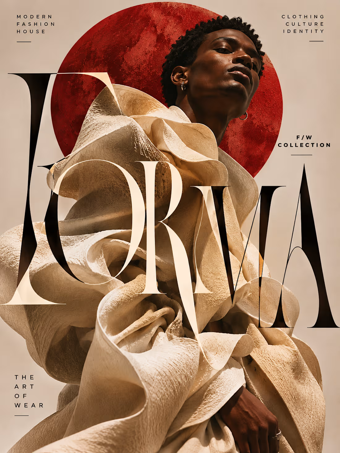
FORMA is a self-initiated fashion editorial poster concept developed for a fictional contemporary fashion house exploring the relationship between clothing, sculpture, identity, and visual expression.
The project was conceived as an experimental fashion campaign that challenges the conventions of traditional promotional design.
Rather than relying on predictable fashion advertising layouts, conventional product photography, or heavily decorated compositions, the artwork treats typography, photography, and garment construction as interconnected design elements.
The creative objective was to develop a visually arresting campaign poster with the sophistication of a luxury fashion publication and the expressive energy of contemporary experimental graphic design.
The resulting composition balances dramatic visual impact with a carefully controlled editorial aesthetic.
Creative Concept — The Art of Wear
The central creative concept is built around the idea that fashion can exist beyond conventional clothing.
Fashion becomes form. Form becomes identity.
The campaign presents clothing as a sculptural medium capable of transforming the human silhouette into an expressive architectural composition.
At the center of the artwork, a male fashion model wears an extraordinary ivory garment constructed from exaggerated folds, layered fabric, and voluminous sculptural shapes.
The garment extends beyond traditional tailoring, creating an almost architectural structure around the body.
Its oversized forms establish an immediate connection between fashion design, contemporary sculpture, and experimental visual culture.
The model's confident expression and upward-facing pose introduce a sense of strength, individuality, and artistic independence.
Rather than functioning as a conventional clothing advertisement, the composition presents fashion as a form of creative expression.
Fashion Photography & Art Direction
The photography-inspired art direction draws from high-fashion editorial publications, conceptual runway campaigns, and contemporary art photography.
A close, slightly low-angle portrait establishes a commanding visual presence.
The model's face remains sharply defined, while the surrounding garment creates dramatic layers of volume, texture, and movement.
The ivory fabric features intricate surface detailing that catches the light, emphasizing the garment's sculptural construction.
A large textured crimson circle appears behind the model, creating a striking visual counterpoint to the neutral background.
This circular form introduces tension and depth while providing a strong compositional anchor.
The overall art direction remains intentionally restrained, allowing the model, garment, and typography to carry the visual narrative.
Experimental Typography
Typography is the defining feature of the FORMA campaign.
The brand name appears in enormous, high-contrast serif lettering that extends across the composition and overlaps the model's sculptural garment.
Rather than being placed neatly above or below the photograph, the letterforms become part of the visual architecture.
Some letters appear to pass behind the garment, while others stretch across the foreground.
This interaction creates a layered relationship between typography and photography, transforming the wordmark into a structural design element.
The typography uses extreme scale, elegant stroke contrast, unconventional spacing, and carefully controlled overlap to create a dramatic editorial statement.
Despite its experimental treatment, the brand name remains recognizable.
The design demonstrates how typography can move beyond information delivery and become an expressive visual subject in its own right.
Editorial Information Hierarchy
The artwork incorporates a small number of carefully positioned supporting statements.
MODERN FASHION HOUSE
Positioned in the upper-left corner, this establishes the brand's contemporary luxury positioning.
CLOTHING CULTURE IDENTITY
Placed in the upper-right corner, this reinforces the campaign's conceptual direction.
F/W COLLECTION
Positioned along the right side, this introduces the collection context while maintaining the composition's refined editorial character.
THE ART OF WEAR
Placed near the lower-left corner, this acts as the campaign's defining creative statement.
These supporting elements use restrained uppercase sans-serif typography with generous letter spacing.
Their understated presentation contrasts with the oversized FORMA wordmark, establishing a clear hierarchy between the primary visual statement and secondary information.
Color Palette & Visual Identity
The campaign uses a highly controlled palette designed to communicate luxury, artistic expression, and visual confidence.
Sculptural Ivory — #E8D8C2
Establishes the garment's architectural character and introduces a tactile, refined quality.
Warm Editorial Beige — #D8C6B5
Provides a subtle background that supports the model and typography without introducing unnecessary visual noise.
Oxide Crimson — #A5271B
Creates a powerful focal point through the large textured circular form.
Deep Black — #171310
Provides strong contrast for the experimental typography and supporting editorial details.
The palette is deliberately limited.
Rather than relying on multiple accent colors, the design creates visual energy through proportion, texture, contrast, and typography.
This restraint reinforces the sophisticated fashion-editorial aesthetic.
Composition & Visual Balance
The composition is built around three interconnected elements.
The Sculptural Fashion Silhouette
The oversized ivory garment occupies the majority of the artwork, creating a dramatic visual foundation.
The Experimental Wordmark
The enormous FORMA lettering overlaps the fashion imagery, introducing scale, tension, and visual movement.
The Editorial Supporting Details
Small typographic statements provide context and balance without competing with the primary elements.
The model's upward-facing pose creates a strong directional movement through the composition.
The crimson circular form provides a contrasting geometric structure, while the organic folds of the garment introduce fluidity.
The interaction between these elements creates a composition that feels visually complex without becoming overcrowded.
Minimalism Through Restraint
Although the typography is highly experimental, the overall design remains minimal in its use of visual elements.
There are no unnecessary decorative illustrations, promotional stickers, product descriptions, or excessive graphic effects.
The artwork relies on a single model, one extraordinary garment, one geometric background element, and a carefully considered typographic system.
This approach allows the design to achieve strong visual impact without sacrificing sophistication.
The contrast between oversized expressive typography and understated editorial details creates a distinctive balance between experimentation and refinement.
Potential Campaign Applications
The visual concept could be adapted for a range of fashion and editorial applications, including:
Luxury fashion campaign posters
Fashion magazine advertisements
Designer collection announcements
Runway presentation graphics
Editorial fashion spreads
Fashion exhibition promotions
Contemporary fashion lookbooks
Digital fashion campaign visuals
The project demonstrates how experimental graphic design can create a recognizable visual language for contemporary fashion communications.
Final Design Outcome
The completed FORMA campaign showcases an approach to Posters & Flyers that combines avant-garde fashion photography, sculptural styling, experimental typography, and sophisticated editorial composition.
Its strongest characteristics are the commanding fashion portrait, architectural garment construction, oversized interwoven letterforms, restrained color palette, and carefully balanced negative space.
Developed as a self-initiated portfolio concept, the project demonstrates the ability to create fashion advertising that feels artistic, contemporary, and visually distinctive.
FORMA — The Art of Wear.
1
37
The Daily Grind Café — Creative Coffee Shop Poster & Flyer Design
Posters & Flyers | Coffee Shop Advertising | Hospitality Graphic Design
Project Overview
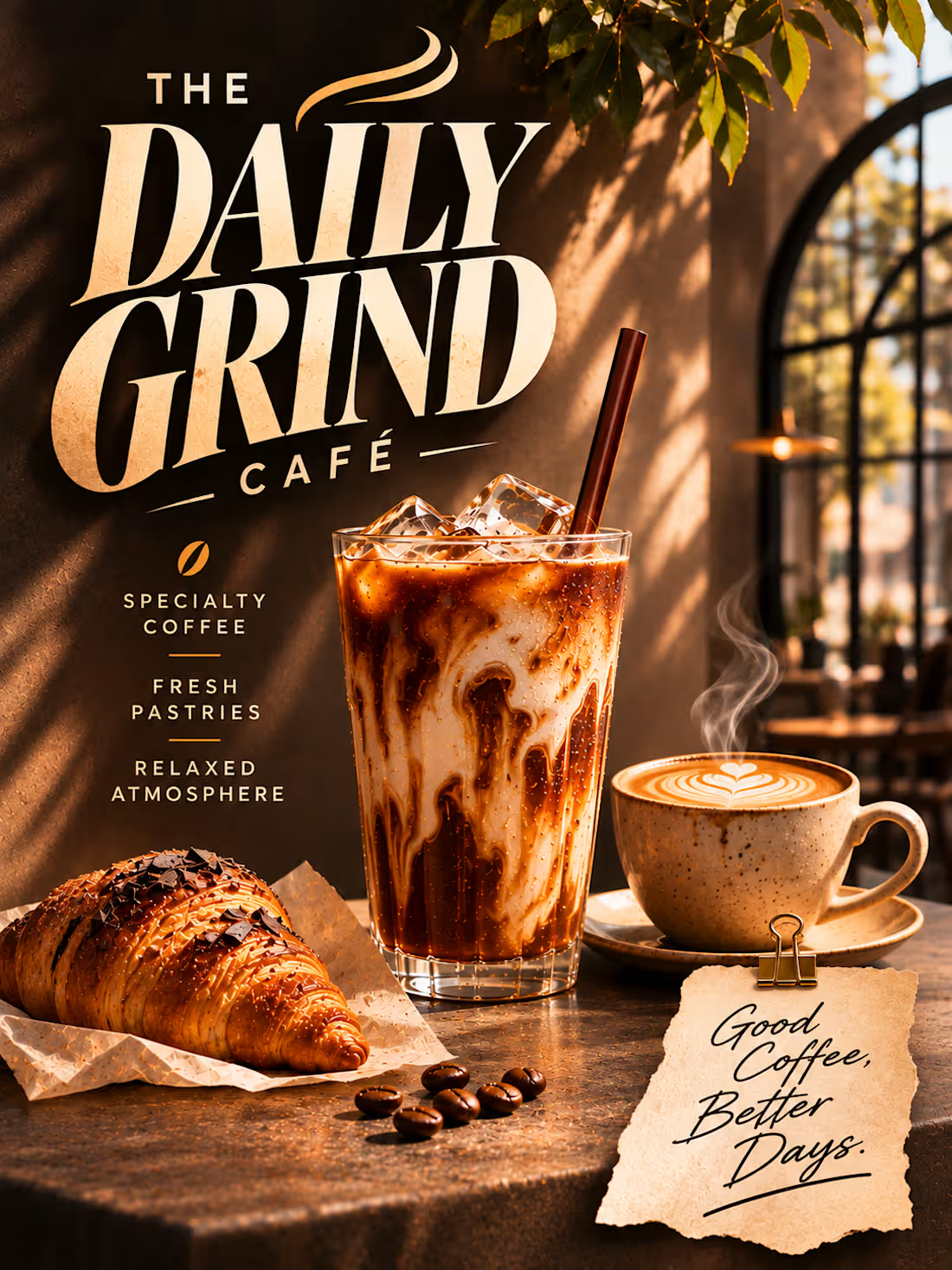
The Daily Grind Café is a self-initiated poster and flyer design concept developed for a fictional specialty coffee shop centered around quality beverages, fresh pastries, and a welcoming café experience.
The project explores how expressive typography, cinematic product photography, and carefully considered editorial art direction can transform a familiar coffee shop advertisement into a distinctive piece of visual communication.
The creative objective was to design a poster that immediately communicates the café's personality while creating an inviting atmosphere that encourages viewers to imagine themselves enjoying the experience.
Rather than relying on conventional promotional graphics, crowded menus, or excessive information, the design emphasizes a small number of carefully chosen elements: an impactful headline, beautifully presented coffee, an appetizing pastry, and concise supporting messages.
The finished composition balances visual richness with clarity, demonstrating how a restrained layout can still feel expressive, premium, and memorable.
Creative Concept & Visual Storytelling
The creative direction is built around the idea “Good Coffee, Better Days.”
This message positions the café as more than a place to purchase coffee. It represents a welcoming environment where customers can slow down, enjoy quality beverages, and appreciate simple everyday moments.
The scene features a chilled iced coffee with rich espresso-and-milk swirls, a freshly prepared latte with delicate heart-shaped latte art, and a golden chocolate-drizzled croissant.
These three elements establish the café's core offerings while creating a visually appealing lifestyle moment.
The products are arranged on a textured stone café table, illuminated by warm natural sunlight filtering through an arched window.
Soft greenery, subtle architectural details, and blurred café furniture provide environmental context without overwhelming the composition.
The result is a sophisticated visual narrative that communicates warmth, comfort, freshness, and relaxed hospitality.
Typography & Visual Hierarchy
Typography is the defining feature of the poster.
The café name, THE DAILY GRIND CAFÉ, dominates the upper-left portion of the artwork through oversized, high-contrast serif lettering.
The words DAILY GRIND use dramatic proportions, sharp letterforms, and tightly controlled spacing to create a bold editorial statement.
A subtle steam-inspired flourish introduces movement and connects the typography to the café theme.
The word CAFÉ appears beneath the main headline in smaller, widely spaced lettering, creating a clear hierarchy while preserving the impact of the primary typography.
The headline's cream color contrasts strongly with the dark background, ensuring immediate readability.
This approach creates a recognizable typographic identity without relying on excessive decorative elements.
Supporting Information & Messaging
Beneath the main headline, three concise statements communicate the café's core offering:
SPECIALTY COFFEE
FRESH PASTRIES
RELAXED ATMOSPHERE
These phrases are arranged vertically in clean uppercase lettering, separated by delicate gold rules.
A small coffee-bean symbol introduces a subtle visual reference to the café's specialty without competing with the typography.
The supporting information is intentionally concise, allowing viewers to understand the café's appeal at a glance.
A textured paper note positioned near the bottom-right corner introduces the message:
Good Coffee, Better Days.
The handwritten lettering creates a softer, more personal contrast to the structured headline typography.
Together, these elements balance strong visual impact with an approachable, human tone.
Color Palette & Art Direction
The visual palette is inspired by the natural colors of coffee, warm café interiors, and freshly baked pastries.
Espresso Brown: Establishes the rich, atmospheric background and provides strong contrast for the typography.
Warm Cream: Creates an elegant, highly readable headline while complementing the latte foam and pastry tones.
Caramel Gold: Introduces warmth through the coffee, sunlight, and subtle graphic accents.
Toasted Amber: Reinforces the appetizing quality of the croissant and the inviting café environment.
Natural Green: Adds freshness through the surrounding foliage and soft environmental details.
The palette feels cohesive and welcoming while supporting the premium editorial character of the design.
Photography & Product Styling
The photography-inspired product presentation plays an essential role in establishing the café's appeal.
The iced coffee is rendered with visible ice cubes, rich coffee-and-milk marbling, and subtle condensation.
Its tall glass and dark straw create a strong vertical form that complements the headline typography.
Beside it, a ceramic latte cup features carefully detailed heart-shaped latte art, communicating craftsmanship and attention to detail.
The croissant introduces an additional tactile element through its flaky golden layers, chocolate drizzle, and glossy baked surface.
Warm directional lighting emphasizes the textures of the beverages and pastry, making the products feel inviting and visually appealing.
The surrounding stone table, scattered coffee beans, and subtle environmental details contribute to a believable café atmosphere.
Composition & Layout
The composition is designed around three primary focal areas.
The Typographic Identity
The oversized café name establishes immediate recognition and occupies the upper-left section.
The Product Presentation
The iced coffee, latte, and croissant occupy the central and lower portions, creating an appetizing visual narrative.
The Supporting Message
The café offerings and handwritten note provide context while maintaining the poster's clean editorial character.
The layout uses controlled spacing to prevent visual overcrowding.
Rather than introducing unnecessary objects or decorative graphics, the composition allows the typography, products, and atmosphere to carry the visual story.
The result is a balanced advertisement that feels sophisticated without becoming overly minimal.
Editorial Details & Atmosphere
Several subtle design elements contribute to the finished aesthetic.
The arched window introduces architectural depth and creates a recognizable café setting.
Warm sunlight casts natural shadows across the textured wall and table.
Soft foliage adds organic framing and visual freshness.
The handwritten paper note creates a tactile editorial detail while reinforcing the café's personality.
The ceramic latte cup, textured table, and pastry presentation contribute to a sense of authenticity.
These elements work together to create an environment that feels inviting and visually cohesive.
Design Applications
The concept demonstrates a visual direction suitable for a range of hospitality marketing materials, including:
Coffee shop advertising posters
Printed café flyers
In-store promotional displays
Specialty coffee campaigns
Social media café advertisements
Coffee shop website visuals
Seasonal beverage promotions
Hospitality brand presentations
The design showcases how a consistent visual approach can communicate both product quality and brand atmosphere.
Final Design Outcome
The completed Daily Grind Café project demonstrates an approach to Posters & Flyers that combines expressive editorial typography, realistic food and beverage imagery, atmospheric lighting, and clear visual communication.
Its strongest characteristics are the oversized typographic headline, inviting product presentation, balanced composition, and cohesive café art direction.
Developed as a self-initiated portfolio concept, the project showcases the ability to create hospitality advertising that feels visually distinctive, commercially relevant, and emotionally inviting.
The Daily Grind Café — Good Coffee, Better Days.
1
35
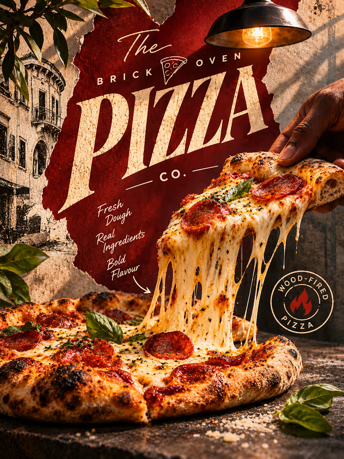
The Brick Oven Pizza Co. — Creative Restaurant Poster & Flyer Design
Posters & Flyers | Restaurant Advertising | Food & Beverage Design
Project Overview
The Brick Oven Pizza Co. is a self-initiated restaurant poster and flyer design concept developed for a fictional artisan pizzeria specializing in wood-fired pizza.
The project explores how bold typography, cinematic food imagery, and expressive editorial composition can create an advertisement that immediately captures attention and communicates the appeal of freshly prepared food.
The creative objective was to produce a poster that feels authentic, energetic, and visually irresistible while establishing a recognizable personality for the restaurant.
Rather than using a conventional restaurant flyer layout filled with prices, promotional offers, and menu items, the design focuses on one powerful visual moment: a freshly baked slice of pizza being lifted from the pie, with melted cheese stretching dramatically between them.
This creates an immediate sensory connection with the viewer while allowing the typography and surrounding visual details to reinforce the restaurant's identity.
Creative Concept & Visual Storytelling
The central concept is built around the irresistible moment of the first slice.
A hand lifts a generously topped pizza slice, revealing long strands of melted mozzarella stretching from the remaining pizza.
The image emphasizes the qualities associated with authentic wood-fired pizza: blistered crust, bubbling cheese, rich tomato sauce, fresh basil, and carefully prepared ingredients.
The close-up composition places the viewer directly into the dining experience, making the product feel tangible and appetizing.
Supporting visual elements—including textured paper, vintage Italian architectural illustrations, a hanging industrial lamp, and scattered ingredients—establish a rustic restaurant atmosphere.
The overall presentation combines the authenticity of a traditional neighborhood pizzeria with the visual impact of contemporary food advertising.
Typography & Visual Hierarchy
Typography is one of the defining elements of the poster.
The oversized word PIZZA dominates the upper portion of the composition, using expressive, high-contrast serif lettering with a slightly distressed printed texture.
Its angled placement introduces movement and energy while complementing the dramatic diagonal motion of the lifted pizza slice.
The surrounding words THE BRICK OVEN and CO. complete the restaurant name through smaller, widely spaced lettering.
Handwritten script introduces a more personal, handcrafted character through the supporting message:
Fresh Dough. Real Ingredients. Bold Flavour.
The contrast between oversized editorial lettering, structured supporting typography, and expressive handwritten details creates a distinctive hierarchy.
A circular WOOD-FIRED PIZZA emblem provides an additional point of recognition without competing with the main headline.
Color Palette & Art Direction
The design uses a warm, appetite-driven palette inspired by traditional pizzeria environments.
Deep Tomato Red: Establishes the primary background and communicates energy, warmth, and Italian culinary heritage.
Aged Cream: Provides contrast for the oversized typography while reinforcing the vintage printed aesthetic.
Charcoal Black: Introduces depth through the stone surface, shadows, and restaurant-inspired details.
Golden Amber: Appears naturally through the baked crust, melted cheese, and warm overhead lighting.
Fresh Basil Green: Adds visual freshness and contrasts with the dominant red and cream tones.
The colors work together to create an inviting restaurant atmosphere while maintaining the intensity needed for a visually impactful poster.
Food Photography & Styling
The hero food image is designed to communicate freshness, texture, and indulgence.
A thick, blistered pizza crust establishes the wood-fired preparation style, while glossy melted cheese and rich tomato toppings emphasize the product's appeal.
Fresh basil leaves introduce color contrast and reinforce the use of recognizable ingredients.
The lifted slice becomes the central storytelling element, creating a sense of movement and anticipation.
Warm directional lighting highlights the pizza's texture, bringing attention to the golden crust, glossy toppings, and stretching mozzarella.
The surrounding dark stone surface provides contrast, ensuring the food remains the primary visual focus.
Composition & Layout
The composition is organized around two interconnected visual elements.
The Typographic Statement
The restaurant name occupies the upper section, establishing recognition through oversized lettering and a distinctive editorial treatment.
The Hero Food Moment
The pizza and lifted slice occupy the center and lower sections, providing the emotional and sensory focus of the advertisement.
Supporting details are integrated around these primary elements rather than separated into conventional graphic boxes.
The handwritten message, circular wood-fired emblem, architectural textures, and surrounding ingredients contribute to a layered composition with a clear reading hierarchy.
This creates a poster that feels expressive and visually rich without losing its central message.
Texture & Editorial Details
The artwork incorporates several tactile elements inspired by traditional print advertising and restaurant interiors.
Distressed paper textures establish a handcrafted atmosphere.
Aged architectural illustrations reference the visual character of historic Italian streets.
Subtle grain and surface imperfections reinforce the poster's vintage-inspired aesthetic.
A suspended industrial lamp adds depth and warmth to the restaurant setting.
These elements are balanced with photorealistic food imagery to create a contemporary interpretation of classic pizzeria advertising.
Design Applications
The concept demonstrates a visual direction suitable for multiple restaurant marketing formats, including:
Restaurant promotional posters
Food advertising campaigns
Printed restaurant flyers
In-store promotional displays
Social media food advertisements
Restaurant website promotional imagery
Menu campaign graphics
Takeaway and delivery promotions
The design can serve as a visual reference for brands seeking an expressive alternative to conventional food advertising.
Final Design Outcome
The completed project demonstrates an approach to Posters & Flyers that combines cinematic food photography, expressive typography, visual storytelling, and cohesive restaurant art direction.
Its strongest characteristics are the dramatic cheese-pull imagery, oversized editorial headline, rich color palette, and tactile printed aesthetic.
Created as a self-initiated portfolio concept, the project showcases the ability to develop compelling restaurant advertising that balances product appeal with distinctive visual communication.
The Brick Oven Pizza Co. — Fresh Dough. Real Ingredients. Bold Flavour.
2
2
72