The network for creativity
Join 1.25M professional creatives like you
Connect with clients, get discovered, and run your business 100% commission-free
Creatives on Contra have earned over $150M and we are just getting started
Back to feedPost

VELA — A Study in Movement
Avant-Garde Fashion Poster | Experimental Editorial Design | Luxury Womenswear Campaign
Project Overview
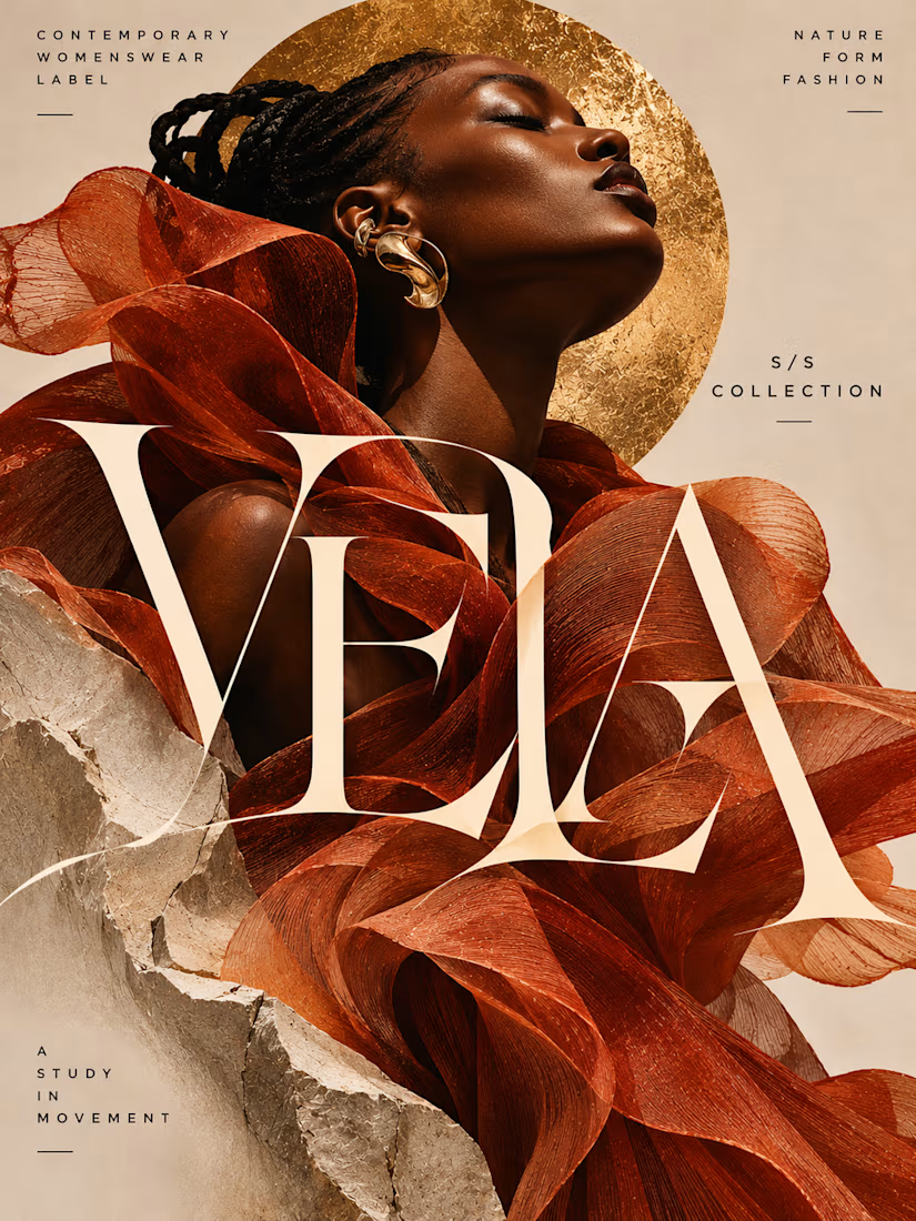
VELA is a self-initiated fashion poster and editorial campaign concept developed for a fictional contemporary womenswear label.
The project explores the intersection of fashion, sculpture, movement, and visual identity through a striking combination of expressive garment construction, high-fashion portraiture, architectural materials, and experimental typography.
The creative objective was to produce an editorial campaign that feels artistic, contemporary, and visually commanding while maintaining the restraint and sophistication associated with luxury fashion publications.
Rather than relying on conventional advertising layouts, decorative graphics, or excessive promotional messaging, the composition treats the model, garment, typography, and surrounding materials as interconnected parts of a single visual statement.
The result is an immersive fashion editorial that communicates individuality, elegance, and creative expression.
Creative Concept — A Study in Movement
The central concept is built around the relationship between fashion and motion.
Clothing becomes movement. Movement becomes form.
VELA imagines fashion as an evolving sculptural experience rather than a static collection of garments.
The central figure wears an extraordinary terracotta-colored ensemble composed of flowing, translucent fabric structures that twist and curve around the body.
The fabric appears almost weightless, creating dramatic organic forms that suggest motion even within a still image.
These fluid shapes contrast with the rigid, fractured stone elements surrounding the model, establishing a visual dialogue between softness and structure.
The concept celebrates the ability of fashion to transform the human silhouette into an expressive work of art.
Fashion Photography & Art Direction
The photography-inspired art direction draws from contemporary luxury fashion campaigns, experimental runway photography, and sculptural editorial imagery.
A striking Black female model anchors the composition through a powerful close-up portrait.
Her head is tilted upward, with her eyes gently closed, creating an expression of confidence, serenity, and artistic independence.
Intricately styled braids and sculptural gold earrings complement the avant-garde garment without distracting from its dramatic silhouette.
Warm directional lighting highlights the natural contours of the face and emphasizes the translucent textures of the fabric.
A large textured gold circle frames the model's head, creating a strong geometric contrast against the organic movement of the garment.
The background remains minimal, allowing the fashion styling and typographic elements to dominate the composition.
Experimental Typography
Typography is one of the defining elements of the project.
The brand name VELA appears in enormous, high-contrast serif lettering that stretches across the composition and overlaps the flowing garment.
Rather than functioning as a conventional headline placed above the photograph, the typography becomes an architectural element within the artwork.
The letterforms interact with the fabric, introducing depth, tension, and movement.
The exaggerated proportions and elegant stroke contrast create a sophisticated yet experimental visual identity.
The typography is deliberately oversized, allowing the brand name to become one of the primary visual subjects.
Despite the unconventional scale and overlapping treatment, the wordmark remains recognizable.
This approach demonstrates how editorial typography can become an expressive part of the visual narrative rather than simply communicating information.
Editorial Information Hierarchy
The artwork incorporates a restrained collection of supporting typographic details.
CONTEMPORARY WOMENSWEAR LABEL
Positioned in the upper-left corner, this establishes the brand's identity and fashion category.
NATURE FORM FASHION
Placed in the upper-right corner, this reinforces the relationship between organic materials, sculptural design, and fashion expression.
S/S COLLECTION
Positioned along the right side, this introduces the seasonal collection context.
A STUDY IN MOVEMENT
Placed near the lower-left corner, this acts as the campaign's defining creative statement.
These supporting details use clean uppercase sans-serif lettering with generous spacing.
Their restrained scale creates contrast with the enormous VELA wordmark, maintaining a clear editorial hierarchy.
Color Palette & Visual Identity
The campaign uses a warm, carefully controlled palette inspired by natural materials, contemporary sculpture, and luxury fashion.
Burnt Terracotta — #A84925
Introduces expressive warmth and becomes the primary color of the sculptural garment.
Antique Gold — #C59A47
Creates a luminous focal point through the textured circular form and sculptural jewelry.
Warm Sand — #DCC9B4
Establishes a soft neutral background that complements the fashion imagery.
Stone Ivory — #E8DED0
Reinforces the architectural character of the fractured stone elements.
Deep Espresso — #211711
Provides contrast through the supporting typography and natural shadows.
The palette is intentionally limited, allowing the garment's shape, material textures, and typographic experimentation to establish visual impact.
Composition & Visual Balance
The composition is structured around four interconnected elements.
The Editorial Portrait
The model's upward-facing profile creates an elegant focal point and establishes the emotional tone of the campaign.
The Sculptural Garment
The flowing terracotta fabric occupies much of the composition, creating dramatic movement and organic visual rhythm.
The Experimental Wordmark
The oversized VELA lettering overlaps the garment, introducing architectural scale and typographic tension.
The Supporting Materials
Fractured stone surfaces and the textured gold circle create contrast, depth, and a refined sculptural atmosphere.
The interaction between these elements produces a visually rich composition without relying on unnecessary decorative graphics.
Negative space around the supporting editorial text helps maintain balance and readability.
Minimalism Through Material & Form
Although the composition is visually expressive, the overall design remains restrained.
The artwork uses a limited number of elements, allowing each component to contribute meaningfully to the visual narrative.
The flowing garment provides movement.
The fractured stone introduces structure.
The gold circle establishes geometric balance.
The oversized typography creates graphic impact.
Together, these elements communicate a cohesive concept without requiring excessive illustration, decorative effects, or promotional messaging.
This approach reflects the principle that experimental fashion design can achieve maximum visual impact through carefully controlled visual decisions.
Potential Campaign Applications
The concept could be adapted for a range of fashion and editorial applications, including:
Luxury fashion campaign posters
Womenswear collection announcements
Fashion magazine advertisements
Designer runway promotions
Fashion exhibition graphics
Editorial lookbook covers
Contemporary fashion publications
Digital fashion campaign visuals
The artwork demonstrates how experimental typography and sculptural fashion imagery can create a distinctive visual identity for a contemporary fashion campaign.
Final Design Outcome
The completed VELA campaign demonstrates an approach to Posters & Flyers that combines avant-garde fashion photography, sculptural styling, experimental typography, and refined editorial composition.
Its strongest characteristics are the commanding fashion portrait, flowing garment construction, oversized typography, restrained color palette, and sophisticated interplay between organic and architectural forms.
Created as a self-initiated portfolio concept, the project showcases the ability to develop fashion advertising that feels artistic, luxurious, and visually distinctive.
VELA — A Study in Movement.


The network for creativity
Join 1.25M professional creatives like you
Connect with clients, get discovered, and run your business 100% commission-free
Creatives on Contra have earned over $150M and we are just getting started



Related posts

Pauli | Fashion with a Personal Touch
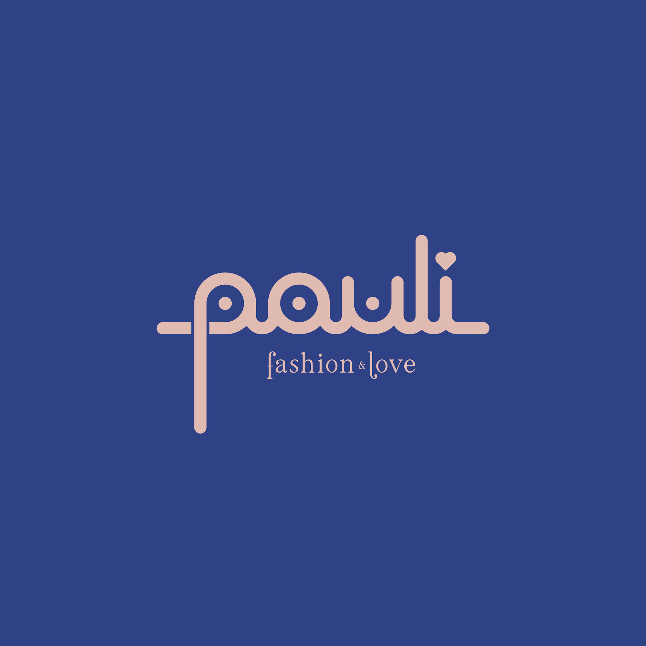
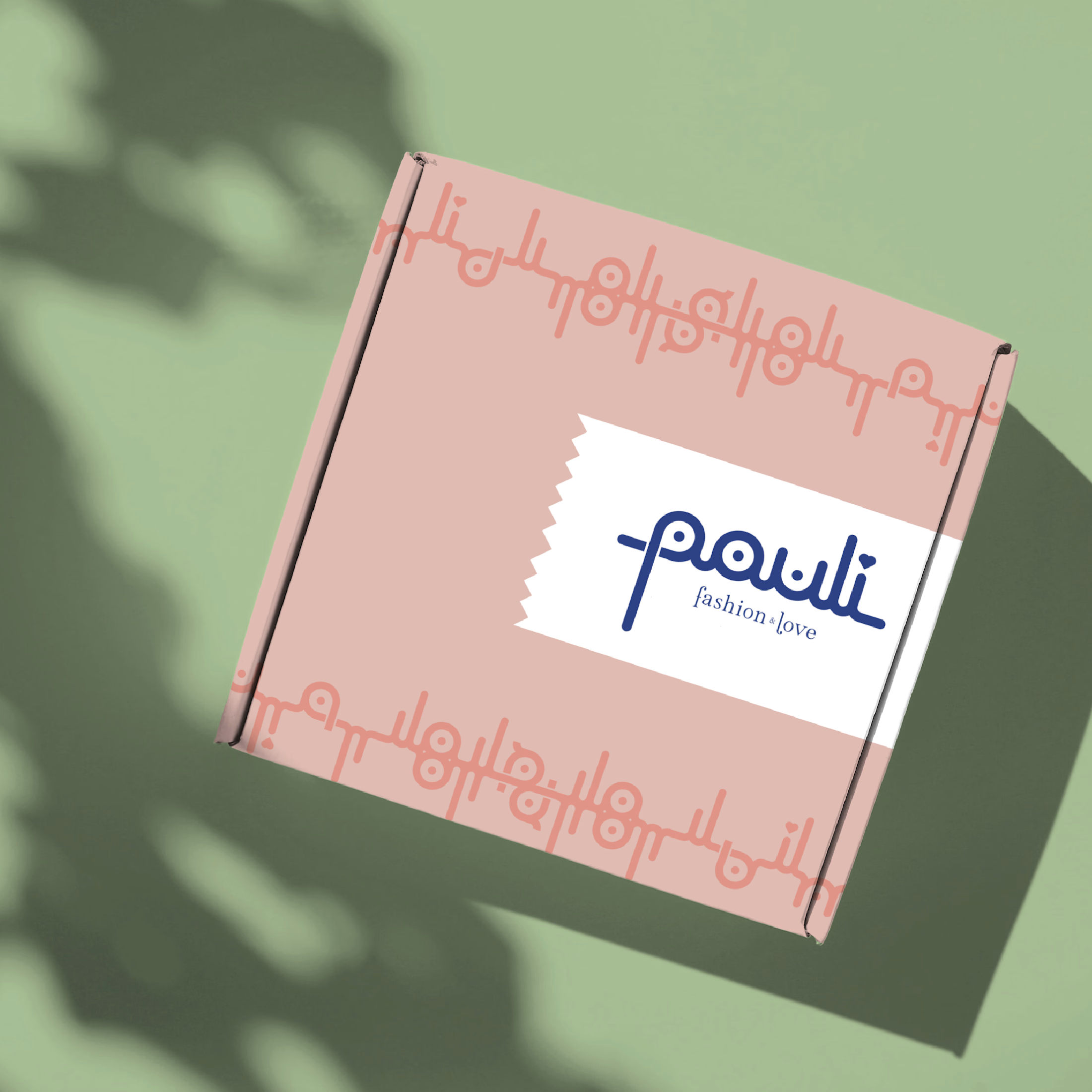
For Pauli, a fashion boutique with a warm, caring personality, I designed a logo that brings its “fashion & love” philosophy to life through playful, distinctive lettering.
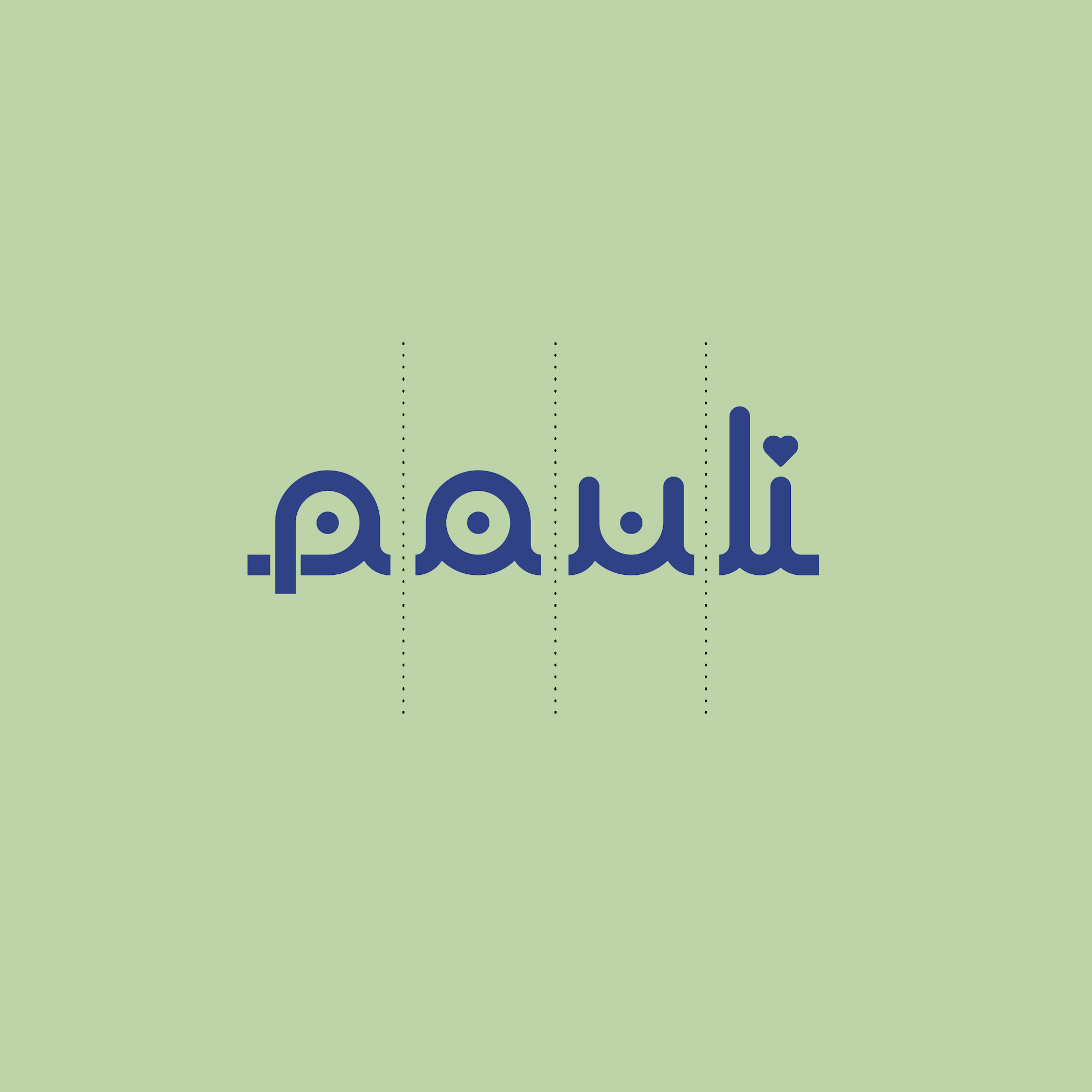
The connected lowercase wordmark combines rounded strokes, circular details, and flowing curves. Its consistent line weight creates visual harmony, while the elongated “p” and tall “l” give the silhouette rhythm and individuality. A small heart replaces the dot above the “i,” weaving the boutique’s affectionate character directly into its name.
A delicate serif tagline adds elegance beneath the expressive lettering. Deep blue anchors the identity, balanced by soft blush pink and fresh pastel green for a welcoming, uplifting palette.
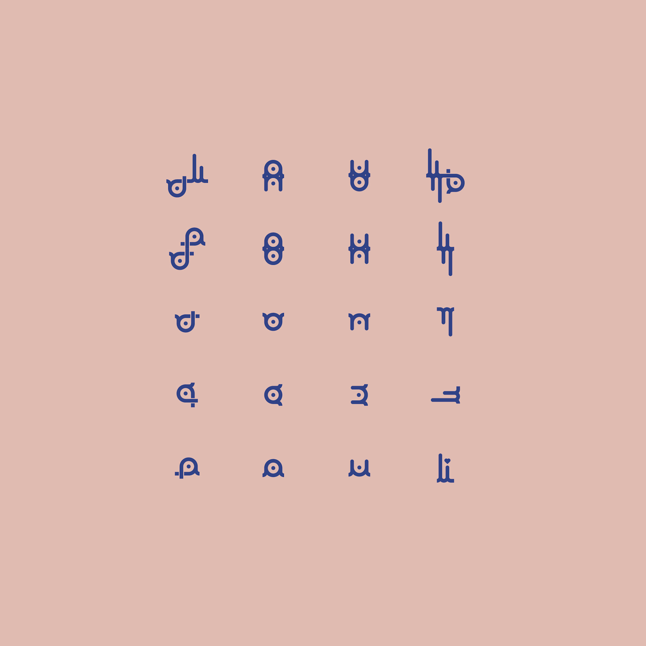
The letterforms also become a flexible graphic toolkit: separated, mirrored, and repeated, they create decorative motifs and packaging patterns. This extends the logo into a cohesive identity, giving every detail the same personal, lovingly considered feel.


Lovely design
One Logo a Day | Exploring Geometric Expression
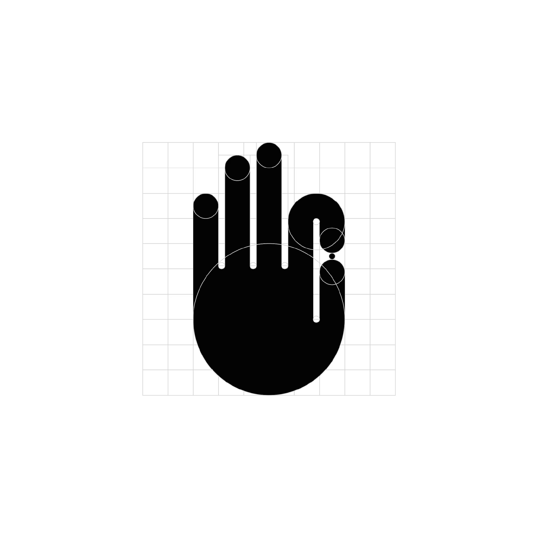
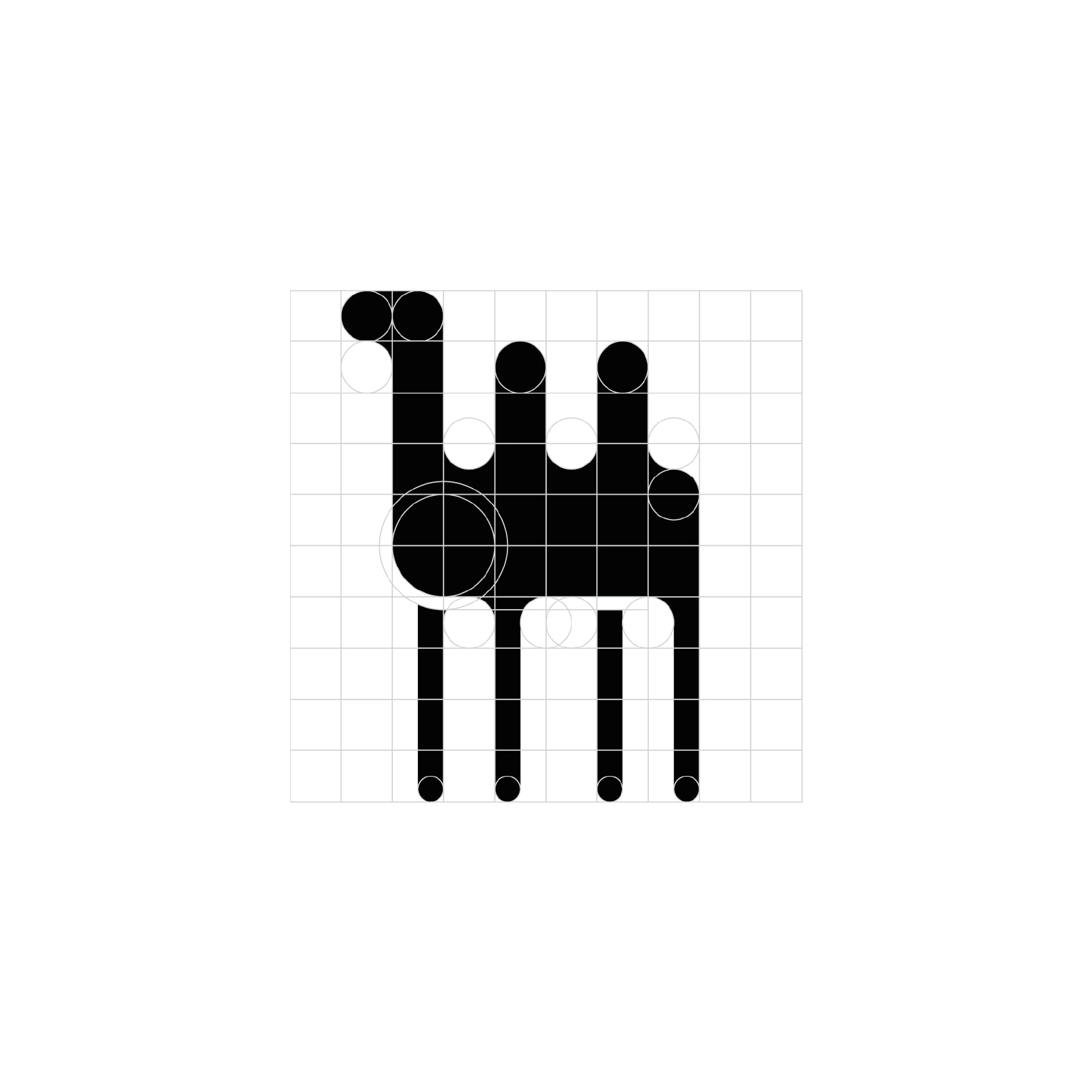
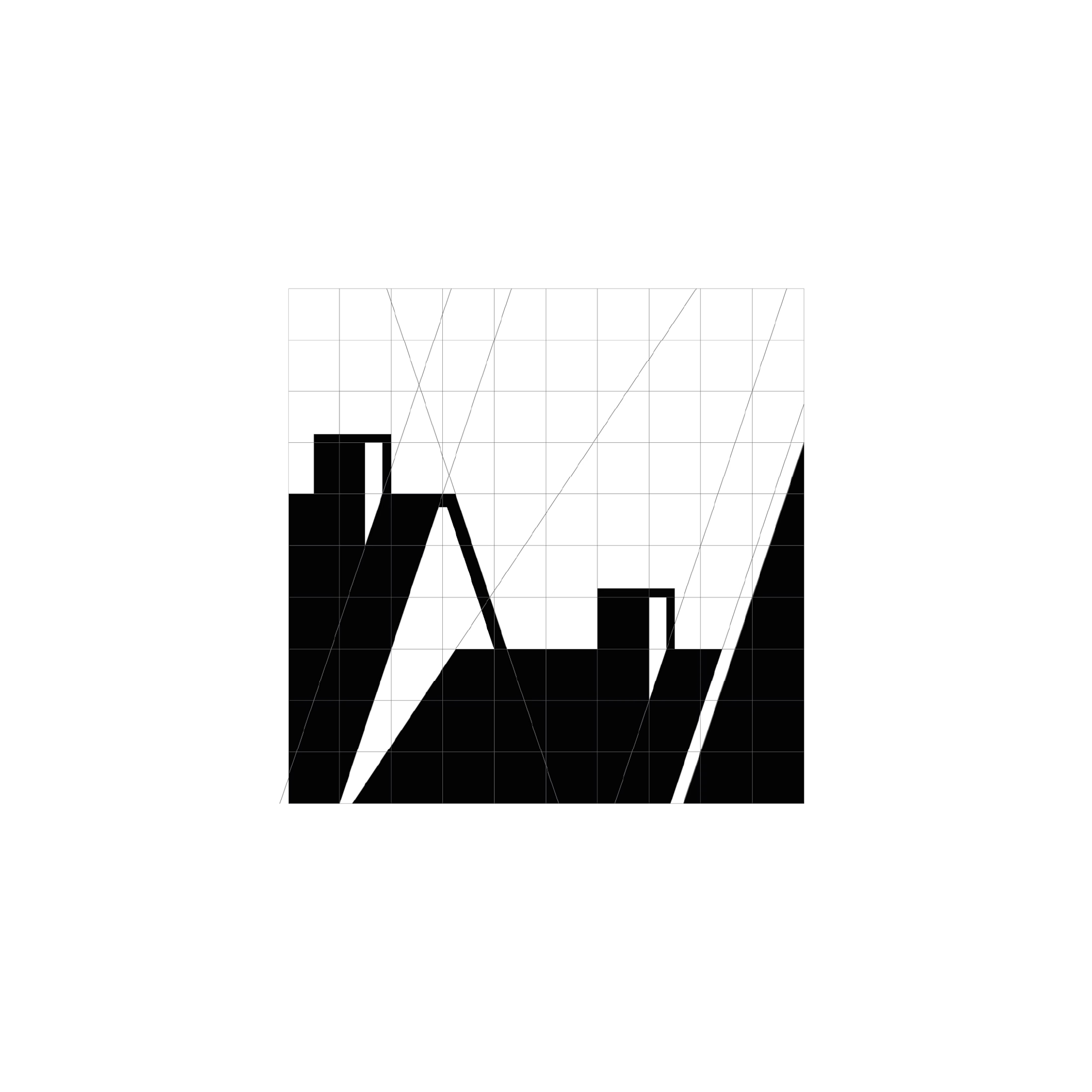
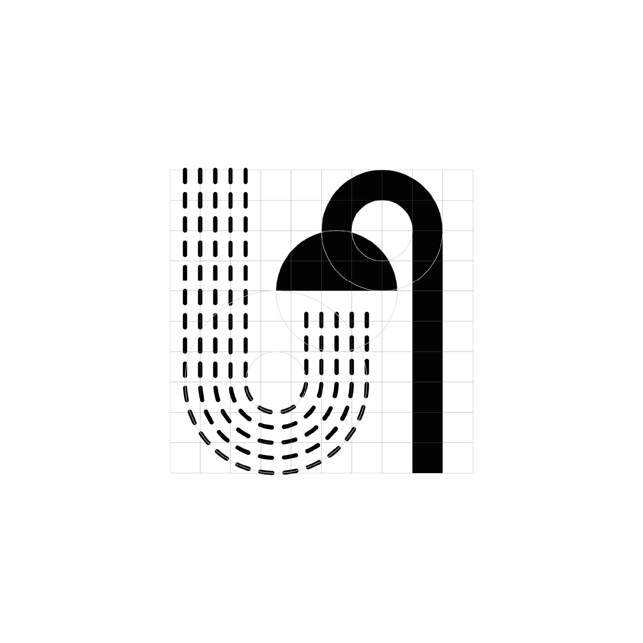
For one month, I challenged myself to design a logo every day. These four favourites share a distinct visual language: bold monochrome shapes, precise geometric construction, and playful use of negative space.
Circles, semicircles, and elongated verticals become the building blocks for expressive symbols. Rounded forms soften the heavy black silhouettes, while repetition creates rhythm and movement. Elsewhere, sharp diagonals and dramatic shifts in thickness introduce a more angular, architectural character.
The series explores the boundary between abstraction and recognition, suggesting familiar objects and gestures through a small number of carefully arranged shapes. Visible construction grids reveal the relationships behind each mark, showing how proportions, alignments, and curves hold the compositions together.
Working entirely in black and white places the focus on form. Each design becomes an exercise in creating personality and visual impact through silhouette, contrast, and space.

German Archaeologists Association | Connecting Heritage and Identity
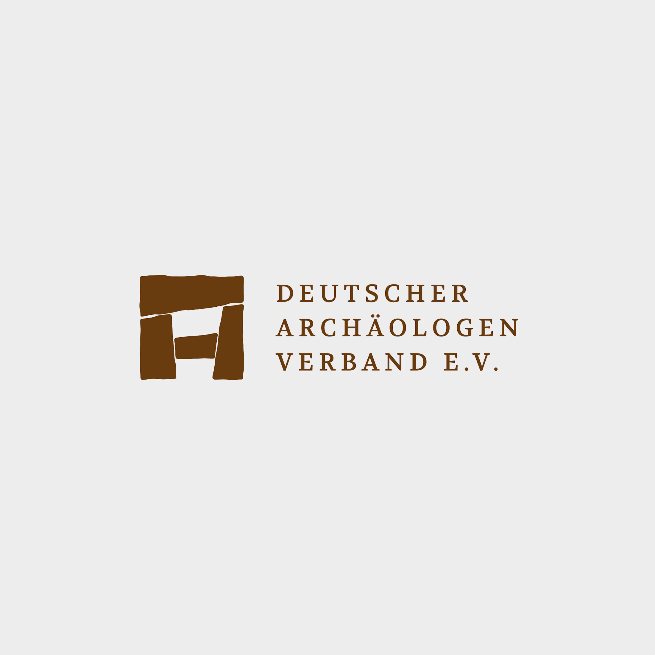
For the German Archaeologists Association, I redesigned the logo to translate the physical character of archaeology into a clear, contemporary visual identity.
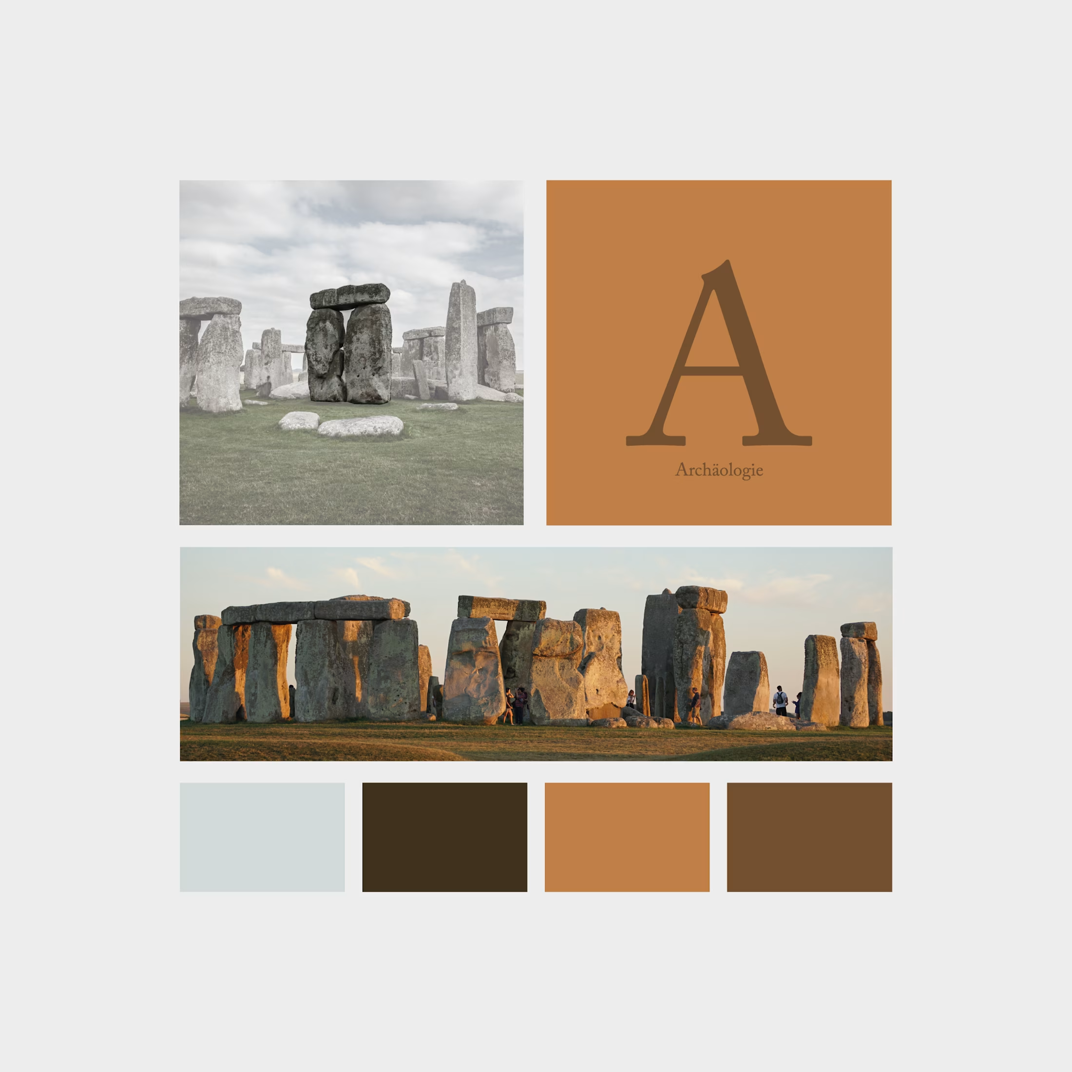
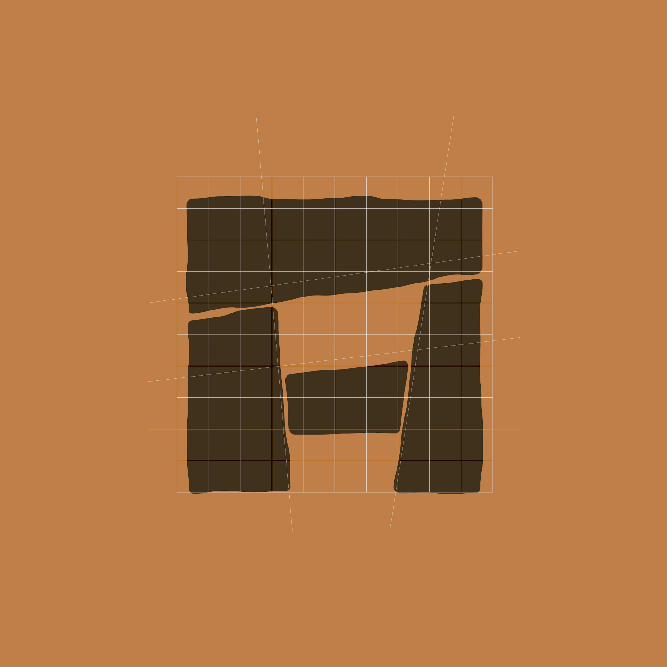
The symbol combines a Stonehenge-inspired structure with an abstract “A” for archaeology. Four stone-like shapes form a compact emblem, with subtly irregular edges that evoke weathered surfaces and ancient construction. Balanced proportions bring structure to these organic contours, connecting historical references with precise graphic design.
Uppercase serif typography adds a scholarly, authoritative character. Generous letter spacing and a structured three-line arrangement give the association’s name clarity and presence.
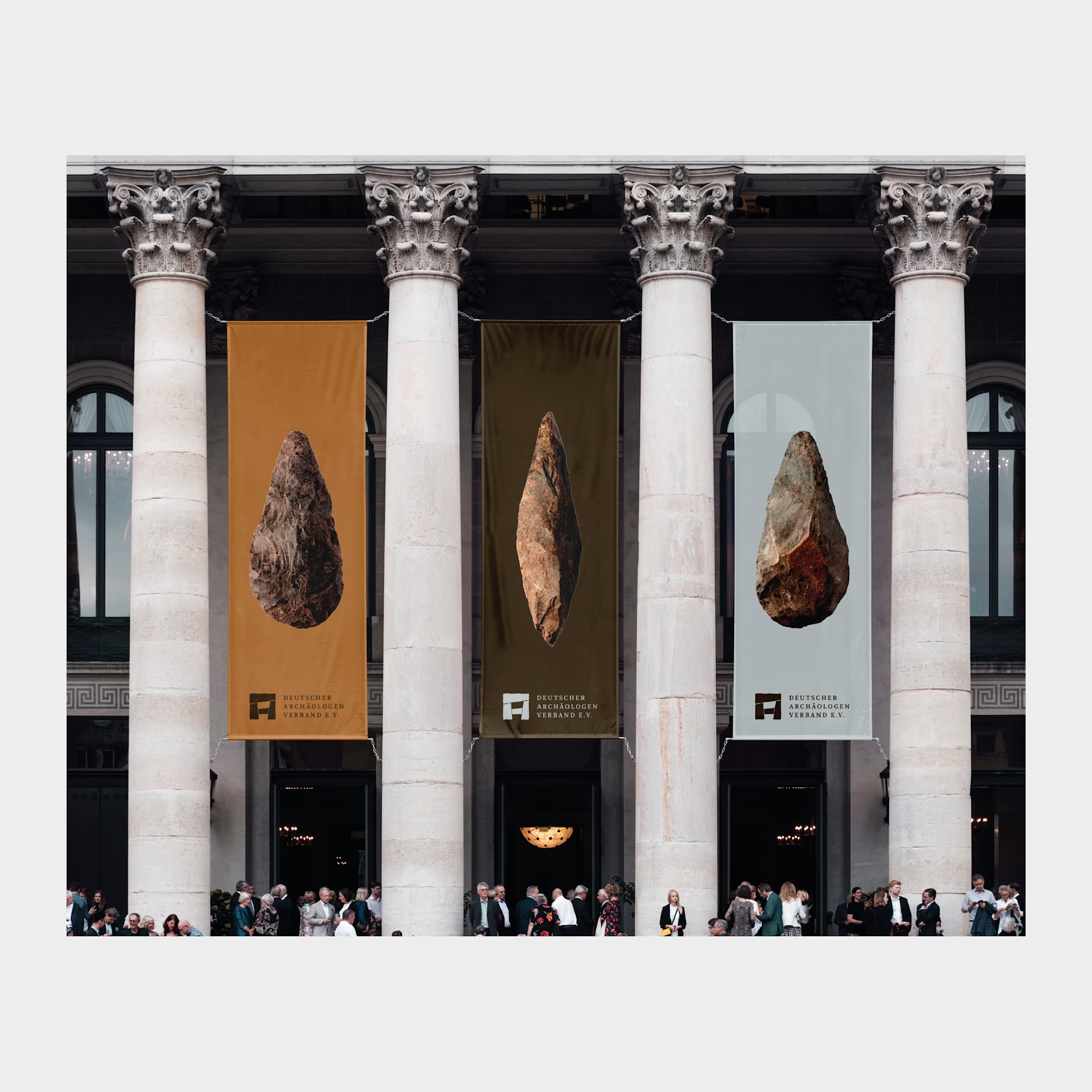
The palette draws on earth, stone, and excavation: warm ochre, deep brown, and cool mineral grey. The emblem also retains its distinctive character in simple black-and-white applications.
The result is an identity rooted in the material traces of the past, giving the association a confident contemporary presence.

love this visual design