Canary
Brett McMillin
Branding Canary
Delivering punk passion to personal care in an overly greenwashed landscape
Not many projects are able to capture my attention like Canary did. It started out as a similar request to any branding moment, but the more we discussed the more in-tune we all felt with what we were trying to accomplish. These are the ones you really want to get right. And the plus side is, these are the ones that typically start to come together really naturally. This was the ideal partnership and I think it shows.
The manifesto
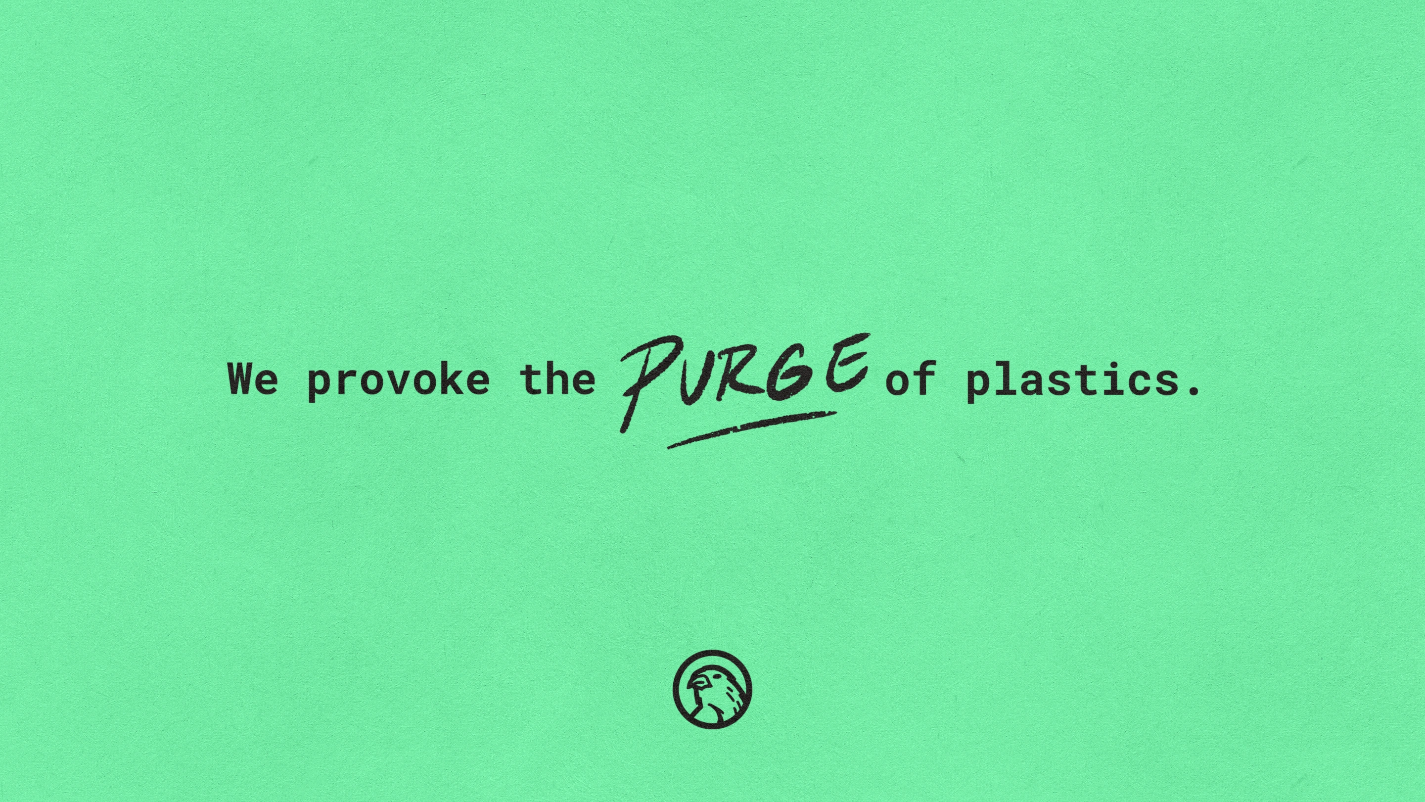
Canary takes an unconventional approach to make you think twice about your personal and home care products. Because what was once conventional is no longer acceptable. Our oceans are full of literal islands of plastic trash, our landfills are choking from overwhelm. Only 5% of single use plastics are actually being recycled. And our homes (especially our bathrooms) have unfortunately become a pitstop for these detrimental products on their way to this irreversible fate.
This is where Canary comes in.
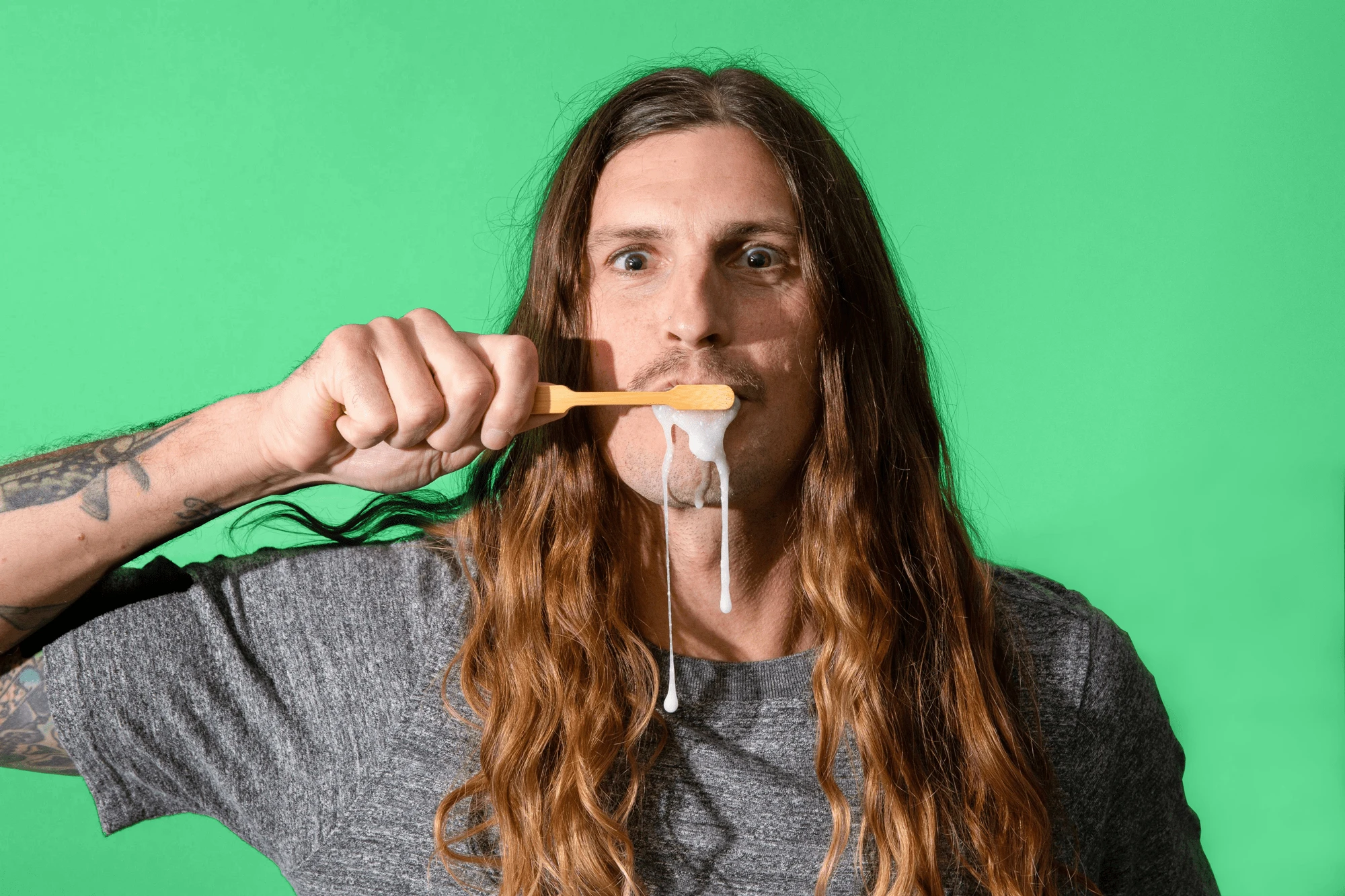
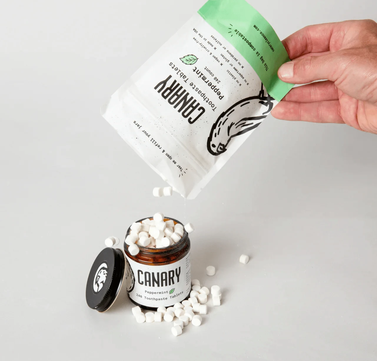
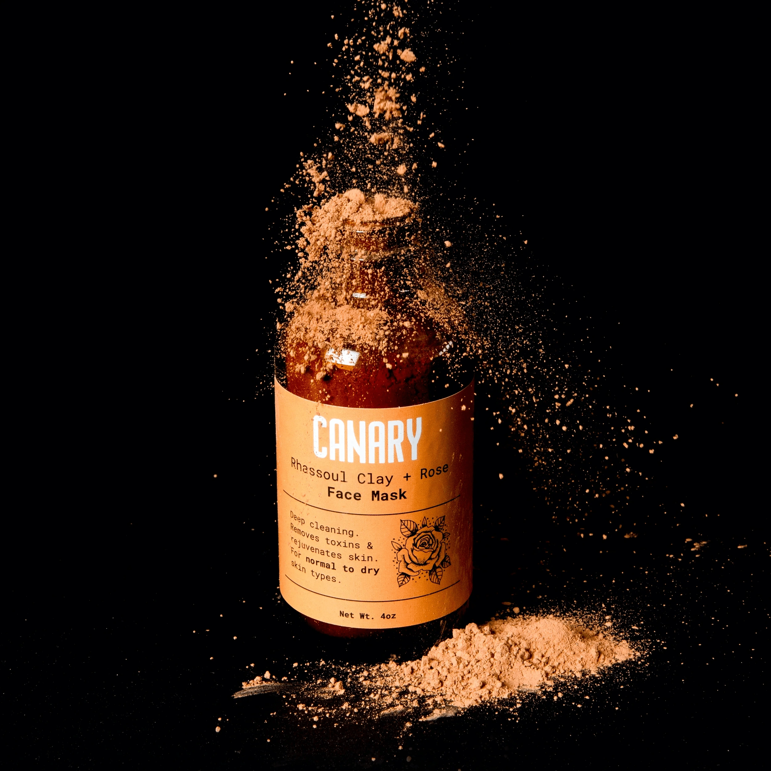
Canary provides fun, accessible ways to ditch single-use plastic items in one of our home’s biggest pit stops: the bathroom.
With carefully-tuned products like tooth paste tablets, mouthwash concentrate, and earth-friendly face masks, Canary believes that these easy approaches towards a plastic-free lifestyle don’t need to be boring.
Taking notes from punk culture
To many, the punk scene may seem like pure subversion and anarchy. But what makes the culture so rich is its ethos of inclusion and free will—see any article, documentary, personal account—hallmarked by its innate ability to rally around a purpose and effectively punch up. Damn the man (save the Empire). Canary had identified a common enemy and wanted to target it in a way that made it damn near impossible for anyone to be excluded at an emotional level.
This needed to manifest in a few ways. We needed a strong purpose. And we needed to follow through on that purpose with a promise of inclusion and connection for everyone in the household (not just Dad, the aging punk still clinging to his studded belt and ratty Vans slip-onscreen—I’m not talking about myself, you’re talking about myself).
Sorry Big Plastics, from our standpoint, this was a call to arms we felt like we could all collectively rally around while making DIY t-shirts, self-published zines, and canvassing the city with wheat-pasted posters.
We wanted Canary to proactively demand attention in contrast to the current market that was content with a minimal, soft brand presence — unintentionally (or intentionally?) exuding a certain elitist gatekeeping of exclusivity to the cause.
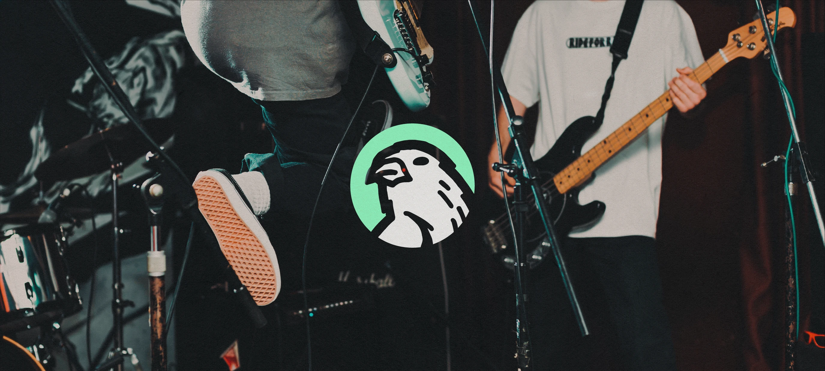
A purpose is required, but we knew what we really needed now was a symbol.
We swung wide in a few different directions to test the limits of the brand (and appetite of our client)
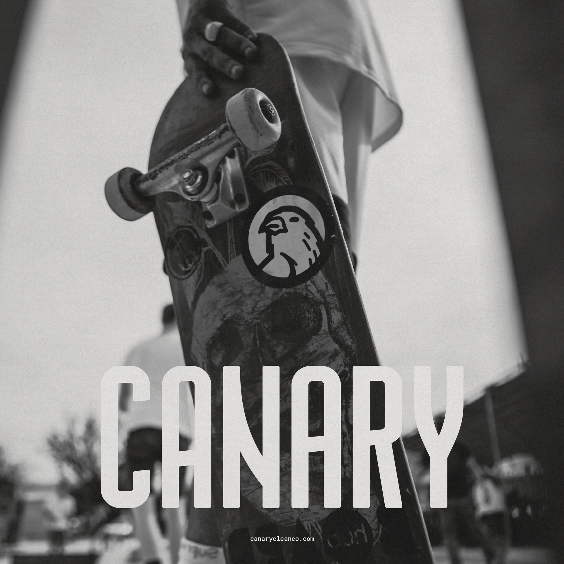
We had metal band logos with fangs, canary phoenixes rising from the ashes, esoteric earthly swirls and shapes. White-boarding this one was a lot of fun. We wanted something that would look just as at home in your bathroom as it would as a sticker on a skateboard.
We realized quickly that going too aggressive would alienate too many people. We wanted to establish this as a brand that could be universally loved by all generations of a household. But really, we knew that if we could nail something that connected with a younger demographic, the decision makers of the household would love it too. Get the kids to brush their teeth and make an environmentally ethical decision? Win win.
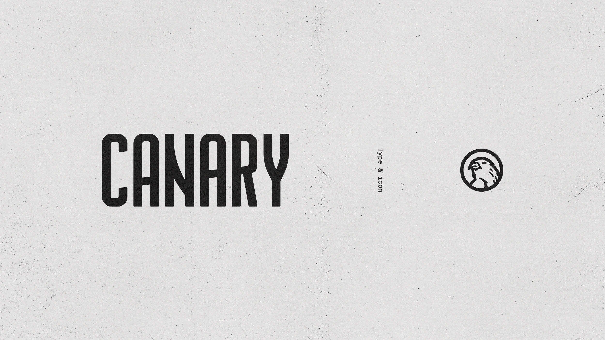
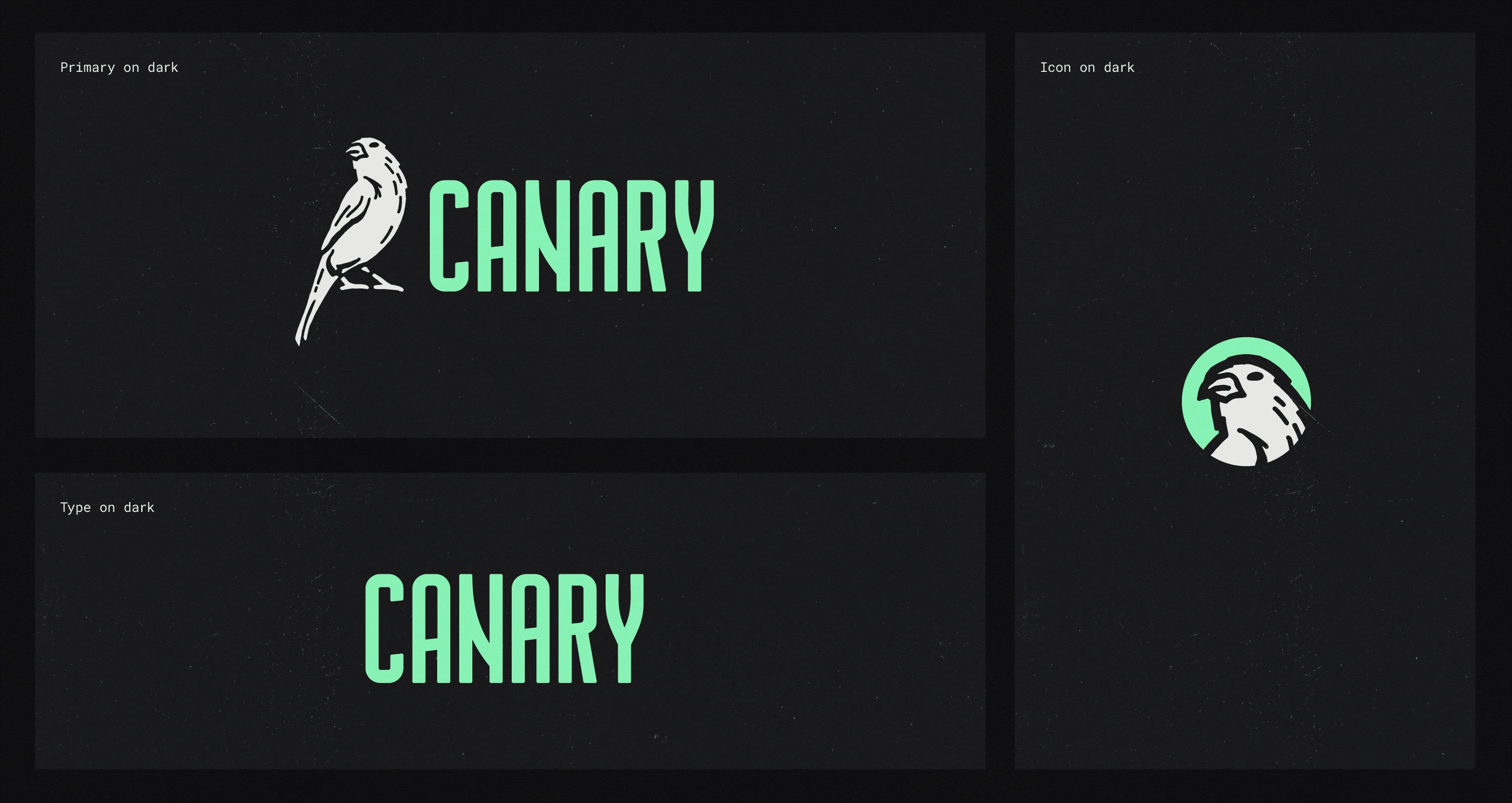
We knew we couldn’t speak softly about the Canary mission, and so the all-caps, customized typeface provided the extra emphasis for the brand. Not content to fade into the self-care aisle sea of soft san-serif delicates.
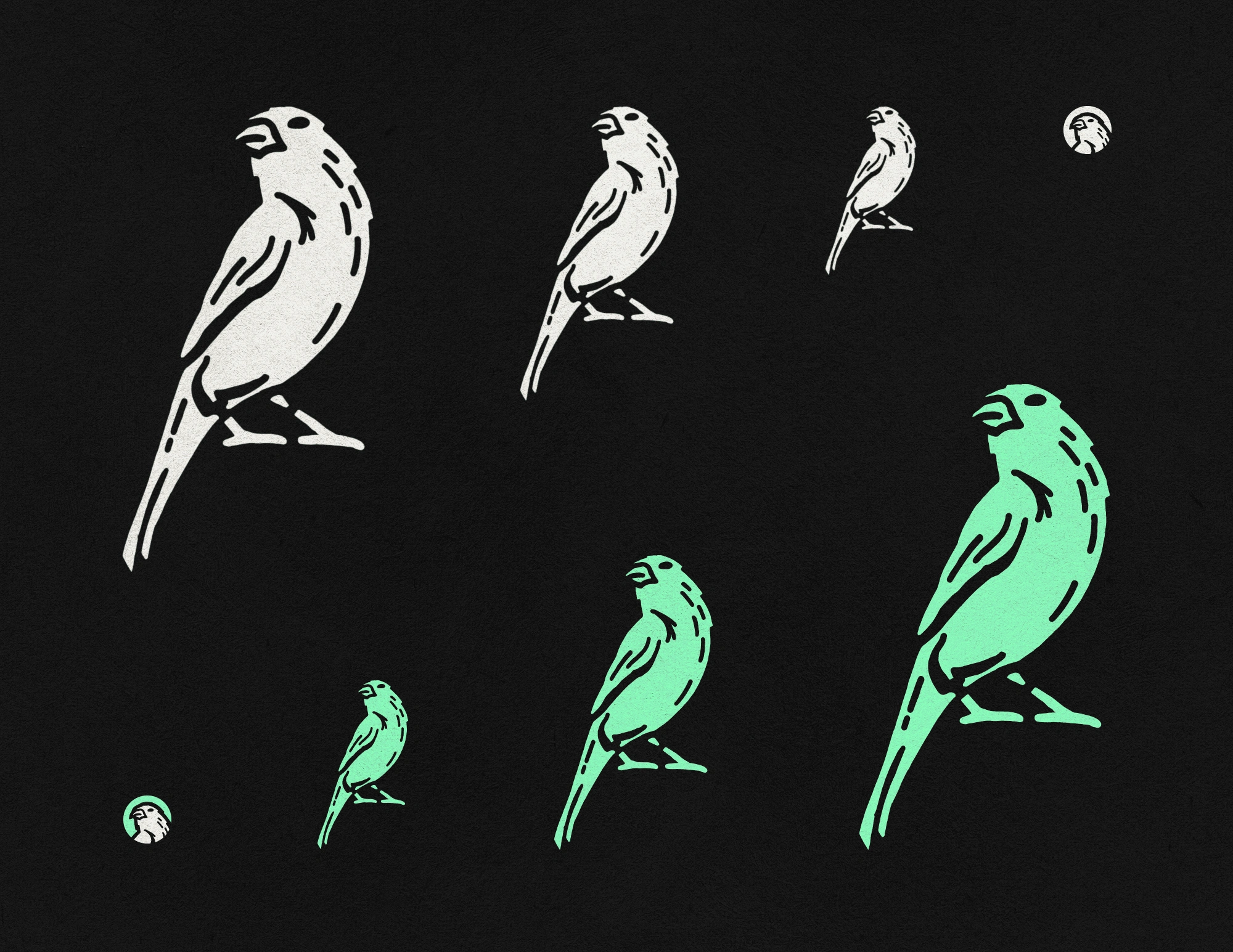
Our little buddy icon in the circle is an evenly weighted line drawing of Scout, our humble mascot. A explorer so brave he is willing to dive head first into the coal mine to report back that yes, the situation is indeed dire. This circular mark scales down nicely as visual punctuation and also lends itself well to that coveted space on the side of a locker or bottom of a skate deck as a sticker.
The evolution of Scout
We spent some time caring for Scout, the mascot of the Canary. Sometimes he was too dramatic, sometimes he was too dead. We knew we wanted him to have the right attitude but also needed to be everyones friend.
At that point, the graphics package and art direction developed smoothly out of a solid brand foundation.
Specific care was dedicated to setting up some vibey doodles for the Canary kids line. This let us be a little more playful in the space even while balancing the passion of the cause.
Overall, we never wanted anyone to feel intimidated to live up to the promise of a sustainable approach to self care. Doing things the right way should be fun, not elevated to the point of it feeling like more of an “in crowd” experience.

The team at Canary executed the brand activation flawlessly from packaging to social content. I couldn’t be more stoked how it all rolled out.
They saw a relatively immediate acquisition of market share and stood out form their competition as they had hoped. I’m just glad I was able to contribute and provide them with the branding to thrive.
And that’s it! Thanks for reading. Hope you enjoyed it.
If you want to know anything more or have any projects that need this kind of brand care, reach out to book some time to chat today!
Like this project
Posted Apr 21, 2023
Brand strategy and design including brand narrative, identity and style guide, illustration and packaging consulting.