Island Dwell
Brett McMillin
Island Dwell
Anyone who has spend their lazy Sunday afternoon browsing homes you can’t afford on Zillow has undoubtably come across the confounding, sub-par photos trying to sell million dollar homes.
It feels uncomfortably voyeuristic to be getting such a look at the insides of peoples living space when there’s been no staging—or even cleaning. More importantly, it’s difficult for a potential buyer to see themselves in their new home when the evidence of the current owner is presented in such a spotlight.
Radsmth was approached by the interior staging company Island Dwell — who, at this point, were unnamed — to help launch their brand as Hawaii’s premiere home interior staging company.
Belonging Creates Joy
We started with trying to pinpoint the brands purpose. More than just their services, finding out where the passion for interior staging came from allowed us to identify the brand’s core values: Joy First, Personal Partnerships, Skillful Scrappiness, & Timeless Innovation.
The team at Island Dwell is comprised of former professionals from advertising agencies and the real estate industry who have escaped the mainland hustle and are realigning their paths to their passions.
All of this played into defining Island Dwell’s brand purpose:
We believe people belong in their dream homes; things belong in their proper places; passion belongs in pursuits; partners belong together; and, joy belongs in life.
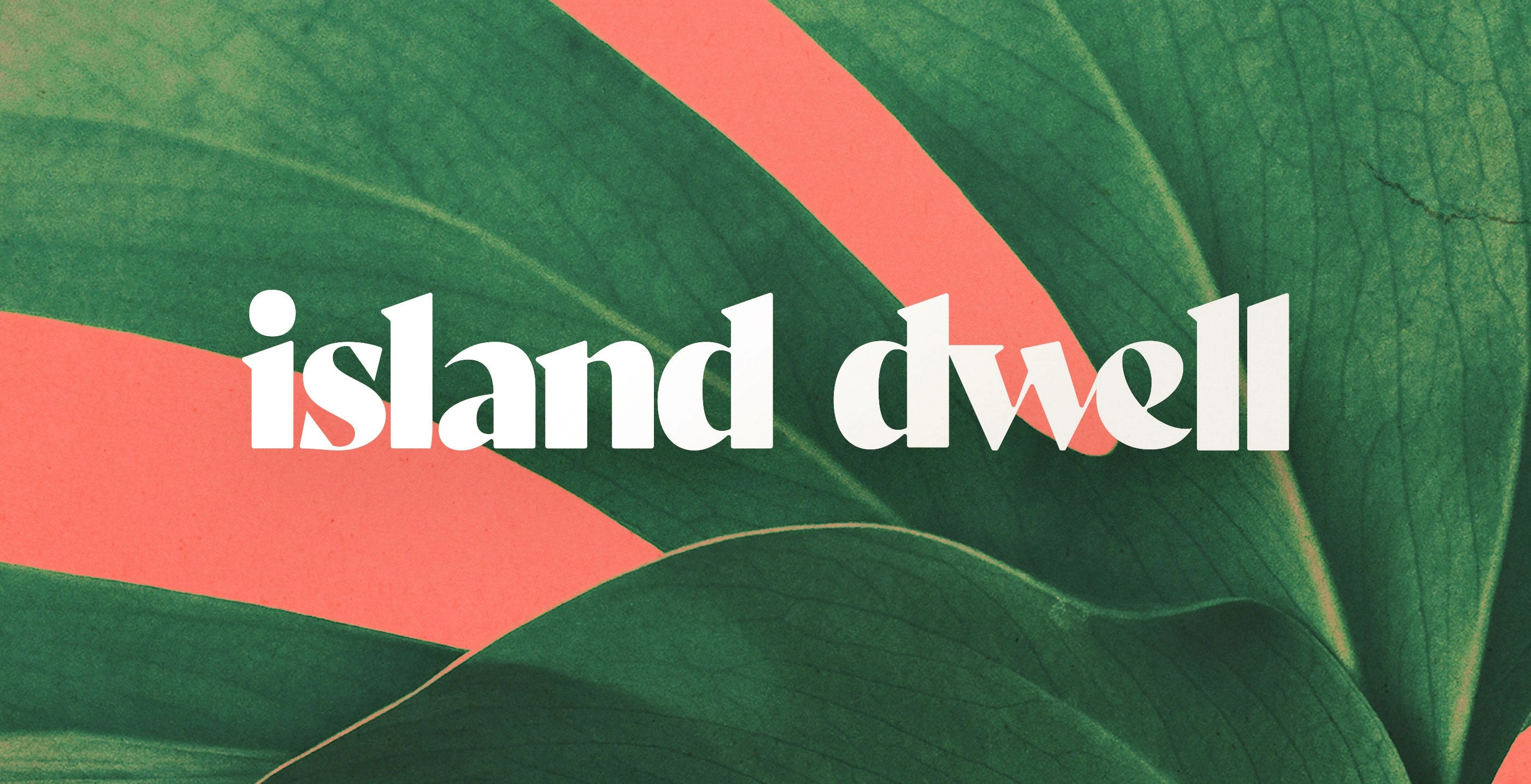
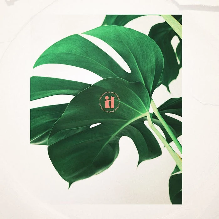
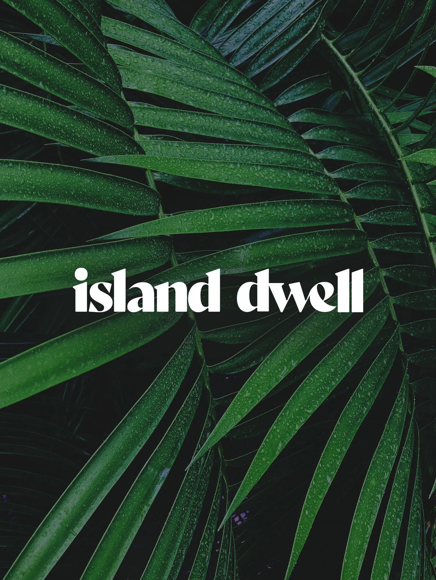
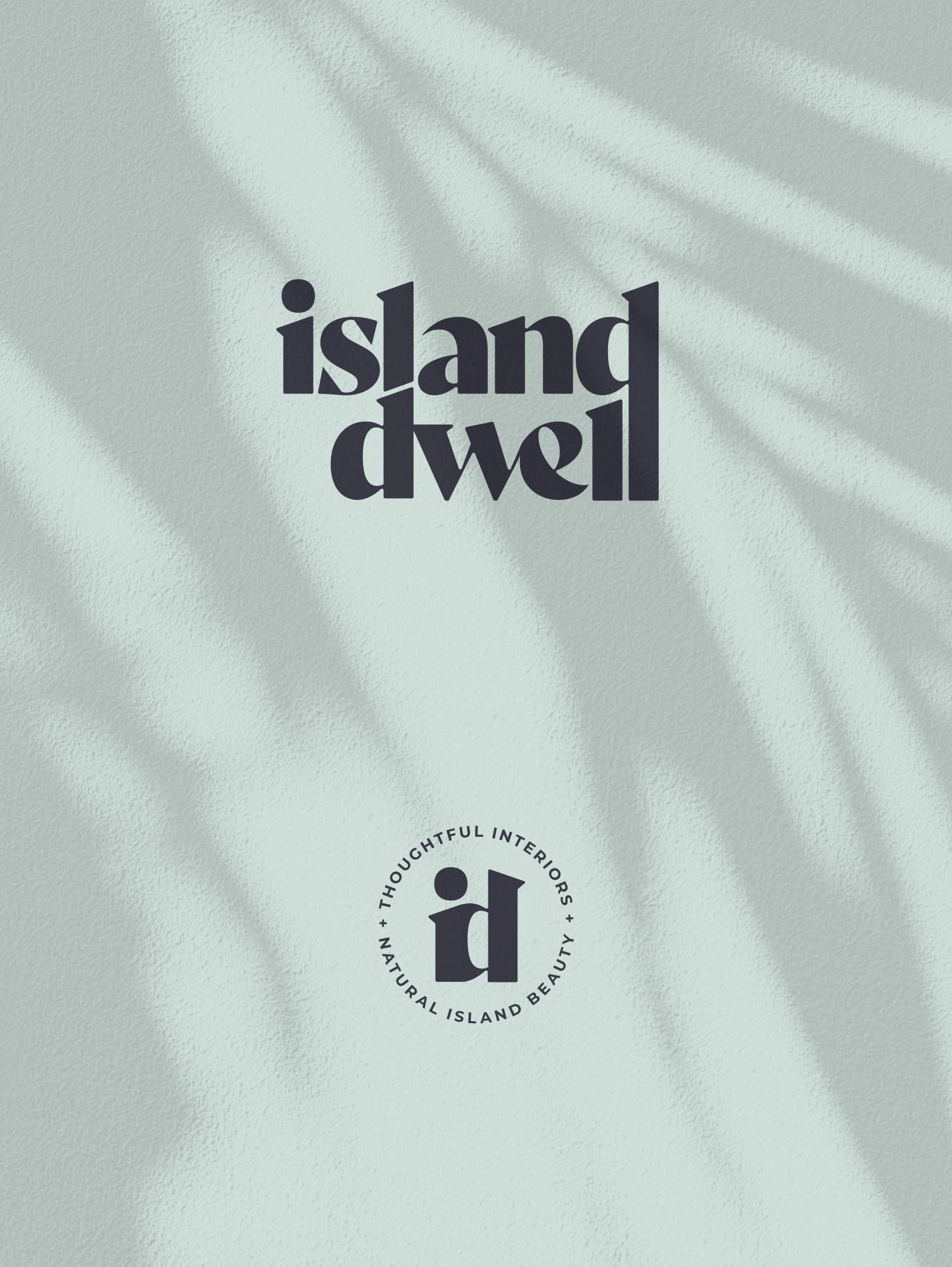
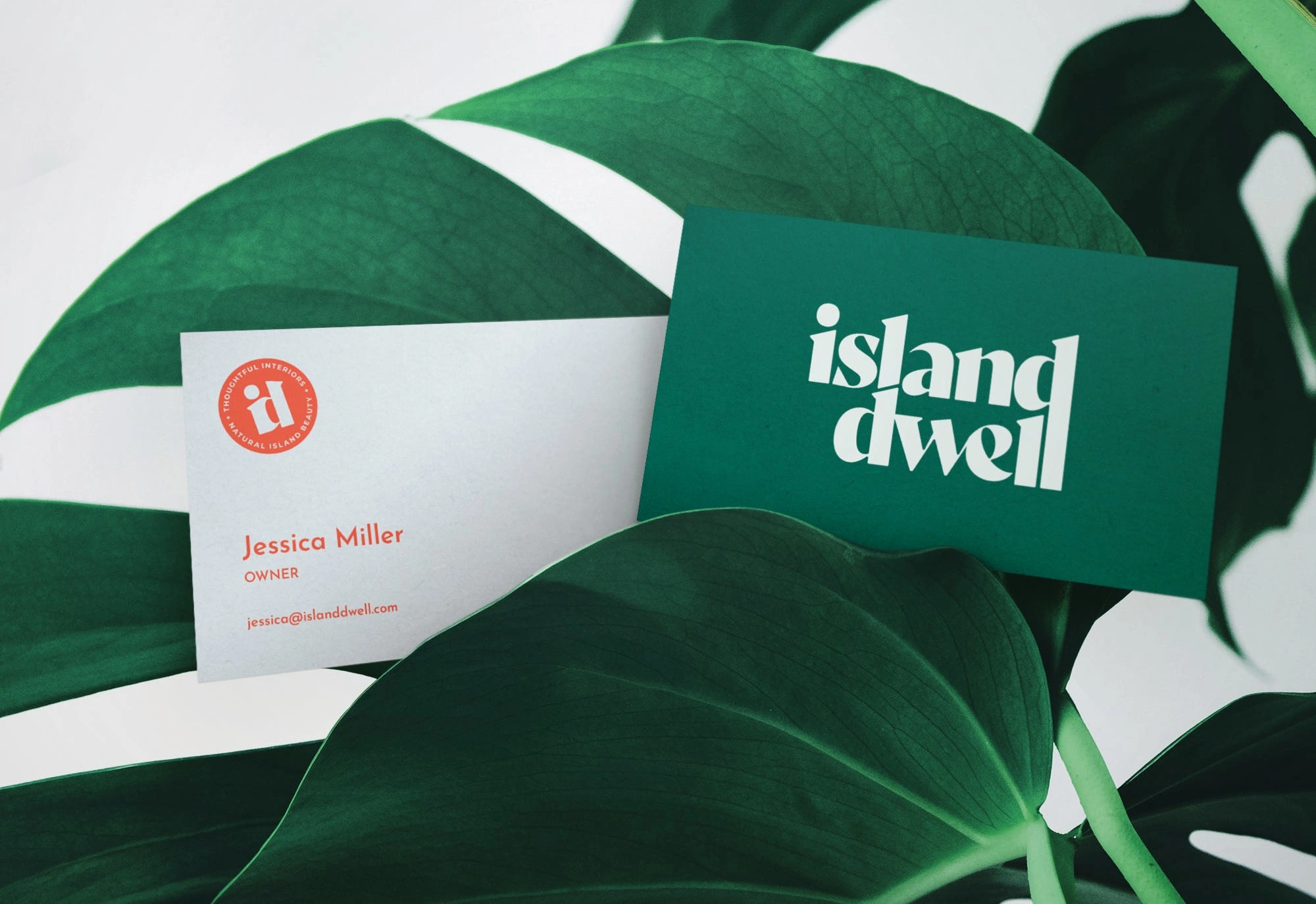
The Logo
To create the logo mark we needed to make sure it complemented the natural island beauty of Hawaii while also embodying the clean efficiency of what Island Dwell offered its clients.
We played around with illustrative styles and different icons to represent tidal vibes of the islands, nodded to real estate and the physical home, teased the aspirational island life…
Ultimately, a bold typographic mark seemed to feel like the right balance of a strong identity without tipping the scales of fun-vs-professional too far in either direction. A modern serif font was altered to trim some of its formality and create custom ligatures to tie it all together.
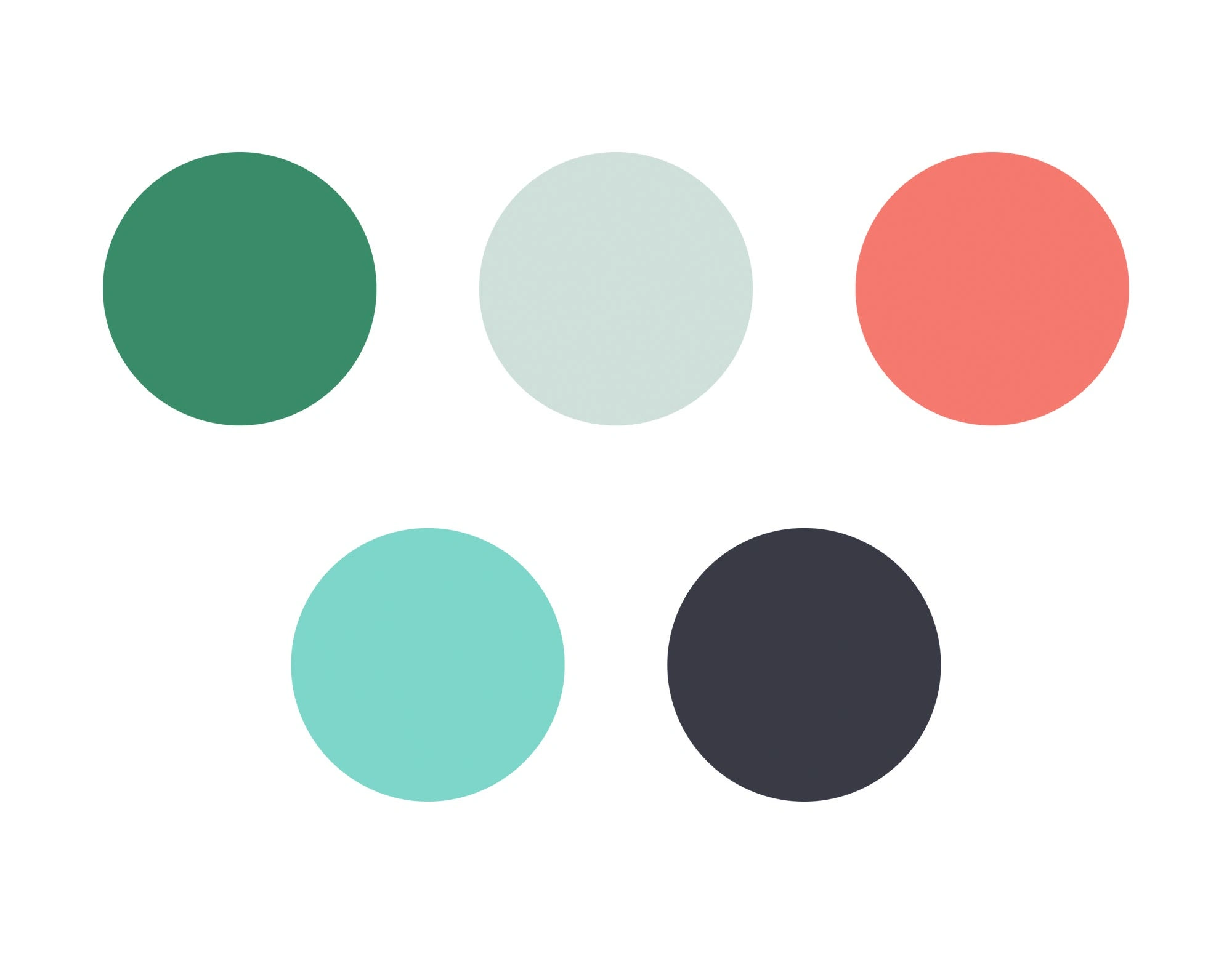
Color Palette
When exploring color, we wanted to make sure we didn’t go full tropical and create a palette for a juice shop (nothing against juice shops, obviously). But the brand needed more personality than monochrome. It seemed pretty common for interior design or real estate-types of companies to end up feeling like dentists (nothing against dentists, obviously).
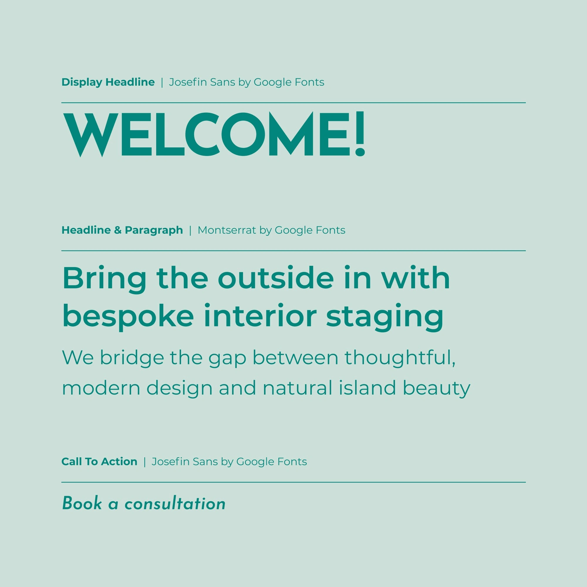
Typography
The typography pairing was narrowed down to two typefaces. Both are relatively modern san-serif forms with display headlines and calls to action given a typeface with little additional character.
Hope you enjoyed this! Interested in working with me? Reach out to hello@brettmcm.com and let’s chat.
Or cruise over to brettmcm.com to view more.
Like this project
Posted Mar 23, 2025
Case study on the brand strategy, values, logo design, color palette & type pairings for Island Dwell, a Hawaii-based interior staging company.
Likes
2
Views
28
Timeline
Jan 10, 2020 - Feb 10, 2020