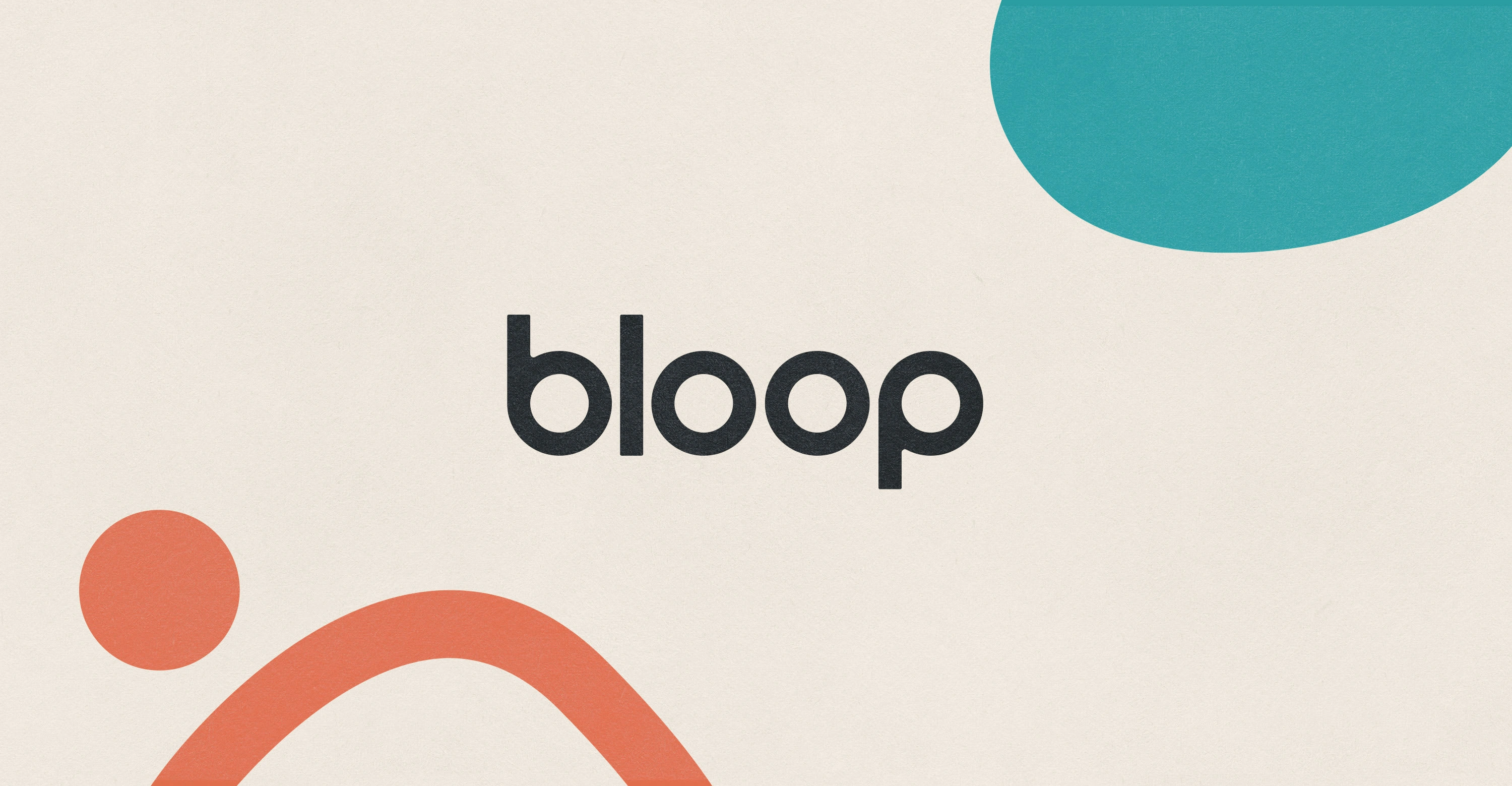
Bloop
Brett McMillin
Branding Bloop
There’s more to sustainable scents than patchouli.
When the team at Canary came to us and told us they were spinning up a sister brand focusing on the laundry room, of course we were in. As they started explaining to me all of the fun chemicals and scents that go into my current laundry soap, my shirt started feeling like poison. The problem (as my sustainable sherpas began to explain) was that most of the options devoid of chemicals make you smell like a hippy. No offense hippies.
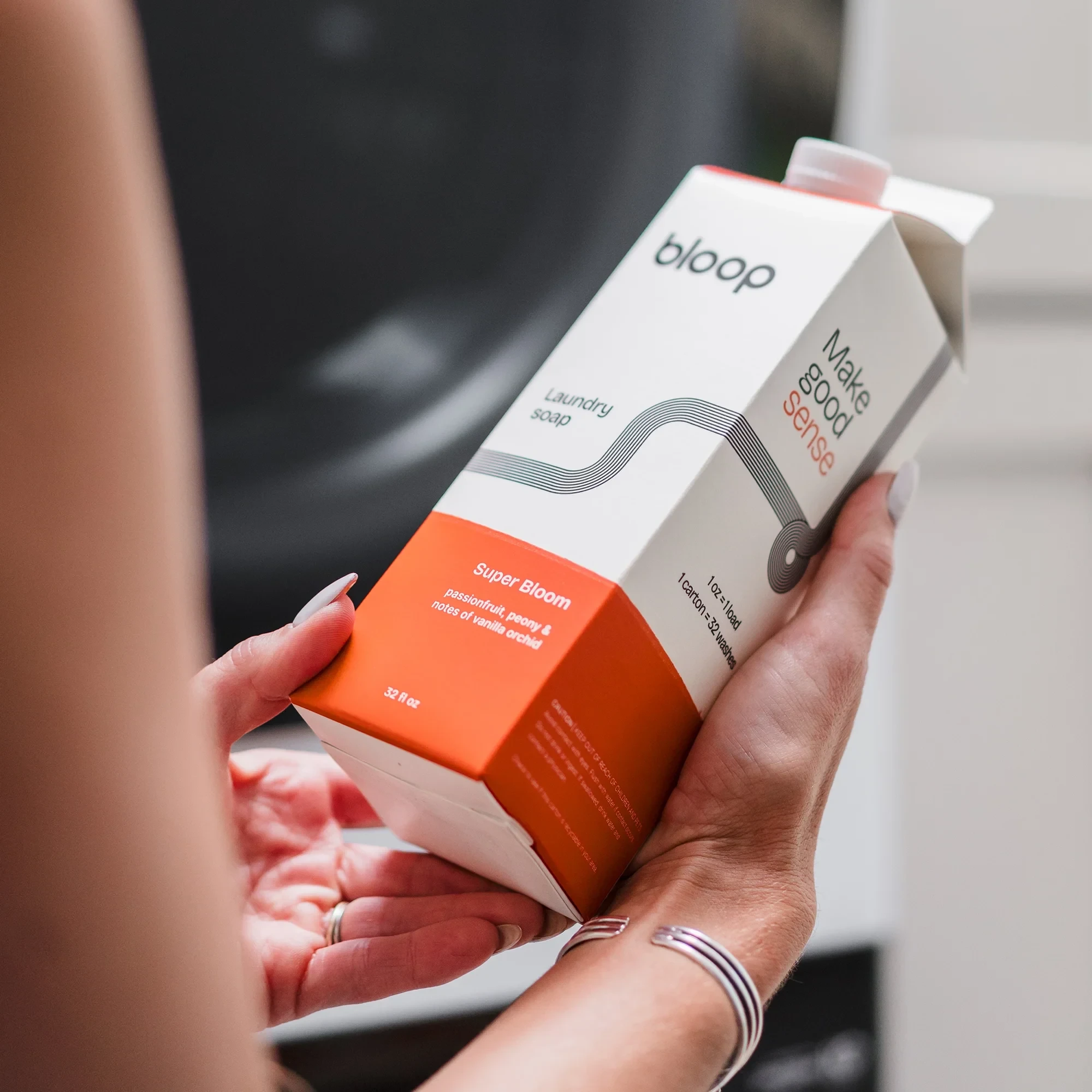
Bloop delivers a small-batch, toxin-free laundry soap in a variety of fresh scents that go beyond essential oils.
The Bloop team wasn’t satisfied with having to decide between natural soaps or fresh smells that didn’t broadcast you were all into Mother Earth (even though you are).
Brand narrative
It’s human nature to seek what pleases the senses. To take action to improve our lives. To connect with where we feel we belong. And to find joy along the way.
It’s our nature to achieve this with Bloop.
We break through what’s been done before, for those who want to freshen up their home essentials game. Taking conventional products for the home and bringing them to you in an unconventional, enjoyable way.
Crafted scents you actually want to smell like, natural ingredients safe for your household and a fresh aesthetic that vibes up any room. We aim to please all of your senses.
We smell good, we look good, we feel good.
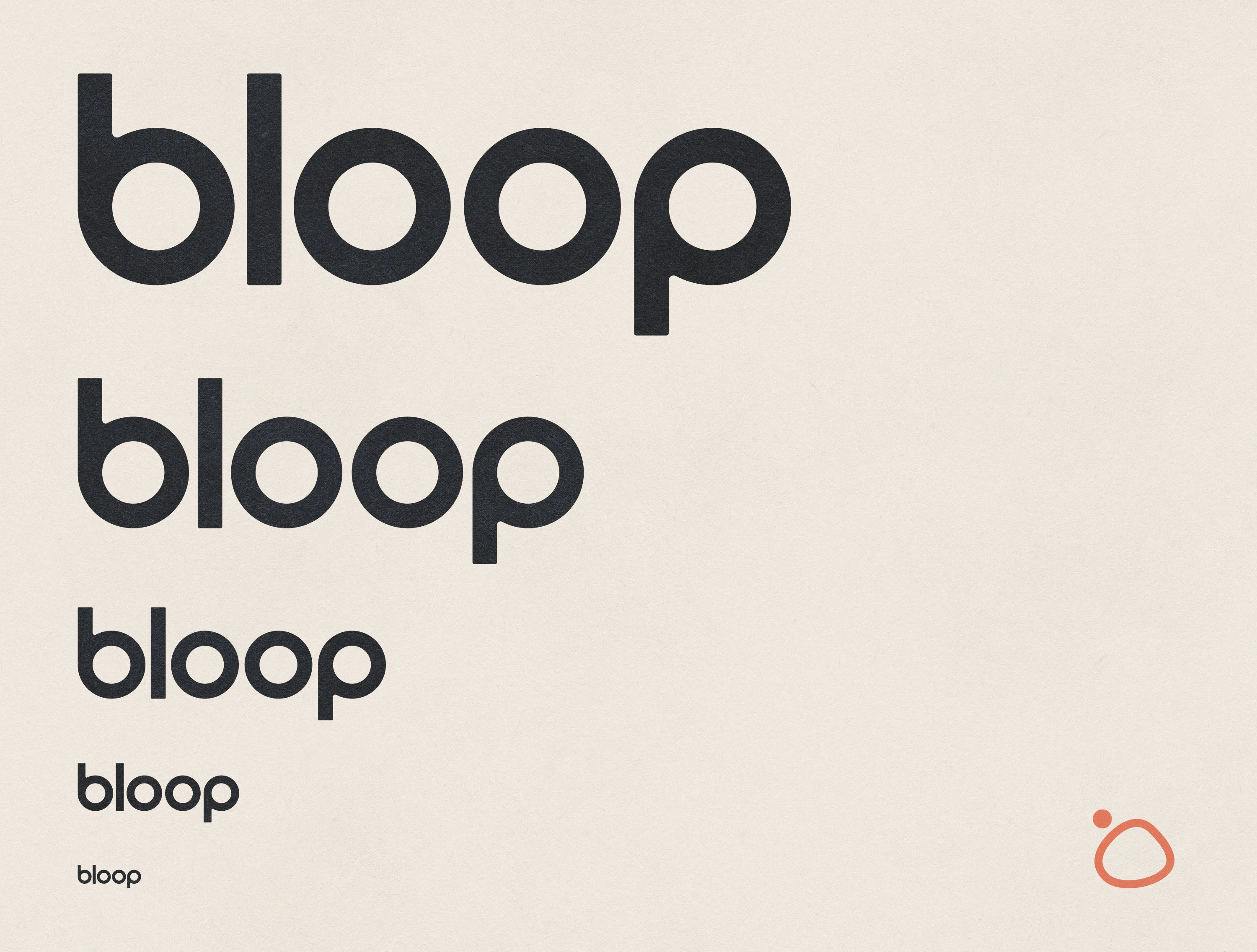
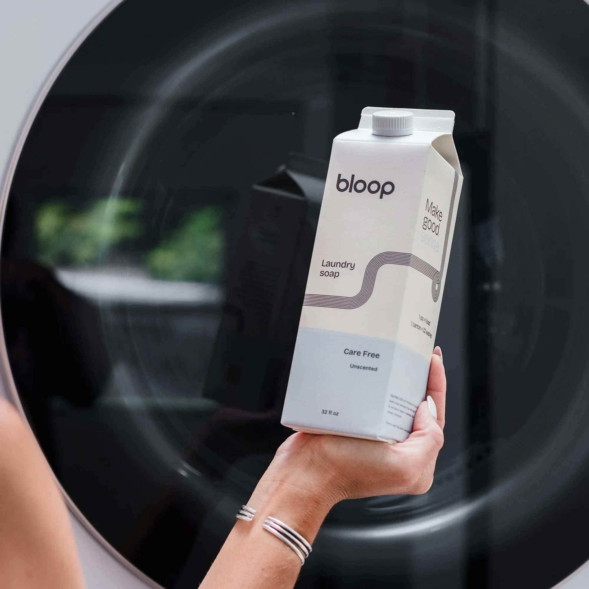
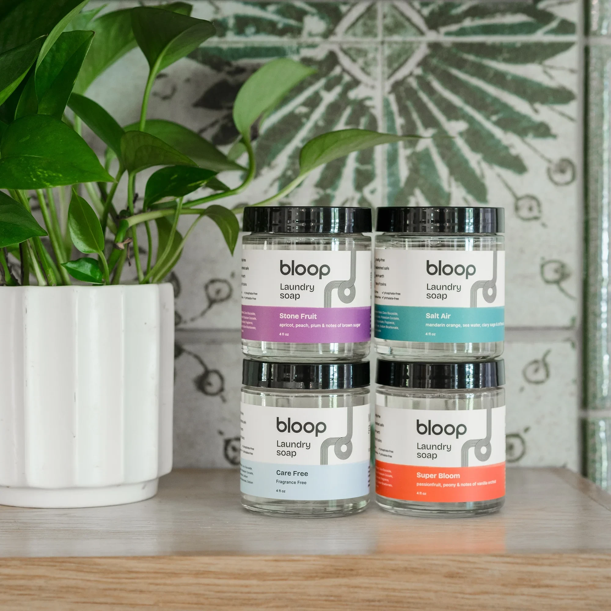
The simple minimalism of a modern, clean laundry room inspired the visual direction of the brand.
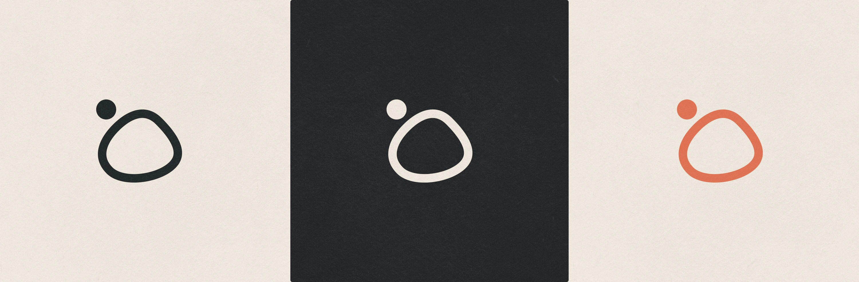
Even weighted lines and geometric balance in the custom typeface provided a solid foundation. The suds icon gave the identity it’s playful and imperfect character.
Visual Identity
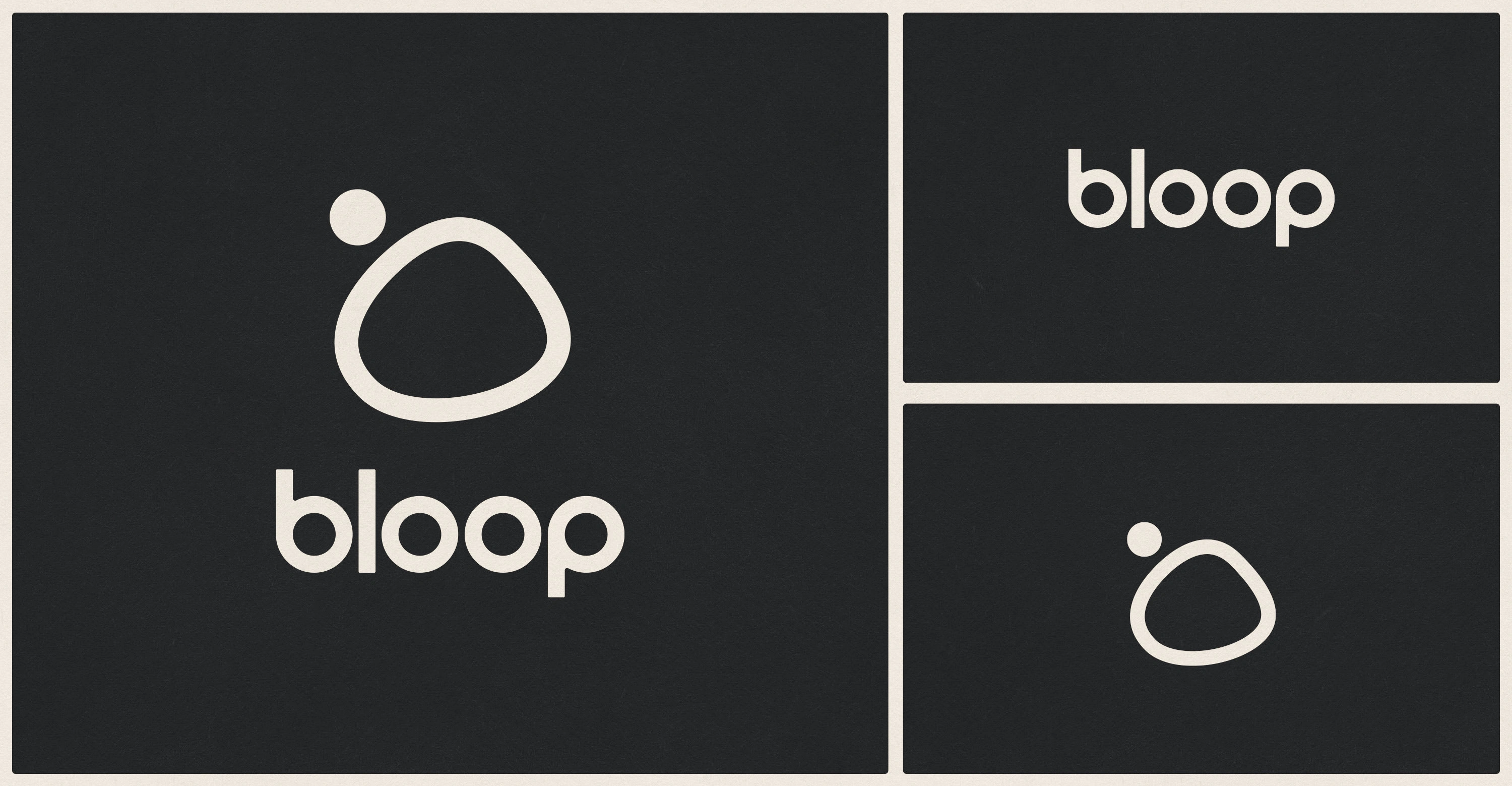
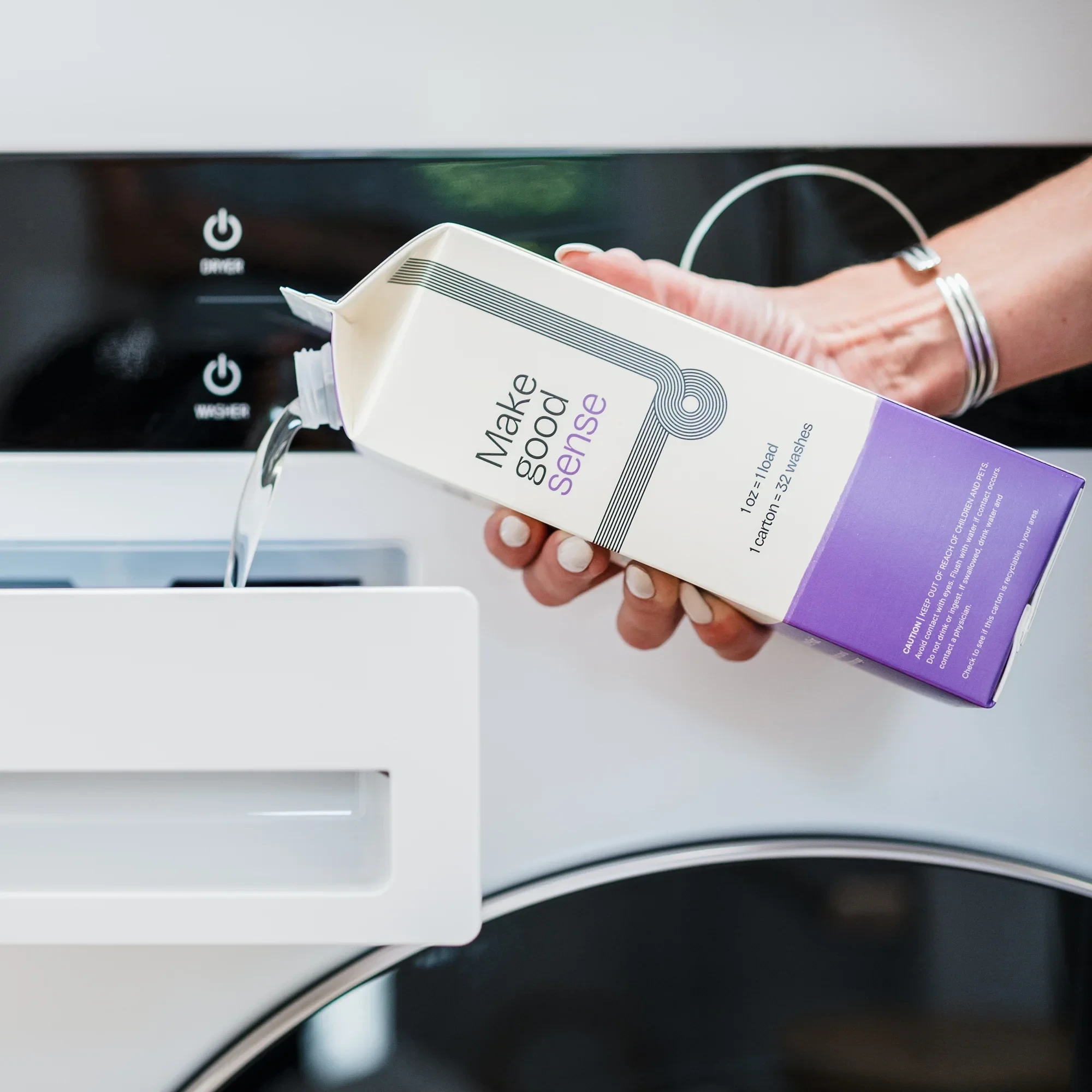
The identity is simple but expressive. The custom wordmark feels soft and rounded, like a sudsy bubble that just popped. The typography is bold, legible, and modern, but never sterile.
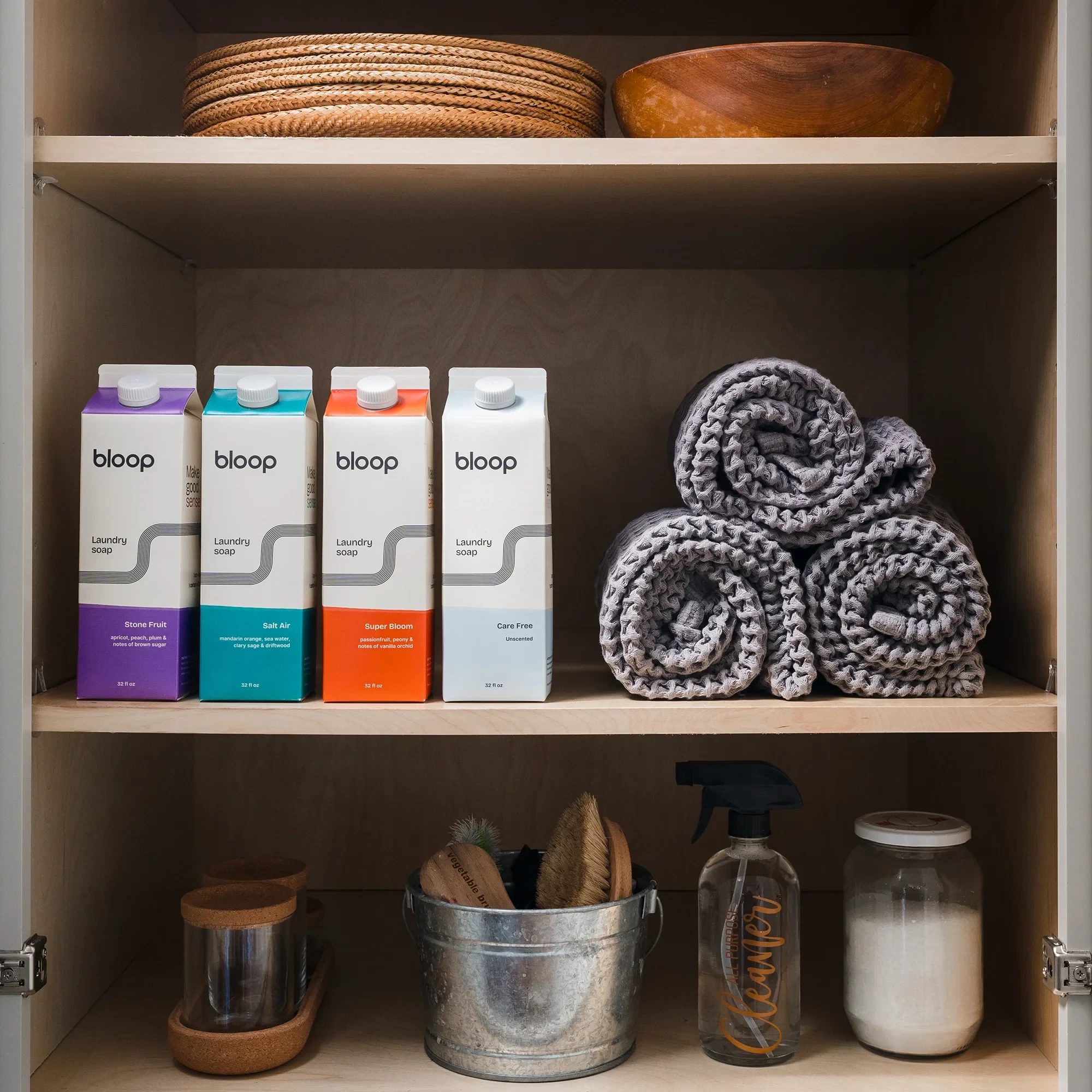
Color plays a big role — clean whites paired with punchy accents for flavor variants or seasonal editions. It was important to keep the system feeling fresh and functional, without falling into typical “eco” cues.
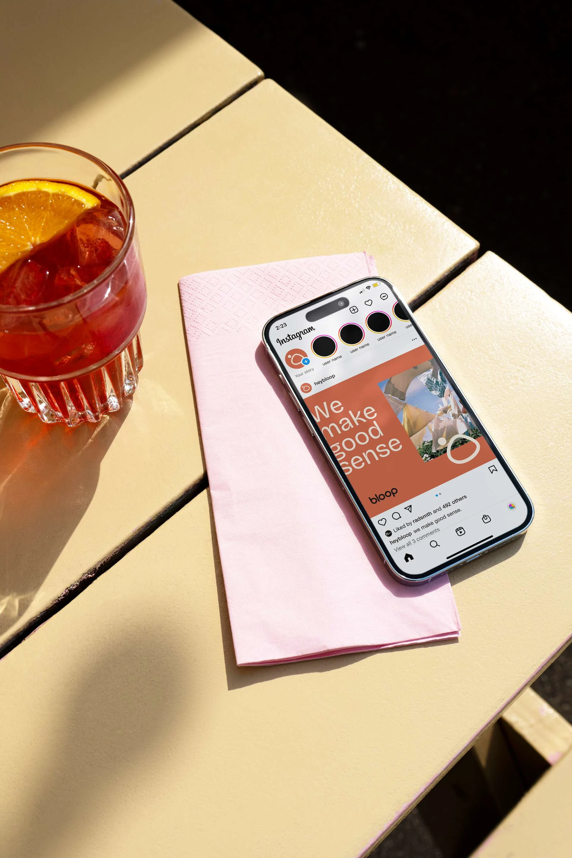
Laundry soap research pairs well with a Negroni
The suds icon was an extension of the midcentury modern aesthetic we knew we wanted to ground ourselves in. Asymmetrical geometry and contrasting shape sizes were ubiquitous in MCM design and we wanted to try and allude to that in the identity.
Bloop dood!
We wanted a mascot. But we weren’t sure if it would work with the voice of the brand. Ultimately we were able to weave in Bloop Dood’s purpose into the overall narrative of the brand. He’s a shy little guy and only shows up occasionally. He’s really there to just make sure you’re doing okay and gives you helpful little nudges towards loving Bloop.
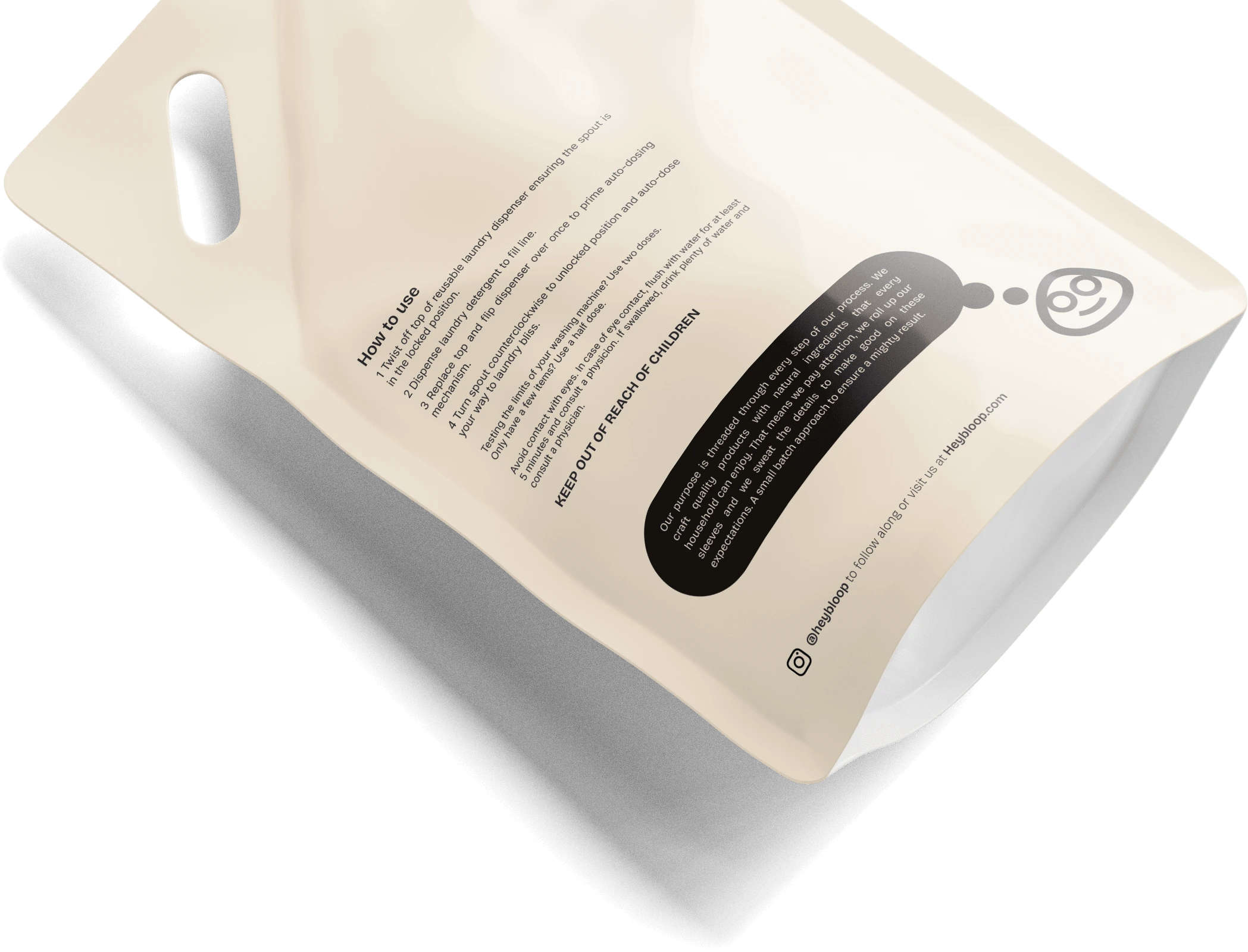
It should go without saying that everybody just loves their giant orange plastic tubs sitting on top of their washer.
Hilarious. We did talk a lot about the packaging. They wanted their soap vessels to be both plastic-free and artistically beautiful. Something you’d like to look at day in and day out. Friendly with a minimal, mid-century modern intentionality (who doesn’t love a little MCM vibe?)
Voice and Tone
Bloop strived to do less, better. They also knew that they weren’t perfect. But we are trying to do the best we can. (Aren’t we all?) That means we may stumble, we may zig when we should have zagged, we may run into challenges that give us a few extra gray hairs. And, we get back up.
This was an important core value. Bloop knew they couldn’t claim perfect (not many brands can) when it comes to being fully sustainable and carbon-neutral. But they didn’t want to shy away from an honest conversation about it and move forward to better themselves. To be imperfect just means there is room to do a little better — for Bloop and, hopefully, for the planet.
Outcome
Bloop launched with strong presence in mostly online outlets. The brand’s personality-forward approach helped it punch above its weight in a crowded space, creating a sense of trust, fun, and repeatability from day one.
For me, this was a dream project — the kind where strategy and aesthetics align perfectly, and you get to build something from scratch with a founder who cares deeply about their product. Bloop is proof that even the most utilitarian products can be joyful when you approach them with thought, craft, and heart.
And that’s it! Thanks for reading. Hope you enjoyed it.
If you want to know anything more or have any projects that need this kind of brand care, reach out to book some time to chat today!
Like this project
Posted Apr 18, 2025
Developed Bloop's brand identity for toxin-free laundry soap with a modern aesthetic.