Sea Lion Electric Equipment
Sea Lion Electric Equipment
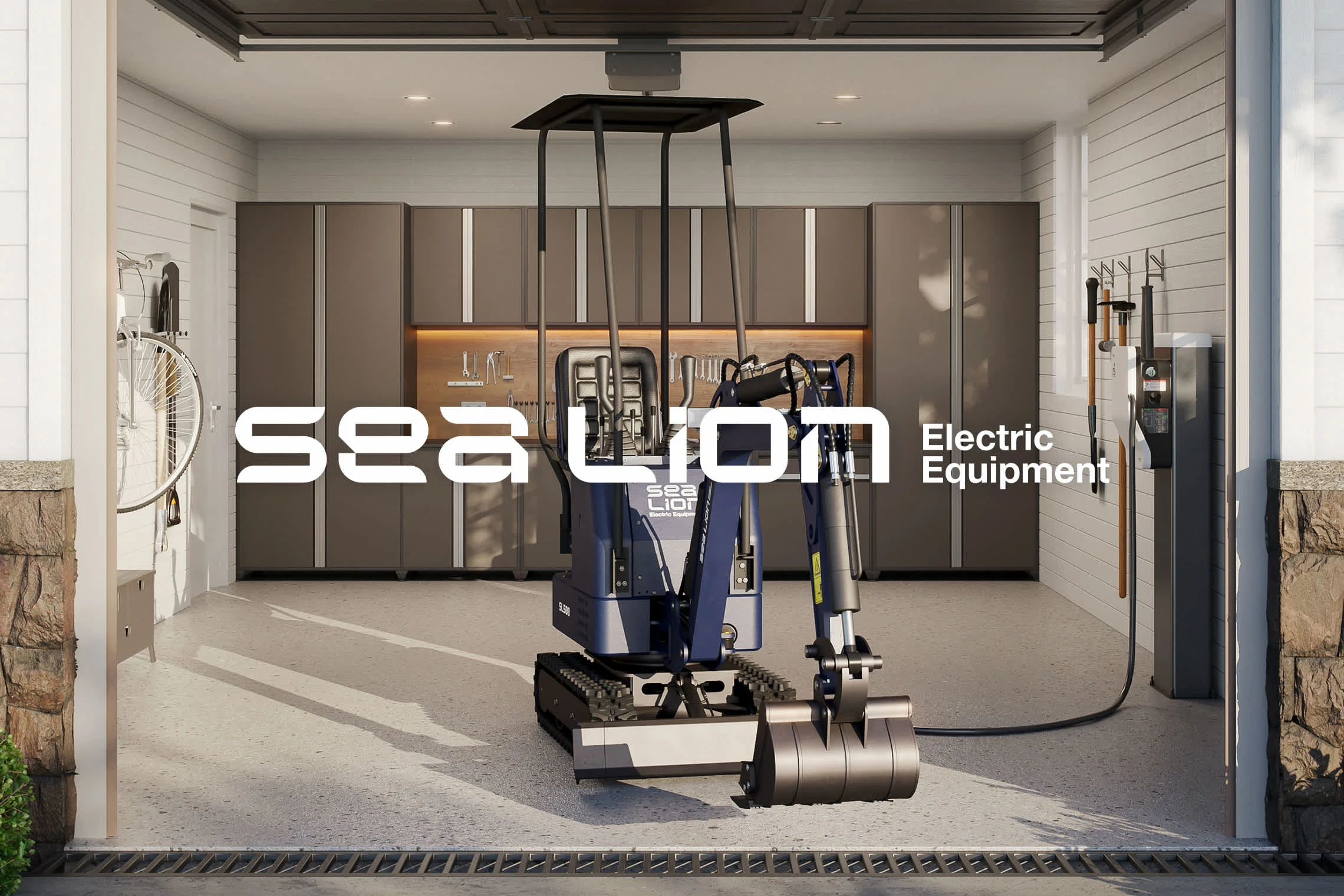
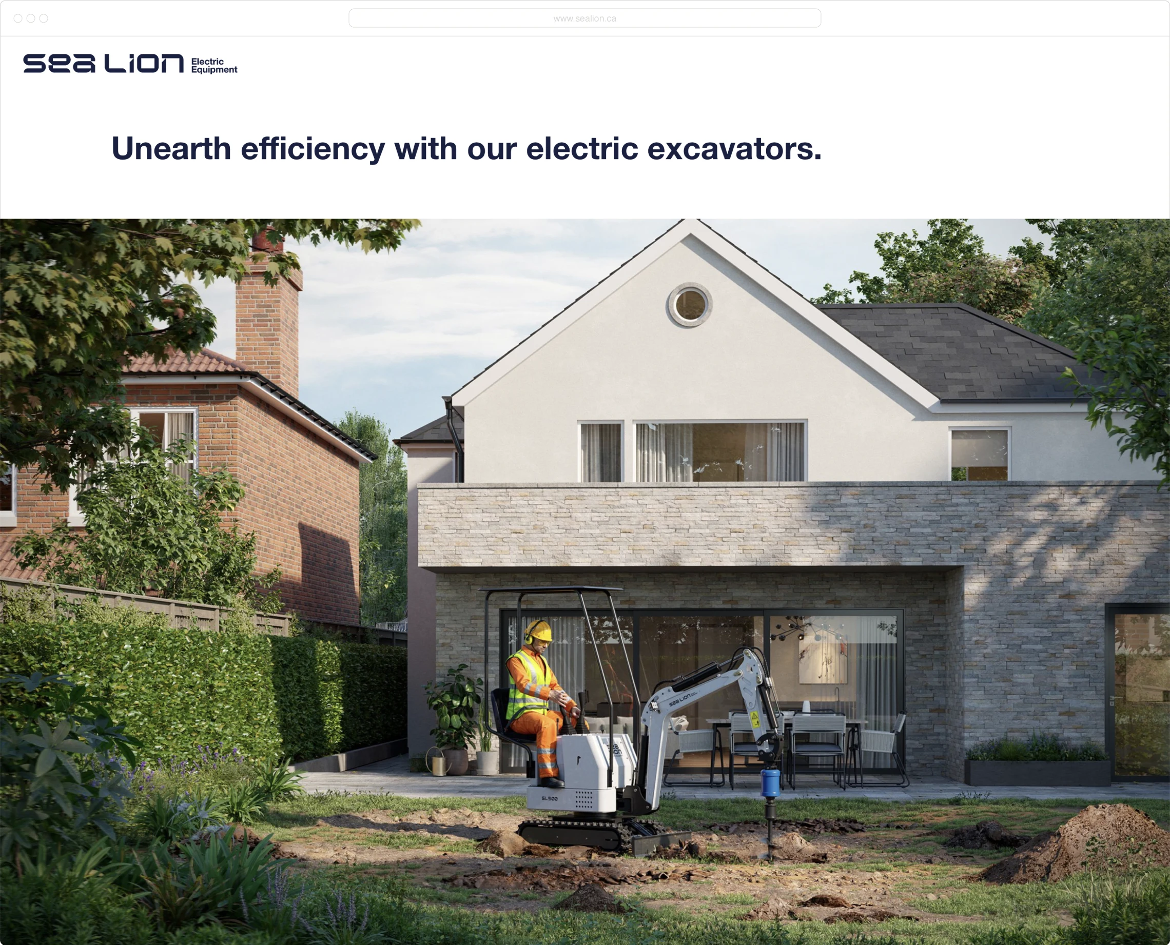
Sea Lion Electric Equipment started when the founder was looking to solve a problem. They needed a mini excavator for projects around their property, but were only able to find the standard gas-powered models. Without a gas station nearby, this would mean storing fuel or making long trips. The answer? An electric mini excavator that is strong enough to do the work, small enough to fit in the back of a pickup truck, and can be charged overnight at home.
They had a product. They needed a brand.
We dove into strategy and it was clear that Sea Lion was a market disruptor. There’s a negative sentiment towards electric machinery, but Sea Lion offers superior, cost-effective solutions. The brand has to be confident, but also have a bit of a sense of humour and not be easily shaken. It’s going up against big names, and fighting an uphill battle—it can’t be afraid to put itself out there. Modern, forward-thinking, cool, but zero ego.
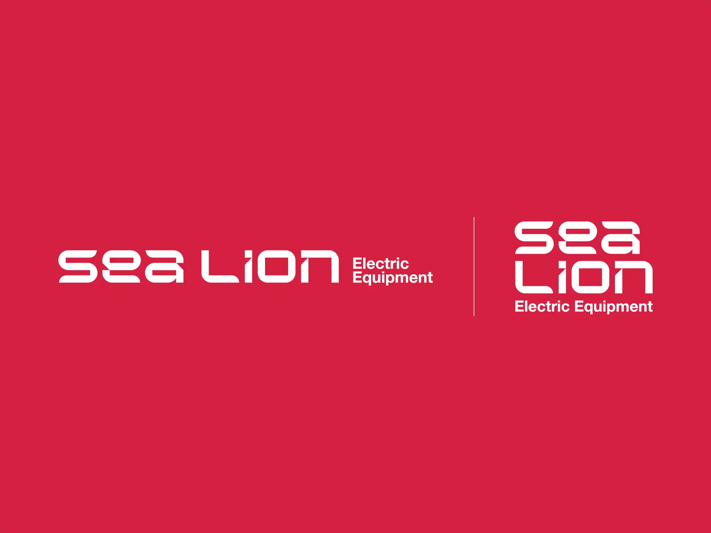
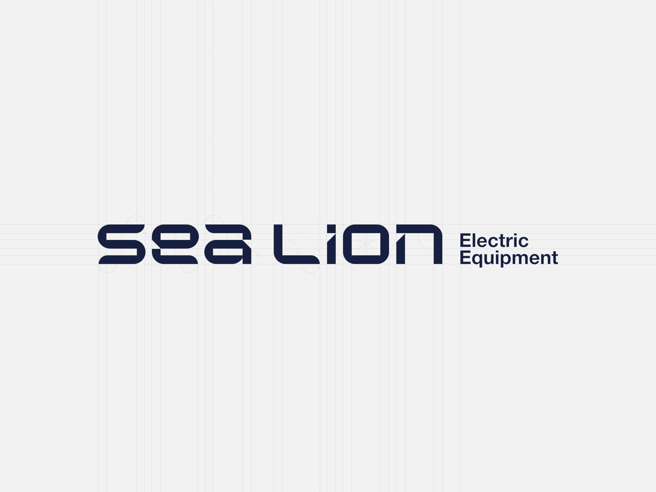
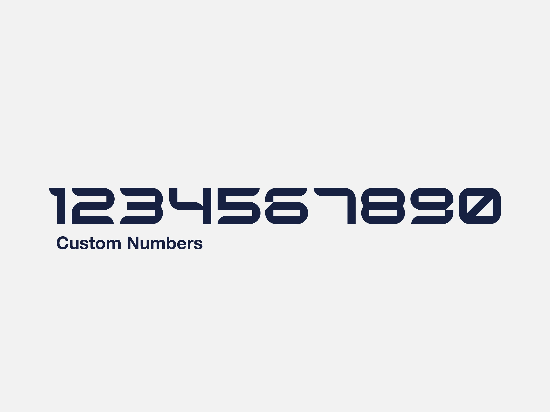
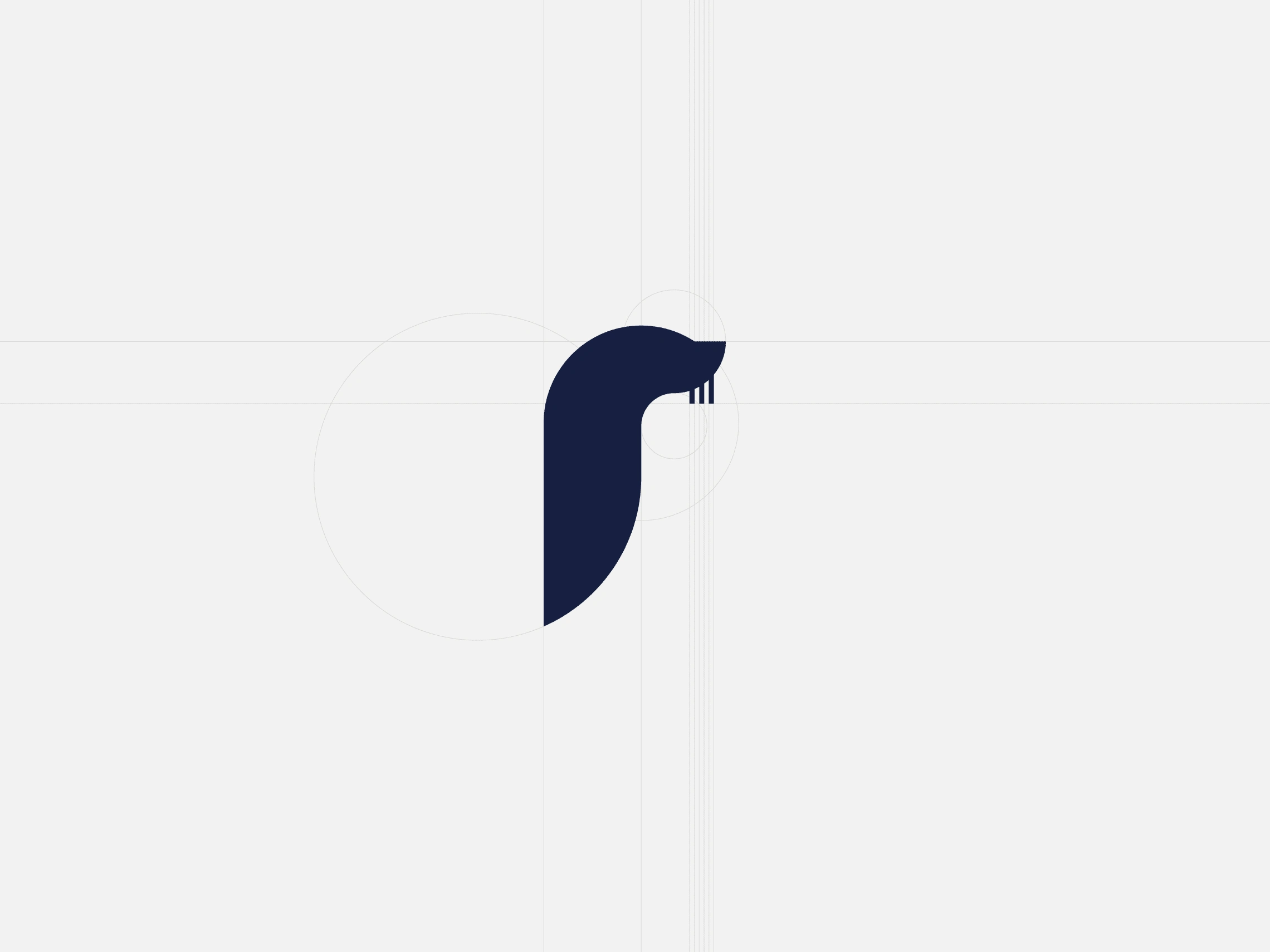
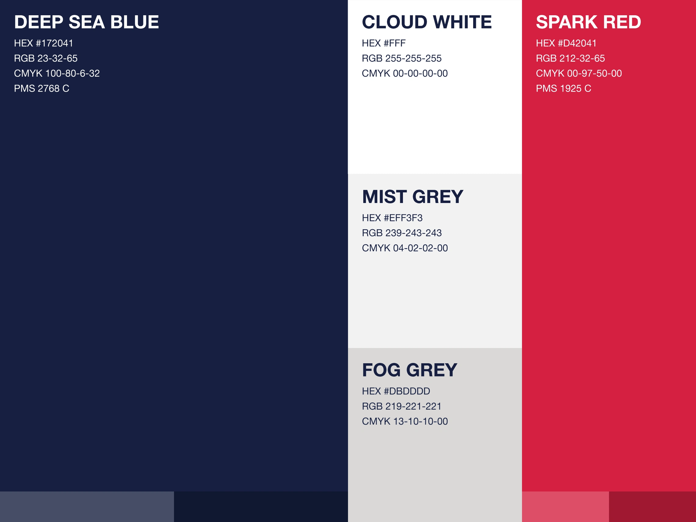
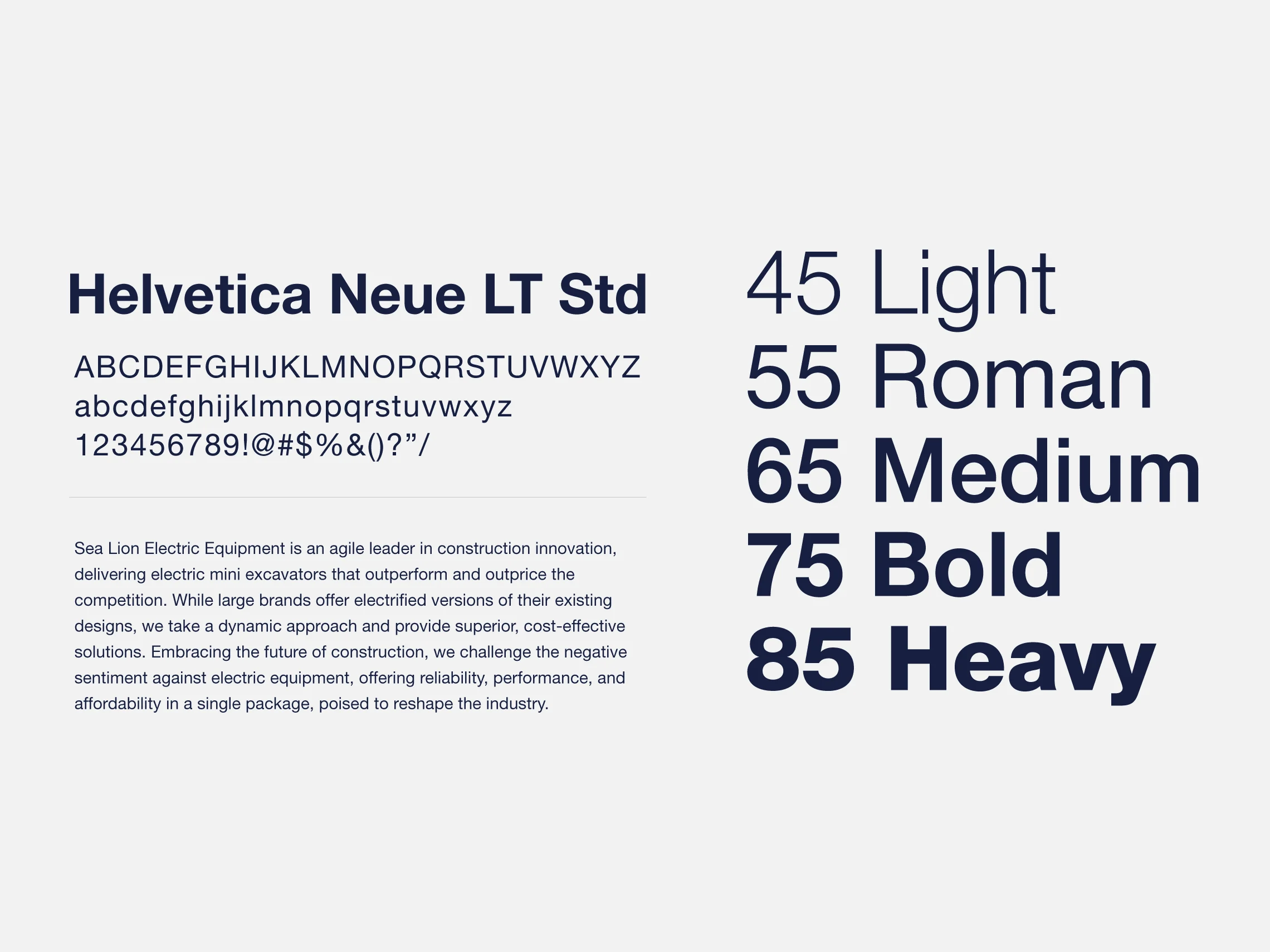
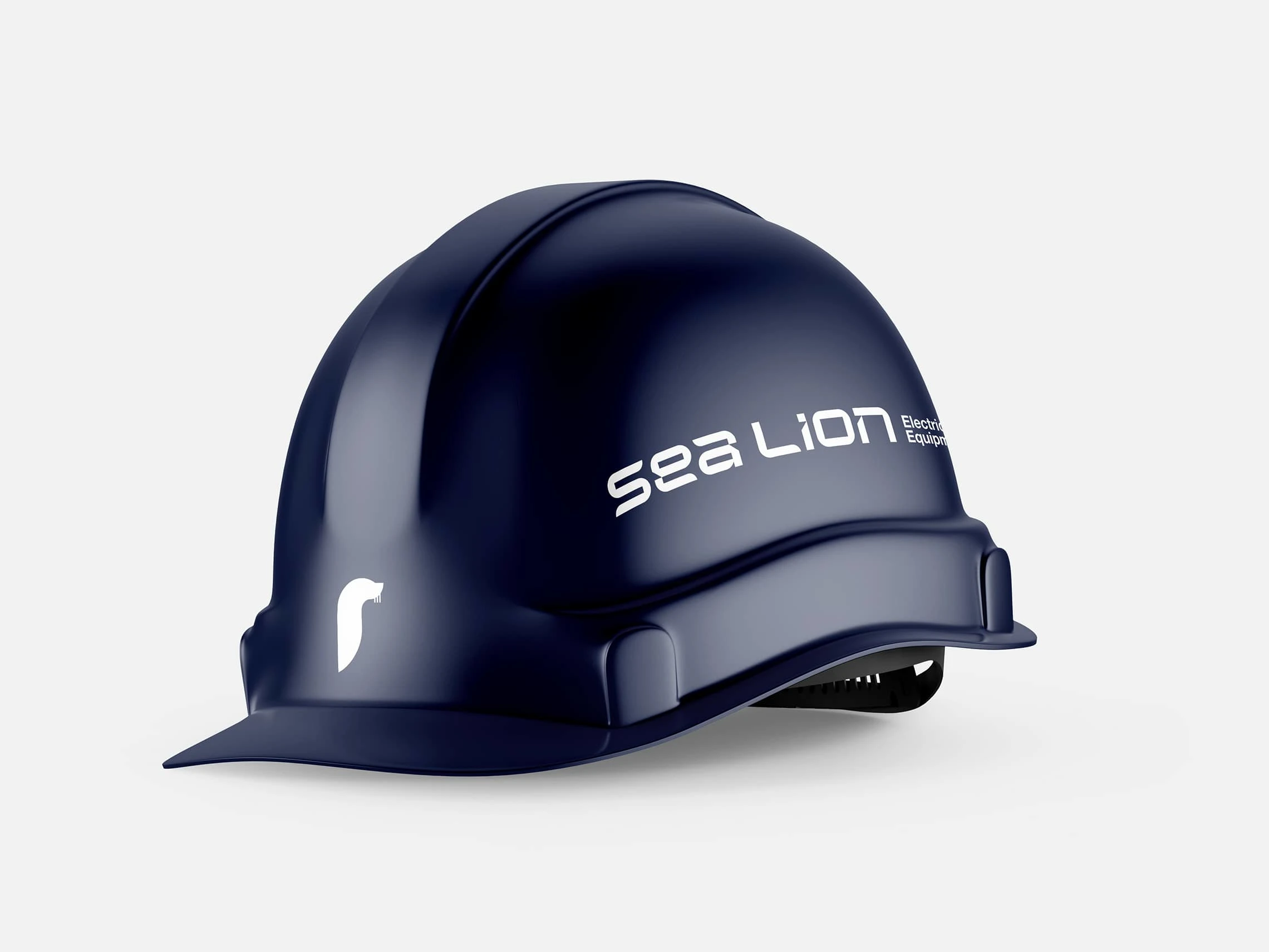
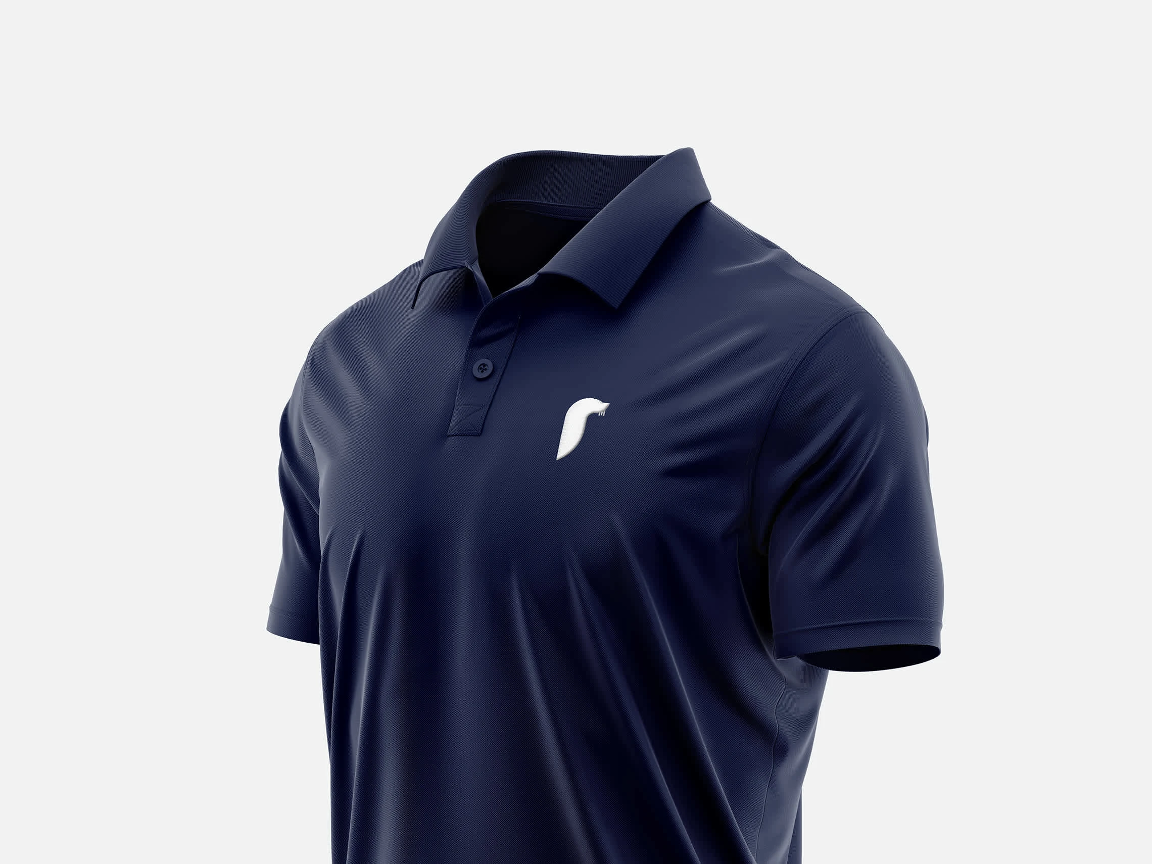
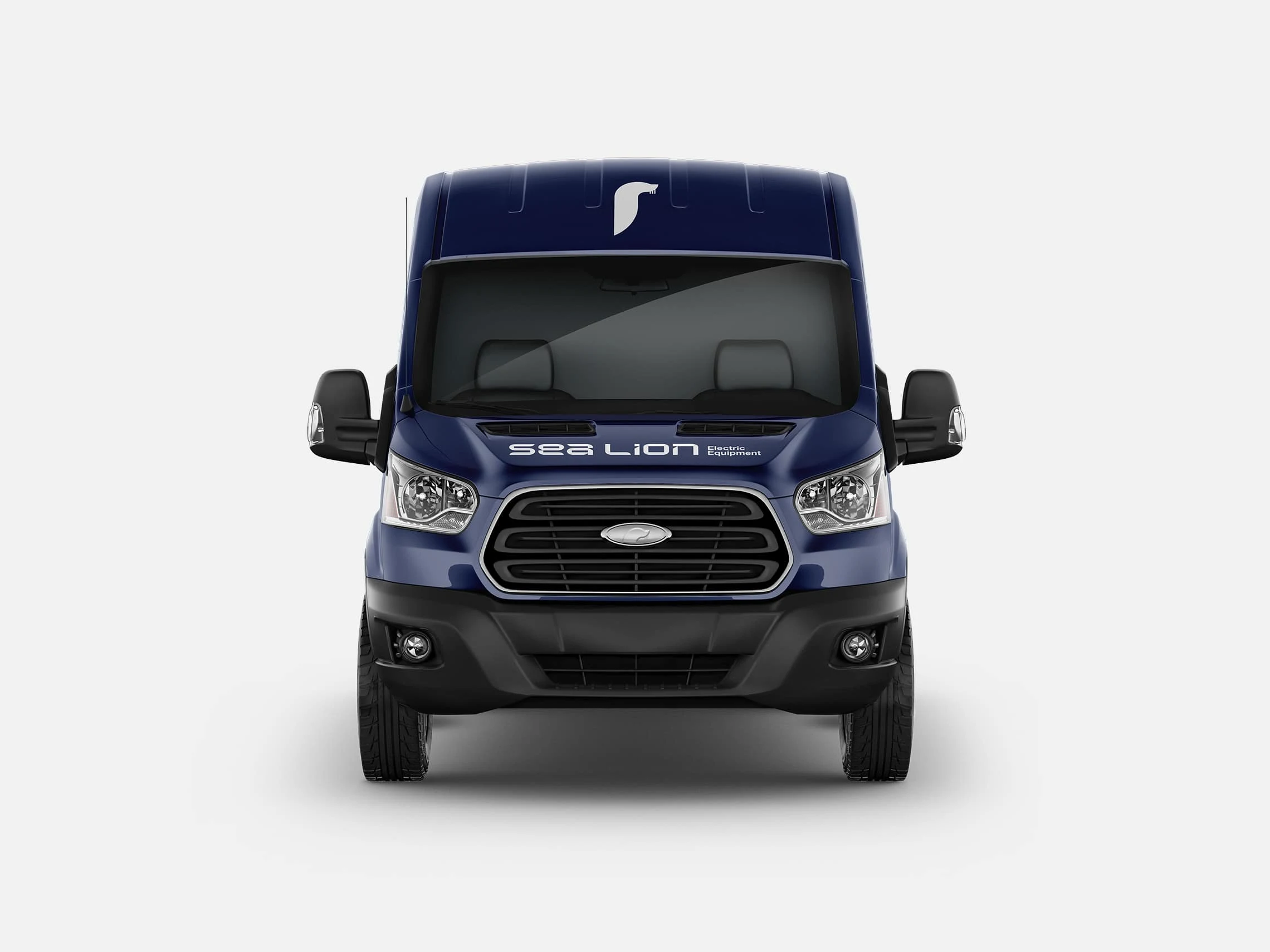
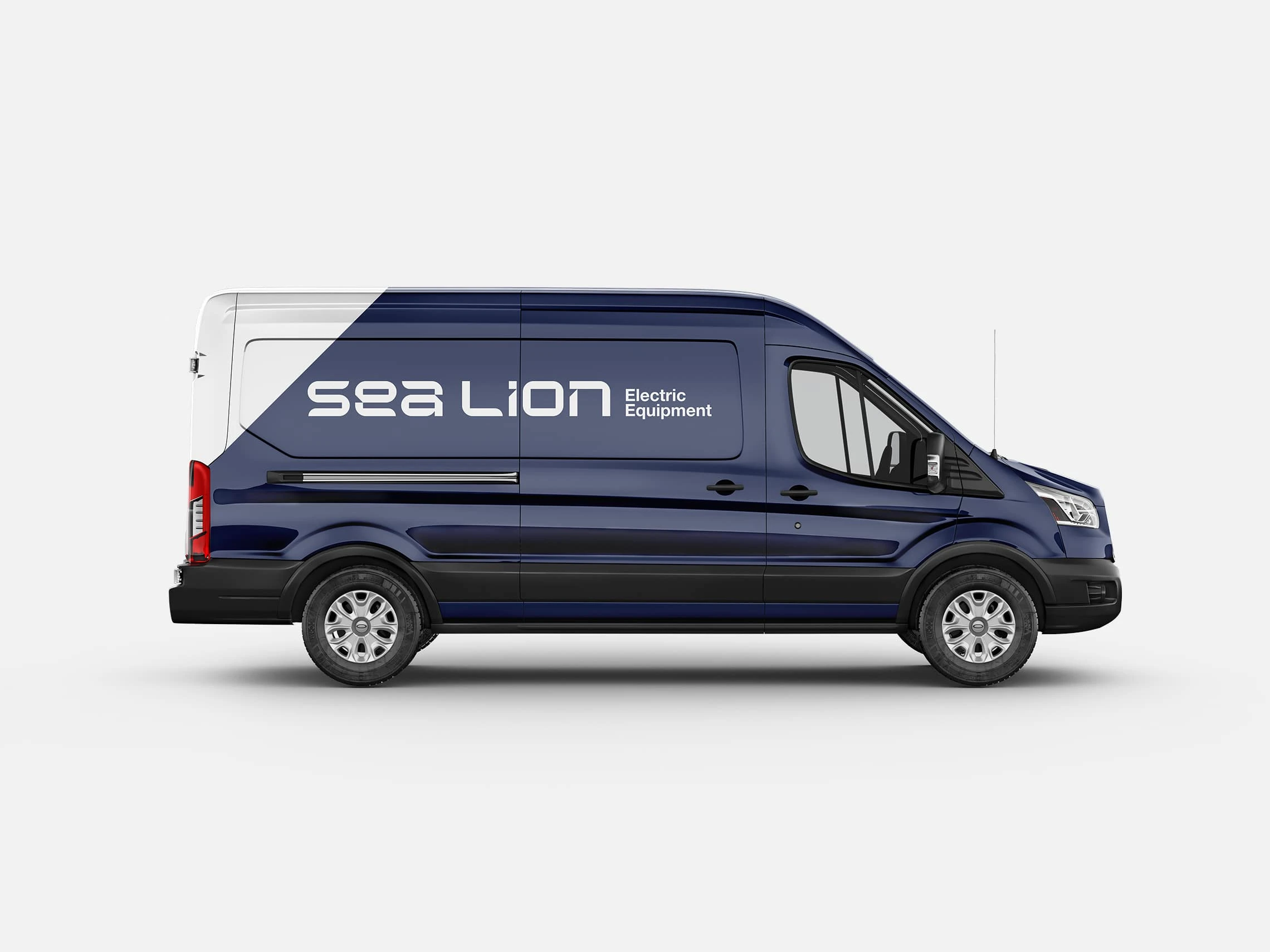
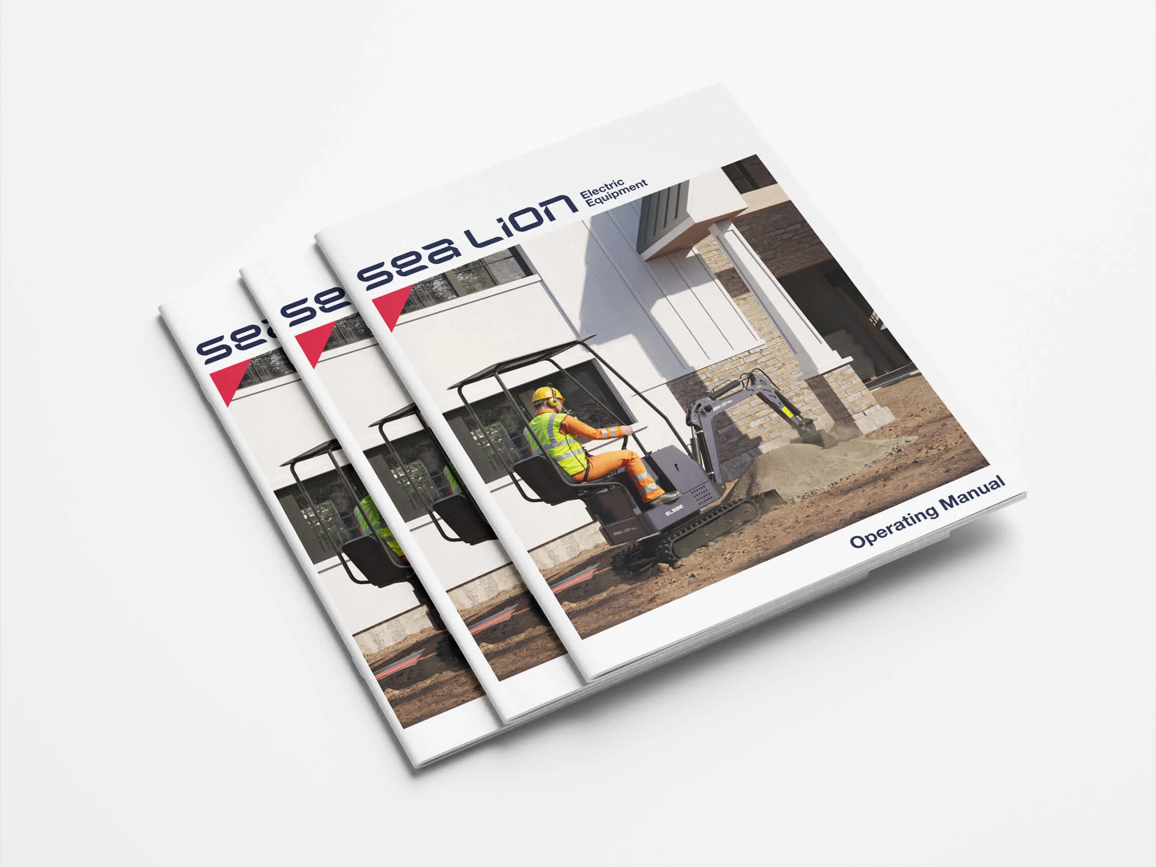
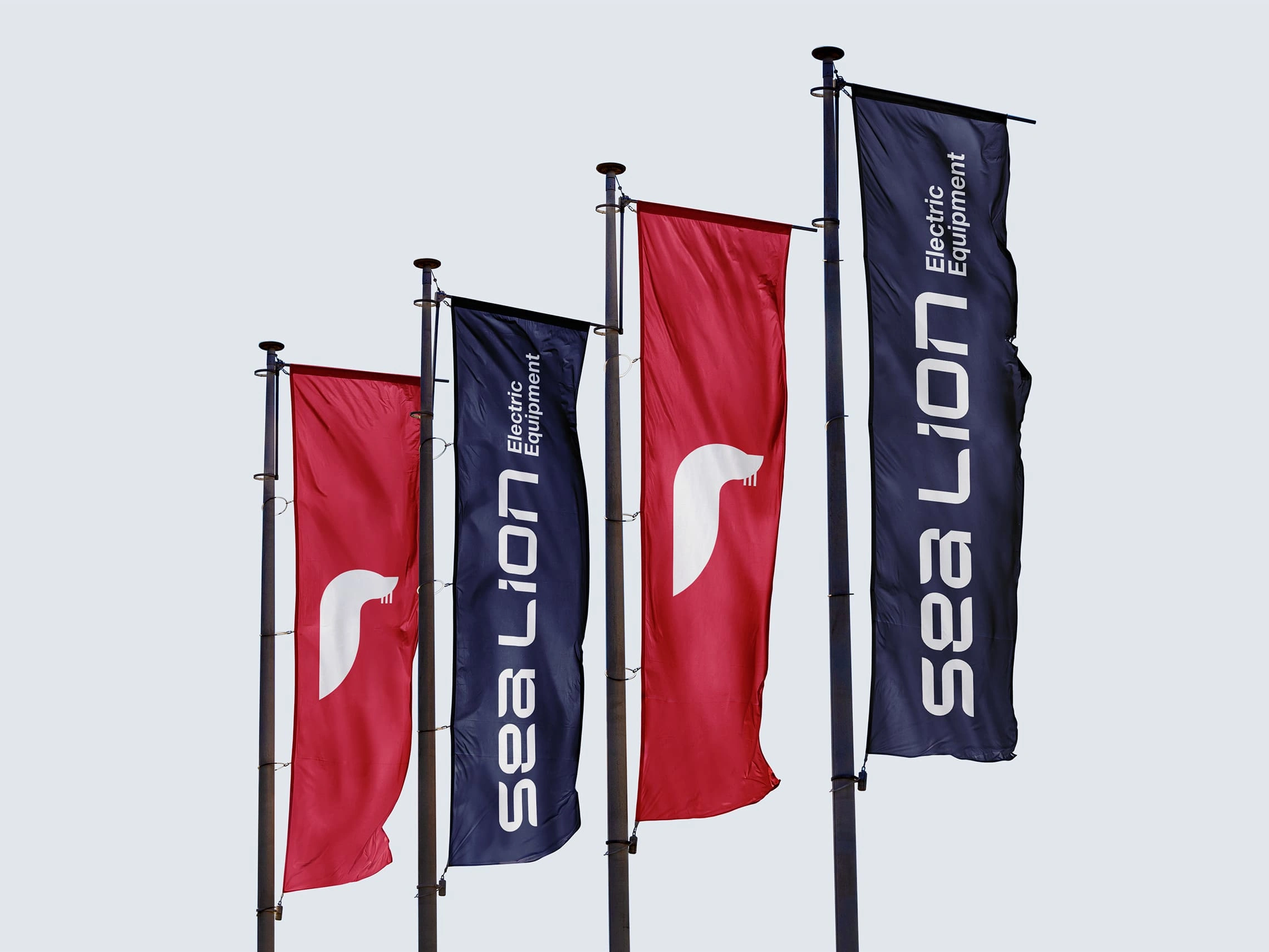
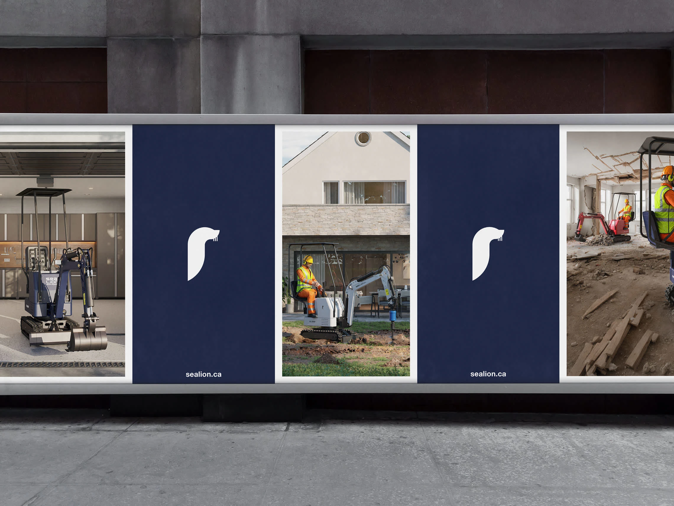
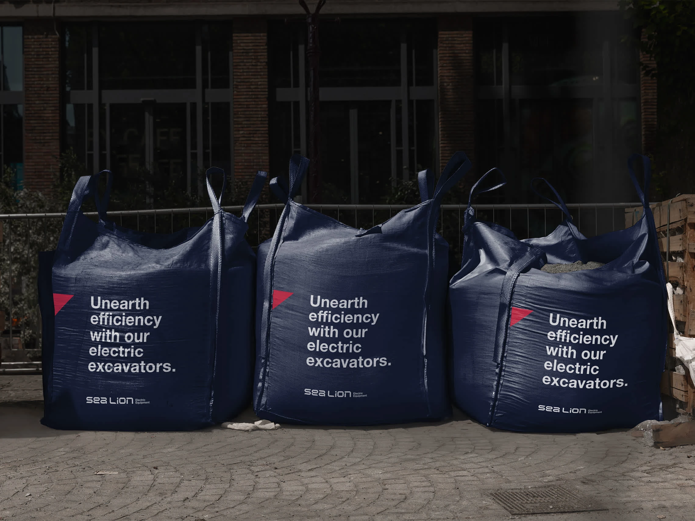
Every element of the visual identity system to had align with this ethos. The result is a custom typeface that was created for the logotype that felt quick and agile. It’s bold, modern, and aims to stand out among similar brands, while feeling familiar to customers who are familiar with those brands. The typeface was further expanded into numbers used to differentiate excavator models. A geometric sea lion icon was developed as a secondary mark, subtly used across branding, marketing, and products. The colour palette keeps the visual language feeling light and fresh, bringing in bold colour as needed, the notches removed from the logotype are used as a design element, while timeless typography balances everything out.
3D Renders: CAV Studios
Logos. Branding. Packaging.
www.brettlair.ca | hello@brettlair.ca
Like this project
Posted Sep 13, 2024
Branding a market disrupter in the electric machinery space. An electric mini excavator that is strong enough to do the work but fits in the back of a truck.

