Iron Road Brewing
Iron Road Brewing
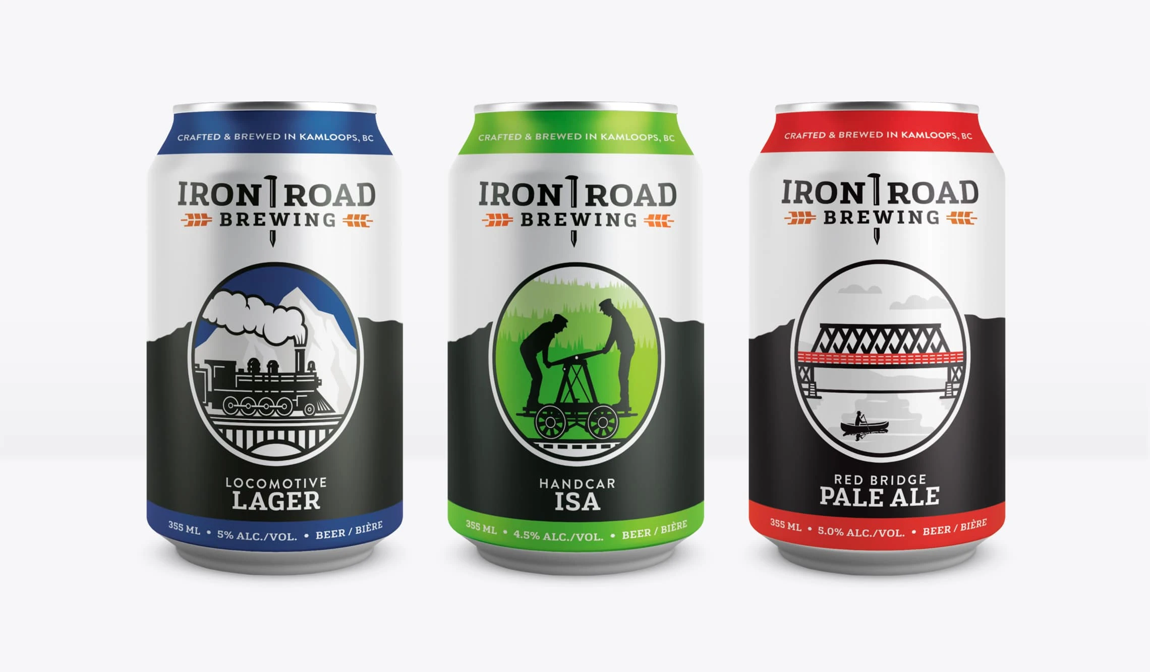
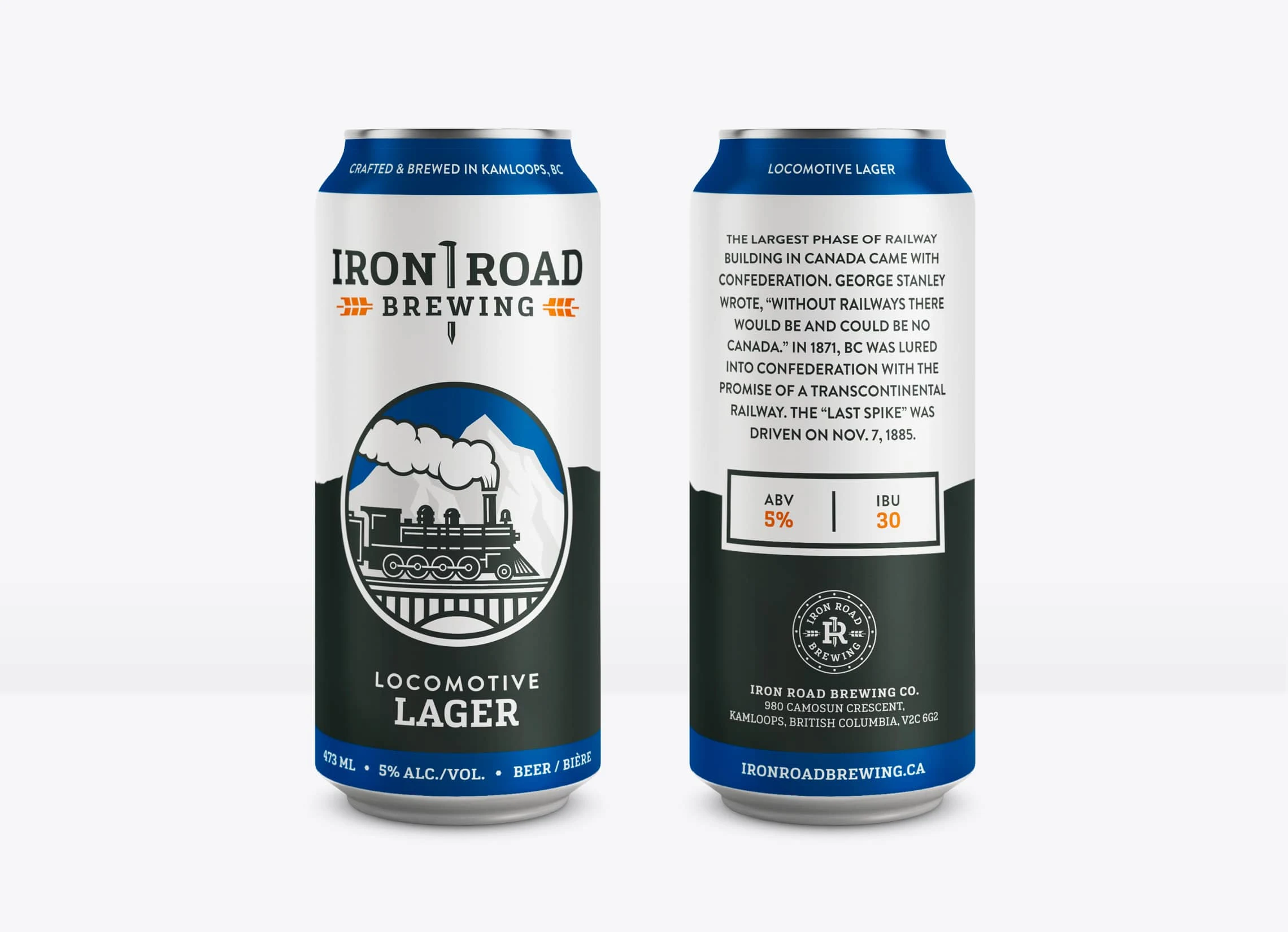
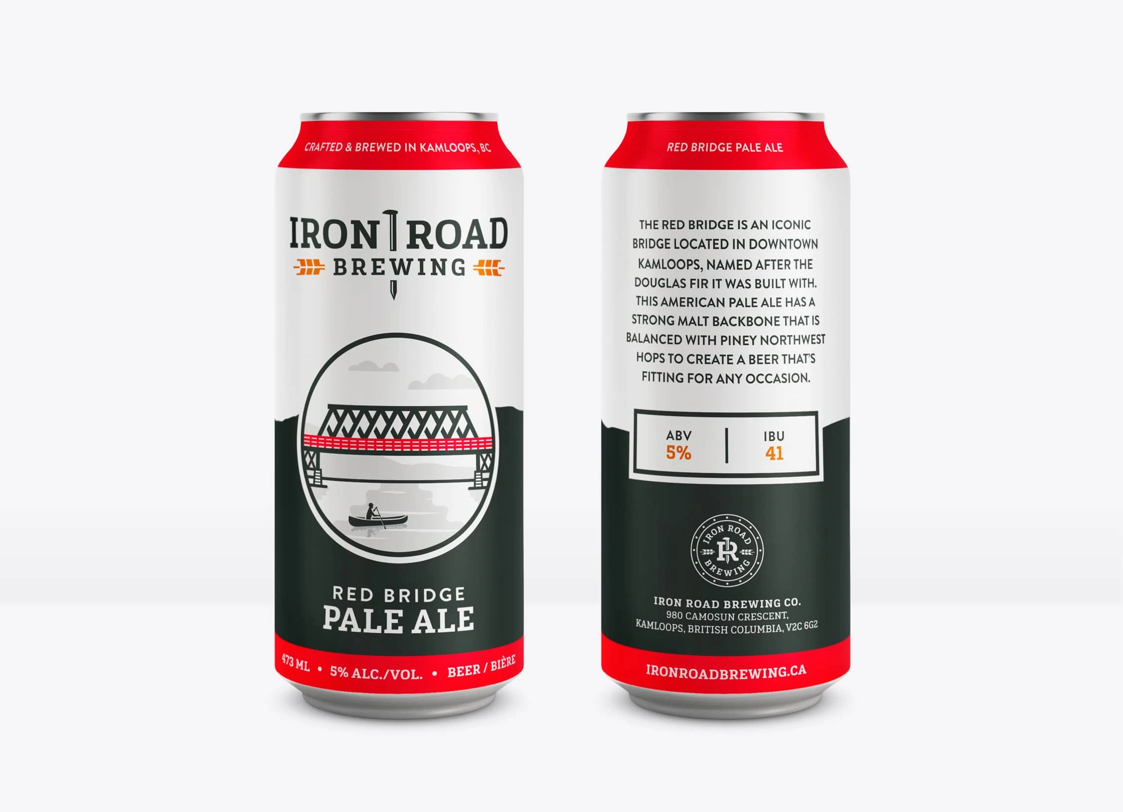
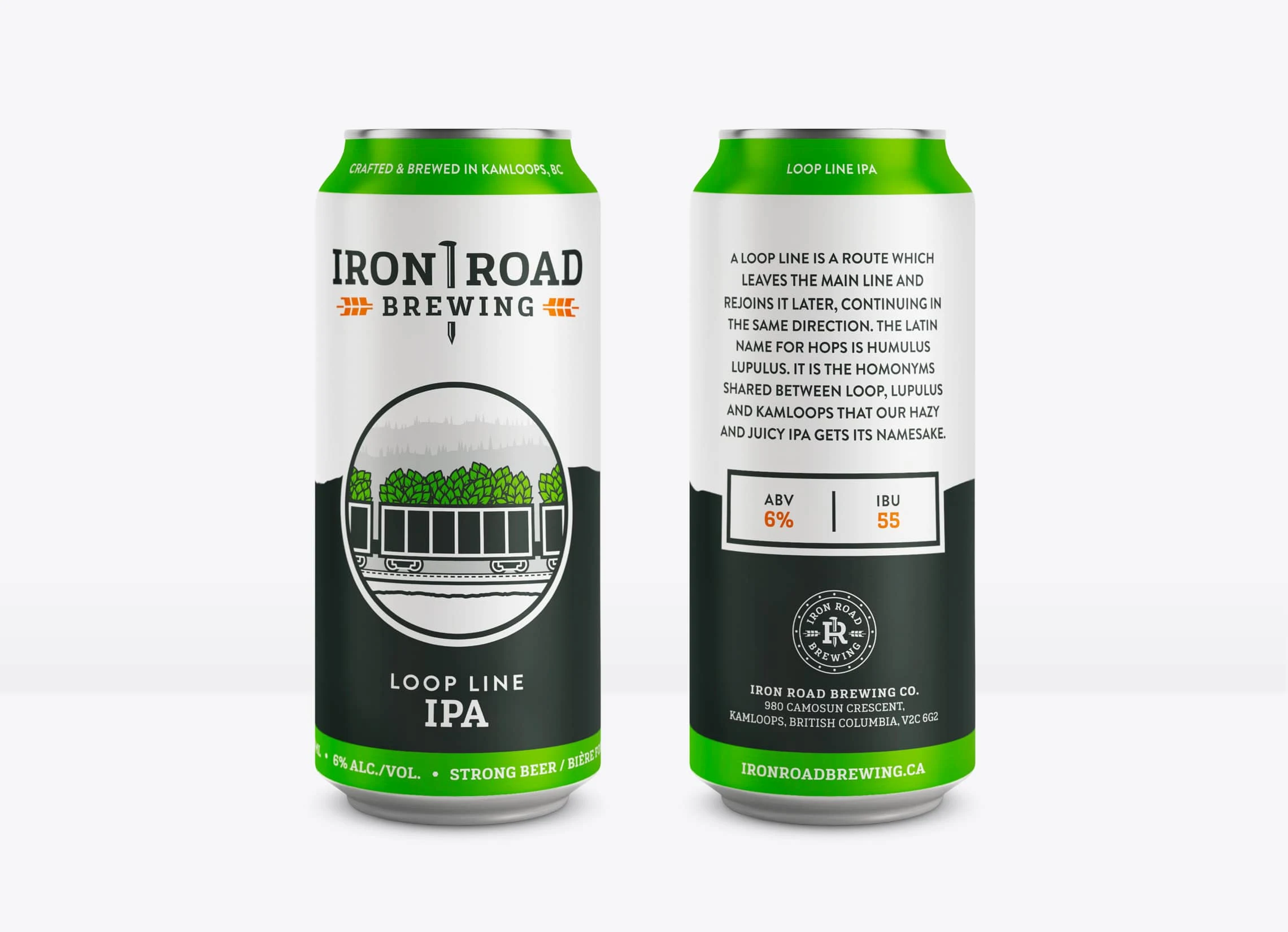
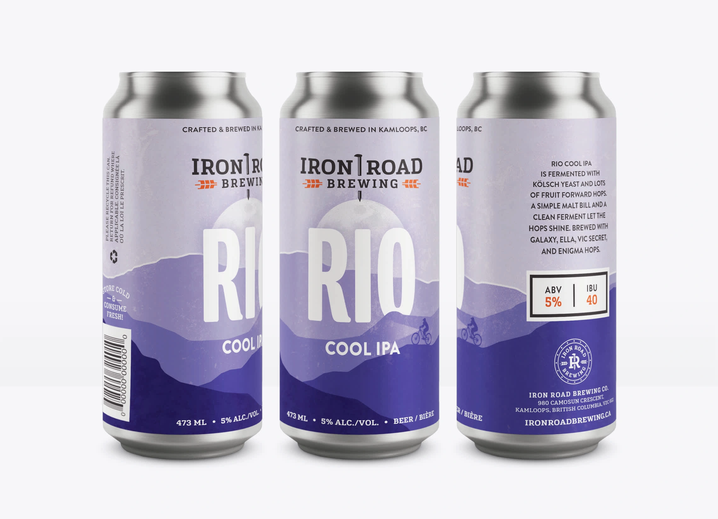
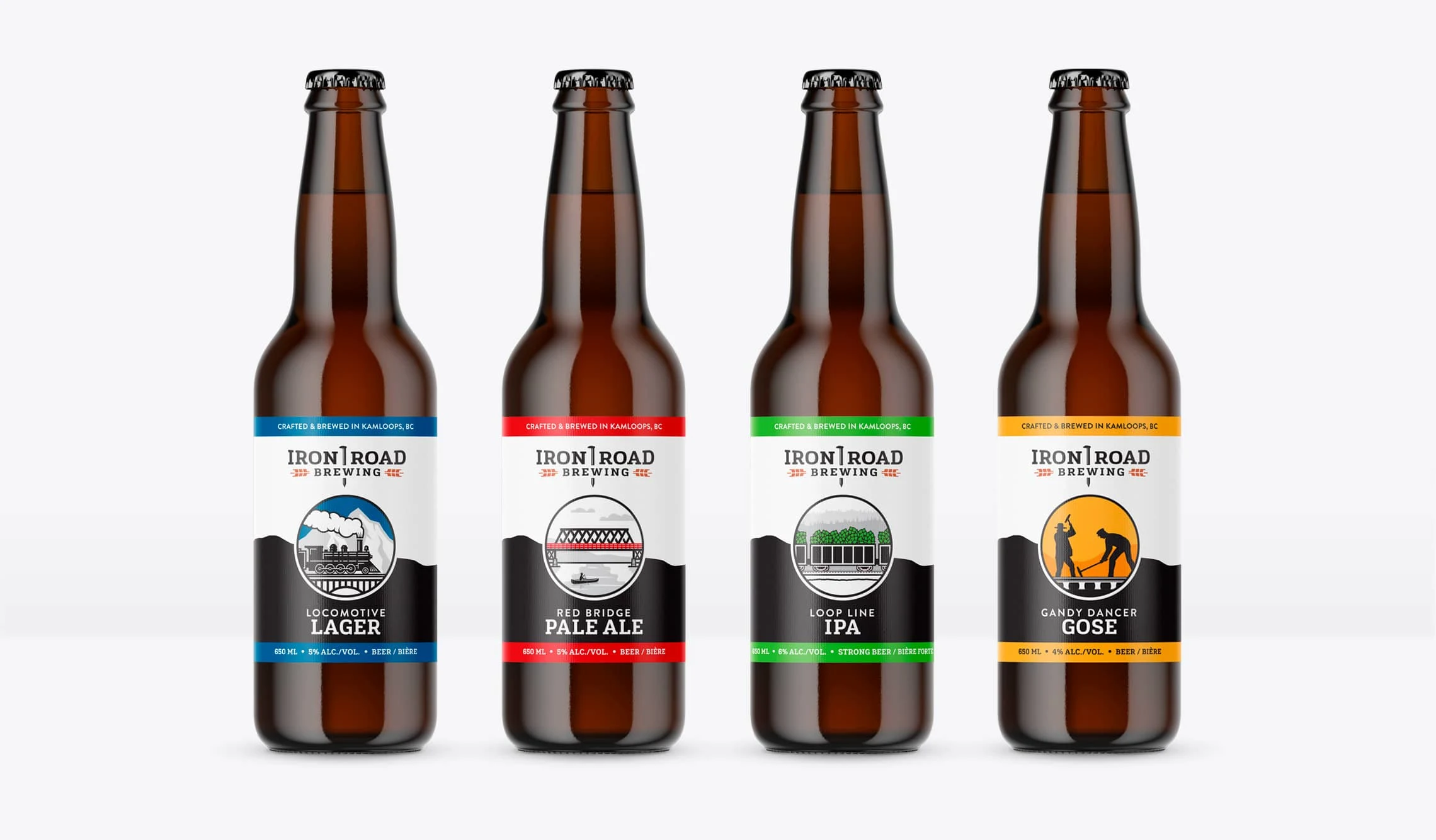
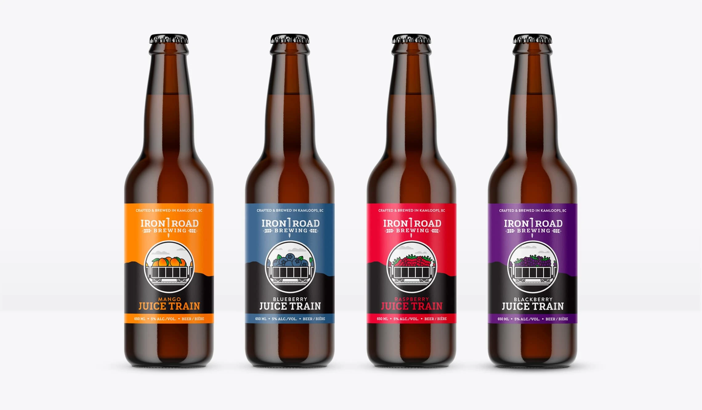
Richard and Jared of Iron Road Brewing approached me to handle their branding after a couple unsuccessful identity designs. Being from Kamloops, a railroad town, they wanted to capture a strong, blue-collar industry look that would resonate with the locals, but also attract a younger crowd since they're located so close to Thompson Rivers University.
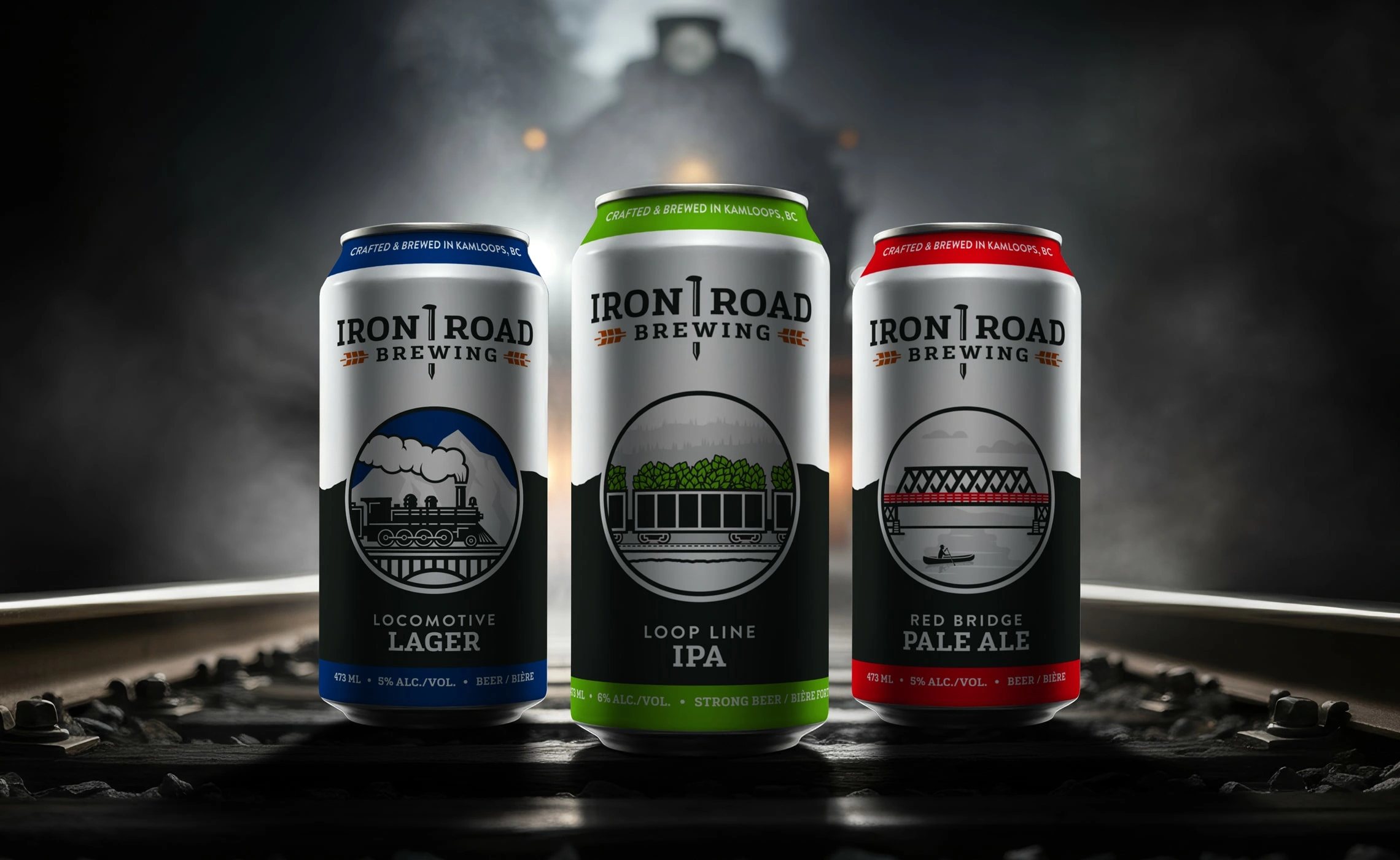
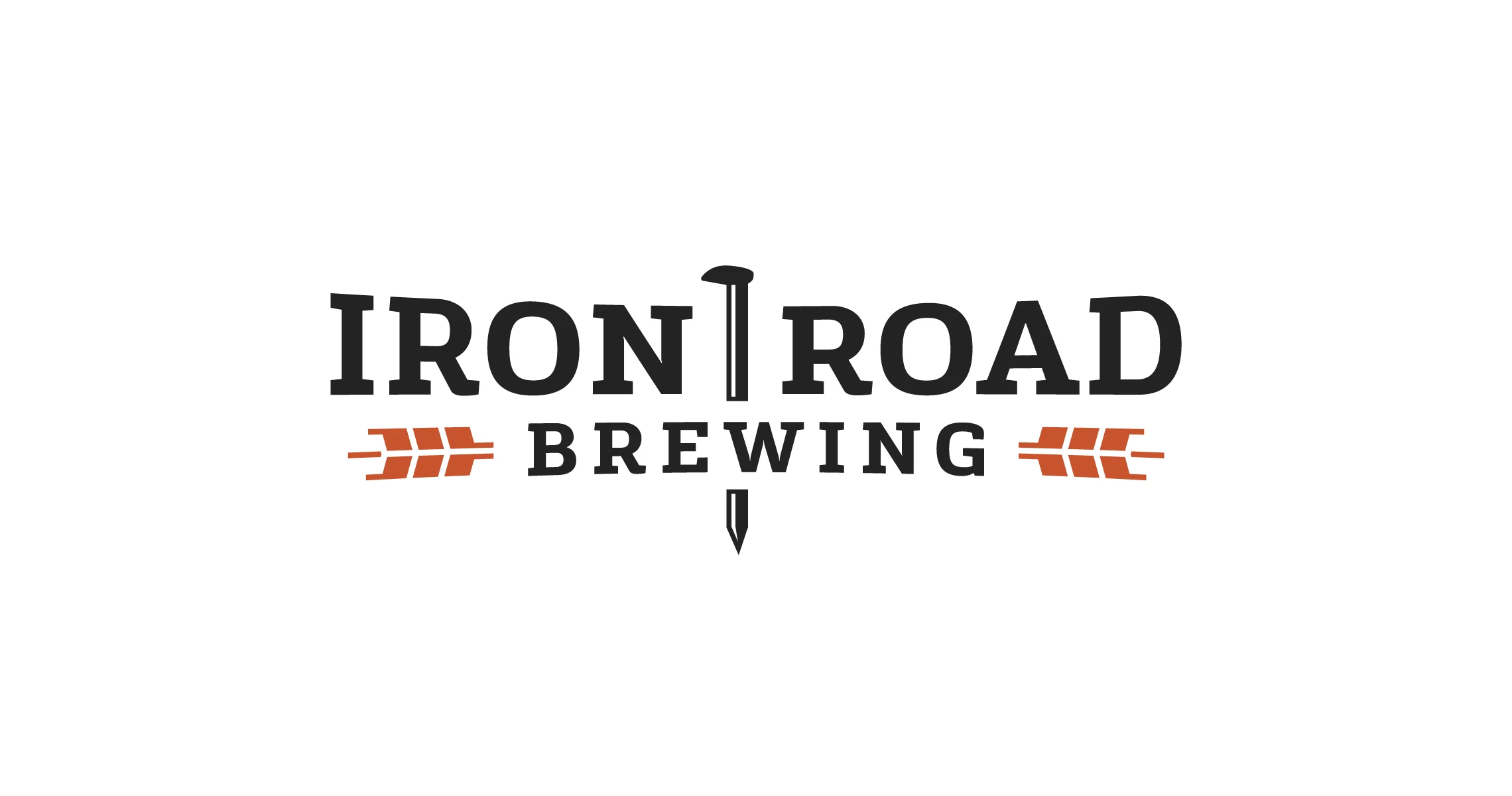
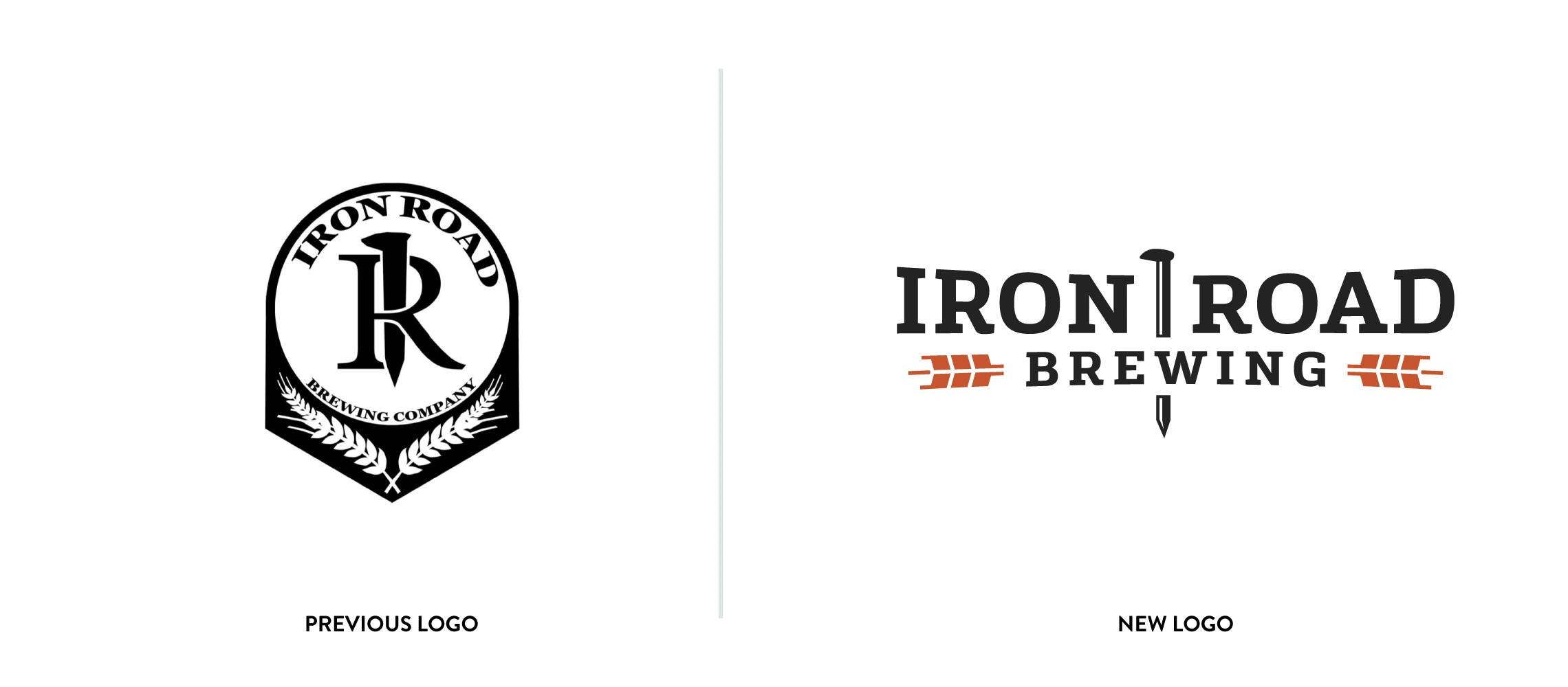
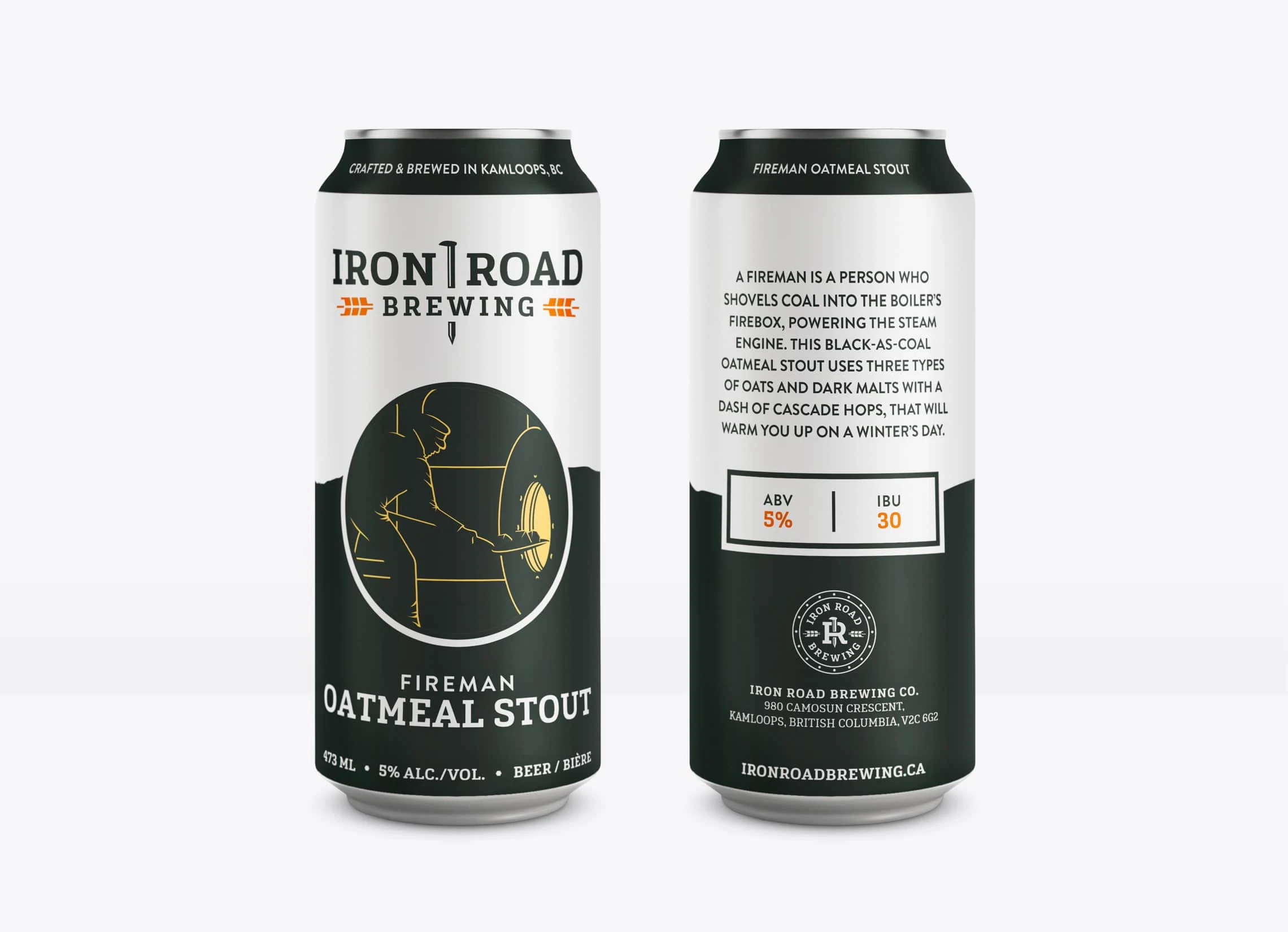
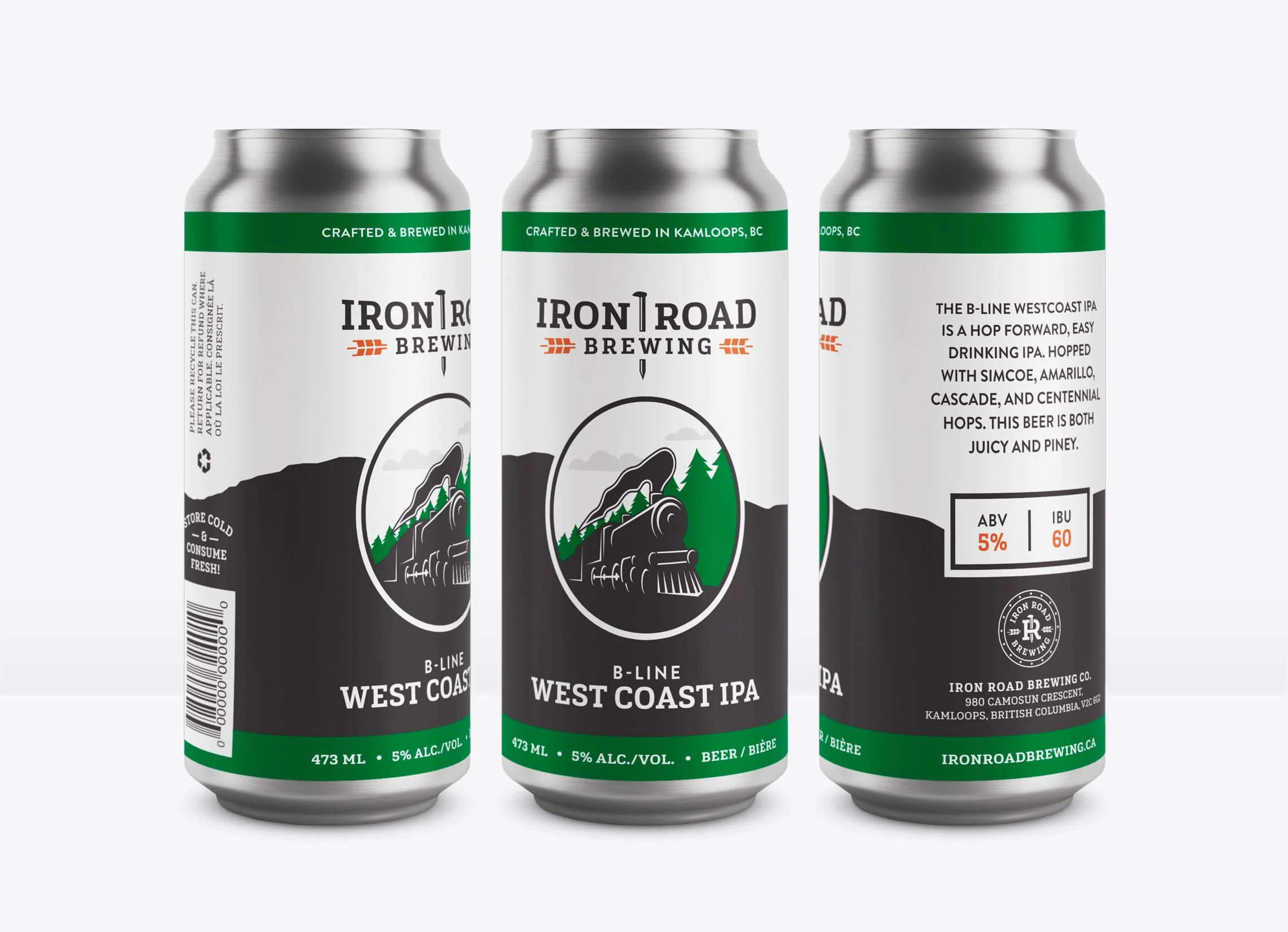
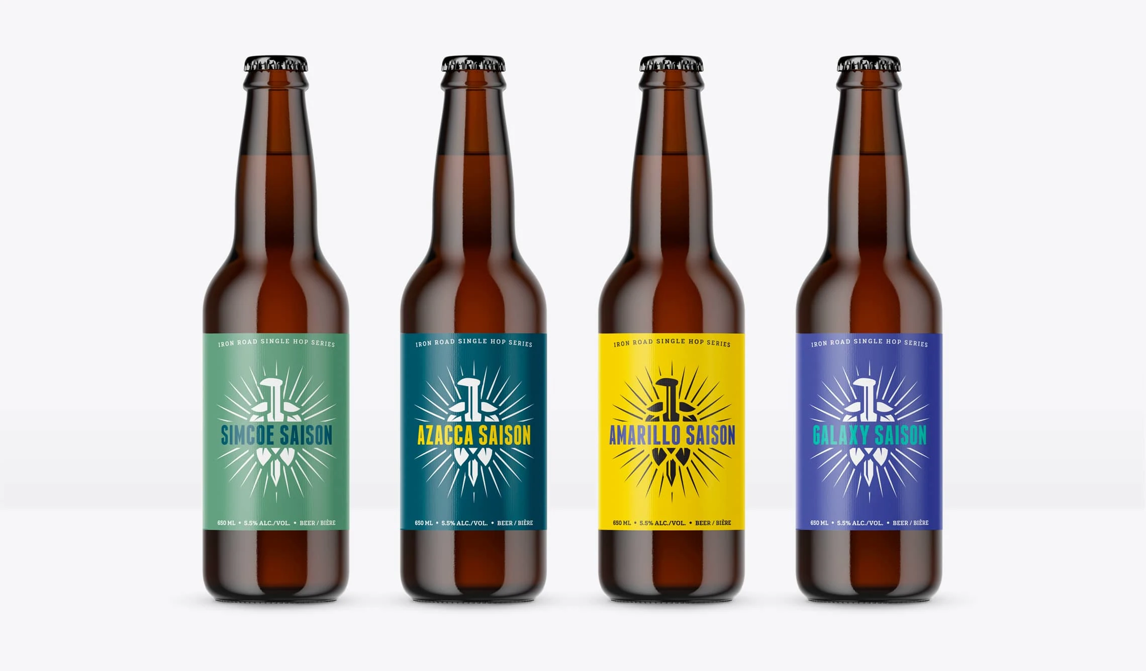
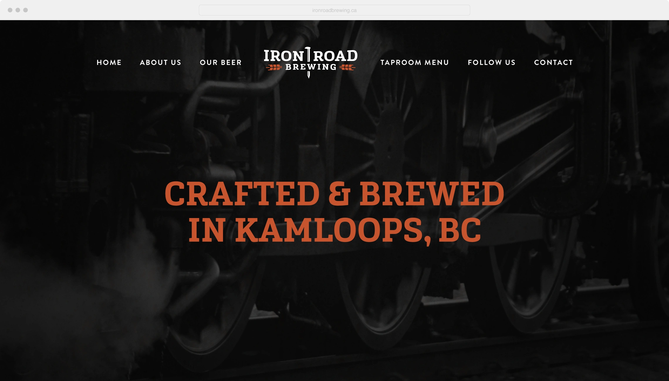
A strong slab-serif font reminiscent of their historical railway industry and bold colour palette are essential to this identity, giving it that balance of industrial and modern. The dark charcoal and rusty orange tones (iron and rust) are tied into not only the railway industry, but the aesthetic direction the brewery’s taproom took on as well.
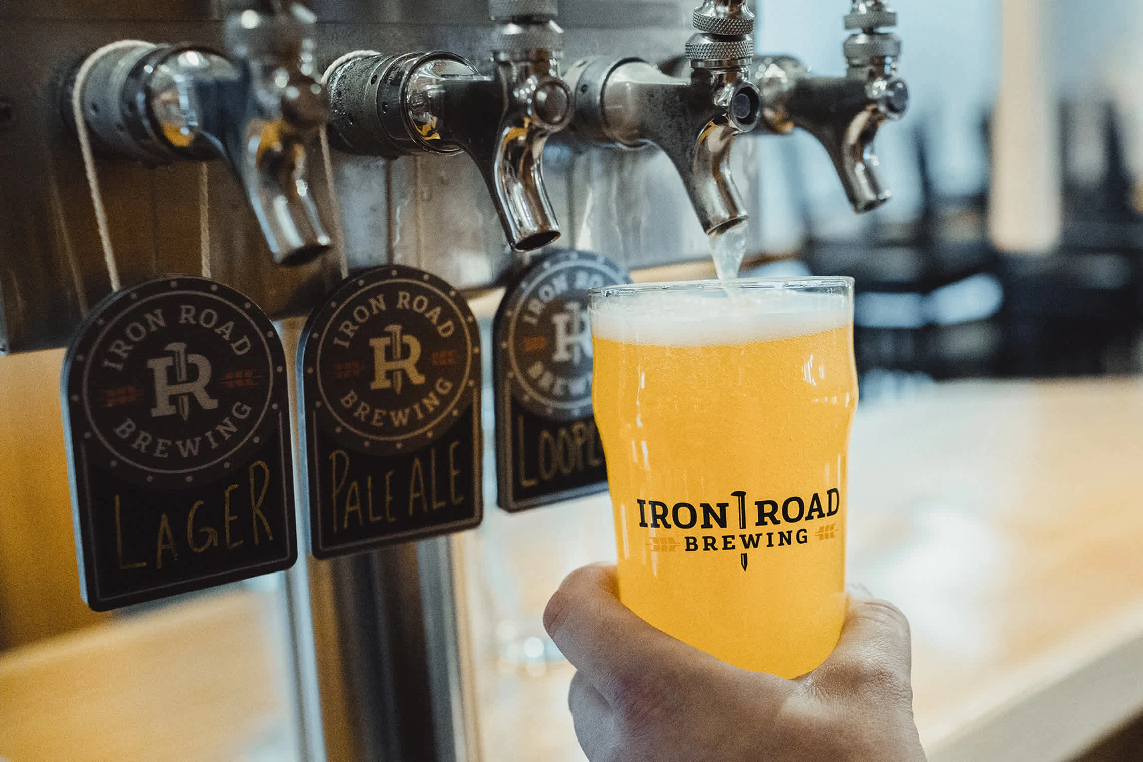
The iron spike that separates the typography is an iconic image of its own, which worked its way into an alternate "IR" identity with surrounding details that are representative of the front of an old steam locomotive to further tie in with the town's history.
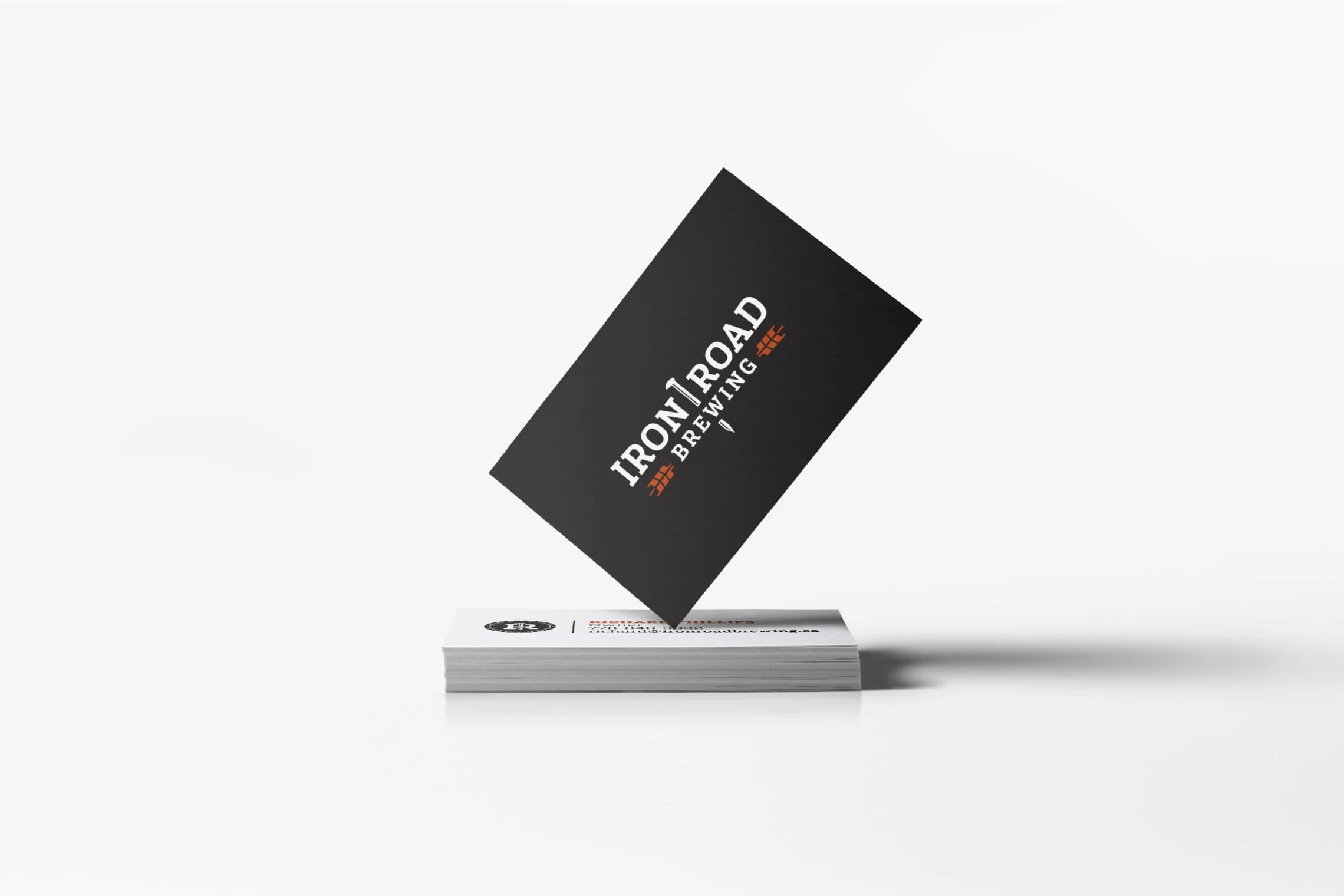
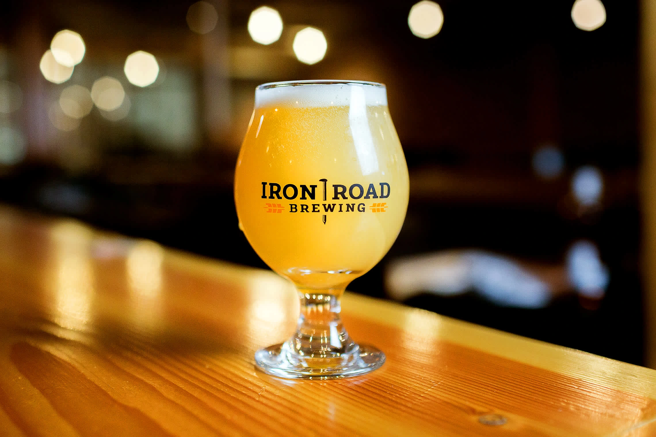
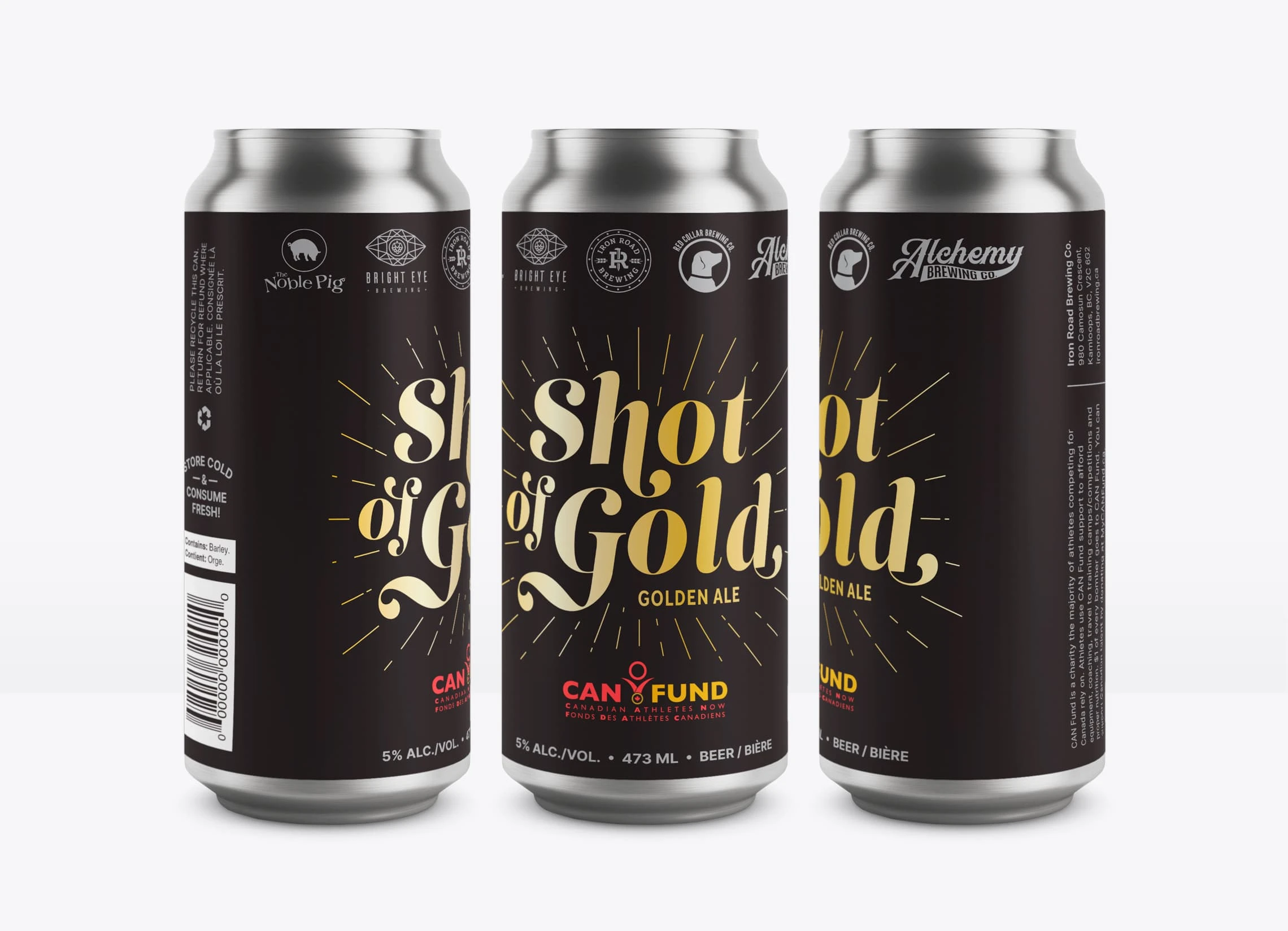
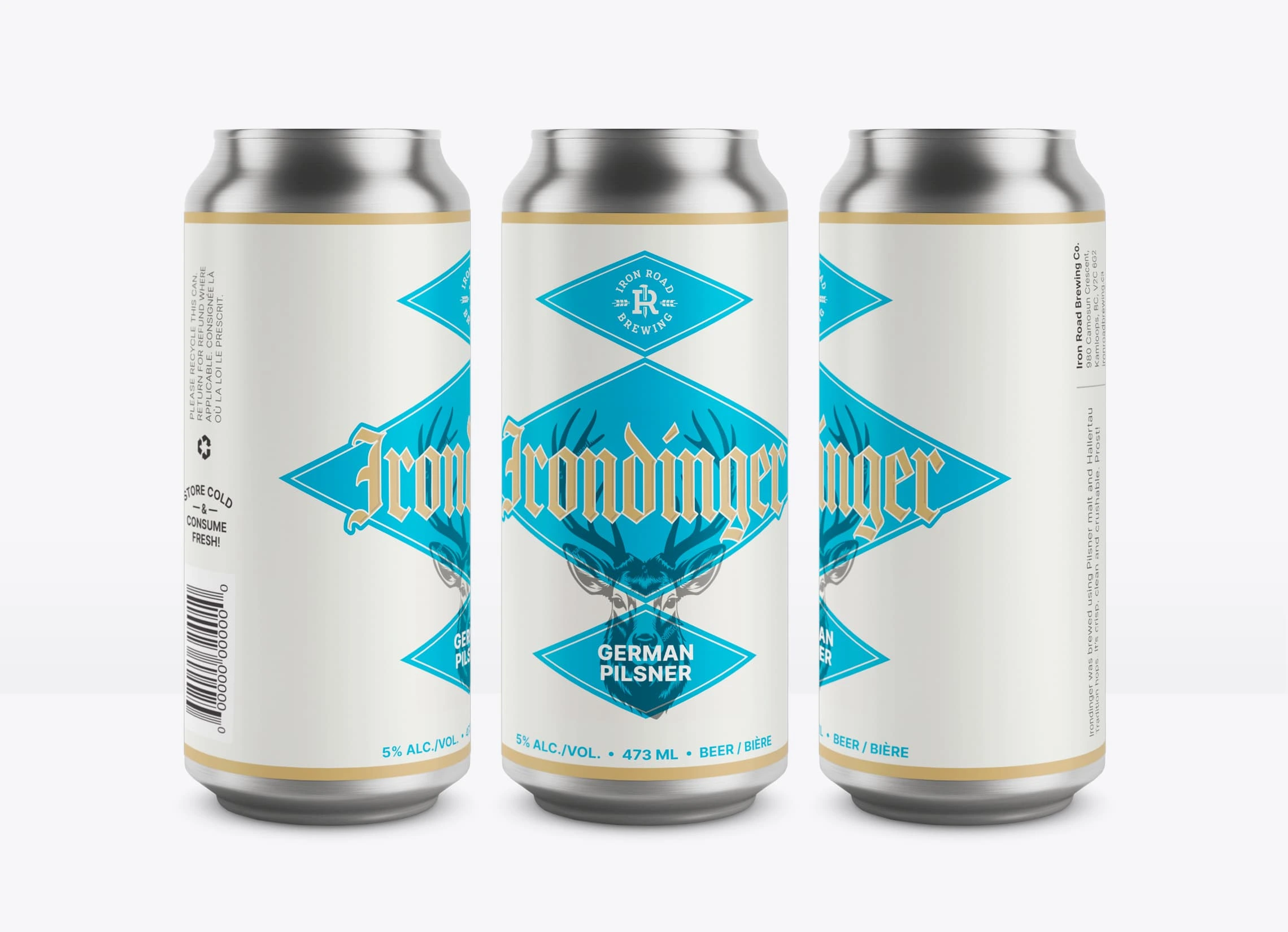
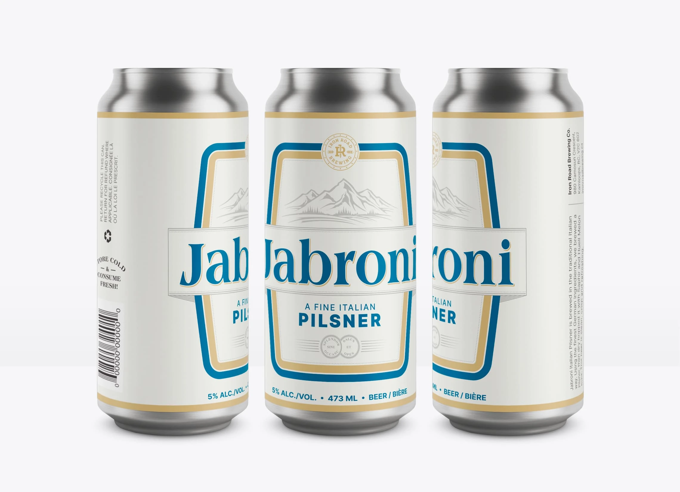
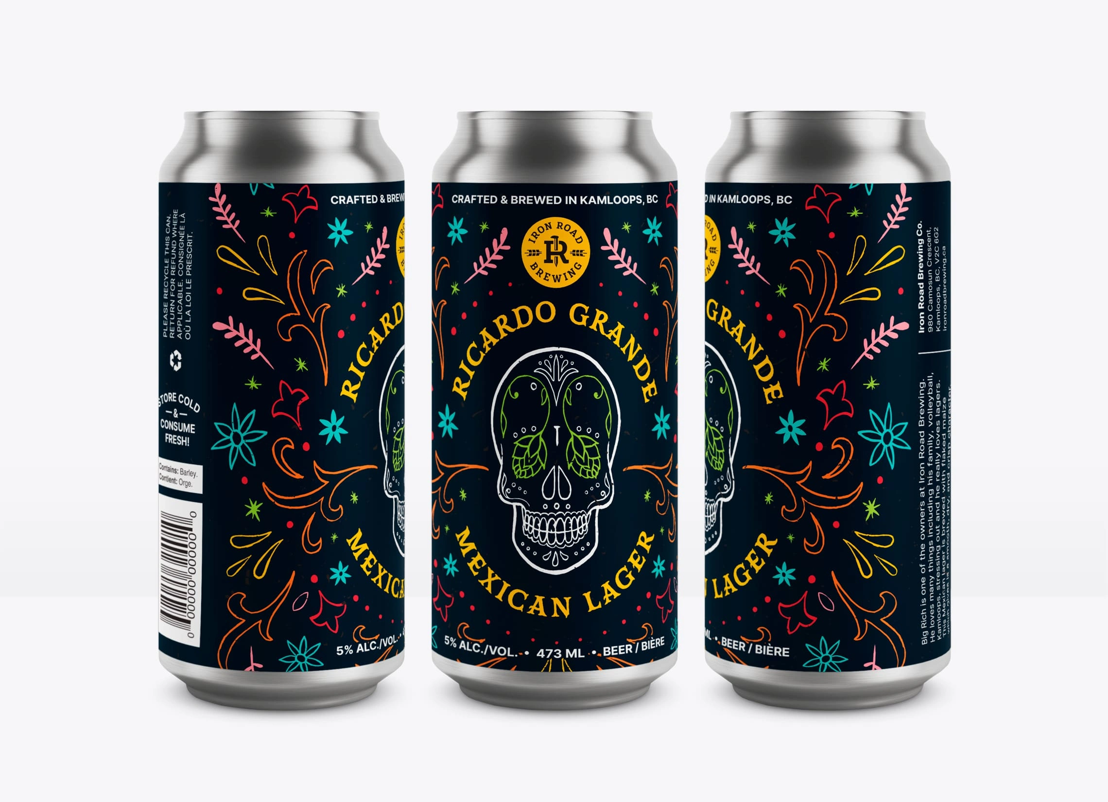
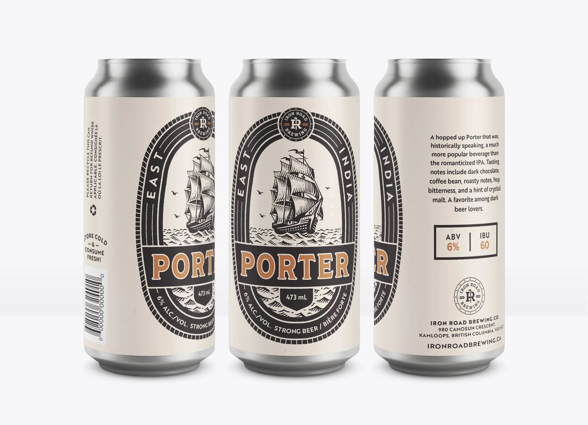
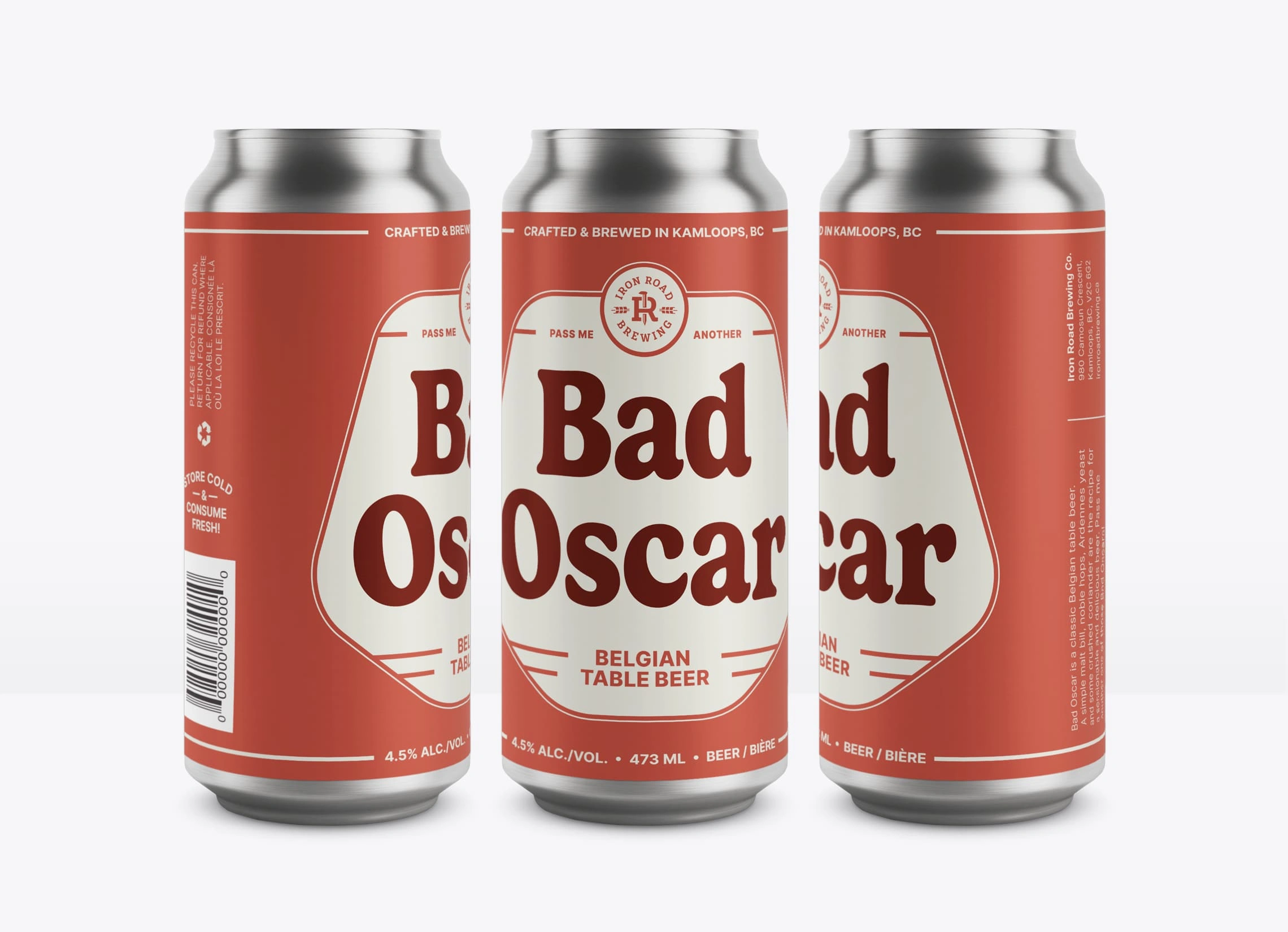
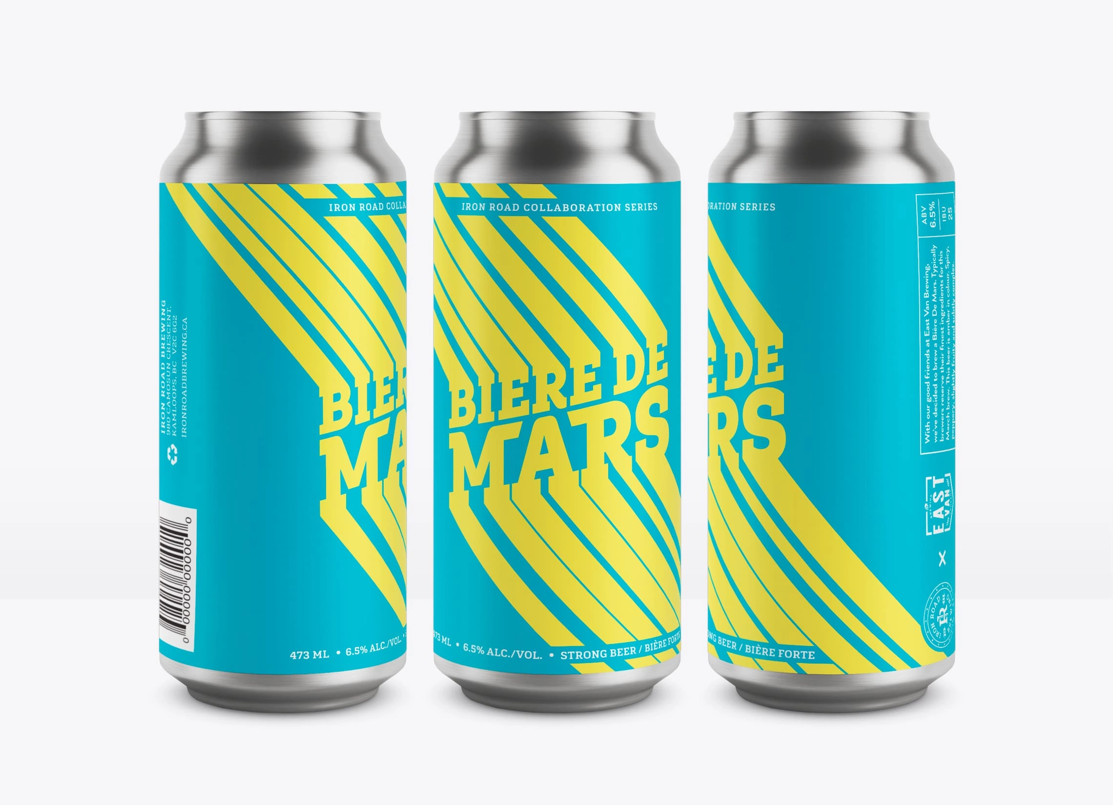
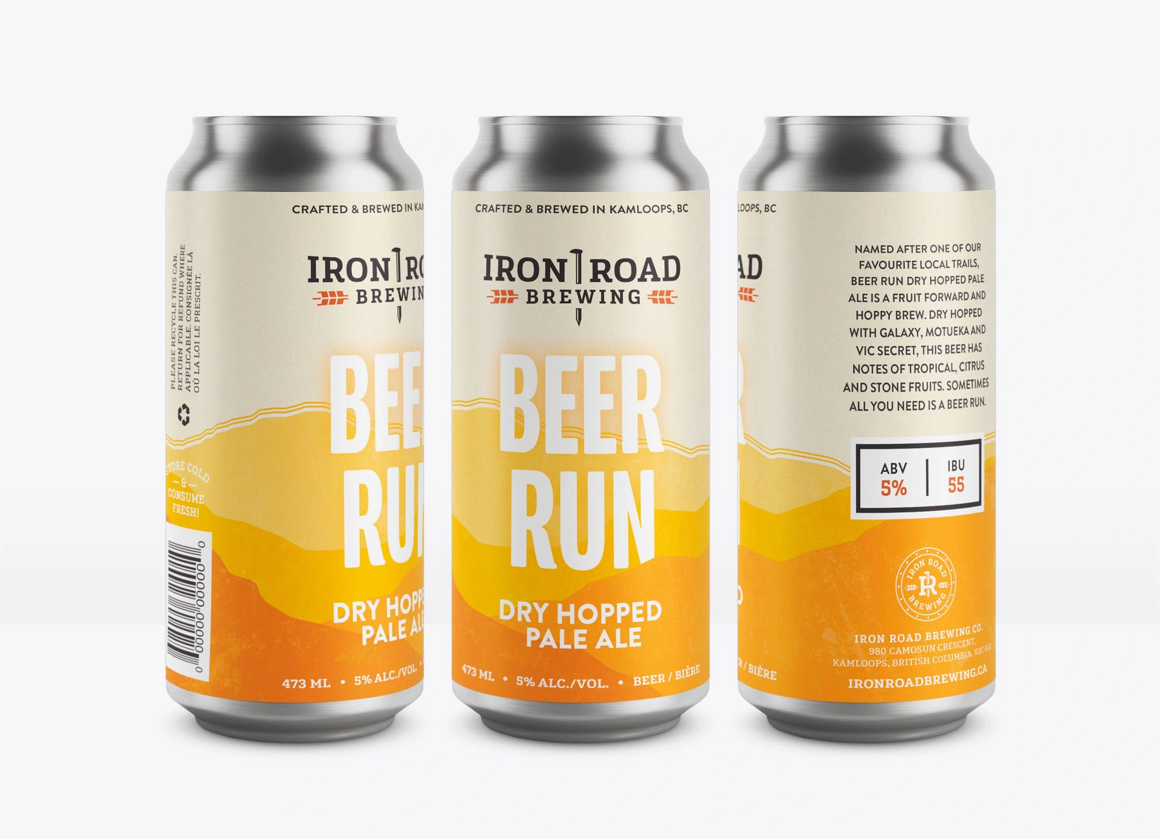
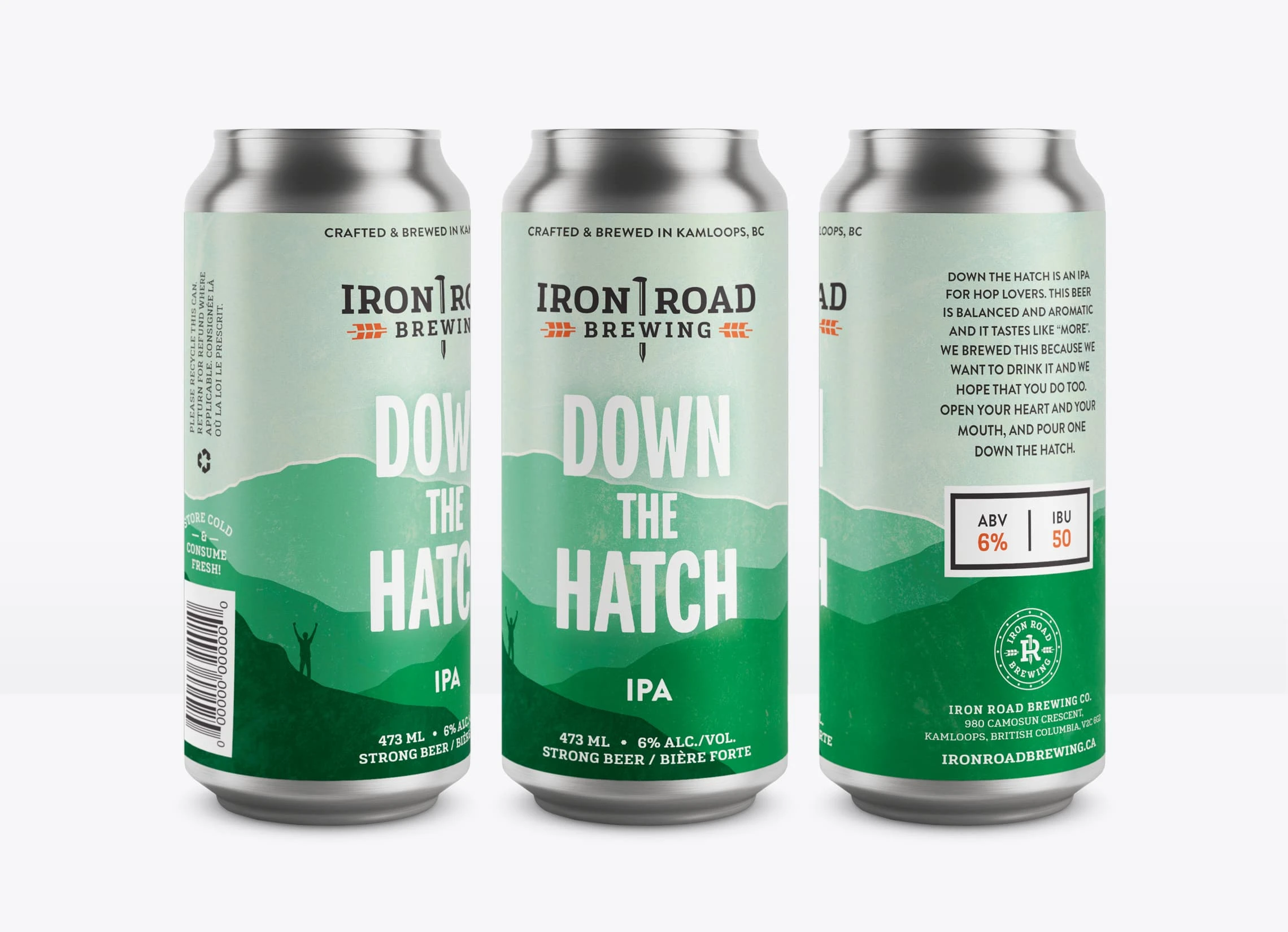
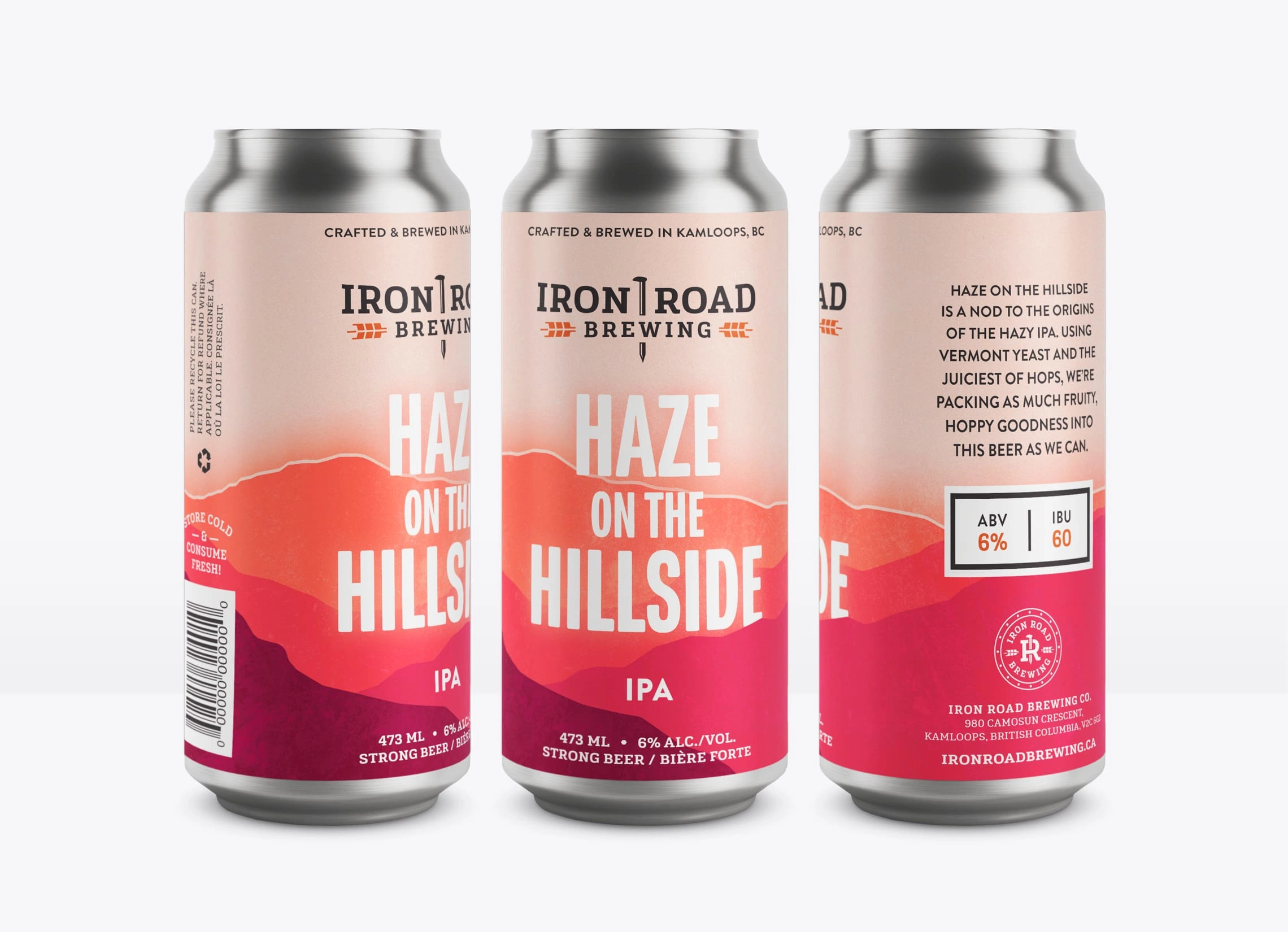
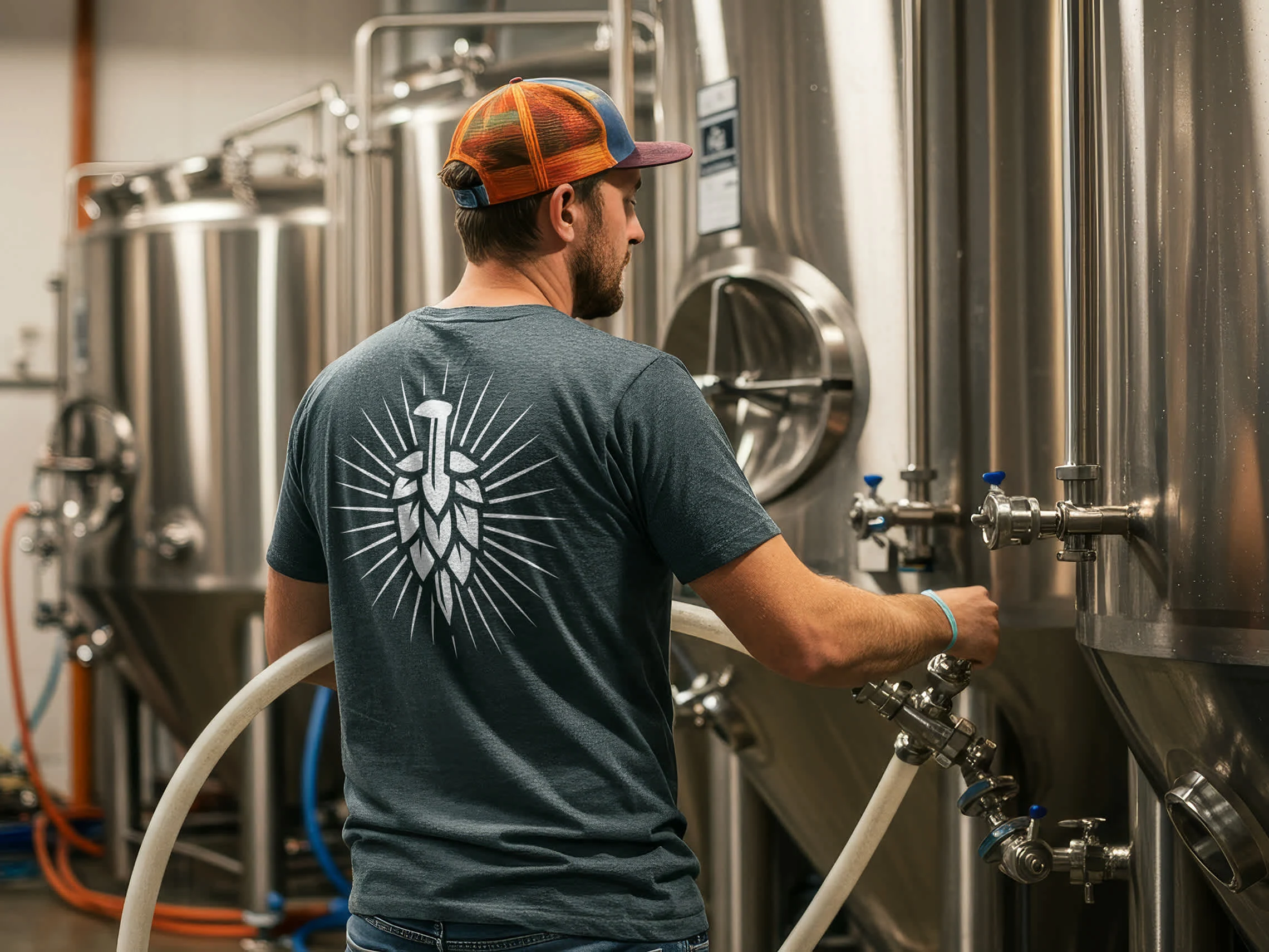
From packaging to stationery and merchandise, the overall brand aesthetic created for Iron Road Brewing lends itself towards a strong, industrial yet welcoming image.
Photography: Iron Road Brewing

Logos. Branding. Packaging.
www.brettlair.ca | hello@brettlair.ca
Like this project
Posted Jul 12, 2023
Branding and packaging for a railway-inspired Canadian craft brewery out of Kamloops, British Columbia.

