Identity Exploration for ClerkMate
Approve request to show earnings
View
Enok Madrid
Verified
Identity Exploration For ClerkMate
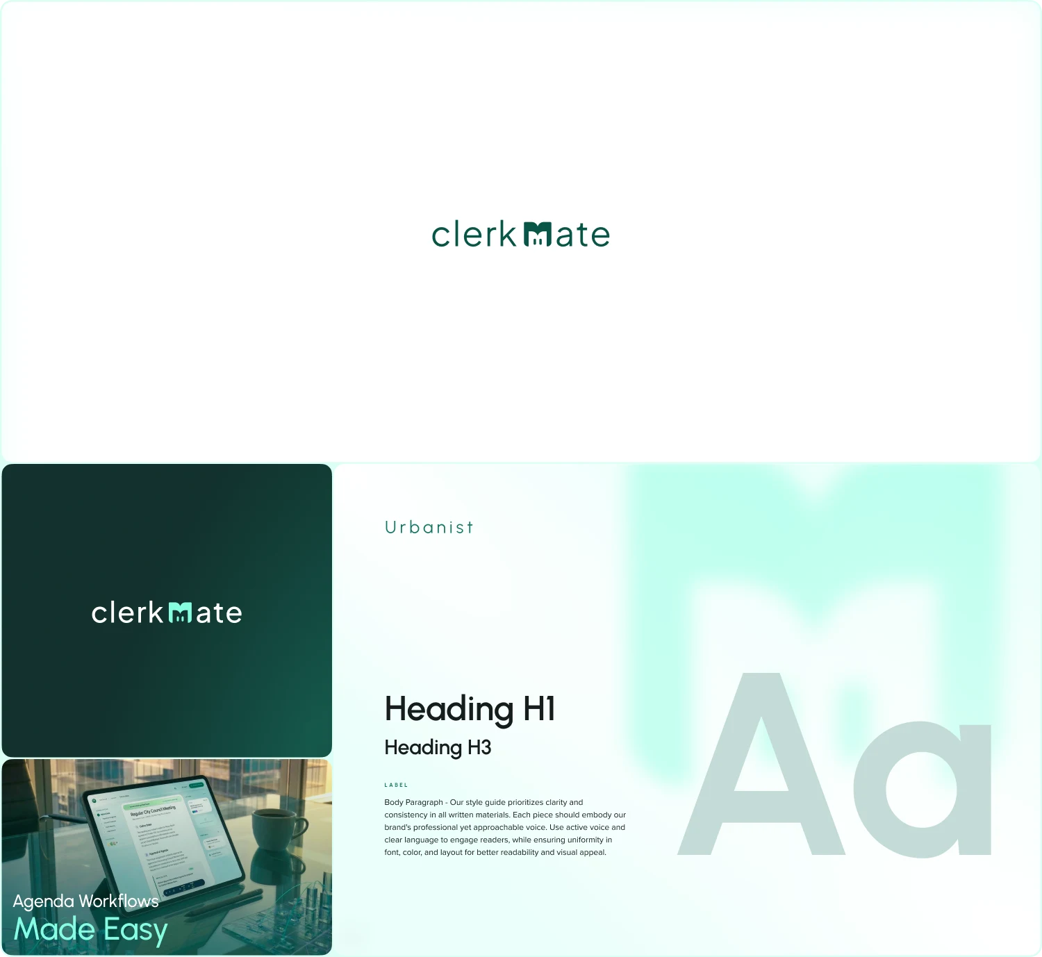
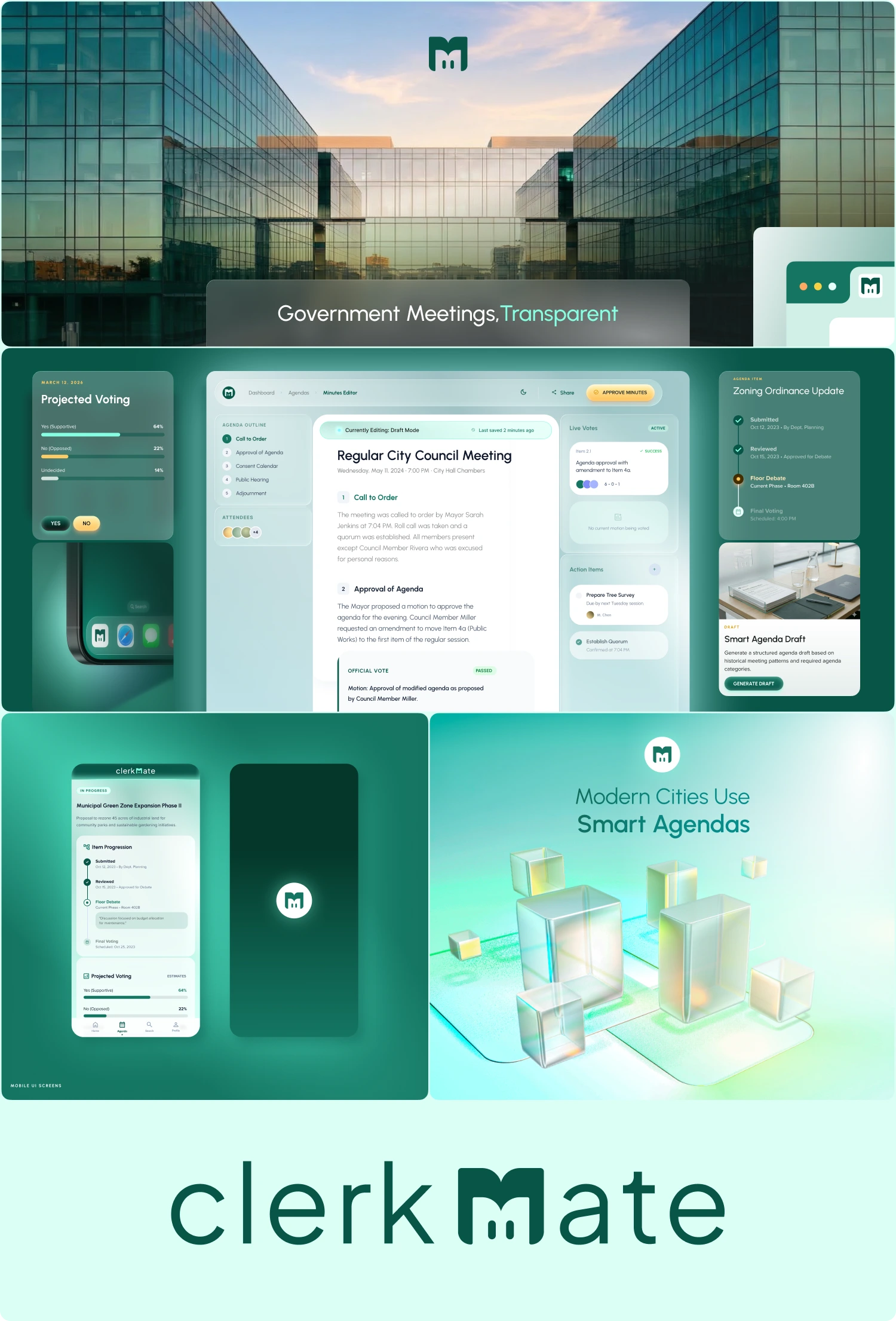
ClerkMate is a digital platform designed to modernize how government offices manage agendas, meetings, and public records.
The goal of this sprint was to define a clear visual identity before moving into product design. The identity needed to feel trustworthy, modern, and aligned with civic institutions while still communicating transparency and technological progress.
I led the identity exploration to establish the visual direction for the platform's UI design.
The Challenge
Government software often feels outdated and difficult to navigate.
ClerkMate needed a brand identity that would signal a different experience.
The identity had to:
Feel credible for city clerks and government offices
Communicate transparency and organization
Translate well into a modern web application
Support a scalable design system for future UI development
The brand also needed to stand apart from traditional government software while remaining professional.
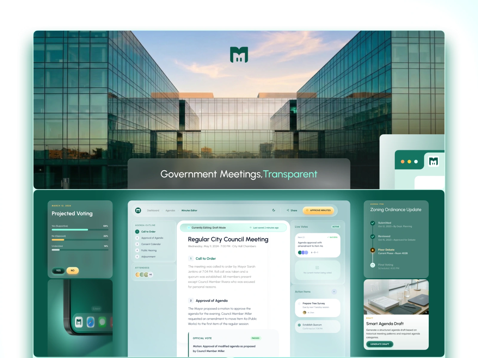
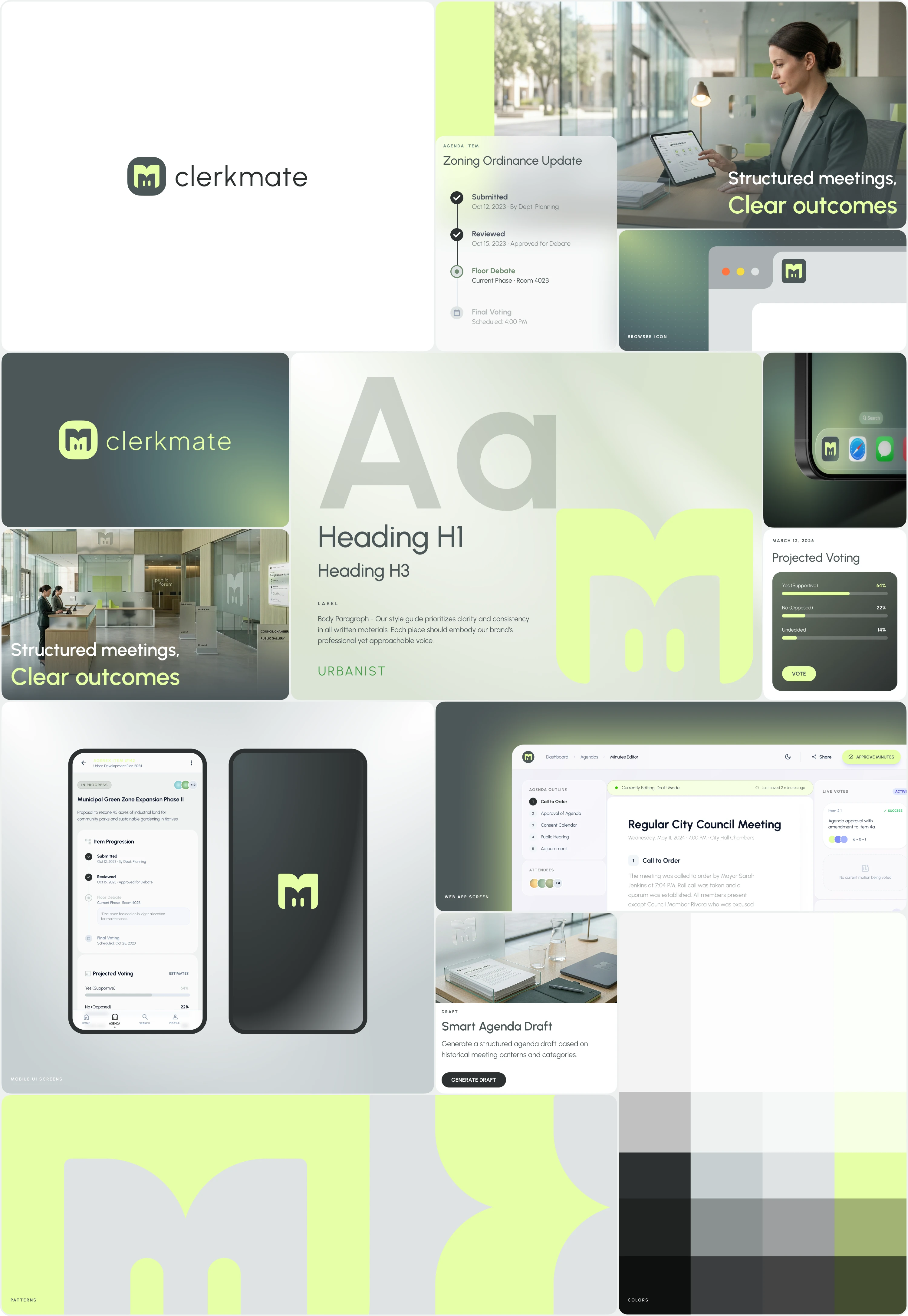
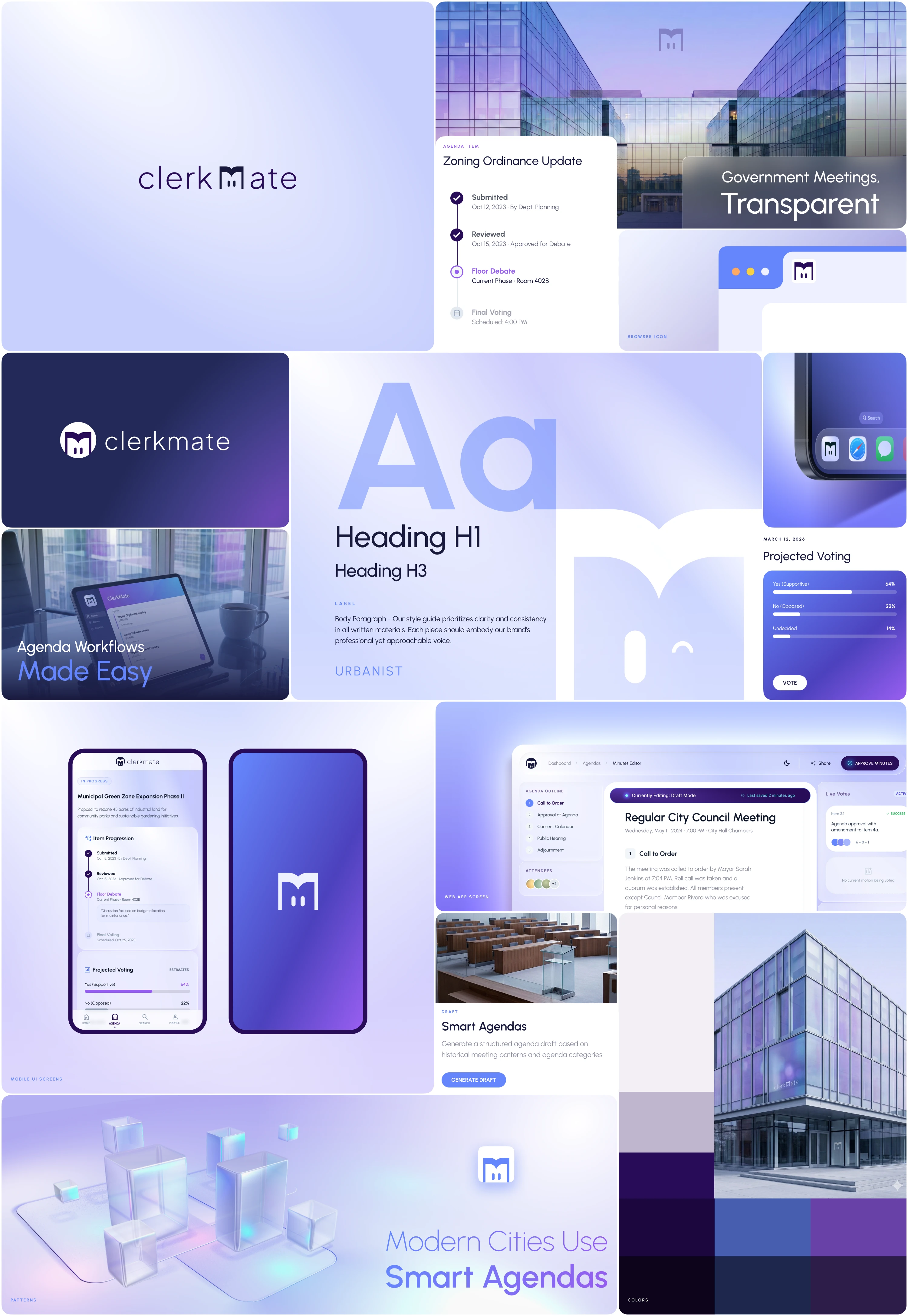
Multiple Logo Concepts
I developed multiple logo concepts designed to reflect organization and civic structure.
The selected direction focused on:
geometric forms
structured grid alignment
a mark that works well in product interfaces
strong recognition at small sizes
The symbol was designed to work across app icons, navigation, and documentation.


Like this project
Posted Mar 14, 2026
Defined the visual identity, including logo concepts, style directions, and UI foundation to guide product design for a modern government agenda management app.
Likes
0
Views
15
Timeline
Feb 6, 2026 - Mar 6, 2026
Clients
ClerkBase