FORMA — Brand Identity for SHAPE Properties

Danilen Villanueva


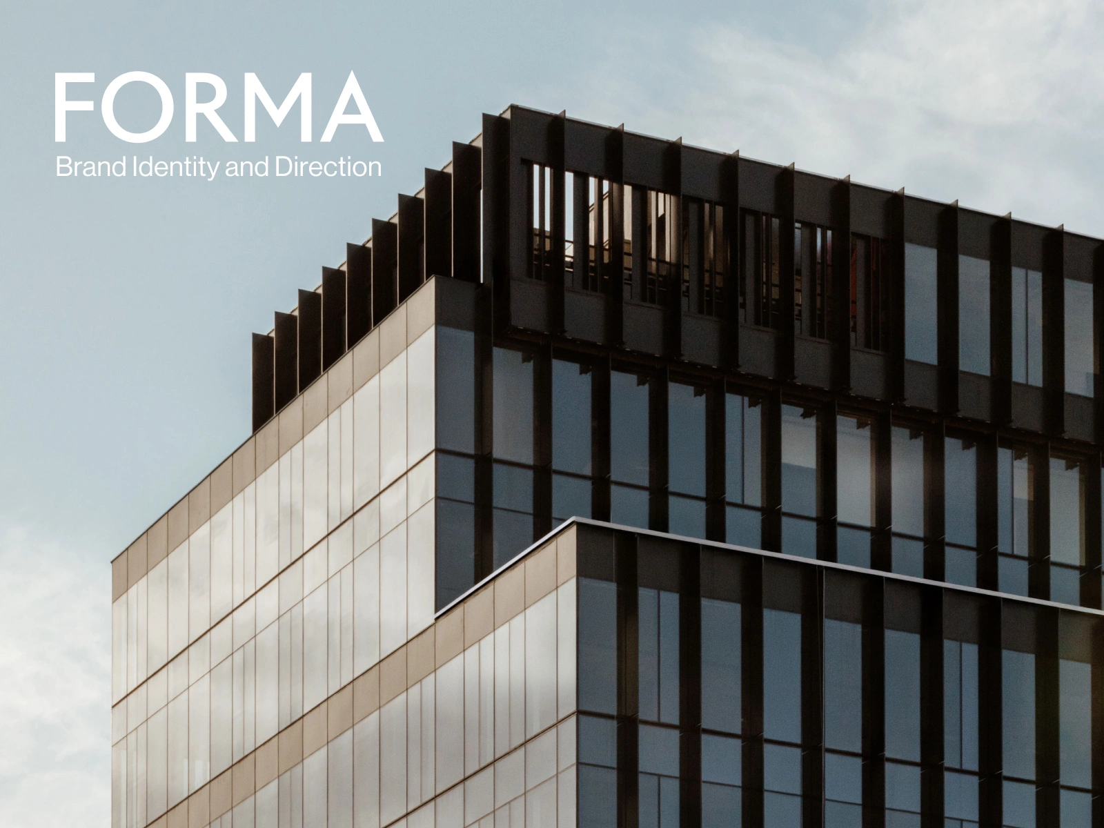
FORMA is a new medical office building rising beside Vancouver's St. Paul's Hospital, and it needed a brand that could work on a business card on day one and hold up on the building itself for the next twenty years. Here's how that came together in three weeks.
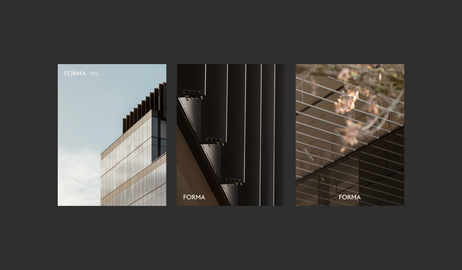
Architectural photography direction for FORMA, with the wordmark applied to test how it actually reads against glass, steel, and light — not just on a template, but on the real materials it would eventually sit on.
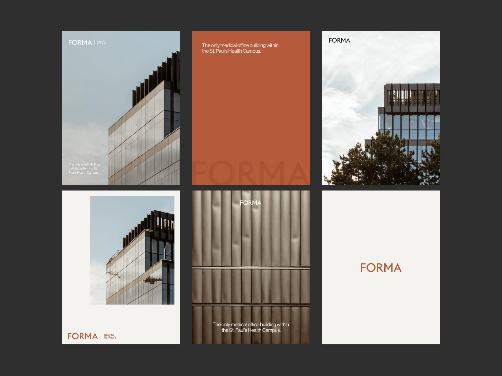
Social media templates built from the same system — the wordmark, the "Next to St. Paul's" tagline, the palette, and the Oxide Clay accent, translated into a set of ready-to-post visuals for leasing and brand awareness.
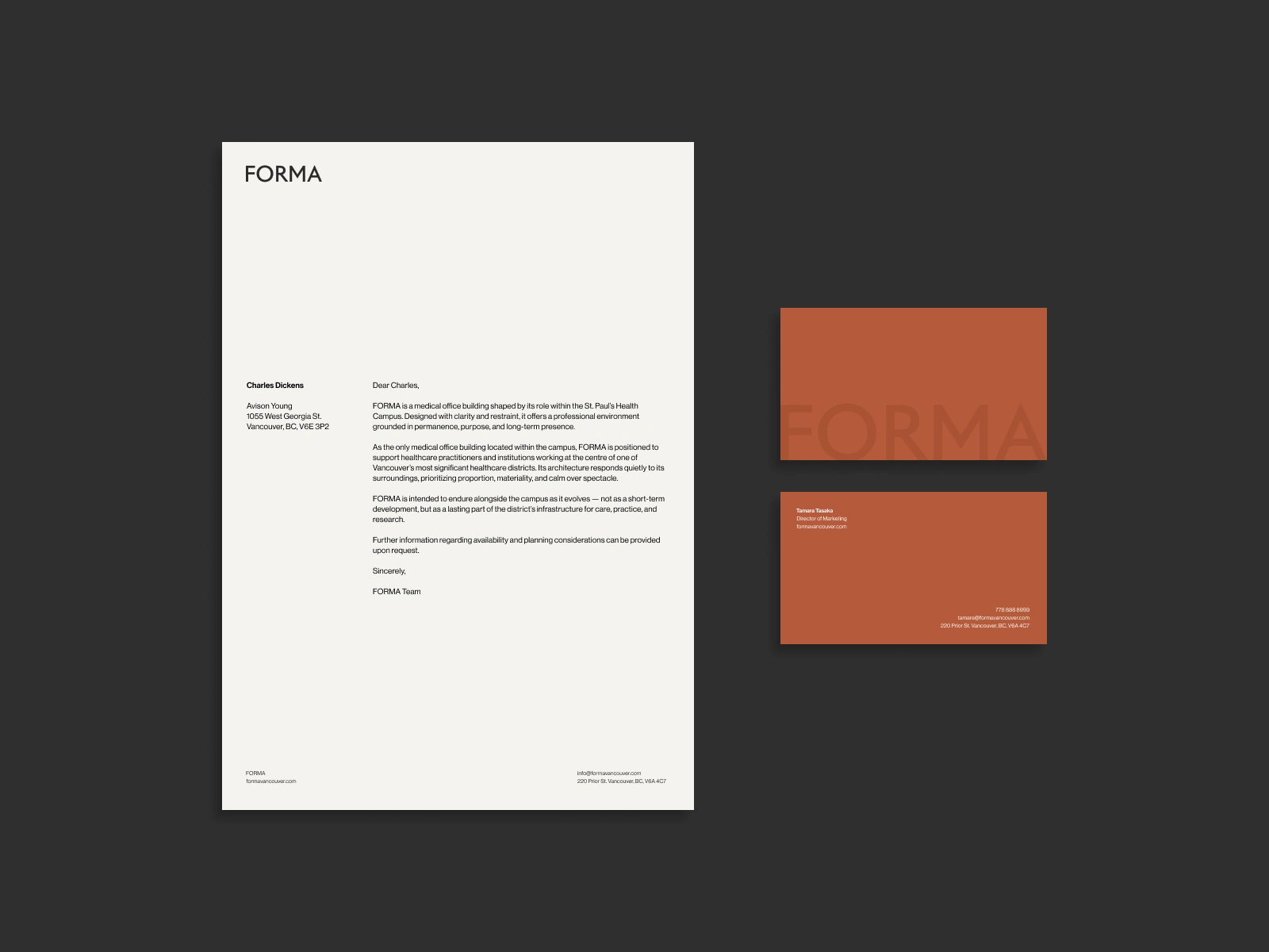
Letterhead and business cards for FORMA, carrying the same restraint as the wordmark into everyday documents — Oxide Clay used here as a full, confident field of colour rather than just an accent.
Like this project
Posted Sep 7, 2026
A three-week identity build for a medical office tower beside Vancouver's new St. Paul's Hospital — a wordmark built to work on a card and a building.