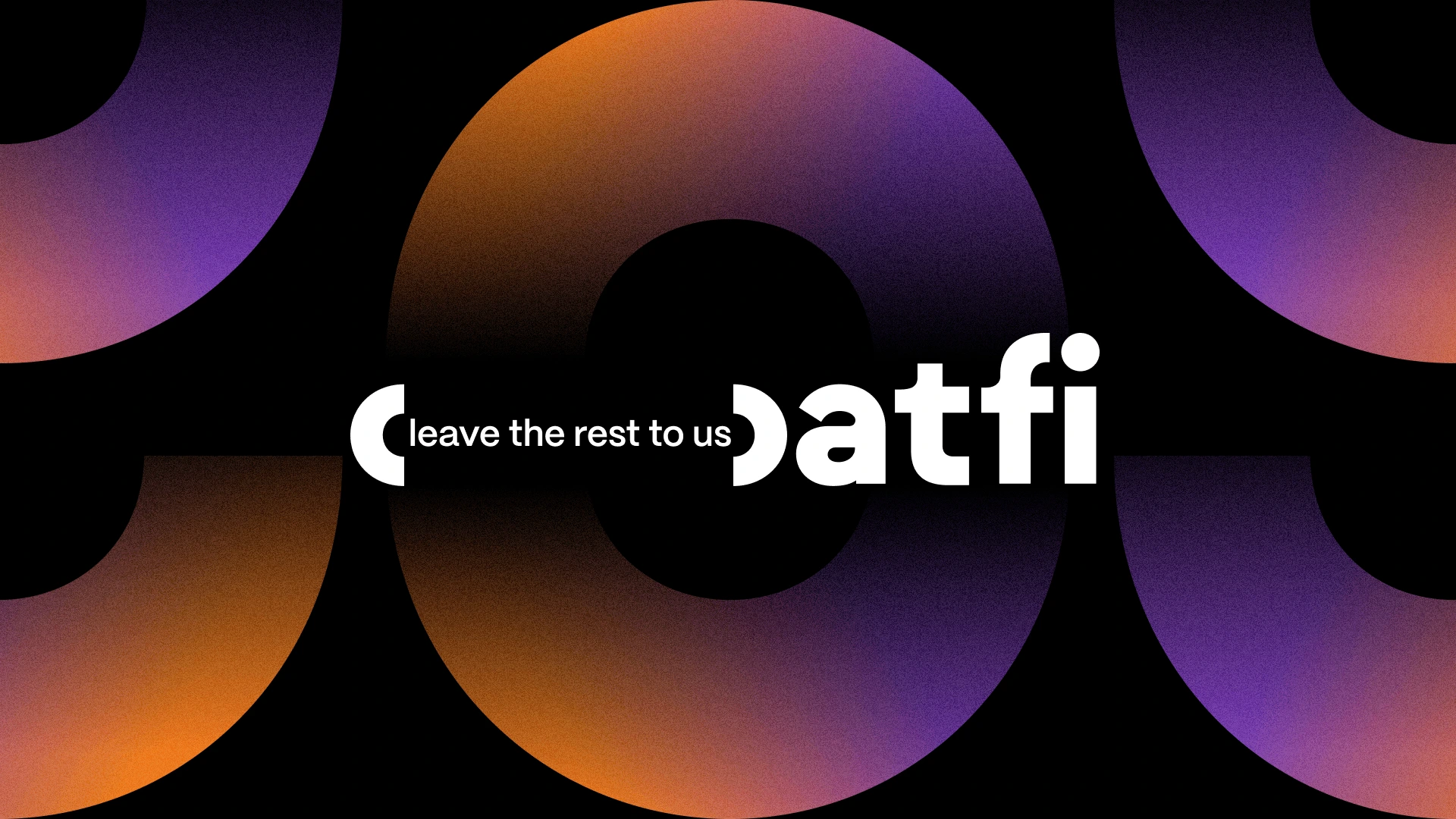
OatFi
Hanna Tapang
Overview
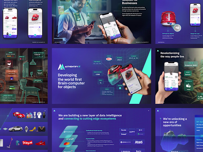
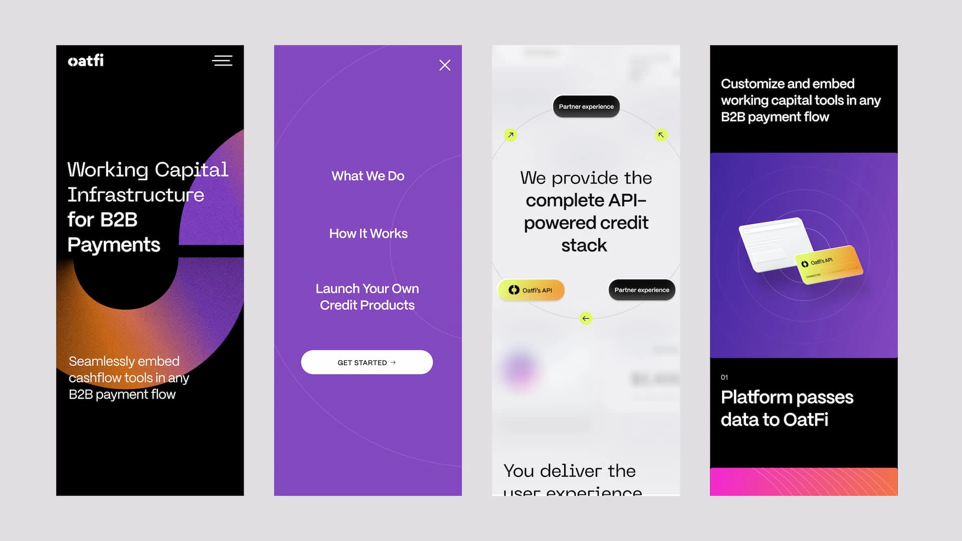
OatFi is a B2B fintech lender. They offer cashflow solutions at scale using an easy to integrate API insfrastructure that allows B2B platforms to simply embed working capital tools into any payment flow for their end users.
Creative Director: Brian Hoff
Design Lead: Tracy Loi
Brand Designer: Hanna Tapang
Agency: RocketAir
Challenge
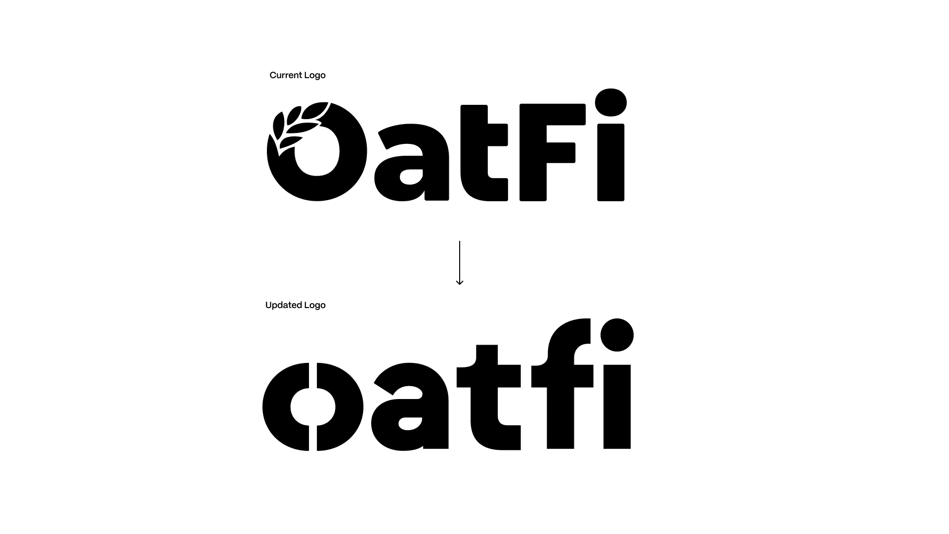
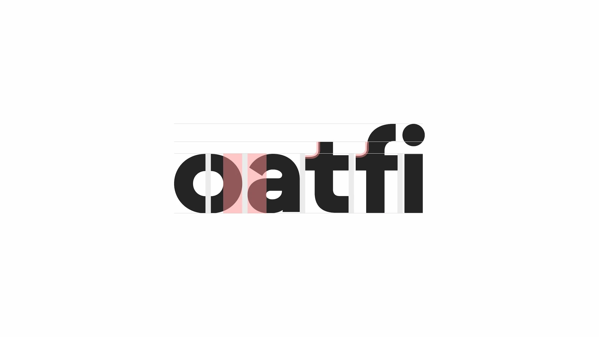
The client approached us with a simple challenge: build a brand system around their existing logo. We looked at the project holistically, and identified that their existing logo was not going to be optimized for web. The oat, embedded within the 'O' was not noticeable when scaled down.
The Logo
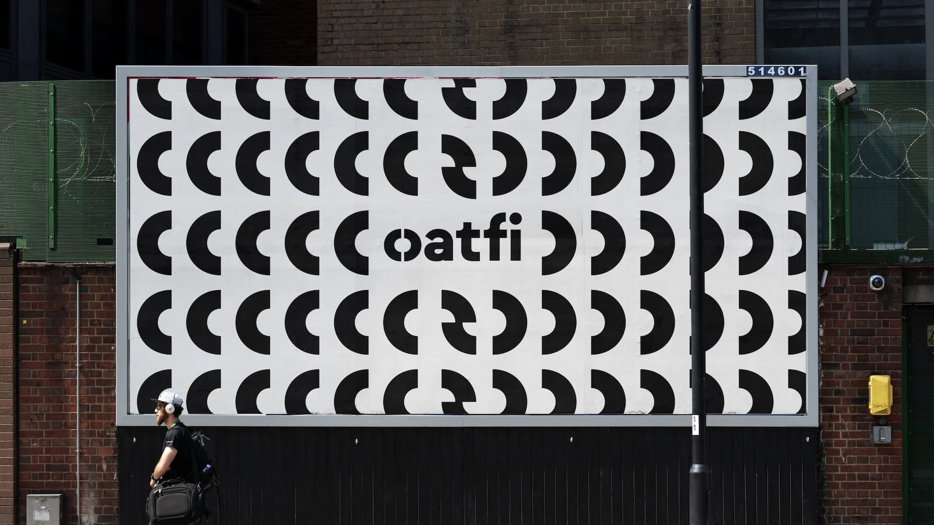
The logo went through a minor transformation as I used the insights fathered from the brand strategy workshop with the clients. The new logo now lowercased has an identifiable "o" that's been divided into two parenthetical shapes.
The Parenthesis (Lowercase O) now communicates the idea that Oatfi provides end to end support to their client with providing Loans and the API to implement. The Parenthesis is the overarching support allowing clients to do what they do best and to run their business seamlessly. The logo leans towards the concept of being “felt, not seen.
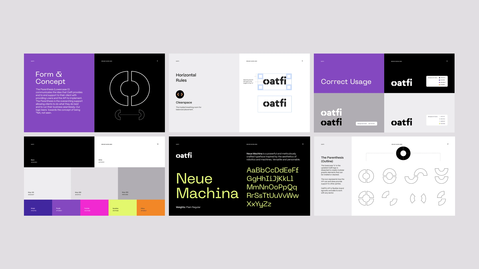
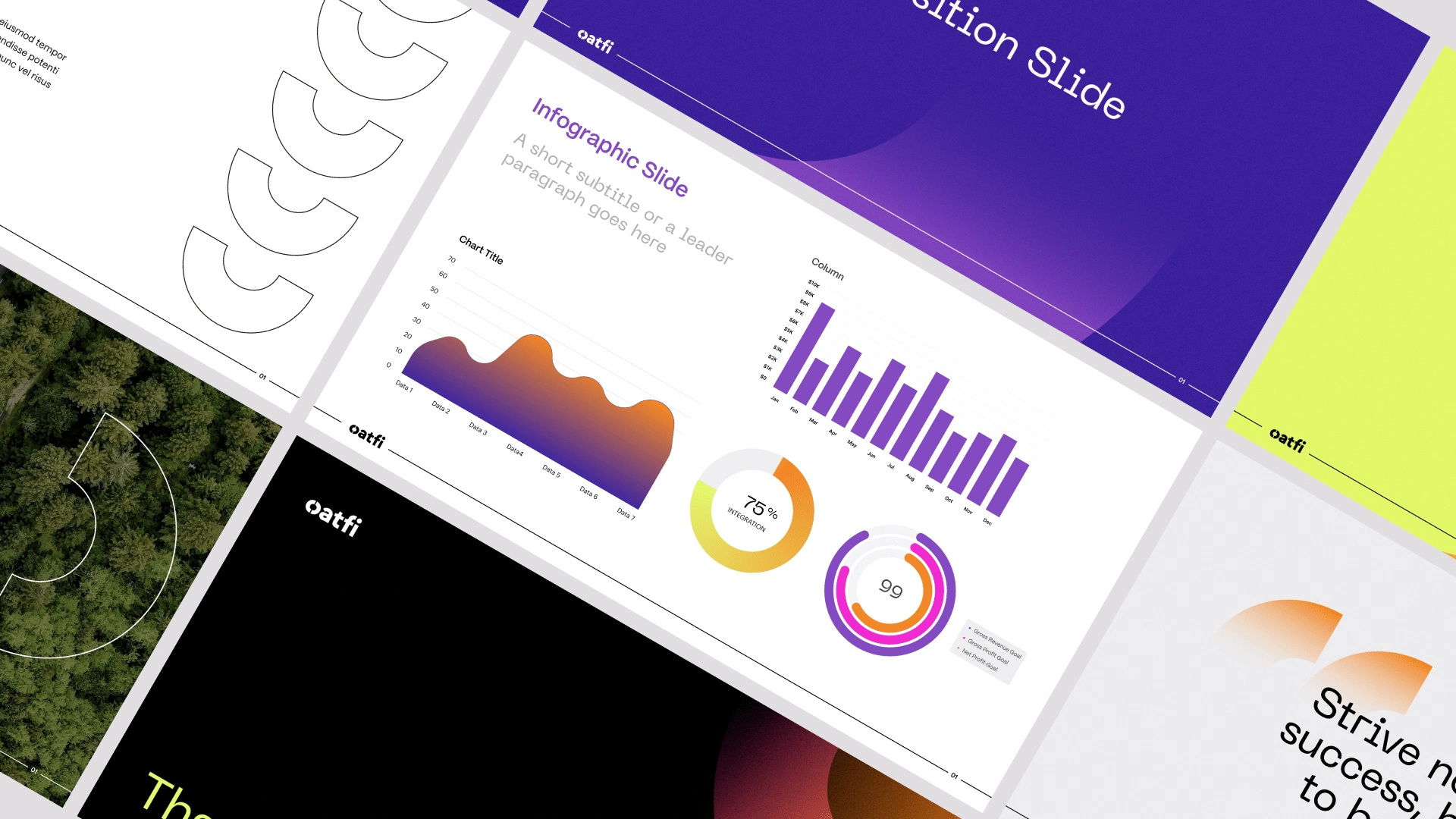
The Brandguideline

Like this project
Posted Dec 12, 2023
Process work for the Logo Design and Brand System for Oatfi, a B2B fintech lender.
Likes
0
Views
47
Clients
RocketAir
OatFi