Branding Kinto - The L2 for Finance
Hanna Tapang
Overview
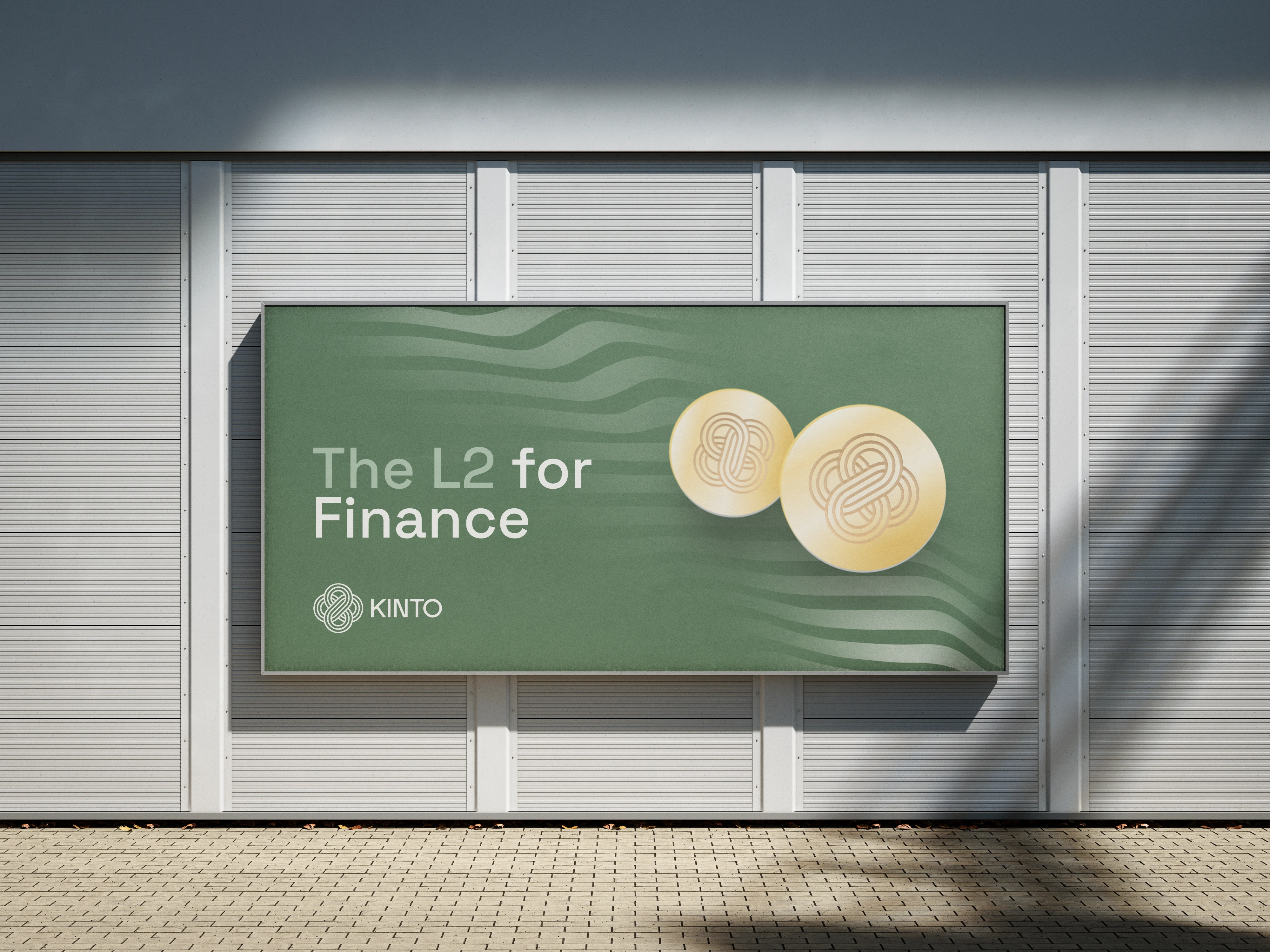
From the Japanese for ‘golden road’, Kinto is the first permissionless Ethereum Layer 2 network capable of supporting every modern financial institution and decentralized finance protocol. By offering a safer, faster, cheaper network built to the requirements of both DeFi and traditional finance, Kinto provides the most attractive infrastructure for users, builders, and investors from both worlds.
Agency: Rocket Air
Creative Director: Brian Hoff
Design Lead: Tracy Loi
Art Direction and Design: Hanna T.
Designer: Mario Ortega
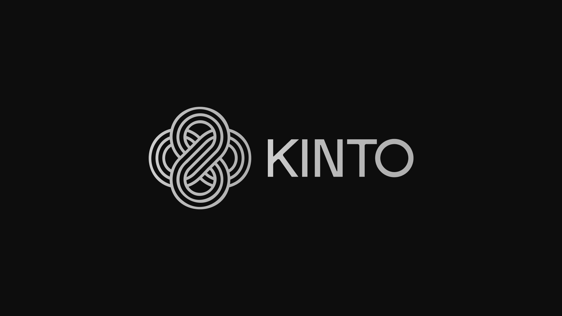
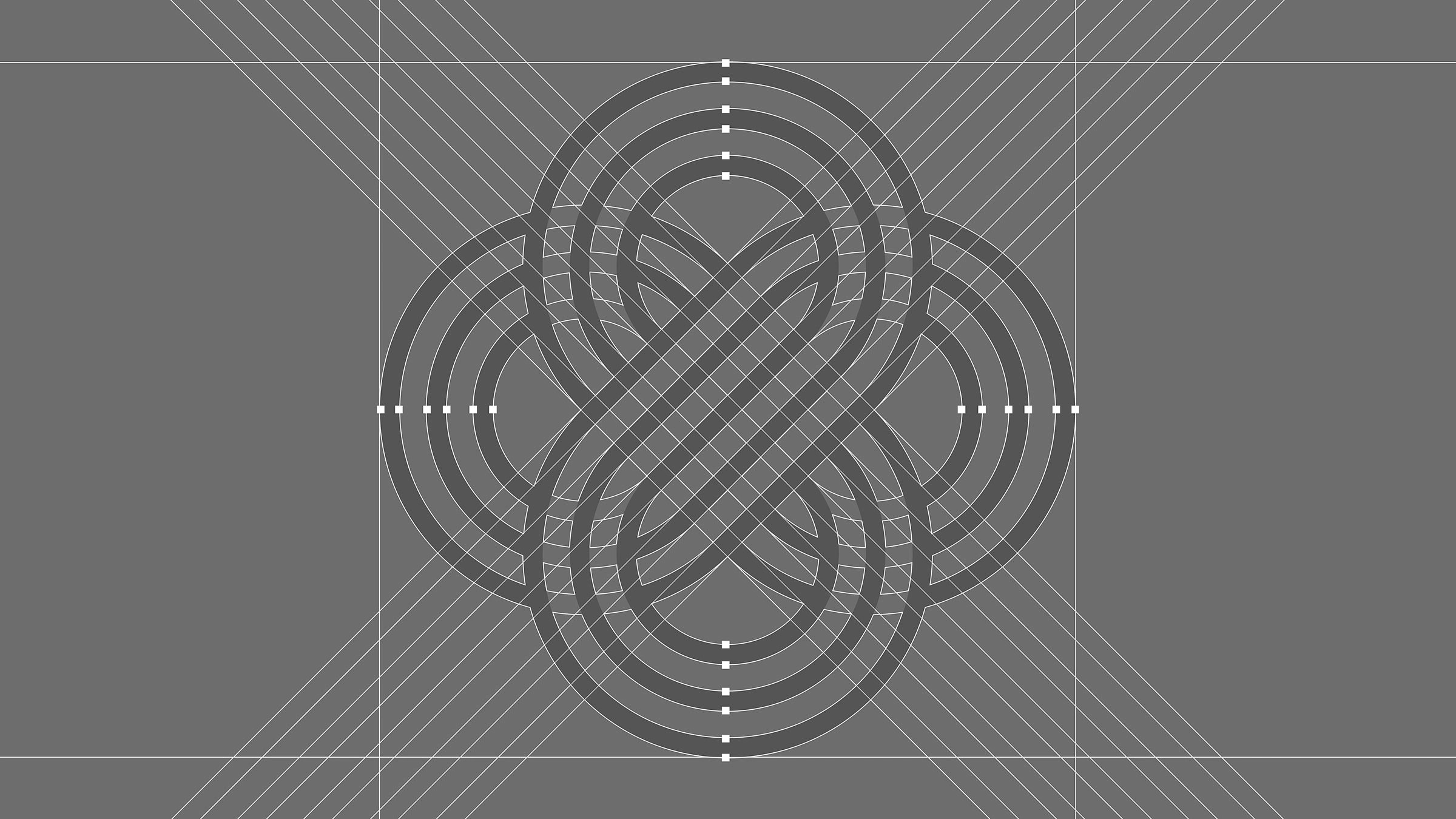
The Logo
Inspired by the Musubi knot or Musubi-Kiri—a knot that is tremendously difficult to loosen once tied — the logomark at once visually demonstrates the trust and security inherent to the Kinto platform while signifying the inter-connectivity of all users on the blockchain.
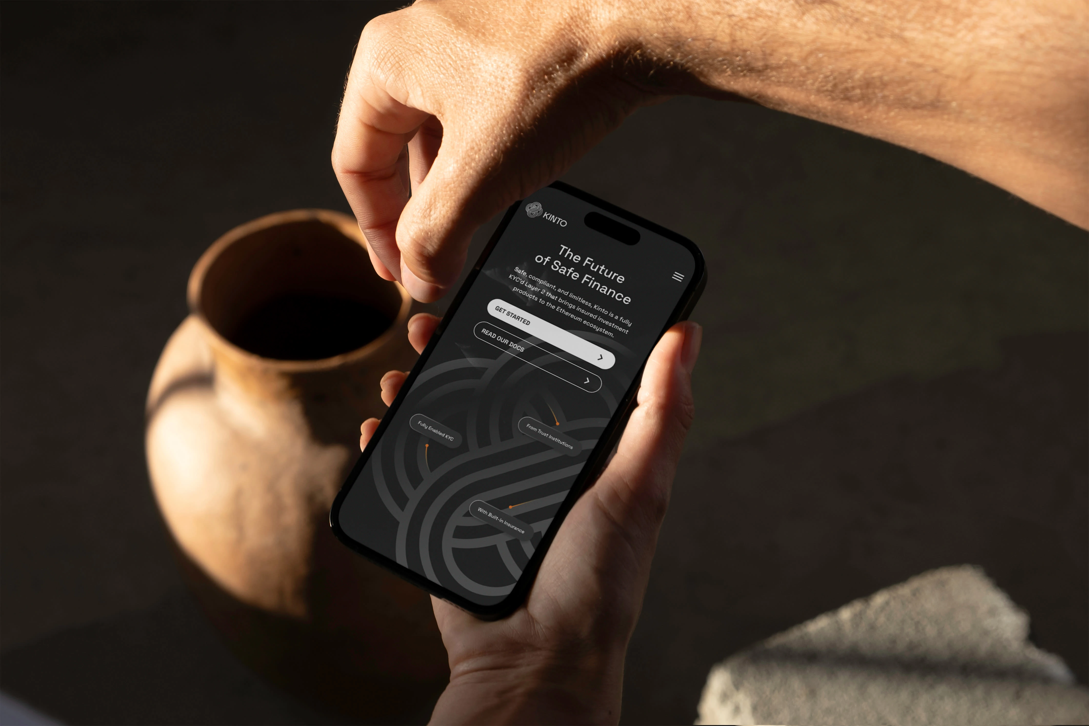
The Website
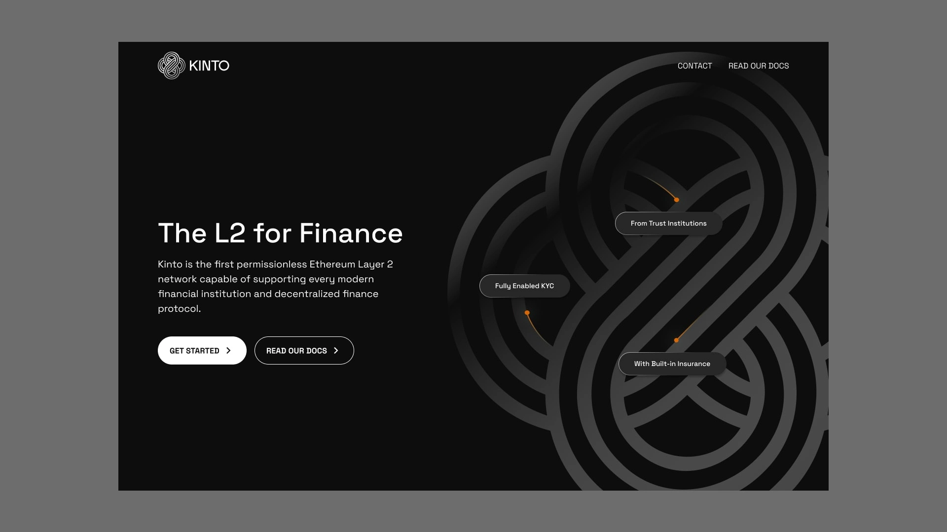
See the website in action:
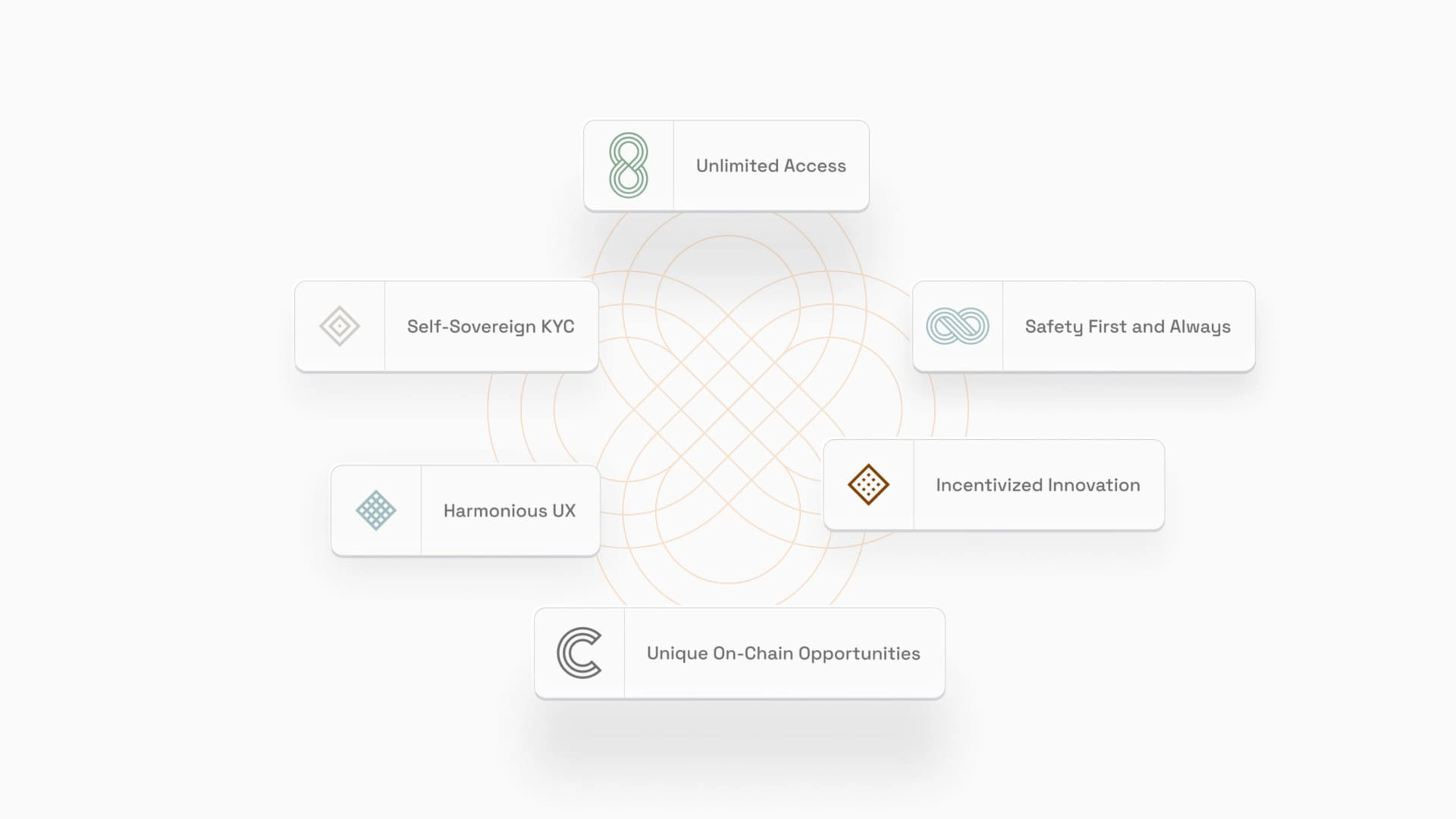
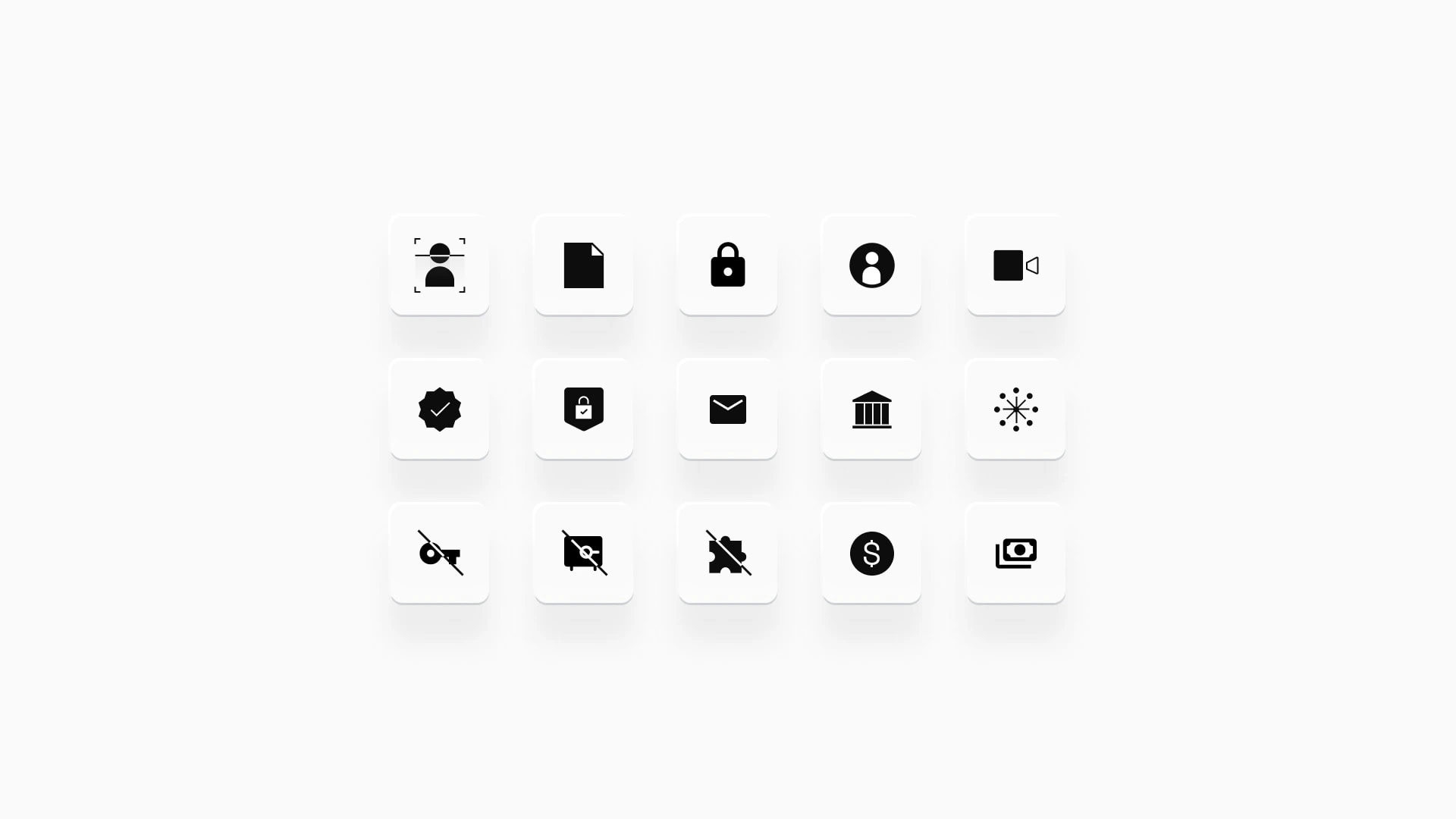
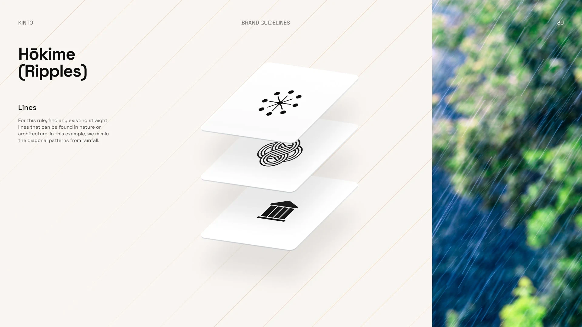
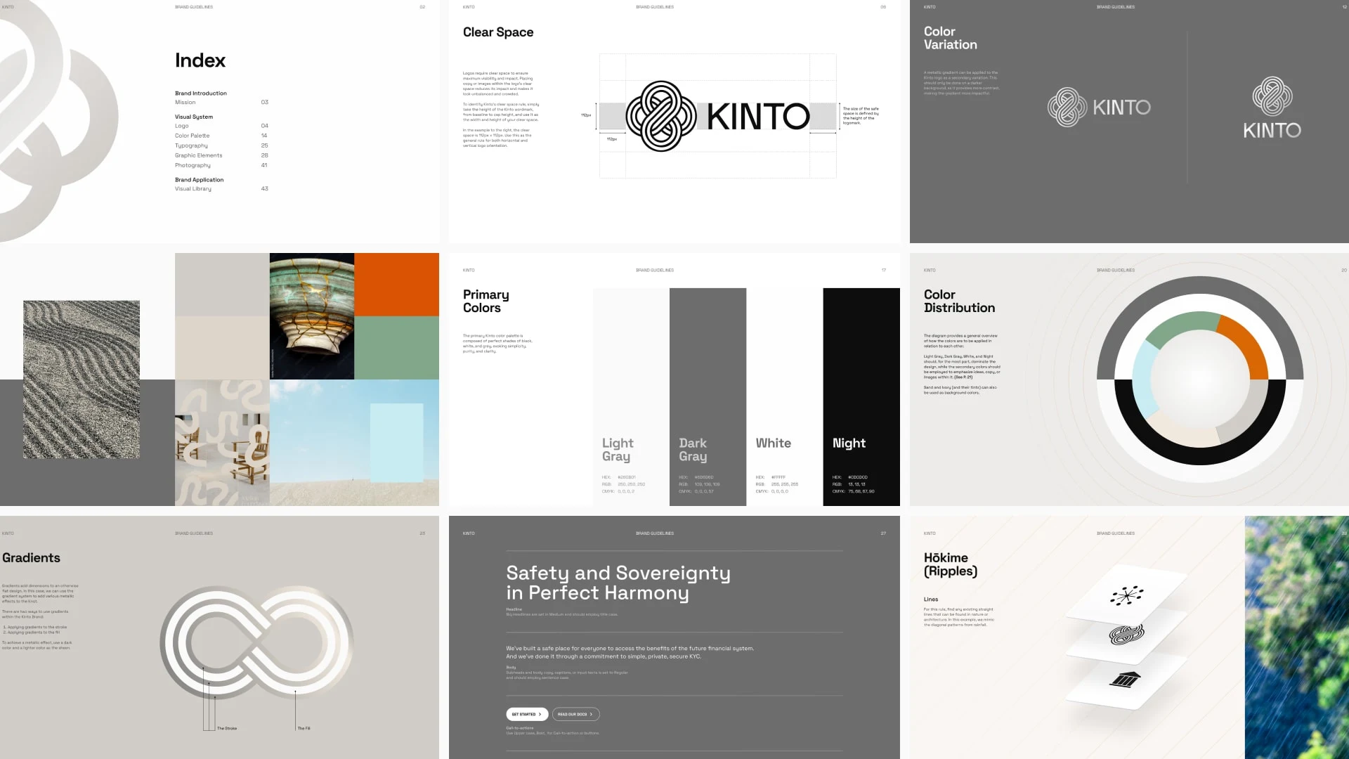
The Design System
The system took inspiration from the lines made in Japanese rock gardens (or Zen Gardens)
Brand Guidelines
The Result
The final branding evokes a feeling of serenity and safety. Devoid of too much clutter, the brand system of Kinto makes use of many of the Japanese design principles: Wabi (transient and stark beauty), sabi (the beauty of natural patina and aging), and yūgen (profound grace and subtlety).
Like this project
Posted Dec 12, 2023
Logo, visual system, and website design for Kinto, a company that bridges traditional finance and DeFi a pioneering permissionless Ethereum Layer 2 network.
Likes
0
Views
42
Clients
Kinto