3D Mapbox Data Visualization and Analysis
📈 Walter Jenkins
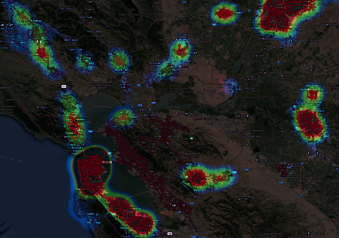
I have built out a 3D visualization using Mapbox and DeckGL showing off the tax collected in comparison to the parcel size. This visualization shows off that the density of a city can improve the return on investment for tax dollars spent. This project was built in the course of 6 hours from start to finish. I started with downloading the Access Database from the City of St Louis, then converted it to a SQL database and wrote out a query to pull the data accounting for the latest year of tax assessment, and summing all the values for each parcel. Then I used QGIS to calculate out the missing acreage values and associated my new data to those parcels. After that I built a web map that showed the tax value / total acreage in vertical height using DeckGL and Mapbox grouping areas to improve rendering time. Since there was a lot of questions about the amount of each, I quickly built a table that would display all of the values that are associated with each pillar on the map.
Blog Post
Demo
Blog Post
Demo
Like this project
Posted Sep 13, 2024
Developing visually engaging data visualizations with Mapbox and React for telling amazing stories
Likes
0
Views
28