Brand Identity for Movmob
Brand Identity for Movmob — A Creative Collective for the New Era of Audiovisual Art
Movmob is a creative collective formed by filmmakers, designers and visual artists redefining how artistic talent connects and collaborates.
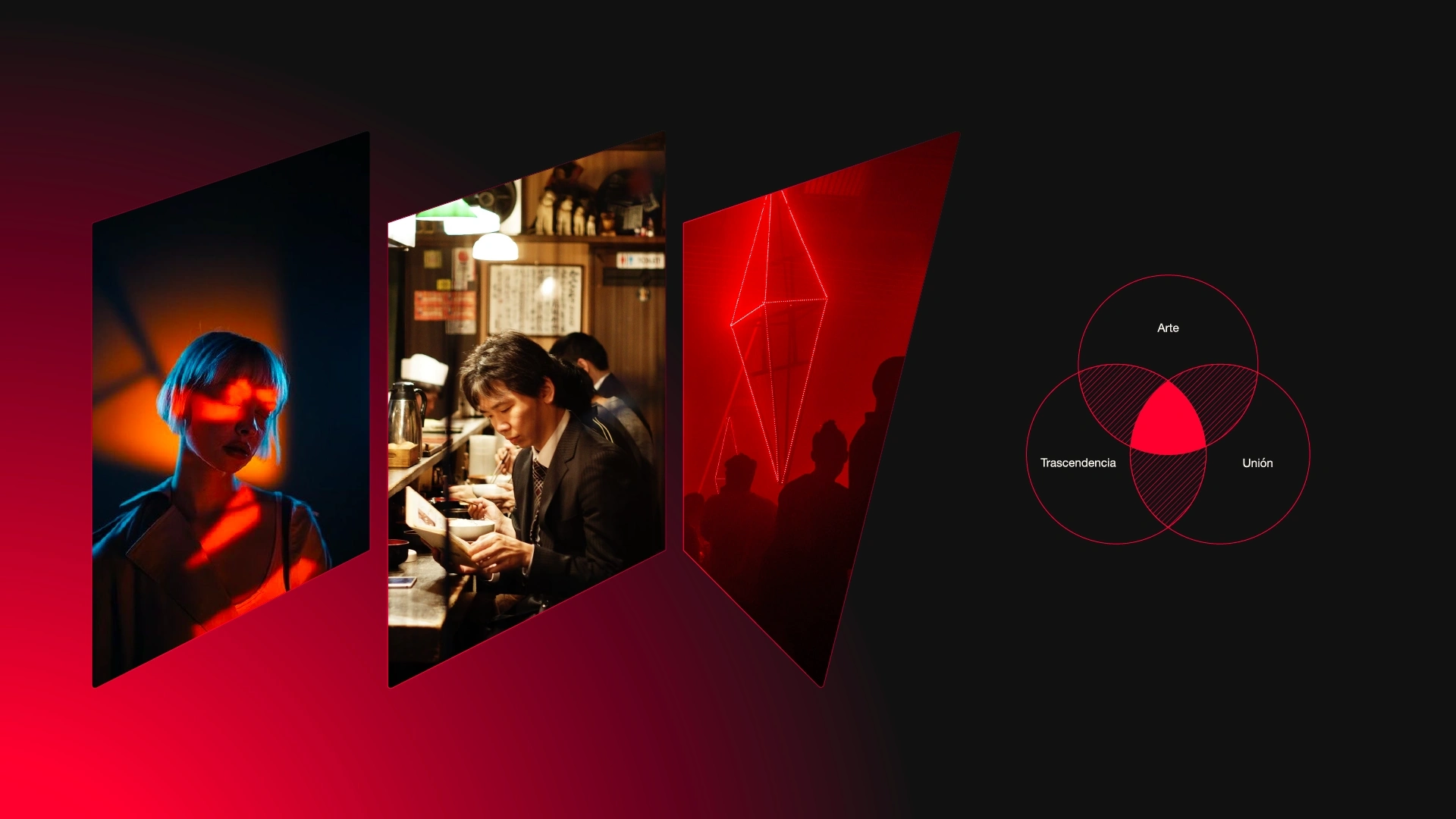
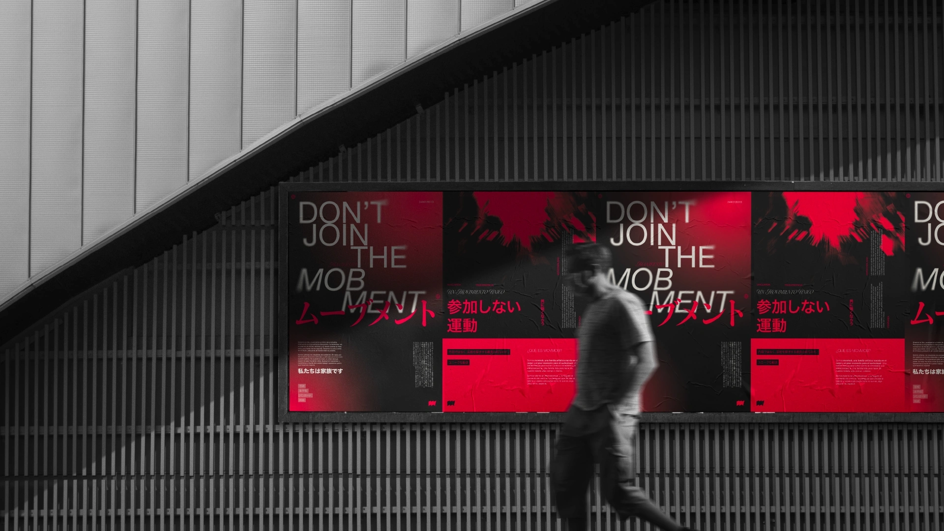
They wanted a strong, raw and symbolic visual identity. One that could reflect their manifesto: “Together we are stronger.”
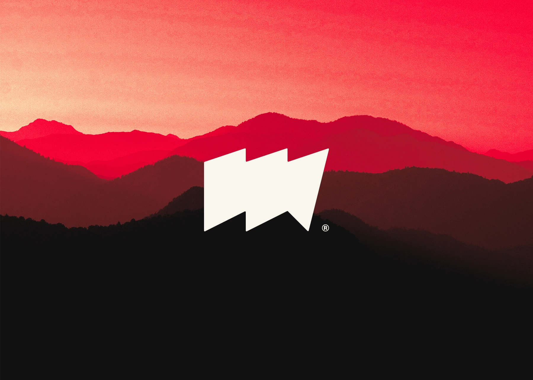
I worked on the full brand identity, from concept to execution, including logo design, color system and visual applications.
The goal was to build a brand that felt collective, cinematic and human; far from the polished and empty look that dominates much of the creative industry today.
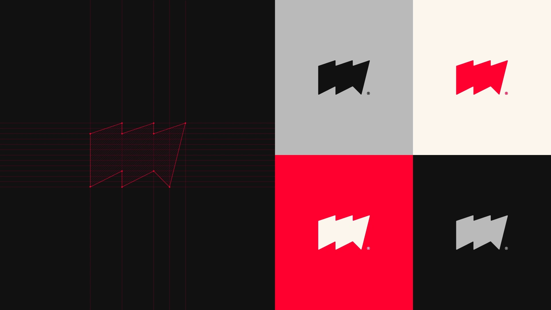
The logo merges elements of cinema, collaboration and challenge:
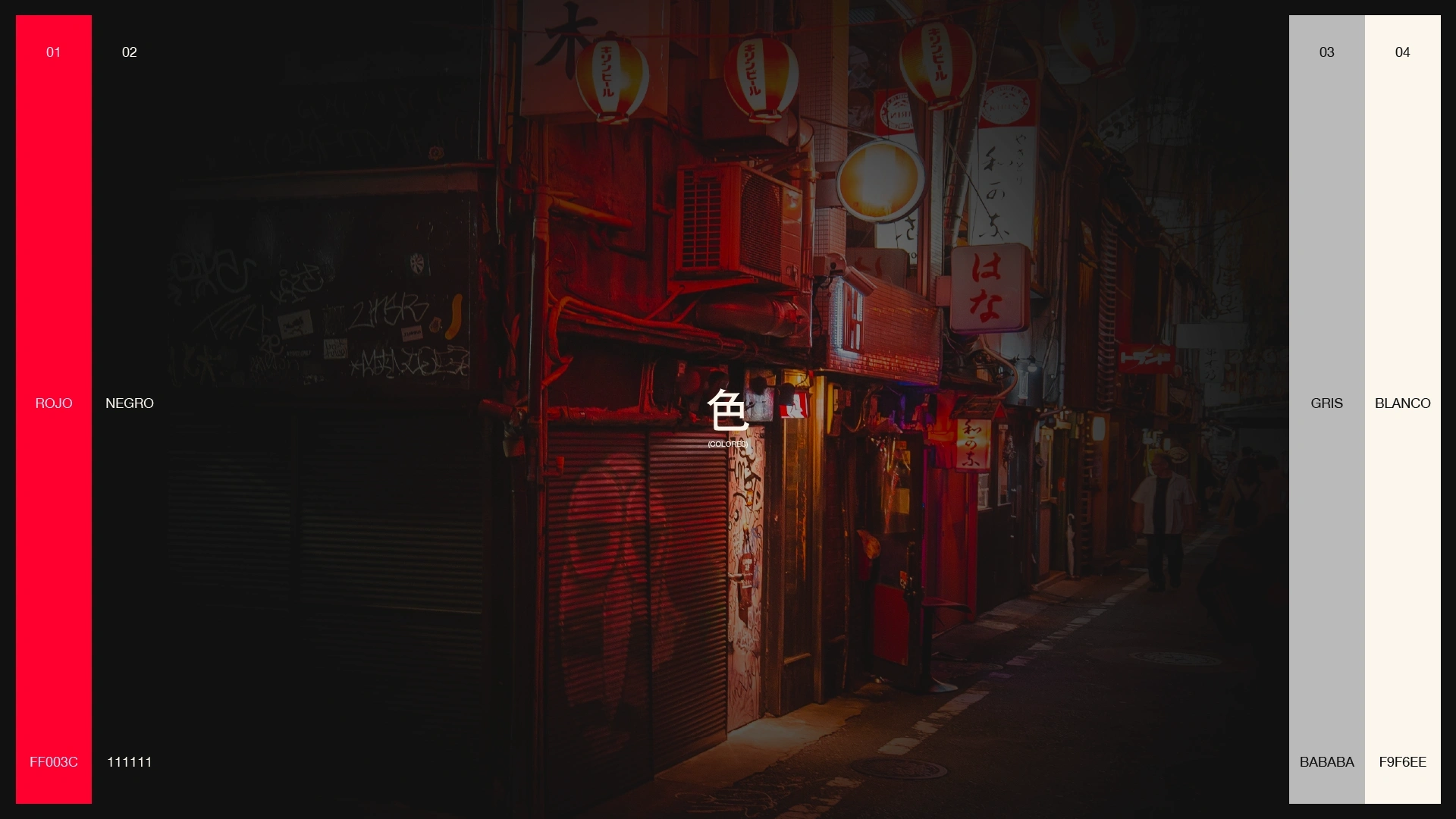
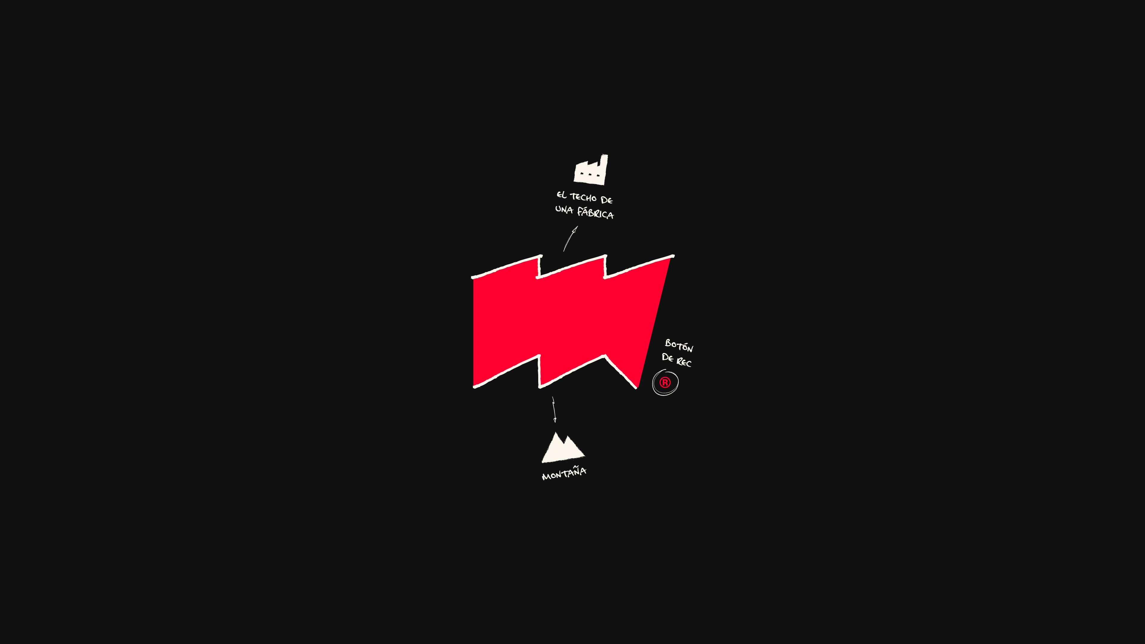
The red symbolizes the REC button: energy, action and creation.
The black connects both the artistic and technical sides of filmmaking.
The M draws inspiration from both mountains, representing ambition and creative challenges, and the rooftops of old factories, as a tribute to craftsmanship, production and the working-class roots of art.
The overall design embraces a brutalist industrial aesthetic, translating the rawness and authenticity of the collective’s spirit.
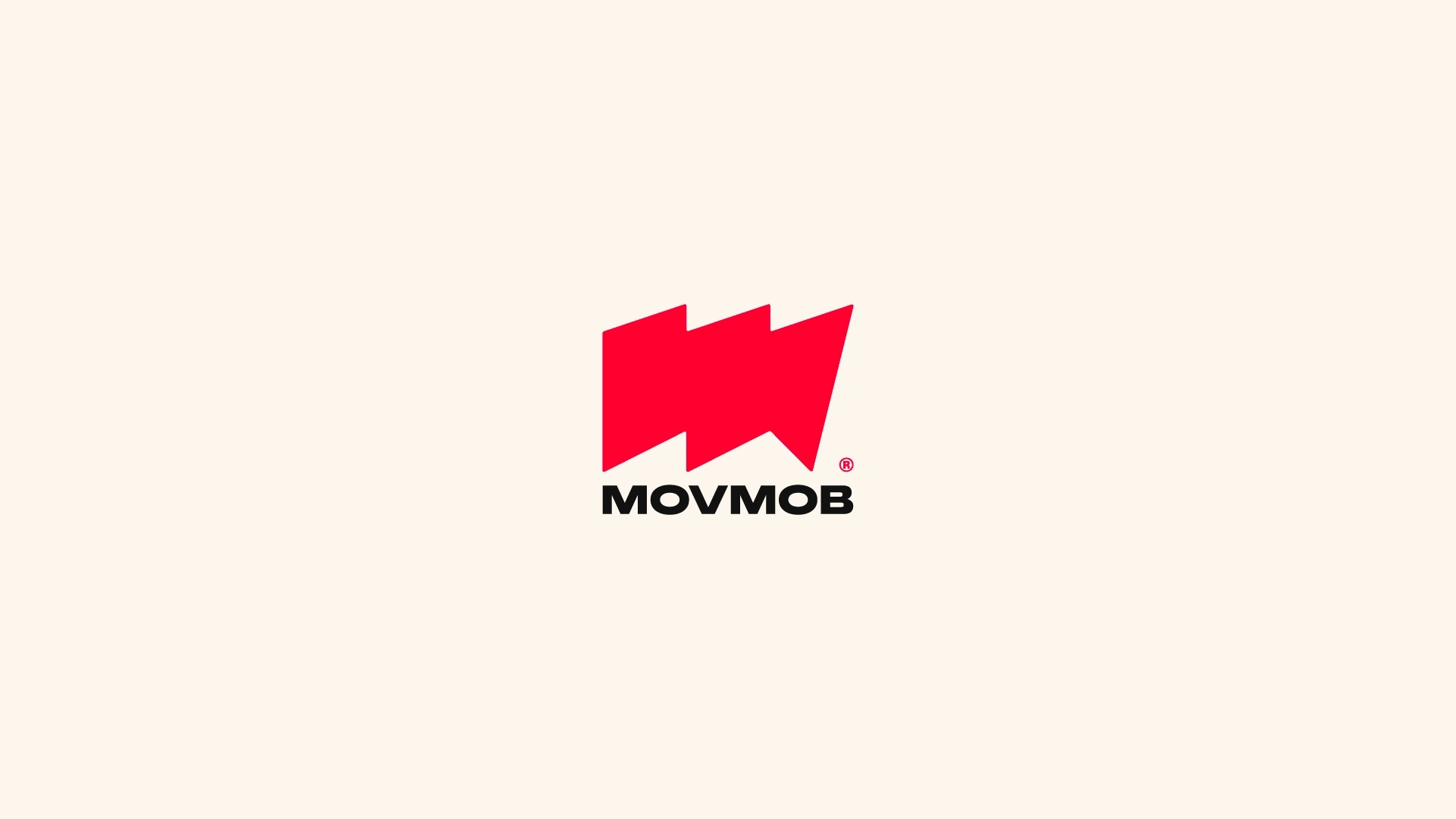
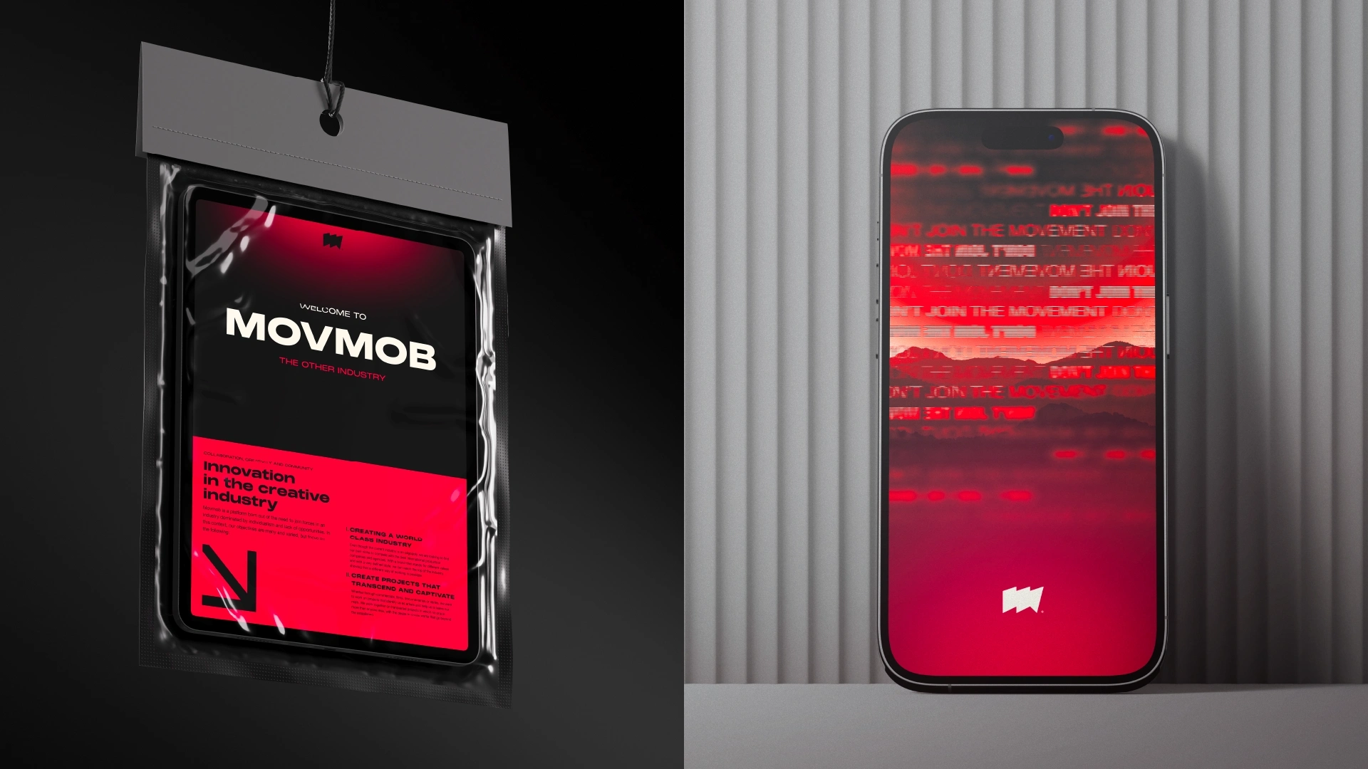
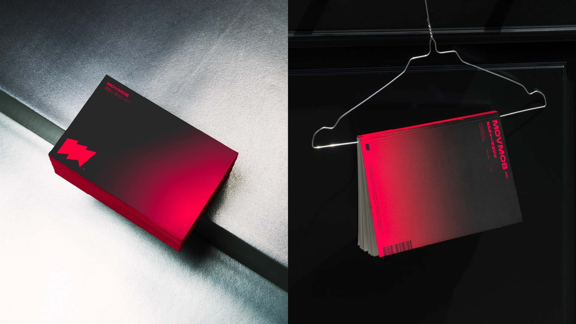
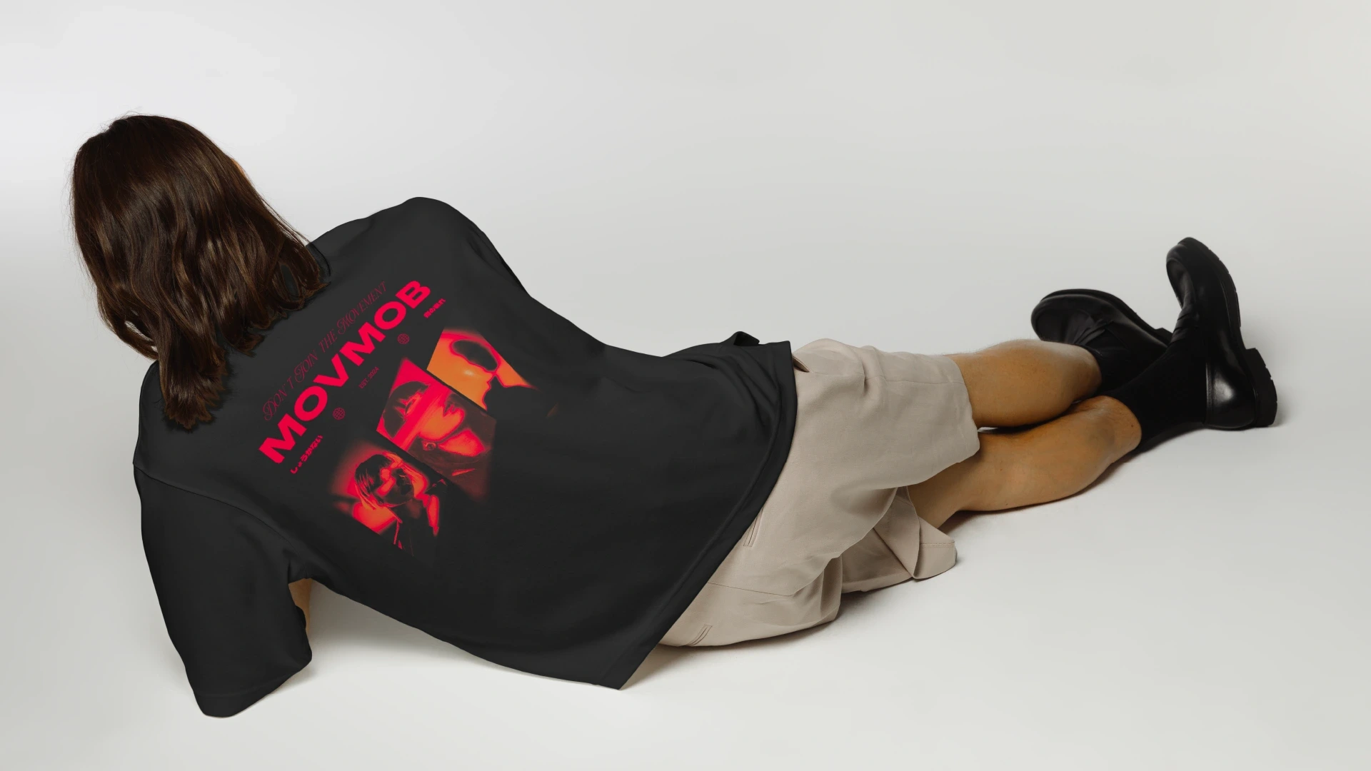
The result is a cohesive identity that captures Movmob’s energy: a brand system ready to expand across posters, presentations and film projects.
A visual language that doesn’t just represent a collective, but a movement.
Like this project
Posted Oct 27, 2025
Movmob is a creative collective formed by filmmakers, designers and visual artists redefining how artistic talent connects and collaborates.

