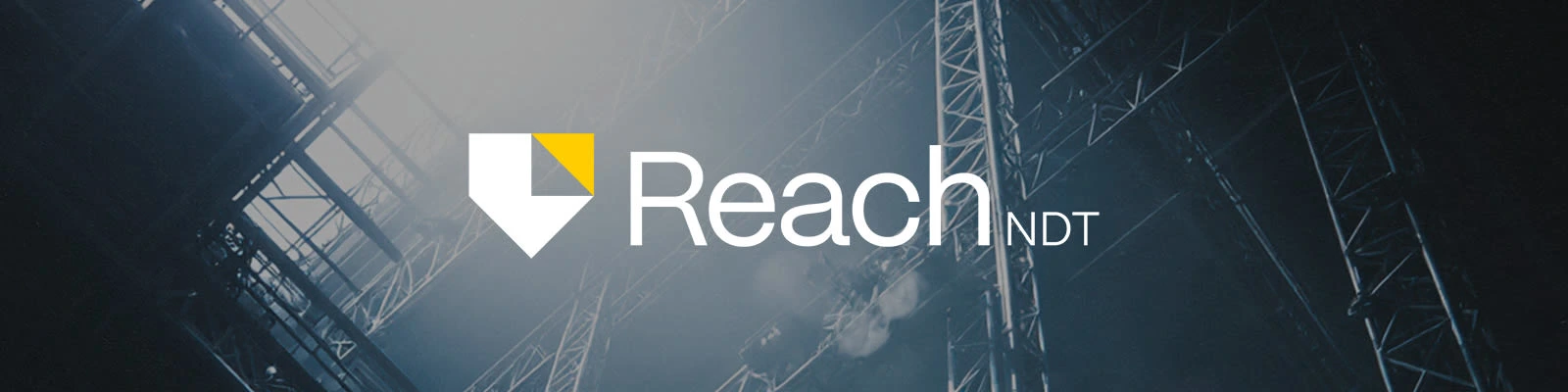
ReachNDT — Logo Design
Tony Lure
ReachNDT — Logo Design
A precise identity for a company built on safety and innovation.
ReachNDT provides non-destructive testing services in high-risk environments.
The goal was to create a professional identity that conveyed trust, protection and precision while standing out from the industry’s dated visuals.
With full creative freedom, I explored a modern and technical design language rooted in geometry.
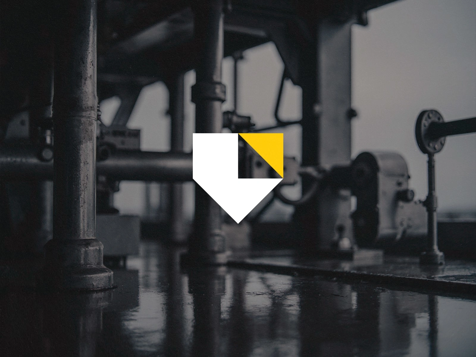
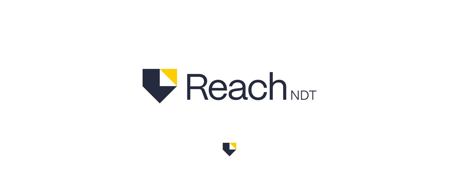
The logo combines two key ideas: protection and reach. The geometric shield represents safety and confidence, essential in non-destructive testing. The upper right triangle stands for projection and excellence, symbolizing the company’s constant forward motion.
Together, they form a mark that feels balanced and technical.

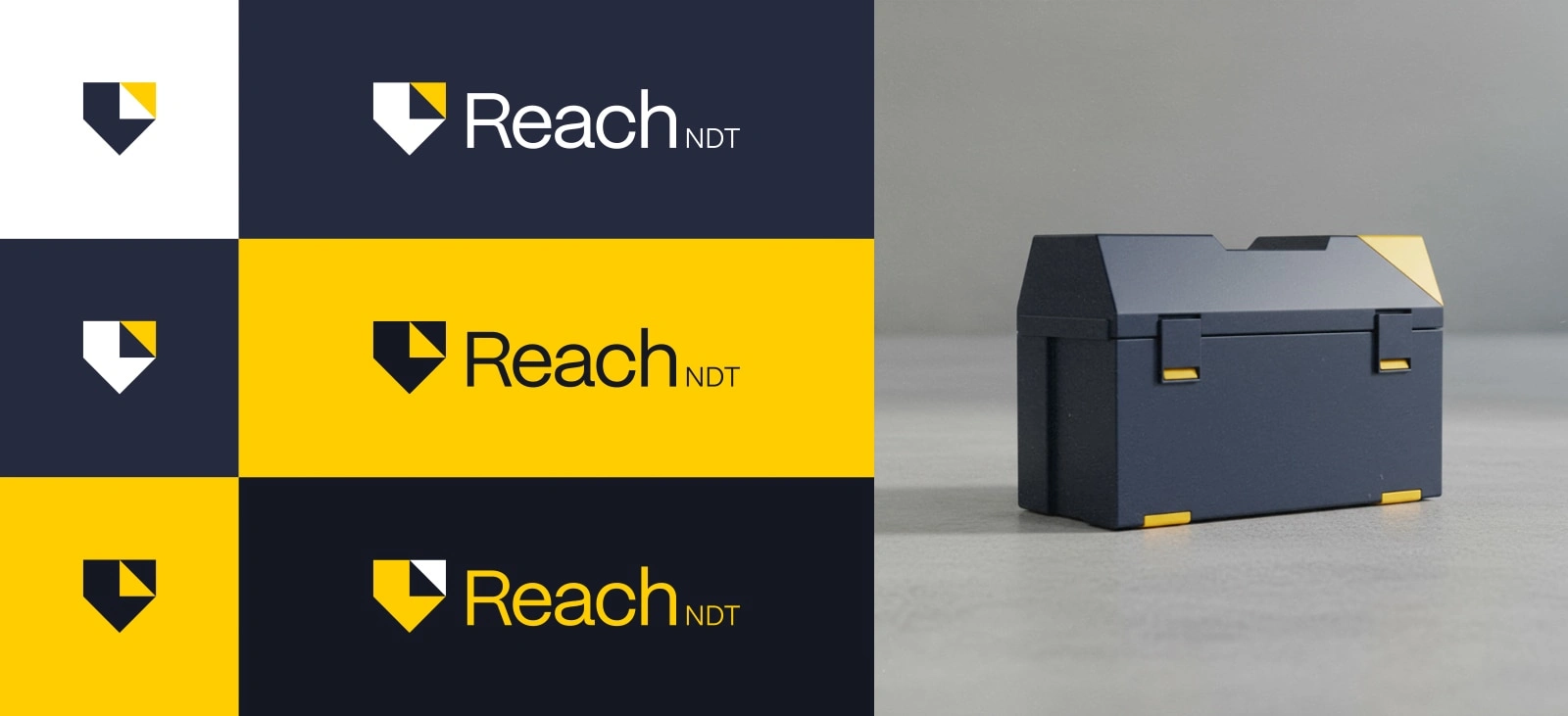
The system includes full, compact and monochrome versions, optimized for digital and field use. The mark remains legible at small sizes and adaptable across any surface or background.
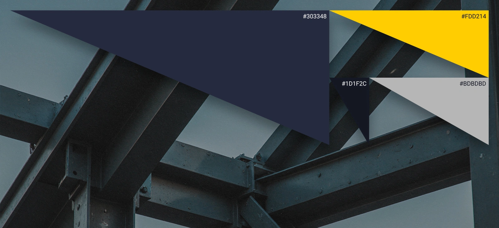
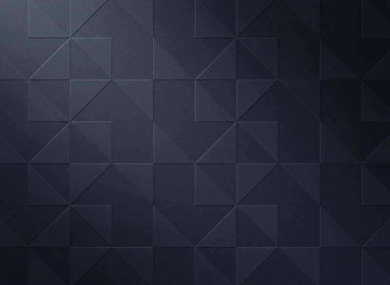
The brand pattern was built from the logo’s geometry, echoing its symmetry and stability. Used subtly in backgrounds and technical documents, it reinforces the sense of structure and precision without distraction.
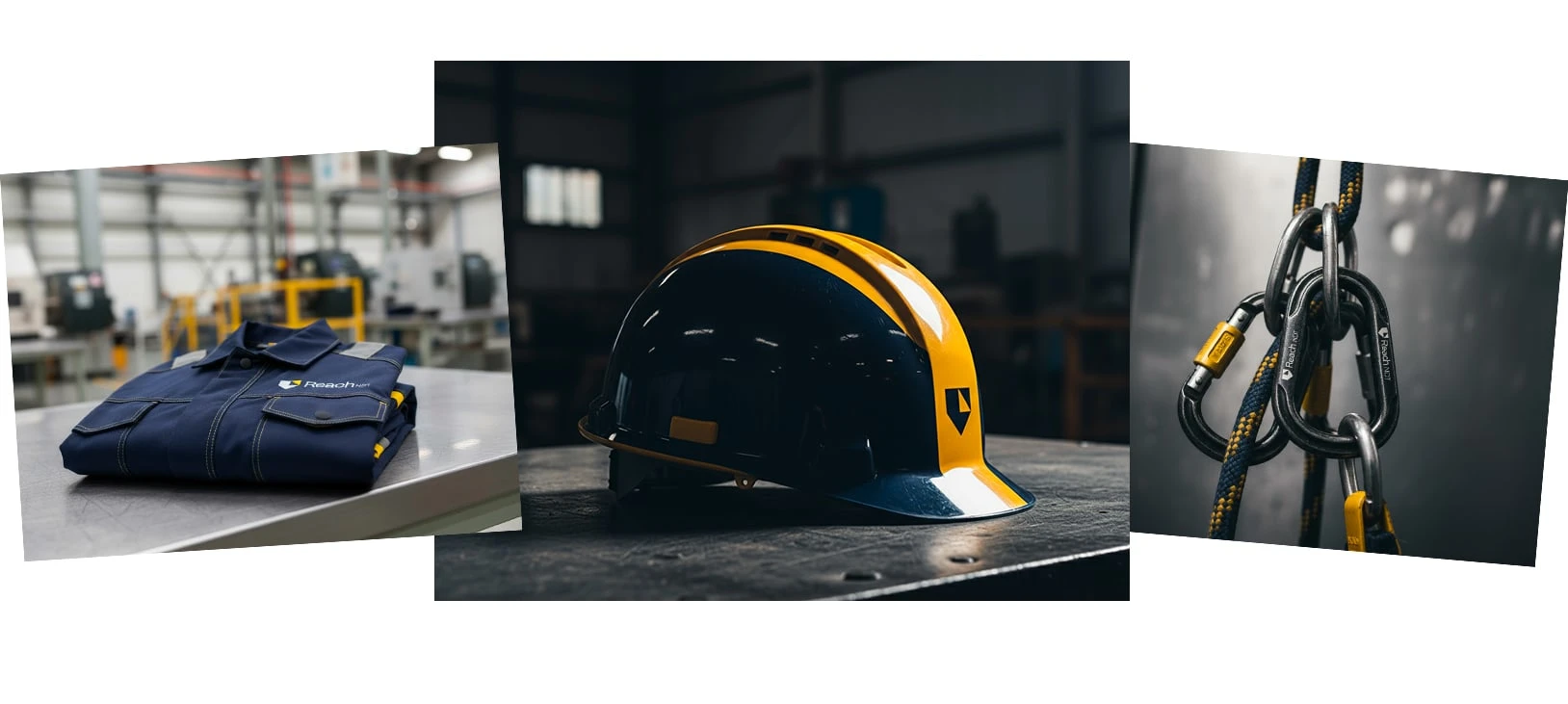
A brand identity designed to reflect the precision and confidence at the core of ReachNDT’s work. Built for environments where trust is everything.
Like this project
Posted Nov 2, 2025
Designed a clean, modern logo for ReachNDT. A brand built on trust, precision and innovation in technical inspection.