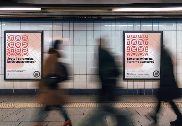
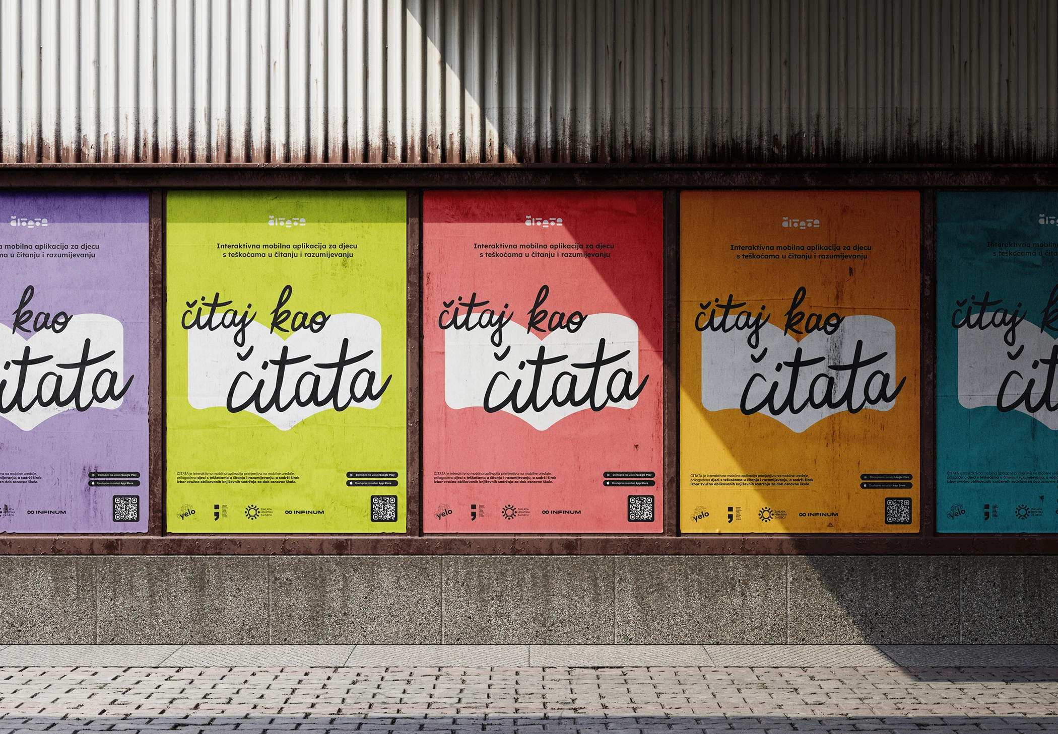
ČITATA: Inclusive project for children with reading difficulties
Vana Bašić
ČITATA is an interactive mobile application designed to support children with reading and comprehension difficulties.
Created as both an assistive and educational tool, it aims to provide an inclusive digital environment where early readers, especially those with developmental or learning challenges, can feel encouraged, capable, and safe.
The project responds to a real and pressing need: many children face barriers when engaging with traditional reading materials, whether due to dyslexia, attention difficulties, visual impairments, or cognitive processing differences. ČITATA offers an alternative: a space where reading is adjusted to fit the child, rather than the other way around.
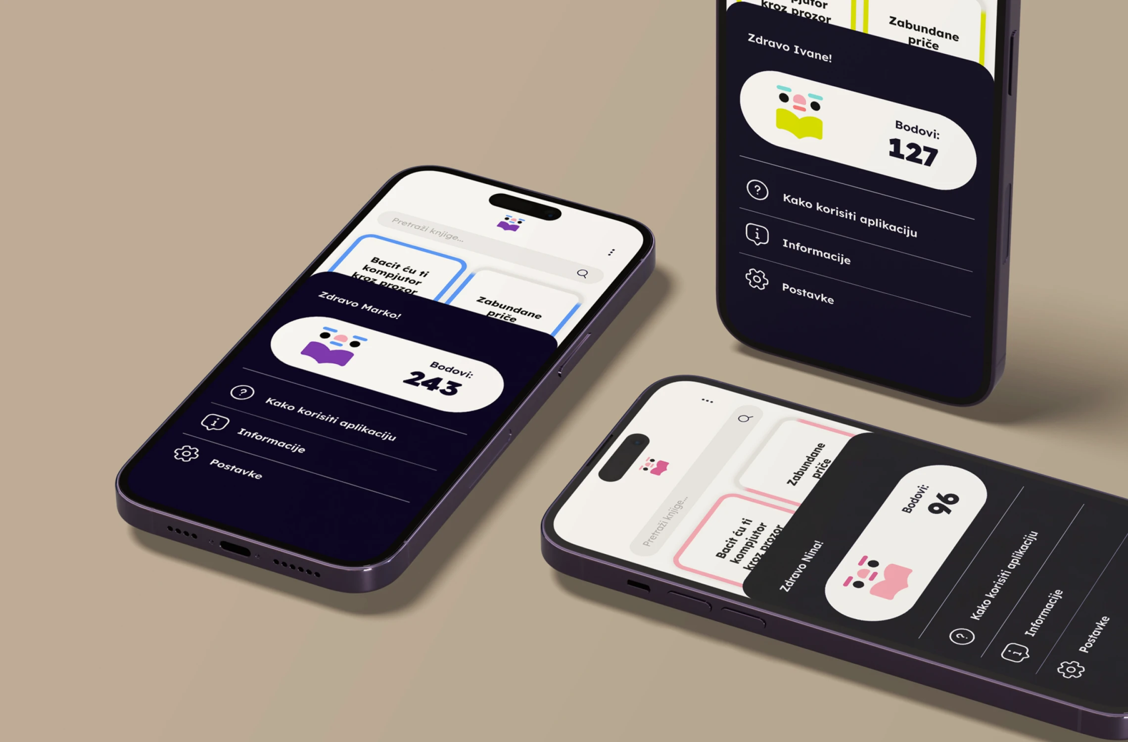
The app is not just a tool, but a companion, supporting children in developing reading confidence, while also assisting parents, teachers, and therapists with a structured, user-friendly platform that helps guide and monitor progress. It supports independent exploration while remaining intuitive enough for shared use between child and adult.
Project combines thoughtful UX, child-friendly visuals, and accessibility-driven typography into one seamless, emotionally intelligent experience, proving that design can be both playful and purposeful.
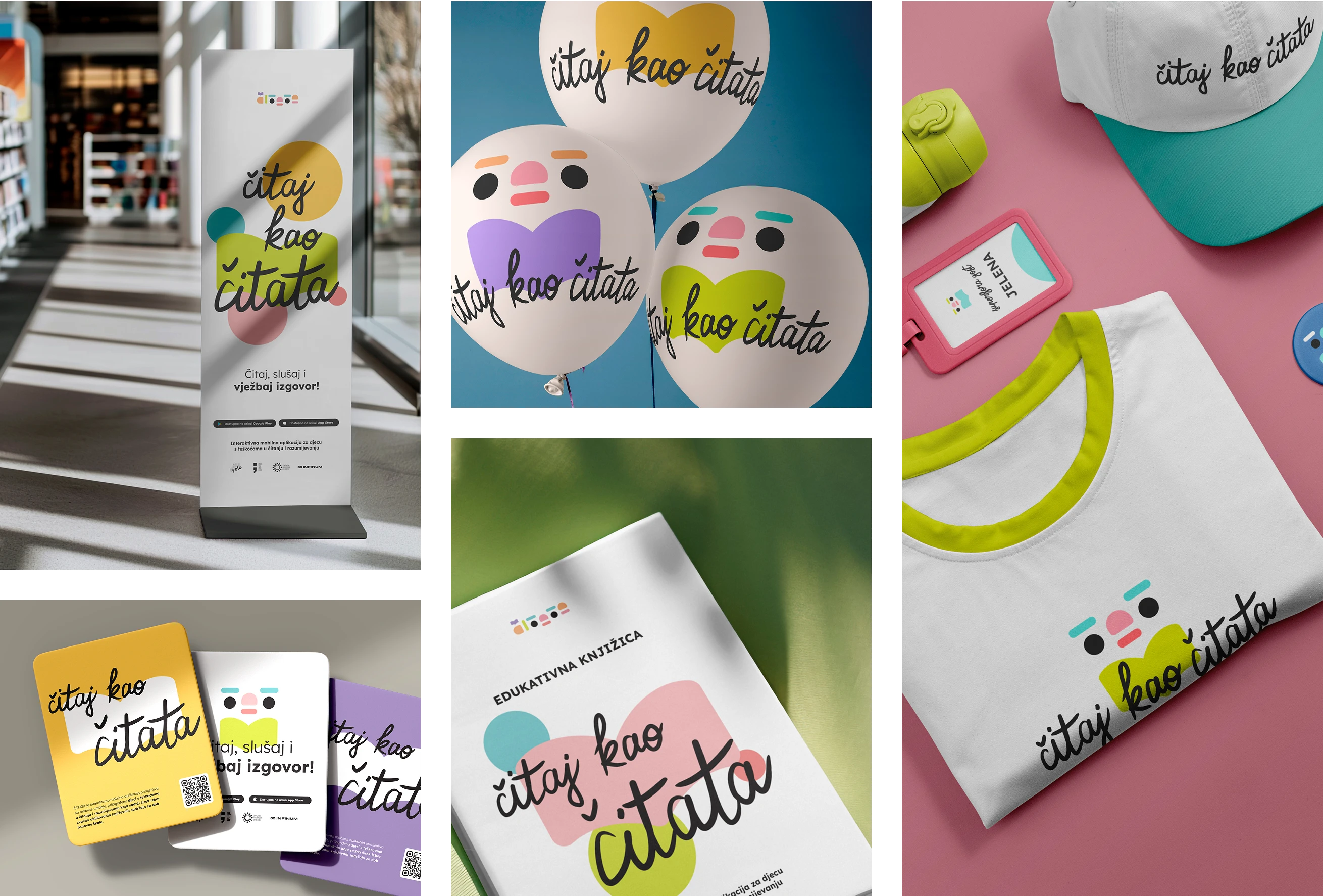
Branding
The visual identity was redesigned to improve clarity, recognition, and emotional connection with the target audience. The updated logo simplifies form while adding warmt, integrating the letters T-A-T into a subtle face-like shape to create a friendly, welcoming character.
Lexend typeface was used, developed to reduce visual stress and improve reading fluency, especially for users with dyslexia or similar conditions. The color palette was selected for both its visual appeal and accessibility, ensuring strong contrast for users with visual impairments.
The branding needed to work across multiple platforms, from app icons to educational print materials, while maintaining consistency and legibility at every scale. The result is a cohesive identity that feels playful and safe for children, yet trusthworthy and professional for adults.
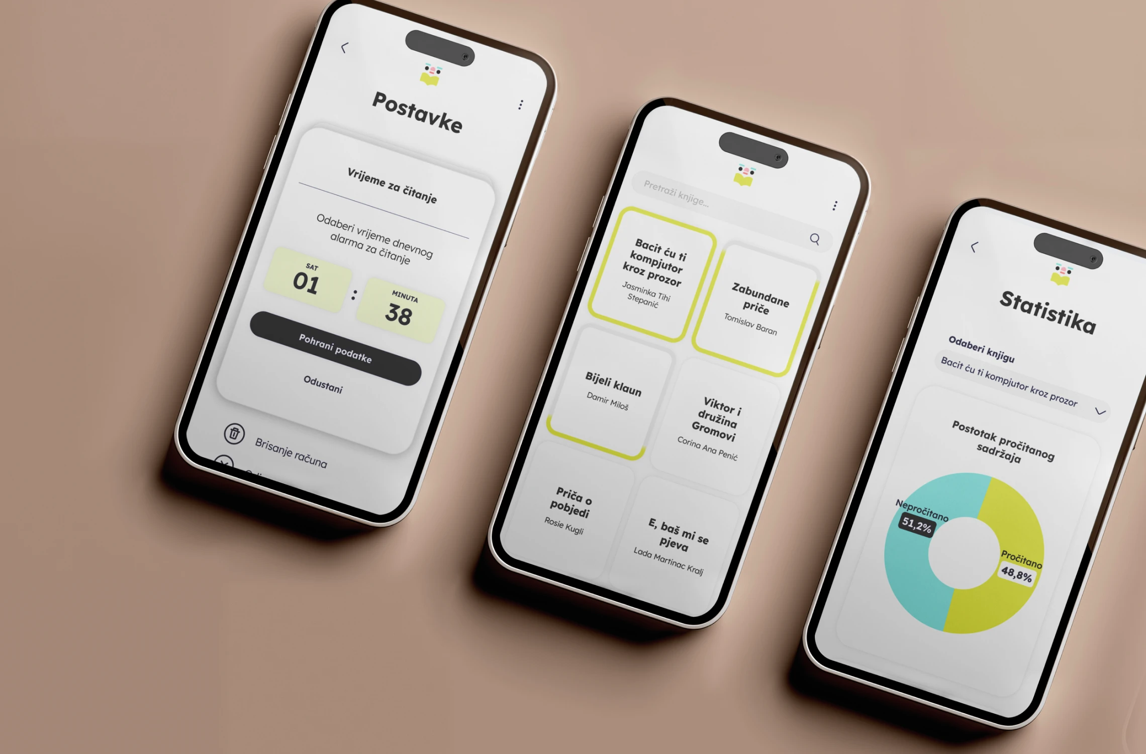
Mobile app
The UX and UI design of ČITATA were shaped to make reading more accessible, intuitive, and engaging for every child. The interface supports a calm, focused experience while offering flexible tools that adapt to different reading abilities and needs.
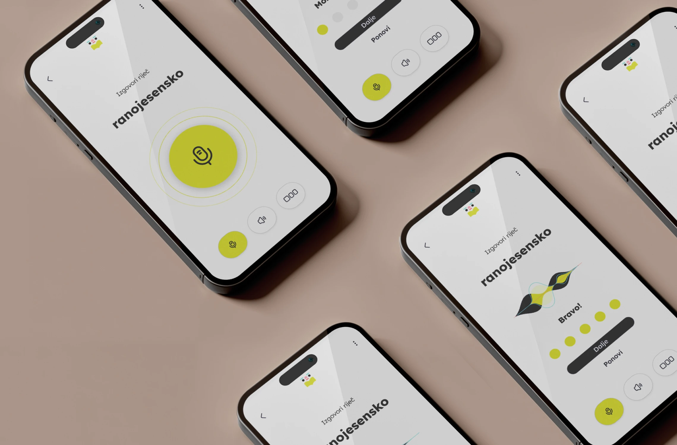
Voice-narrated reading experience
Every book in the app is accompanied by voice narration that follows the text in real time. This helps children who struggle with decoding words stay focused, supports auditory learners, and makes the experience more inclusive for children who cannot yet read independently.
Pronunciation support for complex words
Difficult or unfamiliar words are paired with voice examples, helping users understand pronunciation and meaning without frustration.
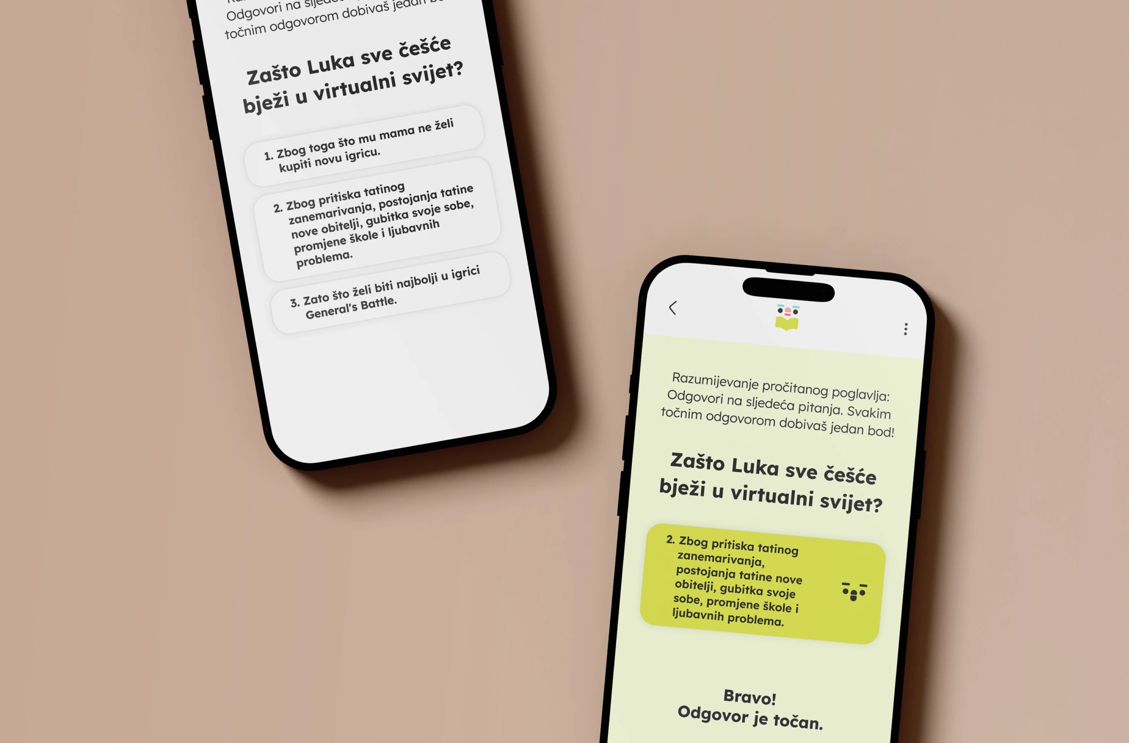
Comprehension-building tools
After reading, children can complete quizzes and interactive tasks that support understanding of key concepts, vocabulary, or story structure. These activities help reinforce comprehension in a playful, low-pressure way.
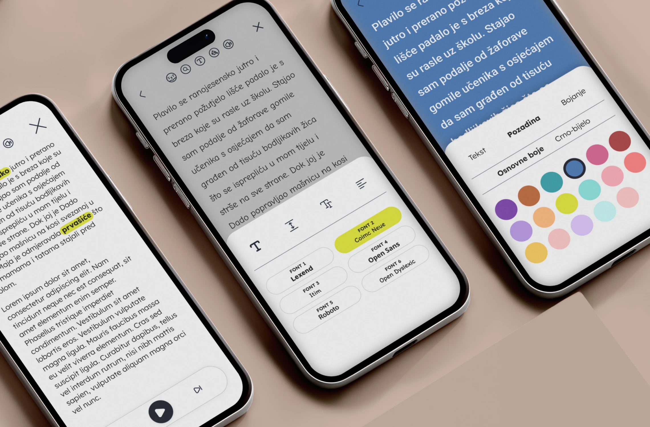
Customization and accessibility settings
Users can choose between six color themes to personalize their interface. The app also includes robust accessibility settings, such as switching different typefaces to reduce visual stress; adjusting text size; changing font and background color to increase legibility for children with visual or perceptual difficulties.
Like this project
Posted Oct 30, 2025
App design and branding for ČITATA, an inclusive project for children with reading difficulties.