A logo that works in
Amit Verma
A logo that works in one place isn't a brand. It's a starting point.
This is a snapshot of how we think about brand systems at Studio Jamoora. Every project here was built so the identity holds across contexts. Not just looks good once.
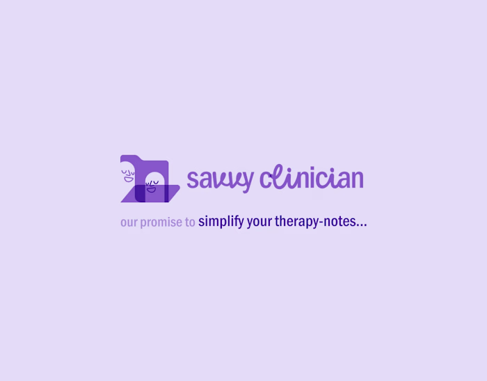
Savvy Clinician needed to work as a full logo, a stacked mark, a favicon, and inside the product UI. Four contexts, one voice. The system was designed for all of them from the start.
Our own identity is built on a golden ratio relationship between the brand mark and logotype. Not decoration. When your mark has to work from a browser tab to a billboard, the proportions need to be intentional from day one.
ABO's verbal identity came first. "Close enough isn't good enough." The geometric pattern system, the rigid structure, the precise repetition. All of it followed from that single line. In healthcare diagnostics, precision isn't a value proposition. It's the whole point.
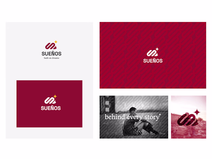
AW Jewelry needed emotional weight. "Telling your ultimate tale" shaped the typography, the photography, the way the logo sits over real hands. The visuals came from what the brand needed to say.
Brand systems mean every touchpoint already knows what it's doing. The logo isn't carrying the whole load alone.
Like this project
Posted Apr 11, 2026
A logo that works in one place isn't a brand. It's a starting point. This is a snapshot of how we think about brand systems at Studio Jamoora. Every project ...