Landing Page Redesign for Jottacloud
Mads McCausland
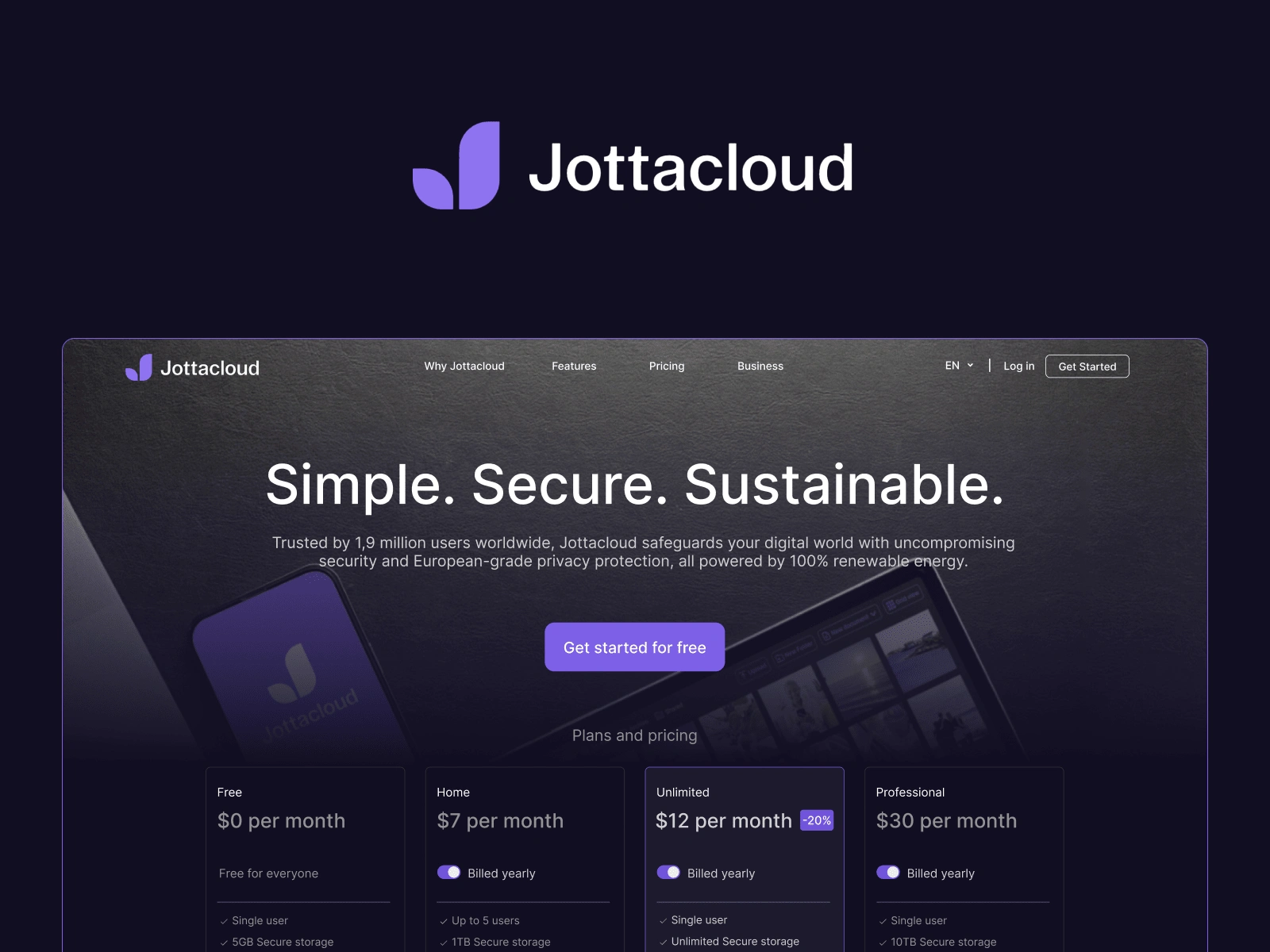
When Jottacloud announced their relaunched website in late 2024, it immediately caught my eye, but sadly, not in the way they might have hoped for. Jottacloud has a solid product that I deeply admire, but their new site was doing them a disservice by underselling the product and its capacities.
The relaunched website had, as realtors like to say, some … potential.
What Else Ya Got?
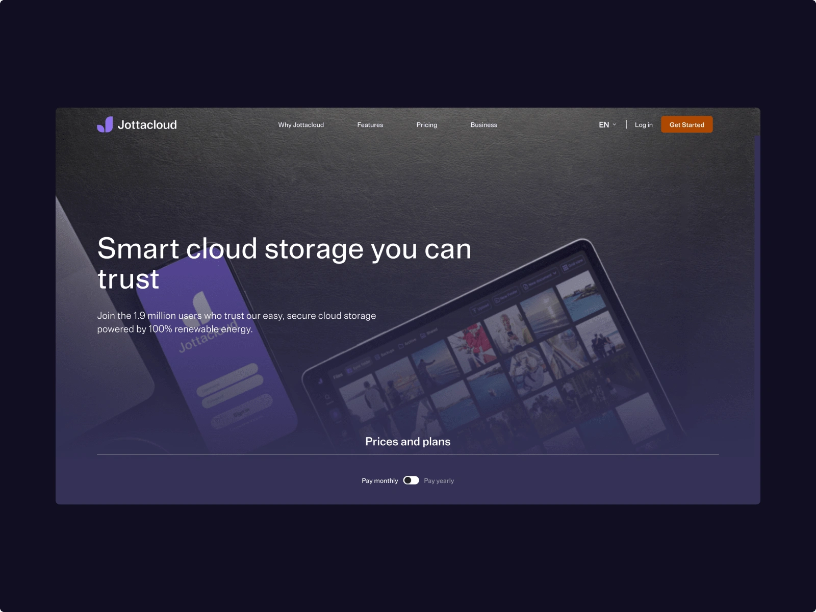
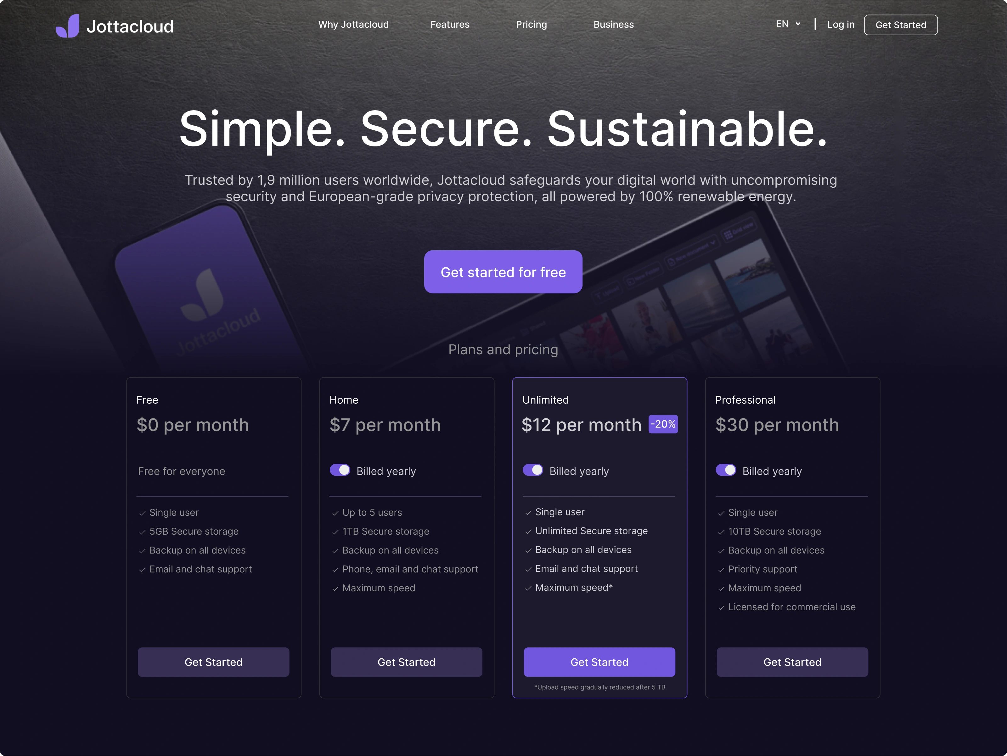
The main issue stood out to me immediately: there was absolutely nothing telling visitors that there’s more content below the fold. You say “Prices and plans”, and even give me a little toggle to play with, but … why? What prices and plans are you talking about? What do you want me to pay for? And what’s that garish brown button doing up there in the corner?
To kick things off, it only made sense to lift the different product packages up just enough to peek above the fold.
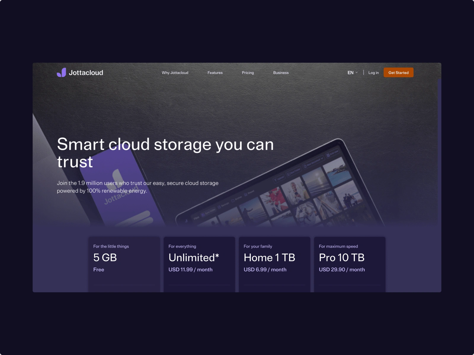
Getting there - lifting the product up for the world to see is a great start. But - we can do better.
This simple adjustment created an immediate visual cue that says "keep scrolling, there's more good stuff down here!" Sure, scroll is cheap, and the navigation has "Prices and plans", which technically hints at more content, but what’s so wrong about doing our users a favor and simply showing them there's more to see?
The Big Purple Button
Still, this still won’t cut it in today’s day and age. The second obvious thing that needed to be done was giving the CTA more attention. Like, by a lot. How do we do this? Well, let's start by making it match the brand colors. Oh, and what if we make it really big, too?
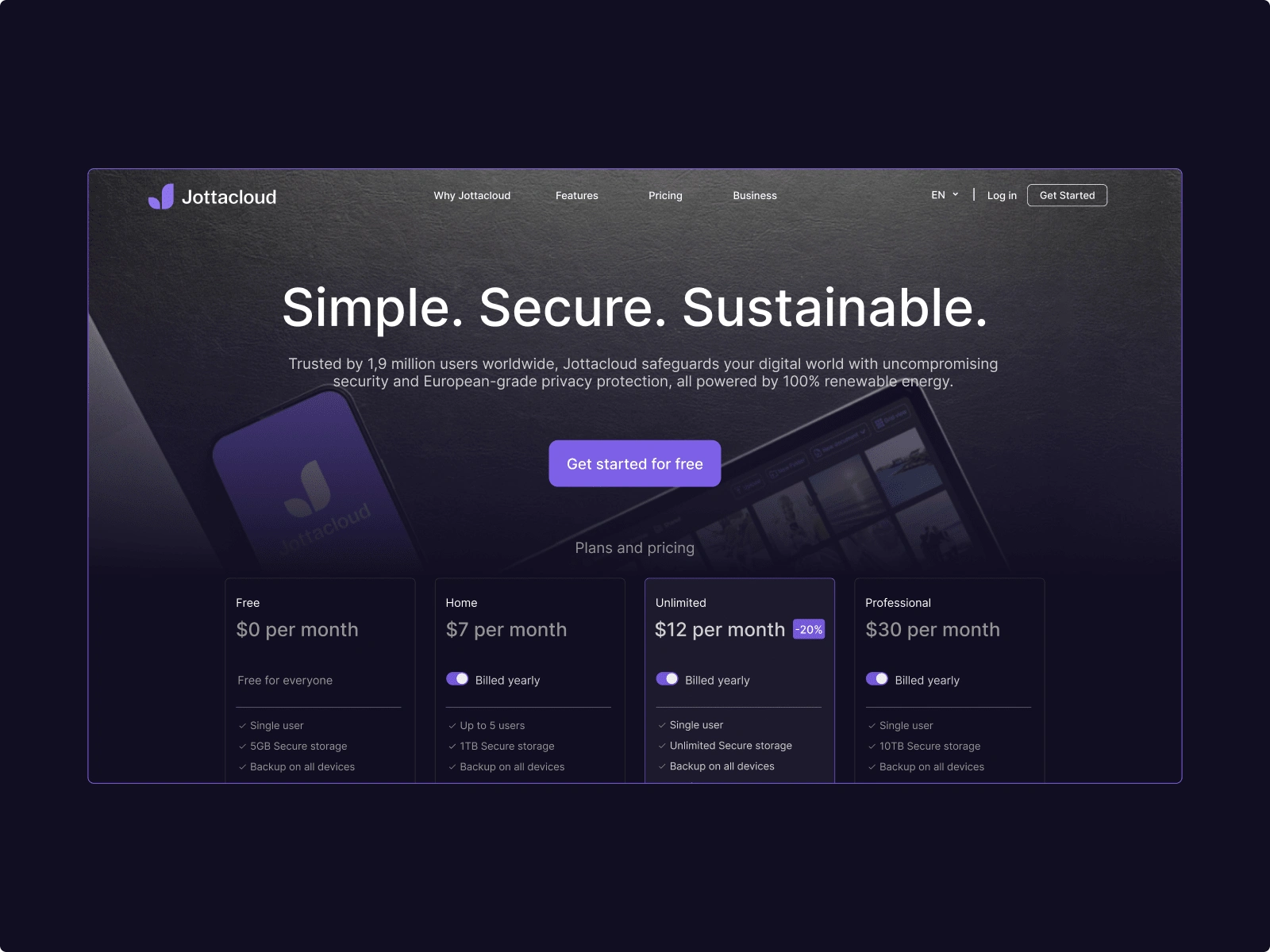
Is that a big purple button you’ve got there or are you just happy to see me?
Center. Shorten. Make. It. Succinct.
When it came to the copywriting, I did a couple of things: "Get started - it's free" tells users exactly what to expect when they click. When a new set of eyes are scanning a website, there simply isn't a lot of room for ambiguity. Having copy that is clear and to the point is therefore critical. Plus, removing uncertainty from the user journey almost always improves conversion rates.
The heading got the same treatment. Strong security should be a given for any cloud storage provider in 2025, not a differentiating feature. A shorter, punchier headline gets this point across quickly while also helping reinforce the hierarchy on the page, guiding the user’s eye down towards the CTA. Pair this with center-aligning everything and things are starting to look pretty good.
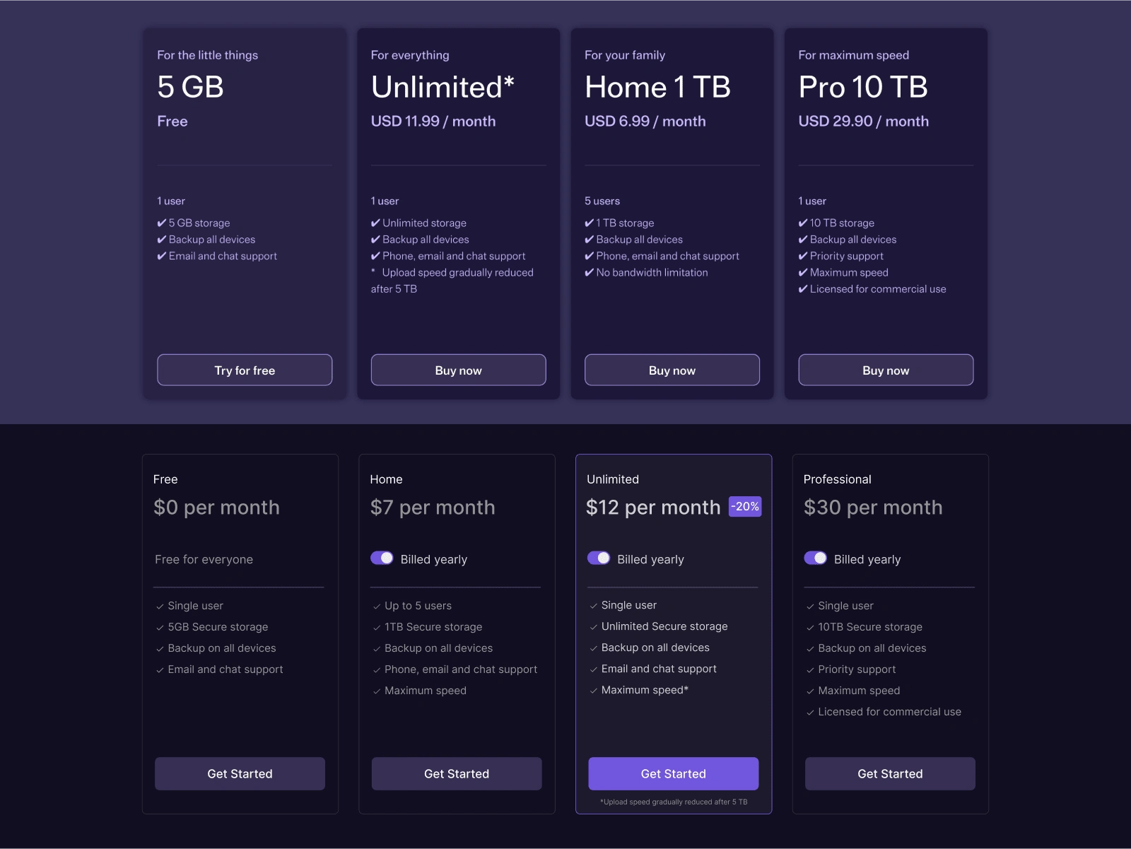
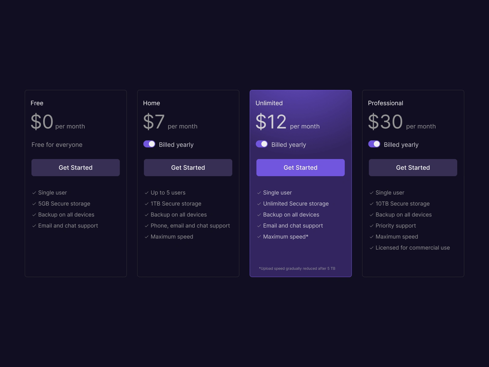
Old (top) and new (bottom). Sorting products by price and highlighting the most valuable offer reduces decision-making and thus cognitive load.
What’s the Cost?
Finally, I spent some time sorting out the details of their product offerings, and redesigning their respective cards. I noticed that a lot of Jottacloud’s competitors, and SaaS products in general, often follow a price structure that, essentially, goes from “free → most expensive”. Plus, more often than not, users are encouraged to pick a specific package/deal, highlighted through things like color and other forms of incentivizing like a good deal.
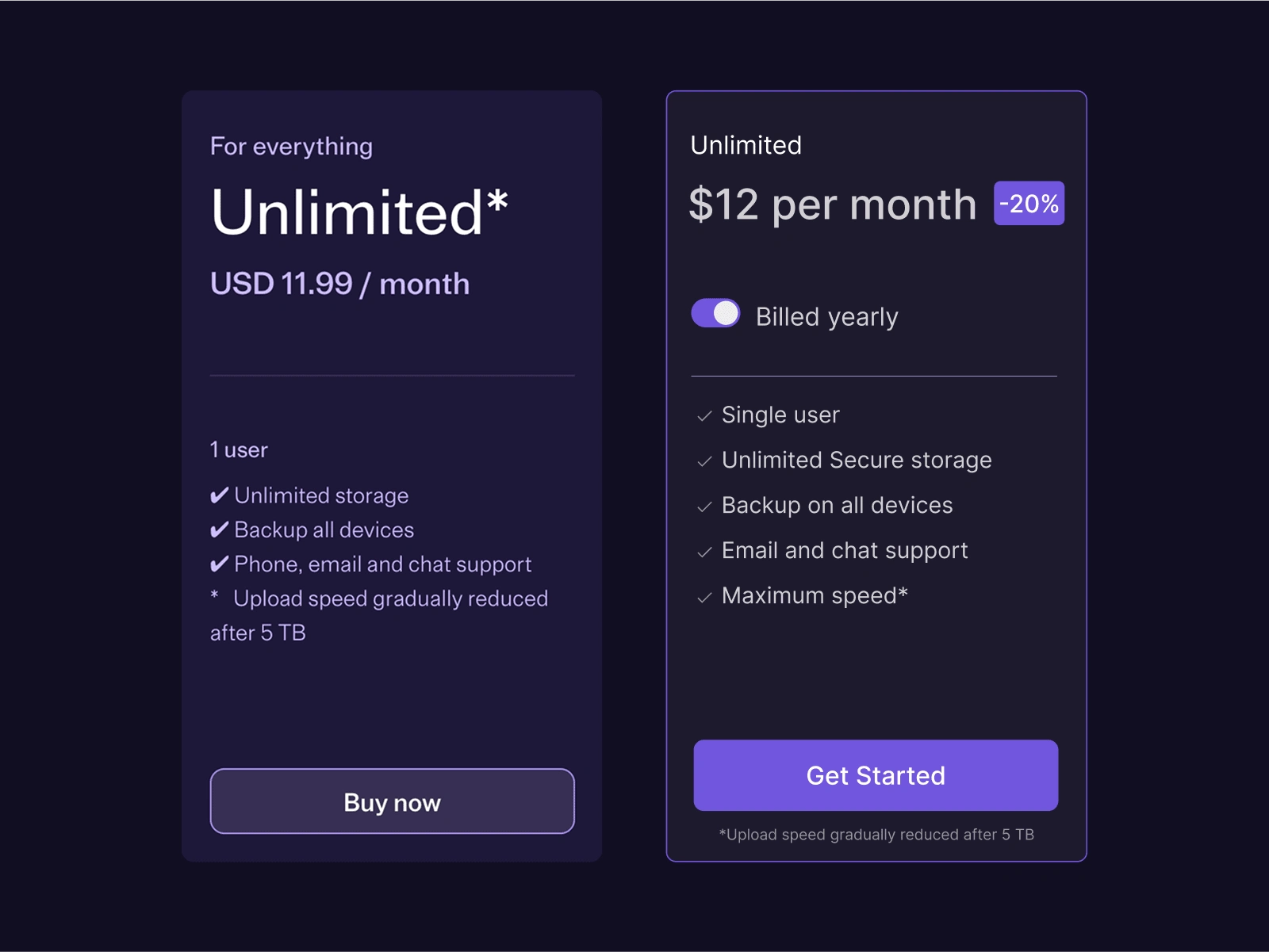
Old vs. new product cards.
While working on the product cards, I was full of questions:
What’s more important to people? Monthly cost or the amount of storage? Does the naming of each package matter at all? The product is, after all, mostly the same. Should the buttons say “Buy now” or “Get started”? Do we move the buttons up top, or keep them at the bottom? How much attention do we give the highlighted card? Full gradient or a simple outline?
Alternative cards. Should the button be up top, or at the bottom? Do we display a large price, or not? The questions are endless.
Ultimately, after exploring a couple of options, I ended up settling on a middle ground. I also worked on the assumption that, while price matters, it doesn’t need to blown out of proportion. A thing I kept having in mind was that the new website was meant to appeal to the professional market, a target group I can only assume cares more about functionality and less about price. Still, price is rarely irrelevant, so I settled on keeping it visible but slightly toned down.
Isn't this just a lot better?
Even though this was a quick redesign, I found myself spending a lot of time iterating and trying out different variations, especially on the cards. As fun as it was using my intuition while also looking at best practices from competitors, I can only imagine how interesting it would’ve been to redesign the entire website with data to back up the reasoning.
Still, I’m really satisfied with the end result. Sometimes the most impactful design changes aren't the flashy overhauls, but the thoughtful refinements that remove friction from the user experience.
Note: This was an unsolicited redesign originally posted to LinkedIn. Jottacloud’s CMO saw my post, reached out and let me walk her through some of my thinking. It’s been delightful to see that Jottacloud has since adjusted the design on their front page according to some of my suggestions.
***
Did you like what you saw? Want to work with me? Let's jam.
Shoot me an email at post@mads.is to get started.
Like this project
Posted Feb 28, 2025
Landing page redesign for Jottacloud. Scandinavian simplicity meets functional hierarchy and intuitive navigation patterns for enhanced user engagement.
Likes
7
Views
312