Podcast Branding for Gina Bygger Landet
Mads McCausland
Introduction
When I think of podcast covers, I often think of book covers: sometimes they shout, direct and in-your-face, other times, they’re quiet, nuanced, and discreet. When Manifest Media approached me to create the identity for their podcast exploring future alternatives to Norway's oil dependency, it made perfect sense to venture into the landscape of protest aesthetics and builder’s tape, especially with prominent environmental activist Gina Gylver as the host.
The podcast, hosted by Gylver, examines Norway's transition from oil dependency to more sustainable alternatives. The initial brief was clear and even came with a rough sketch. "We want Gina front and center, and a background that tells the story of this energy transition. Like this:"
While, well, rough, the first sketch gave a good idea of what the client wanted.
After discovering oil and gas in the North Sea during 1960s, Norway rose to became the world’s seventh largest oil exporter globally, and one of the wealthiest countries in the world. For a lot of Norwegians, myself included, the symbol of the oil platform has, together with cross country skiing, vikings and waffles with brown cheese ended up, like it or not, as part of the very definition of the country. Finding a good quality photo of a platform was therefore critical, even if it was meant to represent something less-than-optimal.
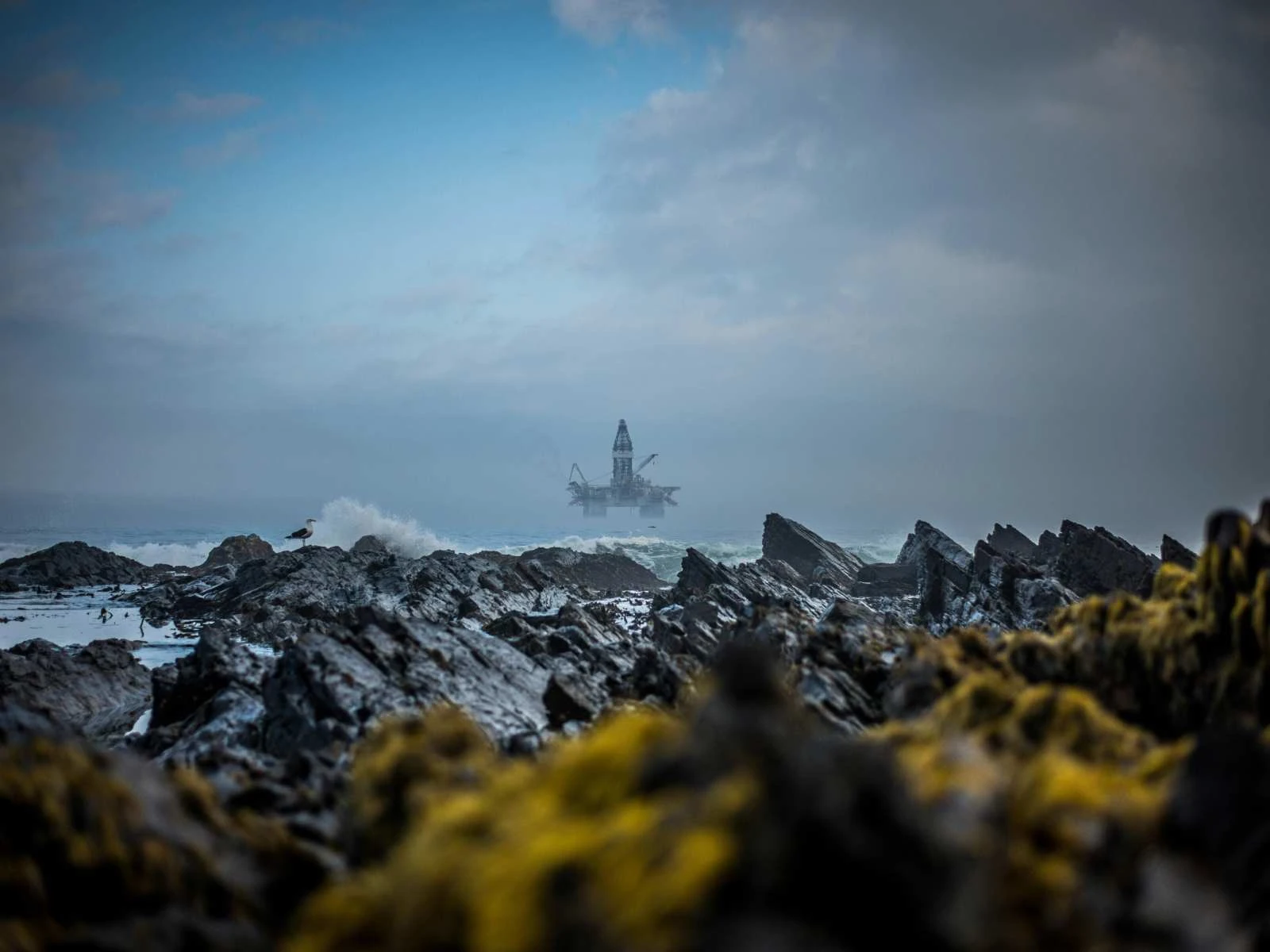
Oil platform in the distance. Original photo by Clyde Thomas / Unsplash
Besides the photo of Gina herself, everything in the initial sketch was either generated or made in Photoshop. Therefore, to get started (and since there wasn’t a lot of time for a full creative process), the first thing I set out to do was to rebuild, clean up and clarify. When the client has a strong opinion on what they want, I always try to accommodate that, unless I have some other ideas that immediately spring to mind. So I moved some pixels, polished up Gina’s photo, rebuilt the background and blocked out the typography.
Wait, what happened to the anger?
After shipping these sketches over to the client it didn’t take long before I got some honest feedback: We need more aggression! More passion! More energy! This all made sense. After all, wasn’t the cover supposed to tell the story of a pissed off activist that wants things to change ASAP?
Lucky for us, Gina is often seen at the frontlines of protests, shouting into a megaphone, chaining herself down only to later be carried away in handcuffs. After some looking around we ended up using a photo that fit the bill a lot better. The color of the suit also ended up, coincidentally, matching the political leanings of Manifest Media, another reason this photo was a great fit.
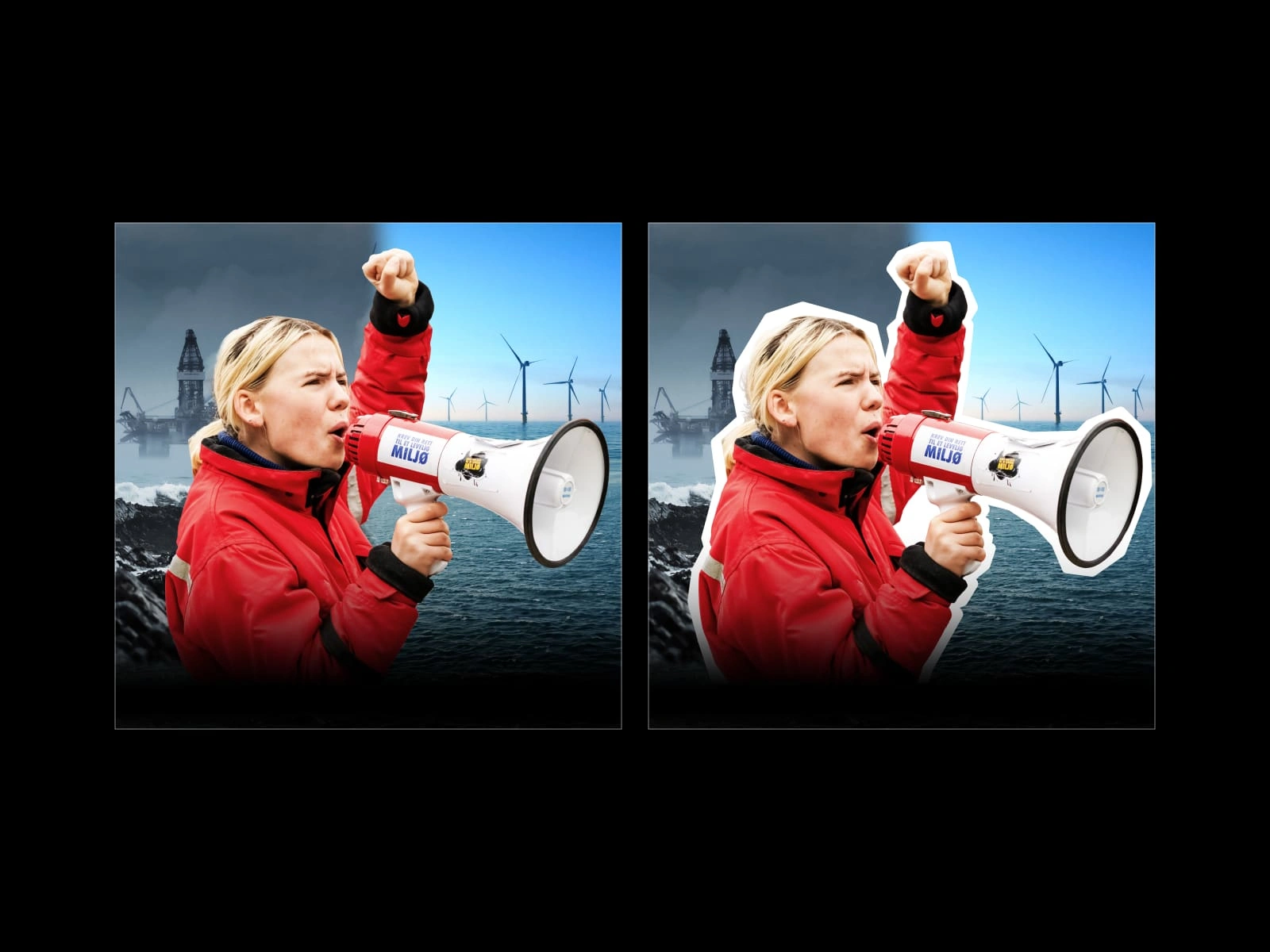
Adding a thick white stroke helped separate Gina from the background.
To make sure Gina really stood out from the background, I cut her out and gave her a thick, solid white outline. While this was something I mainly did for legibility, it’s also an ever so slight nod to what I can only describe as “DIY protest aesthetics”. Think homemade photocopied punk fanzines from the 70s.
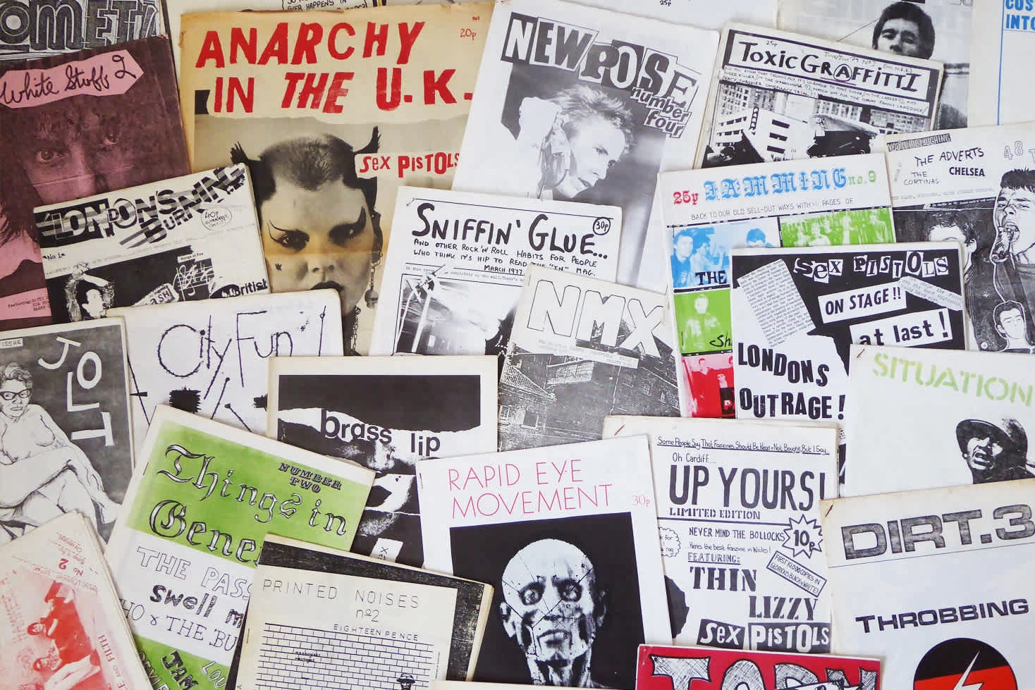
Inspiration: DIY aesthetics. 1970s fanzines by Jake from Manchester, UK - CC BY 2.0, https://commons.wikimedia.org/w/index.php?curid=42975981
Let’s start building - Typographic hierarchy and treatment
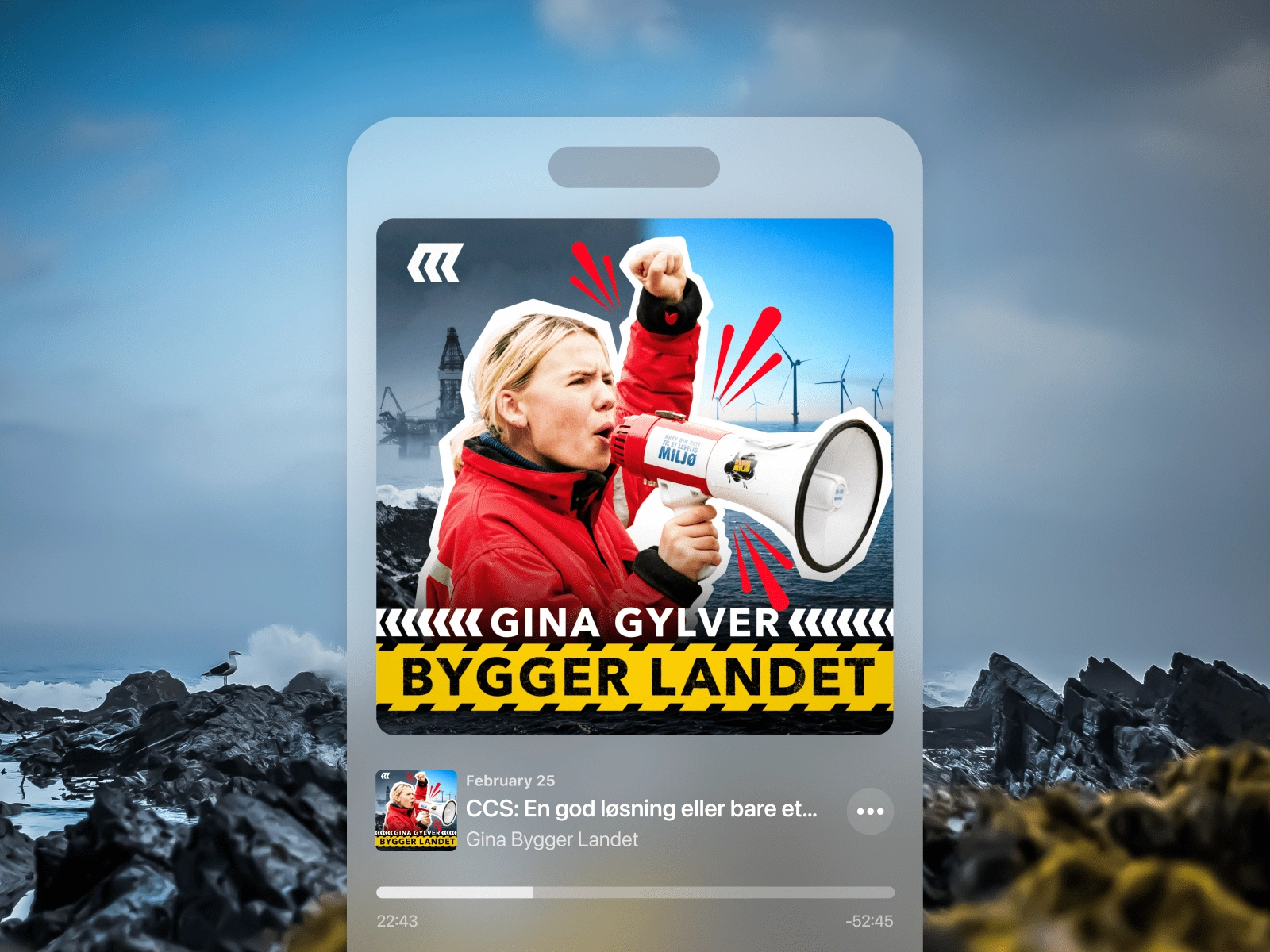
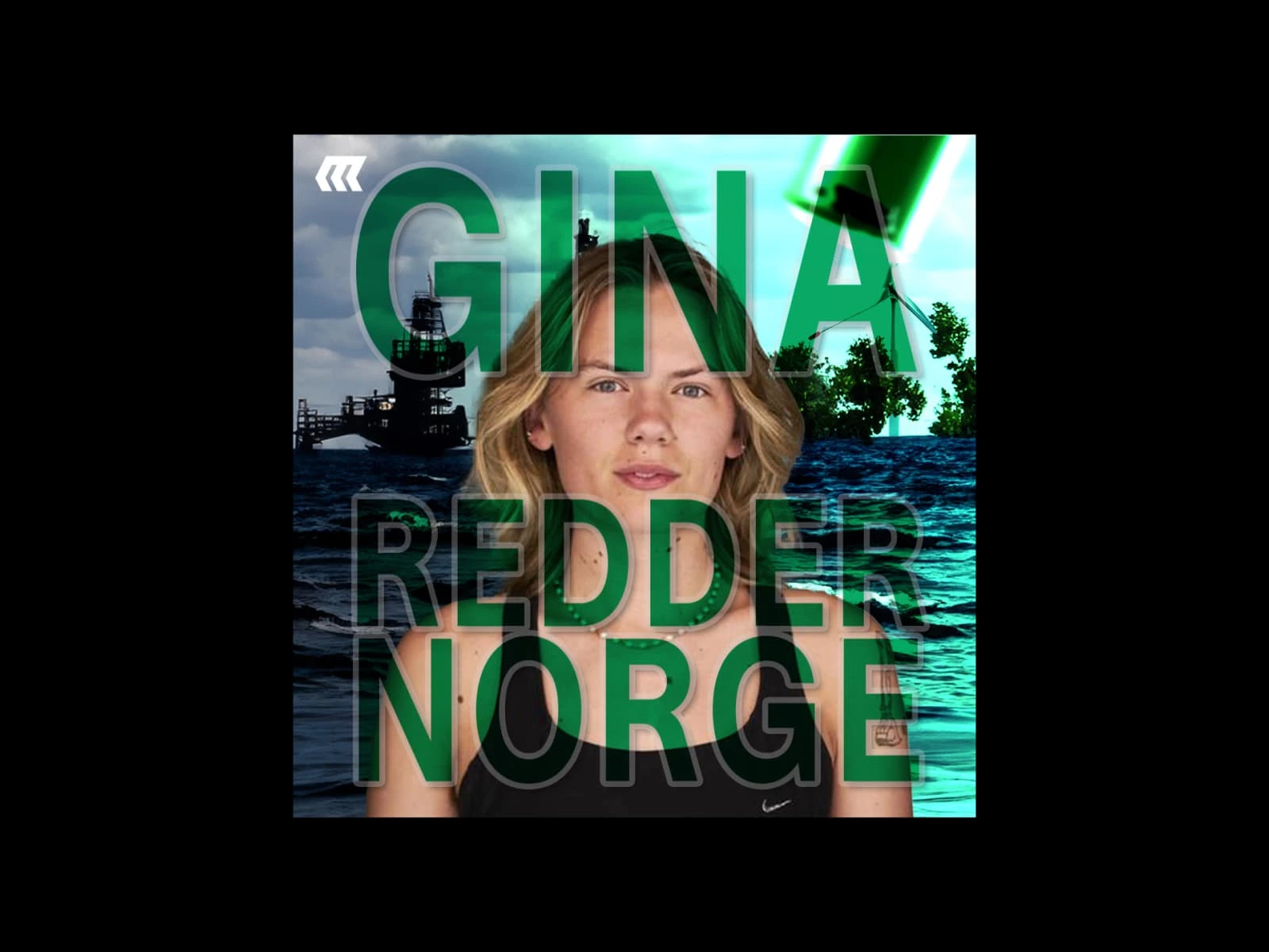
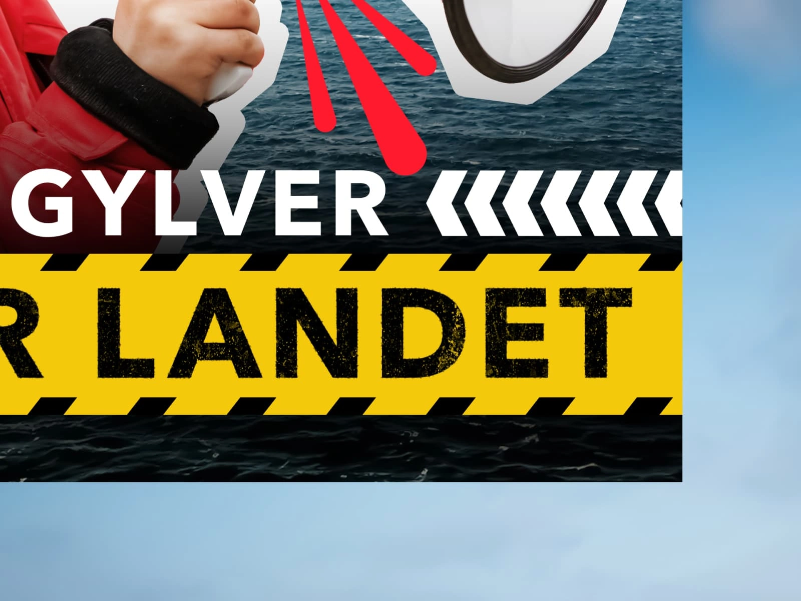
With the background and Gina’s photo taken care of it was time to start tackling the typographic treatment of the title. As the project evolved, the name of the podcast had changed. Now, instead of being “Gina redder Norge” (Gina saves Norway) it was later renamed “Gina bygger landet” (Gina builds the country). Still teeming with ambition, the new title immediately opened the door to a universal and highly recognizable aesthetic: construction tape.
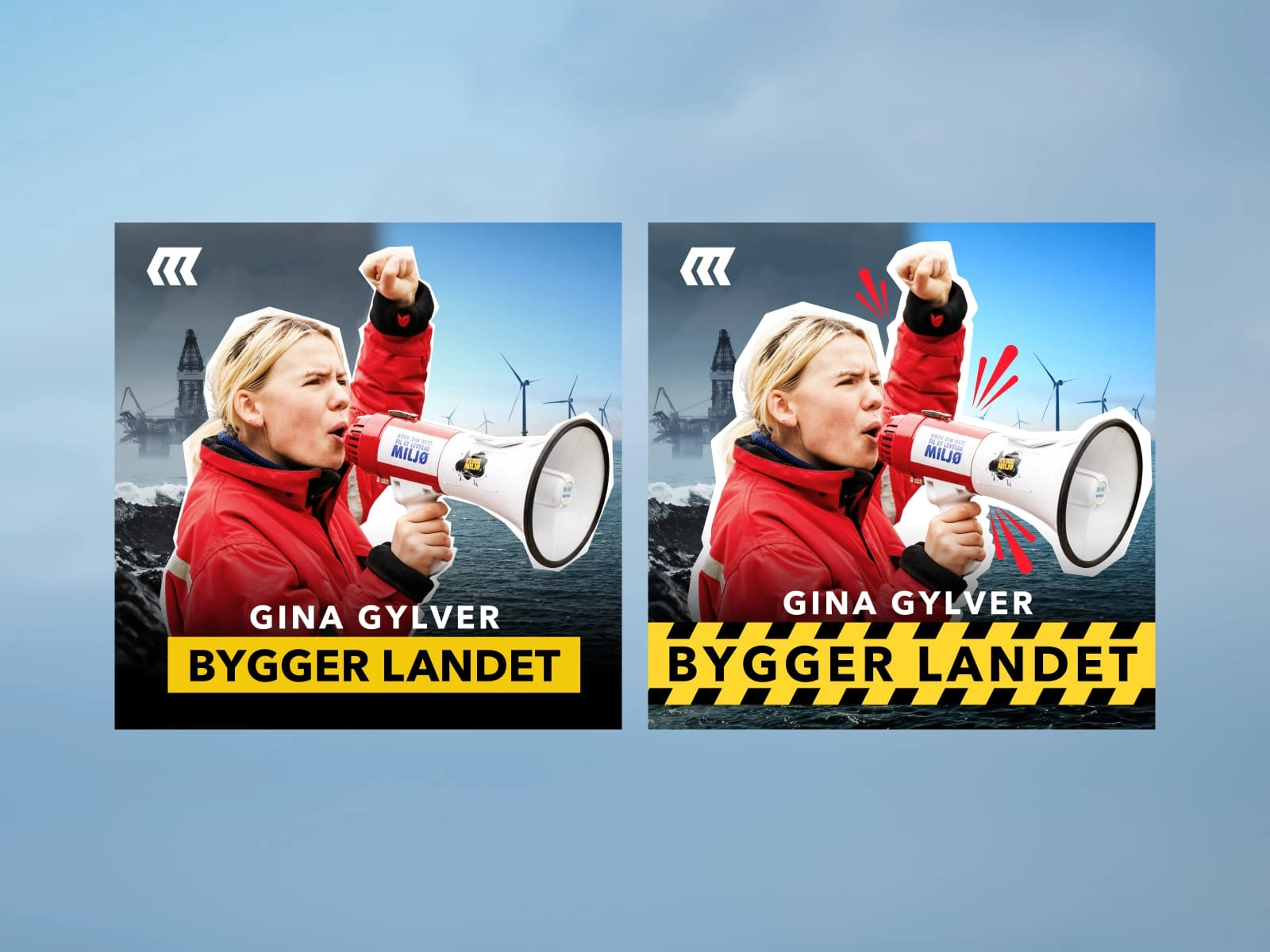
Initial treatment of the title. Did you really need to go overboard with the yellow like that? We get it already!
Initially I didn’t want to go overboard with yellow stripy banners, though. In the sketching process I’m often searching for a middle ground where I can hint at what the podcast is trying to say, without being overtly direct. For one, this isn’t a podcast about actual construction work, and the last thing we want is sending mixed signals. Second, there’s an element of respect for the client (and more importantly, the client’s clients) that I think is really important to maintain, too, as over-explaining something might come across as stupefying.
Variations: What if we use some chevrons to indicate movement and help guide the viewer’s attention?
All that to say, let’s not forget I’m here to help the client communicate clearly what the show is all about, catch new listeners’ attention and tell a story. This typically has to happen in a few seconds, if not less, so it’s essential to find the right balance between a lot of competing elements and layers of understanding. In short: Let’s make it super clear what the podcast is about and not hold back on the construction-tape aesthetic, eh?
Somewhere in the process the red sparks bursting out of Gina also found their way into the design. I decided to add these to further help communicate the ideas of the energetic, angry activist attitude, and add a bit more visual interest.
Getting into the details
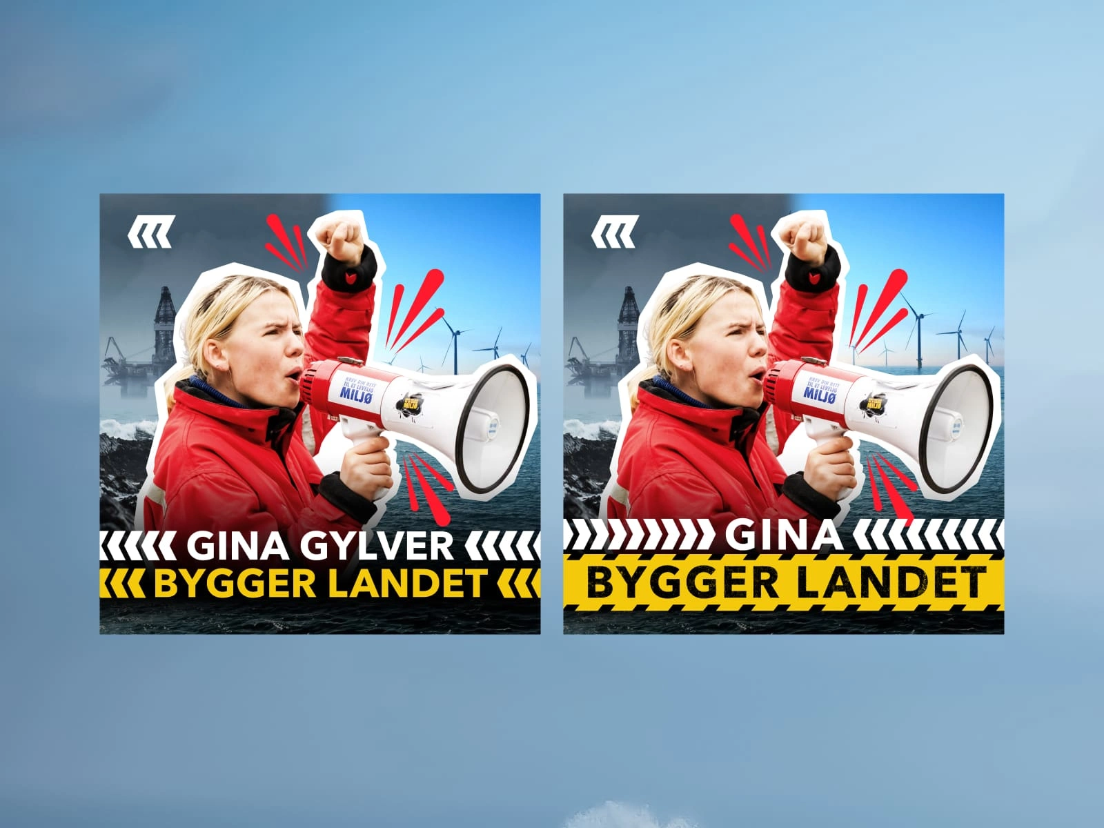
After trying out a handful of different layout options for the title, I eventually settled for one that gave most prominence to the words “bygger landet”. My rationale was that two large words on a single line are quicker and easier to scan than four smaller words, especially when set against a bright yellow background. Still, I couldn’t let Gina’s name disappear completely. To balance it all out I used created a chevron pattern based off of Manifest Media’s logo and added it to the sides of Gina’s name.
With, or without? Adding chevrons to the title might not change the world - but it’s a nice touch.
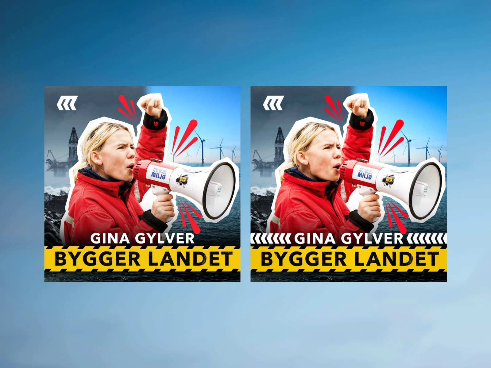
As a final touch, I dove deep into the long lost parts of Photoshop and came back out with some good ol’ roughed up typography. I’d argue that anyone who’s ever tried building something new will admit to the fact that a few splinters and cracks are common, it’s part of the process. When I have time, and it makes sense for the client and project, I love adding little details like these, because, well, they matter.
Final touches: Adding some texture and grit to the title is just … satisfying, you know?
Season finale
The initial season of the show aired four episodes, each of which covered a separate topic: Wind turbines, battery power (think EVs and the like), hydrogen and carbon capture. Therefore, in order to highlight this every time a new episode launched, I created variations of the main cover for each episode, changing the background image and title to align with the current topic. This was quick to implement and added depth to the podcasts’ identity.
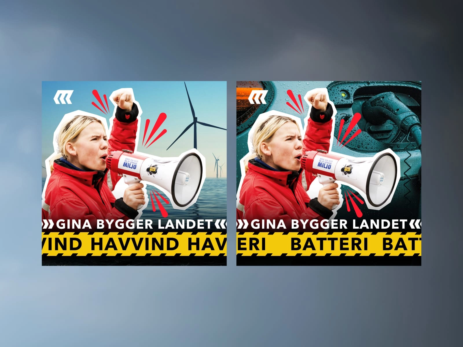
Cover art for the episodes on wind turbines and batteries.
In the end this was a very satisfying project to work on. I had good amounts of creative freedom and was able to help interpret somewhat vague topics and ideas into tangible designs. Heck, I even got to play around with grungy typography in Photoshop - getting paid for it felt like an added bonus.
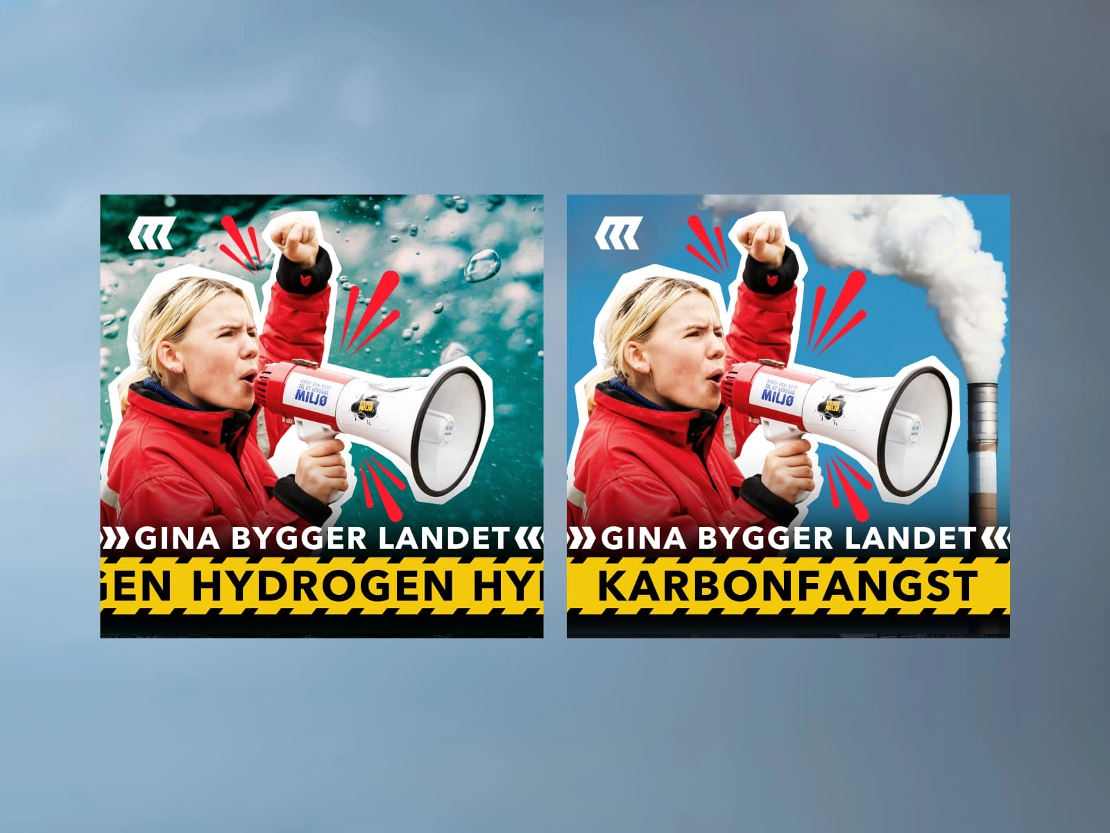
Hydrogen and CCS - two potential futures for Norway?
Look mom, I made a thing!
Did you like this project and want to work with me? Let’s jam.
Like this project
Posted Feb 27, 2025
From protest to progress: A visual identity for an activist-hosted podcast where protest aesthetics meets construction tape and rough, gritty typography.