The corporate identity of the city of Belomorsk
Situation
On the western shore of the White Sea, at the mouth of the Vyg River, stands the city of Belomorsk, the owner of a rich history. I chose this city for my thesis on the development of the corporate identity of the city.
Goal
Create an attractive image of the city that can attract tourists and investors, as well as improve it in the eyes of local residents.
Task
To develop a logo, corporate identity elements and a website for the city of Belomorsk.

Photo of the Belomorsk railway
Research: three stages
Before starting work, I contacted the city administration and sent them a brief. All subsequent work was done based on the answers that were given on this brief.
Then I conducted an online survey in which residents of the city, tourists and investors participated. These answers helped in the creation of the city's website.
And finally, I wrote a theoretical study in which I examined the culture of the Pomors, the Mezen painting and the history of the city of Belomorsk. This research has improved my understanding of local culture and ethnicities, which has had a positive impact on the development of corporate identity.

Dried flowers on the background of the Nizhny Vyg River
Trip to Belomorsk
In addition to theoretical research, I wanted to better understand the city, so I went to Belomorsk, having agreed on this with the city administration and the director of the Belomorsky Museum of Local Lore.
A series of photos and videos were taken during the trip, which was used to create the corporate identity. The trip helped to understand the structure of the city, find interesting routes and places. In addition, interviews were conducted with local residents and the director of the museum.

Photo of a tourist on the background of the White Sea
Brand colors
The brief stated that "red and black colors cannot be used," as a result of which alternative shades were selected that should convey the atmosphere of the north: light green, blue, indigo, white and orange.

Corporate font
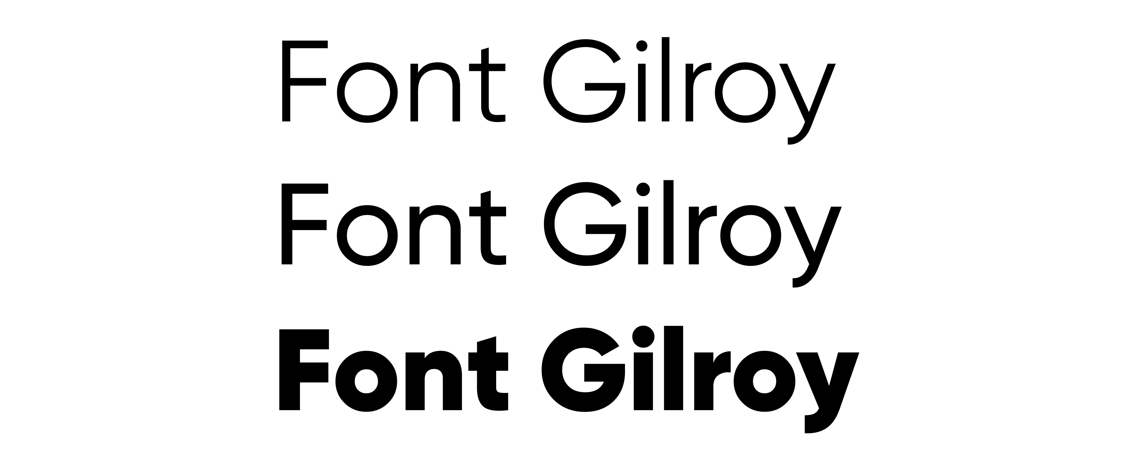
The brief said that a free font should be used, so the Gilroy font was chosen. It is suitable for both headings and text.
Logo development
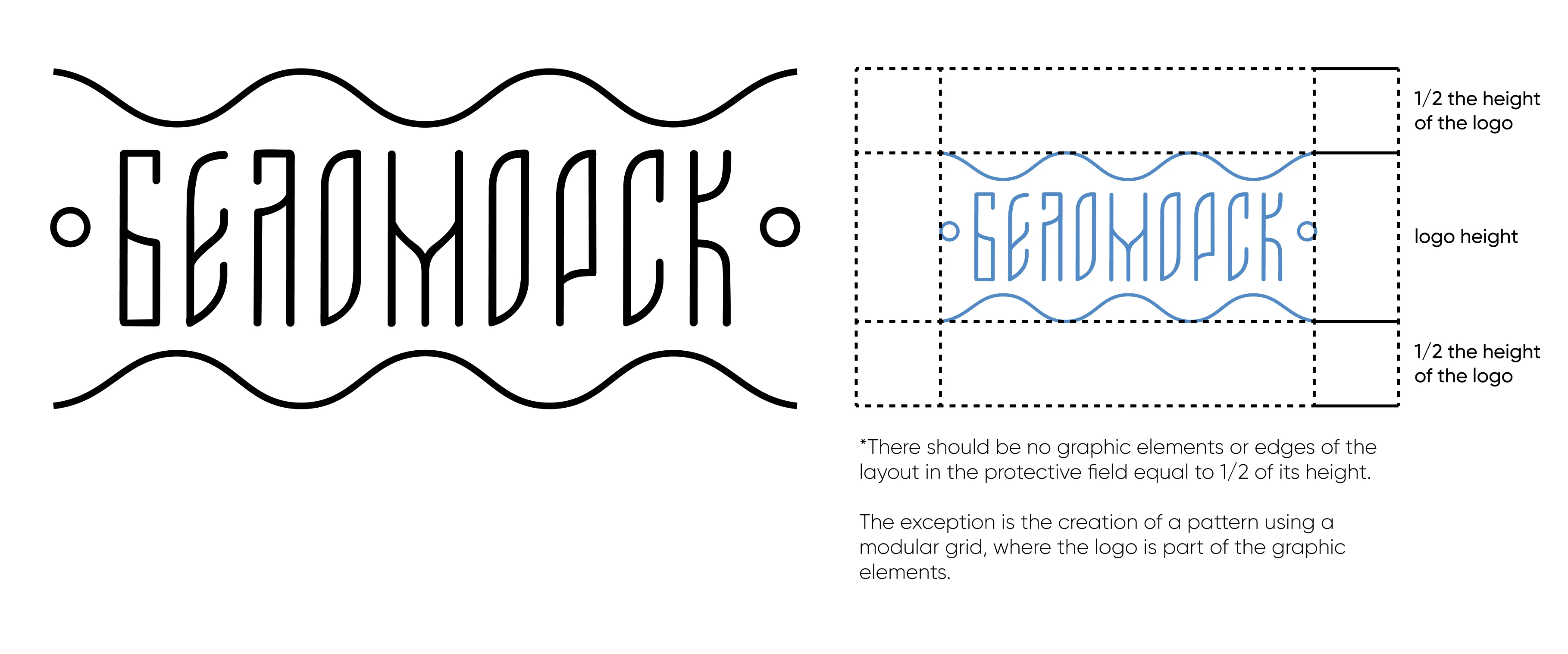
During the work on the Belomorsk logo, four concepts were created, each of which had its pros and cons. The development was carried out in Adobe Illustrator and Figma programs.
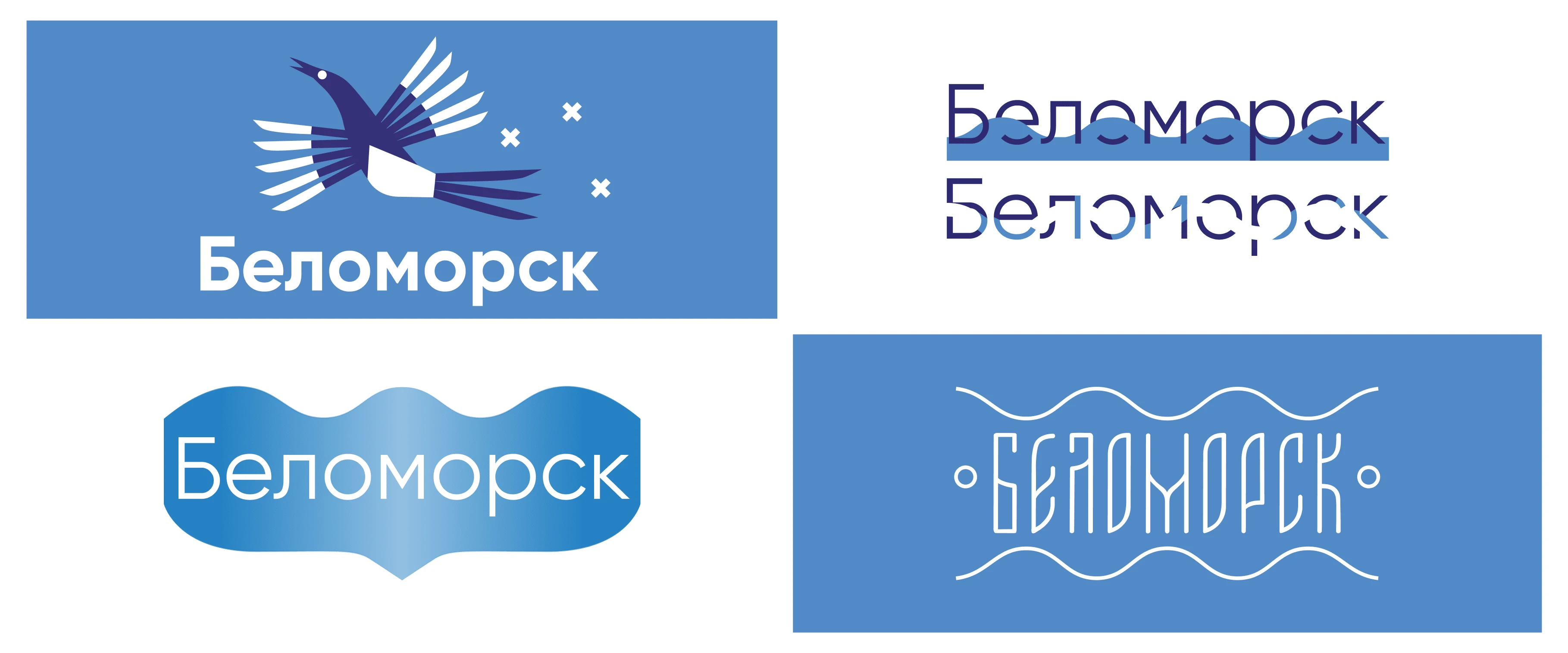
As a result, it was decided to take the fourth version of the logo, as the city administration liked it.
Graphic elements
The Mezen painting was the basis of the corporate identity - I created graphic elements based on its painting elements. I have divided these “elements” into four categories, each of which symbolizes the peculiarities of Belomorsk: “Earthly” symbols - the nature of Belomorsk, “Marine” symbols - the proximity of the sea to Belomorsk, “Heavenly” symbols - the potential of Belomorsk and its desire for development and prosperity, “Living” symbols - animals that live in forests of the Belomorsky district.

Building a modular design system
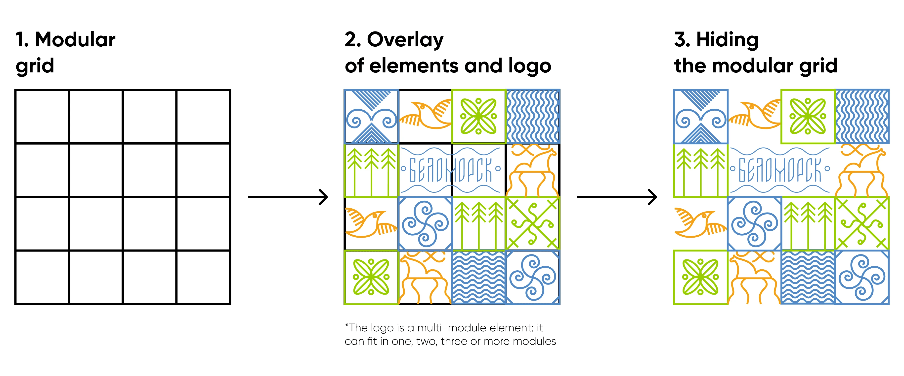
Branded elements are built according to a modular grid: graphic elements occupy one grid module, and the logo can be located in two, three, four or more modules - the size of the logo depends on the object on which branded graphic elements are applied. The height and width of each module are equal - thus a square is obtained. The graphic elements also have equal height and width, which allows them to fit into each of the modules, forming a smooth geometric composition.
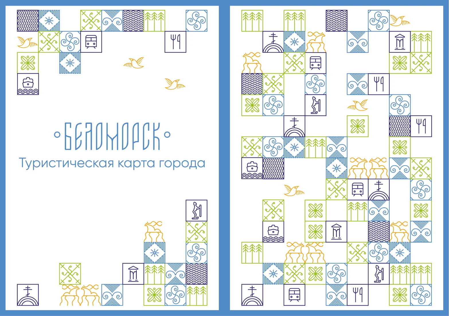
Tourist map of the city
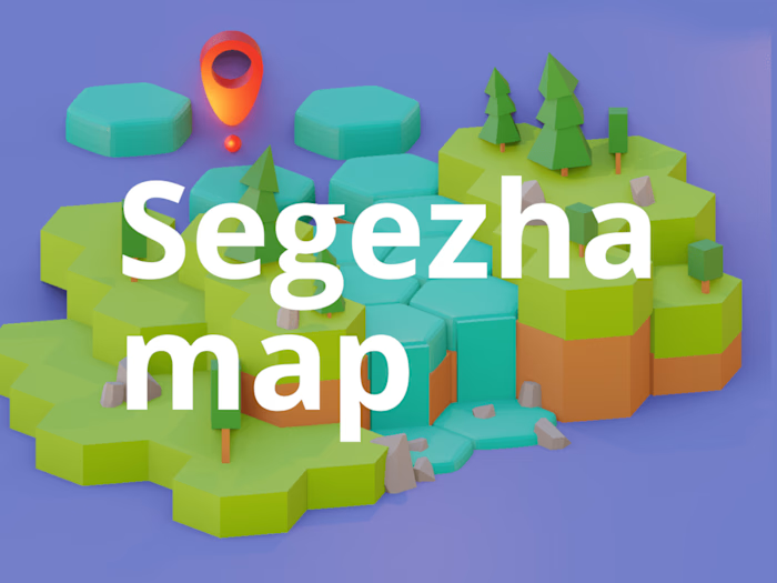
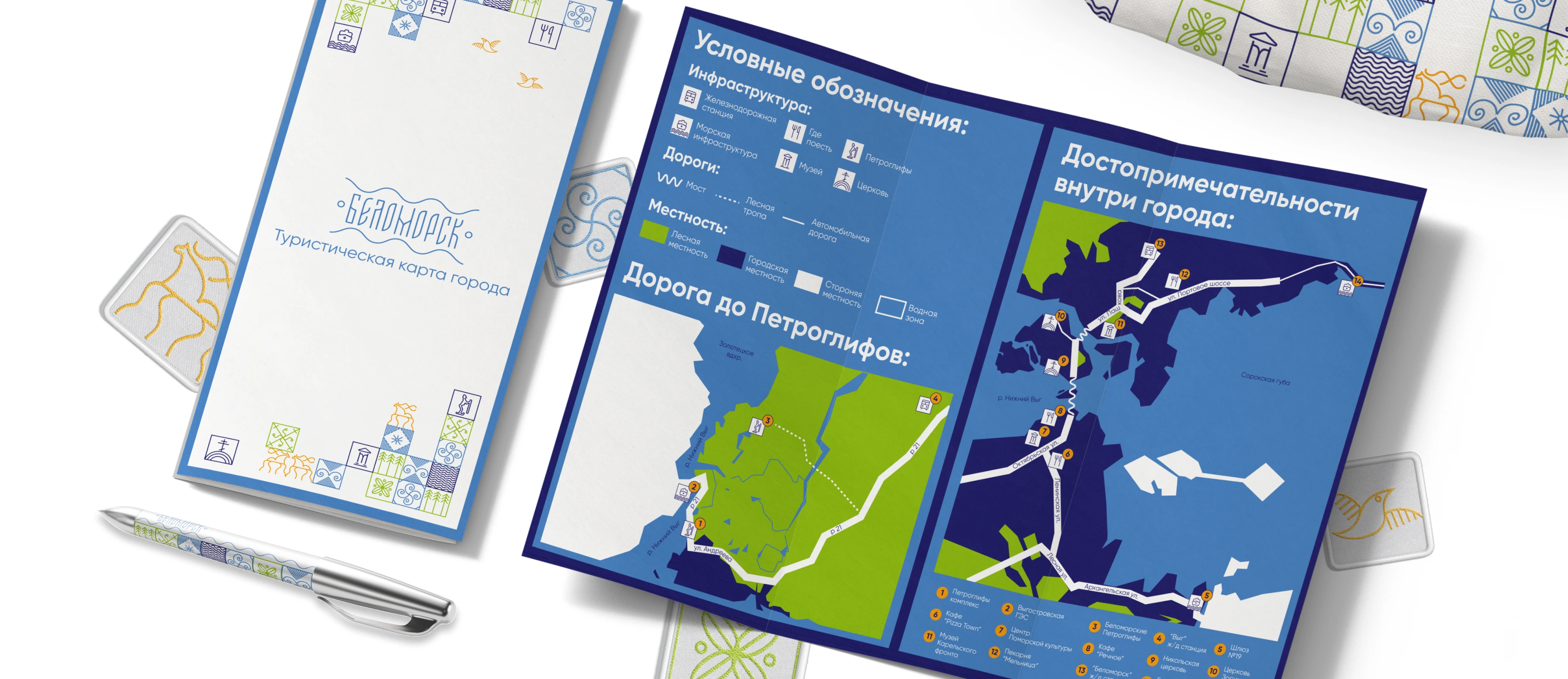
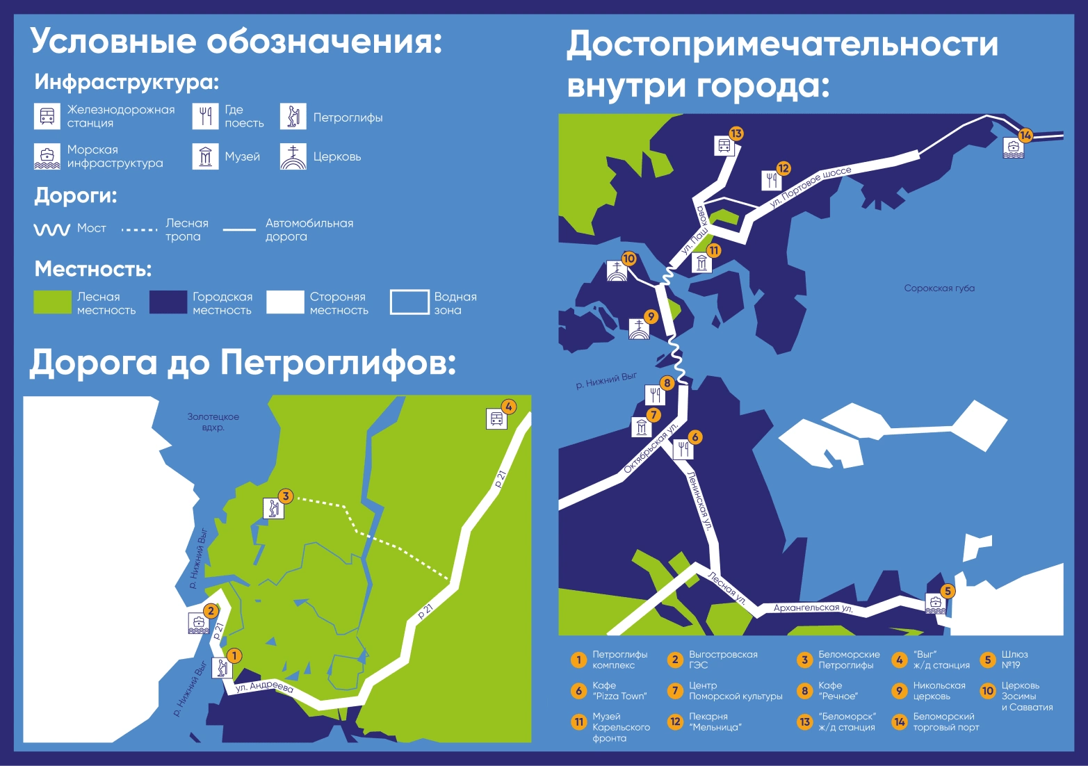
A tourist map has been created for the convenience of visitors to the city. Pictograms have been developed for the map to help you navigate around the city. Thanks to the trip to Belomorsk, I pointed out the most interesting places and key attractions worth visiting, as well as cafes and railway stations.
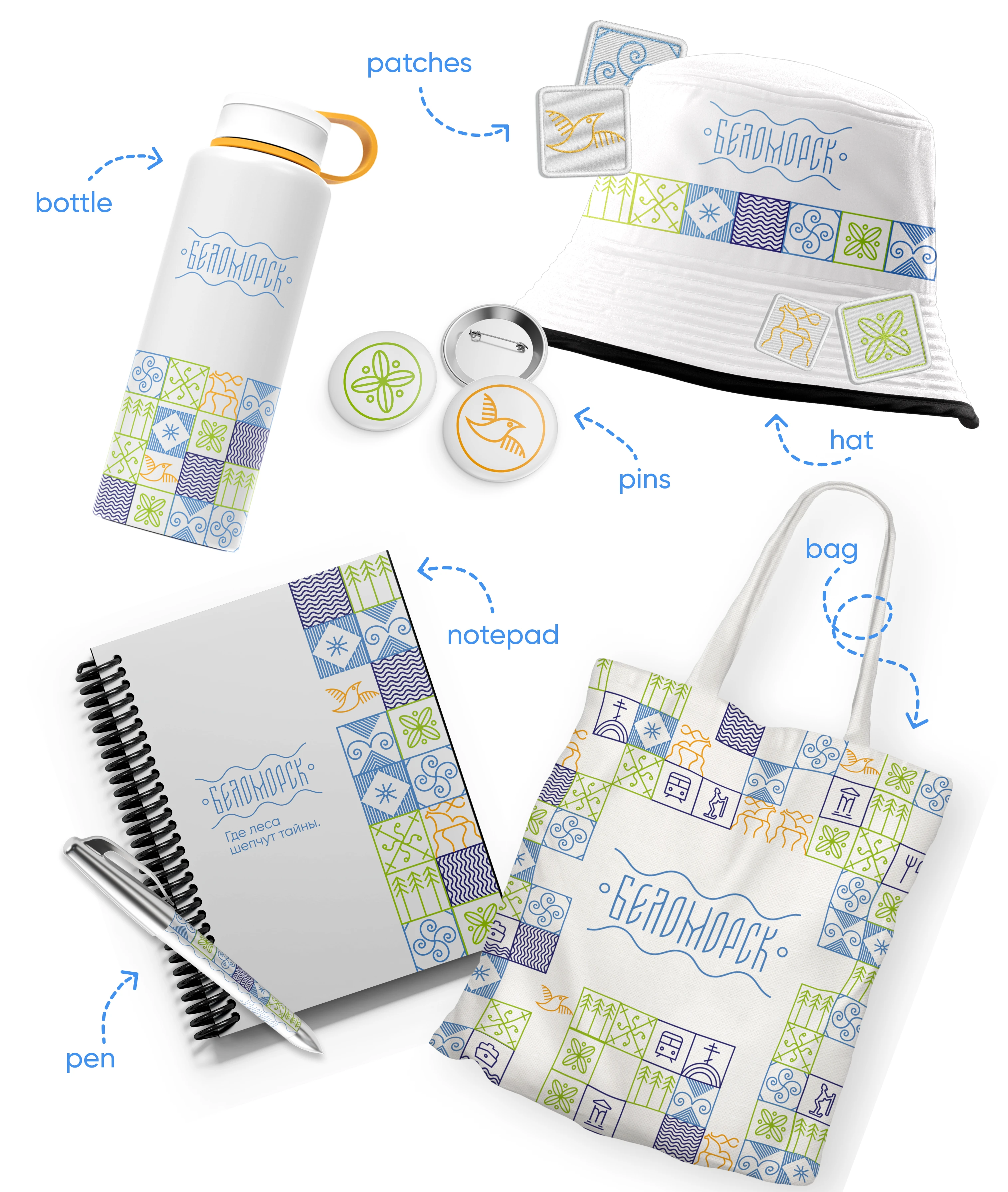
Merchandise
Branded elements and a logo were applied to souvenirs and merchandise.
The city's website
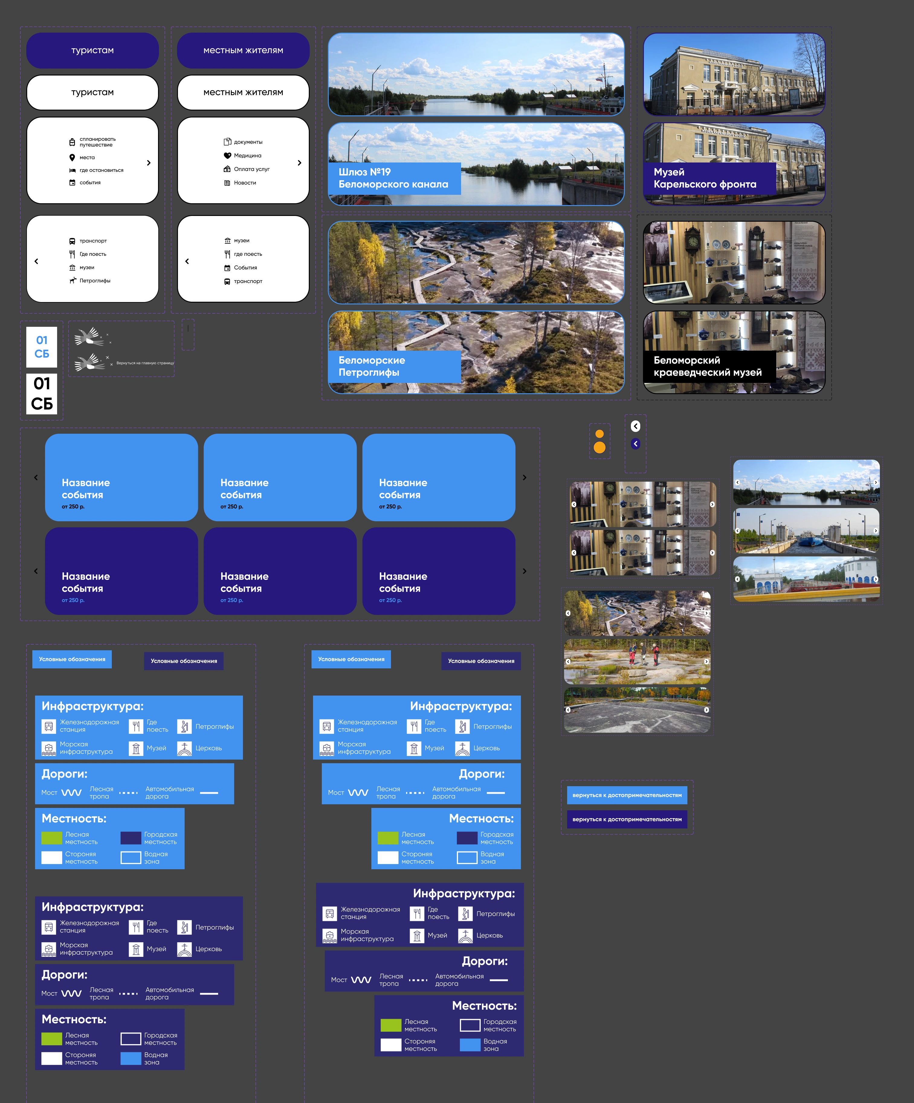
The city administration was also not against rethinking the old city site. I changed the design of the site, focusing on the possibility of using the site by both locals and tourists.
Sections of the site were created based on the answers given by local residents and possible tourists.
So, local residents can find important administrative documents, read the news of the city and learn about the latest events of the city.
Tourists, in turn, can find a hotel, learn about the sights and find the location of the petroglyphs (an important landmark of the city, which was very difficult to find on maps before rethinking the site).

The main page of the site
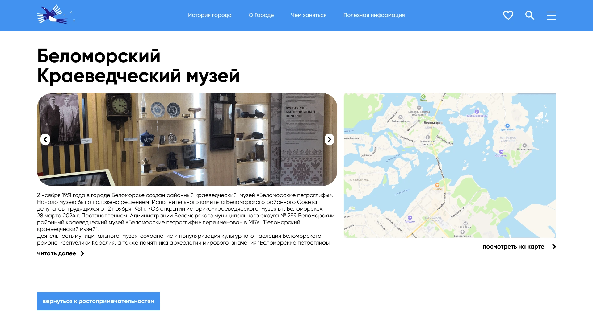
Description of the city's attractions
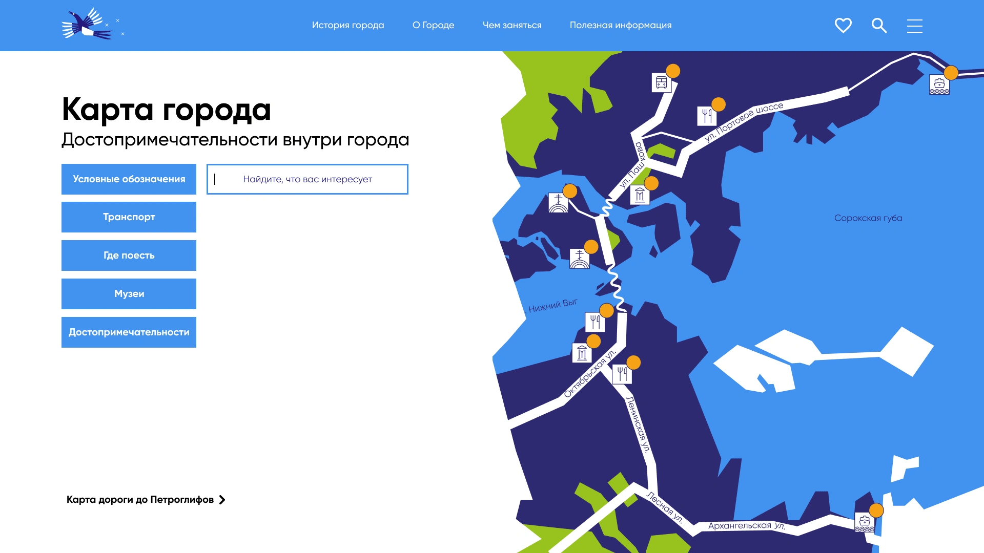
Interactive city map
Animations were made on the site: from clicking on buttons to turning the page.
Like this project
Posted Jul 30, 2024
On the western shore of the White Sea, at the mouth of the Vyg River, stands the city of Belomorsk, the owner of a rich history.

