Coffee Guild | Premium Coffee Branding & Packaging
surjyakanta pradhan
Brand Overview
Coffee Guild is a concept project for a specialty coffee brand based in Bengaluru, designed for independent workers, freelancers, and thinkers seeking calm, focused environments. Inspired by historical guild halls, the brand reimagines coffee as a daily ritual rooted in craft, discipline, and meaningful work offering a quieter, more intentional alternative to fast-paced café culture.
Core Challenge
In a saturated market dominated by convenience and social-first aesthetics, Coffee Guild needed a system that feels calm, premium, and distinctive without relying on visual noise, while remaining scalable across packaging and future touchpoints.
Design Strategy
The identity is built on restraint, clarity, and structure. Strong typography and balanced spacing create a confident, minimal foundation, supported by a modular pattern system inspired by Kolam geometry adding cultural depth without overwhelming the design.
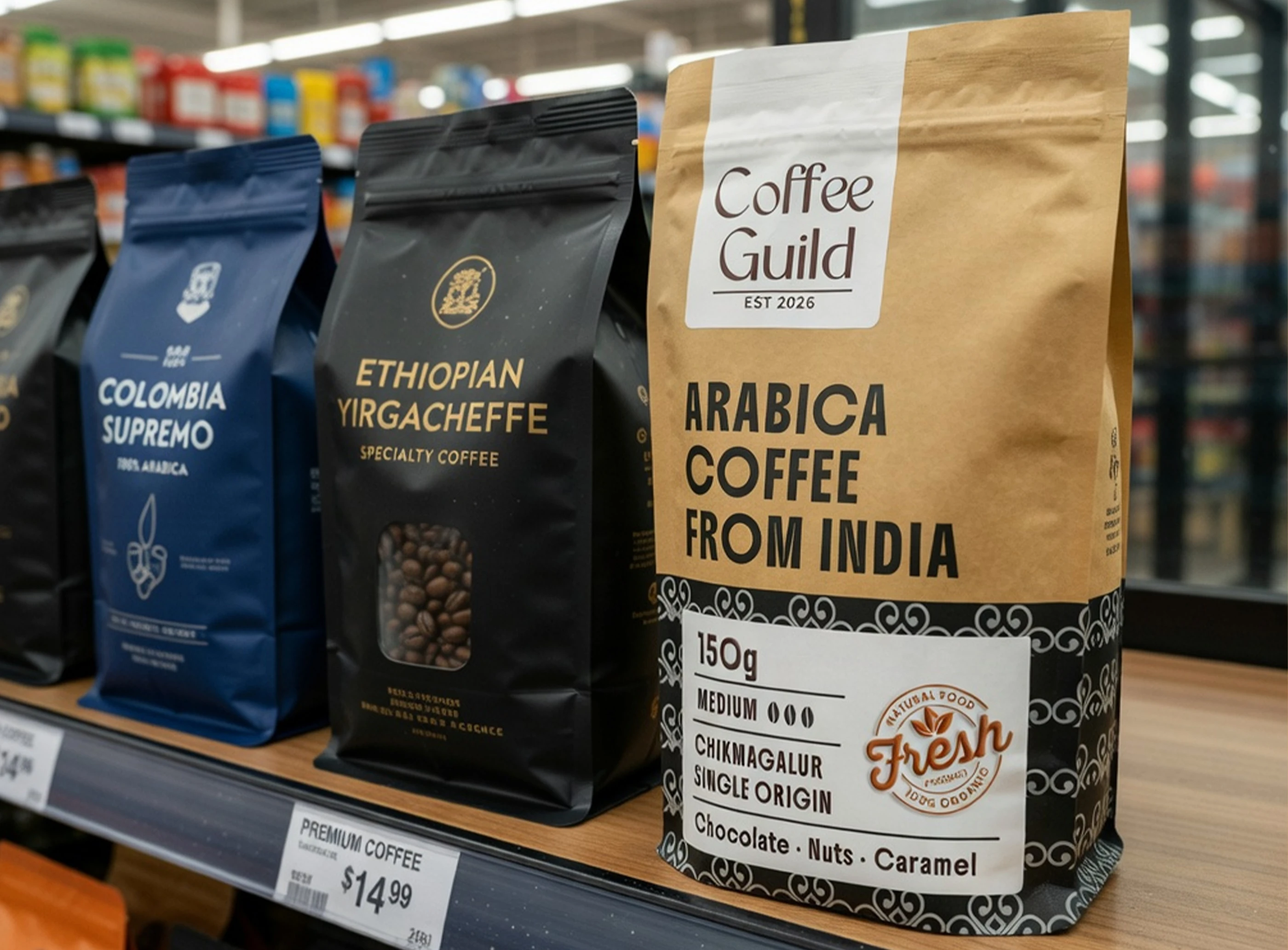
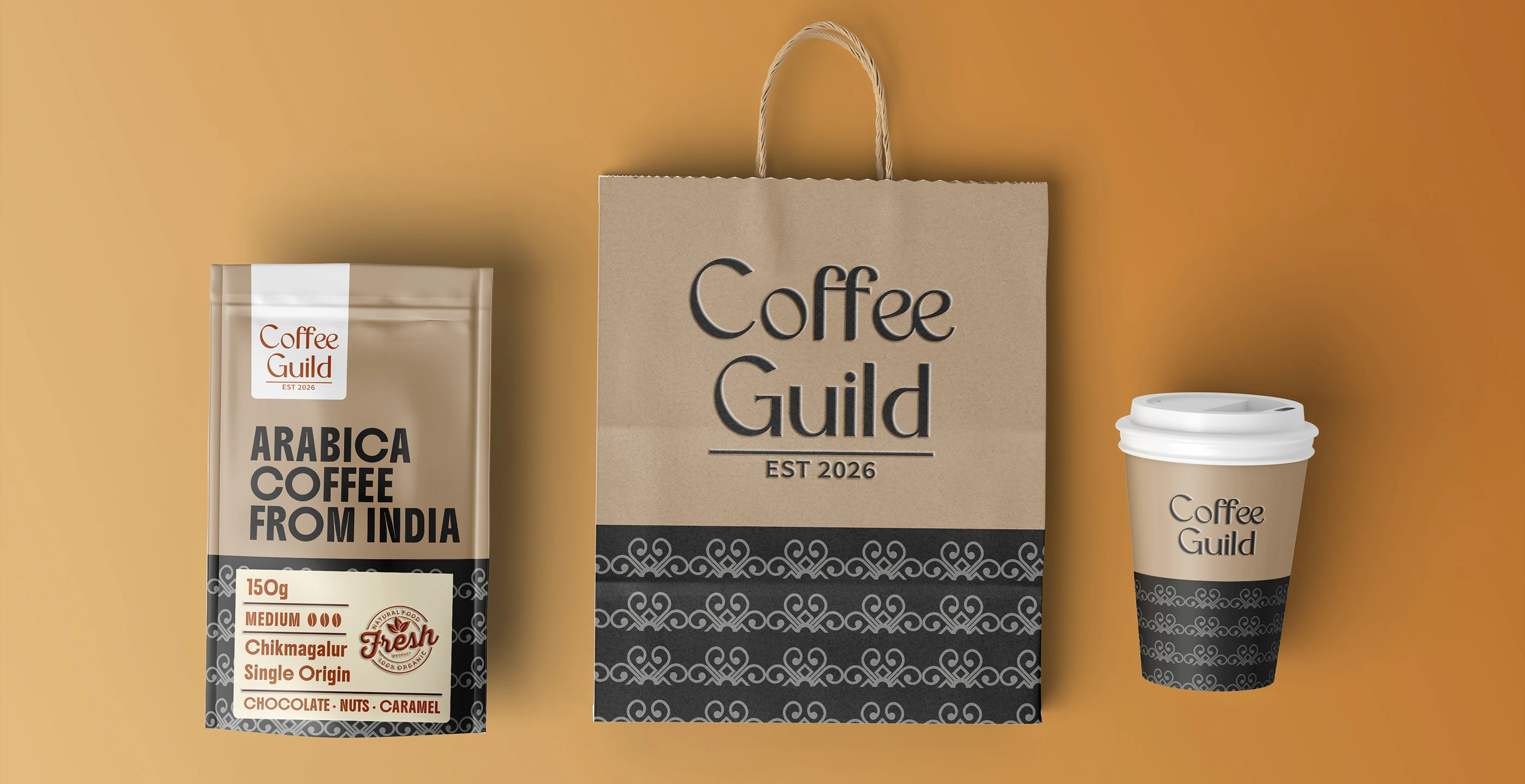
Packaging System
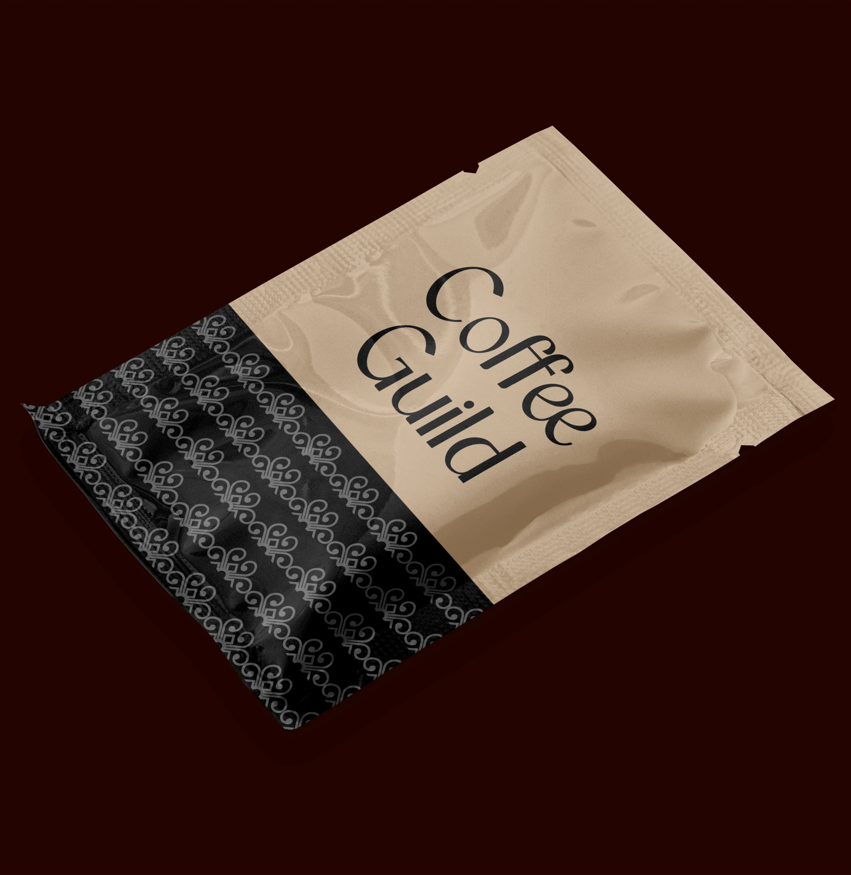
The packaging uses Kraft stand-up pouches to introduce a raw, tactile quality that reflects the origin of coffee. A flexible label system allows easy updates across variants, while a minimal print approach ensures clarity, consistency, and production efficiency.
Deliverables,
• Brand identity system
• Packaging design (front & back)
• Label system
• Pattern system
• Core brand assets
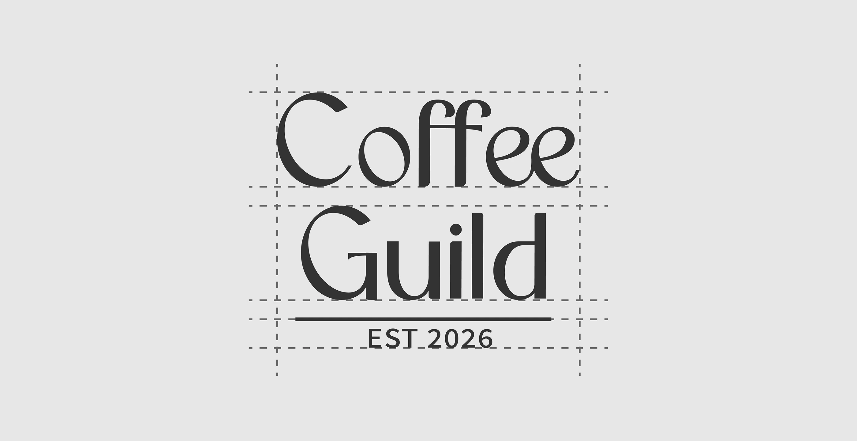
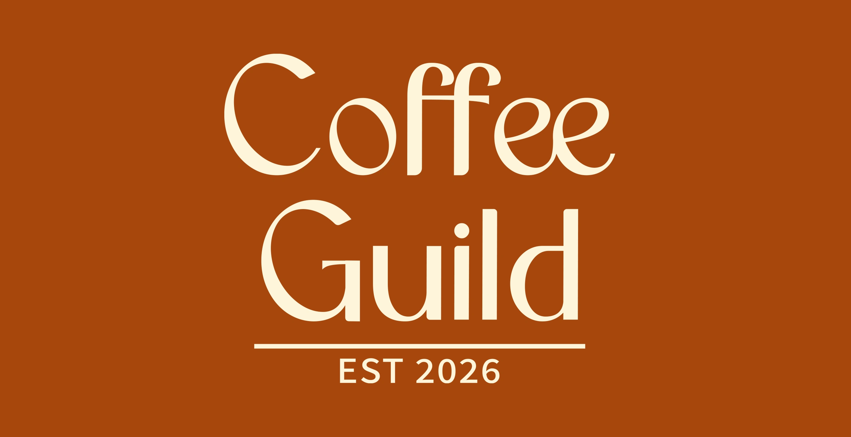
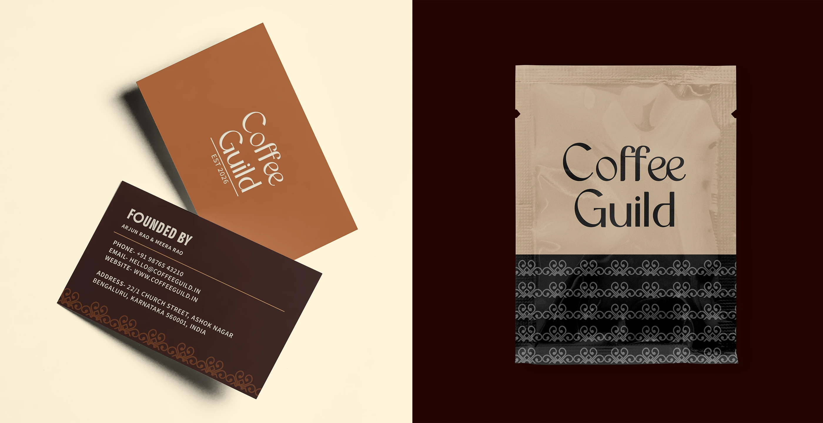
The logo is designed as a wordmark to emphasize clarity, trust, and timelessness. As a new specialty coffee brand entering a competitive market, a strong typographic identity ensures immediate recognizability and legibility across multiple touchpoints from packaging labels to storefront signage and ceramic mugs.
Rather than relying on decorative symbols, the wordmark reflects the brand’s focus on craft, precision, and quiet confidence. The structured typography communicates credibility while remaining approachable, aligning with Coffee Guild’s philosophy
of thoughtful work and shared spaces.

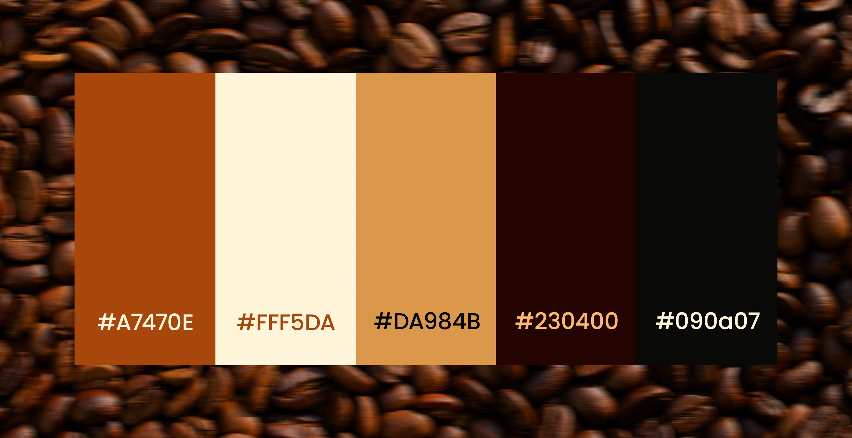
The color palette is intentionally restrained, built around warm neutrals and deep ink tones that complement the natural texture of Kraft packaging. This minimal palette reinforces the brand’s calm and grounded personality while avoiding the overly bright or trend-driven colors commonly seen in café branding. The neutral tones create a timeless foundation that allows the packaging typography and product information to remain the primary focus.
Together, the palette reflects the brand’s commitment to simplicity, craft, and long-term relevance.
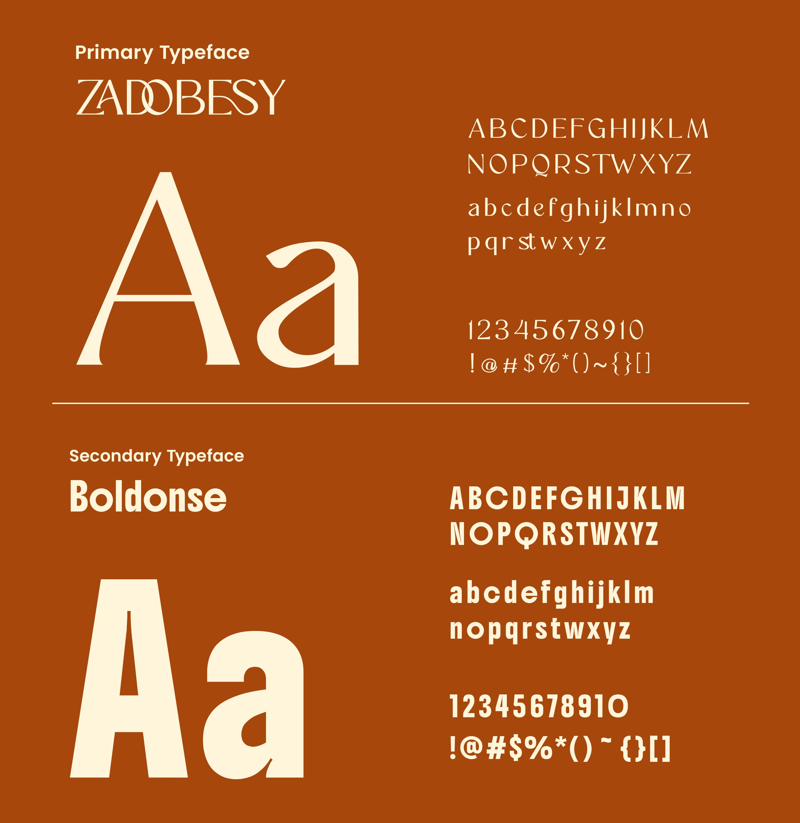
The typography system uses two complementary sans-serif typefaces: Zadobesy and Boldonse. Zadobesy serves as the primary typeface, offering clarity and strong legibility for product information and packaging details. Boldonse acts as a display typeface, adding emphasis and visual character for headlines and key brand moments, creating a balanced and modern typographic hierarchy.
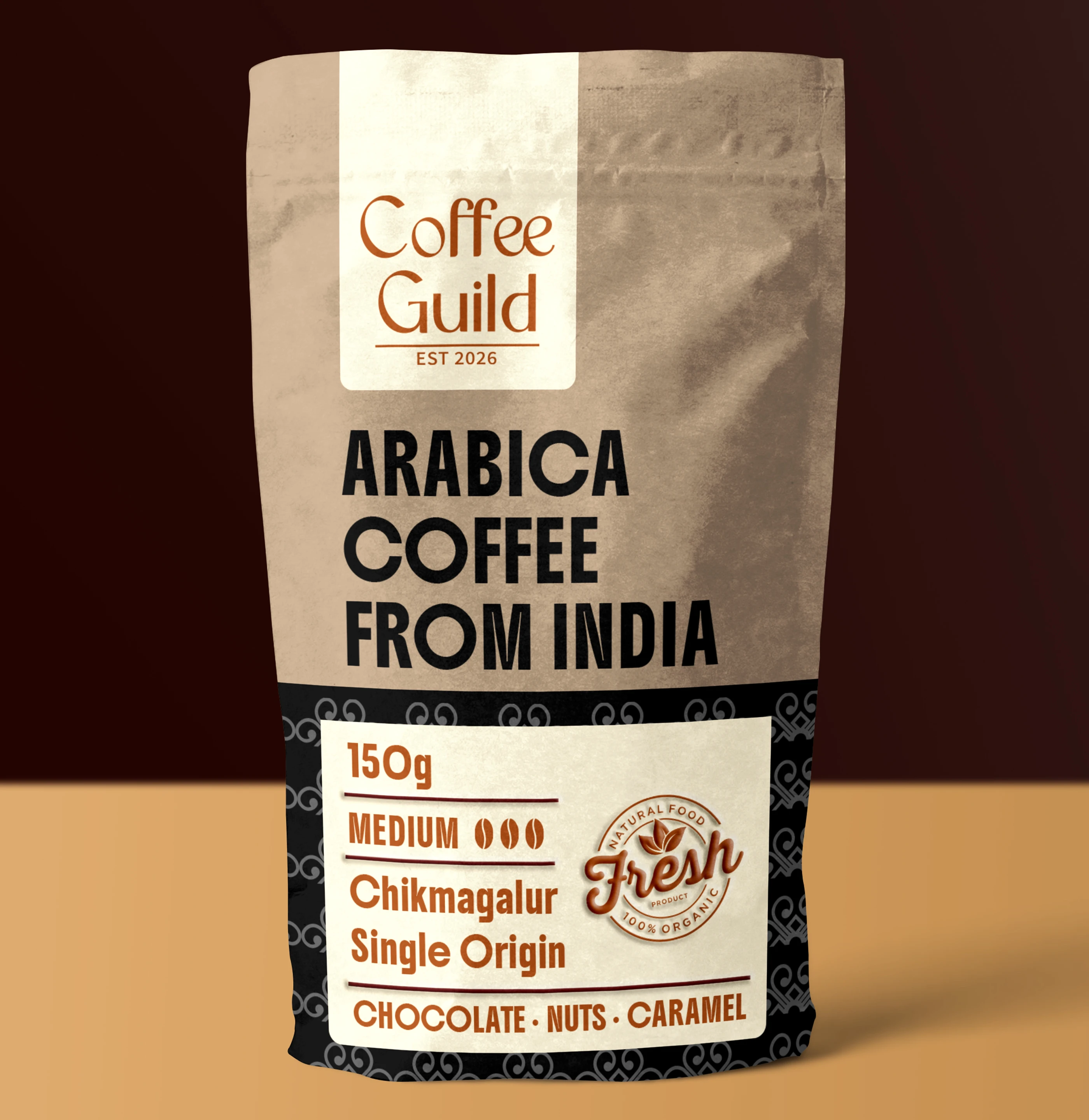
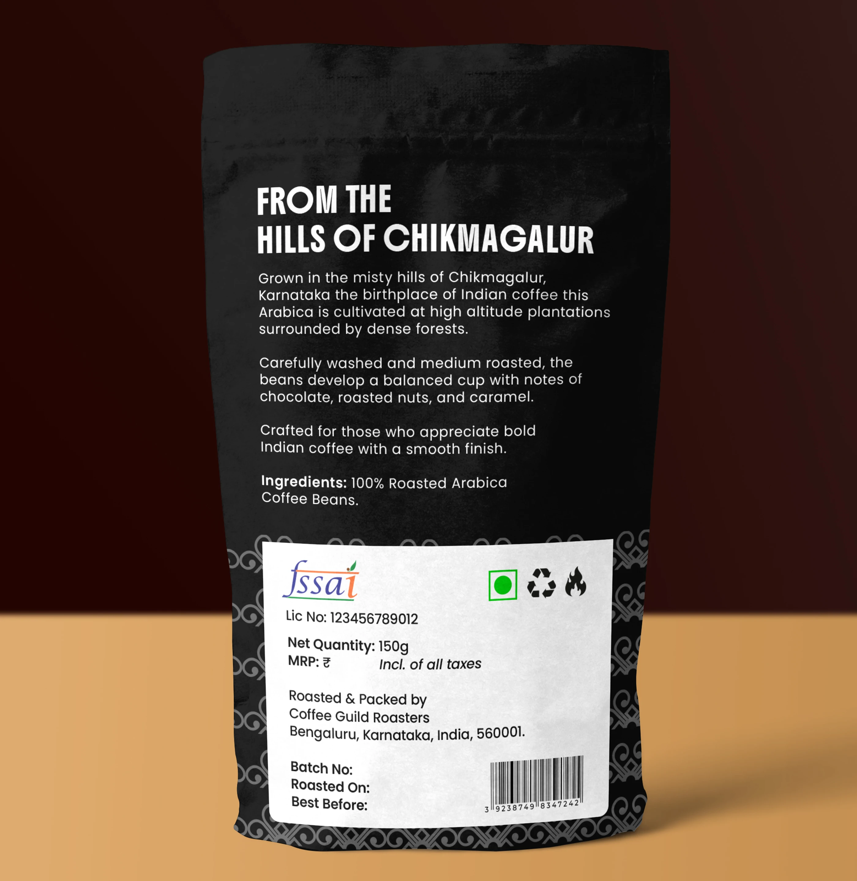
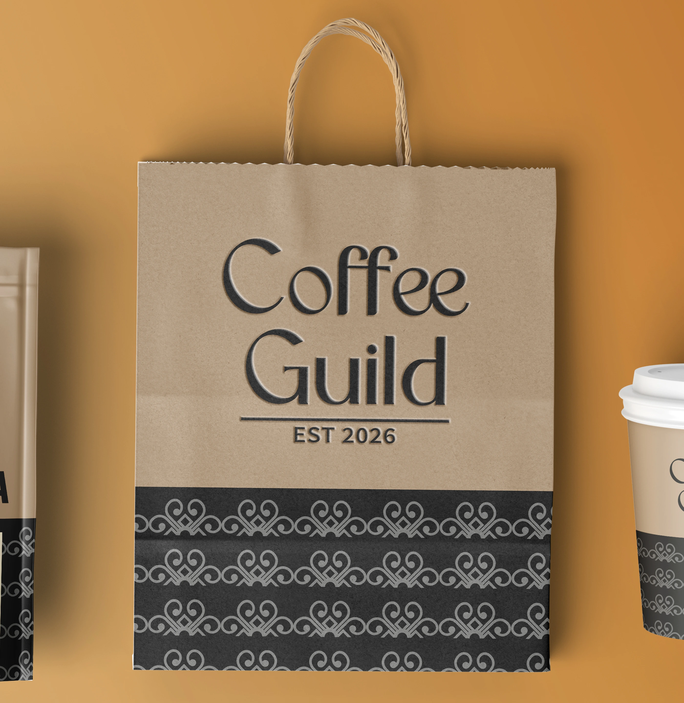
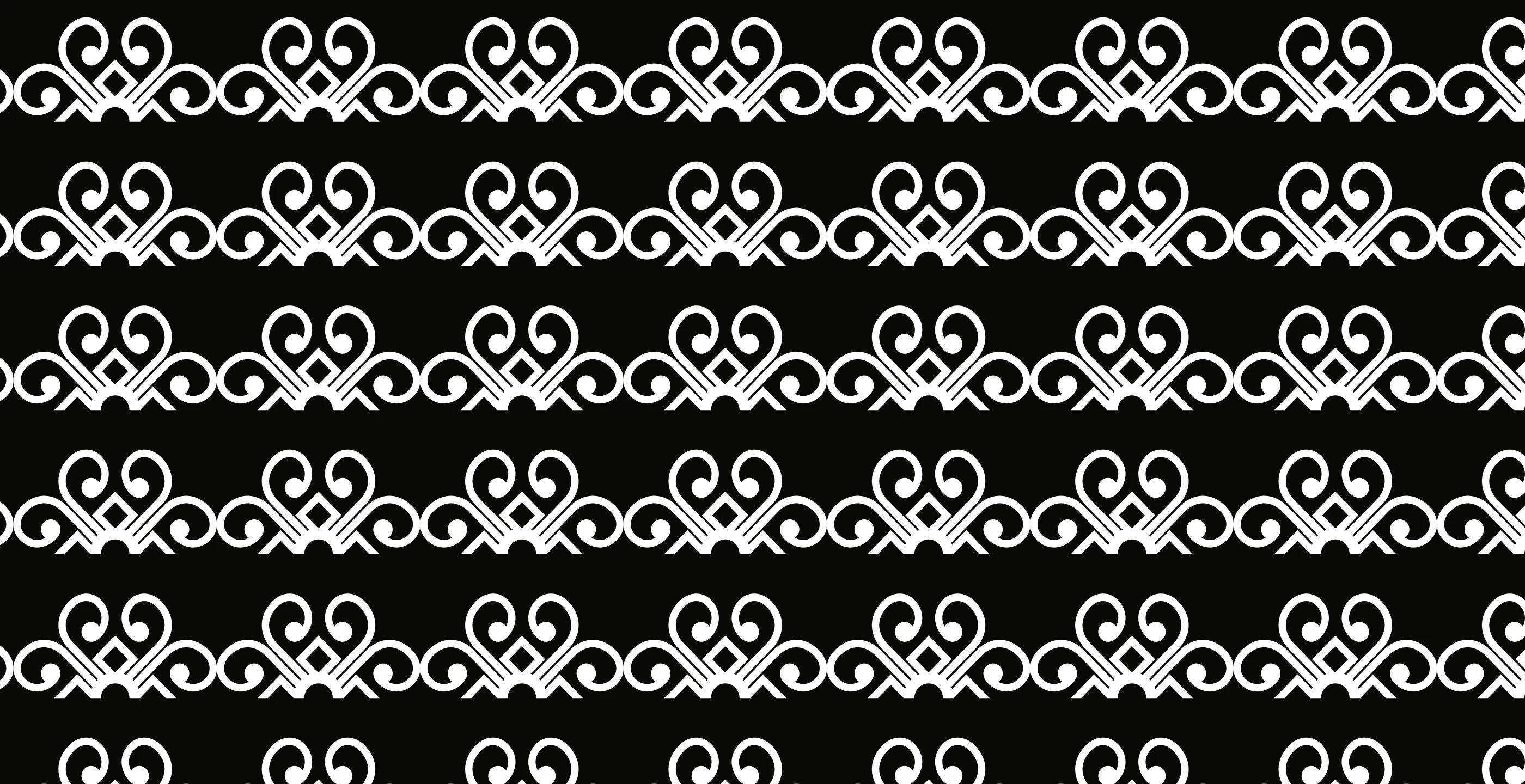
Pattern inspired by Bangalore heritage geometry Kolam..

For projects enquiry DM me on behance or reach out to me via contact.surjyakanta@gmail.com
Like this project
Posted Jun 11, 2026