Zukae | Instant noodle Branding & Packaging Design
surjyakanta pradhan
About Brand
Zukae, is a Premium instant noodles premium Korean brand. Made for people who wakeup in late nights, quick breaks, and cravings, Zukae represents fast, flavorful food that’s easy to enjoy in a go-to bowl or cup. This case study reimagines the packaging and branding system to communicate spice, modernity, and cultural authenticity while staying craveable, bold, and globally appealing.
Brand challenge was
• Lack of premium feel, Most instant noodle brands in the market look cheap or overly casual.
• Weak differentiation, Packaging blends in on shelves, doesn’t stand out against competitors.
• Cultural disconnect, Brand didn’t clearly connect to the Korean instant noodle heritage.
• Limited flavor storytelling, Packaging didn’t visually communicate flavor intensity or uniqueness.
• Modern appeal missing, No strong visual identity to appeal to global youth culture.
1. Primary Audience (Core Buyers)
• Urban Youth (18–30 yrs), college students, young professionals, and global travelers.
• Their lifestyle- Trend-driven, digital natives, into K-pop, K-dramas, e sports, and international street food culture.
• Their motivation- Want quick meals that are flavorful, exciting, and Instagrammable.
2. Secondary Audience (Occasional Buyers)
• Young Families- (25–40 yrs) → parents looking for fun, flavorful snacks at home.
• Their lifestyle- Mix of convenience shoppers and curious foodies.
• Their motivation- Explore unique Korean flavors together.
3. Tertiary Audience (Global Export Market)
• Asian Food Enthusiasts Worldwide- (20–35 yrs) → frequent shoppers of Asian marts or international aisles.
• Their lifestyle- Foodies and trend-seekers interested in authentic cultural experiences.
• Their motivation- Try bold flavors connected to Korean culture.
My Role
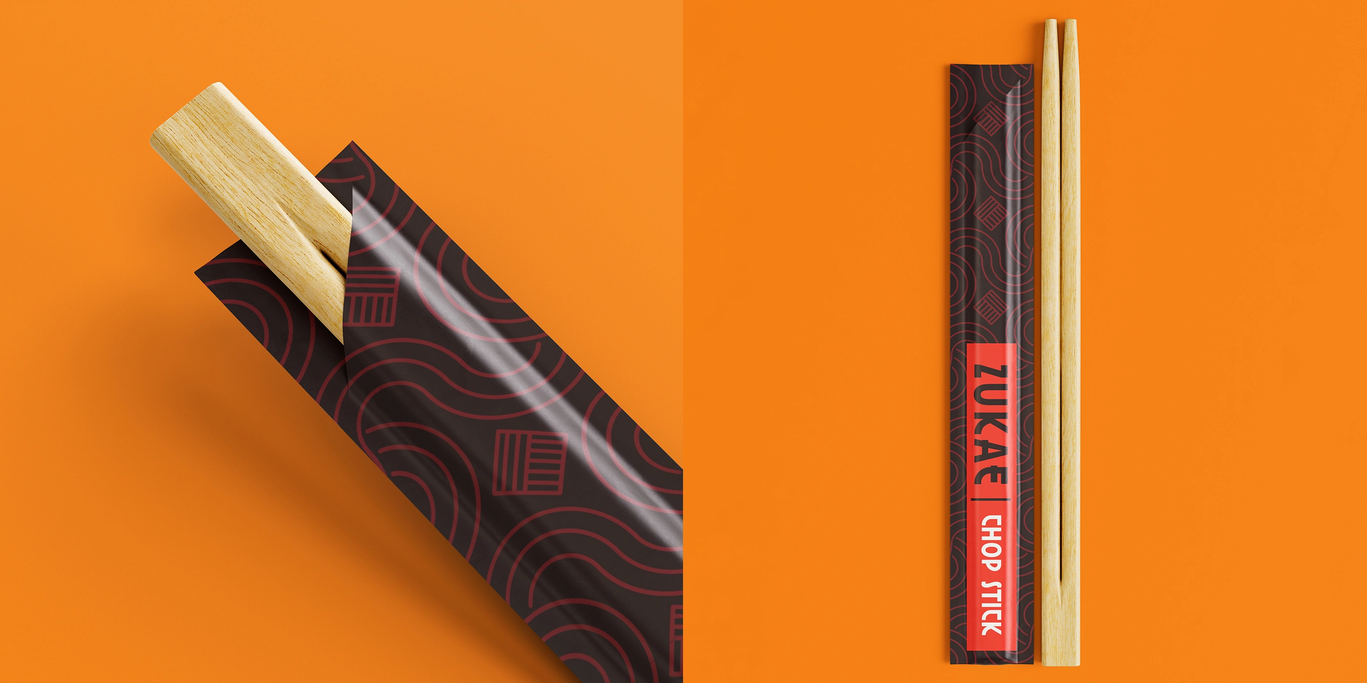
• Logo Designer, Packaging Designer
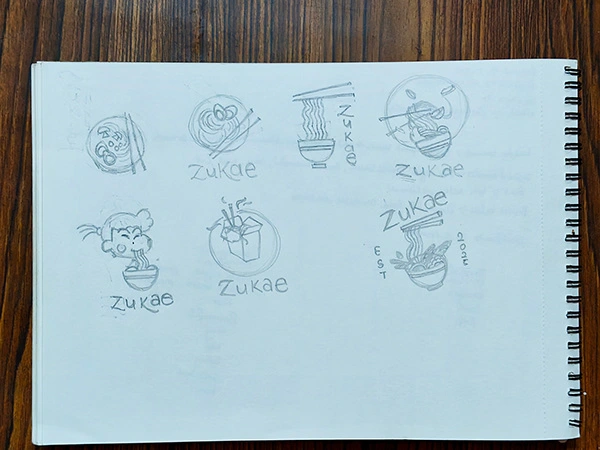
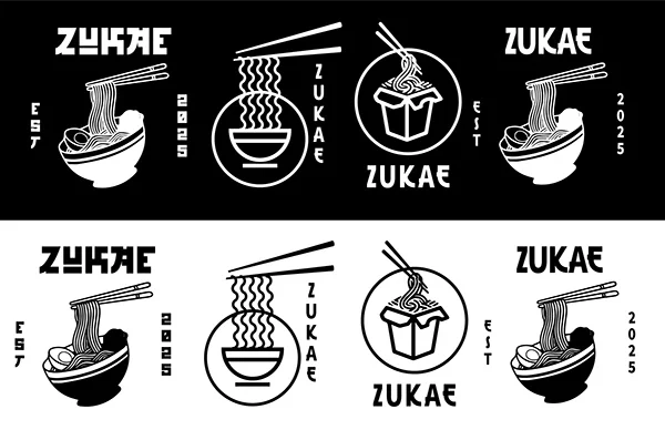
During the logo exploration phase, i digitize a few concepts then out of 8, only two strong directions have emerged on the third image, first Option A (a circle-based, minimal wordmark lockup) and second Option B (a vertical typography with chopsticks and bowl integration).
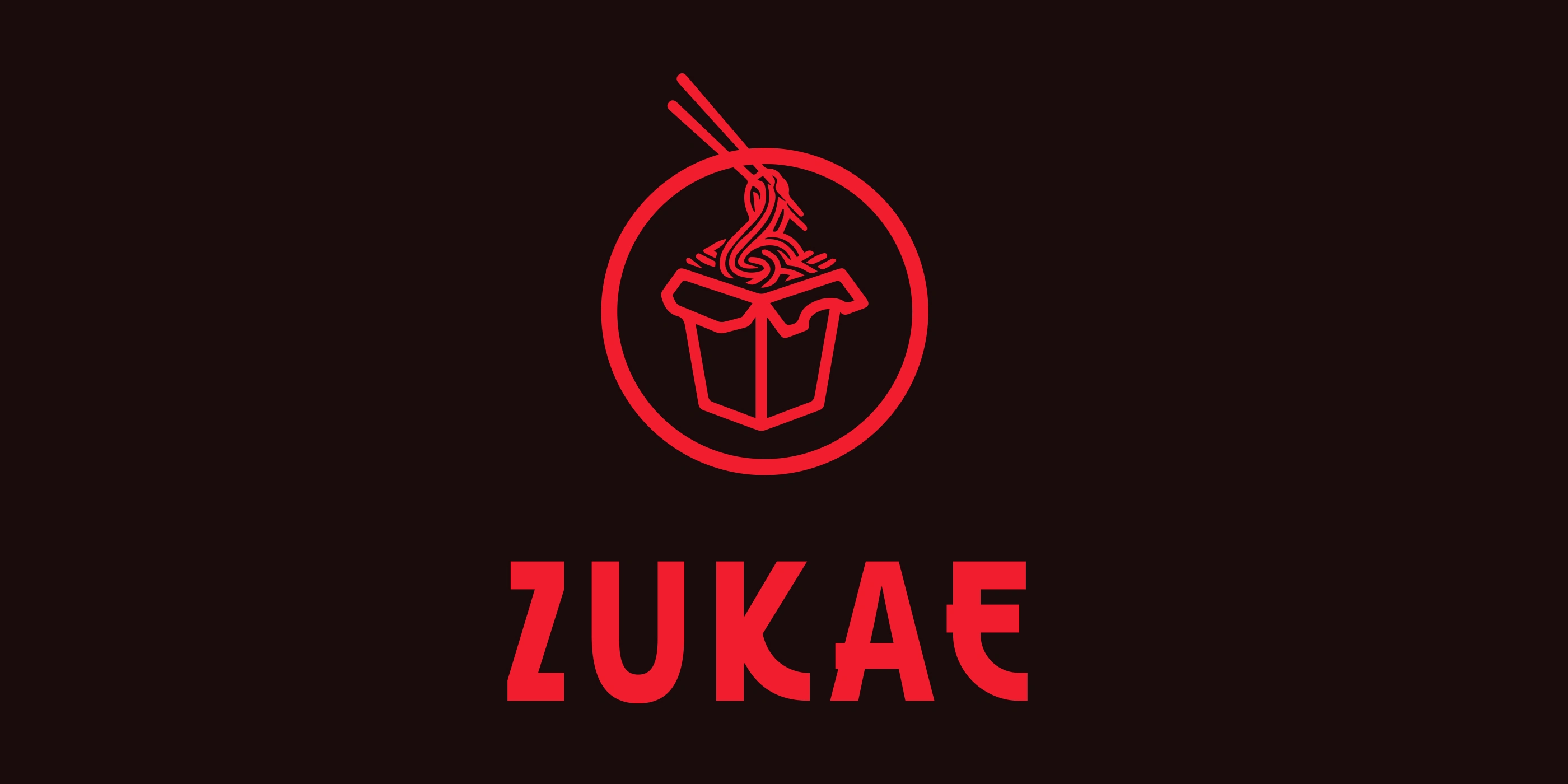
While Option B carried strong cultural storytelling, Option A was ultimately selected for this project because it offered greater versatility and simplicity. Its clean, circular form adapts seamlessly across various packaging formats, digital touchpoints, and small-scale applications, such as stickers or social media icons. This choice ensured the identity remains bold, legible, and timeless, while still allowing supporting elements, such as illustrations, patterns, and color, to express the brand’s Korean-inspired roots.
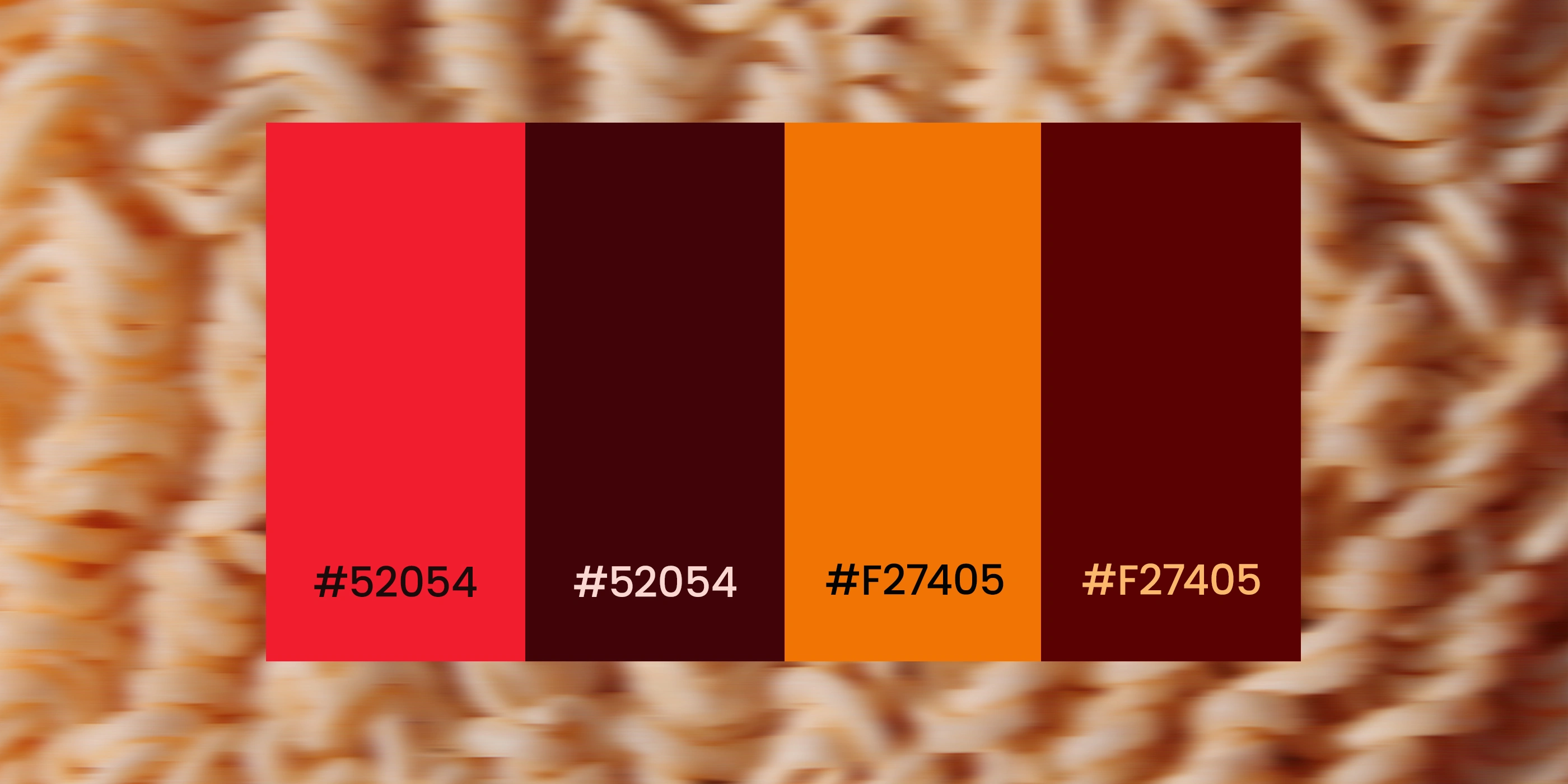
The color system draws inspiration from the vibrant energy of Korean street signboards and the fiery warmth of authentic instant noodle flavors. The primary palette establishes a bold foundation, while secondary tones bring balance and flexibility across packaging and digital use. A single accent is applied sparingly to highlight calls-to-action and spice cues, following a 60–30–10 hierarchy to ensure the brand remains consistent, premium, and instantly recognizable.
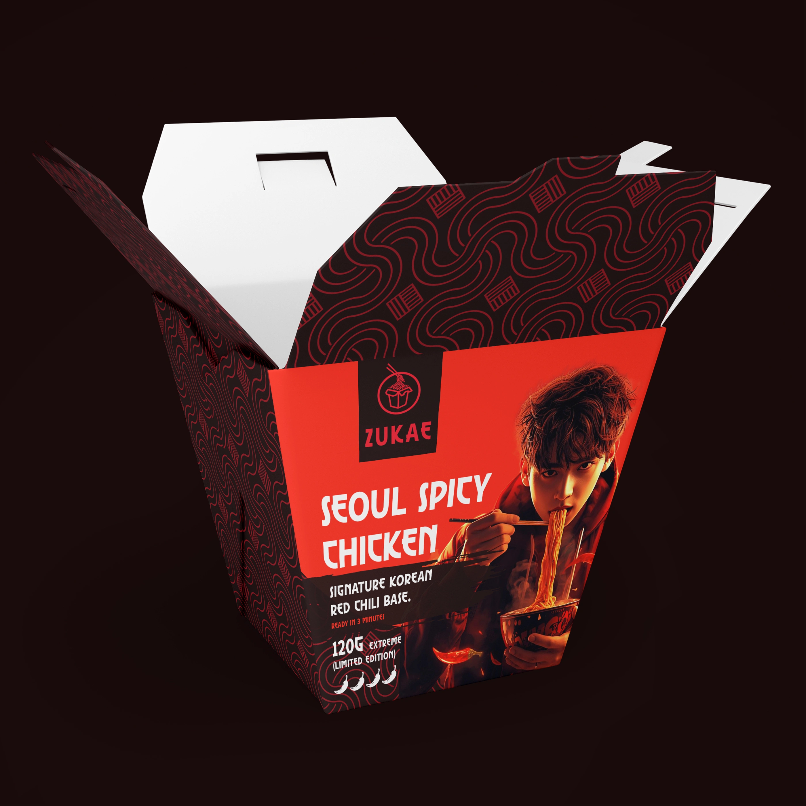
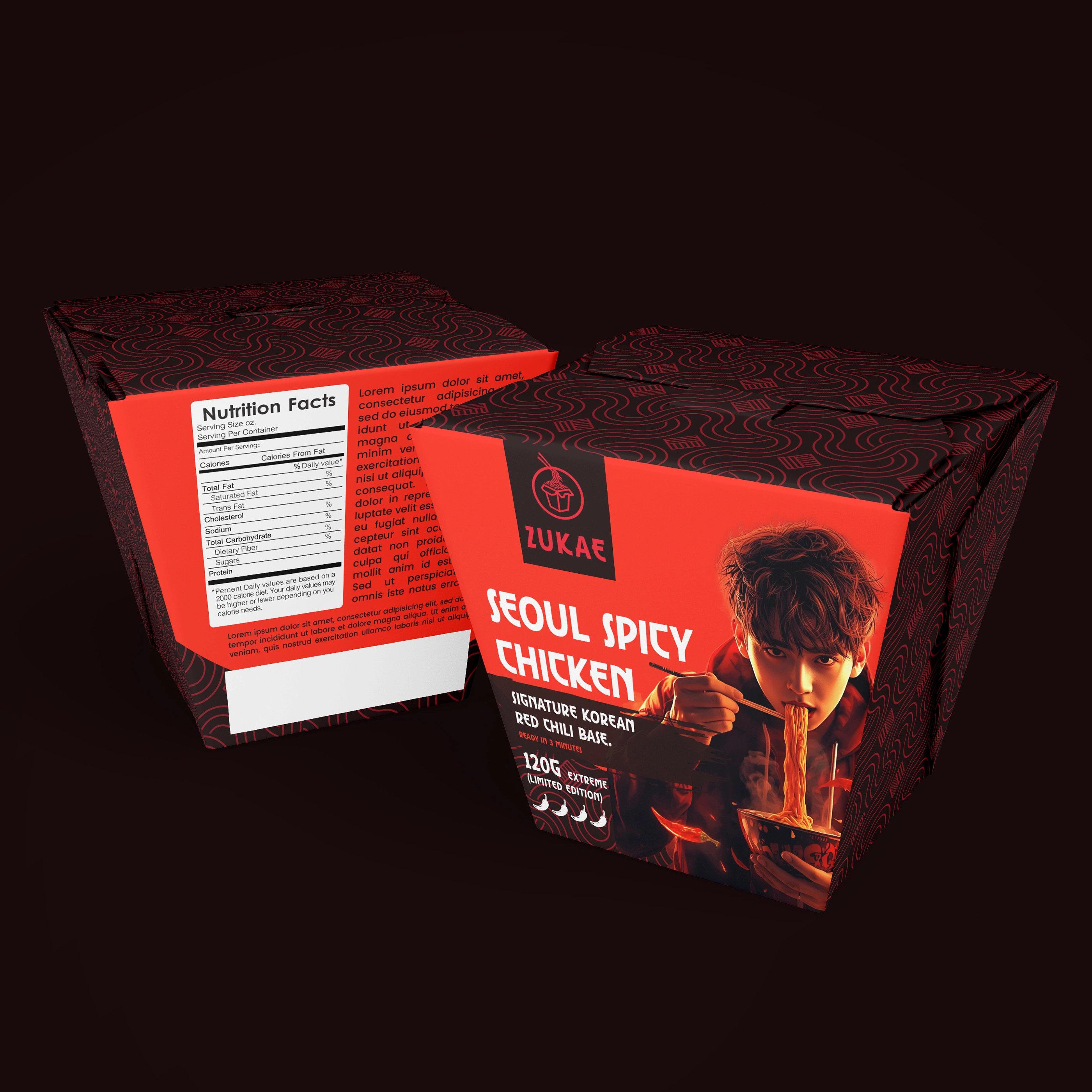
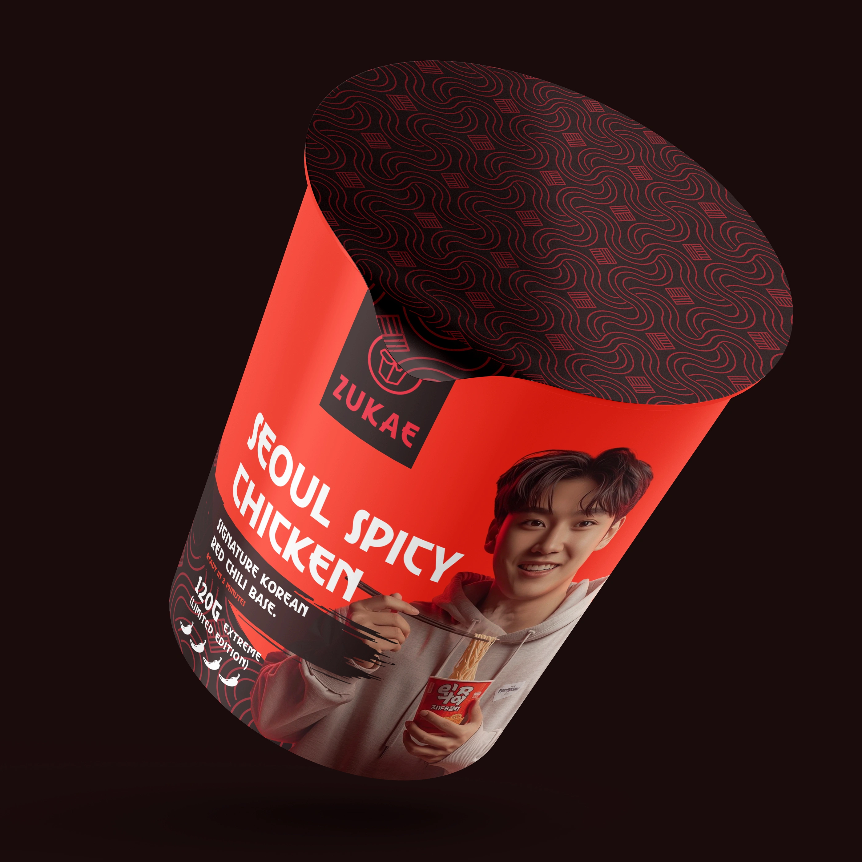
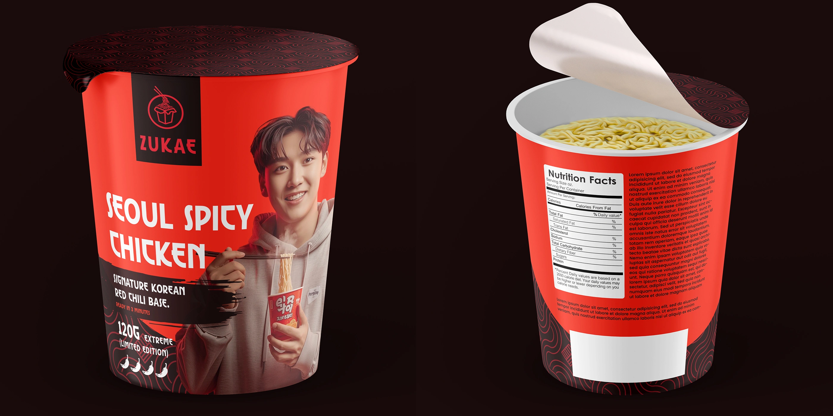
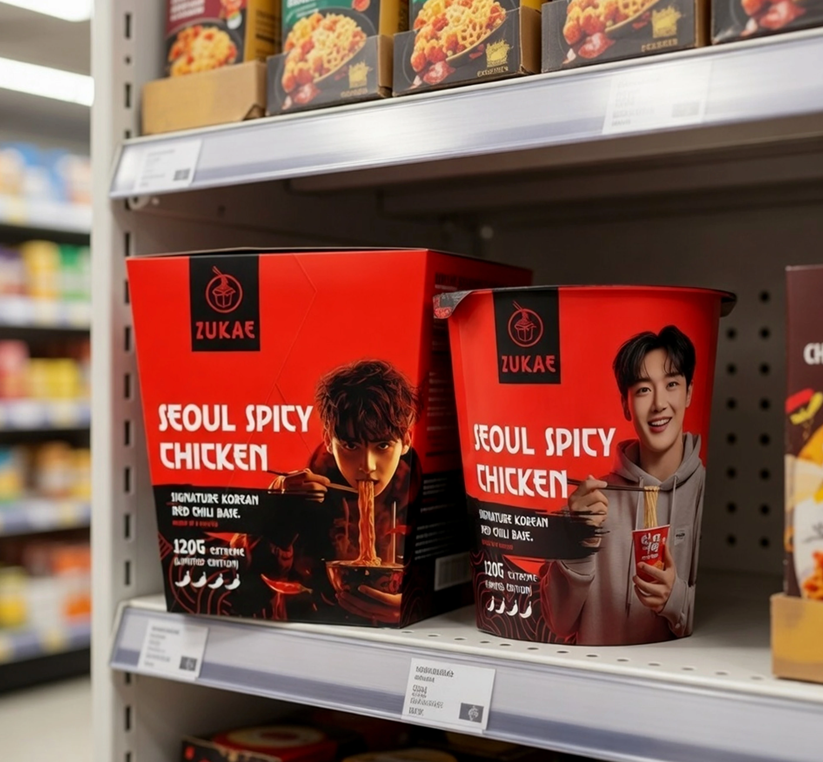
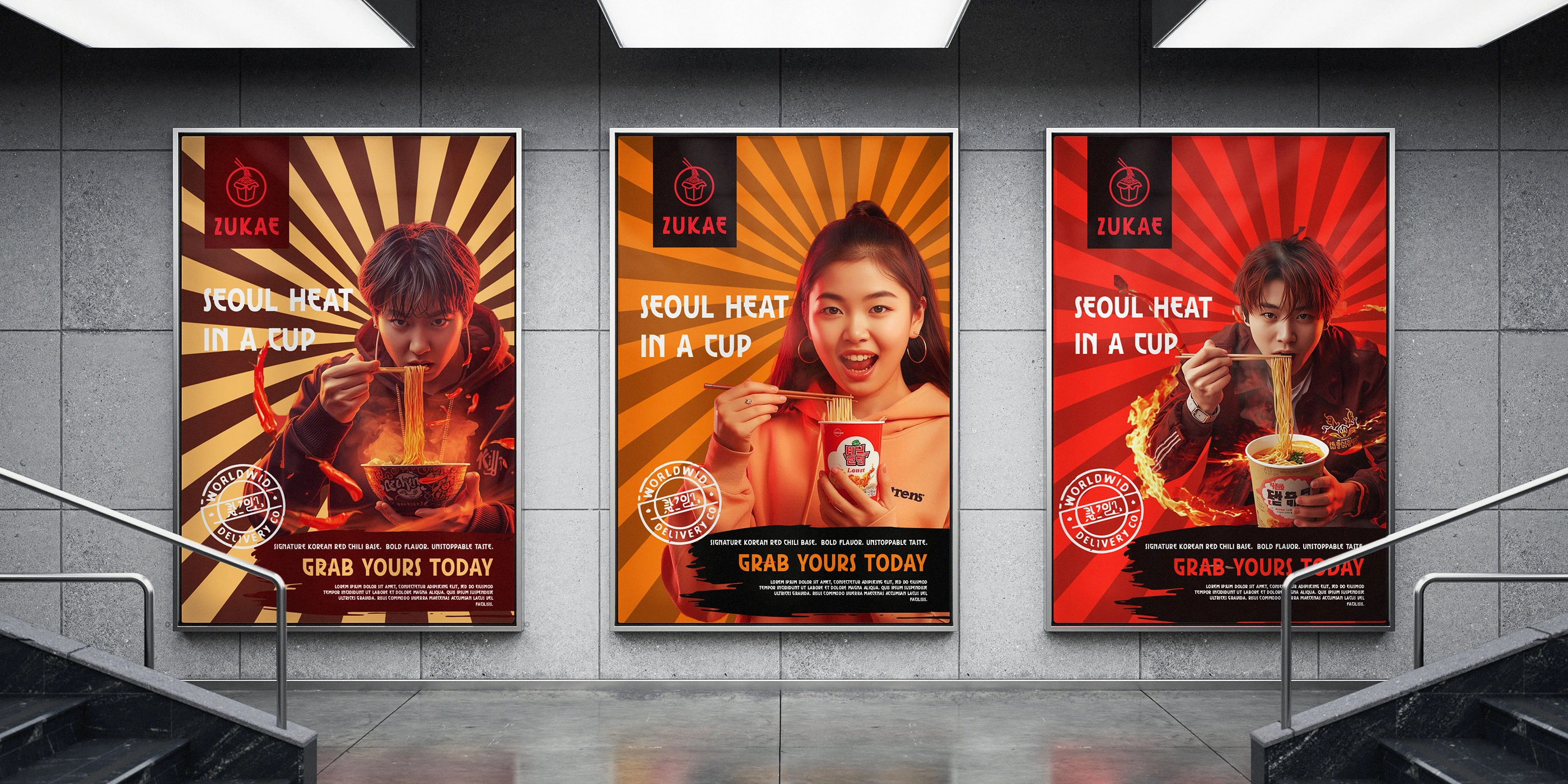
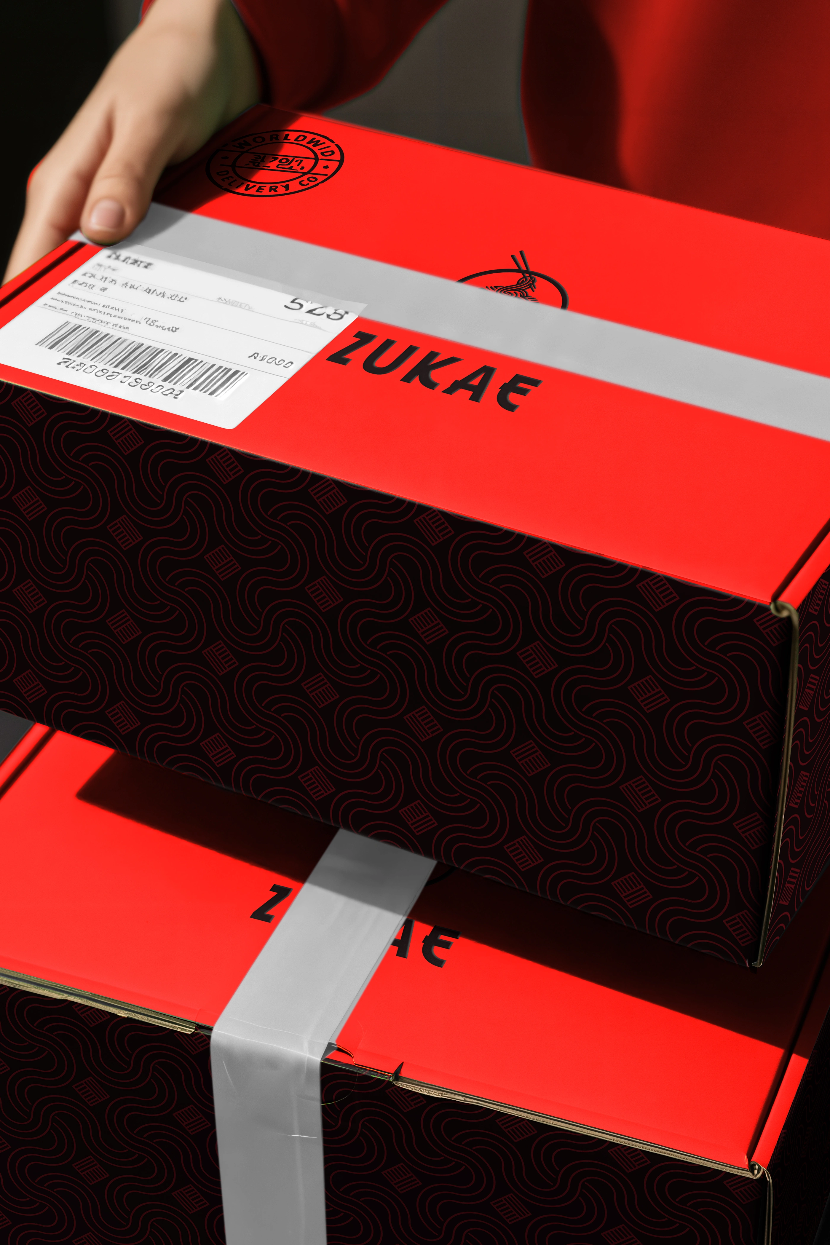
This case study showcases one hero flavor (Seoul Spicy Chicken) applied on the premium cardboard cup to demonstrate the brand system. The design system was built to flexibly extend across additional flavors and formats, including a plastic convenience cup.
For projects enquiry DM me on behance or reach out to me via contact.surjyakanta@gmail.com
Like this project
Posted Jun 11, 2026