SKNLY | Premium Skincare Branding & Packaging Design
surjyakanta pradhan
SKNLY is a concept skincare brand based in Bengaluru, India, positioned as accessible premium at the intersection of modern wellness and minimalist design. It targets ingredient-conscious, design-aware consumers seeking simple, transparent skincare routines.
This brand main Challenge was Position as modern and trustworthy without feeling clinical or overly luxurious. They need a system that remains visually minimal while working across multiple SKUs
and formats. My approach is simple, using a typographic-led identity combining expressive display type with a clean sans-serif system for clarity and usability and a structured packaging system where color and typography differentiate products while maintaining consistency and strong shelf recognition.
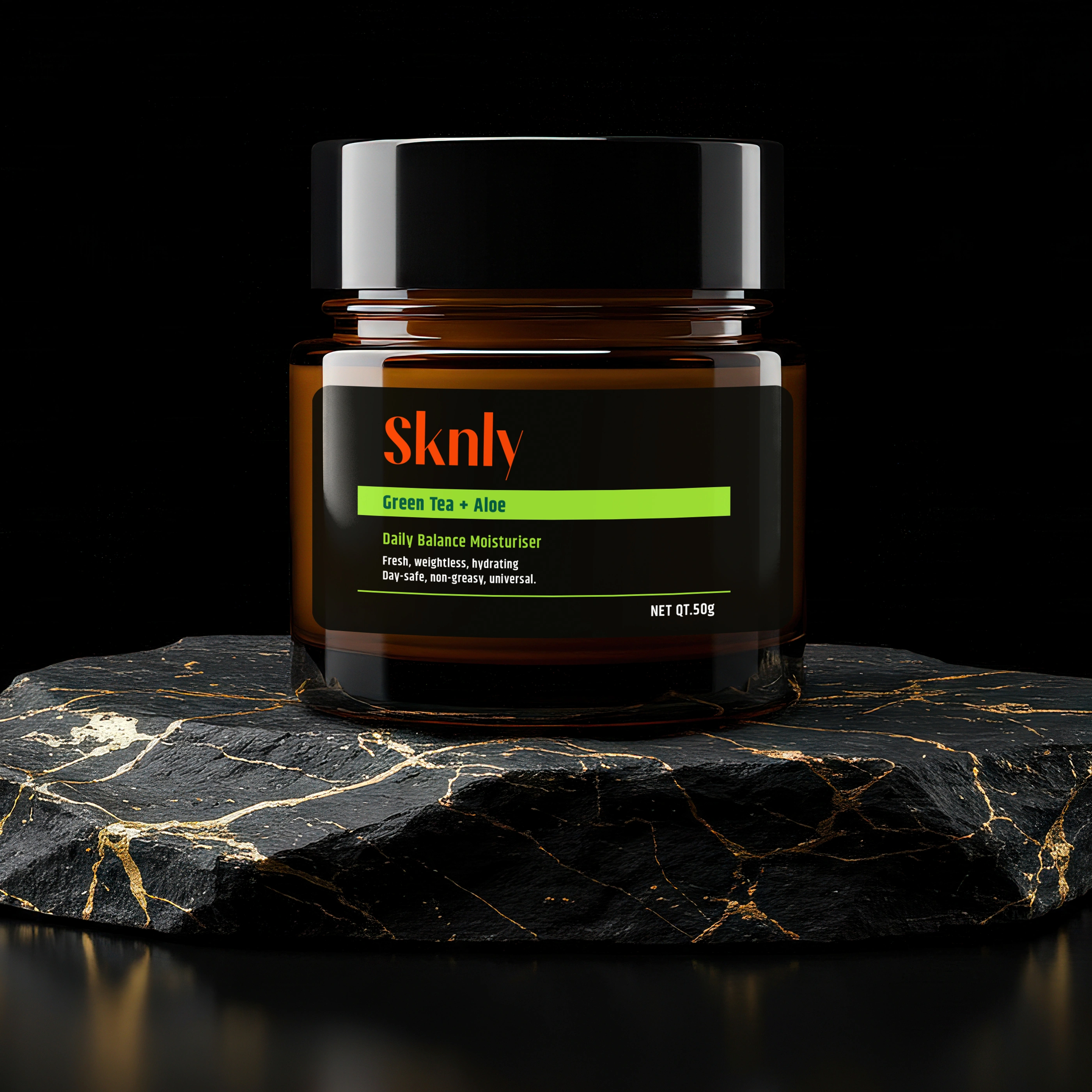
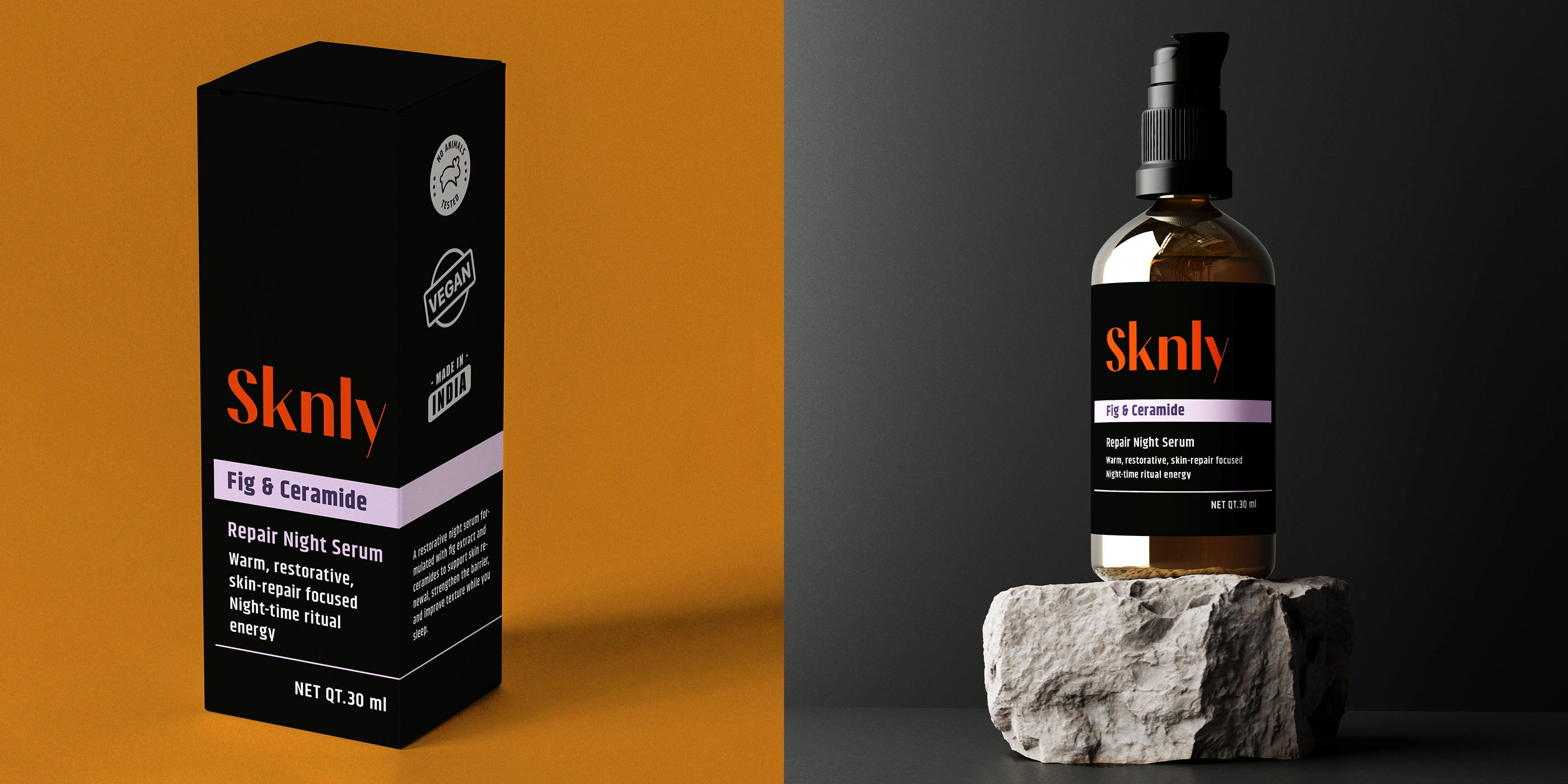
In Material System we used Tinted glass bottles for product protection and a refined visual tone. Recyclable PET/HDPE for closures durability and practicality. Uncoated labels and minimal print to reduce visual noise.
Deliverables- Brand Identity & Packaging Design.
Brand Category- Premium Honey / Gourmet Wellness CPG
Based in- India (Global Market Positioning)
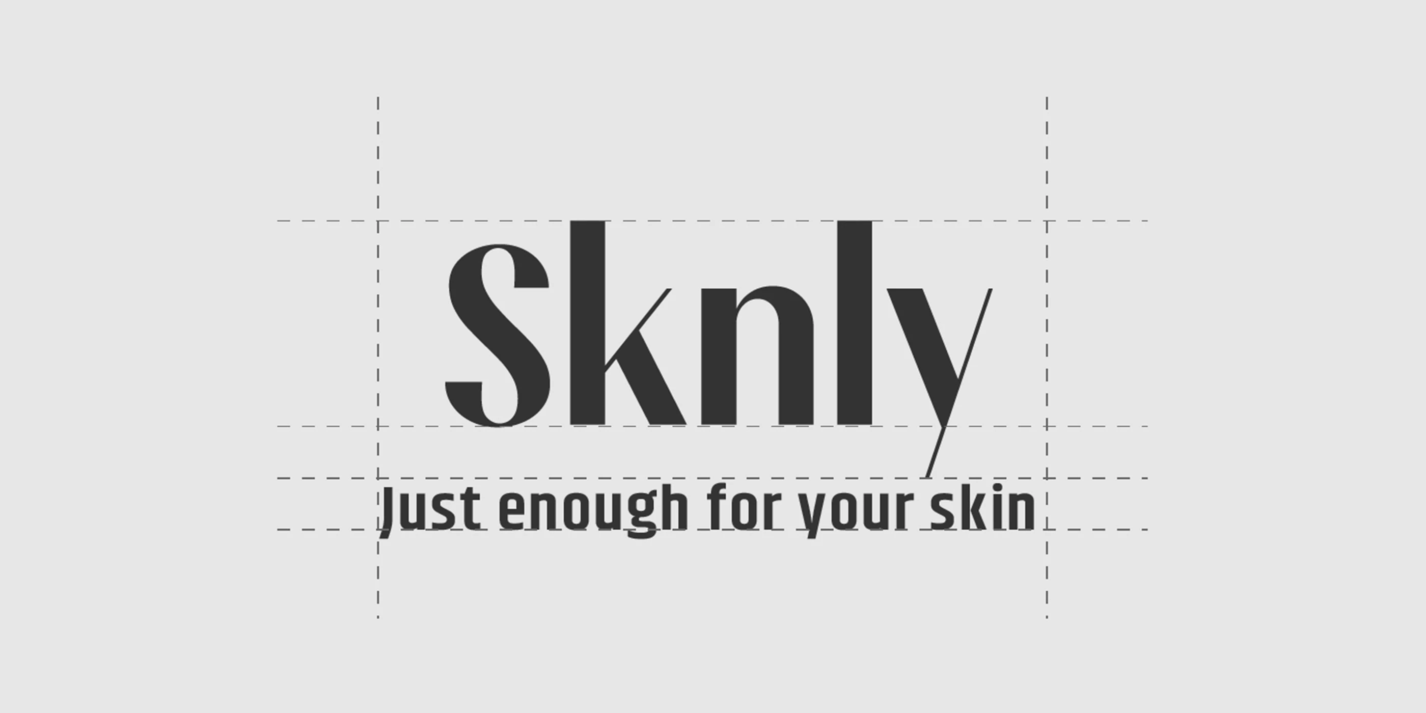
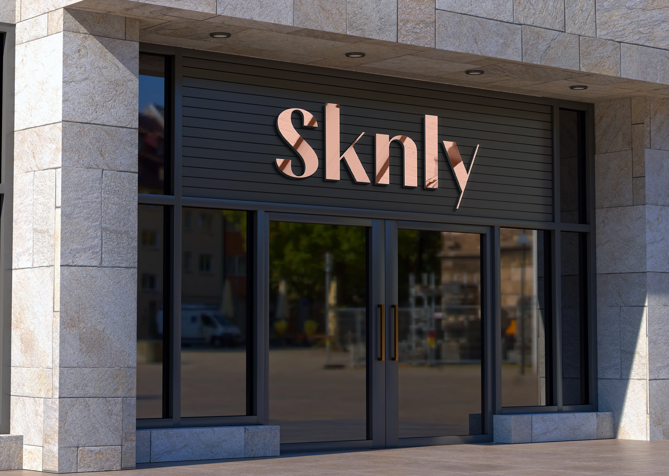
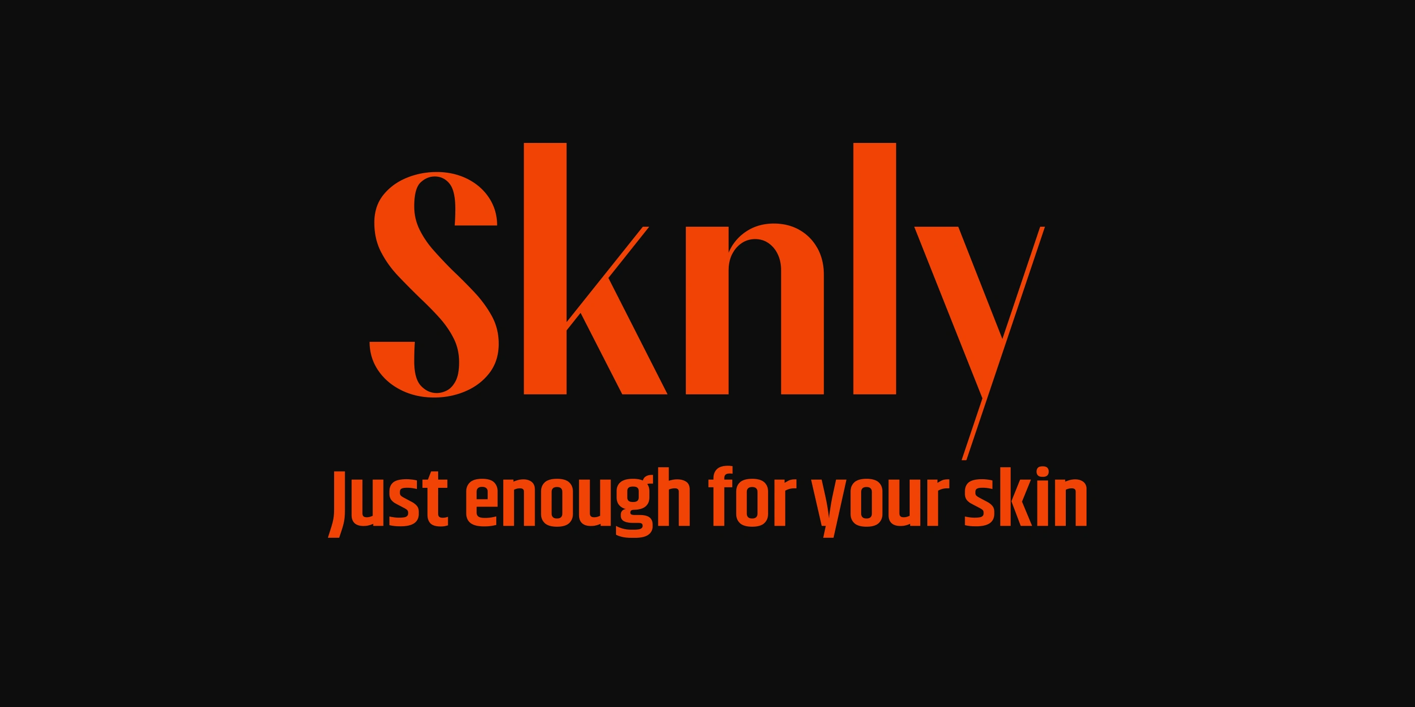
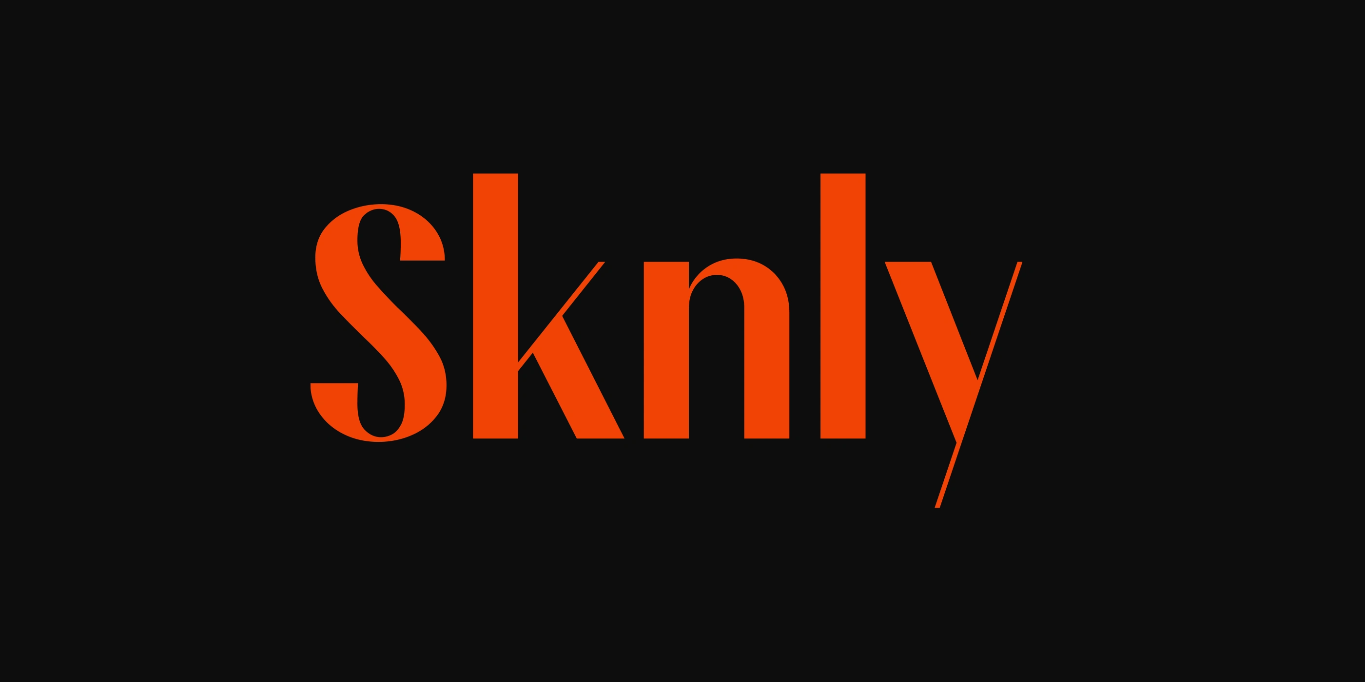
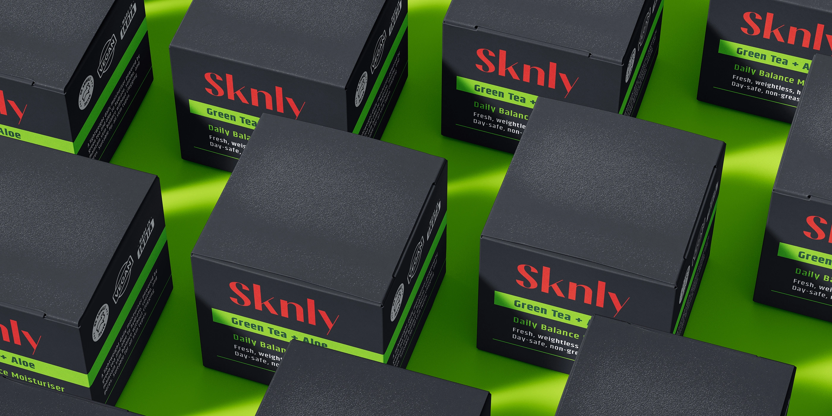
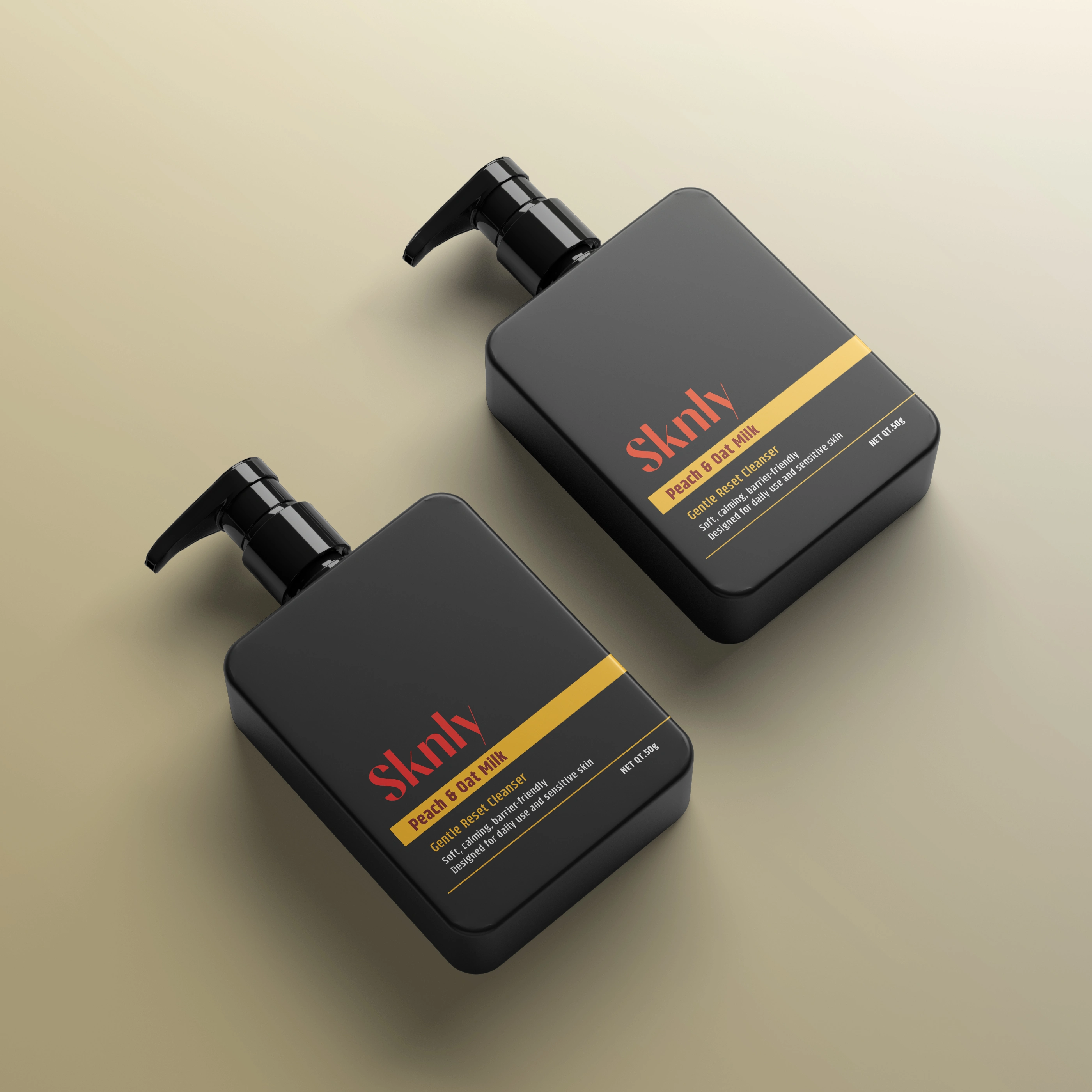
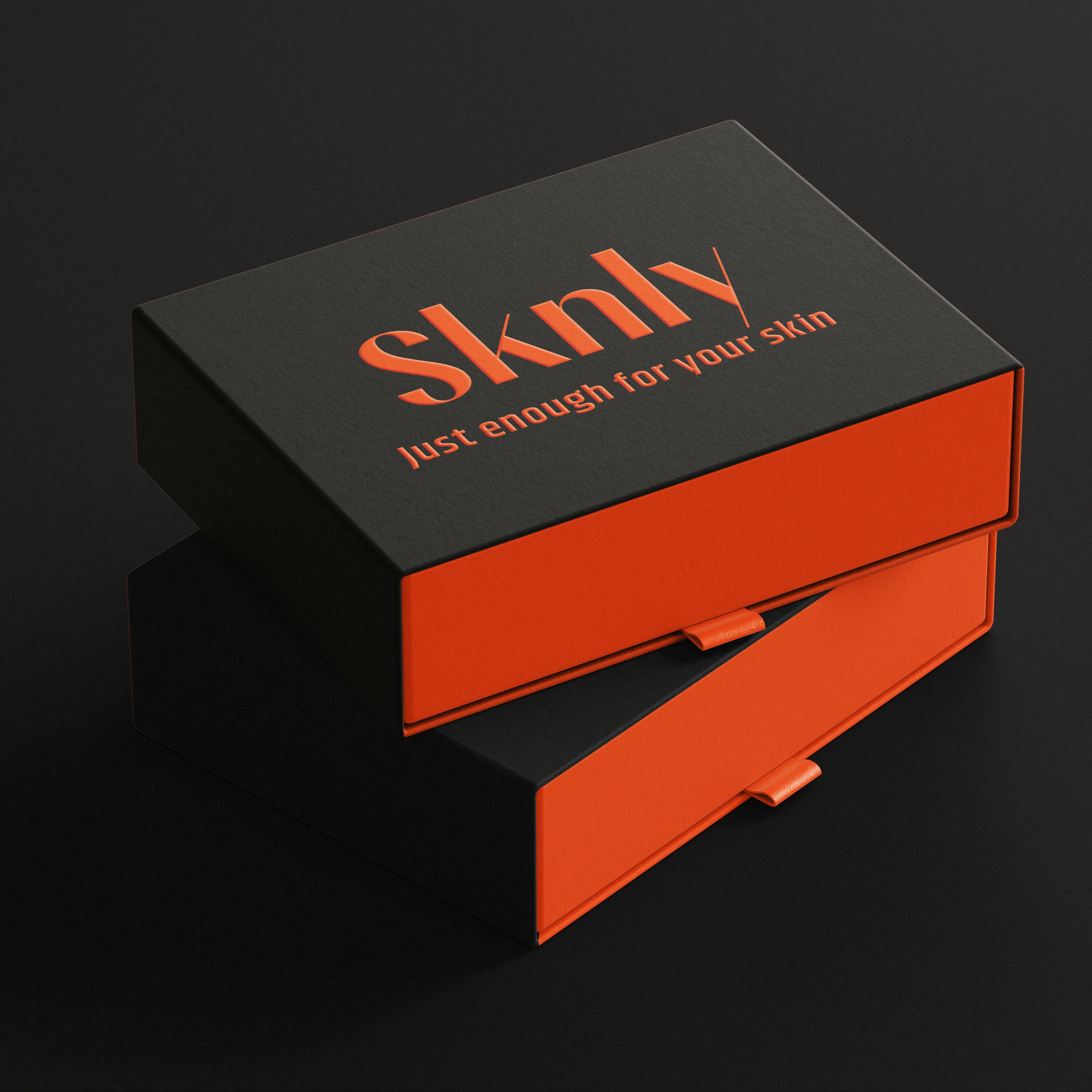
The SKNLY logo is designed to feel calm, modern, and direct reflecting the brand’s philosophy of simplified skincare. Its restrained typographic form avoids clinical or luxury-coded aesthetics, allowing the brand to communicate clarity and trust while remaining adaptable across packaging formats.
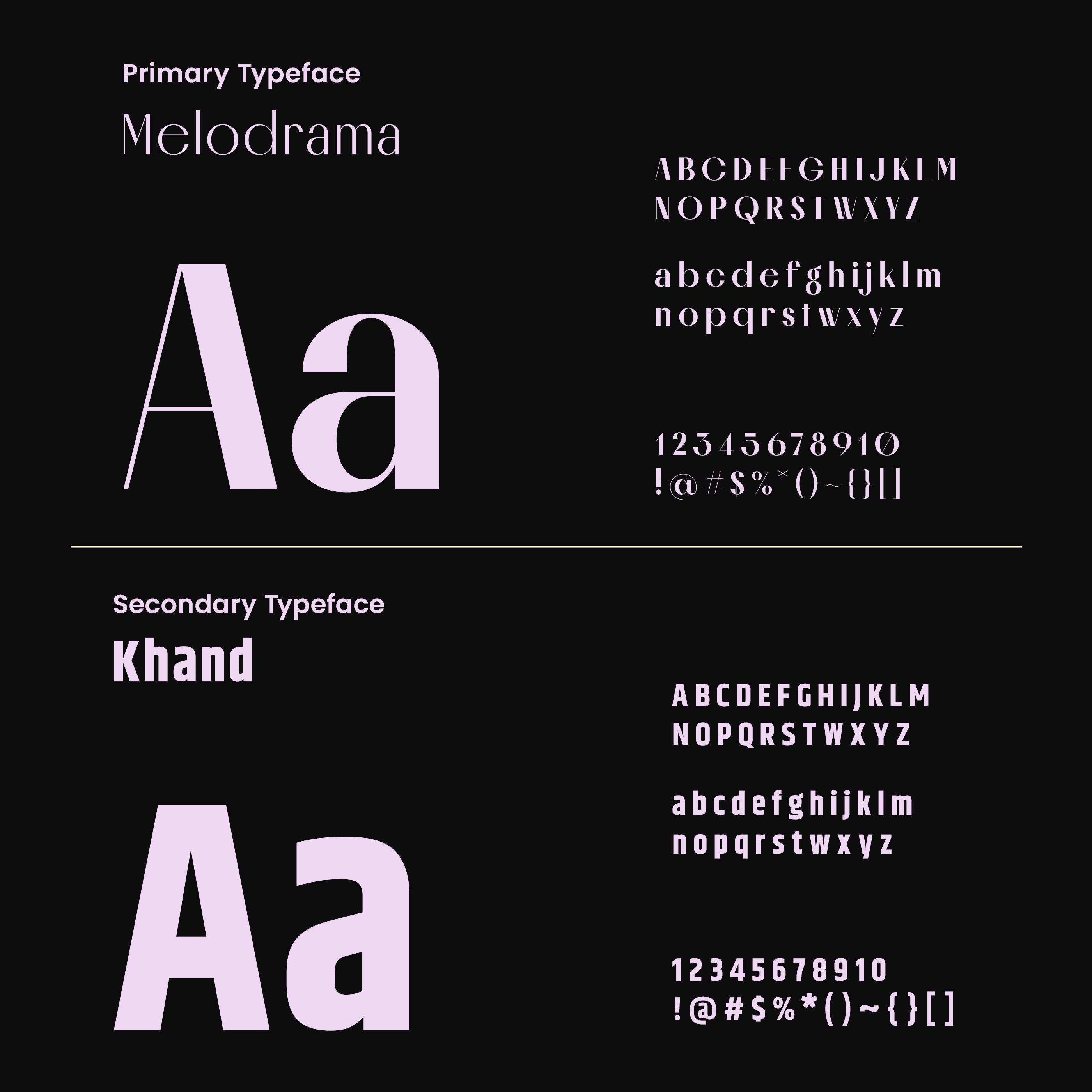
The typographic system uses Melodrama for the brand logo to introduce a distinctive, design-led character, while Khand supports the packaging labels to ensure clarity and readability. By using different weights of Khand for hierarchy, the system separates brand expression from product communication allowing the packaging to remain minimal while ensuring product information stays easy to scan and trustworthy for consumers in a retail environment.
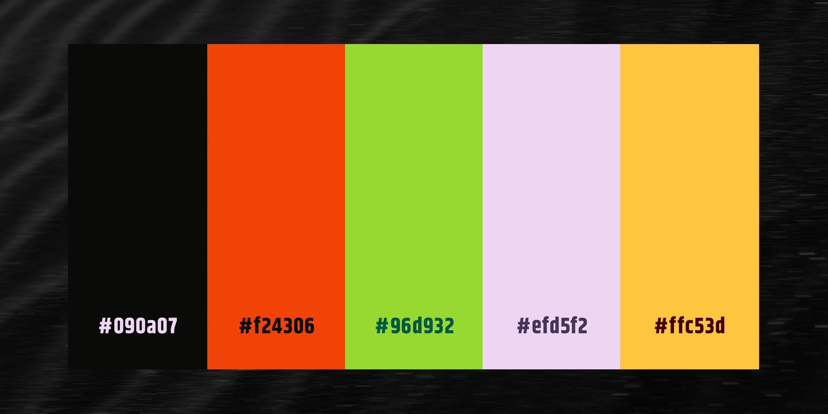
The color system combines a deep anchor tone (#090a07) with a vibrant, flavor-inspired palette (#f24306, #96d932, #efd5f2, #ffc53d). The darker tone provides a stable base for typography and brand elements, while the brighter colors are applied minimally to the containers to create instant product differentiation.
This approach keeps the labels minimal while improving shelf recognition across the range and reinforcing SKNLY’s modern, energetic skincare positioning without relying on heavy graphics or decorative printing.

For projects enquiry DM me on behance or reach out to me via contact.surjyakanta@gmail.com
Like this project
Posted Jun 11, 2026
SKNLY is a premium skincare brand for Gen-Z.