Bodax Gaming – Identity, Website & Social System

Max Bode


Bodax Gaming
Bodax Gaming is a German esports organization fielding teams in Valorant across the European competitive ladder.
Year: 2026
Role: Co-founder & Creative Director
Industry: Esports / Gaming
Scope: Brand Identity, Pitch Deck, Web Design & Dev, Social Media Design
The Brief
Bodax Gaming is the esports arm of bodax.dev, a German web development agency. I co-founded the venture as Gründer & Creative Director – this wasn't a client engagement; I was inside the founding team, leading every brand and creative decision from the first whiteboard sketch onward.
The strategic premise was clear from the start: build a credible presence in competitive gaming to reach a younger, entrepreneurially-minded audience – and create a natural pipeline back to the agency. Rather than running ads at founders, meet them where they spend time.
My remit covered everything visual and brand-facing – identity, partner pitch deck, social media posts and templates, and a full website design and development – all built to work as a coherent system from day one.
The System
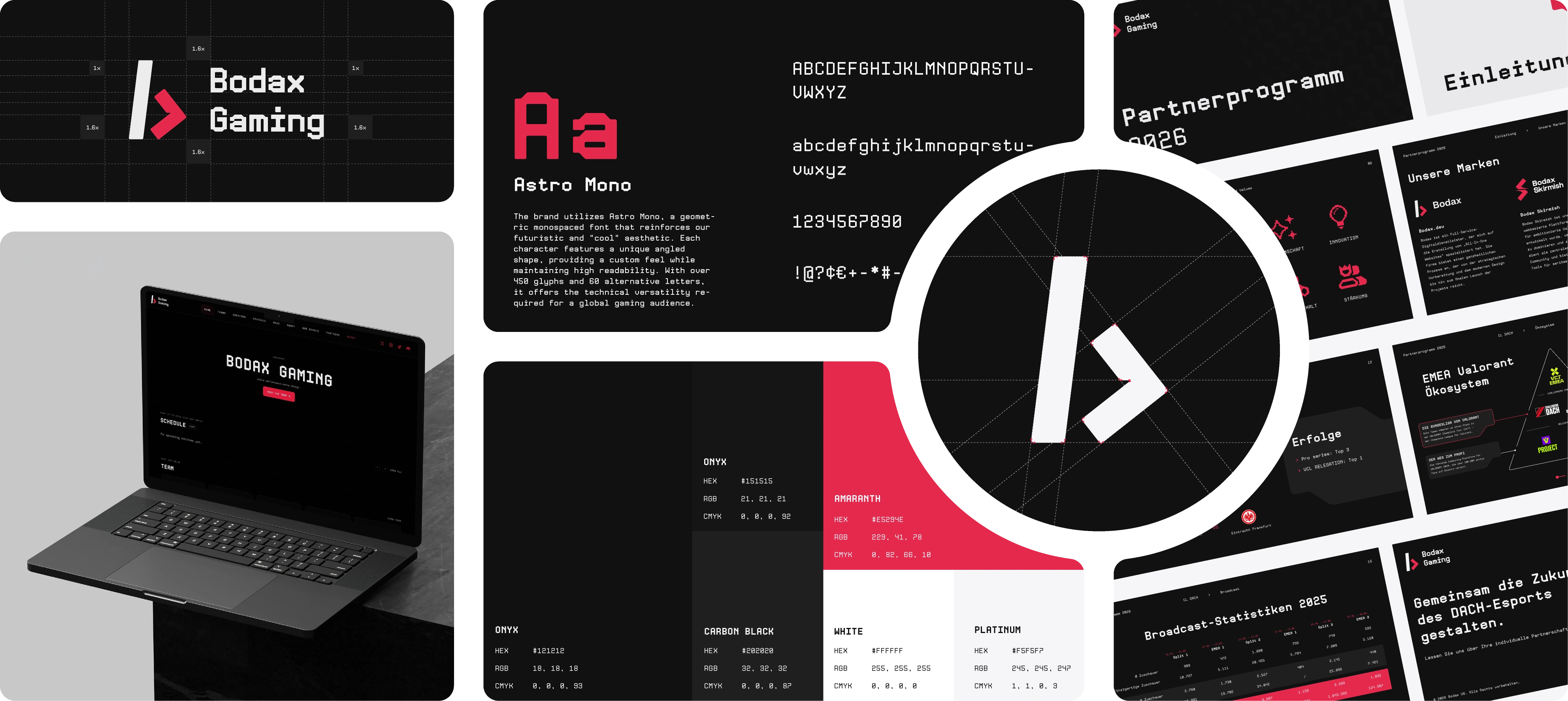
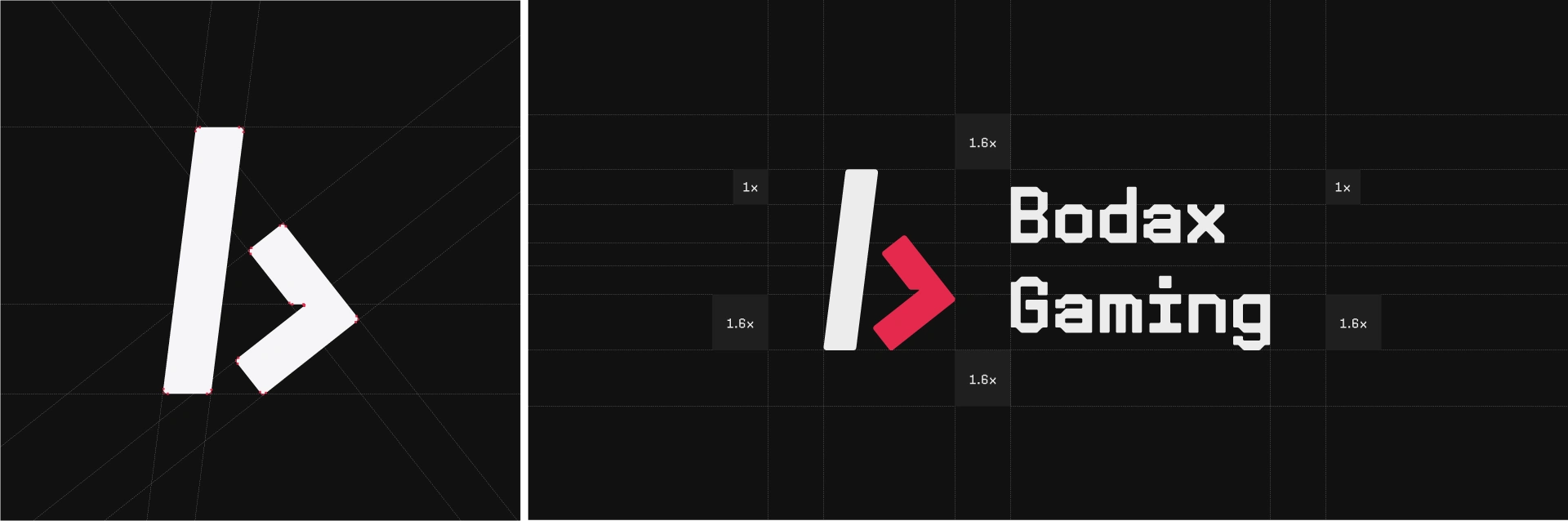
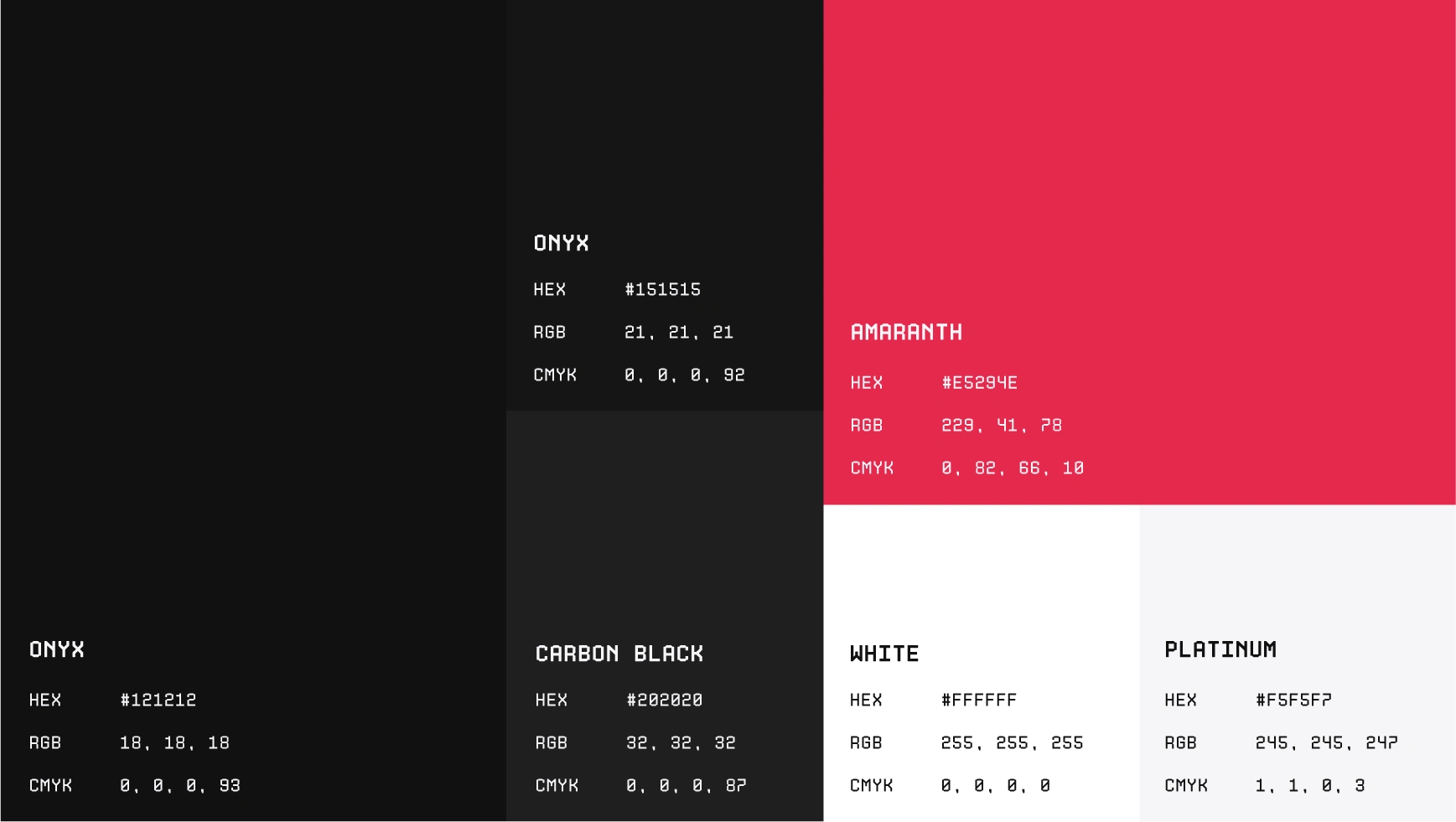
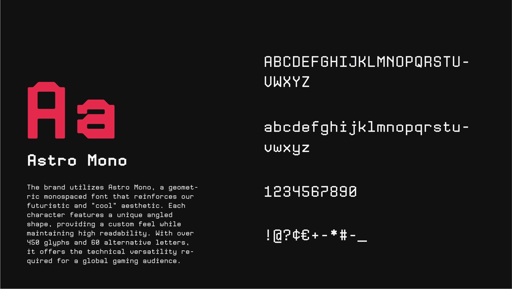
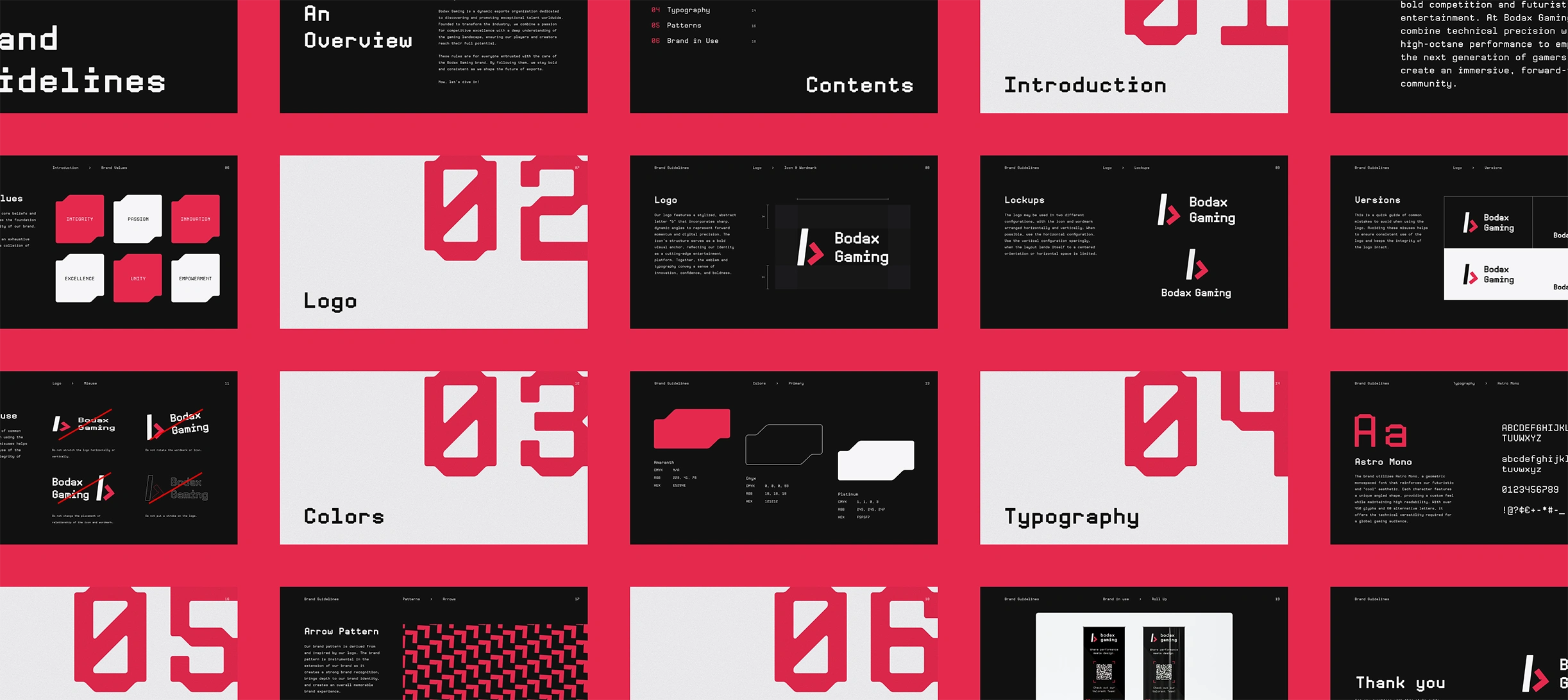
Beyond the working files, the brand was packaged into a guidelines document – logo,colors, typography, patterns, and application examples in one place. The point was to make the system usable by people who weren't in the original conversations: future designers, freelancers helping with one-off posts, or anyone joining the team later.
The Pitch Deck
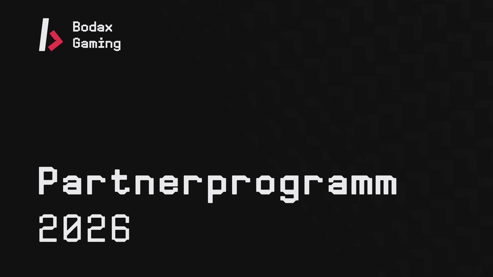
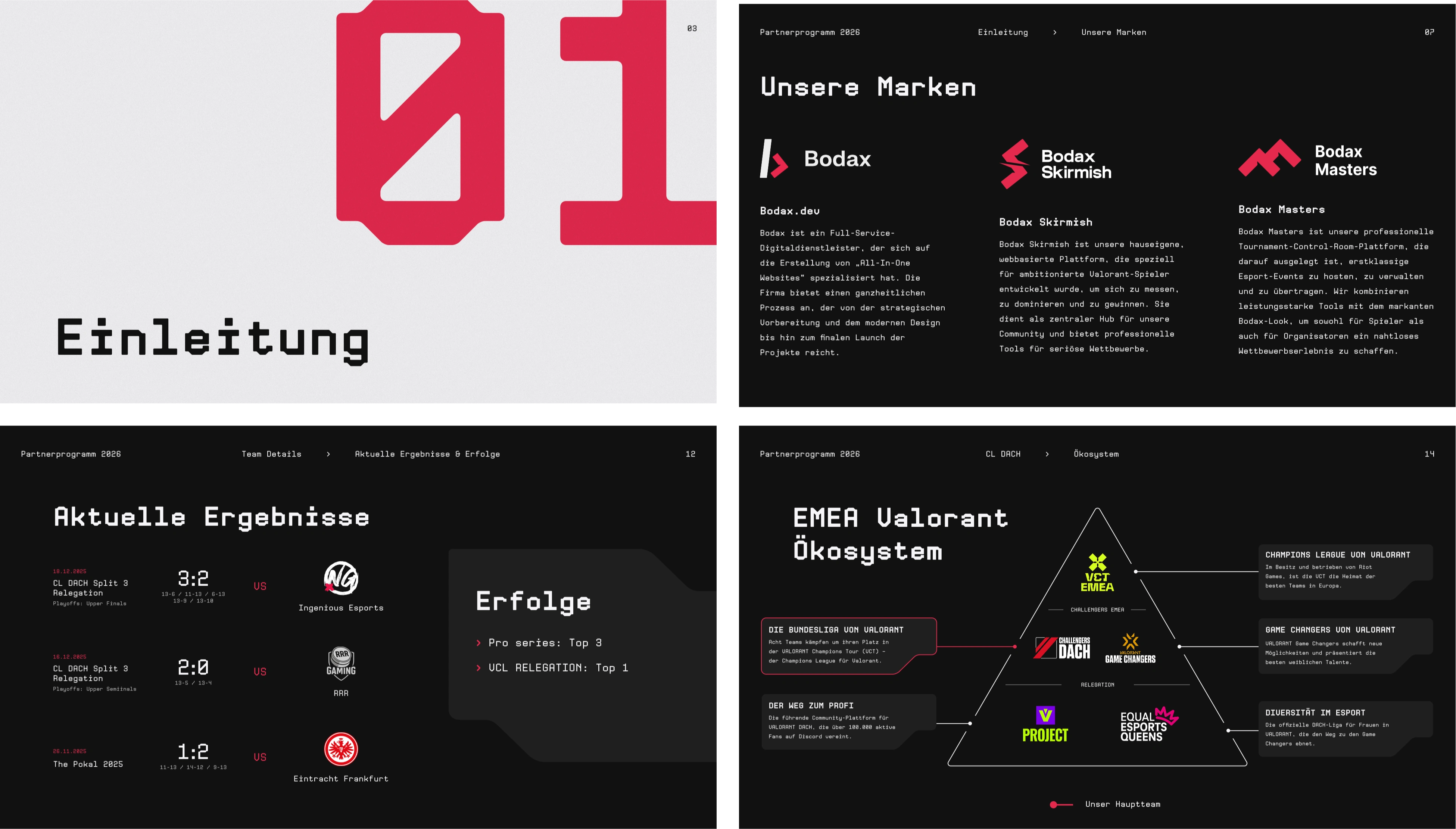
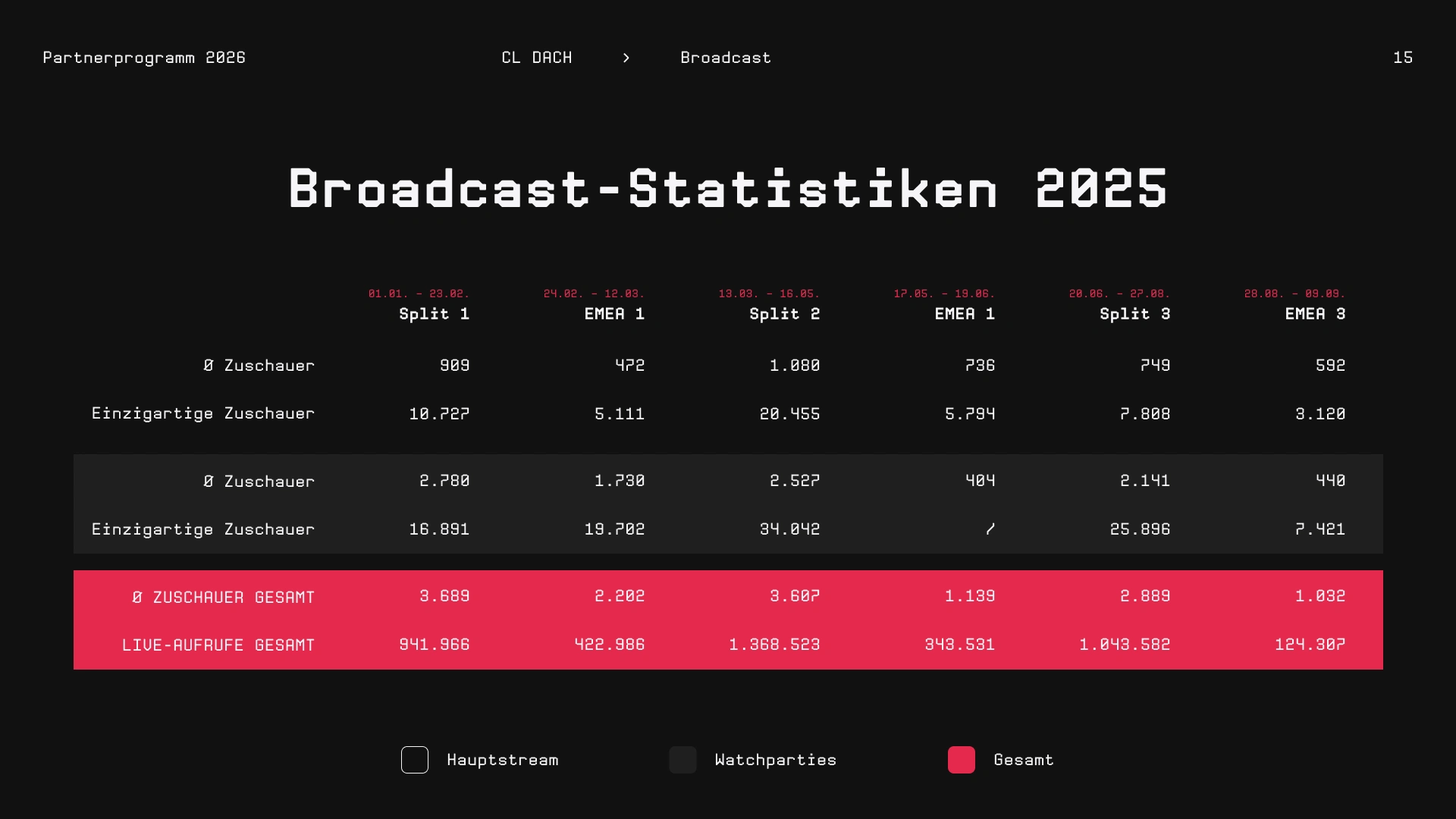
The partner program deck is the document we used to pitch sponsors on the org. It pulls double duty: carrying the visual identity at full strength while handling dense information design – team structure, the EMEA Valorant league ecosystem, broadcast statistics, and the roadmap for the season ahead.

Social as the primary touchpoint
The biggest risk with a brand like this is landing somewhere in the middle – too corporate to feel authentic to the gaming community, too aggressive to connect back to the parent agency. The identity had to feel like it genuinely belonged in esports, not like a consultancy trying to seem cool.
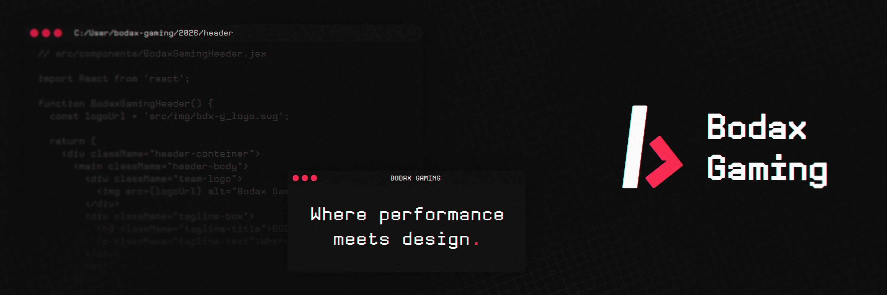
That meant building from gaming visual conventions first – dark backgrounds, high contrast, angular shapes, a type system that reads fast at small sizes on social posts and broadcast graphics – then finding the thread back to bodax.dev through shared values: precision, clarity, and a sharp attention to craft. The two brands don't shout their connection. They share DNA.
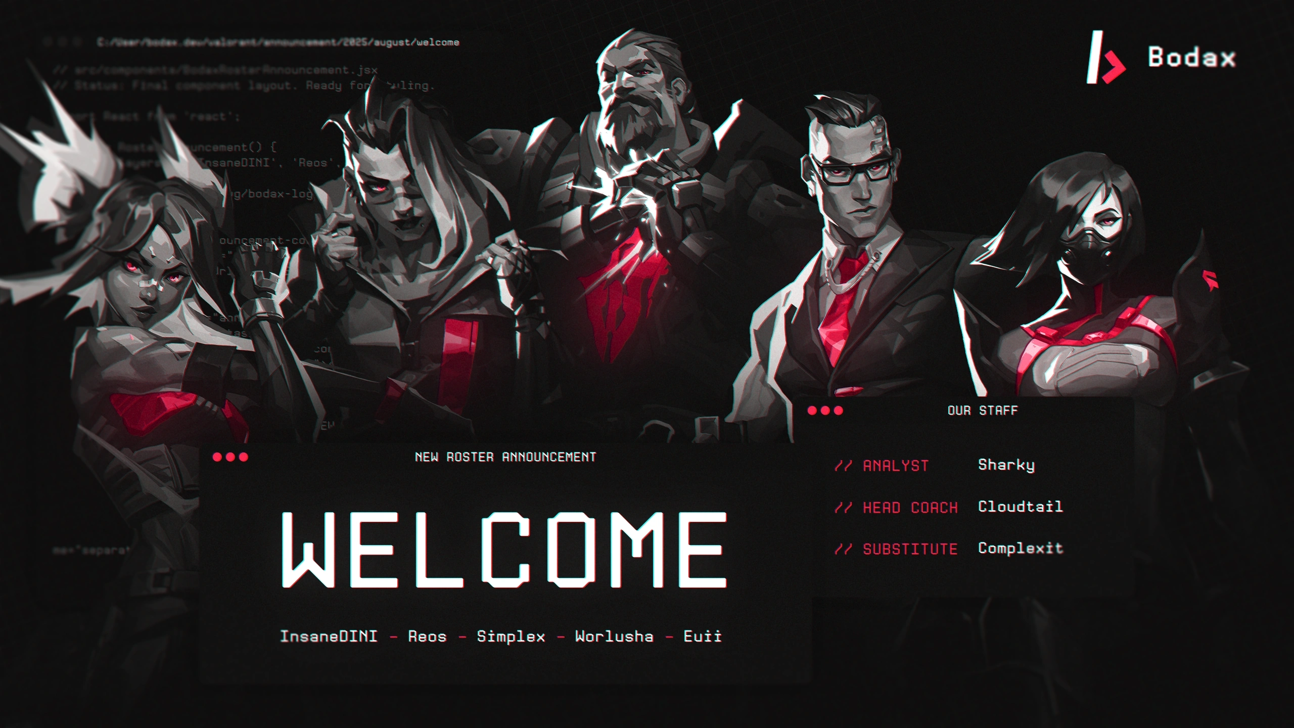
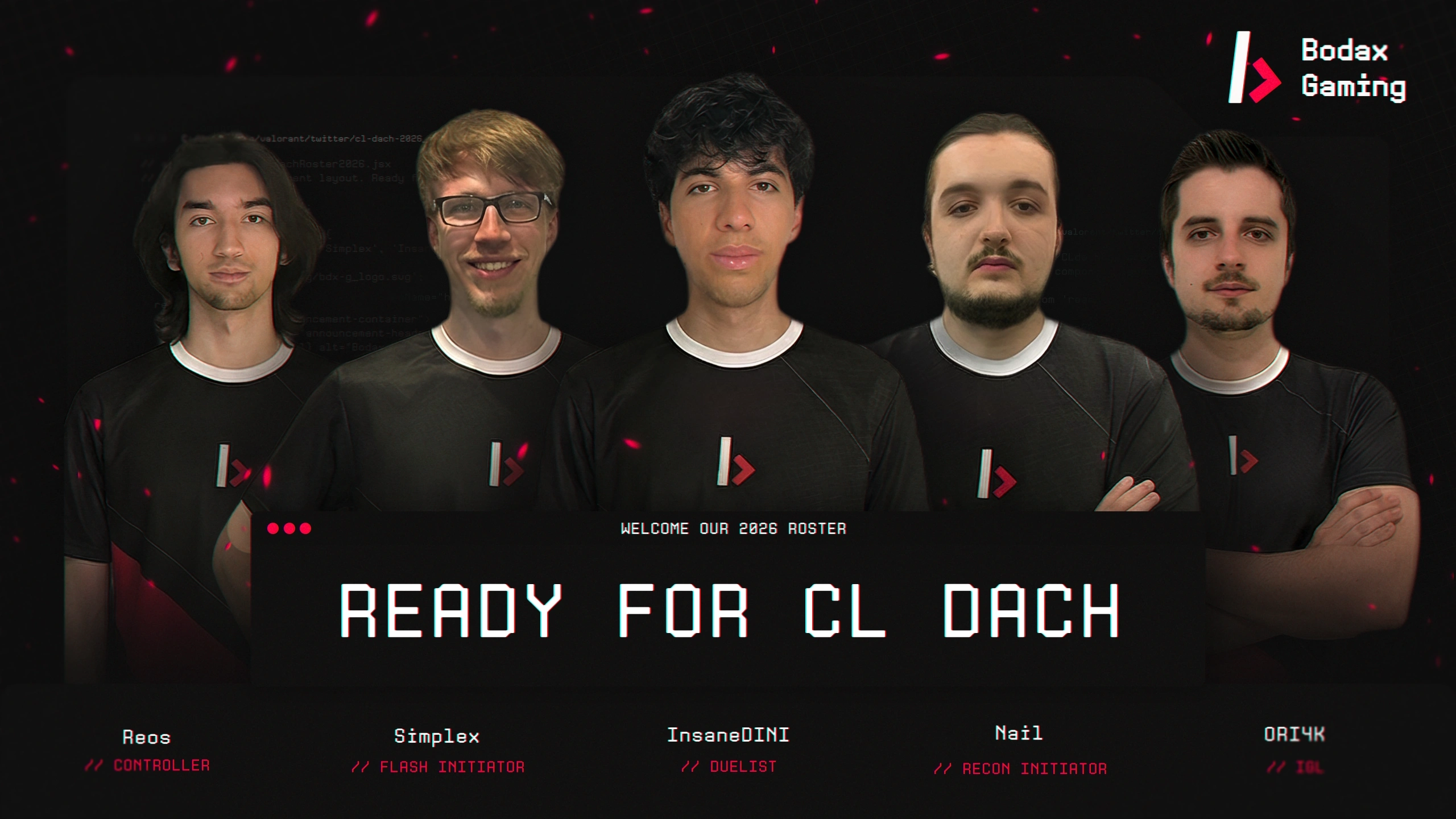
Social media was treated as the primary touchpoint for audience-building, so the template system was designed for speed and consistency: any post, any roster update, any match result should look unmistakably Bodax Gaming without needing a designer each time.
The pitch deck pushed the same logic in another direction. Information-dense without feeling heavy: section dividers act as breathing moments between data-rich spreads, and the dense layouts – broadcast stats, social media metrics – get the same type discipline as the brand identity itself. The document reads as one object, not a slide template wrapped around a content dump.
Working with Max was genuinely great. He didn't just build the website – he also developed the full branding and social media concept. You can really tell he thinks of it all as one project. Everything ties together and feels really cohesive. On top of that, he brings a lot of passion and a strong sense of responsibility. I could rely on him at every step.
Alexander Kechagias – Bodax UG
Like this project
Posted May 7, 2026
Brand identity, responsive website, and social template kit for a German Valorant esports org – built to feel native to gaming, not corporate.