Kunath Group – Brand Refresh & Pitch Deck

Max Bode


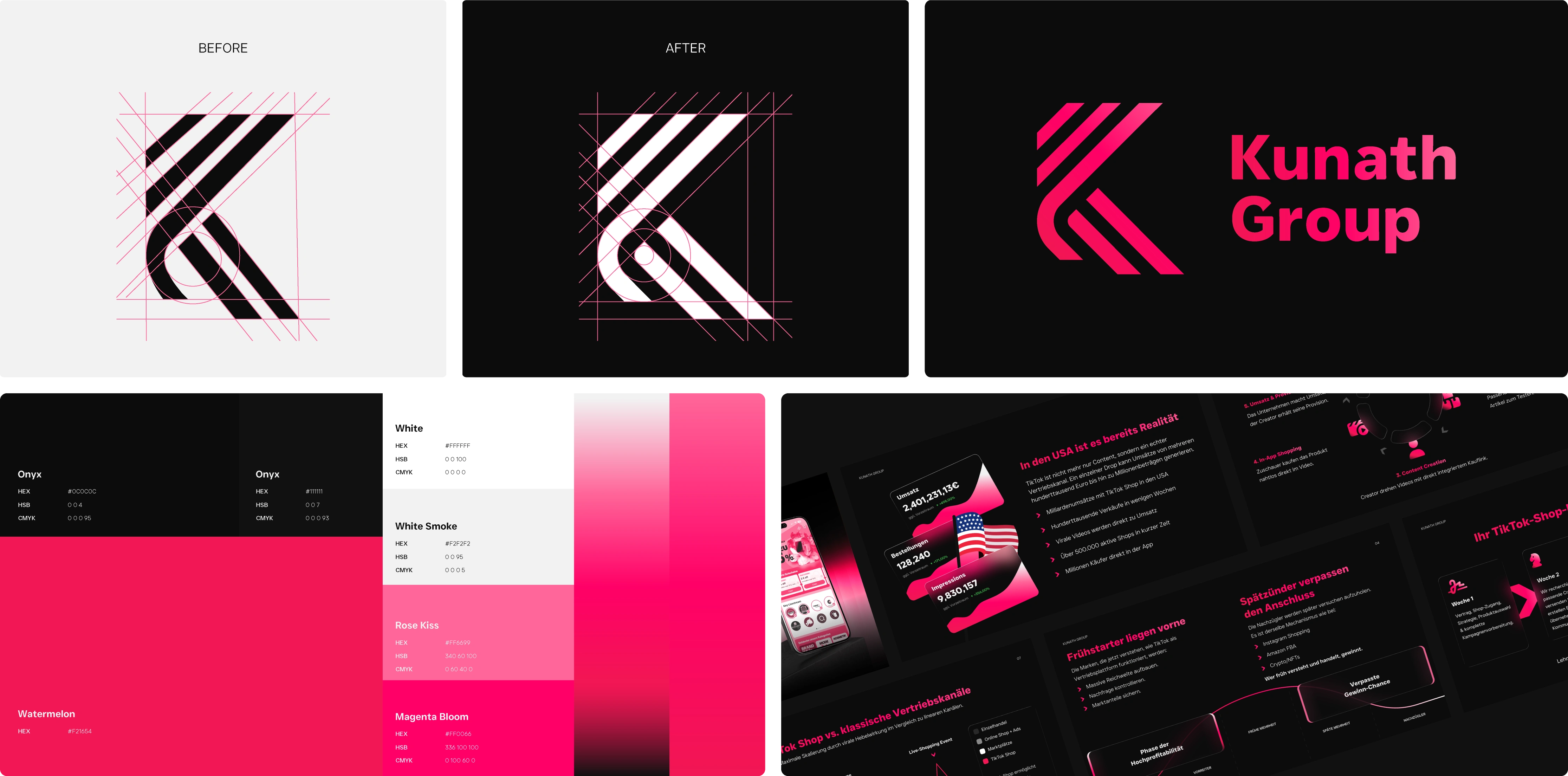
Kunath Group
Brand identity refresh and pitch deck for a German social media
marketing agency helping creators and businesses turn reach into
revenue.
Year: 2026
Industry: Social Media Marketing
Scope: Brand Identity & Pitch Deck
The Brief
Kunath Group is a German social media marketing agency specialising in
TikTok Shop, content creation, and influencer marketing – helping
businesses and creators convert their audience into revenue.
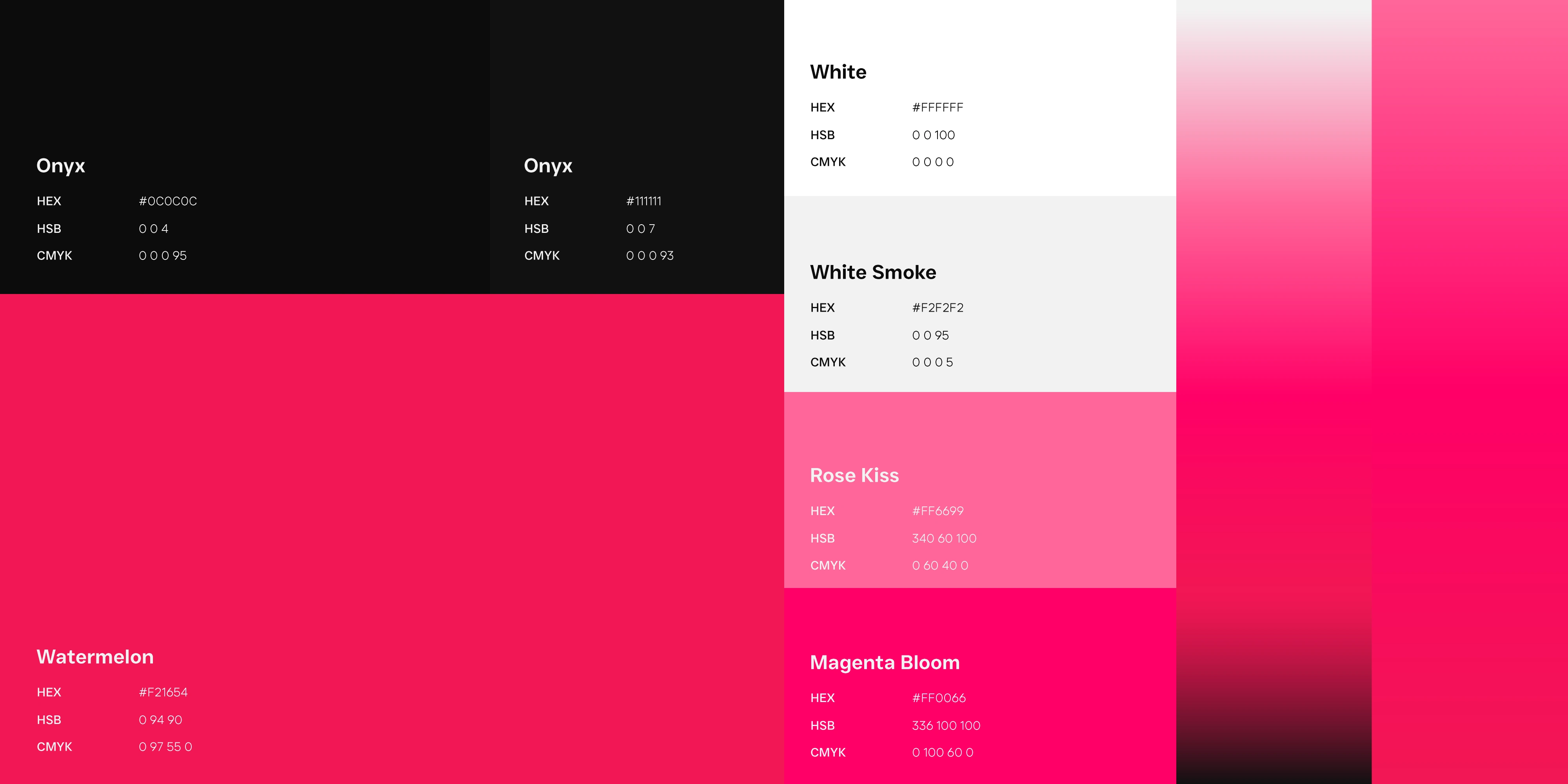
The brand needed a full refresh: a premium, Apple-inspired identity that
would position them as a serious player in a crowded space. Clean and
minimalist, but dominant enough to make prospects feel like working with
anyone else would be a mistake.
Alongside the identity, they needed a pitch deck that could carry the
brand into investor and client meetings – visual-first, low on text,
high on conviction.
The Pitch Deck
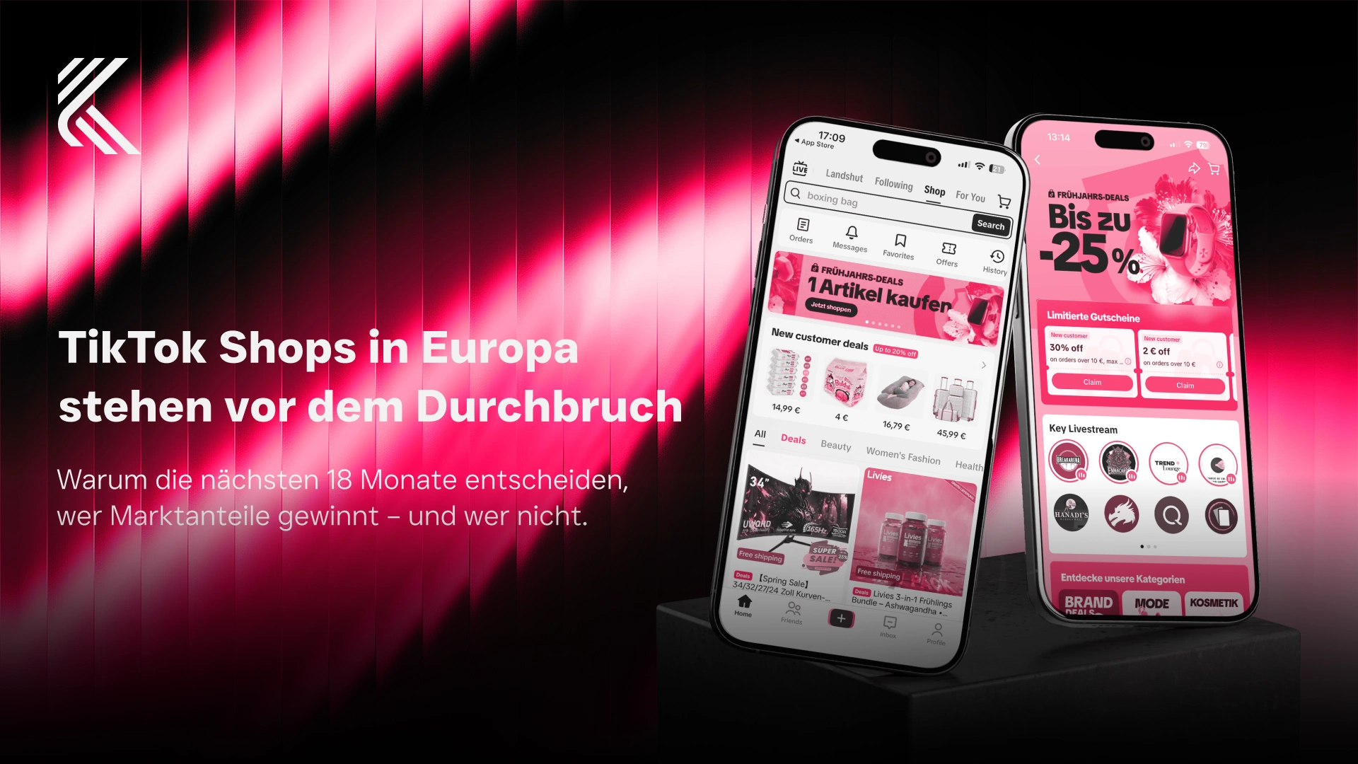
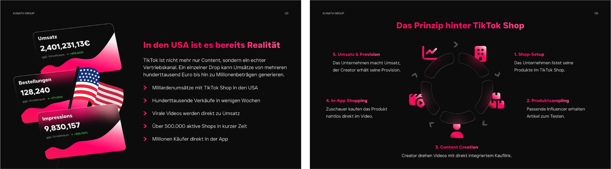
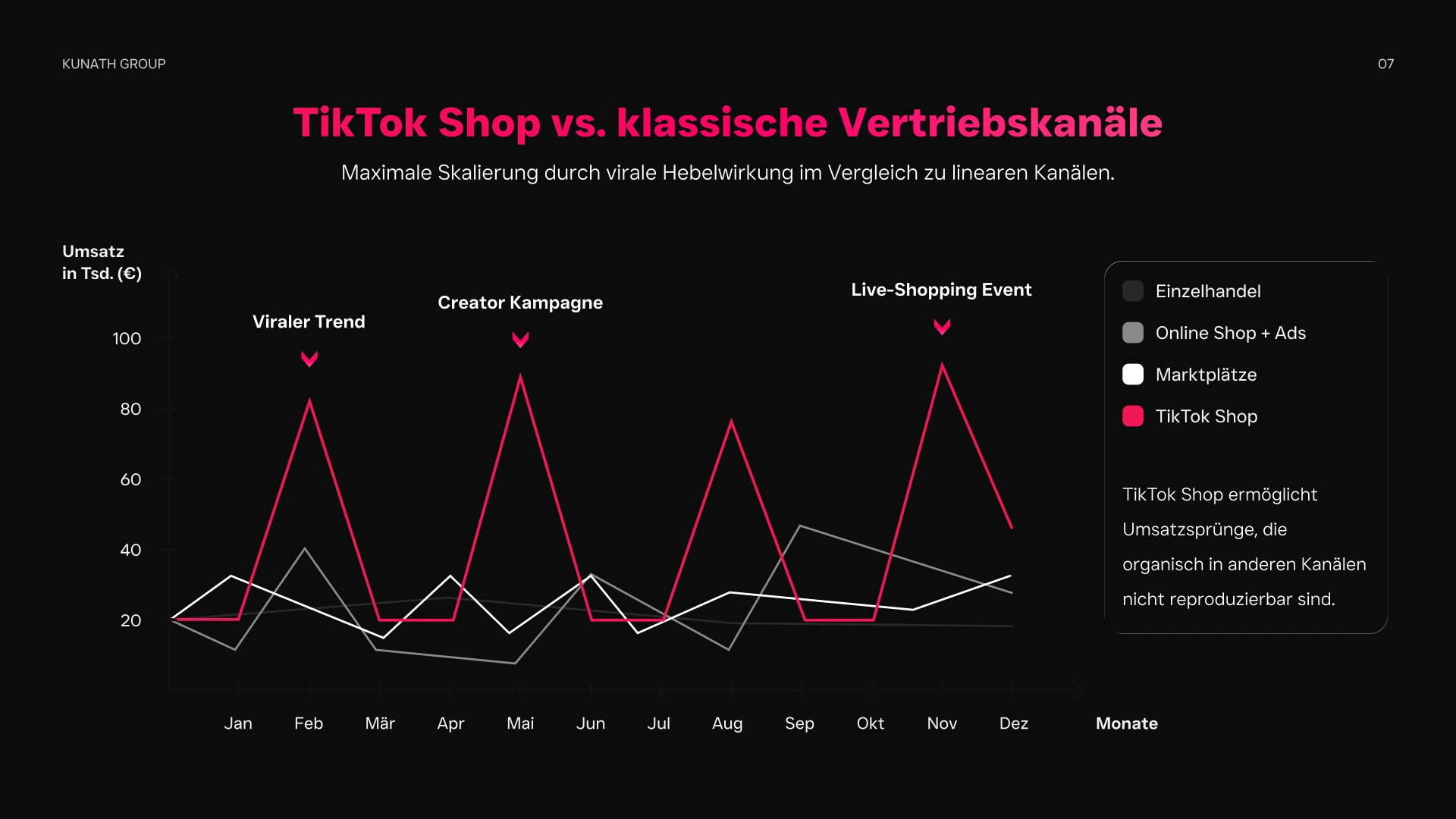
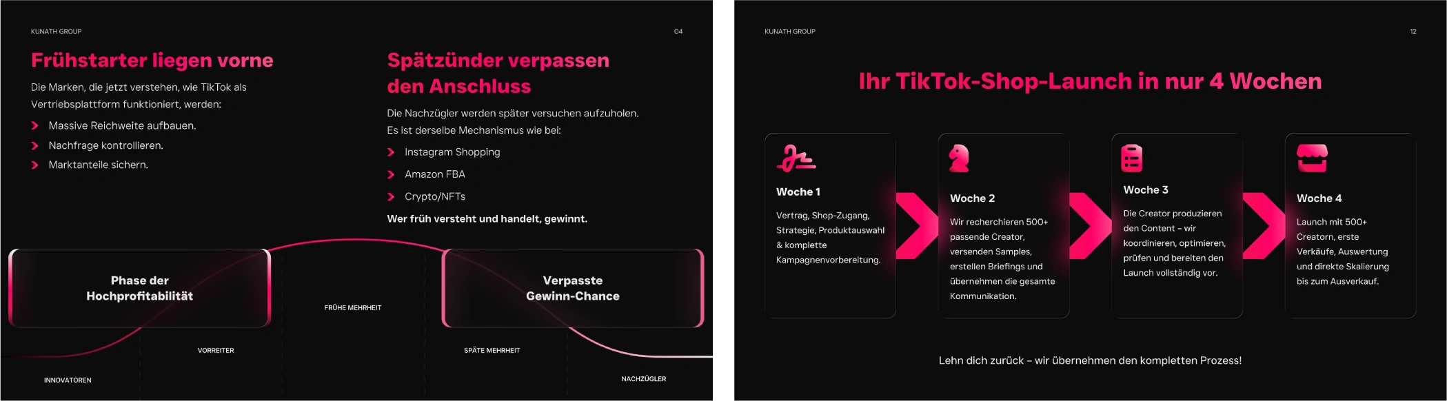
The partner deck is built to carry the brand into investor and client meetings – visual-first, low on text, designed to land conviction faster than any pitch script could. Dense information design – market data, process flows, adoption curves – gets the same type discipline as the identity itself, so the deck reads as a single composed object rather than a slide template stretched around content.
The Thinking
The biggest challenge with a brand like this is avoiding the trap of
looking like every other agency, either too flashy and cheap, or too
safe and forgettable. The brief was clear: premium without being cold,
dominant without being aggressive.
The direction pulled from Apple and high-end tech brands – reduced
color, strong contrasts, a type system built on legibility and weight
rather than personality. The goal was that a prospect landing on their
pitch or website should immediately feel: "these people have their act
together." That sense of authority has to come from the brand doing the
work quietly, not from bold claims.
The pitch deck followed the same logic – visuals and data over walls of
text, plenty of breathing room, and a structure that builds competitive
pressure without spelling it out. The feeling should be FOMO by design.
Data visualisation got the same treatment as the identity itself –
market timing, channel comparisons, process diagrams handled with
generous spacing, restrained color, and type doing the heavy lifting
instead of decorative chrome.
Really strong work – focused, efficient, and on point. Communication was clear and straightforward. Highly recommended. I'll stay a client.
Chris Kunath – Kunath Group LLC
Like this project
Posted Jun 3, 2026
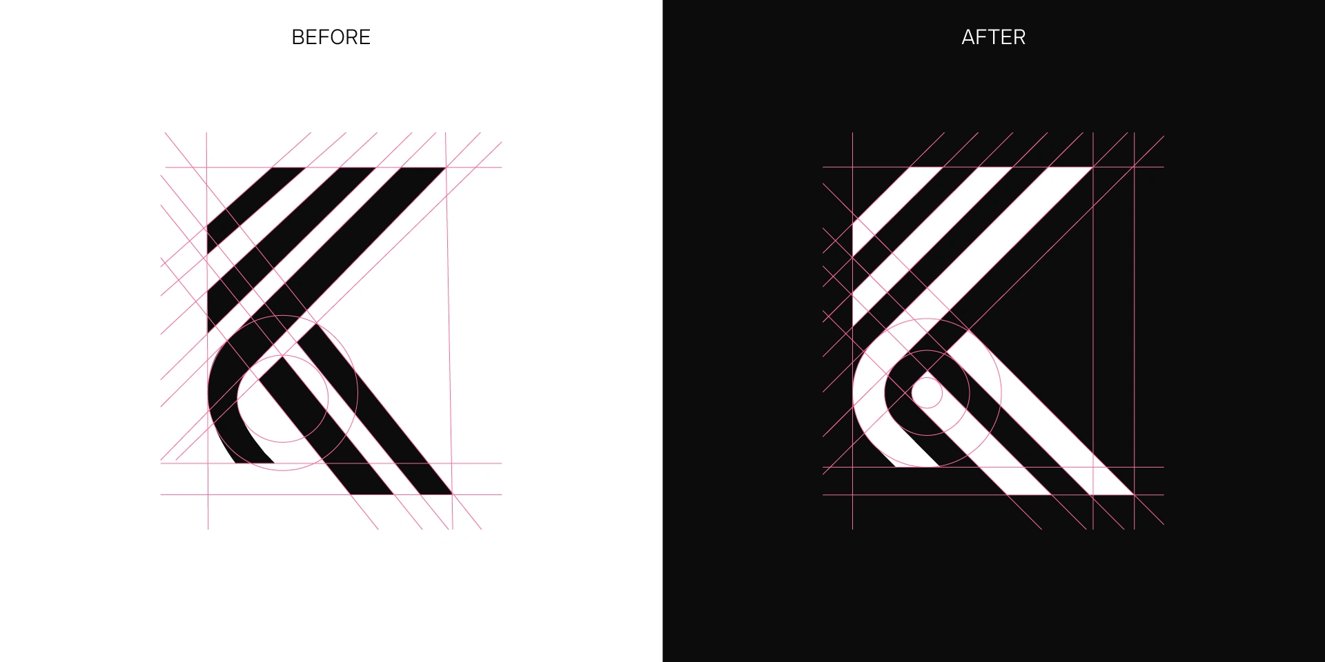
Brand identity refresh and pitch deck for a German social media marketing agency – new logo system, color, type, and a client-ready pitch deck.