Vortech Solutions Website Redesign
Noah Wainwright
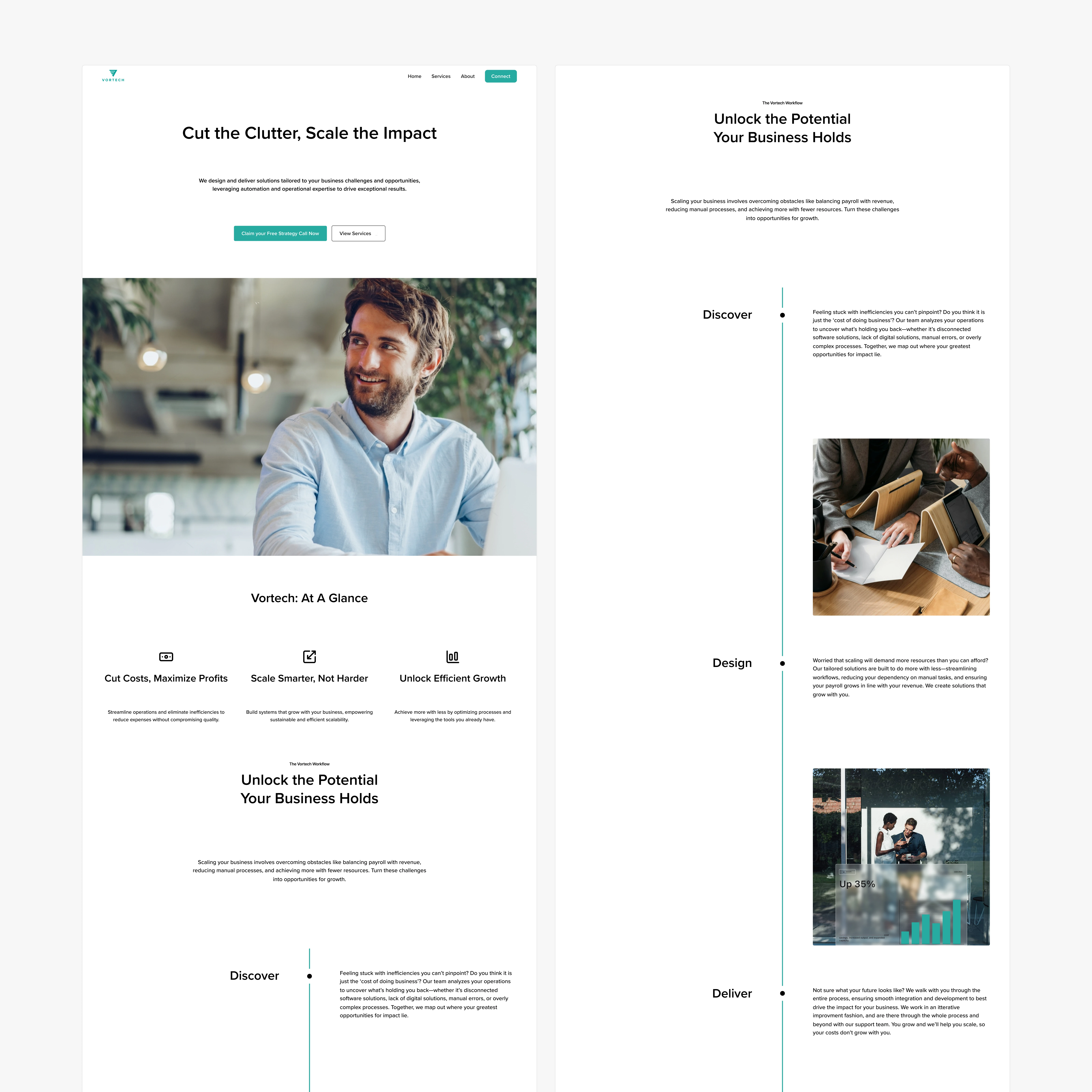
At A Glance:
Vortech Solutions is a B2B automation company helping clients streamline operations, cut costs, and accelerate performance.
Before the redesign, their website felt like a generic services firm—outdated visuals, unclear positioning, and no value-driven messaging.
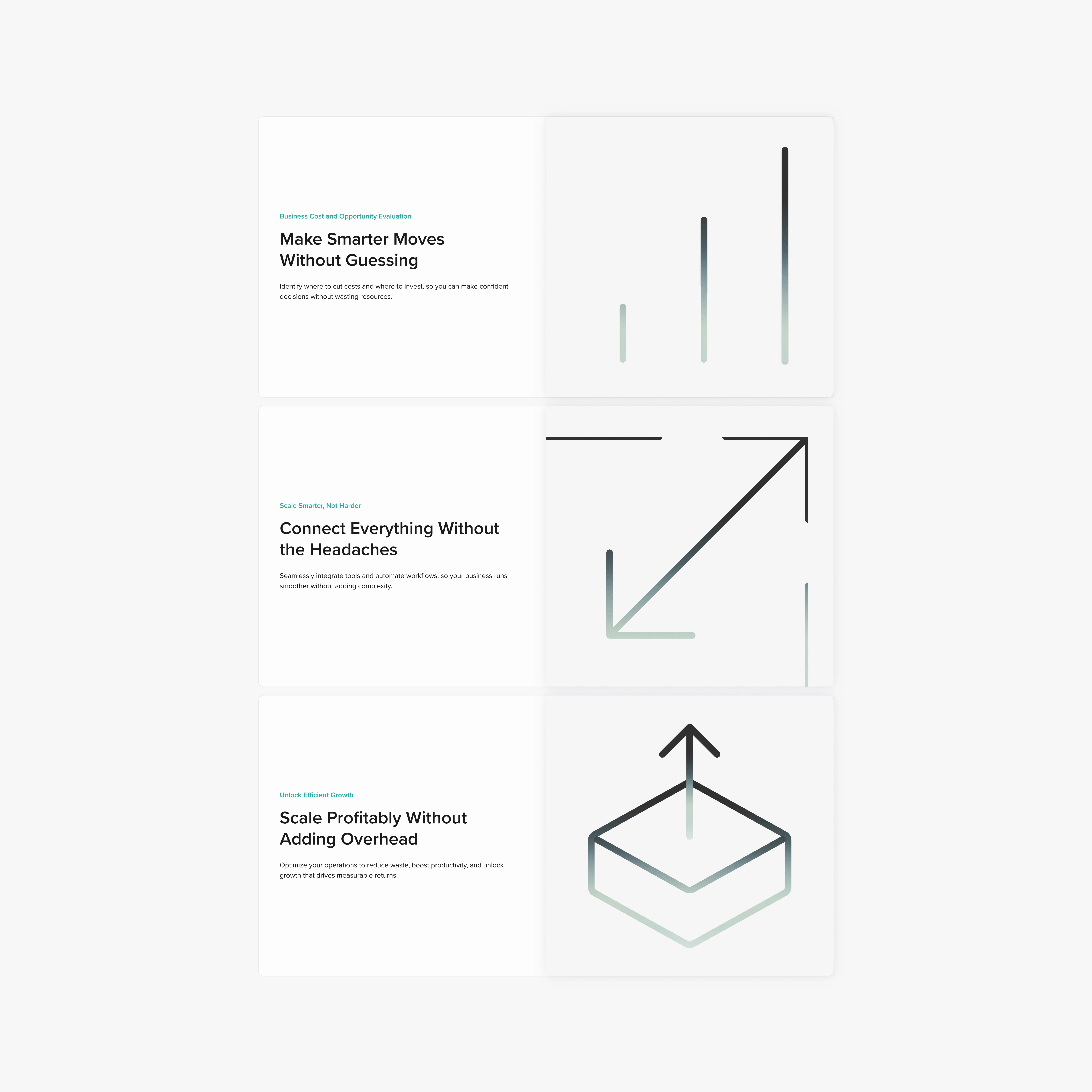
We redesigned the brand and web experience from the ground up:
• Clarified the core pitch around “automated outcomes”
• Refined brand identity to feel efficient, modern, and trusted
• Rebuilt the site to convert: fewer words, more results, focused case studies
Outcome: A lead-ready site that speaks directly to operators, not browsers.
Context & Challenge
Before the redesign, Vortech’s online presence didn’t reflect their edge in B2B automation.
The site looked like a dev shop—not a strategy partner. And while the work was high impact, it was buried beneath vague language and a static layout.
Key gaps:
No clear differentiation from low-cost service providers
No proof, no path to convert, no urgency to inquire
Design language didn’t reflect their promise: fast, efficient, outcome-first
The result? Lost leads. Low clarity. And brand perception that didn’t match the quality of their work.
Solution and Strategy:
We approached this redesign like a product launch, not a portfolio refresh.
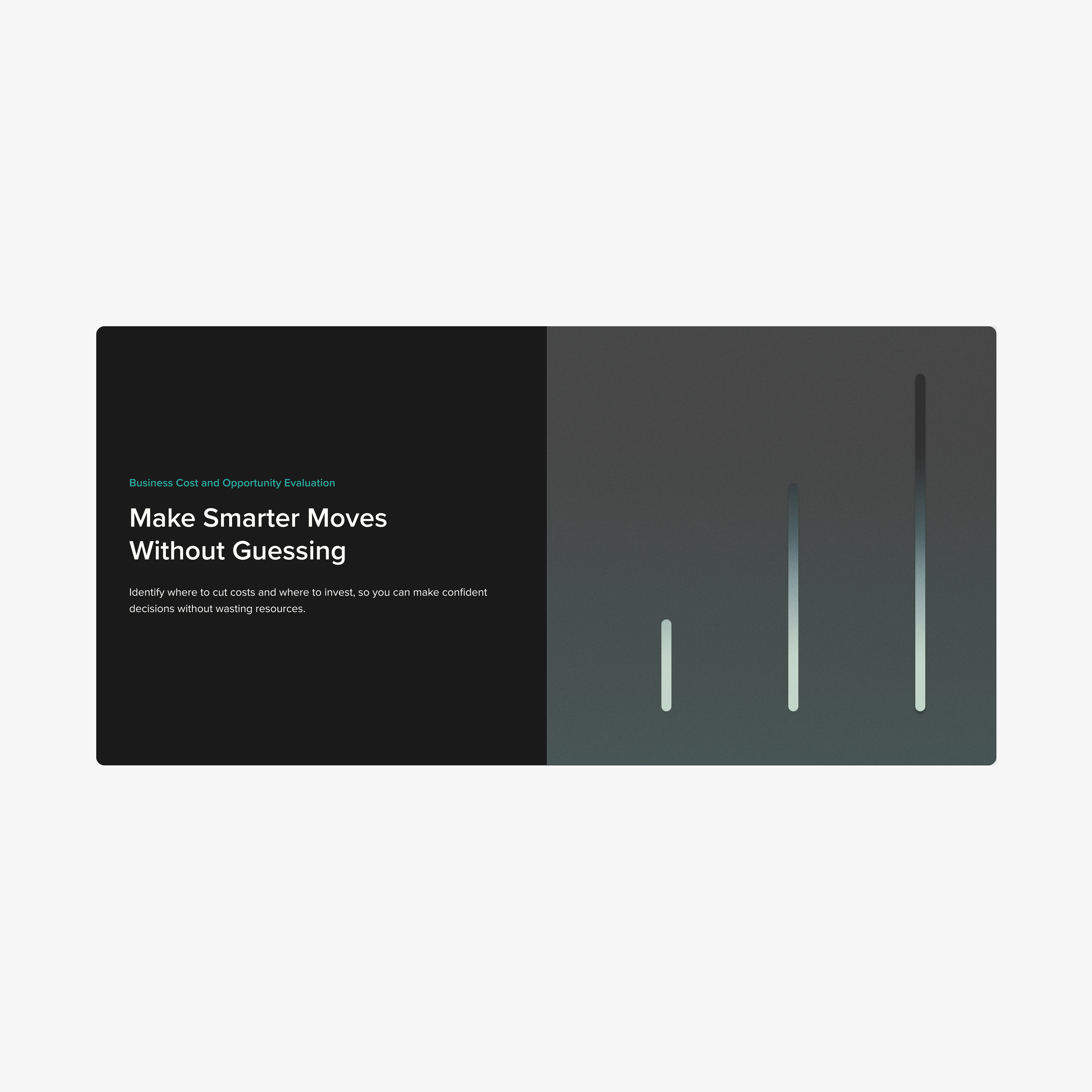
1. Brand Positioning That Sells Outcomes
We reframed Vortech from “we build automation” to “we drive results through automation.”
This aligned with the founder’s core vision—speed, efficiency, results—and repositioned the brand from dev shop to growth partner.
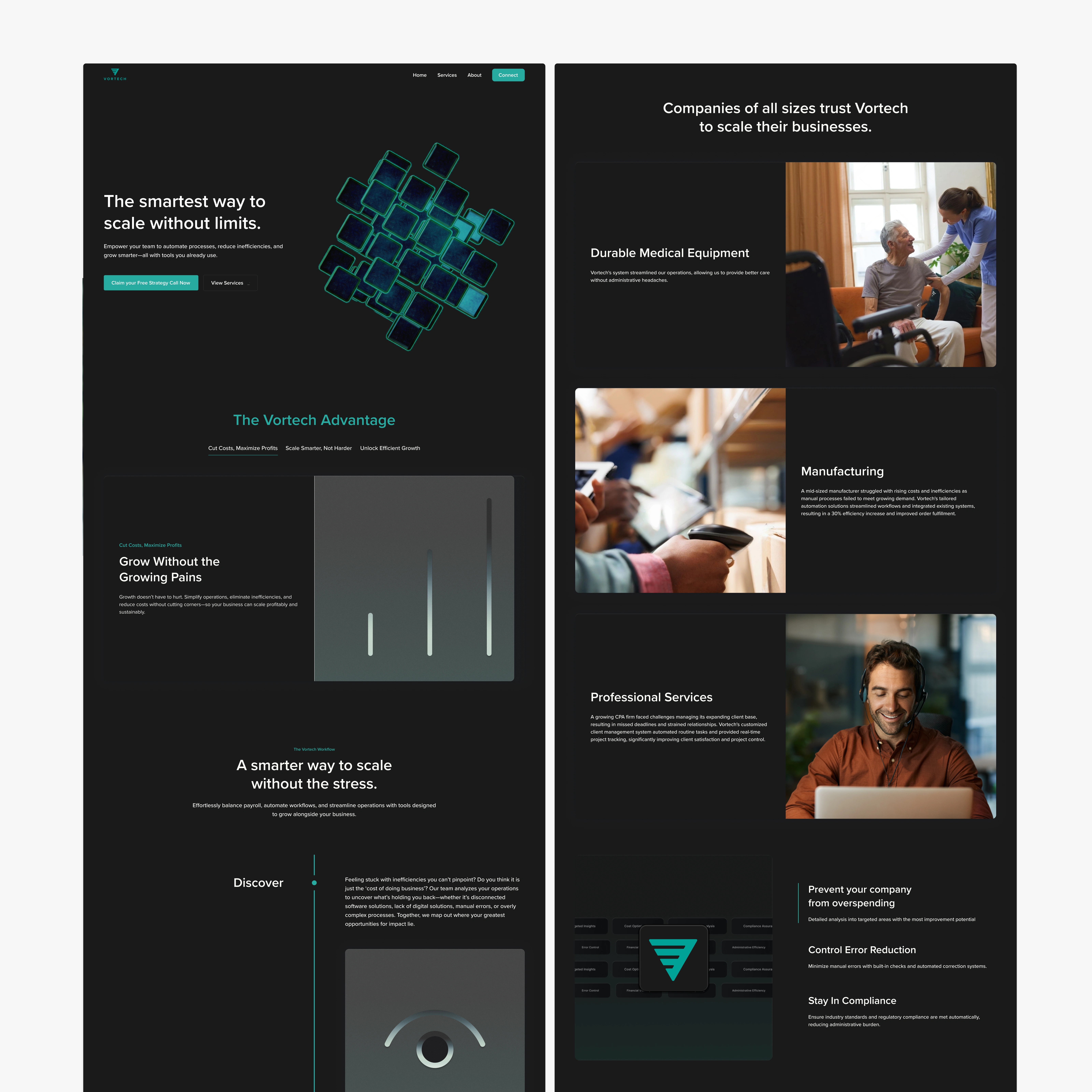
2. Minimalist Identity System
→ Color palette built on black, white, and teal for tech-forward precision
→ Typography and spacing optimized for speed + modernity
→ Logo refined to feel abstract yet structural—automation, encoded
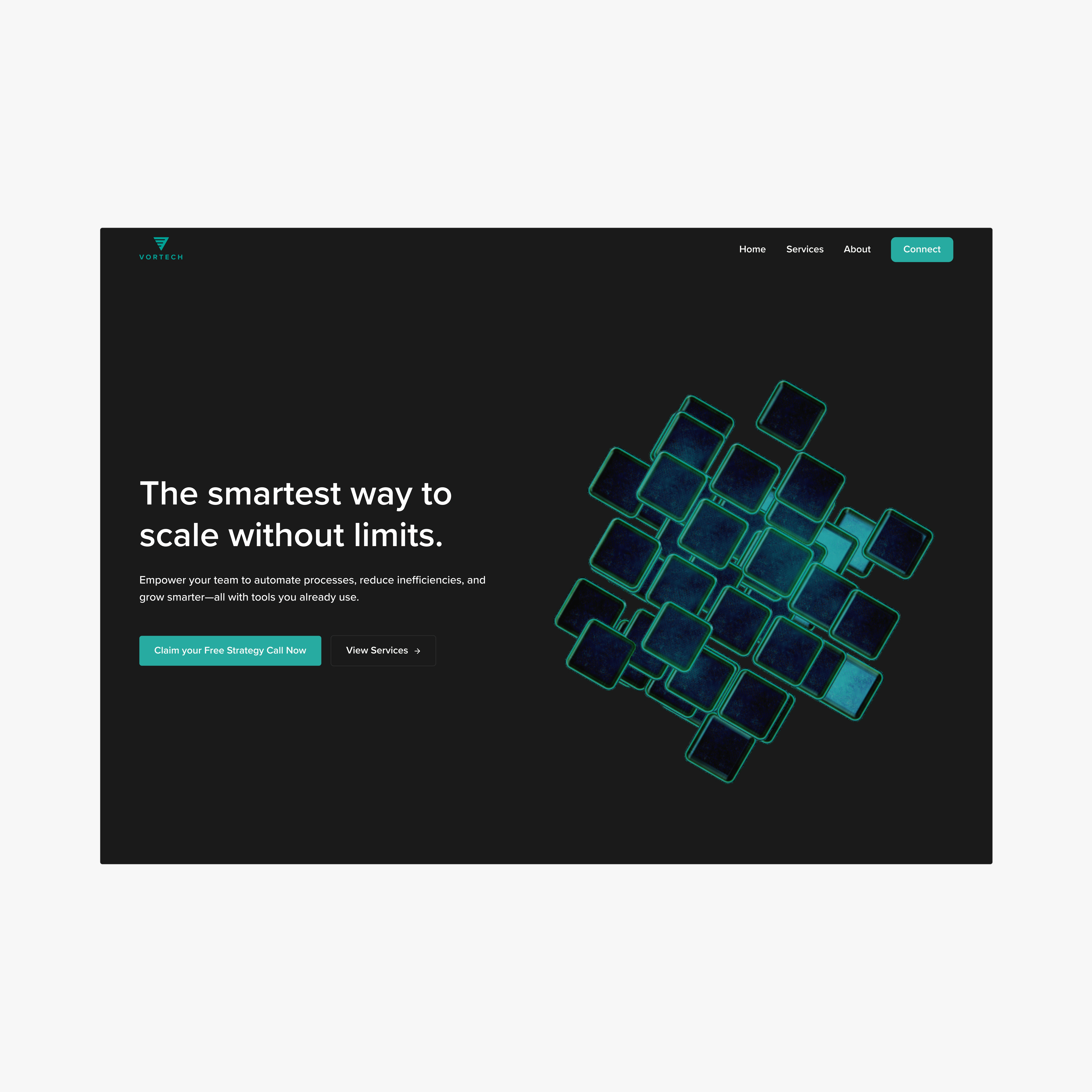
3. A Site Built Like a Sales Deck
→ Every section tied to a business outcome
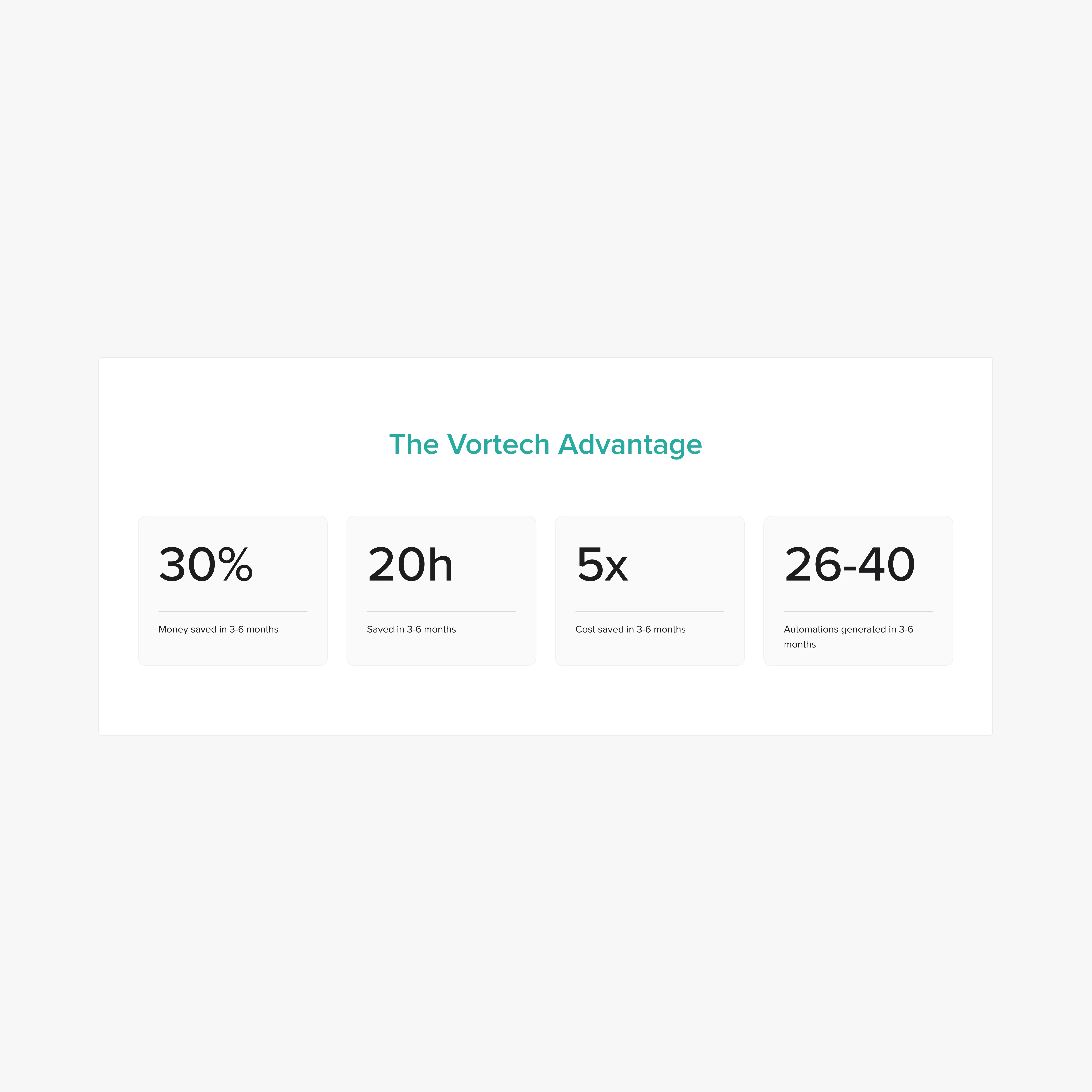
→ Case studies reframed to showcase ROI: “Reduced processing time by 47%”
→ Call-to-action clarity: “Let’s automate your next win”
→ Pages stripped down to move users from interest → belief → contact
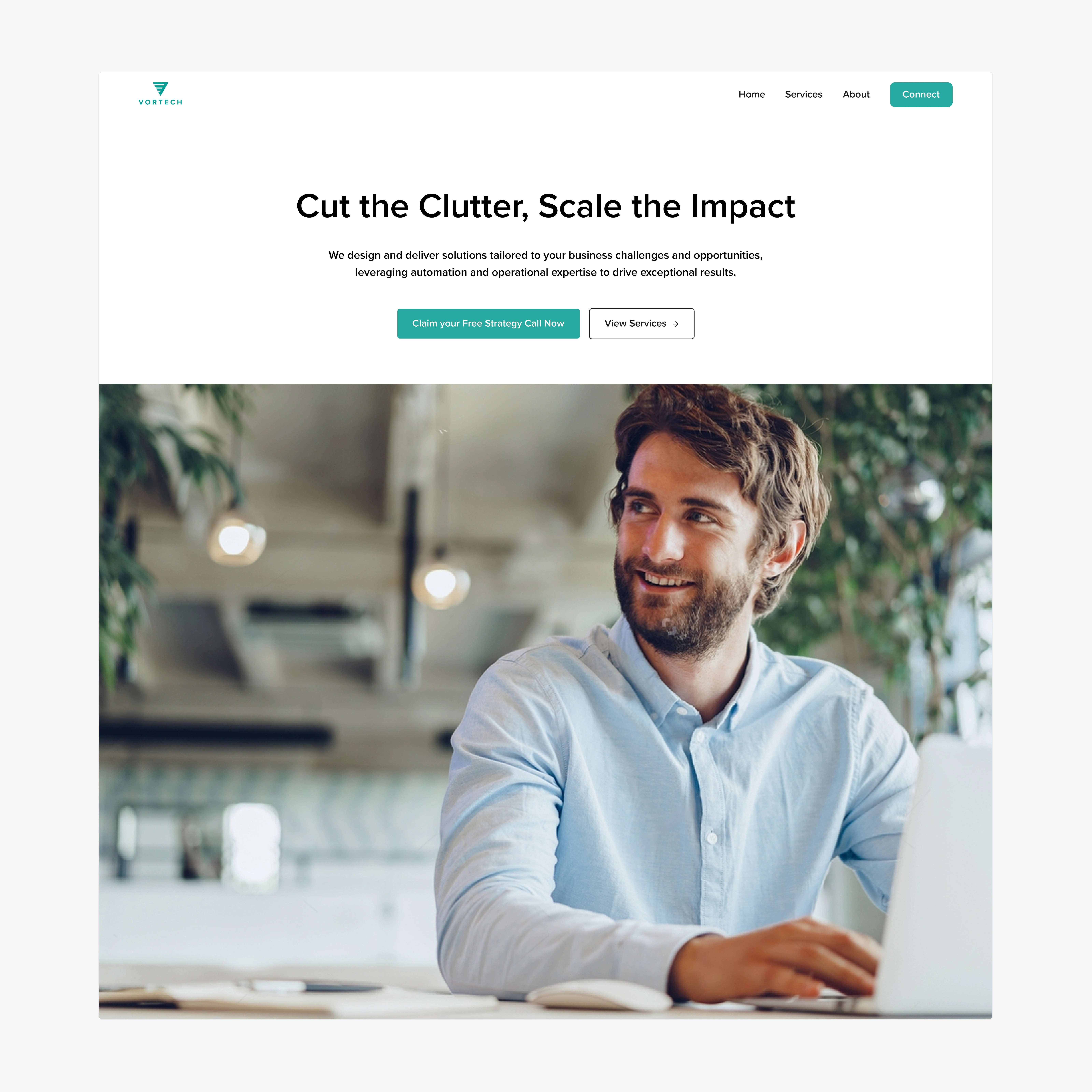
Initial Concepts that were rejected. These went "too heavy" on the tech feel.
Rejected Hero Section
Results & Business Impact
Lead Quality Improved
Vortech’s new pitch speaks directly to operators and RevOps-minded execs, leading to more qualified inbound requests.
Clarity → Confidence
The new messaging helps buyers understand exactly what they’ll get: less admin, faster cycles, clearer ROI.
Perceived Value Increased
By shifting from generic web copy to strategic outcomes, the brand now competes with top-tier automation partners—not low-cost implementers.
Before: “We help you automate”
After: “We reduce cost, boost speed, and increase quality—through automation.”
Why It Worked: Lessons & Takeaways
Clarity Sells
We built the site like a pitch—not a portfolio. Every word earned its spot. Every section answered: Why should I care?
Design Signals Trust
Small B2B buyers judge on feel. This brand now feels like a high-end, specialized automation partner.
Positioning = Differentiation
Most firms sell what they do. Vortech now sells what changes after you work with them. That’s the conversion driver.
If your B2B SaaS needs a landing page or a product redesign that drives conversions and eliminates friction, let’s talk.
Like this project
Posted May 16, 2025
Redesigned Vortech’s brand and website to drive clearer positioning, increase lead conversion, and reflect their expertise in B2B automation.