Imunyze Brand Identity & Packaging
Vlad Ionut
The Brief
Imunyze is a nutritional supplement brand focused on naturally boosting immunity. They needed a complete brand identity and packaging system that could stand out in a crowded supplement market while communicating three core messages: efficacy, safety, and all-natural ingredients.
The challenge was positioning Imunyze as a premium, science-backed product without falling into the clinical, cold aesthetic that dominates the category.
The Approach
I started with strategic positioning, identifying where Imunyze sits relative to competitors and defining a visual language that balances scientific credibility with warmth and approachability.
From there, I developed the full identity system: logo, color palette, typography, and brand guidelines. Every decision was filtered through the question: does this make someone trust what's inside the bottle?
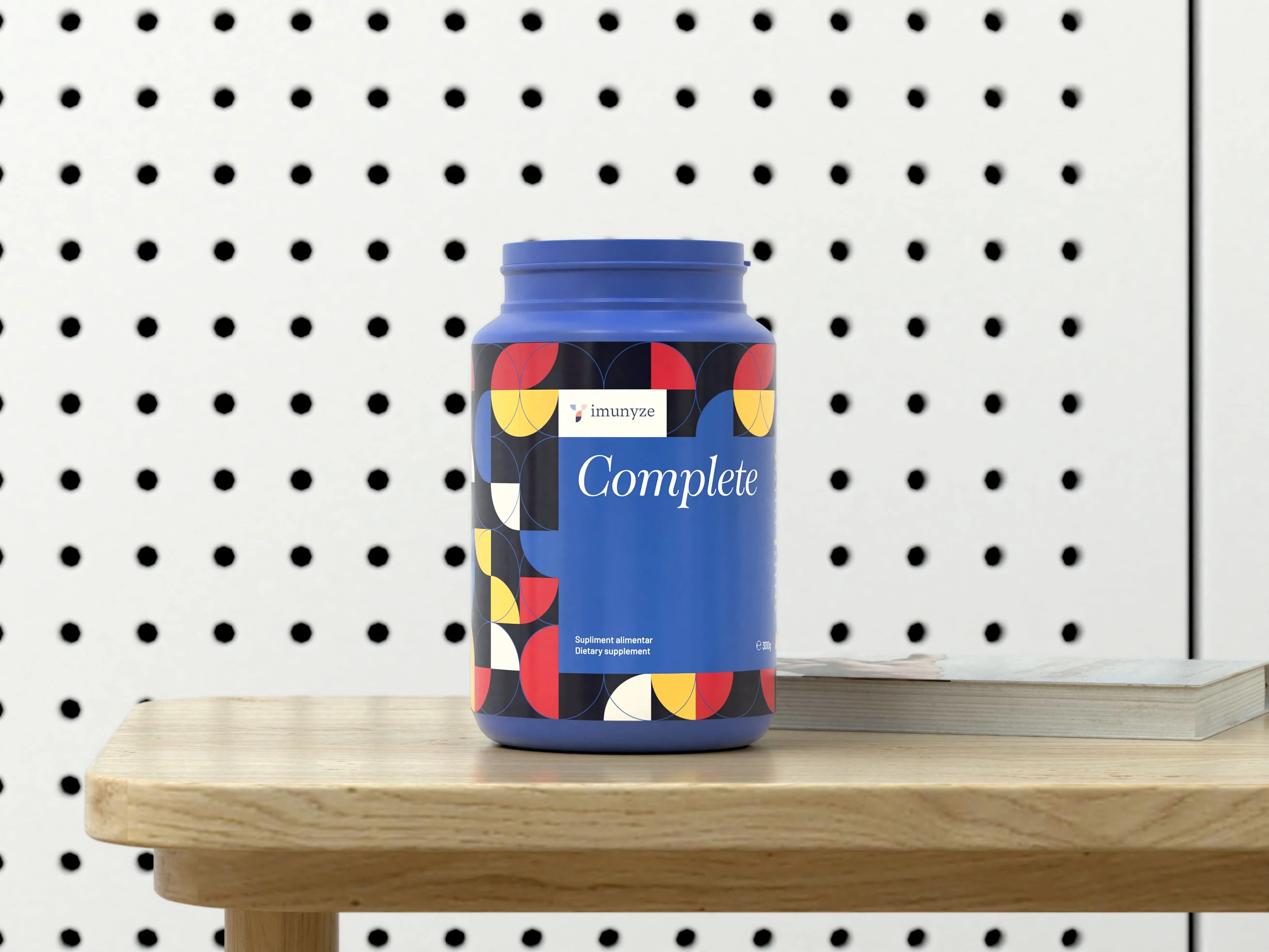
Packaging Design
The packaging was designed to do the heavy lifting at shelf level. Clear hierarchy, confident typography, and a color system that signals "natural" without looking generic. Every element was built to communicate the product's benefits quickly and clearly to potential customers scanning a crowded aisle or online store.
The Result
A cohesive brand identity and packaging system that positions Imunyze as a premium, trustworthy supplement. The design bridges the gap between science-backed credibility and the approachable, natural feel the brand needed to connect with health-conscious consumers.
Like this project
Posted Jun 27, 2026
Brand identity and packaging design for a premium immunity supplement, built to communicate efficacy, safety, and natural ingredients.
Likes
0
Views
2